Micro Madness 2023 / MM4 R3 Semi-Final 1
-
 27-February 23
-

 posix
Offline
Document 
Only heavyweight names left now, heavily flexing their muscles, or trying to built the highest cake. Or both. But who will advance?
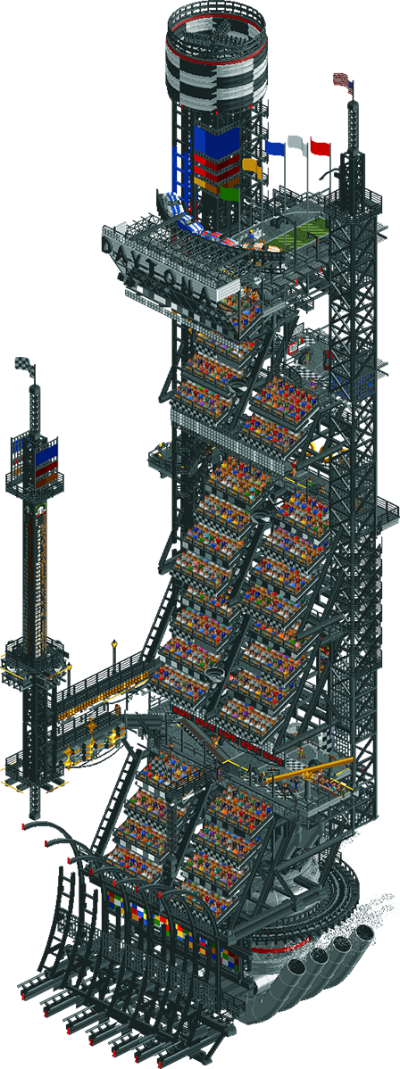
Daytona 5000
nin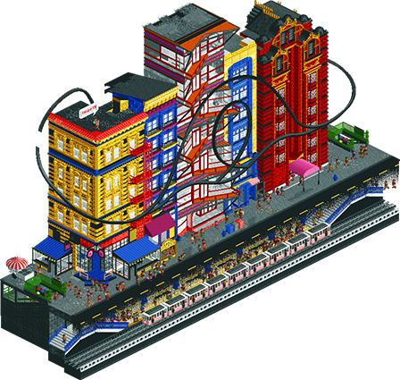
Lichtenstein Manhattan
FK+Coastermind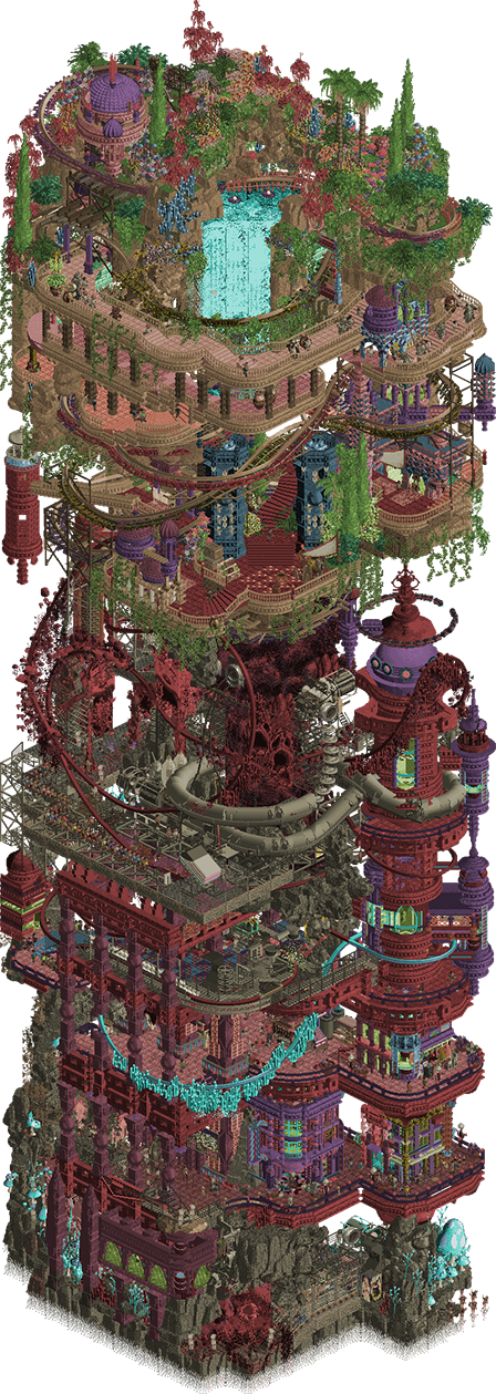
Babylopolis
Ethan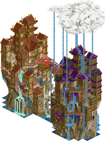
i will be clouds in the morning and rain in the evening
Camcorder22
Voting Rules
- You must view all parks in this match to vote. If you cannot view a park, for example if you don't own LL, then please do NOT vote.
- Once you have viewed all parks, select your favourite and second favourite in the above poll. The poll will close after approximately 3 days and the results will be posted.
- The winners will be determined by the formula set out in the Rules & Regulations topic. The creator of the highest score entry will proceed to the next and final round. The second highest scoring player will be placed on the reserves list for the next round. The two lowest scoring players will be eliminated.
- Everyone may vote except for those participating in this matchup. If you are part of this matchup, please null vote. Voting is public and monitored by admins, any cheating will be picked up on and dealt with.
-

 RobDedede
Offline
Wow. A great set of parks here. I loved all of them!
nin - For me, atmosphere is a highly important factor when deciding on who to vote for. The atmosphere in this micro is cranked up to 11. That is why it won my vote. I can appreciate someone going for some space-station NASCAR amidst all these "artsy" parks! It's a breath of fresh air, in a way.
FK - I am a big fan of Roy Lichtenstein. We have some recreations of a few of his paintings in our house. The WHAM! diagram with the little plane was so awesome, I love to see it! Again, here the atmosphere won me over. Though I think the coaster and the surrounding areas could have used a bit more highlighting.
Ethan - I do not know where to begin on this one. The sheer amount of content is quite the achievement, but for me, that's also what holds it back a bit. It's quite a lot to take in! Granted, I really like looking at almost all of it, but I honestly do not know exactly what I am looking at. Is it a take on the tower of Babel? For me, I enjoy parks with a clear narrative that still manage to be unique, and I think this micro could have used some more clarity! But don't take this criticism as my dislike of your park, quite the contrary! The framing of the waterfall on the tallest level of the tower was wonderful. And the foliage was well done.
Camcorder - The rain affect was very neat, and I really liked the custom music you included here. I am not one to talk, but I feel as though this park was just a touch less technically advanced than the others. I also think this micro was hurt a little bit by the exactness of the symmetry on both sides. For such symmetry to be more effective, I think a sharper contrast in colors between the two sides may have been a good idea. But again, please do not assume I did not like the micro, I really did enjoy viewing it. It's just that at this point in the contest, I have to start splitting hairs over who to vote for in some cases. -
 Ling
Offline
clouds - Slightly pretentious name. I love the style, wish it had maybe a few more named items to tell me what's going on. The lightning strikes are great. Neat sounding song but can't understand it.
Babylopolis - I enjoyed the horrifying, unsettling faces in the rocks on the upper levels. Thanks for that. I'm not usually a fan of mega tall micros like this, but this is as good a concept to apply to it as any, and the coaster layout actually makes solid use of the height, popping in and out. The bullworms are dope. I suspect this will be most peoples' first pick.
Daytona - I like that you found ways to use all the levels on the backside, but ultimately this is just a really, really tall slice of bleachers. Not even a road?
Lichtenstein - Tough call between this one and clouds IMO. This one has a lot more color and motion but is just a little more matter-of-fact. The fade effect on the road for the underground section is GREAT, even though it's simple. There are definitely references that I am not getting, but I can at least identify them as references.
-

 AvanineCommuter
Offline
1. Nin - said it on discord but once again - WOW what a fantastic execution of a really cool concept. Despite not being into racing at all, the vibes here were immaculate. The structure itself is so well thought out and cleanly executed, it’s really beautiful to look at architecturally. And when you dive in, there are so many great details and “interior (exterior?)” moments. The music and cars zipping by were crucial to creating the right atmosphere here. Nailed it, easily my #1 here.
2. Ethan - This was epic, wild, chaotic, beautiful, messy, incomprehensible, disaster-bench-lite, skillful, overwhelming, exciting, creepy… that is to say, a very Ethan micro. While I do not fully understand the concept here, I enjoyed the density of content mixing city, garden, and an unknowable demonic presence scattered throughout. There were moments of brilliance in the architecture and structure amidst the chaos, and moments of messiness that made it difficult to read. The coaster itself was impressive but was also very hard to follow, especially with the map turning issue being such a tall micro. I love to see your ambition continuously translated into the game and this is no different, though I think some editing would help the legibility and clarity in your work.
3. FK - I am so happy you are back in as a replacement, and this is such an amazing continuation of your artist drink series! The murals are so great as expected, you truly have a gift in translating real life sculptures / murals / ideas into the game in a way no other parkmaker does. However, I would have loved to see more of the famous half-tone elements more prevalently shown here in some of your own famous textural work. The coaster worked perfectly in the space, and that penthouse apartment interiors was really nicely done as well. I was debating between you and Ethan but in the end, I ended up spending a lot more time in Ethan’s exploring the nooks and crannies. Still, I am stoked to see what else is next in this series…!
4. Camcorder - A beautiful entry with some stunning music; I think this is the first time I’ve heard your stuff and it’s amazing! That lightning effect is genius and really creatively executed. I’d liked to see some more movement and interactive content in here to hold the viewer’s attention a little longer, but great work overall. -

OddmentsAlchemyLab Offline
What a stunning round this was. I was excited to go through the park pack because one of my personal favorites was in. A newer builder I believe, Ethan has really captured my attention with his detailed artistry and object additions. I went in, sight unseen, with his work in first.
1. FK's was the first I opened and my jaw dropped. I sat back and looked at the detail on the red building and just seethed in a stew of jealousy and amazement. "I hope they get it" and admittedly, I really didn't. I did not get the art references which I blame on the attractive classmate who sat next to me in Freshman Art Appreciation. I learned nothing. That said, I didn't get it, but I think I caught on. The pop art style on the back with the art deco flair was fantastic frame to frame. I love this entry top to bottom and it jumped from bottom to top.
2. NIN - Why must you tease me with ibeams? I'm a fan of the bare, industrial look and have been knocking around with a pipe and beam expansion set since I feel these items are underwhelming. I've been fooled twice by the single rail tracitecture and it looks so good! What blew me away was how very few objects you actually used to make this piece. It's a lesson in less is more. And the engine? Yeah that was sweet. I couldn't pull it over FK's piece, but this one hit my soft spot.
3. Camcorder - I liked the look and the lightening and the prominent water feature. It felt very on par with this level of competition, but for me it lacked a hook. In reading the other thoughts, this may be due to my hearing issues and the fact that I do not turn on the game sound. This is a habit I need to change with the use of custom sounds right now. Why not go look at it with sound now? My computer/stereo setup is a pain to set up and my gaming computer and media computer are separate. I'm also lazy.
4. Ethan - I still love your stuff! This one felt muddy and lost in the color. With so much detail and care put in to each tile space, the utopia palette was a risk. It was like fine art through a blur filter. I love that I can zoom in anywhere and see such attention to detail and I love that your concepts are eclectic, yet transition so well. All of that talent is evident here - its just buried under a thick muddy color.
There is nothing here that I could come close to replicating. I honestly can't believe the energy and passion going into this 20+ year old game. You are all artists and your works are inspiring. Thanks for all the hard work you've put in to make this a really exciting tourney.
-

 wheres_walto
Offline
In the order I saw them:
Cam: love the lightning effect, really creative and well done. For years we all struggled with clouds, I think this attempt along with AVC's round 2 park have finally broken us free. Architecture is well done, I like the duality and shading you've applied to differentiate the two structures. ++ music, I love seeing our skilled members put their work into these creations
Ethan: well.. nobody can say you didn't do the most. When I break this park down, I see so many elements of cool construction, clean detail, skillful layering, and a wholly unique vision of the game. But I don't think it comes together for me. Maybe I'm just projecting and viewing too much through the lens of what I want it to be.. I'm quite torn on what it makes me think/feel and what I should think/feel as a viewer and critic, but I just don't get a clear sense of location, cohesion, or refinement. It feels like an unpleasant gory mess of vomit on the screen, which maybe was your intention as a horror-scape fever dream? I don't know man, your stuff confuses me
FK: so happy you submitted another park, I've quite enjoyed your series so far. I think this one hits the mark again, I've wanted for a while to see pop art and comic book styles portrayed in the game and this is the best attempt I can think of. Your clean outlines were particularly effective. It's interesting to see your map-design consistency: opening angles more grounded in realistic(ish) scenes inviting the viewer to rotate and enter a fresh aesthetic each time
nin: I'm a sucker for stadiums and live events in-game, so this one hit the mark. I like how you've adapted the concept to maximize your limited space. The effect of cars whizzing by with the audio is super effective, and your clean use of lines in industrial construction has always been a standout for me. Very cool
In the end, strong execution of clear themes won the day for me
-

 Ge-Ride
Offline
Babylopolis. I voted first for this one, after some deliberation, because even though it's messy it has the most to offer on repeat viewings.
Lichtenstein Manhattan I give my second place for sheer aesthetics. You did a beautiful job translating Lichtenstein's work into RCT. It just doesn't have quite enough content to reach Babylopolis for first place.
Daytona 5000. It was fun to watch. It just doesn't have a real full circuit ride. The racing cars were cool but it doesn't have quite the same impact as a real coaster or a full circuit racetrack. Great concept though and it's tough to give this third place when it is so well thought out. I guess it just comes down to personal preferences.
I will be clouds on the morning and rain in the evening. I like this entry too, even though I gave it fourth place. It is very poetic and fun to ponder for a little while. However, it is sort of static timewise and the detail level is a bit lower so I ranked it lower than the other entries. Still something to be proud of and congrats on getting all this way.
-

 Cocoa
Offline
1. daytona---this micro fucks
nah but seriously, it punches way above its weight. the way you've layered in all these attractions to the grandstand is just epic and leaves so much mystery to be imagined about the world it occupies. just such good environmental storytelling here. nailed it
2. baby lopolis---this thing is wild and weird, and i'm down for it. I don't understand anything about it but its just heaped with vaguely gorey scifi details and machinery, and its very compelling. rich and interesting
lichtenstein---a close race here, I adore the mural on the backside. compositionally it does a really interesting thing, where when I first opened the park I was like, yeah this is good, but once I had spent some time getting into the pop art mindset, the front of the micro totally came alive. love the continuing art theme too
clouds in the morning---obviously the song is an absolute jam. the lightning is a seriously great effect (altho i reckon we can probs hide the bolts before they get to the clouds) and overall its a wonderful diorama with some mysterious storytelling. it feels very personal which is always seriously compelling to me---using rct as a vessel to explore something about yourself is seriously difficult and underrated. idk why i used the word 'serious' 3 times here, but I guess thats the flavor it left me with
-

 Turtle
Offline
I think there's a clear winner, then 2 and 3 are close, and then 4 is a little way off that.
industrial tower racing takes the win pretty clearly for me, it was an incredible piece of work. i felt bad that i ranked your entry 3rd (i think?) in the last round when i actually really liked it. very glad that you've come and smashed this semi final hopefully. just an awesome, different, atmospheric slice of a very believable larger whole. you've picked the perfect bit to showcase, everything fits together and works, and it's also a super interesting crossover theme. loved it.
i ended up going for artsy city block second, i'm really enjoying this signature thing you've got going on and i hope it gets you to the final. a fun concept, again, and the tie in to the previous entries is great. having said that, i preferred last round to this one. probably just a by product of the artist, who lends themselves better to rct actually, but ends up being a slightly less cool thing to look at than the craziness of the last round. still, enough to get second spot and i'm sure i'll find more things to see on the second viewing - something i've experienced with your entries so far, i keep opening them again and enjoying them more.
third to pastel living tower, close to second. ultimately maybe a little less polished, a little harder to read. So much to see, and so much of it is great, but it overall felt slightly messy and i think that stopped me putting it second. still, i love that it's different to what's mainly going on, and i want to see more of this style of work. maybe more horizontal and less vertical and it might be easier to tell what's going on?
fourth for asian raining city - it was a nice scene and the lightning was great, actually. i think as a whole it feels a little samey, even though the structure is impressive. I liked it for sure, but probably a little behind the others.
thankyou everyone, loving this.
-
 Babar Tapie
Offline
Daytona 5000 : As for your previous park, I love this use of a coaster to create movement and dynamics it works wonderfully well, the atmoshphere and the theme are always very consistent, a solid park
Lichtenstein Manhattan : I find absolutely great this series of park that you propose since the beginning of the contest, there is such a mastery in the theme, it is always a great pleasure to open your park. The association artist/country/architecture is always very coherent. The artworks are sublime, bravo
Babylopolis : It's very impressive there is so much to look at, a kind of enigmatic creation that can be discovered and interpreted, it's conceptual like a work of art. I don't know if there is an overall meaning but I think that is not what matters here.
Clouds : I really like this link between the music and the park, the global architecture looks like a search result on pinterest like "dream city on a cliff" (it's a compliment), it's very beautiful in the execution, I really like the verticality all in delicacy, it's perfectly dosed and pleasant to look at, congratulations !
-
 Six Frags
Offline
1) Babylopolis by Ethan
-Concept:++
-Content:+++
-Quality:+++
Overall; Crazy amount of content you managed to get it. I don't agree with others that it's not readable anymore; I felt it was pretty easy to see what was going on every level. The overall concept on the other hand is a bit vague, I'm guessing it's your take on a kinda futuristic/alien tower of Babel mixed with (the hanging gardens of) Babylon. The Ishtar Gate was so telling just under the top hanging gardens bit. I also love following the coaster descending down and going through all kinds of caves and structures, and the crystal objects under the rails brought a nice aesthetic to it. The colour scheme, deco usage and palette bring an awesome unique atmosphere and the difference between the garden-esque top and rocky (/architecture-rich) bottom was nice as well. I think out of all the micros so far I've spend the most time exploring this one. It also gets better and better the more time you spend looking and exploring it. Well done Ethan, you get first place from me
2) Daytona 5000 by nin
-Concept:+++
-Content:++
-Quality:+++
Overall; Wow, you're on a roll nin. I like that you've kinda took inspiration from your previous micro, with the rats running like crazy through the middle and now you've took that concept, and transformed them into race cars Very cool atmosphere, and the big tower with on every level something else to see, made me spend more time with this micro than I originally envisioned. Especially like the trackitecture usage, creates nice dynamic structures throughout.
3) Lichtenstein Manhattan by FK+Coastermind
-Concept:++
-Content:++
-Quality:+++
Overall; Very cool impression of an artist again, this time Roy Lichtenstein with his pop-art cartoon-ish art as centre point. I think you stayed true to his style with everything in this micro (especially the backside obviously), and the coaster was very fitting, kinda emulating his bold black contour outlines. Nice architecture forms, deco use and colour scheme. Wish there was a bit more, but yeah, 100 tiles isn't much..4) i will be clouds in the morning and rain in the evening by Camcorder22
-Concept:+
-Content:+
-Quality:++
Overall; I read on discord you made this song first and then the micro around the song, so that in itself is an interesting approach I've not seen done before. I think the biggest drawback was the monotonous colour scheme here; some more variation other than the red and purple roofs would've done wonders. Now it's all a bit same-y.. I really like the small patches of foliage around the architecture though. Other than that, there's not a whole lot to explore. I did like how you did the clouds and especially the lightning, great effect. The other micros in this group had more content and originality to them though, but nice effort and most importantly, great song! -
 Xtreme97
Offline
nin: Love how this builds up from the moment you open it with the music getting more intense and the sounds of the cars coming in. Lovely atmosphere and great details in the structure, from the V8 engine to the racing pylon.
FK: Really loving the string of artistic themed micros you've been doing, really delving into their respective styles faithfully and here is no exception. Excellent portrayal of Lichtenstein with the bold primary colours giving life to the buildings, and the mural in the back is another of your strengths that works so well here.
Cam: Wow, really loved the atmosphere and tension of this micro. The way the music plays into it and builds up, you can tell there's a story behind it that I want to explore more of. The lightning effect is excellent as well, adds some wonderful animation to the map by not making it static.
Ethan: Similar to your previous micros I find this one quite hard to comprehend on first look but as I sat with it for a while I got more engrossed by it and started being able to pick apart the layers. I don't really understand the idea behind it beyond the aesthetic level, but even then it's superb, oozing atmosphere and horror vibes.
Excellent work by everyone this matchup, very hard to pick my favourites and it really is by hairs. -

 Jens J.
Offline
nin - It's the sound of the cars zooming by that does it for me. Great structure, really nailed those racing grand stand vibes. So many details I like about this, such as the racing pylons or all the blinking lights. A great performance all-around!
FK - So happy to see more artistic FK work this contest! Just like your last few micros, the front look pretty unassuming but still really good. Then you turn the park and bam... various artwork thrown right into your face. And it's great artwork too, like you immediately get the pop art vibes from it. Especially love the explosion going on behind the plane and the use of letter vehicles to really make them pop out more (no pun intended). Very nice work!
Ethan - This is so quintessential Ethan in the best way possible. Insane amount of content which is also executed very well (and didn't almost kill my pc this time so ++). While the lower levels look nice and all, I'm actually most attracted to the top part since the foliage and rockwork are done so well there and I'm just a sucker for those things. Again, idk how this all even fits in a 10x10, but you managed to do so in great way so props to you!
Camcorder - The lightning bolts omg... I have been wanting to create good ones for so long but could never figure out how. And these look freaking fire. Music has a really nice build-up and definitely fits the vibe created with the peep stare down and the sunny / rainy side. While I find the architecture to be a bit repetitive, I have to acknowledge that it is executed very nicely.
Can we like, y'know, get some more wildcard finalist spots? There is too much good stuff in these semis. -

 Lurker
Offline
Daytona 5000: Such a cool and fun concept, it has some great atmosphere too. A ton of racing-related details to find and even a working drop tower. I honestly want to see a "Nascar in space" park or design after seeing this.
I will be clouds in the morning and rain in the evening: Beautiful architecture and great weather effects, the lightning strikes are done so well and the cloud looks great. And the music really sets the atmosphere here, nicely done.
Babylopolis: Creepy, dark and so much hyper detail, a ton of content and the way it changes as you look up or down the tower is cool. Another micro with great atmosphere, also the main ride in this makes for a great take on the "Polar Coaster" style coaster.
Lichtenstein Manhattan: Love how the coaster fits into the mural, and I like seeing these artist-inspired micros. Another one that takes a style and makes it work so well in RCT.
Overall, it's getting almost painful to vote on these matches, these were all so much fun to look through. -

 posix
Offline
Document 
Match
ConclusionThe poll is now closed. The formula to derive the results is:
1st choice votes + ½ × 2nd choice votesPlayer Calculation Score Outcome nin26 + ½ × 15=33.5 (41%)Grandfinal Ethan16 + ½ × 10=21 (26%)Replacement Chance FK+Coastermind8 + ½ × 18=17 (21%)Eliminated Camcorder224 + ½ × 11=9.5 (4%)EliminatedAs replacement, Ethan is invited to submit a park for the Grandfinal. If there is a drop-out their micro will be chosen at random as replacement. Likewise, he is eligible for the wildcard spot.
-
 RCT2day
Offline
Shoot, I missed voting by a few hours. Anyway...
1.) nin - absolute masterpiece from you. The atmosphere in this is my favorite of all of MM so far. It's creative, exciting, fun, intricate, just about a perfect micro, if you ask me. I especially appreciate how much detail you put into the grandstand structures. And engine at the bottom provides such a cool foundation for this thing to be built on. Amazing work
2.) ethan - it's incredibly impressive how densely packed this micro is! My favorite part is the gradual lightening of colors as you approach the top, which to me is the most beautiful layer by far. It's all very good, but it's a bit too messy for my liking. On one hand, I appreciate that there is so much to discover in this park. I spent a good long time exploring every level and each was superb! But it still just feels like a mess. Seems like you're going for that though? It creates an immersive horror/dystopia atmosphere, but still too messy to earn my top spot.
3.) camcorder - absolutely gorgeous. I love the lightning effect, which couldn't have been executed any better, in my opinion. Even the crash of the lightning bolt felt real. Architecture is also stunning. I think what I was missing was something dynamic besides the lightning and water. Maybe a coaster weaving in and out would've helped? But that would've been tough to fit in, and perhaps would detract from the atmosphere. Nice job, super cool entry
4.) FK - upon first opening, I really thought you finally went for something simple or ran out of time. The front is bright and whimsical, especially the way that the coaster is framed by the buildings. But then the back shows that its still your usual style of art. Amazing as always, but I felt that the other micros did a better job of creating an interesting atmosphere. Nothing to be ashamed of, this was a phenomenal entry in a really tough round.
-
 Camcorder22
Offline
great round all around! well deserved finals place nin.
nin - LOVE the stereo panning for the car sounds, made it all extra immersive. love how it all feels like a slice of a big stadium, gives it a lot of sense of scale. lot of good details on every level and nice job getting some traditional rides in there too.
ethan - my kind of micro, a gory and goopy layer cake full of colors and details. lot of people including me at times have said "you'd be even better if you reigned in the chaos a little" but you know what i think there's absolutely a place for this and i'm glad i can get my maximalism fix. its kind of like if kumba was building in the current meta but at the same time your style is so uniquely you and i think you shouldn't change that. really impressive you fit in so much coaster in 100 tiles and i like that its kind of ubiquitous no matter what level you're looking at.
fk - glad to see you get an encore, its been a treat seeing your interpretation of all these different art styles. i also enjoy how much coaster layouts have played a part in every single one of your micros so far. this one might be a little less packed full of details but still manages to make a statement on the smaller map. honestly hope we get some sort of bonus round entry from you.
since there seems to be some interest in meaning/backstory of parks i'll do some oversharing. i figured this was my last entry either way so i decided to go with my idea that felt the most personal and enjoyable for me, knowing that it might not be the most mindbending or technically over the top. with the way music is taking me in life, this is probably my last release for quite a while so it seemed like an appropriate bookend. the song (same title as the entry) came first, i wrote it last december for a new project of mine, yall actually got the world premier.
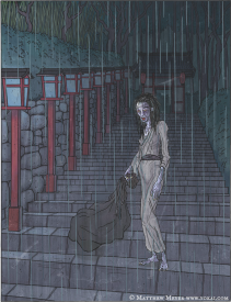
the inspiration comes from Ameonna, the Japanese yokai (spirits/supernatural beings in Japanese folklore) whose presence calls forth rain. one thing i like about this sort of folklore is that there's a variety of different interpretations. some sources portray the ameonna as a malevolent spirit that steals children, others as a mourning spirit that women who have experienced loss become, others as a holy goddess who ends droughts. in modern Japan, "ameonna" is used to describe a person with bad luck whose presence ruins events due to weather. the Konja Hyakki Shui, a collection of yokai pictures, compares the ameonna to a Chinese goddess who seduces a king, from which came "i will be clouds in the morning and rain in the evening, so at morning and evening, lets meet down at the balcony". my interpretation tried to capture a bit of all of these, the destruction brought by the ameonna behind her but her queen waiting for her on the balcony in front of her. if anything, i hope i can be remembered for making the most sapphic rct releases thus far lmao.on a personal note, the song/entry are also a reflection on the feeling that you bring misfortune/negativity anywhere you go, similar to how ameonna bring rain
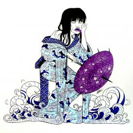
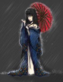
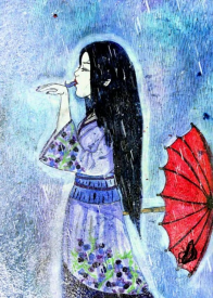
some traditional japanese art that helped steer color choices:
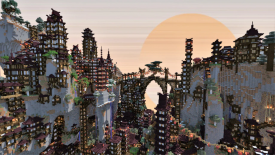
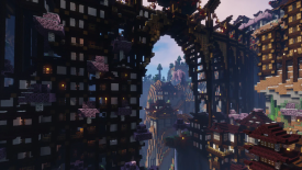
ended up going down a minecraft rabbit hole when looking for inspiration. i liked how vertical these towns were and figured doing something like this would be a good way to make the 100 tile map feel bigger:
one fun curveball was the expanded color pallette update dropping on deadline day for this entry where i was already trying to do color gradients. i might update this with the expanded pallette just to see how the finer gradients look.
shoutout to Cocoa for putting together the MM 2023 playlist: https://www.youtube....GEOAaHss2vptdv1there's actually a second half of the song, which i didn't end up including because i thought the screaming would bug people, but seeing now how fucked up yall's parks are i kinda wish i had lmao
-

 Gustav Goblin
Offline
1. Ethan: It's gonna take me a long, long while to fully get my head around this one. An ungodly abomination that could not have come out of anyone but Ethan. This feels almost like a parallel to Jaguar's Karst from the last Micro Madness; just a huge towering mass of micro goodness. It's tough to me to comment on this one because of how much there is to mention, but the highlights to me are the absolutely insane train-itecture (who thinks of trains of frogs for eldritch abominations?) and the little street scenes near the bottom which are surprisingly immersive despite their chaotic context. The Giygas music definitely caught me off guard too. While I do agree that the next step in your evolution is to focus on clearer and more readable forms, don't lose an ounce of your style either. What you offer is one of the most unique and eccentric styles of anyone here.
2. nin: Unbelievably close with Ethan's. Just as titanic but so much more readable and with a more understandable atmosphere. The custom music does wonders to drive it home with the cars zipping by at light speed. The structure itself is insane in its size and execution and just feels so precise. Loved all the little sections to break it up like the Dale Earnhardt memorial, the little stalls, and the rides you managed to sneak in there. Never been to a NASCAR race and I can still see myself at the final lap. I think my favorite touch is the V800 engine the whole thing is mounted on. Just that alone drives up the artsy concept factor so high. Unfortunately Ethan's edged this one out just a teeny tiny bit for me, but amazing job on making it to finals. Told you to take that close win in my round and run with it and now we're here. Cannot wait to see what bonkers concept you can fill 400 tiles with.
3. FK: You deserved that second lease on life dude. Not surprised to see yet another iteration of the artist-turned-cocktail with an absolutely mind-bending back view. What I love about this one though is how you tie Roy Lichtenstien's pop art style into the architecture as a whole. The vibrant colors, clean forms, and flawless half diagonal flourishes work so well no matter what angle you view it at. Admittedly the back view thing does lose its luster the more you pull it off, but going the Lichtenstien route was a smart move since it's flat enough to not require one-angle insanity that takes up a bunch of tiles. The BOOM, POP, and WHAM have a surprising amount of detail behind them too; in particular the WHAM with the exploding plane looks flawless and I had to dig around to see how you pulled it off. The rest of it is just unbelievably clean to the point where it's kinda scrambling my brain. Even if you're bowing out of Micro Madness, you left with one hell of a message; there is nothing you can't do to perfection in this game. Bravo, FK!
4: Camcorder: A gorgeous work of art, even if almost completely still. Pensive. Somber. Evocative. The archi is gorgeous in its detail, consistency, and verticality. The way you used Minecraft as reference does not surprise me here. Some have pointed out the symmetry makes this one feel a little samey, but there are definitely differences between each side. Special mention goes to the amazing looking cloud above the rainy half and the genius lighting bolt effect with the laser CTRs.
Obviously enough though, my favorite part is the original custom music. As a musician myself, hearing a parkmaker's original tunes winding up in their work will never not leave me overjoyed. I frankly wasn't aware this shoegaze/black metal hybrid even existed but my god this is so damn good. It shouldn't be surprising the song inspired the micro; that's a surefire way to get an incredible entry done. Flattered to be part of this project's very first audience!
Also fantasical Asian houses with the roofs burning away showing the burnt frames? I see you Aki.
 Tags
Tags
- No Tags
