Micro Madness 2023 / MM4 R2 Quarter-Final 4
-
 07-February 23
-
 Xtreme97
Offline
Document 
Round 1 champions Splitvision (Group H), Otsdarva (Group I) and RobDedede (Group J) bring plenty of heat in this group, facing up against replacement wheres_walto (Group N), filling in for In:Cities, and mamarillas (Group G).
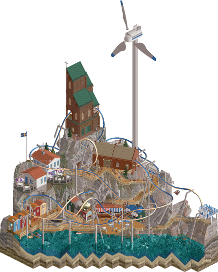
Salthamn
Splitvision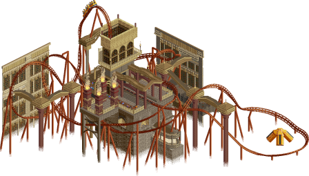
Forbidden Knowledge
Otsdarva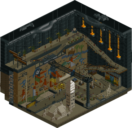
Egyptology Exhibit
RobDedede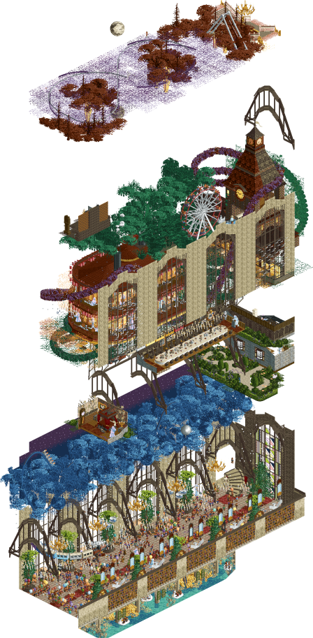
Lost in a Memory
wheres_walto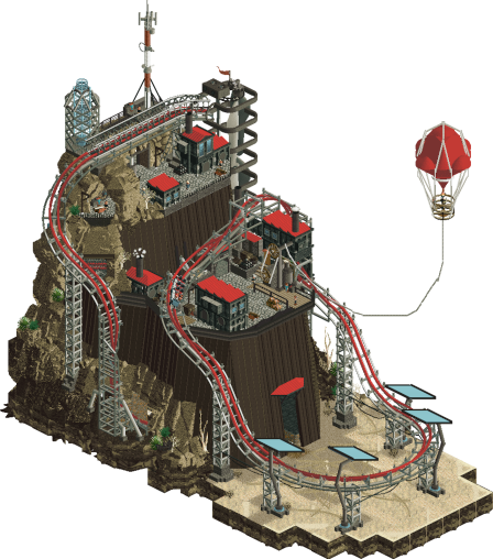
The Outpost
mamarillas
Voting Rules
- You must view all parks in this match to vote. If you cannot view a park, for example if you don't own LL, then please do NOT vote.
- Once you have viewed all parks, select your favourite and second favourite in the above poll. The poll will close after approximately 3 days and the results will be posted.
- The winners will be determined by the formula set out in the Rules & Regulations topic. The creators of the two highest scoring entries will proceed to the next round. The third highest scoring player will be placed on the reserves list for the next round. The lowest scoring player will be eliminated.
- Everyone may vote except for those participating in this matchup. If you are part of this matchup, please null vote. Voting is public and monitored by admins, any cheating will be picked up on and dealt with.
-

 Cocoa
Offline
1. walto---excellent stuff here, so compelling and so interesting. I love each of the scenes, kind of a surreal blend of 19th century scenes that peeps fall through, with vague quotes which to me felt like snippets from a long life. the highlight is certainly the layer with the boat plowing through flowing grass, but i love how the motif of the central hall carries all the way up through the levels. just a great, thought-provoking little narrative.
2. outpost---close here IMO but this one took it for me on strength of new ideas. the vibe and details are all great, but I loved the way the string for the balloon hung and the large vertical turbines. very cool scene, straight outta mad max or something
splitvision---cute little scandi area. Love the use of single rail as an inverted coaster, and it was fun to watch it corkscrew around the rocks. bit thinner than the two winners here but overall a very solid micro anyway
egyptology---i love the atmosphere here, the dark palette does wonders. simple composition but the huge wall is a great centerpiece
otsdarva---fun little coaster with the beginnings of some cool surroundings. feels a bit like you lost the plot someway through and then just filled it up with blacktiles and walls, but i think whats there is good foundations for sure
-
 Camcorder22
Offline
walto - oh hell yeah some more of that good psychedelic shit. Great use of music and the shift between levels feels cinematic. I do really love the feeling of "not quite sure whats going on what it feels profound". Beautifully done. Maybe the overall composition doesn't quite come together to the same level as some of the other stacks this round but its tough competition.
mamarillas - you've stepped it up a lot this competition, love the coaster, and the balloon tied together everything nicely. mamarillas - you've stepped it up a lot this competition, love the coaster, and the balloon tied together everything nicely.
Splitvision - Funny how so many people went for blue background for the first time this match. This is quite nice, unique coaster with a nice layout. Setting feels very distinctive as well.
Dedede - a cool contrast in execution of an art museum to FK's entry, with a much more realistic and grounded approach. All the exhibits are nicely done. The inclusion of the balance bike in an art museum feels really hilarious for some reason but I actually like it too.
Otsdarva - nice holding break hack, might be the first time I've seen it? layout is the highlight, the library surroundings are cool for what's there, but wish they would've been fleshed out a bit more.
-

 Turtle
Offline
Gonna do a train of thought on these as I open them in no particular order.
The Outpost - this is really cool, what a great scene. Very believable, and I love the staging of the raider coming after the truck. It left me hoping for a bit more backstory, and I got it when I rotated the map! Great cutaway, really cool little scenes that really give life to the whole thing. Excellent work, this will be hard to beat I think.
Egyptology - OK seems like a strange opening on a big black wall but it does look cool, let's rotate and see what's up. Ah it's cool looking, but everything is so dark and dull brown... I LOVE the little bright yellow/gold touches, those things on the wall are great. They remind me of playing Assassin's Creed Egypt - more of that would have been great. The hieroglyphics are fantastic but they're so dull looking in this palette, I wish the whole thing was lighter.
Forbidden Knowledge - another one with a strange palette, not 100% sure I like it. It looks like an interesting coaster and setting, if not a little "all the same color". Strange big walls too, just kinda standing there. OK seek the vault, let's go... demolish to open the vault. Whoa, what even is that? Very creepy... i've never seen demolishing a ride as a trigger before, not sure how that even works. Think that's the end of it, they're kinda stopped but jiggling. Very impressive, absolutely ZERO idea about these hacks but it's a really cool effect. Nice reveal!
Swedish seaside village - this blue background is very interesting, crazy that so many people have used it this round. I think it fits here, but maybe the shade of blue could be slightly more fitting... I don't know it feels a little jarring. Very nice cliff setting and really lovely atmosphere. Coaster is interesting but a little hard to follow. And god, that cliffwork looks good but feels like a TON of work for not a lot of payoff, honestly. Still, an excellent park.
Lost in a Memory - Lovely opening colors, nice reflection of the moon, too. Scrolling down, wait, I think this must be the wrong angle. OK yeah this one is the one. Strange to open on the wrong one? That train coming out of the wall is beautiful. And yeeessss those rushing white things look way better outside the windows OK i get it now. I haven't seen that coaster foliage before that's awesome. Just seen the people falling down to the level below, and they're holding balloons which looks amazing. Bottom level is very cool, love the confetti. I think this park is winning the round, for me.
So yeah excellent work all round thanks guys!
Voted for Memory, then the Outpost, although it was close.
-

 Splitvision
Offline
Walto - How can you put something this great and beautiful together in just three weeks? Just jaw-dropping. Each level is like an excellent micro in and of itself. I do not get everything (or most of the stuff) happening on the map but it's hard to not just love every little scene which are all so artfully crafted, Just wild, only thing I didn't like was the light effect from the windows on the bottom "floor", that didn't quite work I think. Still, if I was voting in this round, this would be #1.
Mama - A little Mad Max-y, a little E.V.I.L.-y, a little Extraction-y - in other words, a very, very cool aesthetic you achieved here. I think you have found a very good approach to the game where you don't necessarily over-construct, over-detail or over-crunch things but it still comes out looking really interesting and good. Most of all, your style is very clean while never being sterile, and I hope that the general NE meta would turn this way a bit as well, as I just love the look of it. This would be my #2 vote.
Ots - As I wrote in the discord, I love the library theme. I'm almost sad that it was used for a MM entry - I imagine something really grandiose could have been done with it. But this is certainly really cool, you deliver a killer layout as always, and the strands of omniscience that spread around in slow-motion after breaking open the vault is such a neat effect. I think the archy could have been developed a bit more, perhaps some other color and texture choices weighed, but definitely a great entry.
RobDDD - Yessssss, an exhibit. This is really cool with some of the best murals we have seen. It did feel like some of the ground level stuff could have used a bit more development, I think it might have ended up having too many blank areas for being effective as a micro, but I love the idea and now that I am looking at the parks again, your style actually reminds me a bit of Mama's, very clean and also has that warmth to it.
-
 Babar Tapie
Offline
Salthamn : This wind turbine is awesome! It’s a park with a great cohesion, it’s simple but everything is well mastered, the integration of the coaster too! I really like the palette, it works perfectly with this kind of park
Forbidden Knowledge : Minimalist in a good way, I really like this kind of mysterious library, the use of colours is very good!
Egyptology Exhibit : One of my favourite themes, the wall decorations are absolutely incredible, it's really the strong point of this park! Overall it's simple but it works well, and the theme is a good idea. My only complaint is the lack of detail on the walls of the structure
Lost in a Memory : I see that you’ve also decided to make a sandwich park! The park is so beautiful I'm hooked, I loved the atmosphere, the details (especially the banquet scene), everything works well and there is so much to look at
The Outpost : It's so good to see a new and little-used theme! The park is solid, I really liked your R1 and I'm not disappointed by your R2, I think it's very coherent and harmonious between the interior and exterior. A good example of a balanced park where everything has its place!
-

 AvanineCommuter
Offline
Walto: Surrealism at its finest. The amount of detail in this is amazing and while I don’t understand fully the story here, I’m assuming it’s based on a book or film with all the very specific names being called out in the staff and rides. Each layer is beautiful it their own right, down to my favorite part at the bottom where you see a moonlit cloudscape only when you turn the map. Compositionally it suffers slightly from the stacked micro but that seems to be a trend this round. While personally I prefer a clear narrative or an idea that’s less abstract, this is still easily one of my favorites. Great stuff.
Mamarillas: Another knockout from out. The theme itself is similar to something I have envisioned in my mind for a while, and you’ve done it superbly with unique forms, especially the curvature of the landscape. Also quite a bit of unique object usage which is always appreciated, those blade fans are a brilliant way to bring the concept forward while saving space for a lift hill. The coaster itself I think is your weakpoint on both micros so far. The layouts haven’t blown me away, but they serve the purpose well enough. Would loved to have a strong music pairing here to elevate the atmosphere.
Robdedede: Great choice to open on the backstage, to have a very nice reveal moment when viewing. The interiors are really just excellent work all around. Goes without saying that the murals are so so good, really clever and unique ways to create very recognizable images, I spent a good amount of time inspecting what objects you used for these! The bike ride is absolutely spot on for a museum attraction and expertly crafted. It’s a shame I couldn’t vote for this, mainly due to my personal attraction to the themes of walto / mama’s entries, but I think you’ve grown so much from your previous work and I’m excited to see you continue to develop. Excellent work!
Splitvision: I’m pleasantly surprised by this entry as it veers off our expectation for your game breaking antics, but the inverted hack for the coaster itseld is already something I can’t comprehend how to achieve. Very impressive world you’ve crafted and the blue setting really brightens the map, bringing the scandi vibe to the forefront. Landscaping wise this was great, loving the map edges and the terraced nature of the map. The coaster had great moments of interaction, but I wish the layout had a little more clarity here. I think what held me back from placing this higher is the composition of the architecture, which was very simple and minimal; there could have been some really great moments to showcase the scandi style with some detailing and ideas. Tough round to be in but still fantastic work.
Otsdarva: Minimalist, yet effective. The library disappear into the shadows is a really clever effect to make the micro seem larger than it is. While the coaster layout is pretty good, the showstopper is the clever vault hack (have no idea how you did this and that this was even possible…), what a cool effect! I think focusing in more refinement in the composition of the library tower and how it relates to the coaster would have elevated this. Also, personal taste, but I don’t particular like it when micros are not fully viewable from all angles. This is something I’ll repeat a few times in MM I’m sure, but it’s not a hard rule or anything.
Overall the quality throughout QFs has been astoundingly good and all the players in these rounds should be proud of what they made. Amazing work guys! -

 FK+Coastermind
Offline
SV - The visual of the single rail inverter is really fun, though I can't help but be bugged by the glitchiness at times. Given that everyone expects you to deliver some big heady hack wizardry, I thought it was a bold choice to go with something more refined. I did think the coaster was a bit overpowering in places, as I wanted to get more of the content below. That being said, I think this shows you have the chops to make things as crunchy as they are hacked, and the aesthetic was lovely.
Otsdarva - Going for something a little more understated in a contest where more is more is a bold move. I like the aesthetic, particularly with the vault and the visual of the white lines slowly creeping thru the map. The end visual of that really sold me, though I do think this suffers from having 1 great perspective and 3 you somewhat ignored. The coaster was good, though the pacing a bit slow in places. Tricky, as I like the aesthetic you went for, but it has to compete with parks that I think had more variety and thus required more effort to construct.
Robddd - This was a bit hit miss for me. The little exhibits, the hieroglyphics, and the moody colors to mimic and interior space like a museum were really cool. That being said, saving it to open on the back way feels like a miss to me. I get the idea of turning to reveal something more (that's what I did with Murakami) but in this instance it felt like that emphasized that this side didn't have much going on, nor did two of the others. There is a lot of stuff to love, but nothing that really wowed me in a way that I felt the reveal made sense. I will say I appreciate the name drop, that rarely happens to me, lol
Walto - All of my criticisms of other micros are pretty much addressed here. Something as simple as rotating a few of the scenes gives this micro so much more dimension because each perspective has something new and exciting to explore. The content is surrealist and artsy in a way I adore, I think you hit the right balance between large, expressive strokes of color and finer details and sculpting. Execution is a little sketchy in places, and yet, the concept of memory almost covers that, like how our memories are rarely crisp and detailed but more emotional and broad. I was surprised you didn't get thru the first round, so I'm so glad to see you enter here and with something that I think capitalizes on what this contest is all about.
Mama - This map just hit different. Something about the colors and textures and the way you constructed things felt really unique and fresh. I love the little scene with the door closing, the coaster was fun, and it had a level of explorability (though I wish some of the interiors were more fleshed out, I thought they would all be and am thinking that wasn't your intention, but I think it would have added). That being said, this showed to me that you don't need height to cram a lot of content into a micro and tell a unique narrative. This was another standout for me, and I think you could really make a dent in this competition.
My #1 goes to Walto for making something I wish I could have, and my #2 goes to Mama for something that feels so fresh and benefited from the micro format where I felt others suffered from a lack of utilizing all perspectives. Congrats on another high quality round everyone.
-

 Lurker
Offline
Lost in a memory: Presentation is great, I liked following the falling guest through the scenes. And the scenes themselves are amazing.
Egyptology Exhibit: Love the trim and sign work in those murals. Also liked the the other exhibits, the signs and fences around them are nice.
Salthamn: Really nice fun atmosphere, nice rockwork and an interesting coaster. I also like the light colored background, it adds to it I think.
Forbidden Knowledge: A cool and and way to trigger it. I like the creepy, ominous effect this has.
The Outpost: Nice opening sequence, and an imposing structure in such a small space. I also like how the cut-outs were done, letting my see the complete building from the front and the inside after rotating. -

 ottersalad
Offline
Walto: you are quite a storyteller! Loved it. Impressed with every angle has another story to tell and detail to find. Love the layering - while maybe this contest has had a bit too much - and this entry has just the right amount without going overboard. The variety in color palettes between various layers was nice as well.
Salthamn: Cool little layout using a rarely seen ride type. Overall feels a bit sparse compared to some other entries, but still very inspired.
Egyptology: really cool. Loved opening the scene and having to rotate. Make us work as a viewer! So honestly that is where my opinion differs from FK. All the little details/hieroglyphs were neat.
Forbidden: This was pretty cool. Love how the map changed - albeit in a small way. Creative and a crazy hack for someone like me who has no clue how you did that. Great layout as well. Wish more time was spent on everything else - seemed underdetailed in relation to other entries.
Outpost: Really cool lift - quite inventive. Nice theme and palette... sets a great mood. The way everything fits together is very organic.. and I can tell that this was all neatly put together and planned well.
-

 Ge-Ride
Offline
My first place goes to Lost in a Memory. What a well executed concept. Emotionally deeper than your average micro.
Second place goes to Salthamn. It can't compete with the sheer content of Lost in a Memory but the single rail inverted coaster has a great layout and I also really like the landscaping. You found a way to make landscaping fresh again in this era of heavy detail. That's no small feat.
For third I give it to The Outpost. It's a tough choice for figuring what to rank third through fifth but I decided on that because it has the best combination of concept and theming.
Fourth I have trouble deciding. I really love the concept behind Forbidden Knowledge but Egyptology has a better overall atmosphere so I'm going to give it my fourth spot. If there were a bit more detail in Forbidden Knowledge then I might have shifted my vote and maybe given that my second place vote.
It's a tough group. Everybody did a good job, even if the first two were the standout entries for me. Good work and I await your future releases, whether in this contest or outside of it for those who don't make it to the next round.
-

 Six Frags
Offline
1) Lost in a Memory by wheres_walto
-Concept:+
-Content:+++
-Quality:++
Overall; I really did try to figure out what the concept here was; was it from a book/movie/series, was it about the Pink Floyd song, Cowboy Bebop, just a memory of yourself or just a memory in general and how you translated a memory to be displayed in an artistic way into RCT. Guess I'm literally lost in this memory That's kind of the danger you run into doing a conceptual micro like this, that people don't really get the story or what you wanted to display. Anyway, apart from the concept, all the scenes worked well on their own, there was tons of content to explore and the overall artsy/dreamy atmosphere worked well. Just wished there was some readme of sorts to explain what it's about, although maybe that would've taken the fun away to figure it out for yourself.
2) The Outpost by mamarillas
-Concept:++
-Content:+
-Quality:++
Overall; Cool little coaster in a well constructed vertical rock structure. The MegaLite usage is great here, and the colour scheme fits well (although bordering on too dark, the reds save it tho). What exactly this outpost is about is a bit of mystery to me (is it just a fuel storage?), but the opening scene was nice with the door closing and the raider trying to steal it. I wish it was zoomed in on opening tho; only discovered the scene when reading the comments here and opening it again. Feels indeed Mad Max-y, which I like.3) Forbidden Knowledge by Otsdarva
-Concept:++
-Content:+
-Quality:++
Overall; Cool coaster layout and excellent use of the new X7 inversions. Love the vault thingy you had to demolish to unleash this weird line coaster called the 'omniscient'. Nice library-ish setting, with some cool height variations and good colour scheme.4) Salthamn by Splitvision
-Concept:+
-Content:+
-Quality:++
Overall; Nice custom music to set a fun and vibrant seaside atmosphere. The unique coaster, great Fisch rock work, lovely patches of foliage here and there and colourful bits of architecture make this a fun micro. I read on Discord you were counting yourself out already, but I think this is very close for the 2nd spot to go through. Just a bit too thin on the content.5) Egyptology Exhibit by RobDedede
-Concept:+
-Content:+/-
-Quality:+
Overall; Fun little exhibit of a museum setting. Love the murals/hieroglyphs and the whole height variation of the exhibit. The museum balance bike had me laughing a bit, seems so random, but at the same time exciting to ride irl. Think every museum should have one now
-

 Gustav Goblin
Offline
Walto: You OK dude? Looking at this the first time around genuinely had me concerned for you and Mrs. Walto! Just like what I said about Hoob in QF3, you're one of the few parkmakers that can really turn the 20 year-old theme park game into an artform that can stir up all sorts of emotions. Obviously I am here for it. The evocative atmospheres you convey on each layer are genuinely immersive despite being esoteric; in other words Typical Walto. The music does a ton to bolster them, and the top two layers are tuned ever so slightly so you get this atonal effect when they blend which I think kicks ass. Wondering what the deal is with the little mansion scenes interlaced and how they contribute to the narrative as well. Honestly it's tough to really review this one as I usually do because there's so much to take in and dissect. All I'm gonna say is it amounts to my favorite entry this round. Go off captain.
Otsdarva: Pisses me off how underrated you are. Kickass layout as usual. Love the shoestrung holding brake on the drop. The vault/library backdrop is a really cool idea with some great warm colors, even if most of it is only one angle. House By The Sea interior work making a big comeback. Reminds me of the bigass library from Avatar. The vault opening gimmick is super cool too; I can't get my head around how guys like you figure out those bumper boat hacks. The way everything fades into nothing at the bottom always gets me. Awesome stuff dude, you're on a tear.
Starting to run out of reviewing steam so forgive me if I slack on you three.
Mamarillas: I see you've taken a note from your competitor Rob with the intro. It does a great job setting the scene and leading you into the outpost. Love the use of the marble block CTR as the closing door as well. Interiors are great although I wish there were more of a narrative throughout. Would've loved for the intro to set up for something really cool narrative-wise. Coaster is nice and the turbine lift is definitely the highlight. Close race between you and Ots for 2nd.
Splitvision: Love the more refined approach you've taken. The sunny atmosphere and verticality are a great showing of your more aesthetic-focused side. Fiskmasken is a unique little coaster, although there is one point where it goes through an immelmann the wrong way. Love the church interior with the wedding but my favorite part honestly has to be that pier on the bottom. I can imagine myself there. A little gem through and through.
RobDedede: Was excited to see what you'd put out next and this is a really cool idea with equally great execution. The wall paintings and hieroglyphs are obviously the high point, but the little touches throughout do a great job really making it feel like a museum. The night palette and upward-facing lights on the side do a great job nailing that moody museum atmosphere. Also a big fan of the ceiling details as well. While the introduction with the back wall is kinda cool, I'm not a fan of the way it turns this into a one-angle wonder. Sucks your competition was tough but this is a really cool idea.
-
 RCT2day
Offline
1.) wheres_walto - chill out dude, its just MM! This looks like it took forever to build, and yet you put this together just for one round! It's far and away the best one here. The one criticism I would give it is that it lacks cohesion at first glance. And that could be the point. Or I just missed something. Otherwise, incredibly impressive in every facet of the game. Nice job as always!
2.) mamarillas - really cool stuff here. I really liked the turbines, seemingly lifting the coaster up its lift hill. The coaster itself was alright, but didn't do much for me (can't quite put my finger on it). Best part of the whole thing is the atmosphere of it: it feels like a Mad Max and Dune hybrid, which I love. But as a whole, it didn't really keep me as interested as walto's. Well done nonetheless!
3.) otsdarva - very cool layout! It flowed beautifully through the entire thing. I think I followed the directions correctly to see the gimmick? But I'm not entirely sure, because I was expecting something cooler than a bunch of white spaghetti. That sounds harsh, but I appreciate the work you put into the hack (no idea how you did it). Besides the hack, the rest feels pretty barren. Pretty good, but not the best.
4.) splitvision - really cool use of the single-rail track in a unique way. I think that combined with the layering of the whole park were the biggest strengths here. The architecture is a bit bland, though. And the colors are a bit...aggressive? I think the black background would've helped here rather than hinder it. I like the theme and landscaping a lot, especially the mix of textures.
5.) robdedede - very cool interior! We don't get enough museums that are done this well in the game. Hieroglyphics are really impressive and probably the star of the shower. The touch of realism with the HVAC and building framing is really well done, too. But like a museum, it's not extremely dynamic. The only real motion are the people, some sand (?), and the lights on a wall. I think it needed something else to really keep my attention. Nice job, nonetheless!
-

 Xtreme97
Offline
Document 
Match
ConclusionThe poll is now closed. The formula to derive the results is:
1st choice votes + ½ × 2nd choice votesPlayer Calculation Score Outcome wheres_walto28 + ½ × 12=34 (42%)Semi-Final 2 mamarillas10 + ½ × 16=18 (22%)Semi-Final 3 Splitvision11 + ½ × 10=16 (20%)Replacement Chance Otsdarva3 + ½ × 8=7 (9%)Eliminated2 + ½ × 8=6 (7%)EliminatedAs replacement, Splitvision is invited to submit a park for Round 3 (Semi-Finals). If there is a drop-out their micro will be chosen at random as replacement.
-

 RobDedede
Offline
Here are some reviews:
walto: I must admit this is not really my cup of tea. I think this was a little too abstract and hard to glean meaning from. I think the bottom layer was by far the best, with some excellent details throughout, especially the structure of what I believe is a cathedral?
mamarillas: Really great entry from you here. I like how the door of the fortress closes as soon as the truck enters. The coaster is cool; I love the wind turbines as a rotating lift. The floating balloon was a really nice touch.
Splitvision: Probably my favorite of the group. The composition is stellar, with the wind turbine anchoring the entire map. The coaster was very cool... I loved watching it go through all the rocks. The music adds much to the ambience.
Otsdarva: Excellent coaster and hack. I only wish the surroundings were a bit more fleshed out. Though I do appreciate someone going for a library theme. Not too different from a museum

Myself: There were definitely some things I would have done differently, such as maybe including a coaster, and giving some room for exteriors so the wall isn't right up against the map edge.
All good things must come to an end I suppose. It would have been nice to make it to semi finals, but a round one win as a pot 10 player feels pretty good too. I can't wait to see more awesome micros in the coming rounds. Thank you to everyone who left helpful feedback. Good luck to walto and mamarillas!
-

 Jens J.
Offline
- 1.) mamarillas - This opening scene with the door closing just before the Raider can get in is so cool! I actually really like how the solar panels were created, pretty simple but very well executed imo. The turbine lift hill is a really neat concept. From all of the inside scenes, I absolutely adore the map room: broken walls + blinking lights = a winning combination. Very cool map!
- 2.) RobDedede - The wall of hieroglyphics is a work of art imo. So many cool scenes are shown on there that I just can't choose which is my favorite one. The dark palette works really well here, really bringing out that darker atmosphere of an inside exhibition/museum. Also love the detail of the quicksand being disposed from the walls. I think the fading of the terrain looks a bit weird on the backside of the building (I would have gone for a straight line), but all-in-all a really strong micro here!
The remaining three in random order:
wheres_walto - Have to say that I was quite lost in the beginning on what was happening since I didn't really understand what the main theme of this map was (and it felt very abstract), but as I explored more and more of this park I really began to like this almost dream-like atmosphere. The boat scene with all the people singing is amazing and I am also very intrigued by all the small little house-vibe rooms dispersed across the levels. The big stained glass window at the bottom looks great as well.
otsdarva - Fading effect works great here. Coaster layout flows really well and has some nice custom supports. And I mean that vault trick with the strings… genius. Don't know how it works with all the bumper boats but a really cool addition to this map and something very unique! Would have loved to see the library walls be duplicated on the other side instead of the blacktile wall we got right now, but a really nice concept nonetheless!
Splitvision - The wind turbine looks really good and I adore the color palette! Swedish vibes were definitely captured here and although I don't speak a single word of Swedish, it was nice that we got some English translations for the introduction text. Architecture looks simple but is executed pretty cleanly. As Gustav already pointed out, the car passes out of the Immelman into the barrel roll in the wrong direction, but that's a really minor nit-pick I could see myself do as well haha.
-
 WhosLeon
Offline
split: once every now and then theres a park that might not look super crazy on the surface but just really hits you in some type of way. this entry did that for me, overwhelming me with summer nostalgia. love the pastel colors, the sunny blue background and the huge windmill. the windmill being so big actually contributes to the atmosphere so much, looking at it feels similar as looking up in awe to something large when you're a naive kid in a way. I might be overanalyzing this, but i really really loved this entry, great work.
walt: cool as fuck, the music transition was awesome and makes me want to experiment more with using different soundtrack simultaneously to create vibe shifts. all the layers are captivating in their own way, with the ground floor being my favorite. i think what drew me back just a little bit the extent of layering, but its not a big problem by any means, just personal preference i guess. it just makes the viewing experience a little wonky at times
[no particular order]
rob: i've been raving about this one a few times already in the discord; im a big fan of what you have created. you are taking huge leaps in both macro and micro with every submission. can't wait to see how your parkmaking will continue to develop over the years; im pretty certain you'll end up being one of the top players in the community someday.
mama: cool unique scene like we've come to expect from you. i really dig the robotic looking solar panels as well as the coaster lift, both excellent touches that add a lot of character to the entire map, good work.
ots: a bit empty on first sight, but when you give it some time the atmosphere starts to come through and it all clicks. the fade effect is as mentioned before greatly executed, might be the best showing of it we've seen so far as it also contributes greatly to the theme. also a big fan of the layout, flows nicely and uses the space well. i think what could have elevated this was a bit more multi-angle compatibility and just slightly more content to lock in the viewer -

 Ethan
Offline
Splitvision - A really nice change of pace for you to stretch your more classic parkmaking muscles. I open it and I feel like I am looking at a travel poster. The whole composition and the touch with the blue sky makes it feel very airbourne. But usually with these slavic themes it takes place in a winter-y environment but here you went for Summer/Spring season which I think adds to the very aviated vibe. The coaster is absolutelt adorable, great elements and path interaction. Your color selection across all the sheds/huts is just such a nice atmosphere you created. Feels very true to the heart from you, very home like. I love that kind of RCT. The giant imposing windmill is the perfect centerpiece to hold it all together
RobDeDeDe - I like how you’ve been going down the realism route in a very fantasy-favored contest but doing something special with it. Egypt, of course, is almost like a been there done that kind of theme but you gave it the perfect, fresh presentation that makes it so special. The wall art, the driving feature of your micro, is incredible. It is clearly very well thought out and tells a story. Your little widgets and museum functions you included are great details that really take this up a lot like your last micro did. I just lobe the attention to the little things in chosing very modern, contemporary themes
walto - Very happy to see a follow up from not even having you on the registration sheet! I love the layer cake thing going on, I admit. I think with how you executed it, compositionally, it is exceptionally readable and fun to explore vertically. Plenty of great interior desifns and artistic motifs, as we have gone back and forward in the discord over the different poetic elements in the entries. More focused on the face value, maybe, it is beautiful. Love the layers of color, the kind of userninteractivity that is done at every floor. It is pretty ingenious ideas that
ots - I love me a good library! Books all with different covers agains the beige canvas. The coaster absolutely rocks and the mystique is fantastic. Feels very video game like, like I need to push some bush cases around to figure out the puzzle
mamarillas - Nice, fun punk-y landscape with a cool well defined technology. Very nicely done industrial interiors once again, and I like the black and red color scheme. Usually it comes off evil as f but here it’s just, a completely different vibe. I get a sense of these people in this world you made.
 Tags
Tags
- No Tags