Micro Madness 2023 / MM4 R2 Quarter-Final 2
-
 08-February 23
-
 posix
Offline
posix
Offline
Document 
A well balanced and interesting group with definite highlights in all 5 parks. And sadly quite some tile overage concerns.
Ariant
Recurious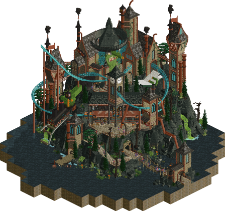 166 over
Crooked Nose, Crooked Rails
Ulvenwood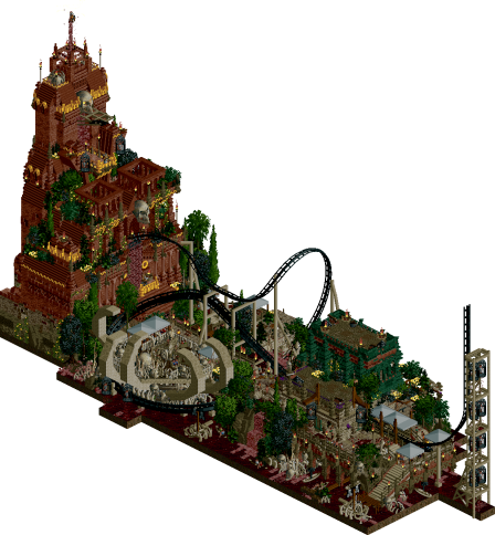 15 over
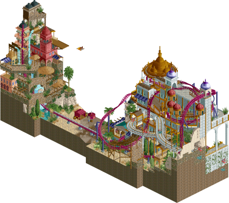
Vermillion Tides
Bubbsy41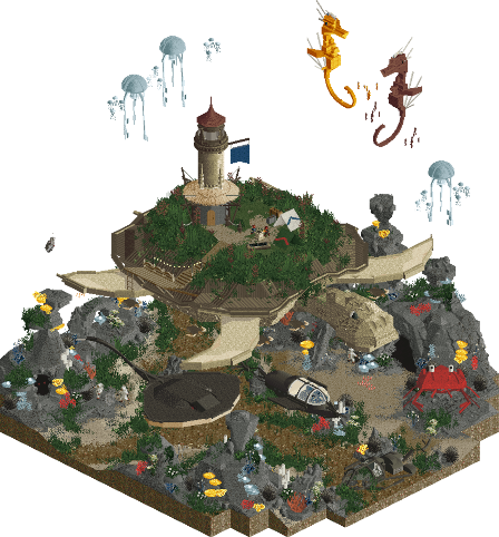
Reefback Valley
Jens J.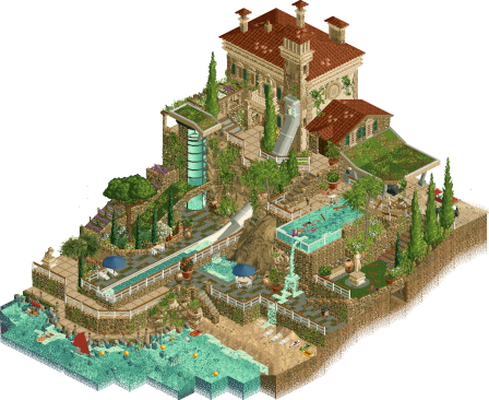
And the eldest son's room was turned into a water slide...
pants
Voting Rules
- You must view all parks in this match to vote. If you cannot view a park, for example if you don't own LL, then please do NOT vote.
- Once you have viewed all parks, select your favourite and second favourite in the above poll. The poll will close after approximately 3 days and the results will be posted.
- The winners will be determined by the formula set out in the Rules & Regulations topic. The creators of the two highest scoring entries will proceed to the next round. The third highest scoring player will be placed on the reserves list for the next round. The lowest scoring player will be eliminated.
- Everyone may vote except for those participating in this matchup. If you are part of this matchup, please null vote. Voting is public and monitored by admins, any cheating will be picked up on and dealt with.
-
posix
Offline
Since Ulvenwood's park used black tiles/black void as an indicator for where the park ends, all water does count towards the tile limit. We will decide on an adequate penalty for this case.Confer rule B.5 https://www.nedesign...es-regulations/
The "blacktile" of a map does not have to be black - it can be any colour, or even water, so long as the boundary of the micro is clear.
-
 bigshootergill
Offline
Hope the penalty is very minor, seems like an honest mistake and a bit of confusion on his part. If the water tiles didn’t count, is his micro within the limit? Ulvenwood rocked it with his micro too!
bigshootergill
Offline
Hope the penalty is very minor, seems like an honest mistake and a bit of confusion on his part. If the water tiles didn’t count, is his micro within the limit? Ulvenwood rocked it with his micro too! -
 wheres_walto
Offline
wheres_walto
Offline
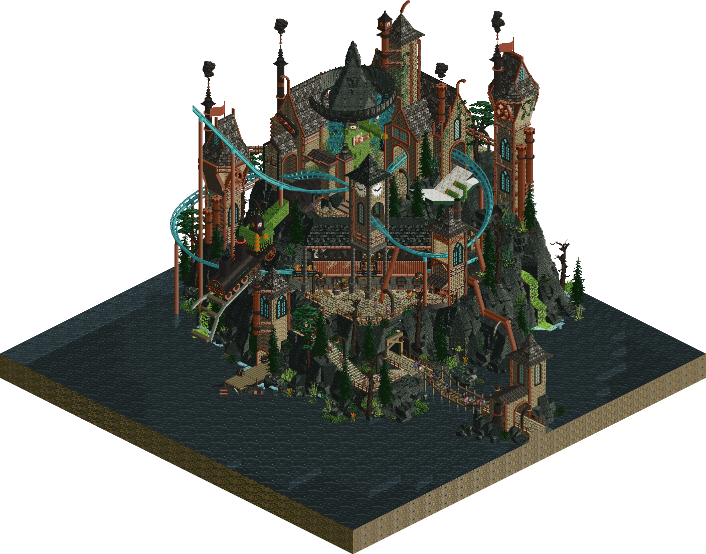
Ulvenwood - highlights for me were professor frog, the witch holding the derailed train, and face. No idea how you managed to sculpt the eyes, good stuff
Recurious - gorgeous, the palace is a real winner, nice vibrant colors. A clear theme executed well will always score points
pants - I mean this in the best way: this is the second-dumbest idea of the contest so far (it's raining men retains the gold). Brilliant. You're frighteningly good, the interiors were a highlight, you're forcing your way through by sheer realism skill to this point. Upon second inspection, I've noticed some mysterious happenings on the property. That won my vote
Bubbsy - deep red water background works wonderfully here, your color use here is top notch. The combination of shades of green, bright yellow accents, and red base layers works really well. Love the sacrifice and blood spilling down. Caged prisoners in the ride supports is an excellent detail
Jens J - this is so well done, impeccable rock work, the use of avl 1/8 flower as underwater weeds is excellent. That object carries such a unique shape that really sells flowy movement. Your sculptures are quite nice
This is a really tough vote, all 5 parks hit different notes better than others. pants and Jens were the most intricately detailed but both suffered from a lack of movement and action, Recurious and Ulvenwood sacrificed a bit of detail for more lively submissions. Bubbsy I think did the best in those two axes. Each park brought a clearly defined idea and executed it well in their own ways. Ugh
-
 Mulder
Offline
I think Ulven should have been given a chance to fix a simple thing as the water when it was a misunderstanding of the rules. Not sure how much 166 over counts towards number of votes deduction, but looks like a death sentence.
Mulder
Offline
I think Ulven should have been given a chance to fix a simple thing as the water when it was a misunderstanding of the rules. Not sure how much 166 over counts towards number of votes deduction, but looks like a death sentence. -
 Babar Tapie
Offline
Babar Tapie
Offline
Starting the day by opening parks is a real pleasure and a pleasant habit, I will miss it after the competition
Ariant : I love this oriental architecture, it's cool to have chosen a less explored theme! The building on the left is really solid with the waterfalls and a very good use of the diagonals, the whole is fluid and very coherent, my only little reproach is the area between the two buildings which lack a bit of details!
Crooked Nose : I love the way you deal with the theme of fantasy, you have a unique vision of this style that I already noticed in your previous parks, something a bit old school! There are some great touches used with delicacy, I think of the teacher. Frog or the locomotive. In fact I think what I like about this park is the childishness and the love for simple things, really congratulations, I loved this park
Vermillion Tides : It's dense and full of detail, each tile is cleverly used, I really like the right hand side of the map with that boathouse/balcony! Of course the temple is also very solid and the general atmosphere of the park is really good. I just have a doubt about 2 colours in this park: the red of the temple and the green on the right, I might have replaced them by other colours more in grey/brown tones
Reefback Valley : I love this (relative) simplicity and the choice of this theme, a bit like Crooked Nose each element is brilliantly executed! This giant turtle is fantastic, all the sculptures are overall very very good and participate to this coherence. I really think that this park is right on all levels!
And the eldest son’s : A very quiet park, I really like the vibes, like a quiet summer in Sicily (if we leave aside the creepiness of the story ahah). The architecture and landscape are excellent, enhanced by a great choice of colours. It really makes you want to chill on the beach. In short, this park is very accurate, it's solid!
In summary I really like the general atmosphere of this band, it's an ode to simple things, the final choice is very difficult but congratulations to all, your group has something unique!
-
 Cocoa
Offline
Cocoa
Offline
1. pants---primarily, the house here is just a stunning piece of architecture. really phenomenally designed, I spent a long time just staring from different angles. the murder mystery on top, while slightly confusing, was great to drive some narrative
2. jens---was a close second place here, but in the end I had to give it to all the awesome creatures. just fun stuff all around
crooked nose---this is a great little scene, with cool coaster interaction and excellent atmosphere. top notch stuff.
ariant---I love how busy and lively this is, with colorful architecture and fun rides. great, classic rct, but perhaps a bit too old-fashioned in its designed choices to beat a really tough crowd (as in every match lol)
vermillion---hard to believe again that this is my last pick for this group, because its still so good. excellent, detailed architecture, just oozing with atmosphere. it's a bit muddy all up perhaps, but it doesn't take much away from all the neat spooky details
-
 Six Frags
Offline
Six Frags
Offline
1) Vermillion Tides by Bubbsy41
-Concept:++
-Content:++
-Quality:+++
Overall; Very lugubrious atmosphere, with all the bones, peeps in cages and bloodied water. The dark palette works well here, almost the same as with Lost World in H2H9, where it took some time for my eyes to adjust to it, but once it does you really appreciate the atmosphere more. Especially the bright yellows pop out which creates a nice visual effect. Just a very detailed micro with a nicely flowing coaster, great foliage, architecture and water effects. Finally, that death grip hand with twister in it was great (although a bit borrowed from the Good Death from H2H9 ) and the turning of the views, which gave some great new visuals, won me over.
2) Ariant by Recurious
-Concept:++
-Content:++
-Quality:++
Overall; Cool custom music which immediately after opening sets a great Arabian atmosphere. From googling Ariant I found it's an area in a game called MapleStory? Unfamiliar with that, but you don't really need to know the reference material in order to appreciate the nice Arabic vibe you've created here. Some cool vertical construction, which is always smart in a small micro, and a great colour scheme (the whites and golds work really well together). The flying carpets fit well into the theme and the serpentice coaster is well integrated into the landscape and architecture. Lovely interaction with the hallways rides as well. Nice foliage, although I think some more details/props inside and on top of the palace would've lifted this micro even further, as that's the only part that felt a bit bare in spots.3) Crooked Nose, Crooked Rails by Ulvenwood
-Concept:++
-Content:+
-Quality:++
Overall; Very cool eerie atmosphere you've created here. Love the sculpturing throughout like professor frog with the cauldron, the giant witch head, how the witch is holding the locomotive and how she is holding the spellbook. You've integrated the nicely flowing coaster well into the architecture, although I felt the architecture was a bit too 'clean' with all the deco pieces on the side of the walls. With such a dark theme I feel some dilapidated/destroyed/overgrown buildings would've fitted better. I also feel the Fisch rock work was a bit too clean or overwhelming, I think some variation with regular (mossy) land would've worked better, looks a bit too artificial now. Nice colour scheme though, makes it quite unique.4) And the eldest son's room was turned into a water slide... by pants
-Concept:++
-Content:+
-Quality:++
Overall; Even after reading that readme I was a bit confused what the story is about. Something about a slide being build into a summer house and the housekeeper angry about its construction and how 'they' treat one of the sons? A plan was hatched? What plan? I see red footprints on some paths, is someone murdered? It seems so seeing those inspectors investigating the scene and seeing a dead body in one of the pools. And that purple Cadillac of the uncle is also in the pool. Was the uncle murdered and was that the plan? I see the middle son escaping at the start, so did he do it? Ah well, setting the story aside, it's a nice almost movie-set like micro, with nice architecture, highly detailed interiors and just an overall nice crunch to it all, from the beach to the brick pieces blending into the landscape. Best thing for me were the height variations though, gives some great depth to the whole piece.5) Reefback Valley by Jens J
-Concept:++
-Content:+/-
-Quality:++
Overall; The 'giant turtle with something on his back' idea has been around for a while and I've seen it mentioned in quite some H2H brain storm sessions, so seeing it done here was nice to see. The sculpturing throughout is just very nice and smooth and the whole land texturing and foliage placement is done very well. Bit unsure about the colour scheme, as I think there could've been done more interesting things in that area to create a more interesting aesthetic. Was missing some more content as well, as I got bored pretty quickly after I saw all the sculptures.. -
 Ge-Ride
Offline
Ge-Ride
Offline
It took a couple views to decide what I liked in what order.
First place I give to Reefback Valley. The underwater scenery, the animals both sculptural and moving, and the dialogue that keeps you invested in what's going on a (no pun intended) deeper way.
Second place I give to Ariant. Two intriguing 'tracked' rides with the coaster and the flying carpets.
Third I give to Crooked Nose, Crooked Rails. Cool sculptures, nice atmosphere, and I like the boiling over cauldron and the witch's cackle. A good entry to be sure.
Fourth place I give to ATESRWTIAWS. I abbreviated it because it takes so long to write. It was a very good entry. A bold idea. Very good architecture and landscaping. It just felt, at least to me, like too little payoff for figuring everything out. Maybe that reflects more on me than your micro but it was good, just not good enough to make it into my top three.
Fifth place I give to Vermillion Tides. It had a good coaster and overall concept. I liked the coaster and the rides but the theming just wasn't my cup of tea. A good micro, just not as good as the others.
-
 FK+Coastermind
Offline
FK+Coastermind
Offline
Recurious - In places this felt transcendent, like I really loved the composition and charm around the back end of the coaster's double launch section with the waterfalls and smaller structures. In other places it felt a little half baked. It just seemed to be missing some of the finer details and polish that micros are living and dying by this MM. I enjoyed the coaster, it had some great moments that I think took into account the on-ride experience in a way that would be fun for the peeps. I think the main structure felt like it should be the star of the show, but just needed more to elevate it stylistically. I couldn't shake the feeling that I've seen stuff in this style before.
Ulvenwood - I really enjoyed the color choices and overall aesthetics of this, very unique. The sculptures were well done, particularly the train. I think the execution was lacking or a bit basic in places, but there were some nice architectural flourishes. I love the coaster color and the lifthill visible inside the tower was a great detail, though it felt slow overall. A solid micro, but lacking some of that polish to bring it all together I think.
Bubbsy - Overall, I really liked this micro. It has a unique aesthetic, not really a new concept but done in a really interesting way. There were a good amount of smaller details and bits to explore. The coaster was nice, though I won't like I'm getting new pieces looper fatigue (though that ain't on you, hell, I used them). I really liked the peeps in the sacrificial cages on the back of the coaster, that was a nice touch. Altogether, I think this is a great micro, but something feels a bit off about parts of it. There were some places where I felt it was reaching for a more blended, crunch look and didn't quiet hit, or where repetition of the same groups of objects maybe took away from the construction underneath. I wouldn't say there were things I specifically didn't like, but I think it might have just missed on the wow factor that this MM has necessitated.
Jens - As far as construction goes, this was top notch. A plethora of great sculptures that look excellent from all angles. I thought your choices for how to construct the seafloor were great; balancing clear nods to what you were trying to capture but differentiating the aesthetic from other underwater concepts we've seen. The narrative was fun, if a bit confusing. I feel like you had a lot of great ideas that look really cool visually but don't necessarily all make sense. Which is fine, I love artsy for the sake of artsy, but it did feel a little odd to have what looked like a nautilus sculpture and ruins and then a smaller version, and the two speakers were somehow oblivious to the turtle with a lighthouse and underwater breathing people on its back? A little kooky in that regard, like you smashed together two different things, but regardless I really enjoyed it.
pants - In a contest of big ideas, this was all about the little details. To start the architecture is wonderful; simple forms with elegant additions to make a really engaging structure and one you could do some masterful interiors in. Adding to that the murder and a bit of narrative really brings this to the next level. It gave stuff to explore without needing to be super tall or super crammed. I love that this provides both that way to explore it but also some great parkmaking to just enjoy the serenity of what you created. I'm a particular fan of the greenroof and the crunchy layers of patio leading down to the water.
The variety in this round is very interesting, definitely intrigued to see how this goes. My first vote is going to # pants which I think had the best execution and narrative. My second I'll give to Jens. While maybe not as flashy as the others, it felt refreshing and well constructed in a very pleasing way. Congrats all on another tough group.
-
 Lurker
Offline
Lurker
Offline
Crooked Nose, Crooked Rails: Love the atmosphere, and the sculptures and rockwork here, also like how the dark palette is used, fits the theme but is still easily readable. And the music really helped, cool stuff.
And the eldest son's room was turned into a water slide: Good storytelling, and I like how it does it with the super-detailed small static scenes, with just a little bit of motion here and there. Also like the blend of older and newer architecture.
Ariant: Really like the colors, the bright shining main building with the sand and stone for a nice bit of contrast. And I like the overall layout of the map, with the two opposing towers with the coaster launch going through the open space between.
Vermillion Tides: Good way to use the water rule to help set the atmosphere, also a nice use of a dark palette. Some cool details too, like the guest cages and that skeletal hand.
Reefback Valley: Really nice sculpture work, with some nice rockwork and foliage. Also lol at the "Fire" scene. -
 Splitvision
Offline
Splitvision
Offline
Recurious - I really, really loved your R1 entry, and I feel you took inspiration from that with the map shape here, and while I do think it looked a bit better iand perhaps more refined or natural n R1 than here, it again creates a cool dynamic to the map, and makes the juxtaposition of the palace vs the rest of the city clear. The architecture striking but perhaps borderline too eclectic, some more cohesion might have bumped it up another notch. Still, to me, this was the winner in this round.
Ulvenwood - I feel for you man. I understand if there was some confusion here and possibly a lapse in communication, but rules are rules, and I hope it won't damage your enthusiasm for the community. That aside, this is a really great entry. The charcoal-black landscape looks cool, and the structure on top if it is very well made. Color choices are top notch, and the palette itself works great here. Love the way you tucked the coaster inside the castle, and the diagonal station is of course the cherry on top - a casual showcase of skill that also fits very well on this map.
Jens - Who can resist uber-cute sea creatures crafted this expertly? An amusing scene with a fun narrative, and the ocean floor looks great as well. The only thing is that this entry maybe lacked an element of movement, especially as we are not looking at an old castle that might have been unchanged for centuries but a large gathering of animals. On the other hand, it induces this fun feeling that they are temporarily remaining absolutely still to lure in the next victim, haha. The other thing that forced me to not spare a vote for this entry is that the underwater theme has been a bit too overused in recent times IMO, so it didn't feel as novel as it needs to. But a very likeable and enjoyable entry nonetheless.
Pants - I very much support murder mysteries depicted in RCT
 This was fun and very well made - the villa and it's surroundings are positively beautiful. However, I think the idea was maybe not the best fit for a MM QF, as it feels a bit thin on content. On a larger map, the narrative could have been developed much further.
 Bubbsy - This feels like something that could have been really great, but for me it is just a bit too unrefined. I don't feel the palette works here, even if the theme is supposed to be kind of occult. The temples are cool in and of themselves, and the layout is pretty neat, but the very reliable-looking support structure for the vertical track looks way out of place here and kind of encapsulates my impression that this needed a bit more thought and refinement to compete.
-
 AvanineCommuter
Offline
1. Bubbsy - I loved this so much. The dark blood red sea blends so nicely into blacktile that when I zoomed out I couldn’t tell where the sea ended, looked endless! The coaster itself is great, but that bone-claw twister was also perfectly integrated into the setting. Favorite part has to be the station, that deep green mayan trim is gorgeous and looked deliciously devilish. I hope we get to see more like this from you.
AvanineCommuter
Offline
1. Bubbsy - I loved this so much. The dark blood red sea blends so nicely into blacktile that when I zoomed out I couldn’t tell where the sea ended, looked endless! The coaster itself is great, but that bone-claw twister was also perfectly integrated into the setting. Favorite part has to be the station, that deep green mayan trim is gorgeous and looked deliciously devilish. I hope we get to see more like this from you.
2. Pants - what a fun idea, perfectly executed. I think this was the best quality out of all the entries, the amount of subtle detailing and textures being used within the cutaways especially is what sold me. I wish there were more interactive / movement elements to sell the narrative, but just the sheer quality of the work itself is enough to get my second place vote.
3. Ulvenwood - I was debating between this and pants for 2nd, as I really really liked what you made here. The eyes on that witch still confuses me as to how you made them… and the sculptures throughout were very classy and well done. The ride itself breaks the grid so nicely and I loved the entire atmosphere. Where it fell short for me is the architecture and some compositional elements that seemed very square and unrefined compared to pants’ park, but otherwise this is fantastic fantastic stuff, a huge step up from your R1 for me. Big shame about the tile overage, I also agree with others that you should have had the opportunity to simply replace the blacktile with water and call it a day… I hope you aren’t discouraged though, great work.
4. Recurious - Although the theme is nothing new, I really loved the ride interaction and the multi-tiered levels in this. Really beautifully executed, reminds me of Terry’s go karts from this past H2H in the way the different rides wove in and out of each other. The layout is also fantastic with the multi launch and switch track. Where it fell short for me is the architecture which could have used some refinement in both form and texture, and some of the detailing is missing (such as the visible interior and the backside of the coaster’s spike). The way the map cuts off in very orthogonal lines also could have used some curvature or organic edge, which isn’t too hard to do and would add a lot to the overall micro. Still some great work.
5. Jens - Honestly it isn’t fair you landed at the bottom of my list because this is wonderful, this round was tough competition. Lovely sculpture work and the narration added a lot to the concept. That turtle is amazing but I adore the seahorses! I think you would’ve jumped up a few spots on my list if you had a good ride to go along with this, and maybe some more foliage in kelp / coral to really amp up the atmosphere. Great stuff and best of luck in the rest of the competition! -
 Camcorder22
Offline
Camcorder22
Offline
this was a really tough vote, maybe the toughest of the round
1. Ulvenwood - think this was the most well rounded one of the round. Love the layout and the diagonal station, and some great details like the derailing train and the witch face. The soundtrack added a lot too. Sadly, the vote might not end up going very far but I wanted to recognize it nonetheless.
2. Recurious - felt like multi-level Zerzura. This is the type of micro that appeals to me, good content, composition, and some interesting rides, even if it wasn't the most unique theme, so it took second for me.
(can't even begin ordering the rest of them)
pants - GREAT architecture and details, haven't seen a mansion micro like this in the current meta. the story was pretty well done, but after I had clicked on the guests I felt like I had seen it all pretty quickly.
Jens - Iove how this feels like a screensaver. the bits of movement with the fish and jellyfish add a lot. Not the most novel theme, but the turtle scene did feel unique.
Vermillion Tides - Excellent composition and detailing, if anything it was just hard for me to adjust to the pallete? And the coaster being black against such a dark background didn't really do it any favors in visibility. Still really well done though.
-
 RCT2day
Offline
RCT2day
Offline
1.) recurious - this was awesome! It's full of life and color everywhere! It feels like a textbook dynamic scene for MM. I love the waterfall going right through the middle of one side, almost like a communal source of clean water. The architecture on the wealthier side was maybe a tad too busy, but the colors there were perfect. Just a really really good micro that deserves to move on, in my opinion! Nice job.
2.) bubbsy41 - cool stuff here! That coaster interacts with everything perfectly and is the real highlight here. I like the little detail of the in-game date to reinforce the time period. That beautiful temple provides an awesome backtrack for everything, yet is just as deeply entwined with the rest of the park. You've also fit in a ton of stuff, but I think that's the biggest weakness here. It feels really tight, like a lot tighter than other micros. And the colors are a bit jarring on the eye with the red water/blood background. Otherwise, it's phenomenal.
3.) ulvenwood - wow, what a cool layout. And the interaction with everything is seamless. The little details throughout are also really good, like the witch's hat and face at the top and center of the buildings, and the train oozing green liquid into the water. I love the verticality of it as well, specifically at the highest point which provides a great overlook for guests. This is just another aweome, fun, creative micro from you. Well done
4.) pants - architecturally, it's stunning. I love how the building feels like it was always there, and then modern amenities were added on in an almost unnatural way, as if the millionaire just demanded it without thinking. This feels like a scene out of Glass Onion. Cool narrative, I'm a sucker for that. But there's not a ton to explore after that. I lost interest relatively quickly compared to the rest.
5.) jens - love the sculptures and the story that sucks you in immediately. That stingray is really cool, as are the two seahorses. And of course that turtle too (didn't see it as first even though its staring right back at you). The colors of the creatures really contrast well with the seafloor. It's good, but I think we needed something else to make it more dynamic.
-
 Gustav Goblin
Offline
Gustav Goblin
Offline
Ziscor jumpscares my group, ensures I can't even do a replacement entry, and then doesn't make the next deadline. I'm only a little bit mad.
Recurious: My DUDE. I'm gonna have to be the eight thousandth person to make the Zerzura comparison here with the elaborate white palace jutting from the sands. Serpentice is an amazing layout that gets a lot of length, interacts with the setting beautifully, and provides a great accent color to the palace as well. It just does it all. Love the way the skycycles weave through and add verticality as well. Gotta give a shoutout to the queue that wraps around and through the palace. Pretty mind-boggling how much you managed to stuff in there. Can't leave without mentioning the big rural village stack on the other side with the vertical spike weaving through. There's just so much going on and you still manage to fit in that cozy little scene with the visitor to the sultan! Fantastic composition. This is definitely worthy of my first place vote.
Ulvenwood: It is absolutely eating me up that you're facing such a harsh penalty on a submission like this. You've set up such a strong aesthetic with the clock towers jutting out of the black rocks. Of course it would've be an Ulvenwood micro without a huge sculpture and the witch in the center is very recognizable. There's something about the way she's just casually holding up a derailed locomotive which just works with this micro, as far away from the theme as it is. Professor Frog might be one of my favorite little touches in any micro this round; one of those little "How did no one else think of that?" moments. SpellBreaker is a gorgeous little layout that also breaks the grid very nicely. Love the diagonal station shoestring. Would've been nice for some of the other buildings to break the grid in a similar way. Would not be surprised if this ends up getting one of my votes, you made something truly special here.
Bubbsy: Some really awesome ideas and aesthetics here. Super dense with tons of unique buildings and peep-level moments but also shaped well enough to form a great overview. This is one of those parks where OpenGL super-zoom is a blessing. Sacrifice is a nice little layout with some great over-and-under moments and Death Grip reminds me of a twist I had planned for a scrapped H2HC park. Big issue here is that between the dark palette clashing with the black coaster and just how much stuff is going on, it comes off as a bit hard to read at times. Someone should fire the dumbass who made you that palette. Tough race between you, Pants, and Ulvenwood here. Classic hyper-detailed Bubbsy goodness.
Pants: Been thinking about the concept of some sort of mystery that can keep you invested in a micro even without any rides or peeps and yeah, this is it. The readme sets things up beautifully and it's easy to get lost in cutaway view looking for clues. Such a good idea. The actual construction of this micro is just gorgeous. Love the combination of the villa-style architecture and the organic terraced roofs. Such a look! The house's interiors are executed very very well and do a great job setting up the murder mystery scenes. I also like how even in a 15x15 map you still find a way to use five million different kinds of rocks. Only one that's not doing it for me is the big 1J rock near the pool. Tough to decide whether it'll get my vote or not with competition like this but damn if I don't love this to bits.
Jens: Love the way you introduced this with the story through the messages. Never fails to elevate a micro. The sea life throughout is sculpted beautifully and is instantly recognizable. The little dwelling on the back of the turtle is a highlight; something like that on a larger scale would be perfect for a contest like this. The named staff throughout is a treat as well. Ultimately this didn't feel as content-packed and lively as the other submissions, and even if Pants' was just as still I felt the way he kept you invested was more creative. Great micro though!
-
 Liampie
Offline
Liampie
Offline
Recurious: this looks (and sounds) like a map from a 90s video game. Great colours and atmosphere, lots of fun! I would’ve liked to see more of the town, I think I prefer the look of that to the palace - though the palace looks excellent. Mini Madinat.
Jens: underwater landscapes are tricky and you did a great fucking job! Love how you did the coral. The animal sculptures are great! Love how the ship (and the shipwreck) blend in. Short review, but trust me, I love it!
Pants: I said Iretont’s map would be great for a murder mystery… And then I opened this one. The map looked like a really pleasant mansion thingy, didn’t expect it to be morbid like this - though comically morbid. I love it. The absurdity of the slide, it even has a drop track. Trying to puzzle together what went down. Every little spot on the map has its own identity, this would make for an excellent movie set. Kind of like Glass Onion.
Bubbsy41: is this a metaphor for harmful masturbation techniques? It’s good stuff in either case. There’s nothing here I dislike, and a lot that I love: the uniquely coloured temple architecture, the skeleton ships, the coaster and how it pops out of the tower near the top… It took me a while to notice the actual sacrifice. Sick! Poor man. That’s a lot of blood too. The only confusing thing might be the lanterns around the tents. Is that a case of duplicate objects making something you added appear as lanterns for others? I’m seeing lanterns. A bit confusing, but the repetition still makes it pleasant to look at.
Ulvenwood: what a great fun atmosphere! Is this a witch taking revenge on the train operator for a missed connection or something? The witch sculpture is well done and blends in nicely with the architecture - of course the towers resemble pointy hats. Cogs, clocks, smoke… How often do you see witches in a kind of Victorian era environment? I like it. -
posix
Offline
Document
Match
ConclusionThe poll is now closed. The formula to derive the results is:
1st choice votes + ½ × 2nd choice votes
Notice: Recurious, Bubbsy41, Jens J. and pants have all agreed to treat Ulvenwood's entry as if the background had been full water, like sketched here. It is conceded that the black tile use was an oversight which should not be penalised in full. When rounded to the nearest 5, the entry's new overage is reduced to 30, and will be applied as such.
Player Calculation Score Outcome pants18 + ½ × 10=23 (32%)Semi-Final 1 Jens J.9 + ½ × 11=14.5 (20%)Semi-Final 27 + ½ × 7=10.5 (15%)Replacement Chance Bubbsy41=5 + ½ × 1072 × (15 ÷ 225) ≈ 510 (5%)Eliminated Ulvenwood5=9 + ½ × 1072 × (30 ÷ 225) ≈ 9.514 (19%)Eliminated4.5As replacement, Recurious is invited to submit a park for Round 3 (Semi-Finals). If there is a drop-out their micro will be chosen at random as replacement.
-
 Jens J.
Offline
Jens J.
Offline
Ulvenwood - You're gonna have to teach most of NE that eye trick for the witch since it looks really cool. Great object usage for all of the sculptures made in this park! My faves are definitely the witch and the frog with the cauldron in the back. Really love the diagonal station and the coaster interacts really well with the surroundings including some nice head chopper moments. I think the only downside I could find about this park was the relatively simple coaster supports which could've used a polishing session, but all-in-all a great entry!
Bubbsy41 - I live for the boats constructed out of bones. Great height elevation in this micro. I love the gradient at the back of the temple going from the natural browns of the terrain to the red from the temple. The temple itself also has some lovely yellow/gold accents to break up the general color a bit. Love the idea of the Death Grip, fingers definitely feel gripped around the flat ride. The poor sacrifice probably bled out like 500 times to get this water so red lol
Recurious - Loooove the coaster here! As many pointed out already, the temple is a winner. Lots of great movement throughout the whole park. Have to say that I am not a fan of the off-white Fisch rocks, I think brown would've been the better fitting color and would blend in a bit better with the surroundings. Nonetheless, another very solid micro!
Pants - Had to take this opening angle in for a bit cuz there is so much to see. Thanks to the read-me, I understood the story very quick and the intent behind all the different scenes immediately became clear. The execution is on another level, so good! From the gradient of the beach to how you integrated the slide so well into the surroundings, it is all a feast to the eyes. Think my favorite scene might be the car crashing through the fence into the swimming pool with water dripping down the side. The rest of the architecture are also top-notch and if I had to vote in this match-up, this would've been my winner. Great work!
Jens J. - Oh hey it's me! This entry was definitely not what I had in mind in the beginning but I think it definitely turned out better than what I had envisioned originally. The original idea came about a year ago when I found this picture online and just knew I wanted to make a "turtle city" in OpenRCT sometime in the future:
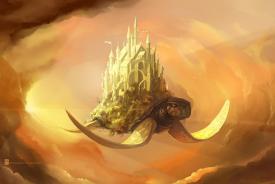
This Micro Madness competition proved to be a good shot at trying out the theme. Due to some time struggles I had throughout all of the weeks, I quickly decided to drop the city part and chose to go for more of a underwater reef theme with various sea creatures (including the turtle) and add some low-key architecture in the form of a lighthouse and camping spot. This was my first time CSO sculpting and I had lots of fun with it! I know underwater themes have been done quite a lot in the past so I hope to have at least shown some originality/creativity with my sculptures and reef work. I am shocked to see how far I have made it in the contest since I initially didn't think I was going to have a long run and just want to thank all of you that voted for me and/or left constructive reviews for me. Got lots of stuff to work with now and hope to show up in semis with a good micro!
-
 Bubbsy41
Offline
Bubbsy41
Offline
I am just now realizing that people were seeing lanterns. The lanterns are supposed to be awning fringe objects, which are very common so I'm surprised they were an issue. I thought xtreme and I had solved that problem but I guess not haha.
Tags
- No Tags