Micro Madness 2023 / MM4 R2 Quarter-Final 1
-
 08-February 23
-
 posix
Offline
posix
Offline
Document 
Former MM champion Cocoa (Group A) joins Round 1 winner Iretont (Group B) and runners-up Tolsimir (Group C), nin (Group D) and Mattk48 (Group E).
Urban Fabric
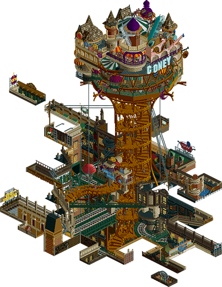
Cocoa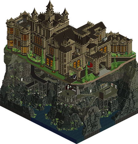
Wayne Foundation Ball
Iretont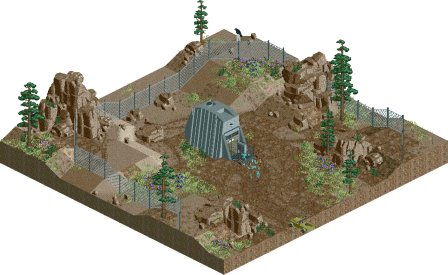
The New Element
Tolsimir
The Vermintide
nin
Friends on the Other Side
Mattk48
Voting Rules
- You must view all parks in this match to vote. If you cannot view a park, for example if you don't own LL, then please do NOT vote.
- Once you have viewed all parks, select your favourite and second favourite in the above poll. The poll will close after approximately 3 days and the results will be posted.
- The winners will be determined by the formula set out in the Rules & Regulations topic. The creators of the two highest scoring entries will proceed to the next round. The third highest scoring player will be placed on the reserves list for the next round. The lowest scoring player will be eliminated.
- Everyone may vote except for those participating in this matchup. If you are part of this matchup, please null vote. Voting is public and monitored by admins, any cheating will be picked up on and dealt with.
-
 Thethrillman
Offline
Thethrillman
Offline
Guys make sure you use Cut Away View or else. Dang these parks are so cool. Such a hard choice
-
 FK+Coastermind
Offline
FK+Coastermind
Offline
Cocoa - A classically wonderful Cocoa idea, to take something we know and do it in an unexpected way. Seeing the bits of city burrowed into the ground, like staring down into 'urban fabric' is pretty awesome. Some of the angles were pure magic, while others I wished I could have seen further in or used cutaway to explore further down into things. That would have really pushed this to another level. As is, it reminds me of Xtreme's in that it has a sense of beauty in the chaos and charm of it all, but seems a bit more like a little set piece opposed to something with more depth to explore. I'm unsure if the surface level alone would be able to compete with some of the other parks this round.
Iretont - For 'not anticipating that you'd get to the second round' this certainly feels well planned out. The architecture is really beautiful, deceptively in places because I think the textures do a lot of work, but it all comes together well. The bat cave and the raising platforms were such great moments, as well as batman taking off. I feel like the interiors aren't quiet up to the same level as other elements, in a few places I think they felt like some other park fell into the mansion. But overall, a really well constructed and complete package with some great storytelling.
Tolsimir - Have we seen this done before? I've definitely had the idea to do a top-down park with cutaway before, but not sure if anyone has actually done it. The concept is great, the execution is great, the little scenes were lovely to explore, and the very bottom is industrial/science stuff done right. I do wonder if there might have been a cleaner way to construct the cutaway that didn't slice thru the back of so much of the work, but that's nitpicking.
nin - I really enjoyed this. There is a strong sense of stroytelling without much need to explain. That is good parkmaking, where it sells itself. Compared to some of the other micros, this didn't have as much of the variety or smaller moments, but I can appreciate the dedication to a strong concept. In places, this felt new and refreshing, but in others I felt like I'd seen this sort of medieval aesthetic before.
Mattk48 - This feels very traditionally micro-madness. Multi-layered, lots of cutouts and interiors, very well executed and pulling in references that help to build out the narrative. I think your architecture looks great, but is just missing a bit more scale and detail to sell the NOLA vibe. Conceptually, I like how you've linked the two with the coaster, but I'm not sure it has that extra wow that some of the other multi-layered parks have been showing this round. That is to say, I really enjoyed this but I'm not sure if it takes the cake for me.
Ultimately, I think all of these are really great entries that capitalize on a lot of great parkmaking. I was torn on how to vote because I don't think any of them have any huge weaknesses nor did one overwhelmingly wow me enough to immediately snag my vote. Ultimately, I decided to go with the two that felt the most fresh and interesting to me and voted Iretont #1 and Cocoa #2.
-
 ottersalad
Offline
ottersalad
Offline
Nin: I'm guessing you played Plague Tale recently? Damn this is cool and I like the new objects you've added. Great concept, and overall a great scene you've made. Layout is ace too. Great blend of nincso as usual. I'm a sucker for it. Sorry other entries lol
Tolsimir: Neat idea - just maybe underdetailed unless I'm missing something? Like the idea of the element being discovered.
Mattk: Great architecture and very New Orleans feeling. Makes me miss my trip there in 2018! I think the layering here makes sense. Great vibe overall. I think the nostalgia for visiting NOLA elevates this for me.
Iretont: Great stuff dude. Love the Wayne Manor... amazing archy work here. Really impressive subterranean level too.. it really all comes together well.
Cocoa: wow, the depth to this is astounding. The music adds to my wonderment of it all.. you executed the name/theme perfectly. I want to dig deeper and explore more of this scene. If the rooftops are this lively, what is the rest of the city like?
-
 wheres_walto
Offline
wheres_walto
Offline
Iretont - cool comic, lil extra effort like that can make the difference in a tight contest like this. Love the continuity with your first submission, very nice exterior and rock-work, I like the introduction of Batman and Alfred in the cave discussing things. Unfortunately I think the interiors fall just a bit flat in places, parts like the master staircase, library, and attic woodwork are really nice, other things like the floor textures and plain Fisherman wall stand out as undercooked. The music overlap is kinda giving me a headache so I ended up pausing the game. I like it, I think with a bit more time this could have slapped even more
Mattk - interesting composition, it's a New Orleans cake with a coaster running through both levels. Feels conceptually like something we'd see a lot of in the 2007-2011 era, I think the grounded palette doubles down on that feeling (how interesting that palettes from 4 years ago now feel grounded). I've never been to New Orleans, would love to go sometime, spent a lot of time in Saint Denis. I like this one too, this contest has been a nice showing for you, I'd like to see more of what you could do unbounded by micro restrictions
Tols - pretty cool, the messages were a little awkward but I got the gist. I really like the progressive, scripted reveal. That bottom layer has all kinds of weirdness, no idea how you achieved some of these effects. It's nice to see this realized after having talked about a factory last H2H. I want to say I wish there was a bit more continuous life, but that wouldn't really fit the theme and I think the visual of the spinning block with lasers and spazzy blackout is an excellent set piece
nin - okay, this rules. I'm not familiar with the source material (assuming it exists), but I'm getting strong horror vibes from the running mice, chained tower, and music. Absolutely love the miniaturized taverns to force a sense of scale. Those steep background objects are an incredibly clever way to create a novel shape, major plus for that move. For me, the tower and jagged protruding wood are the highlights, I feel unwelcome in this environment, great job capturing that sentiment
Cocoa - I'm getting major Synecdoche New York vibes from this, the choice of roof as blacktile implies that the city is much more expansive than if you had chosen the void. Your composition is the standout here, this is such a fresh wacky way to portray what you've built. I'm having a hard time deciphering if what I'm looking at is real or forced perspective. The central tower is really successful, as are all the cutouts, even if they provide the smallest possible amount of payoff
I thought there were two clear winners from this group, tough choice between the two of them
-
 Turtle
Offline
Turtle
Offline
Damn I really don't know how to vote for this one. Some absolutely amazing stuff here.
-
 Ge-Ride
Offline
Ge-Ride
Offline
Tough choices to make.
I voted for first place Wayne Foundation Ball. Even though it's another Batman themed micro, it was enjoyable just like your last. It just had the theme behind it to make it worthwhile viewing.
For second place I'm going with Vermintide. It had an interesting if short coaster. The scared cattle was a nice touch. And I liked the shrunken medieval houses with smoke coming out of their chimneys.
For third, this was tough, but I'm going with The New Element. At first I thought it was going to be a NE Designs micro. That has nothing to do with my placement but just saying. I liked the interactive elements where you have to enter a letter in order to see what was going on. I didn't realize you had to look in underground mode but it was interesting to look at. It was tough to put this at third. It was really a matter of which gimmick you prefer and which execution. I suppose that it was somewhat confusing not knowing that you needed to look for. In the end, it just wasn't quite as slick so I'm reluctantly giving this my third place despite a very cool concept and good execution.
My fourth place goes to Cocoa. Good idea, it just felt like shards of various ideas that didn't quite gel into a whole for me. It was a very creative idea and a bold risk that for me, just didn't quite pay off in this tough matchup. The visuals were cool but not very lively aside from the tower. Ultimately, it was good, but not as good as my top three.
Fifth place goes to Friends on the Other Side. Good idea with the split level with New Orleans above and the swamp below. It just lacked some of the aesthetic wow factor that all the other entries had to some degree. It just didn't quite capture the spark of New Orleans for me. Still, a very good micro, just facing advanced competition.
-
Turtle
Offline
I just voted and i'm very surprised to see the current scores.
First place for me was Urban Fabric. It was the cleverest idea I think i've seen so far, in terms of subverting what this contest is all about. Negative space micro building DOWN from the surrounding areas is SUCH a clever way to present a design. It's also potentially really difficult to make look good and read well, i'd imagine. Even so, you've made something that's so beautiful, so different from everything else that we've seen so far, that I felt it deserved the win. So much stuff to see, such interesting angles, I almost didn't really care about the concept/theme itself but that was also excellent. LOVED it.
Second place for me could have been any of three others - New Element, Vermintide or Wayne Foundation Ball, for different reasons. I went back and forth a lot, honestly, but landed on New Element. Again, it's a REALLY clever way to present a design, and everything there is SO good. Really tells a story, using hacks that I don't understand, but none of it is messy and it is easy to understand what's going on. You've also managed to make a potentially cold theme feel really interesting and inviting, so very well done.
Third/fourth/doesn't matter - Vermintide was eeexcellent. What a really cool vibe and gimmick those mice are. Reads really well, I don't know the subject matter (if there is any) but I don't care really. The scene was awesome, the theming is some of the best in the contest so far, and the overall end product was brilliant. Some of my favorite parts - the colors, the slanted walls, the tiny houses giving a sense of a larger scale, the coiled chain up the tower.
Wayne Manor could easily have won for me as well - I had this top at first but ultimately it just felt sliiiiightly less polished than the others. But wow what a scene, that batcave was amazing, the moving platforms, batman moving, the scale was perfect. So much to see, loved it.
Friends on the other side was a perfectly nice park with a cool split level thing going on, but goddamn coming up against those other 4 parks was unlucky.
Think this matchup was even better than the other one, and I thought nothing could top that.
-
 Six Frags
Offline
Six Frags
Offline
1) The Vermintide by nin
-Concept:+++
-Content:++
-Quality:+++
Overall; Awesome atmosphere when you open the park for the first time; the jarring music with the pumping drum beats, the rats running and swarming through the middle gap of the map, the imposing architecture, the coaster (with one of the best supporting jobs I've ever seen) wildly interacting with the architecture, the texturing/crunch, colour scheme, landscaping... I think there isn't one aspect of parkmaking in the micro I don't like and it's all just very high quality. Definitely my favourite work I've seen from you nin, keep it up man and you might even win it all (if Leon has a bad day )
)2) Wayne Foundation Ball by Iretont
-Concept:++
-Content:+++
-Quality:+++
Overall; You know I'm a big fan of (custom) music in a park, but this was a bit too much; the 2 songs, like Walto, also gave me a headache, so I ended up turning off one song. Having done that, I really enjoyed exploring your micro. Awesome Wayne Manor recreation (or interpretation I guess), great batcave area and the synced CTR's were a joy to watch go up. Not sure about the colour scheme, was a bit too drab for my tastes and when you rotate 2 times to view the backside it was all a bit under-detailed, compared to the front. Almost looks like you ran out of time, which I can fully imagine with all the work that had to be done on this map to create all this content. Would've been awesome if you could've continued the batcave area on the backside view as well, but yeah, time.. Great Fisch rock work in the batcave area though, love the height variations. Excellent interiors as well; lovely library, little band playing at the main hall with people watching and kitchen area. Always nice to see people take the time to do these. Hard choice to pick between this and nin's entry, but had to give it to nin with the slightest margin as I felt his was a bit more polished and finished overall.3) Urban Fabric by Cocoa
-Concept:+++
-Content:++
-Quality:++
Overall; Very cool idea to have this see-through panorama from the rooftops, where the whole map background is basically roof. The big tower hovering above it all gives a great focus point and aesthetic. Bit messy on top of the tower though, but I guess that can't be helped with the stuff that has to be put in, in order to create a tiny tower-themepark (Coney Highland-very neat idea). A coaster of some sort would've been so cool tho, and could've elevated this micro a few tiers when done well I feel. Would be very challenging to get that fit in tho, so I can imagine you deciding to not take that risk as it could've become even more messier on top. Love the custom music, gives it a nice edge, and great architecture, colour scheme and deco/detailing throughout.4) Friends on the Other Side by Mattk48
-Concept:+
-Content:++
-Quality:+
Overall; Love the street setting and New Orleans vibe/architecture you've created on the upper layer. Not sure the lower layer works that well though, and it's missing some narrative connection between the two, other than the Shadow Man coaster of course. Speaking of which, I like the layout, especially how it's swooping in and out of the architecture. A nice vibrant colour scheme throughout, although I'm not sure I like the aesthetic of the swampy colours and tone below. Was missing some music as well, which creates a very dead (in the wrong way ) atmosphere. Highlight for sure was the architecture on top; great details, depth and deco used.5) The New Element by Tolsimir
-Concept:++
-Content:+
-Quality:+
Overall; I was a bit disappointed when opening the park for the first time. The underground stuff obviously was nice to discover, but still I felt like more could've been done with the concept. The black hole was a clever idea and the accelerator generating the power to conduct the experiment, the lasers creating the new element and the little control rooms were just all well done. It's all 'nice', but I must admit I was kinda expecting more from a Tolsimir QF park
-
 Babar Tapie
Offline
Babar Tapie
Offline
I think this is a very strong group and one of the most interesting by the diversity of the themes
Urban Fabric : As always it's dense and well constructed, I think the space usage is really clever. The way you've built on top of the tower is a really smart too. There's not much more to say, just get lost in it and admire the details, very very good.
Wayne Foundation : Really congratulations for this theme it's original and the atmosphere is so good and immersive. The inside of the building is a bit empty but that's really a minor issue. I loved looking at this park, it might even be one of my favourite parks of this R2!
The New Element : Again I find the theme very original, sometimes lacks a bit of detail but like Iretont park it's really a secondary problem. I really like the way you make us look at the different windows/scenes, it's pleasant.
The Vermintide : I would like to tell you that I loved your R1! I didn't comment your group so I'll tell you here! First of all I find the idea of the skavens very cool, it's simple but well done. Again a very good theme, I really like your work on the top of the tower, maybe the bottom is a bit rough. I also like these micro-houses, and the coaster looks great! In summary a very good park, the choice will be so difficult in this group…
Friends : I love the integration of the coaster and its relationship to the architecture and the elements, it feels like the whole thing was built around it and it's really good. There is also a real good architectural work and a lot of detail, a great work there too !
-
 Splitvision
Offline
Splitvision
Offline
Nin - Among the QFs released yesterday, this was the one with the most immediate impact for me. The horde of massive rats stampedeing across the map is one of the more dramatic things we've seen in RCT I think. On top of that, the surrounding medieval tower structures are amazingly well done - super impressive, and the trick with the miniaturized buildings around it makes for a great perspective trick to make the towers look huge, although I think it is maybe a tad too extreme. The layout is really great as well and that crimson is such a perfect color for it. Incredibly cool and unique theme, it just looks very "complete", like you had a lot of time to really refine it.
Iretont - I both like and dislike the fact that you continued on the Batman theme. The plus side is that I like the kind of world building you can do in this way - depict different scenes and elements from a certain universe - but the downside is that it kind of implies that ideas were scarce. I think it's a bit of a binary thing, where it would be crazy cool if you won the whole contest and *all your parks were Batman themed parks* - I mean, the balls to go into the contest with a concept not just for a single park but how you would tie multiple parks together which again presumes advancement from each round - but the middle ground would not quite work IMO. All that aside, your entry is really cool and very well captures that dark comic book vibe you'd want from a Batman entry. The rising piers are of course the most eye-catching feature, and they are done so incredibly well - they line up with the scenery in a ultra-precise way that is super satisfying. I will go ahead and give you my second vote even if it was super-tight - now go ahead and win MM by piecing together the equivalent of a full-length Batman movie in MM entries.
Cocoa - What an instantly classic Cocoa MM concept - basically inverting architecture so that everything is a sea of roofing, except for a small opening where all kinds of wacky structures spring up and things and peeps busily move about. The Coney Highland tower as the centerpiece is really great and works as a fun spin on Coney Island. But I think based on what I'd expect from you, this is somehow a little lackluster for me - it's hard to put my finger on it exactly, but it could be that while the idea is cool and probably executed as well as is possible, it's still not strong enough to challenge some of the other entries in this QF of Death.
Tolsimir - This was a very cool idea and it is executed in a clean way, as long as you view it in the way that you intended with the different view modes - I mistakenly used cut-away the first time as more or less a reflex, and that did not work as well. In general, having a concept where the contents of the map are slowly revealed is such a great fit for MM, where space for content of course is at a premium. That said, I think I wish there was even more to this - maybe more levels, a longer sequence of storytelling, etc etc. In normal circumstances this would for sure warrant a vote from me but this QF is just too crazily stacked!
Matt - Very charming entry and the vertical juxtaposition of a city scene (I am assuming this is Louisiana somewhere) versus a scene way out in the swamplands was cool, but not directly intuitive to me - is there perhaps some reference to some folk lore here or something that I am maybe missing? The cityscape is very pretty, but I didn't find the swamp area to have the same level of refinement. The layout is also maybe not of the quality needed to progress.
-
 AvanineCommuter
Offline
1. Cocoa - this is brilliant. If this were stark white, it feels like it could be a project from an architecture student in studio, where you carve a negative space out of a volume downwards. I absolutely loved the peeking into this underworld, and the music gave me CHILLS. The tower itself uses those curved stairs so nicely, and I love the commitment to your Cocoa-isms in terms of style and color, so easily recognizable. I think the top of the tower itself could have used some refinement, as some sides appear more clunky than others, but overall this was an easy first place for me.
AvanineCommuter
Offline
1. Cocoa - this is brilliant. If this were stark white, it feels like it could be a project from an architecture student in studio, where you carve a negative space out of a volume downwards. I absolutely loved the peeking into this underworld, and the music gave me CHILLS. The tower itself uses those curved stairs so nicely, and I love the commitment to your Cocoa-isms in terms of style and color, so easily recognizable. I think the top of the tower itself could have used some refinement, as some sides appear more clunky than others, but overall this was an easy first place for me.
2. Nin - what a concept and what top notch execution! The ride itself is great, but my favorite parts are the rat storm at the bottom and the chain around the tower. The messy chaotic wooden supports also work so well to sell the theme, and I can really see the overall vision so clearly. Fantastic stuff. I think one thing I would suggest is to round out the base of the tower so it’s not a giant square, but still. Excited to see what’s next.
3. Iretont - another detail-packed amazing entry from you! The mansion itself is gorgeous, really well done, and the batcave itself is really nicely fleshed out. Those rising pillars are impeccably executed, what a cool thing to see! The music really helped the atmosphere too. It just missed being my second vote for two reasons: the interiors were a bit clunky, and I think the amount of movement and cohesion in nin’s pushed his ahead for me. However, you’re one to watch as we move into SF and I’m excited to see what you’ll continue to do to surprise us! Great work!
4. Tolsimir - I am baffled by how you made the narrative elements work, and the user interaction to be able to cut away at the base is really cool. The black hole? Ingenious. The entire base at the bottom kept my attention for so long just clicking different things to figure out what they are and how you made them. So many ingenious use of objects and CTR to create something so clean like this. Loved it, but it was tough competition here.
5. Mattk - very pleasant entry with some highlights being the detailing on some of the buildings. Loved seeing the section of the hotel and the atmosphere was great on the above ground portion. I think it missed the mark for two reasons for me: the underground portion wasn’t as fleshed out, and the coaster itself didn’t have the flow or refinement I’d have liked to see. I think if you could have replicated the execution of the top level to the lower level, then this would have been a big competitor. -
 Gustav Goblin
Offline
Gustav Goblin
Offline
Cocoa: Please marry me. For some weird reason this is like my favorite thing ever. The flat roof as this map's Quirky Blacktile Substitute is easily the most creative implementation I've seen yet. Really sells the illusion of looking down from the roof of a huge city which is executed phenomenally here. I love how every angle is an entirely new view of the city. The way the trams and monorails add tons of atmosphere and depth but also tie into the overall fabric theme by resembling cross-stitches is genius. Love the massive Coney Highland tower; you packed so much into it. I'm aware it's based on the 7x7 Coney Island tower you did years ago, but it also reminds me of Zuphiro from the last Micro Madness. I think my favorite part about the whole thing is just how Cocoa it is. The one thing is I do wish you had lowered the land before saving and submitting; the half diagonal tram tunnel has some nasty clipping issues with the land right next to it. Absolutely love this either way.
Iretont: Didn't know Christopher Nolan played this game. The opening scene with the piers elevating and Batman getting in the Bat Wing is awesome and I loved the time narration. The big problem is it clashes so much with the other 5000 music tracks playing at the same time that it loses most of its luster. It's not just all hacktacular fluff either; this is fantastically constructed from mansion to Batcave. Interiors are hit or miss; the details throughout are great but some parts also look a little under-baked. It also feels like there's not as much going inside as your first entry. I understand time was a concern and you definitely prioritized the exteriors and the animated intro. I'm sounding way harsher on this entry than I should be; this is fantastic and a definite contender to move on. You're quickly becoming one of the best parkmakers here, not even joking. H05 just built too different.
Tolsimir: One of my favorite cinematic ideas so far. The narrative with the passcodes that align with hotkeys is super clever; just a shame the default messages bork it unless you turn them off. The main scene at the bottom with the new element being created is so cool. Would've never thought about using miniature diesel locomotives as laser guns. That marble block CTR is getting some real use this contest and I can't wait to see what else can be done with it.
nin: Didn't have time to actually build on your last Vermintide park so you make another. I see how it is. Would've been really funny if this was your R1 so I would've had to face Vermintide a second time. I'm still as unfamiliar with Warhammer and Vermintide as I was during H2HC, but doing some research I seriously admire your commitment to the source material. The scale of the archi is massive and perfect for a micro, especially with the shrunken NCSO houses setting the scale. Or maybe they're just rat-sized houses, I don't know. Love the idea of taking a realistic ride like a Premier Sky Rocket and adapting it to fit this fantasy setting. The hordes of Skaven and the scared livestock are a great atmospheric cherry on top. Motivated Nin is legitimately one of my favorite builders now and it's so sad that either you, Cocoa, or Iretont won't make it out. Love this so much.
Mattk48: Cool seeing you make it to quarters and pulling out an idea like this. The New Orleans vibes are palpable on both layers and I love the effects of The Shadow Man going through the buildings. Archi is definitely the highlight of this park. Just wish the rides were peepable in some way. Unfortunately competition got the better of you here and this is not a bad park to lose on at all.
Very very hard vote here. I don't know how Nin's still alive after two rounds this close.
-
 Lurker
Offline
Lurker
Offline
Urban Fabric: What a cool and creative way to do the blacktiling. And I love the vertical city going down into the map like that, and the shape of the tiles used is pretty nice and works with the theme. Main tower is nice too, I especially like the spiral stairs.
The Vermintide: Great apocalyptic atmosphere, and I love how the looks with the ragged support work and mechanical pieces. Layout is pretty cool too, the inversion lift fits this theme and micro really well.
Wayne Foundation Ball: Well synchronized storytelling with some really well done effects like the platforms and Batman leaving in the vehicle. Also good us of supplemental stuff in the .zip to help set up the scene.
The New Element: I like the way the reveal is done, using hotkeys for hidden views like that. And the the scenes are some cool sci-fi industrial stuff.
Friends on the Other Side: A nice city scene (With some very nice pavement texture work), and I like how the coaster bursts through the windows of the buildings. -
 RCT2day
Offline
RCT2day
Offline
1.) Cocoa - wow, the perspective trickery in this really messed with my mind at first. Once I figured that out, I realized just how brilliant this was! The main tower is super impressive considering the footprint. I love the metal scrollwork going up the side and continuing on the path level. It's the usual cocoa-level amazing stuff. But I think you took a risk with the lower train level and it paid off. A lot is left visible only from one angle, so the viewer fills in the pieces of that space based on the other angles. And what is visible from a particular angle is gorgeous. It's really well done. Nice job as always!
2.) nin - geez, you always come up with great ideas. This almost crashed my game, so I had to pause to look around most of the time. Anyway, I love the theme and how it carries through front and center. I think the main tower and windmill are very out of scale relative to the village below. In fact, I think the village houses should've been left out altogether because it really grounds the scale. The coaster and its support work are brilliant. It's a phenomenal layout with a unique mix of supports throughout. And the interaction with the buildings is superb. Overall, not your best of all-time, but certainly really really good. I have it just slightly better than...
3.) iretont - I'm a sucker for good storytelling. You've got the beautiful, peaceful atmosphere on the top and comparatively gray, ugly, wet underground of the Batcave right below. It's effectively two separate micros, each of which is superb on there own. The mansion is beautiful and opulent from the outside, but I think the inside could've used some more love (seems like you ran out of tiles to). And the Batcave is super detailed between the rockwork, foliage, and Batman's infrastructure. I love it, and love your style.
4.) tolsimir - I think relying on viewers to read messages can be dangerous - I missed the instructions the first-time and used cutaway view to spoil everything. But the narrative was cool and what was ultimately at the bottom was a bunch of cool scenes. Some of the motion was a bit jarring though, like the forklift and black hole. But I appreciate that narrative a lot and the work put into this.
5.) mattk48 - good stuff from a great movie! Kinda like the Batman entry, this is really 2 separate micros that are each really good. The top level feels a bit too...modern perhaps to be the New Orleans imagined in the movie. I get that impression from there being too much white and cleanliness, I suppose. But it's still good and has a great Mardi Gras color scheme. The bottom swamp looks great from one angle, but lacking in the others. I love the coaster's station, that was really well done. Overall, excellent, but tough competition means that I have it towards the bottom because its another tough group.
-
 Liampie
Offline
Liampie
Offline
Cocoa: I’ve sometimes though of urban landscapes as canyon-like, and I remember essays by (maybe) Corkscrewed about how classic parkmaking is adding shapes to a map, while subtracting is also a strategy. This is a good example of subtraction. I really like what you did here, and the tower is just the cherry on top. That view must be shit though. Lastly, impressive how many rides you crammed in there!
Mattk48: when the contest started I’ve touted you as a potential breakout star. R1 didn’t deliver, to be honest - but with this entry you’re doing exactly what I expected and hoped for. This is excellent. Great swamp, great archy, great interiors… The coaster is probably the weakest part, though the interactions are still cool! What is going on exactly? Some kind of voodoo magic?
Tolsimir: reminds me of one of the original Camcorder micros, but combined with mamarillas R1 hangar - and now a little narrative. Well synced. All the movement and sound at the basement level is pretty hypnotising. This map is very clever in the way it is designed, as well as in its object usage. Some points of criticism: I got a lot of missing exit path messages that kind of interrupted the narrative for me. And I would’ve liked to have a few more clickable things to explain the little interiors on the first level. Lastly: the experiment loops contain a bunch of moving black shapes. Is that what it’s supposed to be? Anyway, good map! I really liked it!
Nin: Wow! I had to google what Skaven are, but the idea works just fine when you know it’s ‘rats’. The rat traffic was an amazing touch. Wish you hid the teleporting rats a bit better, but fortunately my eyes is nearly continuously drawn to the stream of rats in the center. Reminds me of rats go on the move when there’s some kind of natural disaster. Harbingers of suffering. The music adds to it. Coaster is good, themeing is good (love the inclusion of medieval huts!, adding the chain is a brilliant move. Great work, nin.
Iretont: awesome batcave, and well synced! Unfortunately the narrative didn’t really go anywhere? Batman just fucked off in his airplane thing! No connection to the mansion. I think the map would’ve been just as good if it were just that awesome mansions. Looks great on the outside, but the interiors are even better. That library is epic. The piano is huge. That’s like thirty octaves at least. This setting would’ve been amazing for a Gangland-esque Agathie Christie styled murder mystery. We even got classy female RCT peeps. First female peeps in RCT outside Faas’s mom? -
posix
Offline
Document
Match
ConclusionThe poll is now closed. The formula to derive the results is:
1st choice votes + ½ × 2nd choice votesPlayer Calculation Score Outcome nin20 + ½ × 22=31 (37%)Semi-Final 1 cocoa17 + ½ × 13=23.5 (28%)Semi-Final 2 Iretont16 + ½ × 12=22 (26%)Replacement Chance Tolsimir3 + ½ × 7=6.5 (8%)Eliminated0 + ½ × 2=1 (1%)EliminatedAs replacement, Iretont is invited to submit a park for Round 3 (Semi-Finals). If there is a drop-out their micro will be chosen at random as replacement.
-
 Jens J.
Offline
Jens J.
Offline
- 1.) Nin - This hooked me in right as I opened it up. The coaster absolutely slaps, I especially liked all the interaction with the trackitecture around the big tower. The texturing on this main tower is also phenomenal, l love the shadow gradient near the top. The horde of rats combined with the hanging skeletons and super dramatic music really gives this scene some eerie vibes. First and second were very close here but in the end the wow factor that this provided was the deciding factor for me. Fantastic micro all-round, can't wait to see how you're going to do next round (and fit a coaster in a 100 tile area lol).
- 2.) Iretont - Took me way too long before I noticed but holy shit those rising piers are so cool! I'm very impressed with how you did the underground area in general: from the equipment walls to all of the rockwork and the scene where Batman leaves in his Batwing, it's all executed to such a high standard. I would have probably liked a darker green for the foliage in the underground area but that is just a minor nitpick. And while the bottom part of your micro is already amazing, the castle above it is equally as good. The castle composition is really good and the inside scenes have some nice detailing. Not really much to fault here imo, all-in-all a great park!
The remaining three in random order:
Mattk48 - The architecture in general looks great! Would definitely make a reservation at The Shrimp (or the hotel) just to see the coaster crash in and out of the building. I'm not really getting the connection between the modern upper level and the swamp below, but that didn't make it any less enjoyable to me. I also don't know it if was an intentional choice but the strip lights felt very high of the ground? Solid micro nonetheless, tough competition this round for sure!
Cocoa - This tower is amazing! It looks so full of life but also not too over-crowded. Such an interesting idea to use the roof as the blacktile here, makes it feel like this city is densely crowded with buildings and the only area where you can get some natural sunlight would be this open section with the tower. Rest of the park looks great as well, lots of movement in the lower parts of the map and every single building looks solid. May we meet again in semis
Tolsimir - Looking at just the screenshots before opening the parks, I was confused by this one being so light on content but knew something was up with that. Following the guests from the jeep into the elevator to the underground area proved why. This might actually be one of my favorite underground labs I've ever seen in OpenRCT. Such creative CTR usage with the miniature trains for the laser machinery and a marble base vehicle going crazy with the rotation mode. The new Fisch rock boulders at the top are also great and I bet they will be heavily used in the coming years.
-
 WhosLeon
Offline
WhosLeon
Offline
coc: annoyingly clever idea, and executed to about it's max potential i think. classic cocoa vibe with beautiful colors and a lot of life everywhere. i think my favourite part might be all the sign designs scattered around, really adds to the rooftop vibe and makes the whole thing read as a vibrant city scene.
nin: you tackling this theme is not a surprise for me as you proposed it during H2HC, but man, the execution is beyond what I envisioned back then. the rat parade is great, as are the curvy blacktile objects you've used to create the curvy tower edges. the layout engages nicely with everything and offers a beautiful contrast with the red track
[no particular order]
tols: love the idea, love the reveals that you so cleverly made very accessible and easy for the viewer. I know the narrative didnt work out the way you wanted it to in the end, but that doesnt take away from the fact that its just excellent RCT with the Tolsimir novelty touches that we are so used to by now. my favourite moment might be the miniature trains being used as equipment on the bottom floor.
matt: so much vibrancy in this one, great lively colors. the architecture is excellent and i feel like the top half could have been an great micro on its own. the bottom layer is cool too. i think making the map shape more organic, with the bottom layer just showing in some spots instead of all the way around could have made the composition you went for work better, but regardless of that its still very enjoyable
iretont: somehow you doing the same thing again is the most unexpected thing you could have done, lol. some parts of this micro are excellent, especially the cave is top tier. great rock work and the lifts are executed just perfectly. the top half, while the architecture is really great, left a bit to be desired for me, especially the interiors at the back. just looked a little unpolished compared to the rest, which i think could be a time issue? -
 J K
Offline
J K
Offline
Bah I this was the hardest round for me. Iretont straight #1 for me, the level of immersion and objects created added so many wow moments. You know when a park is good and you have to open your park to add a load of objects to it!
Lastly I don't think anyone cares for their releases as good as you, you bring so much detail and thought process to the mix and it really makes me want to build with you again. I still don't think we've seen you in your prime yet which is scary.
---
The second was a toss-up between nin and cocoa. Both powerhouse builders and straight favourites to win. I went with nin as whilst cocoa was the vibe, nin just secured a few more 'excitement attributes' for me... you know the running rats that just make something so iconic. First entry had this with pegasus and the colosseum helix. Everyone take note.
Tols – This is more of what I expected from you and you didn't disappoint, like others have flagged the main control I needed to access were being hidden by malfunctions. It was essentially the bread and butter of the entry so it took me a minute to reload and go again, and again until I turned ORCT notifications on to retrace my steps. Super fun, great objects throughout.
Matt – Good to see you back with another strong entry, was really great to see this. For me I just wanted the theme pushed harder, immersion is your best friend in MM. The entries that you spend 15-20 minutes on usually bag the vote.
Tags
- No Tags