Micro Madness 2023 / MM4 R1 Group E
-
 16-January 23
-

 posix
Offline
Document 
Classic styles and H2H9 traces, and the sole and proud RCTLL entry of the round (and possibly contest).
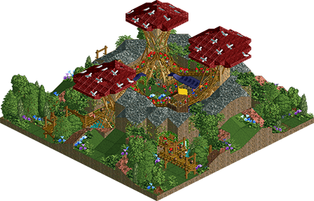
Gnome Crossing
dr dirt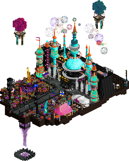
Mechanical Style - Bubbsy Remix
Bubbsy41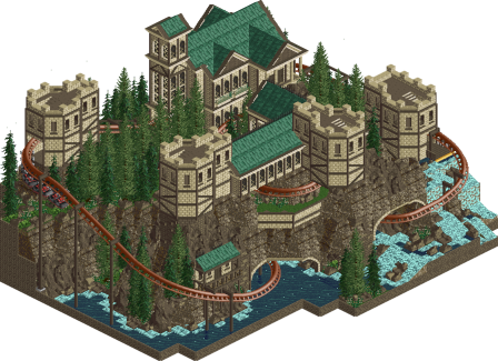
Port Adventure, the last Freehold of the North
Mattk48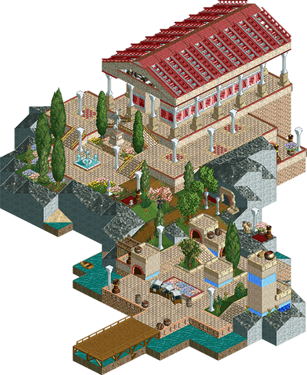
Temple of Hades
Lilith
Voting Rules
- You must view all parks in this match to vote. If you cannot view a park, for example if you don't own LL, then please do NOT vote.
- Once you have viewed all parks, select your favourite and second favourite in the above poll. The poll will close after approximately 3 days and the results will be posted.
- The winners will be determined by the formula set out in the Rules & Regulations topic. The creators of the two highest scoring entries will proceed to the next round. The third highest scoring player will be placed on the reserves list for the next round. The lowest scoring player will be eliminated.
- Everyone may vote except for those participating in this matchup. If you are part of this matchup, please null vote. Voting is public and monitored by admins, any cheating will be picked up on and dealt with.
-

 Fisch
Offline
Everybody in this group seems to have had a clear picture in their minds of what they want to be the focal point. That's a great aspect about all of these entries. Big fan of the macro in Gnome Crossing and the colors in Mechanical Style - Bubbsy Remix
-

 wheres_walto
Offline
Bubbsy was the winner for me, very cool stylized vision, the audio made me laugh too. Runner-up was a tough call.. I liked Lilith's entry (gutsy call to go LL, I particularly liked the walls you used inside the temple to depict artwork), I liked dirt's entry (deceptively complex, excellent color balance, very cozy feel), and I liked Mattk's entry (visually impressive, though would have benefitted from more action)
-

 Narc
Offline
You had me at cyka blyat.
As for picking second choice, really difficult. In the end my inner philhellene assumed direct control and voted for me. Really enjoyed the classic (in a NE sense) look.
-

 ottersalad
Offline
Rave: wow, chaotic, colorful. Pretty neat.
Temple of Hades: pleasant and enjoyable. Very detailed LL and I highly respect your choice for making something in LL when this contest is all about hyperdetailing.
Swans: Small and simple. I agree with Walto that it is very cozy.
Mattk: very grand architecture. Layout was a bit slow in the middle. Bold choice of using 4-5 colors.
-

 AJ-
Offline
BubStep- This goes so hard! I love this, its so much going on and i love how it looks! The colors are so fun.
Mattk48- this is so cute, its so moody and rich! This is a great layout in a small space, and a great coaster type to see. I like that there are no peeps!
Dr dirt- this is so cute, i wanna eat a ppj here and so various drugs.
Lilith- i love to see it. This looks so great!
-

 Xtreme97
Offline
1 Bubbsy: Haha this is awesome. Love the remix, accompanied by the animation that definitely kicks the stage up a notch. Great details in the back too. Sick entry and my first choice this matchup.
2 Lilith: An LL entry is always a pleasure. Great work Lily, nice rockwork and composition of the market area split from the temple. A full park like this would kill.
3 dr dirt: Very calm aesthetic, more toned down than some of the other groups but the contrast is good, bit of a place to unwind. Very classic dirt style with the PT2-esque objects and reserved landscaping.
4 Mattk48: This is lovely. Again another entry that's more toned down in activity but made up for with serene vibes. Nice layout and architecture with a clean colour palette. -

 barnNID
Offline
1. Bubbsy- I wana do molly now
2. Mattk48- landscaping is very good. It might have been nice to add a gradient here starting darker at the water and lighter near the top of the cliffs. the water and everything was great also. I would like to see peeps in here I think. Very cool entry overall.
Lilith- I like this, super cool entry. Your use of the chess pieces is really cool. I enjoyed
Dr. dirt- I love the mushrooms, clever use of objects to make those. I feel like I would like to see a bit more content overall.
-

 Camcorder22
Offline
1. Bubbsy - Actually had an unfinished idea like this for MM 2014, but it works a lot better in the current meta. Stage is particularly well done, love all the little festival details including the death portal.
2. lilith - close one for second but this felt really pleasant and serene to me and I liked the water surroundings. Props for sticking to your guns with LL.
Mattk48 - Glad to see you building again, always enjoyed your style! Nice composition and landscaping, not sure if I'm sold on the coaster layout but still a lovely entry.
dr dirt - Appreciate the landscaping/macro focused style you've been leaning towards, cozy & picturesque, a bit light on content for this format.
-

 AvanineCommuter
Offline
1. Bubbsy - I LOVE THIS IDEA, and you killed it. The colors, the music, the atmosphere.... the stage itself is wonderful, and the crowd is so well done too, I feel like I'm at a rave and I love it. I don't quite get the floating void things, thinking maybe they weren't necessary, but this is definitely one of my favorites so far. Great work!
2. Dr dirt - very cute idea and the mushroom towers are so well executed, really nice. This is such a dirt entry with the composition and the landwork, and that does you a lot of favors. Definitely if you're going to go further in the competition, I'd love to see you bring forth some more ambitious work if time permits.
3. Mattk48 - really pretty entry, the architecture is nicely done and so is the landscaping, but definitely super static. The coaster layout also leaves something to be desired, I think some peeps and little things could bring this alive.
4. Lilith - really pleasant entry, some classic ideas and composition which is always appreciated. Could also use some life or movement to bring it alive.
-

 Splitvision
Offline
#1 - Bubbsy - A great homage to one of our beloved RCT tunes. The remix is quite catchy! I would be interested in hearing a whole concert with remixes of the other styles as well. Content-wise and aesthetics-wise it feels like a slice of a Stardust park, so while not exactly a brand new look, it still obviously looks very cool, just like Ziscor's entry. I wasn't entirely sure what was going on with the void and the floating dolphin? But that doesn't matter as the map clearly is just meant to be really fun, which it is.
#2 - MattK48 - A very clean and elegant entry. It does get a bit close to being too spartan, and parts of the landscape looks a bit repetitive, which in other more stacked groups could have cost you the #2 vote from me. But in the end I do like the cleanliness of this piece. You also did with the map edge what I wish RWE would have done in not mixing the plain land wall with Fisch rocks.
Lilith - Going for atmospheric and "static" LL for a MM entry feels daring, mostly because there are many LL-ignorant people on NE like me, who might not understand the skill it takes to build something like this. I love the look of the scene itself, but it does not feel like enough to earn a vote from me.
dr dirt - While quaint, this felt quite underdeveloped to me. I feel you went for a similar vibe with Pineapple Express and there it really worked, with the expansive meadows and the woodie wrapping around the landscape. This piece ends up lacking something special for me.
-

 Cocoa
Offline
1. bubstep---very funny and atmospheric. loved poking around all the stage details, and the soundtrack is hilarious
2. gnomestep---definitely understated but i think there is a huge amount of excellent parkmaking going on here nonetheless. the swan ride is cute and I love the construction of the mushroom houses. feels very whistful but also surprisingly grounded
mattk48---love the ride choice and the grottos underneath. the layout is a bit slow in parts and the buildings are a bit samey---be careful with that muddy texture/color
lilith---cute little entry, with some lovely LL parkmaking. maybe needed something to keep my attention but a great little diorama
-

 MorganFan
Offline
1) Bubbsy41 - love the colors and energy here! The micro is super detailed and held my attention for quite a while! Very fun entry.
2) Mattk48 - lovely work, feels very clean and natural. The coaster felt a bit hidden but I think the landscaping and macro makes up for it.
3) dr dirt - very cute, surprisingly dense atmosphere. interesting object choice but nothing bad and very clean entry.
4) Lilith - I love this, and I'm so glad LL made it into this contest! Very serene and pleasing to look at. -

 FK+Coastermind
Offline
No LL so unfortunately can't vote, but I'll provide some quick thoughts as I'm going thru:
mattk48 - super atmospheric, love the aesthetic and the landscaping was super well done. This felt like a larger design squished down, which can be a tricky route to go in MM. I think in this MM particularly, each angle and each level really needs to provide new content and new things to explore, and while this was charming, it felt like it needed another dimension to it.
dr dirt - my thoughts for this are similar to the above for mattk48. Elegant, understated with a clear aesthetic, well organized, a nice little micro. As part of a larger concept I'd love to see how this further expands, but in such a small format I think this lacks the variety of content necessary to really grab the viewer and pull them in. While I support more macro-focused approaches to rct, Micro Madness is a risky place for that.
Lilith - can't view in game unfortunately, but I really enjoyed the screens included. Another understated approach with some really lovely macro. I'll sound like a broken record, but I don't think this has that extra level to compete with some of the multi-dimensional micros we're seeing, and while I love seeing LL the fact that I can't vote (as I may well have voted for this) is a bummer.
Bubbsy - This was the clear winner for me in this group. A really cool and unique aesthetic, lots of little details to explore, and some great ideas packaged in a unique way. It seems to both be part of the current meta with some of the crunchy textures but also entire outside with the juxtaposition of dark colors and bright neons. Having done a fair amount of festival-ing, I think you got the vibe just right too. I do think you may need more levels/layers moving forward in the contest, but very excited to see what you'll do.
If I could vote, I would have put Bubbsy #1 and then been pretty torn on the remaining. I don't think either of those three really capitalized on the format, but they all delivered on a bold vision. I think I probably would have gone Lilith, but a tough call.
Congrats on an interesting round everybody! Good luck in the voting!
-

 Ethan
Offline
Bubbsy - So much color and energy. Love the backstage scenes and the intricate stage facade. It's always cool to see those electronic festivals create such elaborate facades and you executed in RCT and took it to another level with the fantasy aspects. The content is superb, I love the giant puddle of lean and the music is exquisite
dr dirt - I like this funky fungi look. Feels like a game of rct's time cant quite put my finger on it. I like the landscaping, such a cool donut shape.
lilith - You have held this match hostage with the LL park. I quite like this though, everything feels well thought out and delibearte. Very fitting I suppose with a small tile count but I feel like there is such nice content and well executed theming done here.
Mattk48 - I love the vibe with the tunnels and the coaster peaking in and out. Very moody and the castle form is really nice. I quite like the the landforms and cutouts you did as well as the folaige.
-

 Gustav Goblin
Offline
1. Bubbsy: CYKA BLAT! MM MM:clap: MM, :clap: MM MM MM:clap: MM, :clap: CHEEKI BREEKI IV DAMKE! Far and away my favorite entry of the round. Love the music festival setting through the eyes of someone tripping the hell out. Not just visually, but also the way peeps can trip the hell out and fall into the Lean Void. The little authentic details like the backstage and the medical tent really bring it over the top. Of course Ethan would be greened out. On that note, I love the named staff all over. I'd be the worst festival security guard though. Also I really wish you committed to the name Bubbstep for the site. That's just too good.
2. dr dirt: Vibes. This is definitely one of those parks that grows on you the longer you stay, almost like you're slowly being welcomed into the gnome village. I thought you went without a ride this time but the swan river proved me wrong. While I wish it stood out a bit more, those little tunnels with the waterfalls inside and the vines growing outside look so beautiful. Just in general you've gotten so much out of the PT2 bench this micro, it's really inspiring. Very reminiscent of your more recent work and I'm here for it.
3. Lilith: Can't go wrong with some good ol' LLilith. I forgot who it was who said you can do whatever with LL and it'll still feel like some good ol' RollerCoaster Tycoon in the end, and once again that rings true. There's a simple charm intertwined with the well-executed theme and LL hacks, and those little terraces and outlooks just make my heart sing. I do wish it had another dimension though, whether it be some staff to add movement or a hidden secret in the temple. Very nice entry through and through though.
4. Mattk48: Love seeing more stuff from you and this is no exception. Definite Adventurers Club vibes from this one with the dark rocks and water, and I love how it contrasts with the light brick buildings. Almost feels like a painting. Honestly the layout feels a bit jilted. Hiding the scenery shows it looks like it was only designed for the moments you see outside of the rocks and about half of it is underground. Additionally, it feels like a lot of polish like frozen staff scenes, custom supports, or even a name for the coaster was overlooked. The use of pine trees looks great, but you can tell on closer look some of the foliage looks pretty spammy and could use some slight variation here and there. Beautiful start; just needed a little more IMO.
-

 kenos
Offline
@bubbsy41 - i love the festival stage very much it could be a stage from the famous tomorrowland
-

 Lilly
Offline
Temple of Hades (1): This park can be viewed from all angles but the one used in the thumbnail in particular is just so compositionally interesting for me, a unique shape as well. I thought the structures were well-built, the scenery and landscaping well-placed. A beautiful park and I feel like it had a very unique way of presenting the roman architecture. The small elements make it feel more like a real place rather than a diorama. It really just has an understated beauty in my opinion. Clearly showcases a lot of talent. Great work, great park!!
Port Adventure, the last Freehold of the North (2): Usually I prefer more contrast in a park, but this muted color palette just really worked for me and the tone of the park. I like the idea that it's this small kingdom, the last Freehold of the North and they've decided to put a rollercoaster going through it. The buildings are very clean and precise and so one small detail I like is that the caves that the coaster is entering through have that neat border around them. Small detail, but I noticed and appreciated it! Only tiny tiny thing I will critique is it seems to just be mainly one type of tree in a few sizes and colors, I'd love to see more diversity. But then again, I think a highlight of this park is it's neat and 'polished' quality, so very similar and manicured plant-life might make sense. Either way, a great park!
Mechanical Style - Bubbsy Remix (3): Wow! Such a colorful and vibrant park. After watching all the fireworks go off I was drawn to the very interesting situation happening below the park. Wild element, but created in a really cool way and I feel like it makes the overall composition more interesting. I love how lively this park is, the peeps feel like a really big part of it. This park has a real energy happening in it. Such unique architecture. And I also think those floating air balloons with the banners are too cool. Interesting audio. Stunning park!!
Gnome Crossing (4): That sure is a lot of gnomes! Cool technique to make the mushrooms. I think different sized/shaped mushrooms could have helped with composition! The landscaping and scenery placement outside feels a little random but perhaps that can be attributed to the randomness of wild nature. Also wish the rock terrain would have more seamlessly transitioned to the grass. Still, a cute concept!
-

 Six Frags
Offline
1) Mechanical Style - Bubbsy Remix by Bubbsy41
-Concept:+++
-Content:++
-Quality:+++
Overall; Love the edit on the 'mechanical style' RCT music and the whole vibe you created here. So many funny little scenes throughout the micro, and the colour scheme, fireworks & animations make it so alive and vibrant. Well done!2) Port Adventure, the last Freehold of the North by Mattk48
-Concept:+
-Content:+
-Quality:++
Overall; Reminds me of the Adventure's Club final park in H2H9 (but the title of this micro already implies that I guess). Very nice high quality content and a lovely flowing (although sometimes a bit too slow) coaster, just wished there was some music and peeps to make it more alive. And the colour scheme is a bit monotonous.3) Temple of Hades by Lilith
-Concept:+/-
-Content:+/-
-Quality:+
Overall; Nice little scene, just wish there was a ride or something to make it more alive.4) Gnome Crossing by dr dirt
-Concept:+/-
-Content:-
-Quality:+/-
Overall; Relaxing atmosphere, but not really for me I'm afraid. -

 Mulpje
Offline
1. dr dirt - The foliage looks ace in this entry, not a big fan of the mushrooms tho, maybe a bit to blocky for my taste.
2. Bubbsy41 - Very original idea and the excecution is awesome. Cool little details and even managed to get a little slide in there.
A shame we could not work together on our park in H2HC. Would have loved to have your eye on the park we briefly worked on toghether. Nonetheless have a 1st place from its very much deserved
3. Mattk48 - The buildings are looking really cool. I only really miss some movement in the park. The coaster is cool but some peeps would have bring the place to live
4. Lilith - My knowledge of LL parks does not go very far. But really like the scene and its nice to see an LL park in a contest thats chock full of small details and lots of CSO. Im having a hard time giving someone the second place in this group. But since this is the only LL park so far and it has a really cool excecution of the theming, why not, have a 2nd place.
 Tags
Tags
- No Tags