Micro Madness 2023 / MM4 R1 Group D
-
 16-January 23
-

 posix
Offline
Document 
A very packed group full of skill and good ideas. Take your time and choose wisely.
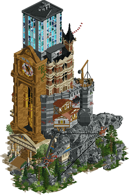
Time's Arrow
barnNID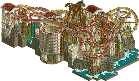
War & Courage
nin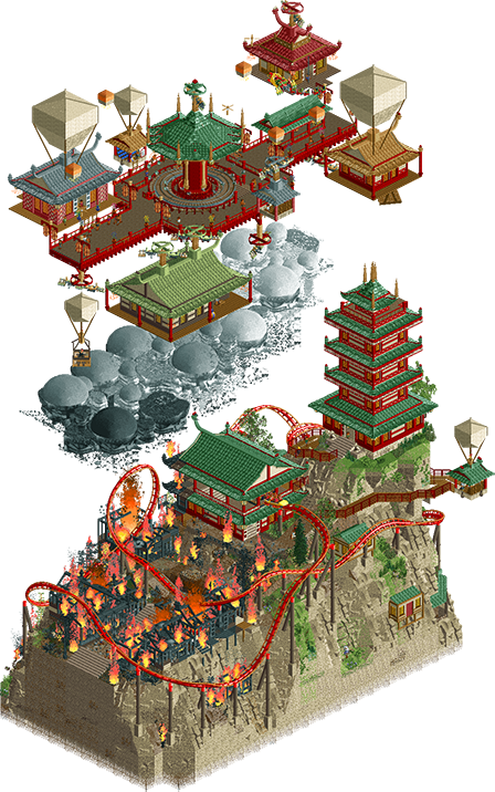
Home Away From Home
Gustav Goblin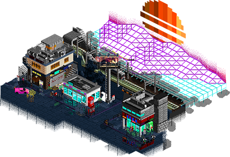
80s Anemoia
Ziscor
Voting Rules
- You must view all parks in this match to vote. If you cannot view a park, for example if you don't own LL, then please do NOT vote.
- Once you have viewed all parks, select your favourite and second favourite in the above poll. The poll will close after approximately 3 days and the results will be posted.
- The winners will be determined by the formula set out in the Rules & Regulations topic. The creators of the two highest scoring entries will proceed to the next round. The third highest scoring player will be placed on the reserves list for the next round. The lowest scoring player will be eliminated.
- Everyone may vote except for those participating in this matchup. If you are part of this matchup, please null vote. Voting is public and monitored by admins, any cheating will be picked up on and dealt with.
-

 Fisch
Offline
Wow this division looks crazy. Some great artistry and a lot of message and thought put into these entries. That bow and arrow sculpture in particular is fantastic.
-

 wheres_walto
Offline
Clearly the standout group from day one, all four entries could have advanced from elsewhere in the bracket.
Ziscor's park entranced me the most so it got my vote, incredible realization of synthwave complemented by cool microrealism. BarnNID's park got my runner-up vote, the archer sculpture is one of the best things I've ever seen, and the clock tower is equally as good. Very tough to not vote for nin or Gustav, these were all quality entries
-
 Xtreme97
Offline
Absolutely mammoth round! Some of these could be finals parks, very difficult to choose and so unfortunate that any of you guys are going to be in fourth place when you could all easily make first in another group.
Don't think I'll be able to decide my vote just yet, so reviews in alphabetical order:
BarnNID: Absolutely stoked to see you submit something and it's probably my favourite piece of your work. The sculptures all around are so good - the grandfather clock, the rockwork archer (unreal). Great vertical story too, progressing through the ages.
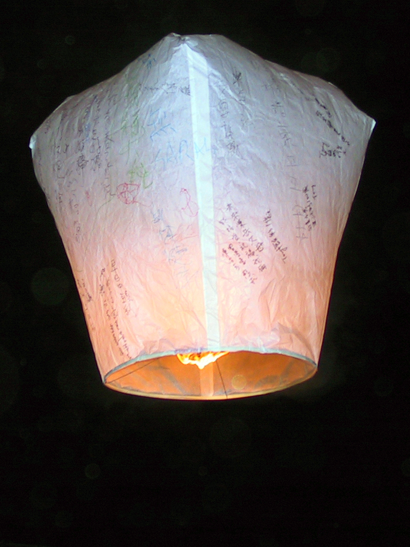
Gustav: It's such a shame that your second go around has been placed into the group of death. Either way your micro is awesome, from one "Asian-themed Fantasy Micro" maker to another lol. Both layers here have great ideas - the box lanterns as balloons is one of my favourite things in the contest.
nin: YES. Damn, this looks like a coaster I wanna ride in real life. Pac, get on it. Two great layouts somehow squeezed onto so small a map, and with their own quirks too. Excellent entry.
Ziscor: Jesus, near perfect rendition of the vaporwave aesthetic. Doesn't need a coaster because vibes are enough to sustain this. Really dug into every corner here because there's an absolute glut of details and scenes. So good. -

 ottersalad
Offline
This is nuts. Well done to everyone in this match.
Times an Arrow: pretty cool. Really had a "wow" moment when opening this one up.
War and Courage: damn. Great ride, great archy. Wouldn't expect anything less from a pro.
Home Away from Home: Neat floating above the clouds entry that we see quite often in H2H. Clouds were cool.. loved the archy as well. Box balloons not as much.
Ziscor: Wow. loved it. Dark, gritty, unique. Definitely gets a vote from me.
-

 Gustav Goblin
Offline
Man I got screwed. Amazing micros from everyone in this group. We would've farmed any other round. Withholding reviews until voting ends.
Box balloons not as much.
They're based on Chinese sky lanterns that tend to look a bit more square than your average hot air balloon. Definitely agree that it may not have translated to RCT super well though.
-
 RCT2day
Offline
Group of Death!
1.) War and Courage (nin) - Dynamic, fun, unique, it's a flawless micro. I've always loved how you're able to weave together layouts and supports into an exciting environment, and this is no exception. Trackitecture Trojan Horse is really cool, I might steel some of that for something later.
2.) Time's Arrow (barnnid) - geez, everything is perfect. That rockwork at the bottom with the statue pulling the bow, the architecture of the tower from top to bottom, even little details in the clock are all just amazing. It's so peaceful and gorgeous. Top notch micro in every way, just a hair less than nin's
3.) Home Away from Home (Gustav Goblin) - I love it. It's full of unique ideas and creative solutions, but also looks very cool. I love the clouds and propellers on the top level. What's great about this is that there is a narrative which drives the design everywhere in a very linear manner. That's really impressive stuff. The coaster didn't really do much for me - I even deleted it and found the bottom section still looked stellar. Overall, very impressive.
4.) 80s Anemoia (ziscor) - insanely impressive. I love the grit. This had the most atmosphere of any park by far, and that's saying something with the competition here. I could watch this park for hours and still love it. The colors and dynamic scenery pieces really breathe life into this and make me feel nostalgic for something I never experienced. The problem isn't the park, but the competition. Sorry, ziscor, I would have this moving on in other groups easily.
-
 Camcorder22
Offline
1) nin - Absolutely brilliant composition and could easily win design if scored. Might go down as one of the all time best micros.
2) Ziscor - I want this one as a painting on my wall. While reflections aren't a novel idea, you've taken them to the next level here.
3) barnnid - Can't believe i'm putting this third when I thought it was an easy #1 opening it first. Amazing overview, clear presentation of concept (for the tower at least), a lot to see. Wish the single rail coaster train was named not because I usually care, but because I have no idea what its supposed to be.
4) Gustav - Extremely unlucky one here and this was still a great entry that would've been top 2 in any other group. Cool concept and love that the multiple levels are thematically justified. If anything, I think your composition could be a little less square and more off the grid, and I don't mean the lanterns, which I do think look really cool.
-

 Splitvision
Offline
Truly a group of death. Some very difficult choices here.
#1 - BarnNID - I think this is my favorite entry of the parks released so far. A pretty simple concept, but the execution is just amazing. As I wrote on Discord, it took me a few seconds (fitting with the time theme!) to grasp what was happening, and I didn't see the sculpture at the bottom at first. Once I did, I knew this was the #1 pick for me. I think this is the coolest stuff I've seen from you - and I think I wasn't really expecting such a pure fantasy-style entry from you, but here you are really showing those chops and then some. Excited for what you could produce in future rounds.
#2 - Gustav - NE's self-doubter in residence comes out swinging and lands a nice uppercut! This is a really, really cool entry. To be honest, I am mostly over the balloon-mania of NE - how many times have we seen that theme now? - but this is a cool take on it, and it is executed so well that even the somewhat tired underlying theme doesn't drag it down for me (terrible pun intended). The smoke effect is killer, looks really great, and I love that the balloons are square, as is fitting for the theme - though I feel there is a missed opportunity to decorate those balloons with some more colors or different motifs. Also, I think another palette choice could have improved this further, perhaps a slightly darker one. Still, looks really great, and I think you have a great chance of progressing.
Ziscor - So cool that you are back and building great RCT! This is such an atmospheric entry. Everything on the map looks incredibly cool. The grid over the void and the pixelated sunset is such a vibe. I think if this had preceded any of the Stardust parks, I would have been so blown away by the aesthetic that I would for sure have put it as my #1 or at least #2, but since it doesn't, it just doesn't quite have that "brand new look"-impact for me. And without any additional element such as a ride or something happening, I was unfortunately forced to give my #2 vote to Gustav.
nin - Very solid, but there was something about the textures and limited color selection for both buildings and coasters that made it feel a bit messy and jumbled for me. In other groups I could for sure have given this a #2 or even #1 pick, but this is unfortunately really a group of death, and the other entries were stronger.
-

 AvanineCommuter
Offline
Not voting just yet, but leaving my thoughts:
Nin - this layout is bonkers and I can't believe you could fit two duelers of this caliber in a micro like this. Lovely lovely coasters, and so is the atmosphere and the sculptures. Really impressive.
Gustav - Really cool idea and you did it justice, love the burning houses and the floating pagodas. I think the coaster could definitely use another pass. I really love the clouds as well, and the whole stacked composition gave it a lot of content to view and kept my attention for a good amount of time.
Ziscor - Even without music this was such creative work, oozing with atmosphere, I felt transported there. With the music, it elevates it to another level and I absolutely loved it. The urban areas and the reflections were great, and the backdrop also works so well to create a surreal, dreamlike vibe. Fantastic.
BarnNID - the sculpture! the concept! the amount of content! What wonderful work, a big surprise for me and I really enjoyed this micro. That archer must be one of the most impressive things I've seen in RCT, and pairing that with a cool stacked concept with architecture from different eras is even more impressive. The overall composition is wonderfully done, from the feathered ground textures at the base to the way the different eras collided and mashed into each other, really wonderful stuff.
I'm going to have to revisit this round to vote later, but this was such a stacked round right from the get go, great work to all four of you.
-

 Ge-Ride
Offline
I'm dreading having to cast this vote but here goes.
My first place vote goes to BarnNID. It's got some great architecture and I love the whisps which I'm guessing are the sands of time or something.
My second place vote goes to nin because I like the theme, even though the palette isn't to my taste as much. The coasters duel very well, and I love the helixes that go through the coliseum.
Third place, I'm sorry it couldn't be higher, I give to Gustav Goblin. It had good content. The clouds were well done. It was just a little too tried and true for my taste to get my vote. I like the work above the clouds more than that below. The pagoda could have benefitted from a slightly different color scheme if you ask me. No bad work here though.
Fourth place, not bad at all, Ziscor, just not my cup of tea I guess. I liked the chill aspect of it and the names of the handymen as though they're real people. Nice ideas, and I love the nighttime vibes but it just didn't have the content that the other entries had. May have been a second place or higher in any other matchup. You did a good job, just a tough match.
-

 Cocoa
Offline
wow what a ridiculously tough group. they could all be finalists in the other rounds!
1. barnid---very impressive, especially the rock statue of the man holding the bow. excellent stuff, and such a pretty and interesting vibe. the clock is super impressive
2. ziscor---excellent vibe and such good detailing. everything i expected from you tbh. love the sun and the zippy line boys
nin---excellent layout and some good statues and epic structures/scenery. doesn't quite cut it in a difficult round but still a great entry
gustav---again, a very good little micro. the layout was a bit of a mess down below but i loved the sky promenade. maybe felt a bit disjointed as a concept, would love to see the focus on either the destroyed town or the floating haven more fleshed out
-

 MorganFan
Offline
This round went hard! Almost too hard.
1) barnNID - wow. The imagination here and dedication to executing it to this scale is not only impressive, but honorable. That sculpture is probably the best we've ever had in game period.
2) nin - best coaster of the contest so far! Classic theme, but so clean. Love the landscaping and rockwork.
3) Ziscor - I don't vibe with this one as much as others seem to, but it has to be one of the best takes on this theme we've seen. The reflections are very cool.
4) Gustav Goblin - this would be 2nd place or even a winner in another group, which is really unfortunate. Verticality is great, the theme is original, and I love those clouds. -

 pants
Offline
1. nin - Maybe my favourite entry from the red division. It's cohesive, balanced, textured and imaginative. I love the shape of everything and those duelling helixes within the colosseum-ish structure totally rule.
2. barnNID - Holy this is impressive. The sculpture is a great concept that really ties everything together, although I found it a bit hard to read amidst all the other surrounding textures.
3. Ziscor - This style looks so good in the game. It's really well executed and those reflections are bonkerssss. A minor quibble but I wish the whole thing had a bit more height to it
4. Gustav - Good on ya, Goblin. You should be so proud of yourself. Far and away your best work. It's whimsical and bursting with ideas.
Your extensive knowledge of NE releases has made you deeply aware of what makes a release land with viewers, but I think this approach can work against you. Your RCT reference points here are almost too apparent and I can't help but feel like you're limiting yourself to styles that the community has already pre-approved. We all know you aim to please but I don't know if I have a real grasp on what the Gustav Goblin design perspective is.
-

 FK+Coastermind
Offline
I hear this is the group of death?
barnNID - Love the concept, the verticality, and the aesthetic as the building morphs into different styles. In particular, I think the grandfather clock sculptures and the rockwork are particularly successful. I do with that the building styles had morphed into each other a bit more, as in places it felt more like a layer cake and I'd have love to see it like a gradient where the times kind of overlap as they raise. I'm honestly torn because I think this is excellent, but I want you to push the surrealistic elements further (though that's just my way of thinking perhaps)
nin - Coaster-focused micros are always tricky in MM (at least for me) but this delivers on what they can do really well. The small area forces an interactive and complexly interwoven coaster, and this really delivers on that. I enjoyed the aesthetic, sort of blending NCSO with CSO meta. I do wish there was a little more color variation to give some dimension to the structures, as they all look amazing but can blend at certain angles. Interweaving helixes inside the colosseum piece was a brilliant idea.
Gustav - I honestly wasn't sure how to take all the Gustav hype but I'm fucking seeing it now. This is spectacular work and really zeroes in on what MM is all about. Not just verticality, but a lot of great ideas and smaller details that kept me exploring longer than some of the others. I do think your execution skills in a few spots could use some fine tuning, but overall this stands up there with the rest. I think the landscaping, architecture, and the burn village in particular are super successful. What perhaps holds this back for me is that, while capitalizing on what MM is all about, I"m not sure how much of it feels all that fresh. I feel like I can see a lot of your references, which doesn't take away from how well they're executed and brought together, but it does factor in such a close matchup.
Ziscor - This was my favorite of the bunch, hits perfectly on a vibe I adore and the music was a great add. Crunchy and detailed but also artistic in a way that pushes this from being a little slice of realism to being something special and unique. Having recently re-watched Akira, this just hits for me in all the right ways. I do feel like the macro left two angles that don't deliver as much, and it would have been cool to see some additional element to add content behind the sunset.
This is such a competitive group, I don't feel there is an outright "these are the two best" to rely on. With that in mind, I tried to take into account execution, freshness, and based on what was shown here who I want to see more of in this competition. With that in mind, I voted Ziscor #1 and barnNID #2, but a huge congrats to all on really bringing it this group.
 Tags
Tags
- No Tags


