Micro Madness 2023 / MM4 R1 Group I
-
 16-January 23
-

 Xtreme97
Offline
Document 
The first micro madness champion faces off against three up and coming players.
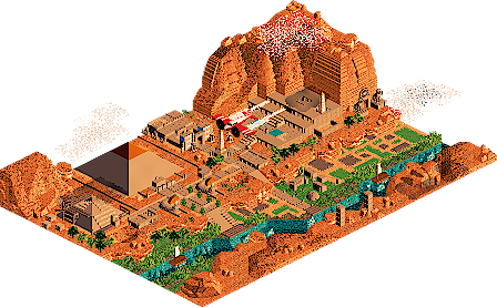
Captain, I think we have travelled in time
Babar Tapie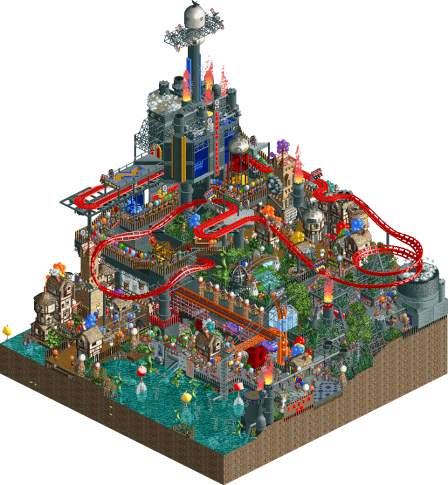
Earth Re-Inhabited
Kumba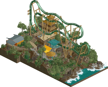
Rainseeker
Otsdarva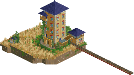
Serenity
Narc
Voting Rules
- You must view all parks in this match to vote. If you cannot view a park, for example if you don't own LL, then please do NOT vote.
- Once you have viewed all parks, select your favourite and second favourite in the above poll. The poll will close after approximately 3 days and the results will be posted.
- The winners will be determined by the formula set out in the Rules & Regulations topic. The creators of the two highest scoring entries will proceed to the next round. The third highest scoring player will be placed on the reserves list for the next round. The lowest scoring player will be eliminated.
- Everyone may vote except for those participating in this matchup. If you are part of this matchup, please null vote. Voting is public and monitored by admins, any cheating will be picked up on and dealt with.
-

 wheres_walto
Offline
Narc - very pretty, serene, I think it needed more of an action-based focal point or scenes designed to keep my attention. I want to see this expanded to a larger map
Kumba - this is about as opposite to Narc's submission as possible, it's neither pretty nor serene but there's so much to see everywhere I look. Very cool to see such a chaotic build with no custom objects
Otsdarva - this is really cool, I like the layout, I like the landscaping, I like the weather effects, I love the windy effect you tried. Good shit dude
Babar - damn this is awesome, a scaled down aerial take on the space is so fresh. It is a bit jarring to have no sound or movement but man what a cool execution
-

 MorganFan
Offline
1) Otsdarva - Very clean free spin layout, and the foliage feels nice and lush. I agree with walto and want to see this expanded!
2) Narc - serene and pleasant, I love the end-of-the-line feel here. Sharp focus and attention to detail. Super cute!
3) Babar Tapie - this is awesome! I love the forced scale building with the trim objects you used. I wish there was more movement, though I thought the scene was well rendered.
4) Kumba - I feel like I'm having an aneurysm looking at this, but there is tons to see here. The longer I look at it, the more fun I can tell you had. -

 FK+Coastermind
Offline
Babar Tapie - A brilliant play on the concept of a micro, making a micro-micro. To repurpose existing objects as miniatures is so smart and very well executed. Being entirely static I think could be a hinderance to this concept down the line, but as far as single-moment micros this held my attention for awhile and I felt really beautifully unique.
Kumba - This seems to walk the very thin line between total chaos and careful construction, and I can't say I know where the truth lies. It was definitely fun to explore the different ideas, but I'm not sure it was always clear what things were doing or intended to be. I find the aesthetic really interesting, as it has a sort of collage feel to it. In places it feels messy, like you just wanted to get something on every square, both other places there are some great ideas, so I guess I have mixed feelings. That being said, I certainly spent awhile exploring all the things you managed to cram in.
Otsdarva - Coaster-centric micros are always risky, but I think the location and the wind and rain elements definitely added. I'm not sure the wind elements were entirely successful, if only because it needed more of it to really capture that throughout. Would also have been cool to see if you could get the trees and other elements to give a bit of shake or shimmer that would convey movement. The coaster was nice, though with a standard layout I think it may have lacked wow factor. What really sells me on this is the wind and rain, but I think the execution is just a little too muted and needed more drama.
Narc - This had a lovely atmosphere as a sort of single moment, I like a lot of the texturing elements you used. That being said, it needed another dimension to really capture my attention, and while the execution wasn't bad, I got the sense that you're still getting your footing with CSO. I'd be interested to see how you could expand on what you've started here.
Babar is my clear #1, but I was torn between Kumba and Otsdarva for the second. I think Ots had a great idea but needed a bit more time to finetune, while Kumba had SO many ideas but maybe needed to hone in on a few to tell the narrative a bit better. Super close call, but I'm going with Ots for #2.
-

 Ge-Ride
Offline
I'm quite certain that my favorite was Kumba's Earth Reinhabited. It had a cool half coaster/half powered ride. And lots of details to look at. Maybe almost too many.
For second place, it's a tough one. But I'm going to have to give it to Babar's Captain I think we have travelled through time. It looks interesting and unlike any other micro, even if I was surprised for a bit that it didn't have anything moving. I put it above Rainseeker because that micro, while cool for the constant rain, had a rather typical screaming squirrel layout. You knew what was coming just by looking at it at a glance.
Narc's Serenity had good atmosphere, but didn't have the cool detail of Babar's and I guess I'm not the sort of Andrew Wyeth fan who goes for that sort of quaint atmosphere unless there's something else with it.
-

 Ethan
Offline
Babar - Super fresh concept. The colors and your scale is super unique and special to look through how you executed all the small buildings. Feels like a pop up post card or something. Great composition in this little scene. I like how the 10 unit ish high landscapes imply such an imposing presence with this scale, which is cool to see because building mountains like that in peep scale would be almost impossible even with expanded limits. Super fire flames execution.
Kumba - Super wacky and zany. This feels so free yet imprisoned. I like the myriad NCSO houses sprinkled around. It kind of reminds me of this super fun Minecraft minigame called Dwarves vs. Zombies where you would get roles and then the zombies would attack and try to infect all the dwarves and the dwarves would fortify and have this society and stuff. Also gives off old school mega park vibes. It's a little thing but I really like these hairpin turns here with the lim track. This is just so fun and crazy and it showcases some pretty cool NCSO ideas.
OTSDarva - All the little wind movement in the CTR is so brilliant and subtle and clever. I love that, it's so bold. The 4D freespin going voer the wavebreak like that is also a really clever and plausbiel idea. The path flow and the queue line is so nicely fit in that landscape. Just such great atmosphere building and the hacking.
Narc - I like how the only movement is the water fountain to the side. Really is quite tranquil, been going through all these entries with the sound on for the first time in a while and then a break of complete silence. The architecture has a unique vibe with this miniature railroad beside it. Feels like some obscure family owned hotel in the middle of nowhere with this unique exterior design and it is kind of off the road. Just makes you wonder.
-

 J K
Offline
Babar – The more I look, the more I love. I was really hoping for a bit of movement here but the concept and small touches won me over. Great job!
Kumba – Pure chaos, pure fun. The coaster was a pretty cool concept that I'd love you to expand some time!
Otsdarva – Super understated but then you fall in love with an impeccable amount of park building throughout. We wouldn't see this in a full scale due to the rainy conditions so I was super happy to see it as a micro. The swinging lights were such a nice touch! Chefs kiss.
Narc – Ballsy concept for sure, I wanted a bit more storytelling throughout the map to really bring out that core idea you had. It was really nice watching the train come into the map, agreed that was really serene!
-

 Six Frags
Offline
1) Captain, I think we have travelled in time by Babar Tapie
-Concept:+++
-Content:+/-
-Quality:+++
Overall; At first I thought my game was zoomed out, but then quickly realized you constructed this as a micro within a micro. What a great concept and don't think I've ever seen this done this way in the game to this high standard. The proportions are spot on. The colour scheme/palette also is very aesthetically pleasing to the eye, and it almost feels like looking at a Van Gogh painting. The visual eye-candy more than makes up for the lack of rides/movement (although on multiple viewings it can feel a bit dull/boring)2) Rainseeker by Otsdarva
-Concept:+/-
-Content:+
-Quality:++
Overall; Just an overall very nice and polished micro here. Like with other micros in this contest, this would get a HUGE boost with some custom music. Come on guys, it's not that hard to get some good music in now with the new .parkobj format and Gymnasiast's tools on his site. Anyway, the coaster just flows nicely on top of a well sculptured terrain. Great foliage and colour scheme. The rain theme wasn't really clear, other than some topping on the brake-run.3) Earth Re-Inhabited by Kumba
-Concept:+/-
-Content:+
-Quality:-
Overall; Even after multiple viewings I can't help but feel this is too chaotic and disjointed. I can't get my head around what you wanted to display here; I see a boiled water storage tank, a giant tech tower, a cardio testing track, salvage seekers.. All stacked on top of each other.. Usually the Kumba contest entries are clear with a fun theme/twist, but I don't really get this entry this time from you I'm afraid
4) Serenity by Narc
-Concept:-
-Content:-
-Quality:+
Overall; Nice building/tower in a lovely quaint field. But nothing more than that unfortunately. -

 Splitvision
Offline
#1 - Babar - I think the idea of minimizing is something that has occured to almost all MM players - it is in the name, after all. But then you have to execute, and that's where you have excelled. Seeing the overview, I honestly thought the admins had missed that you build on a 150x150 map instead of a 15x15 map, haha. Everything from the landscaping to the structures look great. My only complaint is that there is no movement! I feel that is risky for MM, and it made me have to think twice about giving it the first vote, but in the end I could not resist. Great entry.
#2 - Otsdarva - Love the simple theme executed so well. The fluttering canopy, the rain splashing on the rooves, the dangling lamps... very compelling. That type of coaster fits perfectly for a micro as well, good choice. If you had also gotten the foliage to sway, I would have not hesitated to give my first vote to this entry. Very, very solid.
Kumba - Well, this is some classic Kumba stuff, layered to the brim with content. This kind of stuff really impresses me, because I think this is one style which I have no idea how to build, haha. That said, it is bordering on a bit too chaotic, and the theme was not clear enough for me. Like a dystopian stratified society, Snowpiercer-style but instead arranged in a vertical structure...? Cool stuff for sure, I liked some of the clever NCSO uses like the tennis rackets for cryo-chambers!
Narc - The idea is there, but even though the field is very calming and the tower is pretty, I think the execution is somewhat lacking. When you are just going for a single thing, I think it needs a flawless presentation. I think you mentioned playing without sound, and this was a mistake here - if sound is on, you hear the 170 guests in the park ruining the serenity of it. I would have tried to keep them away from the scene, or maybe removed them altogether. Not a bad effort in the end, but more would have been required to compete for the vote.
-

 AvanineCommuter
Offline
1. Babar Tapie - brilliant concept, brilliant execution, but just missing the mark on the stillness of the scene. If you had made the plane move at snail pace, with some cloud ctr moving the other direction also very slowly, and maybe some birds flying about… some atmospheric music or flying sounds… this could have taken on a whole new life and propelled it to new heights. As it is, it is still very nicely done.
2. Kumba - Utter chaos, very Kumba. Not my favorite in terms of aesthetics, but there’s a lot of clever ideas here that are worthy of consideration. The whole narrative is funny and detailed throughout, it kept my attention for quite some time trying to find all the little things that you excel at sprinkling through your parks. Clever object usage abounds, and I think for those reasons you eeked out my 2nd place vote. If you make it through, I’d love to see more refinement from your entries!
3. Otsdarva - this was a close call for me to put you second. Aesthetically this map is much more composed than Kumba’s, and you had very nice touches of the moving lamps and windy canopy. But in the end, I felt that you didn’t take it far enough to really sell the idea of the rain / wind effect. Still a great entry and I’m sure you’ve got plenty to show for future rounds.
4. Narc - very pleasant, reminiscent of Hoobaroo’s work, definitely a good start to build upon for future growth. Remember to play with shapes to avoid blockiness, and to always consider adding some movement to your parks. -
 inthemanual
Offline
Ots! - I loved this, all the subtle motion and the cohesion of everything coming together to sell the "park in a storm" atmosphere. I think the composition could have been improved by nestling the coaster down a smidge and making it feel a bit more engrained in the environment rather than on top of it.
Narc - Peaceful scene and I enjoyed the composition, despite it being a bit too quiet.
Kumba - From the overview I thought I was going to rate this #1, as it seemed like a pretty typical Kumba park and you're generally chock full of good ideas and dense, creative parkmaking. However on this one, I had a real hard time discerning the story, connection, and intent behind all the disparate things going on. Some clarity and direction within the park would have helped a lot.
Babar - This was fun and a great small-scale sculpture, but the palette washed things out too much -

 Narc
Offline
I find it funny how radically different my micro and Kumba's are. Speaking of Kumba's, the submarine drop was really cool. I'll surely steal that.
This had a lovely atmosphere as a sort of single moment, I like a lot of the texturing elements you used. That being said, it needed another dimension to really capture my attention, and while the execution wasn't bad, I got the sense that you're still getting your footing with CSO. I'd be interested to see how you could expand on what you've started here.
It is certainly true that unrestricted CSO is somewhat uncharted territory for me. Aside from a few minor details I don't feel like it constrained my vision however, it mostly caused time trouble. I've nursed this idea of a small tower in a field of yellow grass since the last MM but never had time/motivation to build it. Now that I have it out of my system I don't think I will be visiting this exact theme again but I have a couple more "out there" ideas that I will probably try to build before MM29.
I think you mentioned playing without sound, and this was a mistake here - if sound is on, you hear the 170 guests in the park ruining the serenity of it. I would have tried to keep them away from the scene, or maybe removed them altogether. Not a bad effort in the end, but more would have been required to compete for the vote.
I fully agree, this is my main regret. I asked the admins to cheat on my behalf to address this issue but unfortunately they seem to have some kind of moral compass and a notion of fair play.
-

 Gustav Goblin
Offline
1. Otsdarva: This is an unexpected gem. The 4D coaster is a really great idea for capturing an authentic design in a micro. What makes this one my favorite though is what's going around it. Your use of movement to create a stormy atmosphere is stellar. The snow effects representing rain, the swinging lights hanging off the building near the queue, and the CTR for the canopy blowing in the wind are ingenious ways of conveying atmosphere. Really reminds me of your unused ideas in House By The Sea, in which I have a feeling the canopy CTR is carried over from the swinging lightbulb effect. Micro Madness is a great way to break in clever ideas like this, and it's a strong contender for getting you to quarterfinals. Well done!
2. Babar Tapie: Was a little underwhelmed by this at first due to the lack of movement, but this is really something special. The miniature diorama approach has been done before in Micro Madness, but I don't think it's been done through forced perspective. Your creative object usage makes the landscape look seamless and natural even from miles above. The palm trees with the 1k bushes and poles do the job really well. I love the clouds with shadows and the pyramid being built. Funny how Fisch rocks even work perfectly for a massive landscape seen from far away. Glad I took the extra time with this one because it's really grown on me.
3. Kumba: Still in H2H Classic mode? Wasn't expecting you to go NCSO even though you've mentioned dabbling with it recently. Honestly the overall composition is very chaotic to the point where it's hard for me to tell what's going on. Cutaway view to the rescue! Taking some time with this park lets the narrative set in, especially with your penchant for descriptively naming everything from trackitecture to your classic frozen staff scenes; something I've taken away from many of your parks. The use of ghost train track interspersed with LIM track in the cardio coaster gives it a unique look, and I'm a huge fan of the miniature railways with multiple engines to create steam effects. At the end of the day it's definitely very Kumba.
4. Narc: Such a vibey little scene! Reminds me a lot of that train station scenario secondrun919 made. I love the train that pops up if you spend enough time looking around and how the bridge isn't connected to anything which gives it a surreal look. Unfortunately there's just not enough content to push it above the other three, but well done nonetheless!
-

 Xtreme97
Offline
1 Kumba: I was certainly expecting a little choas with your entry but this is super packed, more than usual. I think the coaster is very well designed with the size limit in mind and being above it all helps tremendously. There are a lot of impressive details hidden in here though when you delve deeper.
2 Babar Tapie: A very slick entry, this really excels at your ability to craft a scene and having the perspective trick work as effectively as this is no small feat. The micro detailing and repourposing of objects on every square tile is superb. Unfortunately the static nature of the plot means it can hold attention for only so long.
3 Rainseeker: Super atmospheric micro, and with a nice idea to drive some of the unique effects that I loved like the shuddering canvas and the swinging lamps. The coaster is well made, and I think this may be one of the first uses of the inverted half loop on flying coaster track to achieve the properly scaled zacspin?
4 Narc: This is definitely the most laid back of these, with a very fitting name for the serene calmness of the map's atmosphere. -

 Kumba
Offline
Babar Tapie: When I first opened this, I was very surprised nothing was moving. The time slip idea was great, just I was left wanting more detail and things to click. On later views, I found it to be like a travel postcard style, which I liked. The palette is great and the micro micro building was cool.
Otsdarva: I love the hacked coaster. I have seen a few of these, but this is the best. Excellent supports too. Maybe it could have been a little better if you shoestringed it to get the 4D seats to rotate on the turnovers? Can't say I was a big fan of the overall (brown, lol) atmosphere, tho the rainfall effects were great details. Loved the swinging lights.
Narc: I really enjoyed everything you had on the map, just it was not very much. I like the train use and how it extended the map.
So my entry... It takes quite a few great micros to win a contest like this. I don't like to use my best ideas too early. I decided to gamble here and try NCSO with everything RCT2Open allowed. I really had no direction and didn't plan on paper. I figured I could wing it. I was actually serious when I said my goal was to do something named for a letter I have never used as a park title before. E was one of 4 of my unused letters (Liam has 3. In a very sad Discord DM, we counted each of ours, lol). I went with Earth since it's that nice globe we all currently live on. At first I was going for a steampunk look, but then I decided that I really liked the cottages with balloons sticking out. I ran with that and then reasoned that all guests need balloons and then that the balloons need a purpose, so they carry oxygen... idk, yeah stuff like that. Made the late switch to a survival type theme... I think?
Lesson here: Plan on paper before you build! Seems I am not that good after all and can't just wing a winning entry these days (but thanks to the few people who think/voted otherwise!). Also, you guys^ writing feedback... The community has come a long way and I am impressed how skilled people are getting at viewing and reviewing parks. It's great to see and a big reason why RCT work is getting to insane levels of creativity.
Great work Group! I wish you the best going forward!
-
 Babar Tapie
Offline
Kumba : I really liked your park, it's lively and full of great ideas as always (special mention for the cryogenic sleep chambers). NCSO is not an easy style and open to everyone, and I think it's great to take a risk. I'm glad I fell into your pool, many of your parks have inspired me and still do. I still find this creativity and sense of detail in your park today!
Ostdarva : I really like the landscape work and the small details, especially the ocean crashing on the rocks, maybe the buildings lack a bit of detail but the whole is very nice!
Narc : Like Ostdarva, the landscape work is really nice, the tower is a bit too impressive but there is a certain atmosphere in the park, congratulations!
-

 bmschulz
Offline
Babar Tapie: Now THIS is micro! Absolutley excellent use of the smallest scenery pieces to make what looks like a huge scene. It feels like I'm looking at a full map, just zoomed out. I've not quite seen this level of scale manipulation before, but it's so, so well done! The little monuments and temples are great. It does suffer from a complete lack of motion (I literally thought the game was paused when I opened the file), but, of course, rides and peeps are much bigger than the scale you were working with. Maybe having one of the mountains be a volcano with some animated smoke scenery would've added a bit of energy -- but that's an irrelevant nitpick to a great scene.Kumba: This feels like stimulation dialed up to 11. It really does feel like a little world unto itself, with the sewers, a sort of "market street" with the stalls, and a very cool ride concept. It's sort of a mishmash of everything all at once, but it works given the fantasy vibe of the whole scene. Definitely tons to look at!Otsdarva: I LOVE this!! To my knowledge, nobody has created a freespin in-game before, and you absolutely knocked it out of the park! Between the layout, the simulated flipping, the AMAZING supports -- I mean, this thing looks exactly like Tumbili. It's so realistic; it's ridiculous how well you pulled this off. Add in some lovely foliage, a wonderful shoreline, and some nice buildings, and this scene is a total winner for me. Really, really well done all around. I like this better than the real 4D Freespin at my home park! Haha.Narc: Simple and atmospheric, but a bit lacking in intrigue. It's nice when the train pulls in, but otherwise, there's not a ton to really hold the viewer's attention. However, this is a place I would love IRL. You do capture the titular serenity, and the archy that is in the scene is well done. I'd love to kick back and have a glass of lemonade or something if this were real.
 -
 RCT2day
Offline
I'm really torn on these, but this is what I came up with:
1.) Earth Re-Inhabited (Kumba) - you know I always love a good NCSO entry. Opening this park was an assault on the senses, but digging into it really made me see the genius of some of your creative tricks and design choices. I don't know where I stand on an overall MM scale, but it's good enough for me to be the best in this group because of how much was packed in there. Always good seeing new Kumba work, too! Nice job.
2.) Rainseeker (Otsdarva) - I was hoping we'd see something like this in MM! Layout is just about as good as you're gonna get with a S&S Free-Fly, although the track type may not be perfect. This feels like a snippet out of a real park, which I love seeing in MM as well. The architecture was just alright, but the landscaping was superb. This nearly beat Kumba's for me, but I think his just had more going on. And what made this better than Babar's was that dynamic feel to it. Nice job, this was a great surprise!
3.) Captain, I think... (Babar Tapie) - haha ok this made me laugh, just from the creativity alone! I don't think we've seen something like this before. It's pretty wild and cool. Part of me wishes there was movement, but I also understand that we really wouldn't see movement from so high up. To say "I like the little details" would have double-meaning here. It was cool seeing statues and building built at such a tiny scale. Overall, it's a good idea that has been executed brilliantly, but I don't think it's enough of a good enough idea to move on for me.
4.) Serenity (Narc) - The name is a perfect fit: opening this felt like stepping outside into a beautiful day. I do wish that there was more than just a train to keep the scene from being static. The little fire next to that tiny building helps, but it's just not enough to keep me intrigued for longer than a minute or two. Foliage is great as well. Nice job here
-

 Cocoa
Offline
this was also an incredibly tough vote, with really a hair between them.
1. babar---i kept coming back to this one the most in my head, so congrats, you get the vote. just so well done, i genuinely thought at first that you had built a big park and then shrunk it done as new cso.
2. rainseeker---i wasn't sold at first until i noticed all the tiny details, like the rain on the canvas awnings or the swinging lights. awesome details.
kumba---so so close. so so kumba. this has a warmth and nostalgia and fun-ness that is hard to describe. LLMM indeed. the submarines dropping off the crane is an amazing idea, a whole micro centered around that concept would have killed.
narc---serenity indeed. love the garden with the winding steps and the little shack
-

 Ling
Offline
"Recycled Meat Sticks" 10/10
I think this was actually one of the less interesting parks of the group despite the technical complexity. But, NCSO is a tough choice in MM and Cardio Testing is a unique little layout. The lack of planning shows I think, but I know you can impress in later rounds.
Captain, I think, if my counting is correct, vastly underutilized the available map space. There is only so much you can do when committing to a scale like this, which is commendable, but I think it's missing something to push it over the edge.
Serenity is normally the kind of thing I'd be all over. Quiet, pretty, landscape and foliage focused... but ultimately it is really mostly a tower, and the foliage isn't super interesting. Some of the greens are too green.
Rainseeker is a wonderful little micro. I don't have anything bad to say about it. It's the best showcase of what a micro should be in this group, IMO. The rain effect is neat and the layout is solid.
 Tags
Tags
- No Tags