Micro Madness 2023 / MM4 R1 Group A
-
 15-January 23
-

 posix
Offline
Document 
Defending champion Cocoa kickstarts his run. But is he really that far ahead?
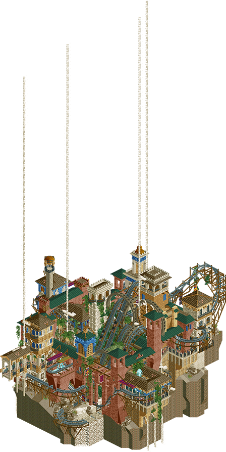
The Sand-Powered Sand Carts of Sand Ksar
Cocoa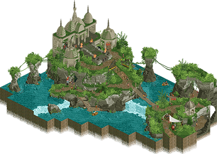
The Heist of Shri Jagath
Jens J.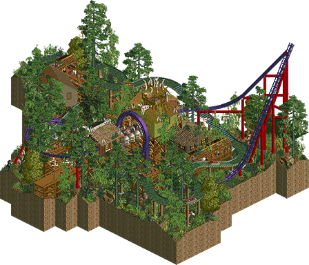
Voodoo Bayou
Sulakke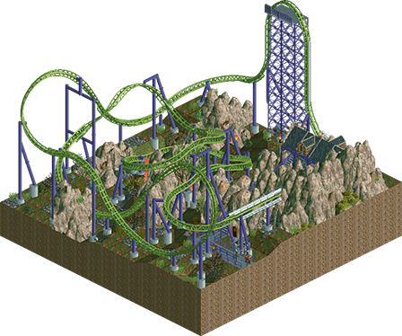
Goblin
mitchellpaul
Voting Rules
- You must view all parks in this match to vote. If you cannot view a park, for example if you don't own LL, then please do NOT vote.
- Once you have viewed all parks, select your favourite and second favourite in the above poll. The poll will close after approximately 3 days and the results will be posted.
- The winners will be determined by the formula set out in the Rules & Regulations topic. The creators of the two highest scoring entries will proceed to the next round. The third highest scoring player will be placed on the reserves list for the next round. The lowest scoring player will be eliminated.
- Everyone may vote except for those participating in this matchup. If you are part of this matchup, please null vote. Voting is public and monitored by admins, any cheating will be picked up on and dealt with.
-

 wheres_walto
Offline
Great start! Cocoa was the clear winner for me, really cool concept well-executed with lots of movement. It was a really close call between Sulakke and Jens J, I thought Jens entry was a bit more innovative and kept me interested for longer. Good showing too by mitchellpaul!
-

 ottersalad
Offline
Really enjoyed Sand and Bayou. Sulakke's entry was very pleasant, and I enjoyed the interaction between everything. Sand coaster was neat, and what I've come to expect from Cocoa in MM. Very chaotic.
Jens, your micro was pretty neat. I'm assuming the treasure is booby trapped with a punji pit? I think overall it could've used more movement. Great atmosphere though. Barely edged out by Sulakke.
Great showing mitchellpaul. Great layout. Just lacked the archy and some of the excellent terrain work that the other entries had.
-

 Narc
Offline
For me it's The Heist of Shri Jagath. Beautiful to look at, with a nice story and full of fun little details to explore.
"Wait, this isn't a nude beach".
-

 Xtreme97
Offline
1 Cocoa: Damn, what a way to kick off! Absolutely packed but still expertly composed, and so full of life. The theming is gorgeous, vibrant colours and textures throughout. Adore the flat awnings too as a motif.
2 Jens J: Knew you wouldn't disappoint. The rockwork here continues the style you've carved out with your recent screen and it's far and away some of the most organic work that's been done. Great little story taking place as you look deeper too, which adds that spark that a good micro needs to stay interesting.
3 Sulakke: Solid work, super atmospheric. Love the bone detailing, and that RS wooden wall is a great obscure texture choice that fits perfectly. This one just got edged out by Jens for me but it's a very cozy entry nonetheless.
4 mitchellpaul: Great to see a new face join the competition. The coaster here was really nice, solid layout and support work. The rocks are a bit haphazard and it's thin on the ground in terms of foliage but it's a good park to debut with. -

 Fisch
Offline
These all have real natural beauty!! Love the use of foliage and landscaping throughout them. The coaster in Voodoo is a beauty with great colors and a wonderful setting, Cocoa's is a great maximalist entry with interesting shapes and a classic Cocoa architectural composition, The Heist of Shri Jagath has souch incredible landscaping landscaping with wonderful colors, textures, shapes and cool details surrounding it, and Goblin has a sick layout that makes great use of the new track pieces.
-

 RWE
Offline
Cocoa: The reigning champion shows that hes here to defend this title. Nice theming, cool gimmick with the sand, enjoyable coaster. What do you want more?
Jens J: Nice diorama with well done landscaping and architecture. Looks quite basic at first but much to see when you go in further
Sulakke: Pretty cool micro. Good composition and a nice ride with good interaction. I also really enjoyed the bone stuff.
mitchellpaul: Solid showing from a rather new face. Showing some good sense of ride design. Looking forward to see what youll do in the future.
-

 Ge-Ride
Offline
I have a slightly different opinion from the majority here. I thought that Cocoa was the clear winner. Great work on the ride, the guests, and the surrounding scenery. But I liked mitchellpaul's coaster well enough that it gets my second place vote because despite cool atmosphere, the others lacked the good coaster element for me. For third place, I'm going with Voodoo Bayou though it's VERY close for me. It has a coaster interacting with a log flume. The row boats on Shri Jagath were interesting, but not quite as much. All being said, I liked them all and I wish I didn't have to pick favorites.
-

 AJ-
Offline
Cocoa- This is so freakin wild. I love the music, this is the most fitting music for any park this batch! It fits the craziness of the layout. This is what I wanted man! Great!!!
Jens J- This is so you in the best way, it reminds me of your old old rmc entry! The colors and shading of the rocks, temples, and trees is so great! The level of detail is incredible, love all the named peeps.
Sulakke- This is so fun! I love how the two layouts fit in. Its a great stingray! The log flume looks like so much fun, i always love a swamp theme. Fetish priest is so great
Mitchellpaul- this is a good layout for such a small space! Love the use of music too
-

 Camcorder22
Offline
1. Cocoa: Love/hate how you so gracefully flesh out a pretty simple but unique idea to its fullest potential. The coaster idea of "RMC that also does wild mouse stuff" is a great one too. A bit hard to follow but I can hardly fault it because there's so much cool shit to see. You fit 3000 feet of track into this map without it looking like a disaster? Come on lol. The queue flythrough and sand splash are my favorite moments. Also love that the music feels like it could be an RCT track.
2. Jens J: At first glance felt a bit light on movement/content, but the story was really well done and easy to understand. Landscaping was too good to overlook too, excellent rockwork.
3. Sulakke: Pretty close one for 2nd, feels like a Sulakke park, very pleasant and well composed with lots of little nooks. Love a micro with some good interaction between rides.
4. mitchellpaul: Not bad at all for a first park! Really solid layout/supports/station. Landscaping could use some practice to look a little less random and more interesting, but really respectable nonetheless, hope to see more from you. -

 J K
Offline
I voted for Cocoa for the win and Jens as a very close 2nd. It seems like Cocoa has done this before right...
1. Cocoa: It was a beautiful concept, love the sands of time vibe falling through the design. Excellent showcase of a coaster with a real intense element and beautiful supporting throughout. The colours I've come to expect from you, your releases are always packed with a vast complimentary palette, that always create interest. I really enjoyed this, you should be super proud.
2. Jens J: BEAUTIFUL landscaping. You always set the bar when it comes to your landscaping... were you a rock in a previous life? An easy second place for me, great world-building that I know I'll be back to again and again.
---
3. Mitchellpaul: Your coaster really held my attention, great to see your entry. I'd love to see this idea expanded to a section of a park or a potential design in the future, the rocks, colours of the coaster and architecture looked super interesting.
4. Sulakke: The coaster looked great from all angles but a bit expected compared to the other coasters this round. I was hoping for some more treatment to the rides such as custom supports on the log flume. I felt the foliage was a bit messy, and blocking a lot of the cool content you'd built.
-

 barnNID
Offline
1. Coaco- Really great stuff. I love the concept and detail you managed to achieve here. Some really cool uses of the flat rides also. That layout is just absolutely insane also. Very cool stuff.
2. Jens J.- I'm a sucker for good landscaping and holy shit there is some incredible landscaping in this entry. Sinking the large rocks into the ground to get that slab look is such a clever idea and looks great. The atmosphere and pallet are also fantastic. You probably could have done more with the water, maybe a custom boat instead of that tiny one. Overall, great stuff.
Sulakke- Really sweet entry, I am a huge fan of the jungle vibe with the bones everywhere. It is a super immersive atmosphere which is great. I also really like the colors here, the purple and red pop in such a nice way. Its also pretty wild that you managed to fit in 2 separate rides into this thing. really cool stuff.
Mitchellpaul- I like the layout here, although I think adding some peeps in there would add some much needed movement.
Jens J.- I'm a sucker for good landscaping and holy shit there is some incredible landscaping in this entry. Sinking the large rocks into the ground to get that slab look is such a clever idea and looks great. The atmosphere and pallet are also fantastic. You probably could have done more with the water, maybe a custom boat instead of that tiny one. Overall, great stuff.
-
 RCT2day
Offline
1.) Sand-Powered Sand Carts of Sand (Cocoa) - creative, dynamic, captivating at every layer, basically a textbook micro that has it all. Its just classic Cocoa and I love it.
2.) The Heist of Shri Jagath (Jens) - I really want to love this, especially because the beautiful foliage and rockwork looks amazing everywhere, there's a narrative that drives everything (everyone should read the employee names), and the technical side is really really well done. But, the temple is...kinda underwhelming: I would've expected a larger temple to house a treasure. Even with waterfalls and people, the park as a whole is kinda static. And while it has other angles to view from, it is clearly meant to be viewed from the opening angle. Overall, while I think there are some faults, I think it deserves 2nd, but just barely over...
3.) Voodoo Bayou (sulakke) - love the bayou theme, I think it really comes through well. The coaster colors really bring out the main feature and offer a good contrast against an otherwise sea of green and brown. I love the things (bones?) hanging from the trees. No real complaints, it's a solid micro that would've done well in other groups! I just think the best parts of Jens far surpass this one's
4.) Goblin (mitchellpaul) - am I correct in assuming that you ran out of time for this? Layout is actually very solid, but the surroundings are lackluster.
-

 Splitvision
Offline
#1 - Cocoa - Quintessential Cocoa stuff, layered to the brim with themeing, tracks and landscaping. A fun idea executed perfectly. Custom music added a little spice to the already well-composed dish.
#2 - Jens - The best landscaping of all R1 entries released so far. As J K said in the Discord chat, it's achingly beautiful. Otherwise quite an understated piece, perhaps lacking in just some additional interesting element. The archy is very pretty, but maybe could have used a pop of color, though I don't know if this is modeled after a real-life structure in which case the muted colors might be warranted. Great entry!
Sulakke - Nice dense jungle/swamp vibe, in a more classic RCT package. I think if the coaster was more unique I'd consider this for my #2 pick, but it ended up just missing that factor for me.
mitchellpaul - Not a bad attempt, and with more themeing the coaster could have been quite interesting, but with the plain and underdeveloped setting it ends up being not quite up to standard to actually be a contender in this group.
-

 Thethrillman
Offline
This was a very hard contest for 2nd place IMO but 1st place belongs to the king
-

 Thethrillman
Offline
Also I didn't like how Cocoa's park was glitching so much IMO, a little too stacked but still really good.
-

 AvanineCommuter
Offline
1. Cocoa's is exactly what I expect from the reigning champion: beautiful architecture, kooky and brilliant concept, chaotic energy, and innovative ride design. Probably the longest I spent looking at the first division parks so far, the ride itself kept my attention for so long, and every angle is beautiful to look at. The music really set a frenetic tone that works so well with the overall micro.
2. Sulakke - Loved the density and atmosphere, it really feels alive and the concept is sold really nicely.
3. Jens J - Lovely landscaping, probably the best out there. However it felt a bit static and I wished there were more to see.
4. Mitchellpaul - the coaster didn't work for me, it wouldn't leave the station. I did like the first two elements though, very nice flow there.
-

 mitchellpaul
Offline
4. Mitchellpaul - the coaster didn't work for me, it wouldn't leave the station. I did like the first two elements though, very nice flow there.
It's paused when you first open it, not sure if that's why.
Thanks for all the criticism so far. Hoping to improve from here on out!
-

 MorganFan
Offline
1) Cocoa - fully engrossing and impressive layering of levels, and very eye catching. Love the music!
2) Jens - the longer I look at this, the more I enjoy it! You have set a really powerful scene here.3) Sulakke - I love the vibe here, and the foliage is excellent. The archy as a collection of ideas works but I wish there was more.
4) mitchellpaul - this coaster is great and the supports are well done! I'm not a fan of the rocks, and I think a bit more archy would help greatly.
 Tags
Tags
- No Tags
