Micro Madness 2023 / MM4 R1 Group O
-
 15-January 23
-

 Liampie
Offline
Document 
Pablo Picasso relives his blue period, as he competes with three blue launched coasters for victory in Group O.
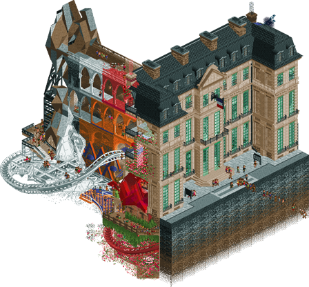
Picasso Sour
FK+Coastermind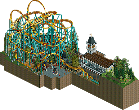
Poltergeist
Maverix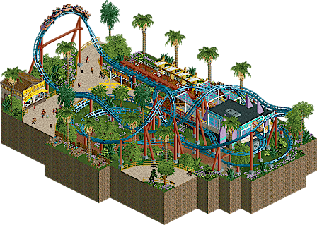
Kaboom!
Faas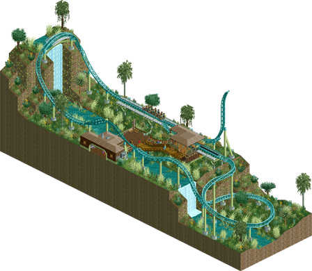
Verdant Strait
bmschulz
Voting Rules
- You must view all parks in this match to vote. If you cannot view a park, for example if you don't own LL, then please do NOT vote.
- Once you have viewed all parks, select your favourite and second favourite in the above poll. The poll will close after approximately 3 days and the results will be posted.
- The winners will be determined by the formula set out in the Rules & Regulations topic. The creators of the two highest scoring entries will proceed to the next round. The third highest scoring player will be placed on the reserves list for the next round. The lowest scoring player will be eliminated.
- Everyone may vote except for those participating in this matchup. If you are part of this matchup, please null vote. Voting is public and monitored by admins, any cheating will be picked up on and dealt with.
-

 wheres_walto
Offline
Maverix - this is great! It's very you, I'll never comprehend how anyone is capable of building a spaghetti coaster, much less supporting it at a high level
Faas - Ha! I love that you went this direction, I was also considering a classic remaster, I've often wondered how older parks would look with modern amenities. Very cool, only nitpick is that I wish you used Intamin track
FK - wow... everything I see is insanely high quality, how you've managed to portray Picasso's work in rct is just stunning
bmschulz - nice submission, just a bit simplistic all around. You've come up against 3 highly skilled, experienced members in your group unfortunately
-

 bmschulz
Offline
I couldn't be more excited to lose to these three amazing submissions
 Of course, I won't be voting, but I do want to offer my compliments to my groupmates.
Maverix: I've seen Premier spaghetti bowl recreations made WITHOUT space restrictions, yet yours comes out on top! Absolutely fantastic recreation of the layout, especially utilizing the new LIM track pieces. The mess of supports is true-to-life as well. Overall, a near-perfect (given RCT2 constraints) recreation of an interesting IRL layout.
Faas: I've loved your other micros -- Thin Air is one of my favorite overall builds -- and this is no exception. It sounds like this is a modernized version of a previous build, judging from Walto's comment? Not sure, but this scene is great. The layout is an absolute BANGER -- it really doesn't look like you were constrained by space at all. It's complete, varied, and has great moments like the zero-G roll through the loop. I think the scale works as well -- it almost reminds me of Formula at Energylandia given its size and length. Add in wonderful details like the picnic benches, great curved pathing, and a nice queue area, and the scene adds up to more than the sum of its parts. This would be my #1 pick if I were able to vote!
FK: This is so dense and creative that I'm not even sure where to begin. Truly an example of how modern builders use this 20 year old game to execute genuinely creative artistic ideas. These sorts of 'abstract' builds aren't quite my thing (I'm ultimately a sucker for a good coaster), but the detail, expression, and execution speak for themselves. A stunning piece for sure.
-

 Ge-Ride
Offline
Okay. I couldn't decide yesterday who to vote for but I've looked at them again and made my decisions.
First place I give to Picasso Sour by FK+Coastermind. It was artistic which gives it a certain amount of character. But the thing that settled it between this and Poltergeist is the double coaster with a top synchronized with a bottom part. This was a great idea and sealed the vote for me.
Poltergeist is just a quality coaster, realistic or not. It was realistic, but still fun for some reason. And slightly less predictable than a Screaming Squirrel which is my main criticism against Rainseeker.
I give my third place to Kaboom! which was just fun and well themed even if it's not too out of the ordinary. I gave my third place to this one over Verdant Strait because it had better theming, even if both coasters were similar.
Verdant Strait had a good coaster, but its surroundings were a little bit plain for me. I liked it but I have to give it fourth for that reason.
Good work by all and now I have to figure out who to vote for in Group H.
-

 Gustav Goblin
Offline
1. FK: It's been a bit. I'm not sure if it's just because you haven't posted much recently. Not sure if it was because of the middling H2H performance. But over the last year or two I completely forgot that FK YOU ARE LITERALLY THE BEST PARKMAKER ALIVE HOLY SHISENDGTISEJGUSEG nice micro dude. This is staggeringly artsy and encapsulates everything I love about both your work and micros as a whole. You manage to seamlessly and effortlessly recreate Picasso's work with such confidence and swagger. The single view abstract portraits are absolutely astounding and I love how Walto's signage wizardry is carrying over to the rest of NE. The blue section is another highlight with all the named staff. Your use of texture, crunch, and seamless fading is beyond reproach in literally any setting, Picasso worship included. The hanging foliage really adds to the vibes too. Even if Eras and Perspectives are pretty short, to make them any longer would be to intrude on extra space they don't need to be in. They work flawlessly in their brevity. Also the over/under dueler idea is sick as hell and I always love seeing it pop up. What I think may be my favorite part about all this though is how you manage to give it a grounded context. You go into that art museum and just feel everything. Bravo FK, win this thing!
Also out of everything I expected to be nicked from my micro, the shwoopy elevator was the last thing on that list.
2. Maverix: Wasn't sure how you'd do with your more grounded style but the spaghetti bowl was a smart choice for a realistic micro. Reminds me of when Dimi pulled one off in Micro Madness 2014. It's awesome seeing the new LIM pieces coming into play as well. I planned to try one out with the new pieces late last year but it fell through. With a slew of realistic launched coasters in this round, what propels yours beyond the rest is the composition. No space feels wasted here. The theming also really sticks out with the amazing entrance sign and station complete with cutaway. It gets everything it needs to across without an ounce of fluff. You've made me a fan!
3. Faas: Wonderful little layout. Is this based on Disneylhand's by any chance or is it just a coincidence? Like Poltergeist, this layout does so much with the space it's given without feeling cramped or awkward. Loving the zero-G roll through the loop and the nested curves. Just doesn't have as much going for it as Poltergeist IMO.
4. bmschulz: This is awkward. I can't get the #X7MEGA train to load properly. With that said, I did see this micro in a buddy's Discord stream. It's a real gem with some great landscaping, almost like an elevated version of what you've been posting in the subreddit. The triple launch is really nice but it takes the second half of the layout way too fast. Surroundings are a good start but could definitely refined as you continue building, which I hope you do!
-

 MorganFan
Offline
1) FK+Coastermind - Clearly you have some extradimensional understanding of this game that the rest of us don't. How do I even describe how cool it is to see this level of art in rct? Everything is perfect.
2) Faas - Strong, cohesive rct, well planned and well executed. Feels fresh even though it also feels familiar. Either way I like it.
3) Maverix - I was extremely close to picking this 2nd, but I had a blast with this one. The coaster layout and supports alone are commendable, but you managed to bring life and character to a favorite theme of mine.
4) bmschulz - This is a nice entry, the coaster is good and the vibe is nice, but the architecture felt a bit minimal and the foliage a bit chaotic. Altogether it looks nice though. -

 Cocoa
Offline
1. fk---awesome stuff. I love the main museum building and the central corridors, and of course the picasso works around it are very impressive (i'll admit, i spent a while trying to figure out where that face actually was built on the map lol). i'm not a huge picasso guy but an awesome little scene here.
2. mav---close between two similar entries from mav and faas but this one edged it out with slightly more interesting surroundings. genius work on that sign btw
faas---close call with a very cute little kanonen. great tropical atmosphere here, very clean and modern
bmschulz---nice coaster for sure, I like how you've built it around a long waterfall
-

 Xtreme97
Offline
1 FK: Jesus, this is incredible. You really know how to take a concept and take it all the way. The concept is so great and exploring the different sides/periods of the map is a brilliant experience, always rotating and finding something new in there. The way you managed to represent his works in RCT is so well done on top of that - especially the 1930s works which are spectacular. The ghost of Carles Casagemas in the top room is another brilliant detail, same with the double-sided flag. Also gotta commend the instant use of AVL's glass pieces which you've clearly taken to quickly.
2 Maverix: I don't know how you have the patience for those supports lol. Awesome micro, with a focus almost purely on the coaster. Could definitely see it fitting into a park of yours, and I really liked the curved sign at the start of the queue.
3 Faas: Cool entry, feels somewhat in the vein of your recent design but with a warmer theme. The coaster is great, compact but well designed and with some good interaction. Also loved the queue and station design utilising the curved steel roofs and half-transparent awnings.
4 bmschulz: Happy to see you join the contest! I enjoyed your entry, nice coaster layout with a cool atmosphere. Could perhaps have done with some denser trees to sell the lush foliage some more. Great placement of the top hat over the waterfall too, shows you have some good instincts about ride and setpiece composition. -

 RobDedede
Offline
FK - Right up my alley. This park is an excellent mix of ride design, ride hacking, artistic expression, composition, and color. In fact, the colors in this map may be my favorite part. The way you used textures to bring out the character of this map is amazing!
Maverix - The support work alone is amazing. Seriously impressive, and something I would not have the patience to do. You also made really nice use of the new elements for the coaster.
Faas - This was also really enjoyable for me. A close third behind Mav. I really appreciate the composition of this map, and my favorite part is probably the coaster station.
bmschulz - Quite nice to see another newcomer. I know what it's like to be one! The coaster is nice if a bit fast, the the landscaping shows promise.
-
 inthemanual
Offline
FK: Great use of space AND intrigue. each rotation brought something deeper to the park and it was excellent how that was set up. One of the few parks I've wanted to keep turning and exploring deeper without feeling forced to.
Faas: Loved the composition of this, and it was fun to watch!
Maverix: Warlock done better. Solid work, although I believe you cheated some supports as well
shulz: Fun coaster in a quaint setting, reminds me somwhat of my finals entry last go-round. -

 Lurker
Offline
FK: Love how the artwork is built into this, some amazing work with trim pieces. And with all the different eras represented there's so much to explore in this map.
Maverix: I can't imagine how tedious and frustrating that support work was, it looks spot on to the real thing, amazing to see such a good Premier spaghetti bowl recreation in a micro.
Faas: Nice layout, and I really like the station. The whole entry is very pleasant and well composed.
bmschulz: Nice interaction with the landscape on the coaster, especially the tophat over the falls. -

 Babar Tapie
Offline
1. FK : Man, this is amazing, clever and totally innovative. A huge woah for the sculptures, the theme is so well mastered, I don't know what else to say, a big thanks for this park !
2. Faas : I like the general atmosphere of this park, it's simple but everything is well organised and in its place, a certain harmony emerges from the whole
3. Maverix : The coaster is really cool I thought it was funny and audacious!
4. Bmschulz : As always, the last places are unfair and your park was really nice, I really liked the use of the horizon, the space and the height with those different waterfalls
-

 WhosLeon
Offline
FK: simply wonderful. this feels like a mix and match of the two styles you've explored in your career with the impeccably detailed realism and expressionism coming together in a way where both are elevated to another level by each other. cant wait to see what you do next!
Maverix: Impressive technical details and layout as come to expect from you. As mentioned, the coaster entrance sign is great and all the details in and around the coaster really make for a believable and immersive environment.
Faas: You have been making leaps in your parkmaking lately, while retaining the fun factor that made your work appealing in the past. I really enjoyed the layout of the coaster and the uplifting lighthearted atmosphere of this micro.
Bmschulz: this is a lovely entry, as well. I like the use of elevation that is used to make the coaster layout interact with the environment! I think i would've liked to see more stylistic direction with the architecture especially, but im curious to see how your work will develop as this micro shows a lot of promise.
It was hard to decide between Mav and Faas, but in the end I went for Mav, mostly because of how impressive the coaster and it's details were. I don't think we have many members that can execute a ride like this at this level of cleanliness and realism. -

 barnNID
Offline
1. FK- Well this is wild. Such a well executed concept. It's crazy how well you blended the fantasy elements with the realism elements in this. Really really incredible stuff.
2. Maverix- Damn this is a cool entry. It's cool to see one of these coasters built with the new track pieces. The support work looks extremely tedious and I like that you did the station cutaway so we could see the inside. Very cool entry. Oh, the signage was also awesome.
Faas- Cool entry with a really some nice signage and a great atmosphere. The coaster layout is also good and I love the color choices. I think the foliage is a weak spot for me on this one but overall I really enjoyed the park:)
Bmschultz- Cool layout! I like the atmosphere you created with this entry as well. I do wish there was a bit more architecture here, the station especially looks a bit too small. Overall, very enjoyable.
-
 Six Frags
Offline
1) Picasso Sour by FK+Coastermind
-Concept:+++
-Content:++
-Quality:+++
Overall; Very artsy, very Picasso, very creative. Love how you did the eras/perspective coaster, gave it a very unique look and fitting to Picasso's style and theme. The cubism at the back is also well done, with the lift transporting peeps to the lower areas displaying the Weeping Woman and Girl Before a Mirror (so well sculptured!).. The different periods are also well thought out and executed (with the club of people he painted in the blue bit like 'the old guitarist' for example). My favourite bit has to be Brick Factory at Tortosa (L'Usine, Horta de Ebro), just amazing how you created all those shades to create this painting like building. In fact, the whole shading and gradienting (is that a word?) to create these nice aesthetically pleasing transitions is immaculately done and just creates this visual porn. The front facade is amazing as well, great use of deco pieces and colours. Only thing missing was some (custom) music.2) Poltergeist by Maverix
-Concept:+/-
-Content:+
-Quality:++
Overall; A very nice recreation. I can't imagine how much time and frustration the supporting job must've been. Overall it looks very nice and the whole is just a more complete package with the music than Faas' entry was. Really close between you 2 though.3) Kaboom! by Faas
-Concept:+/-
-Content:+
-Quality:++
Overall; Very fun and vibrant atmosphere you've created here, especially love the pathing job and how it interacts with the coaster. Lovely colour scheme/palette as well. Just wish there was some custom music or more interesting architecture (at the station building for example).4) Verdant Strait by bmschulz
-Concept:+/-
-Content:+/-
-Quality:+/-
Overall; Fun layout, but wish there was more content to spend time on. Now once you've seen the layout you've kinda seen it all. Nice height variations and landscaping though, just wish the sides of the raised land were a bit more polished, and not just some vine walls on them and be done with it. Nice way to introduce yourself to the community though, it's not bad at all
-
 RCT2day
Offline
1.) Picasso Sour (FK) - More arguments for "RCT is an art form." Seeing a museum come to life with art pieces is such a good idea. The façade is gorgeous, but then we get your usual creative, freestyle approach on the inside and it fits beautifully. I really like the splatters of paint beneath the coaster and the organization of the entire park. Excellent job, looking forward to more of your usual amazing micros!
2.) Poltergeist (Maverix) - Love seeing a good Premier launch in any park, and this is no exception. I've always loved the look of Poltergeist in SFFT. The real star seems to be the support work: it's expertly done and really captures that spaghetti bowl feel of these coasters. Station has some good theming to fit, just like the inspiration. And its refreshing to see a realistic entry, instead of the usually fantastical entries in MM. The back area above the brake run seems like just an attempt to get some green in there, but its otherwise an excellent micro. Really loved it.
3.) Kaboom! (Faas) - I love see something inspired by Kanonen! The layout is excellent. It provides some great interaction. And I appreciate seeing a realistic snippet right out of a park. The problem is, everything that you did well, Maverix did better. Nevertheless, it's always great seeing new work from you! I've always loved your style.
4.) Verdant Strait (bmschulz) - definitely a very nice little park and introduction to the community! I like the layout a lot. It's fun seeing new coaster influences like Ice Breaker reflected in the RCT world. You have a great eye for coaster and landscape interaction, namely in how the waterfalls frame the big drops on this coaster. I think this falls into a similar story as Faas's entry: everything you did good, Maverix did it better. Nonetheless, a great little fun entry that I enjoyed seeing!
-

 Liampie
Offline
FK+Coastermind: okay what the fuck, the cubist architecture and the picasso sculptures are so fucking good. And even where you’re not doing something cubist or otherwise artsy, it’s still top tier stuff. Your archy and theming is just unparalleled. I don’t know what to say, I’m blown away.
Maverix: this took me 30 minutes to open because of an OpenRCT bug. Was it worth it? No. But that would be the answer for almost any micro. 30 minutes is a lot. That’s like 0.005% of a year, I think. If I did that for all micros, it would be 0.3% - a bit more palpable. Anyway, let’s talk RCT. This thing is complicated, though not half as complicated as trying to get OpenRCT to work. Spaghetti bowls are always great to look at in their ugliness, and this is certainly one of the best we’ve seen. Pretty cool that the queue goes underneath, with the corkscrew and nicely done gate welcoming the peeps into the spaghetti bowl. Station is serviceable, interior is better than the exterior which is mostly blank walls, roofs and airco units.
Faas: great layout and colours. I think you’ve stepped up your game when you started doing more modern styles of architecture. Would like to see you do a full park in this modern style, with curvy paths and stuff. It suits you surprisingly well. Is this micro inspired by the disneylhand almost-design?
bmschulz: nice coaster, would be a blast to ride in real life. Foliage is a bit drab, hardly verdant. The station is a bit bland as well. I think you could’ve done more with this. Definitely a nice debut though! I see an inclination to be detailed in your work. Diamond in the rough? -

 AvanineCommuter
Offline
FK: What a great start to the contest with a park that perfectly encapsulates your work: not only can you do stellar realism as evidenced by the facade of the museum, but you also are a master at creative sculptures and have done Picasso justice within RCT. Such ingenious translation of his works. On top of that, you've hacked a creative top-and-bottom coaster to top off your brilliant concept. If this is just your round 1, I'm betting on you to win this whole shebang!
Faas: Love the layout and love the compactness of it all without sacrificing finesse. I think this would fit perfectly within a larger park similar to ITM's entry, great work.
Maverix: The coaster is practically perfect, those supports are super super impressive. I wish you had that same level of care when it came to the station and surroundings though, which is why I ultimately gave Faas my second vote, but seriously impressive stuff. Hoping for your next rounds you step up the detail with the archy and landscaping.
bmschulz: great hack there! I do like the setting you've made with the water and jungly plants, a nice first entry!
-

 Turtle
Offline
Loved Picasso, what a great translation, very obvious what you're looking at while still being completely all over the place. Very well done, deserved first place.
-

 Liampie
Offline
Document 
Match
ConclusionThe poll is now closed. The formula to derive the results is:
1st choice votes + ½ × 2nd choice votesPlayer Calculation Score Outcome FK+Coastermind54 + ½ × 2=55 (60%)Quarterfinal 5 Maverix3 + ½ × 29=17.5 (19%)Quarterfinal 6 Faas1 + ½ × 25=13.5 (15%)Replacement Chance Chocotopian0 + ½ × 2=1 (1%)EliminatedAs replacement, Faas is invited to submit a park for Round 2 (QF). If there is a drop-out their micro will be chosen at random as replacement.
 Tags
Tags
- No Tags