Park / chica blanca
-
 03-April 23
- Views 11,482
- Downloads 240
- Fans 1
- Comments 14
-
 Description
donde estan mis chicas blancas
music on por favor -
1 fan
 Fans of this park
-
 Full-Size Map
-
 Download Park
240
-
 Objects
1
-
 Tags
Tags



Red Division
Yellow Division
Blue Division
R1
QF
SF
A true variety of parks have been submitted for the Bonus Round, including unused contest entries, Grand Final hopefuls, brilliant in-jokes, ultra-density and chill minimalism. Thanks all for submitting!
HOSHI
EthanInfinite Azure
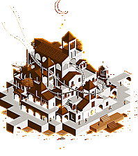
GammaZerochica blanca
Gustav GoblinA Dutch Romance
In:CitiesThe Mystic Gardens of Spellbound Swamp
JaguarSkygarden City
LurkerWSA Brahe Observatory on Notus, 4th Moon of Eos
SplitvisionThe White City Way Up High
ThethrillmanSilhouettes
wheres_waltoThe Simpsons
Xtreme97Voting Rules
Great stuff everyone, lots of fun ideas here. Will review after finals but I'm hopping in early to say I would grealy appreciate it if you turned on sound for mine
same. full volume please - for at least the first 5 seconds
I accidentally voted and didn't see rule 4, as a participant of the round please null my votes
dAAAAAAAAAAAAAAAAAAAMN
Ethan: A little birdie told me this is the concept of your finals round, just not exactly as grandiose as it would've been had you been chosen as wildcard. Either way, this is as not micro as a micro can be. Almost feels like you scooped up Hoshi En in a Katamari and plunked it on a bigass spaceship. Doing the slow cutaway up, I'm frankly overwhelmed by how much you packed into this.I do feel like the top level is a bit awkward though; you have all this beautiful architecture in the middle and then you plop this huge white roof over it! At the very least the angles where you can see said archi are gorgeous though. I had to dissect the pagoda just to see what objects you used for the details. Just in general your detailing blows me away. I really do wish there were peeps; annoying as they are to get to behave, I feel the flat rides and layers would be so much more meaningful with some extra motion. Regardless, beautiful bigass space city tied up in a nice Togo bow. Pure Ethan and I love it.
Also the music is really cool too. Gotta check out Boris.
GammaZero: This is some good-ass Tekken.
In:Cities: Josh you beautiful bastard. I could not see you doing anything else. Cannot think of a better way to thank our favorite Dutch admin. Love the return of the voice of God from Eden. I didn't even notice the alternate angles until writing this review; Jappy with his hot dog out is sending me. 10/10 100/100 best micro best micro
Jaguar: I was really missing you this Micro Madness so it's awesome to see you break out a bonus micro. And of course it is so unabashedly Jaguar. Love the unique CRPG-esque style with that overwhelming Phototrophian crunch. You always lean into the most cursed objects and rides with such confidence and intent. This micro as a whole can be hard to read at times, but you also find good spots to let the water coaster or the little scenes throughout stand out. Love the dark ride you brought back from Hellforge as well. I also love your goofy names for literally everything. It brings a sense of fun and doing your own thing I genuinely adore. Tag yourself, I'm Sir Cum Spect.
Lurker: Really love seeing you tackle high concepts like this while retaining your classic style. The overall idea of the literal upper and lower class civilizations isn't the most cutting-edge but you certainly did it justice. Love all the vehicles throughout, and the crashed cruiser on the lower level ties it all together. I also like the towers that change color above and below the clouds. One touch I always love in your parks are the creative use of soundscapes; in this case the river rapids ambience for the processors on the lower half. The food stalls on the lower half were funny too. Nice little micro!
Splitvision: This was dope as hell on first glance. The observatory and the rockwork it sits on are beautifully executed, all backed by a sunny blue. Wonderfully crafted interiors too, and a great single-rail coaster with a cool galaxy effect at the top. Wonder what objects you used to dither the track like that.
...Real-Time Color shifting pixels?!
I left the game open for six ingame years and unfortunately only saw a trace of color changing, but that's enough to make me realize you actually pulled off a day/night cycle. Most innovative builder in the game right now, and even without the effects this would be unbelievably well done. Will need to revisit and see if I can catch the cycle in full.
TTM: I remember this from VC! Big step up from your first micro, especially as a sequel. The smaller scale archi works and I love the subtle half diagonals. No idea what's going on inside but hopefully they're having a good time. Good start with the Fisch rocks, but varying the textures and slopes would do you well. The story at the beginning is funny too, but I would've liked to see less clipping and a slightly faster pace. You're definitely improving fast though; take in enough feedback and practice enough and you could really be something come H2HX.
Walto: IDK what pisses me off more; how unfairly talented and creative you are or the fact that you used two Cowboy Bebop songs earlier in the contest yet you didn't have the main theme blaring at max volume here. The way you accounted for every angle and portrayed different scenes really pushes this one to its fullest potential. I love how each angle has its own theme. Your use of scenery and rides for different angles and perspectives is perfect knowing you didn't have to worry about color or lighting. Definitely one of the most creative players in the game right now, and even if you leaked this months ago this is still a beautiful send-off for an inspiring MM23 run. Bravo captain!
I just hate having to load another micro after this one. Stupid palette.
Xtreme: Instantly recognizable. Shades of KaiBueno's Weird Al micro from last year. The yellow peeps are the perfect touch for this one. Love Flanders looking over the fence. You even did a couch gag in the middle of the house! You're a god at nailing these pop culture dioramas. Love to see it.
Amazing work everyone, way to send off a hell of a contest. chica blanca writeup coming after voting ends. It's going to be very long and very very cringe.
Nice micros guys, really enjoyed viewing all of them. Not gonna rate them this time, but just some micro comment on them;
HOSHI by Ethan: Wow
Infinite Azure by GammaZero: Splashy
Chica Blanca by Gustav Goblin: Cosy
A Dutch Romance by In:Cities:
The Mystic Gardens of Spellbound Swamp by Jaguar: Fantastical
Skygarden City by Lurker: Dense
WSA Brahe Observatory on Notus, 4th Moon of Eos by Splitvision: How!
The White City Way Up High by Thethrillman: Love the story
Silhouettes by wheres_walto: Geeeeez
The Simpsons by Xtreme97: Ay, Caramba!
Hoshi: Glad you went all out again for this one, with some polish this could have done well in a Grand Final. Love the architecture hidden within the structure, a very unique sci-fi take. I worry all the white and peach drown it out a bit.
Infinite Azure: Went over my head as I'm not that familiar with Tekken lol, but fun joke entry.
Chica Blanca: Really lovely bit of work, very chill vibe and the minimalist design combined with the monotone colour usage is very striking. Glad you were able to finish this!
A Dutch Romance: Lmao, as soon as I opened this I loved it and then the music kicked in. So good.
Mystic Gardens: Jesus, you absolutely went full throttle with the object usage here, even more so than your usual maximalist style. Hard to tease out some of the finer details among all the chaos but there's some good spots and the water is a good help to break it up visually.
Skygarden City: Loved this, very tranquil atmosphere above while being grimy and dystopian below, and fits the micro layer-cake approach well.
WSA Observatory: When you submitted this as the Semis replacement I was seriously hoping to see it compete. Amazing object usage again, making excellent use of the clock/time effect that initially had me really excitedly trying to piece together how it worked and changing my computer clock's time lol. Love this kind of thing.
White City Way Up High: Nice level of detail here and tells a cool story. Might have worked better by covering up the approaching vehicles and having the move faster but it's no big issue. Love the modernist house in the center.
Silhouettes: Another entry I was hoping we'd see in the main competition, so glad to see it presented here. Such a great effect and the artistic touches of the colour blocking and line cutouts is great. Especially loved the carousel, superbly done!
The Simpsons: Me fail bonus round? That's unpossible.
Hoshi: An imposing and impressive spaceship. Love the surreal feeling of all that park and architecture flying through space, music is nice too.
Infinite Azure: Knowing nothing about Tekken didn't help, but did some research and it's a funny joke entry.
Chica Blanca: The palette and minimalist style of this are nice and feel kind of like a retro video game, it makes for great atmosphere. And the music, catchy, relaxing and also adds to the retro game feel, it definitely adds a lot to this micro. I also like how this was pulled off with no trakitecture.
A Dutch Romance: Lol, knew when I saw the overview this would be... interesting. Funny and technically pretty well-made for a joke entry.
Mystic Gardens: There's so much going on here, I love the atmosphere and all the motion, it's beautiful chaos all around. The object choices to me are a lot of "This shouldn't work, but it does" in the classic Jaguar style. I also love the sound design, the music and sound effects together really add to this. Fantastic stuff.
WSA Brahe Observatory: The use of the clock object's time-telling code for the effect is genius, and works well with the micro's theme and concept.
White City Way Up High: Wasn't expecting that story, pretty well done and synced. Architecture has a nice clean and modern look.
Silhouettes: Amazing technical work to pull this off, and a really cool effect. All the motion and the trains going by really make this stand out and make it a ton of fun to watch. (Also a bit of a challenge figuring out how to get out of it by opening the scenario menu and clicking a random scenario)
The Simpsons: Spot-on recreation packed with so many references, love that the house has a full interior. This was a ton of fun to look through.
Overall, a lot of great and fun stuff, thanks to the admins for running this bonus round on top of everything else this contest, I loved having another chance to make a micro for a contest.
Hoshi. I didn't get into this one right away but after I did the cutaway view I saw the insane level of work that went into it and appreciated it a whole lot more. I would have this at a second or third if you made it to the finals. I like the coaster quite a bit. If the Earth doesn't have to have a tragedy to send a ship like this ship into space, I would love to be on it. One question though: Which part of the ship controls the artificial gravity? Nitpicking but just curious.
Infinite Azure. I would say that this one is for people with overactive imaginations because there's not much to see, even less than in in Milo's Almost Alone. Bold idea and it feels like the sort of thing where somebody had to try it at least once.
chica blanca. I really liked the atmosphere here. It reminds me of some of the art I saw in Lucca with atmospheric touches similar to the micro Lunar Lights. It also reminds me of MC Escher with a somewhat minimalistic print-like atmosphere that aims for just the right amount of detail. The coaster was slightly small but it added to the ambience and kept it from being just a rather empty scene. The chroma background was similar to Bangkok Dynamo's which was sort of amusing since there's no way that you could have known that while you were making it.
A Dutch Romance. This entry had me laughing out loud. I haven't laughed this much since I first discovered the comic Saturday Morning Breakfast Cereal. I remembered it unusually vividly compared to the other micros I've seen, whether the bonus round, the main contest, or past micros I've seen.
The Mystic Gardens of Spellbound Swamp. Well, I don't like it overall because it's so maxed out on detail and the colors make it feel sort of self similar all around but I like the stuff in it. The teleporting coaster is neat. And so is the underground dark ride. If you did something about the color scheme and/or the level of detail which might be too extraordinary, you'd have something really good. And of course it's so big that you can't quite call it a micro, but this is the bonus round so who cares?
Skygarden City. I like the micro, the micro itself and most of the micro elements. The clouds sort of cut off the view but not enough to make it unenjoyable. I like the rides and the general aesthetics of both the top and bottom. The sky vehicles and drones were a great touch. However, I have to say that I'm not a huge fan of the gumdrop clouds. I don't know what would have been better, maybe stationary monorail trains? That would have probably been a heck of a lot of work. It's nice to see you trying something more ambitious than your regular contest micros. It feels like two good micros sandwiching a not so good middle layer. Maybe you should have tried some CSO for the clouds. Also, it might have been cooler if the top part was floating instead of being supported from below. Still, I like it overall and I'm worried that people will remember this Skygarden since it's actually in the sky, as opposed to the one I made for the first MM which was just a skyscraper.
WSA Brahe Observatory on Notus, Fourth Moon of Eos. It's a neat trick, but not just any neat trick. It looks different depending on what time you look at it because it uses objects synchronized to your computer's clock. I didn't think much of it at first but after learning that and seeing it again, I'm awestruck and learned something I didn't expect to know. The question on everyone's mind is probably: What trick will you come up with next? You've done gangster scenes, interstellar spaceships, video games within videogames, and other spectacles. I'm still shocked that I used the clock object without noticing that it is synchronized to your computer's clock.
The White City Way Up HIgh. It is a definite step up from your first round entry, going for the scene of an automobile crash instead of making a hotel with a decent but not so special shuttle coaster. It has a similar modernistic aesthetic but shows more knowledge of the game. It works still, since white is more popular for sci fi spaceships than conventional buildings, at least from what I've seen in recent RCT history. I'm eager to see what you do next because you're rapidly improving.
Silhouettes. This was a stunning concept. I can't believe that you got such good silhouettes from all those different angles. Perhaps you should have submitted this for the finals if it didn't break any rules on size. It might have given you more votes from the European voters.
The Simpsons. I liked the yellow peeps and the interior view. The theme music was a nice addition too. I thought this was a fun viewing experience, even if it's a little small and unless I missed something, doesn't seem to have the characters entering the house. Still, pretty cool. It was fun to watch which was what ultimately matters.
Well, I've said a little about each one. I don't know how to vote because they're all so different and I don't know whether to vote for the top three or the five that I liked better than the other five. I had fun seeing these and everyone did a good job, except for maybe GammaZero who was just playing it for laughs, but still had fun with it.
Match
Conclusion
The poll is now closed. The results are posted below:
Thanks for the chica blanca love everyone. Was a super chill and practically stress-free build. Really not much of a micro IMO, but it also caps off what was personally a really weird Micro Madness full of self-questioning. Lots to say about it so pardon me for being cringe.
So we all know how Home Away From Home went. Gustav goes too hard, Gustav has anxiety attacks, Gustav gets absolutely destroyed, ha ha funny Gustav. This really hurt of course, as it felt like the first time I not only had an entire community behind me but a ton of potential and the small chance to really unleash it. There were even a few psychopaths who thought I could make finals. (Maybe next time but anyway...) I went through the comments hungry for advice and suggestions when I stumbled upon an interesting observation Pants made.
I thought about this constantly. Not just in terms of RCT, but myself as a person. I realized I was never really the kind of guy to have a style or even an identity. I just kinda let everything happen around me, let others influence my thinking more than myself, and never really took the time to dig in and find who I was. Considering your art reflects who you are inside, it all lines up. This isn't the worst thing on the planet, but considering how I personally view life it struck deep. I've only got one life on this planet and I would hate to make it something not truly my own. Of course I'm probably overthinking it; I really don't have a lot of time in OpenRCT2 and fundamentally I'm far behind the rest of the community. This means relying on other builds just to find out how they approach certain objects. With that said, at least one other person also pointed out I'm the kind of person to do so much for others they never see who I really am so maybe I'm not freaking out over nothing.
Flash forward a few weeks. I'm trying to crank out my original R2 idea for a potential bonus round but it's just not coming. I decide to shelf it for the time being and hopefully return to it should a bonus round be announced. One night, I found myself learning about the White Towns of Andalusia while doing some research for another project. Something about them just struck me in the right place. It felt like cubist art brought to life and given function. These endless white cubes with a brown roof or a palm tree popping out here and there. Almost Escher-like in their form and simplicity.
Huh. What would that look like?
So I booted up OpenRCT2, opened up the Pro Tour 2 bench, and got to work. I still wasn't sure if there would even be a bonus round, but I didn't really care. I just really wanted to make this for really no other reason than making it. It wouldn't be anything too complex; in fact, I wanted to exaggerate my inspiration by using the most basic objects possible. In retrospect, taking such a basic approach meant I could put less focus on figuring out how certain objects even worked and more on the overall vision. I also wanted to take the opportunity to try AVC's "palette" method and lay out objects outside of the map and grab them later. Combining this with the Scenery Manager was a godsend. I decided on the 64 Shades of Brown palette early on as well. Not only did it fit the look I wanted, I also thought it would be funny to take advantage of the aesthetic given by a joke palette.
I also assembled a little moodboard as I went. Alongside the previously mentioned white towns and M.C. Escher, I also looked into Santorini and Monument Valley. I even decided to do that new-fangled AI thing all the kids are doing just to put my idea in front of my face and help me understand how I would achieve that look. I deliberately tried to not use RCT as inspiration and kept chica blanca as secret as possible in order to try and embrace my own style first and foremost. With that said, I did come back to Liam and Scoop's take on Metamorphosis and nabbed a few roofs from DisneyAir by Xcoaster. I'd plop my moodboard pics here if the site would even let me.
Of course there was some early awkwardness. I started off using objects with actual texture, had a full-fledged boat hire going around the map instead of just one boat starting offscreen, and featured a Weinerlooping before I decided the Vekoma approach would be able to interact with the city the way I intended. I also wasn't sure whether to have the map be peepless with just frozen staff or have paths wind all around the map. I ended up on a healthy compromise where the paths were at the bottom and the frozen staff scenes were on the upper levels. The queues peeking out near the top came naturally as I laid those out, and I think the extra movement at the higher level balanced everything out. My pace was very much on and off as other projects took priority, but it was simple enough that it didn't become an issue.
The name started off as a joke; "where my chicas blancas at" and whatnot. Eventually I just decided to make it the name because hey, I thought it was cool. The lost love story thing came kinda naturally after that. I had some ideas here and there such as the entertainer names spelling out an entire poem in Spanish, but I didn't exactly have the time to do that.
Once March hit, I had so much on my plate that progress shouldn't have even been a thing. Of course this would be the month where the bonus round was announced, and of course the deadline would be right after I clear my plate of everything else. However, chica blanca took up a new role as a therapeutic retreat from all the other stuff going on. It's funny; RCT was always like that for me, but I was starting to fear I had lost that before I started this micro. Nice to see I can still use RCT as DIY therapy even with the pressure of a community that loves me way more than they should and thinks I'm capable of way more than I probably am. At least y'all are making me feel big and strong so I can't complain.
Around this time, a song began to dance around my head. Writing music has always been my thing, and in retrospect I guess that's why all of you make RCT look so easy. It's those years of experience that build up until you can focus less on the game itself and more on what you aim to achieve. Really it's the same as any form of art. The upside to having no time to immediately jot down the song was it had a nice month to marinate before I cranked it out in an hour or two the day of the deadline. Considering how much of their personalities everyone put into their micros this contest, I figure this is kinda my way of doing that as well. I forgot how much I liked writing music without some sort of deadline.
I forgot how much I liked creating anything without forcing myself to stress over it.
Pretty much half of this micro was done in the last week. I was relying on simplicity and SM copypasta spam to get me to the end. I also had an idea to tweak the palette to get some more dramatic shadows and really nail down that Escher feel. I think it's a bit hit or miss and I did forget to adjust shading in some areas, but I think it does wonders for the overall vibe. Unfortunately some legitimate stress and frustration did come in the last day when I had to lay out and fix paths and queues inside the buildings. Peeps were warping all over the place because paths were clipping into each other and it was a nightmare. This crazy troubleshooting rush meant I missed some polish around the map. Also NE thought it would be funny to just not let me upload this micro either, even though I was pushing the deadline. Thank god the casual environment of this round meant I could just send it through Discord or else forget about it. The music also didn't work in the admin build at first but luckily we got that sorted out before the match was published.
Is chica blanca a highlight of Micro Madness 2023? No. Is it even a highlight of the bonus round? Probably not. Did it deserve a writeup this long? Hell no! Will this micro achieve my pipe dream of getting me on a H2H team? Absolutely not! But even then, I really think I needed to build something like chica blanca just to reframe how I see this game and art as a whole. It really is a Home Away From Home antithesis; anxiety-fueled warhellride demanding my constant attention vs. eerily chill and sporadic build, mostly RCT-influenced vs. hardly RCT-influenced, cliche flying theme on top of cliche Asian theme vs. hopefully original abstract Spanish theme, rough idea I was neutral about and pursued because it was my most complete vs. idea I pursued not even knowing if it would have a place to compete because I genuinely liked it and wanted to see it. I've taken my stance as a promising newcomer and the allure of being on a H2H team so seriously that I forgot that this is supposed to be fun. It's always hard for me to keep up the motivation to do anything without a deadline, but considering my rediscovered passion for creating I think it's worth working on. And hey, this is where it starts.
I think I'm finally on my way up.
Once again, massive props to the admins for hosting another iteration of the best contest we have. Equally huge thanks to everyone who entered and competed for all your beautiful work. It really shows that at the end of the day we are artists in some way. Let's keep expressing ourselves.
Lurker - cute entry, makes me think of Skyward Sword with the cloud layer separating up from down. I really like that you've retained your quaint classic style even in a more fantastical setting
Split - I can tell there's something wild happening but I didn't have time to stay. DM me to explain because I want to know I love the interior views, the way you've stacked curved levels on clean diagonals is really pleasing
Xtreme - very nice entry, instantly recognizable, pleasantly surprised to see interiors done as well. Was never a heavy Simpsons watcher so some of the references I don't know but like the vibe
Thrillman - nice entry, I like the synchronized action set pieces. This flashes potential, I'm excited to see your style emerge more in your next projects
Jaguar - this is so you, you're really great at finding and using unorthodox objects to create completely unique aesthetic styles. If I'm being honest, it's a bit chaotic and over-textured for my taste, but I can appreciate the I-Spy nature of your style. Viewing this as a collage makes it click as a dense, interesting piece of work
Josh - A fitting end to the contest. Even in a joke entry, I'm impressed by your ability to clearly illustrate scenes in simple ways
Gutsav - my boy, this is a cool exploration of color. I really dig the high contrast shadows and monochromatic setting. I'm happy to see you push through it all and submit something you can be proud of
Gamma - I didn't play Tekken but I like the depiction. Maybe it's appropriate to go so minimalist because it's making my imagination go wild to fill in the gaps with faux nostalgia of what the scene may have looked like
Ethan - you are a special player. This would have been competitive in the finals. Gorgeous colors, gorgeous layers, you're pushing this community forward right now as much as anyone