Park / Better Left Unseen
-
 26-February 23
- Views 7,555
- Downloads 261
- Fans 0
- Comments 28
-
 No fans of this park
-
 Full-Size Map
-
 Download Park
261
-
 Objects
1
-
 Tags
Tags

Red Division
Yellow Division
Blue Division
R1
QF
SF
We start in a trance and never quite get out of it in this round. The reigning Micro Madness champion comes face to face with the first runner-up of Micro Madness 3, a powerhouse artistic parkmaker and a breakout newcomer in what is bound to be a titanic matchup that breaks all RCT boundaries.
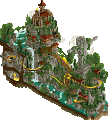
A Night in Goa
AvanineCommuterThis is Art
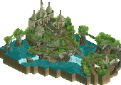
wheres_waltoBetter Left Unseen
CocoaGame Over
Jens JVoting Rules
Wheres_Walto, how did you do that? Please teach me.
Walto why are you like this
Bro
Cocoa: had me bamboozled for a second just waiting for something to happen, lol. I’m a big fan of the concept and the execution lives up to it. the way everything gets progressively weirder and more gory is great and the reactions from the observers make it that much more immersive and cinematic. the huge meadow and music also perfectly add to the eerie vibe. all in all great stuff, man
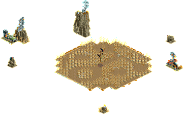
Walto: crazy idea that even if i came up with it, i probably couldn’t even be bothered to try. the way everything puzzles together is so damn satisfying and actually is — given its just made of ride cars — a pretty scene on its own. music slaps, idea slaps, you slap
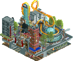
AVC: immediately when i saw the overview my mouth dropped. the colors, composition and vibrancy is so striking that it just immediately infects the viewer. love the look of the lasers, too. i feel like you always bring asthetics into the game in a way no one else can, really.
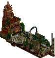
Jens: sick reveal with the interiors; maybe a bit less of a wow-factor than your opponents, but damn, your level of execution has skyrocketed in such a short amount of time. what i really love about your MM run is that you keep things quite understated, but put so much thought and intention behind every single object; it makes me want to improve my micro skills and be more precise with my parkmaking
big hats off to all of you, i have no idea who to vote for lol
No idea how to vote, toughest round yet for me. Going to review a few times.
Walto what the ever loving fuck
Wow, what a Semi-Final! All of these are incredibly good, and totally different from one another.
In no particular order, except for my number one:
Walto, you're insane. This is hacking on another level.
Jens, the detailing and setup of this one is impeccable.
AVC, Hearing Astrix always gets me in the mood. Colours work perfectly here.
Cocoa, you had me staring there for too long. Such a cool idea and overall setting.
Vote has been casted, but it's damn unfortunate two of you four wont go through.
Absolutely spectacular matchup guys, well done all round. Feels impossible to choose between the parks as they all have such different strengths and it'll be a crying shame that only one person from this group can go through.
AVC: Wow! The aesthetic is stunning and immediate. The music, the neon palette and the activity all combine to make this one of my favourite of the contest easily. It's quite shocking seeing what you were able to accomplish in a smaller map size, something that would easily stand toe to toe with the other micros of the contest. Despite this going very vertical I think you've balanced it well with the progressively changing colours as it increases to avoid becoming too layer-cake. There's an incredible amount of detail in the map too that kept me exploring for a while. All around superb job, just narrowly clinches my first preference vote. The music is an absolute bop.
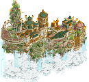
Walto: Another wow moment, this time in a more instantly jaw-dropping way as you realise the ingenuity at work. I'm amazed at what you were able to achieve here and the readability of it all, and it feels like this is really pushing the boundaries of what custom vehicles can be used for now that we've got so many of them. The castle texture being made up of all the raptor track sprites, the coaster forming in the clouds, the random fish being used for leaves.. Crazy.
Cocoa: Yet more wow. I was struck at first by how it felt like sort of a joke entry with the corn field but quickly learned what was happening. I think you're definitely one of the top storytellers with your work, always building around a narrative and here it's a really strong execution of that. Can't imagine it was fun tediously working through all the objects you had to create but the end results is so worth it, so kudos on that. The way it becomes more and more distressed and nightmarish as you progress feels quite surreal and dreamlike which I'm sure was one of the intentions.
Jens J: Another banger. Feels understated compared to the other micros this round but the detail and again the storytelling are on another level. There's clearly a lot of thought put into the interiors and the gory, macabre details and ideas are very well made. Exciting to see a pure horror movie concept brought to life in RCT and perfectly suited to micro madness in terms of scope.
This was really hard to decide on, but here we go:
1.) wheres_walto - haha "classical music" = Zelda's Lullaby, but this fits so well here to go along with the beauty of the scene. That aside, what an amazing idea! This must've taken forever to coordinate and get the timing down. I'm a bit conflicted here. This seems the opposite extreme, where we seeing custom trains create the scene (this time from every angle). But to me, while it's a lot of work outside of the actual game, I think this works because its truly create a world that can be experienced from every angle (or, rather, all 4 angles in the game). The fact that the end result looks grainy only reinforces the dreamlike atmosphere, almost like the brush strokes on a painting. I re-opened this 5 or 6 times just to experience it coming together. Amazing. I loved it.
2.) AvanineCommuter- REALLY impressive stuff here. From the overview, I was expecting these colors to be terrible, but everything blends really nicely thematically. I love how the lasers are done, and they do a great job of breaking up an otherwise rigid (but beautiful) structure and pulling the viewers attention to the focal point right in the center. Oh and that purple skyline is gorgeous. Last of all but most important for me, I kept finding new things. Given the tight space limitation, that was so impressive. Amazing job.
3.) Cocoa - Like Walto's, I'm somewhat conflicted on this. From a technical, aesthetic, and narrative standpoint, it's massively impressive. I'd say all of that alone would normally be good enough for 2nd to me. The music is flawlessly done, as you rotate the screen and spiral more into the madness. Everything, from the architecture to the characters, reinforces that narrative so expertly. However, I've never been crazy about objects that are only visible from one angle. Maybe I'm old-fashioned or just late to this trend, but we've seen so frequent in this MM. It breaks the illusion for me, but I can understand if I'm in the minority here. This is the best that it's been done so far, but it also overdoes it for me. Despite that, I was really close to putting this 2nd overall, but AVC's was incredible.
4.) Jens - Amazing interiors on this. The detailing is super impressive, yet it feels so refined for a decrepit factory. I love the storytelling to bring us into this world, as well. It truly feels like a horror movie. Completely awesome micro, but it's the semis for a reason. Nice job.
Wow, this one left me speechless. Some crazy ingenuity. Great job guys!
just when i thought this competition couldn't get more fucked up... the absolute most painful vote so far, but I had to go with my heart (which ones made me feel the most things)
Cocoa - this has seriously been fucking with my head for the last 24 hours. looked at the opening view for far too long waiting for something to happen, even opened it a few more times to check. i feel like trying to take in all the details in the opening angle improved the overall experience for me, because even in its minimalism its so unsettling. the staff names... the music... the endless sea of wheat making it feel so desolate. on the third time it finally clicked and I just started laughing taking everything in because I didn't know how else to react. its not over the top gory, or overly spammy, just genuinely "horrors behind your comprehension", bad trip, general anxiety brain type shit. the music added so much too. as for the execution, you definitely took the most brute force route possible and ruined all of our object folders, but in this case I don't really care because the end result was so immersive.
walto - moving in a completely different way, left me in awe and to the verge of tears. another one where even though the execution was a bit brute force, the end result was too successful for it to matter much to me. i love watching the way everything came together and moved, the synchronization with the audio, and the coaster at the end was the icing on the cake.
AVC - most painful 3rd place so far for me. from a purely technical perspective, maybe the strongest traditional composition of the entire competition. feels way bigger than the 100 tiles its on without feeling too tall or overly busy. everything is aesthetically gorgeous, love the bold colors. also love how this was composed in a way that it looks equally as good from the front and back angles. very cool theme i'd never thought to try in game before, would love to see a nightclub amusement park irl.
Jens - also a fantastic job, just didn't quite stand up to the boundary pushing of the other entries. great scenes, and another unsettling and dark atmosphere. glad to see you make it this far, knew you were really good!
This is Art. I have to put this at number one. Had several ideas that I'd been kicking around in my mind with using coasters as flowing scenery but did them in a paced journey through time. I was thinking you'd run out of ideas when you were using the Hogwarts Hall as part of your last micro but clearly I was wrong.
Better Left Unseen. I wasn't big on your last micro but I was pleasantly surprised by this one. I like how it looks different from every angle. It was creative enough that I could overlook the lack of movement to a degree, and give it my number two vote.
A Night in Goa. Nice colors, well integrated rides. The coaster goes outside the bounds a bit but other than that, a solid entry and one of the best of the competition but it seems like the quality goes up every round.
Game Over. I liked this entry. It was a good choice of ride for the limited size of micro but all the others were beasts so this comes in at an honorable but regrettable fourth place. The title, sadly, may have proved prophetic in this overwhelming semifinal.
A Night In Goa - HOLY hell. Love the psychedelic colors against the ancient looking architecture, and the music brings a really unique atmosphere. The water coaster is definitely something different.
Better Left Unseen - I legitimately realized I was holding my breath after rotating for the first time and not being sure what just happened. Truly, how? This is just WILD. I do wish there was a bit more movement and that may hold it back against other more traditional micros but the idea here is just insane. I enjoyed how much of a story I got out of this with virtually no names or rides or anything. The narrative is a strong stand-out even this late in the contest.
Game Over - A horror theme, neat, don't get to see that too often. I haven't seen much of the movies but I recognize a couple scenes. Great work and really creative unconventional centerpiece ride.
This Is Art - Most mindblowing thing since the Sagan rocket... this contest is absolutely nuts. Love the recording. Love that it works starting from the beginning and is also perfectly timed once the scene completes. Virtually unrecognizable as RCT. My only complaint is the roof is pretty hard to parse.
Walto - This is finally the micro where your venture into the abstract and esoteric pays off in full. The Citadel was a visual treat but a bit thin on content or innovation. Lost in a Memory was engrossing and beautiful but too busy. With This is Art, I feel you struck the perfect balance and managed to include all ingredients for an awesome micro - the overview is deceptive, there is suspense about what is about to happen once you open it, and once everything comes together, you are looking at a beautiful scene, complete with that GOAT Zelda music in the background. I loved the length of the sequence, that really added to the impact of it all. This is of course also really impressive from a technical standpoint, and I have a lot of respect for this kind of work - I know what it takes to set up incredibly large numbers of rides to work together in harmony. This was possibly the easiest vote in the entire contest for me, so far.
AVC - I feel like you could be prompted with building 100 micros and they would all probably rely heavily on your archy skills and your love for fantasy-style RCT rather than some crazy-far-out concept or something hyper-realistic, and I am sure all 100 of them would be very, very competitive, if not straight up jaw-dropping. This is in itself very impressive, to have that kind of confidence that you can consistently rely on these powers in this way. So while A Night in Goa does not really offer anything new conceptually, it is a truly breathtaking scene with that flawless level of execution and eye for details we expect from you. The details are not necessarily gimmicks of any kind - it's more that the scene feels like it has an ultra-high resolution. Very cool atmosphere in this one, a bit darker than the more serene visions we are used to seeing from you. The light beams are quite eye-catching and kind of dominate the scene, so a pretty bold move, but it works really well to give this a unique look. The faded sky background looks great as well.
Cocoa - Likely the most unsettling micro so far, haha. What a creepy vibe. Everything about it is quite disturbing. While I am not certain I actually get the underlying idea - is this like a play on the idea of the tornado ripping a house on the praire apart a la Oz where instead of the tornado and the house being two separate things, the house itself is somehow the tornado? Probably I am way off lol, but either way, this is very memorable. Of course, the main players in this micro are the 1-angle objects - and I think it is hard to avoid discussions about how niche you can make objects vs the pay-off. I'll say I think this one kind of treads that line and potentially crosses it. Of course, I try to be careful not to be a bigot here, I know I have made many niche objects, like a CTR that hid the flames in Sagan 4 launch. But unless I am mistaken you have made like several dozens of one-angle objects here, and that is maybe a bit much. Still, I think this was one of those ideas that always was bound to be explored in earnest at some point - you went ahead and did it, and you did it incredibly well. I do like that you are exploring other ways of filling out the "void" with other things than actual void, the flat and repetitive steppe works great for this. Still, I can't help but knock a few points off because of the reliance on this amount of new niche objects.
Jens - Cocoa's entry is disturbing, unsettling, etc. Yours is just straight up gory, haha. I think others have mentioned how you have developed a very clean style which still allows for a really high degree of detailing - I think there is some similarity here between you and Mama. The factory building looks absolutely stellar, very convincing. Then on the backside, we are presented with several small gruesome scenes. I love how you managed to present all of them so clearly on such a limited space, I think I get what is going on in all of them. The use of different floor textures works so well here. And there are several small object usages that are really clever, like the animated square for the furnace, that looks great, or using litter to make that crashed candelabra (if that is what it is supposed to be). Lots of potential with that litter editor at any rate, you are really showcasing it here. A great entry, but it maybe lacked that immersive experience that I felt with Walto's and AVCs entries.
1) Walto: The name speaks for itself. Pretty genius. But I guess it's a one shot effect and you can be lucky to have it done first.
2) Cocoa: I cannot comprehend that you took the effort to make all these 1 view objects just for this micro. Very cool to see the transition. Storytelling is on point, the vehicles and gadgets are my favourite part. I also like the ambient sound this time. The final stage was pretty fucked up, maybe a bit too much over the top for me. Nonetheless, execution and concept put this into second place for me.
No order:
AVC: Lasers and the mural are cool, the vibe also but I feel like you went a bit too much into autopilot and your comfort zone in this one. The structure as a whole is a bit too samey all around on first look, nothing strikes out, although on closer inspection you have some neat unique architectural structues.
Jens: Almost went for this one in second place. Architecture is on point, as is the materials/coloring. Also the reveal is nice, but the ride through it confused me a bit in the sense that I couldnt get the park connection (regardless of realism of fantasy intention). Micro details are perfect, every room had a lot of character. Good job overall, it just couldn't pass Cocoa in terms of cleverness of the concept as yours is a bit more 'safe'. However, your path it straight showing upwards, keep it coming.
so hard to judge these against each other, but i guess that's the game.
i went for the cornfield first. what an eerie setting, slightly risky having the opening scene not one that will blow people away immediately but i think the payoff is worth it. really interesting to explore each view, and just bizarre. i appreciate the risk taken with certain objects and the overall aesthetic feels intentional, rather than messy for messy's sake.
i put big clock second, again a risky, heavily concept-based entry, but major props on creating something completely new, and something that reads honestly better than i thought it would. definitely a one and done effect, but one that's new and exciting enough to get into the top 2.
feels VERY harsh to put laser india third as it's probably the best looking entry here, and normally that's something i value very highly, even over concept. i felt like the colors were sliiiightly overpowering to the point of being difficult to look at, but that seemed to be the overall intention so i didn't mind too much.
horror factory fourth, again feel very harsh. it was the most polished entry, and honestly there wasn't really anything between all four of the entries. the factory building itself was really really good - hard to make a dingy, functional building also look interesting but you managed it here, a great atmosphere.
very nicely done everyone, can't wait for the final.
Very tough vote, but so it goes when you get to this round of the contest.
I went with the two that took some big risks and had great tricks to tell a story.
Cocoa: opening this was a very "huh, okay. this it?" moment. Then rotating the view blew me away. Other than Winkleheim, I can't recall something that does this rotating view trick so well. Music adds a lot too. Eerie, creepy, horrific.
Walto: No scenery objects? Nice. Watching the micro get built and come to life was such a "whoa" moment. I can't even begin to think how you planned all of this. So cool.
AVC: I don't like that two entries had to "lose", because this is a banger too. Music is a bop. I think I agree with Tols in that the archy style felt familiar to other stuff you've made before. The overall vibe/aesthetic was dark and moody, yet the music/dance cuts through it.
Jens: Really cool entry.. and the Saw theme is obvious. I think having all the rooms detailed and themed was great and clearly takes a lot of careful planning. Again, really hard to leave this out.
You guys made this hella difficult!
1. Walto: Where's Walto. How's Walto. Why's Walto. I genuinely can't fathom how almost every time you touch this game you turn it into something completely new. Might be the most mind-blowing effect in Micro Madness since Cocoa's Dynamite Dunes from last MM. I can't imagine theorizing which CTRs to use for which parts of the map and how. I mean catamarans for banners? Clock hands for decorative statues? Fish for trees? It's not just all technical fluff either; you utilize it to create a genuinely great scene with a surprising amount of emotion behind it, which the Zelda music absolutely hammers in. Who's Walto? The GOAT.
2. AVC: You made this vote so so so hard. Only 100 total squares and you still made this one look absolutely massive while maintaining a clear macro vision. Insane how many rides and paths you managed to fit in without cluttering up much. Love the unlikely yet sensical hybrid between traditional architecture and psywave culture with the trippy imagery and lasers everywhere. Hearing you say the music itself propelled you through this one makes a ton of sense; the custom music in this is an absolute banger and you might be converting me to a psytrance stan. I feel so bad voting you as second banana this time around, but we're at that point where the sacrifices gotta be made. Hope to see you in as wildcard!
3. Cocoa: I'll admit, you had me stumped. I was hiding land and scenery and going into cutaway view trying to figure out what was going on. Guess the name with the directions slipped by me because I pressed Enter once and...
A house?
Wait, what's happening to the house?
w???h???a???t?????'????s???? ????h????a???p???p???e????n?????i????n?????g??? ???t?????o??? ????t????h?????e????? ???h???o????g???s????G????5????9???3???%???#????$???`?????~?????~????~????`?????~????~????~?????~?????~???`???`????~????~????`???
Classic Cocoa insanity. You love to see it. Shocking how no one really used single view objects to carry an entire micro like this, and no better round to pull it out than the one with the least tiles. The slow progression of the house slowly distorting into an ungodly, eldritch, demopig-filled horror is such a cool effect with a ton of storytelling behind it. The strategically placed underground rides to change the music based on the angle and how high up you are is genius, even if it may have given you a penalty. Unfortunately AVC's just barely edged this one out for me but it was super super close.
4. Jens J: Big fan of your storytelling throughout your micros but I think this is your best take on that yet. Love the Saw theme and the abandoned factory is both a perfect setting and executed unbelievably cleanly. Very clearly presented with just enough crunch to make it authentic. The interior is where things get spicy; is it me or has this been a particularly gory round? Love all the little scenes with the clickable dead peeps all named Game Over. Says everything you need to know. The broken chandelier(?) made of lemonade bottles using the trash plugin is genius. The way the dark ride inside is endless as well has a pretty ominous undertone to it. Unfortunately not enough to compete with the absolutely insane micros in this round, but you should be proud of yourself for continuing the high quality into semis. I've been saying you're one of the most underrated parkmakers here and you've shown it.
All these semifinals rounds are so insane. Everyone deserved their spots here and there are still deserving candidates who went out round 2. Why are we so cool and beautiful and sexy and talented?