Park / Tsuki
-
 06-February 23
- Views 9,610
- Downloads 244
- Fans 0
- Comments 30
-
 Description
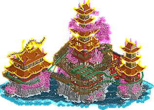
Japanese inspired temple's within a fantasy like foliage and cliffs setting.
Inspiration:
https://www.pinteres...44493671454723/
Xtreme97: Ascension
Gladsheim's dragon sculpting -
 No fans of this park
-
 Full-Size Map
-
 Download Park
244
-
 Objects
1
-
 Tags
Tags

Red Division
Yellow Division
Blue Division
R1
QF
SF
R1 winners RaunchyRussell (Group M), WhosLeon (Group N) and FK+Coastermind (Group O) go all out to reach the semi-finals, while Ethan (Group L) also competes in search of his first win. Hex has dropped out, and is replaced with Mulpje (Group G), who is seeking revanche after a rough R1 elimination...
Greed
RaunchyRussellLast Hurrah
WhosLeonMurakami Highball
FK+CoastermindTsuki
MulpjeThe 5th Dimension: Tower of Terror
EthanVoting Rules
A readme and an OpenRCT plugin that is necessary for proper display of Ethan's park are missing from the download. As a temporary solution, please download the missing files below.
downloads: 191
Bloody hell, chill out guys.
Upon first viewing these are all rad and well done. Will aim to give proper reviews this time.
my god, i am not surviving this round
1. last hurrah---this is one of the best individual pieces of rct i've ever seen. you are on an absolute tear this competition, I don't see how anyone can beat you here. funnily enough, I distinctly remember xcoasters beatles MM park from the very first comp---compare and contrast these two! its full of references but mostly just stunning architecture and design, mixing psychedelic effects into buildings seamlessly. also the layout is a total banger. just top notch, could not do better, damn.
2. murakami---an extremely hard choice here. I went with this just because the backside art was so novel and interesting, even if the coaster and overall composition wasn't quite as good as greed. still, this is a stunning and moody entry, really top notch rct, and can never go wrong with kanedas theme lol. ultimate hype song
greed---so close and so good. I love the landscaping here, and the whole thing is vibrant and so well constructed. the human statue is excellent and the coaster is super fun with great flow.
fifth dimension---I'm not entirely sure how the POV is meant to go but kudos on trying out a really novel idea and having a crack at it. the tower itself is excellent though. I mean wow, i need to get around the puzzle glass meta but i dont think my computer can handle that lol. the dark ride is really fun to watch, so many extremely detailed scenes and oozing with atmosphere. unbelievable to have this quality work this far down.
mulpje---you drew a hard lot here, because this is still a solid micro. the ride doesn't do so much and the fisch rocks are stifling the composition a bit but I love the towers and the winding pink foliage. the dragon is great too
RaunchyRussell Offline
Wow im screwed. lol Seriously everyone built at such a high level and im so stoked to go through all of these in depth! Great job to everyone!
Leon - gorgeous gorgeous gorgeous, awesome vibes with the music. I like the direction you took this, something based in reality but completely fantastical. The signage and small easter eggs throughout were fun touches. You're just too good at this game, man
FK - wasn't sure what to expect when I opened this, right away the palette is striking. Upon rotation, this park completely exits the realm of familiar RCT and delivers visuals I've never seen even attempted in game. Love the thematic connection with your first submission, I thought you were stretching the possibilities last round, but clearly you were just getting started. Impressive display
Mulpje - Very nice submission, I really like the cleanliness, I like seeing you explore different color combinations. I don't like the fisch rocks here very much, the gray feels too grounded and the textures feel unnatural. Good entry, unfortunately you're in the craziest group yet
Russell - this is a stronger implementation of grey fisch rocks: nowhere do the shapes feel repetitive or manicured. I'm finding it hard to find anything specific to comment on, the quality is excellent everywhere I look. I hope we can build together someday, I think we have very similar styles.
Ethan - seriously can you just like fuck off? You're like a gen z K0NG: incredible skill that's going to push this community forward in unexpected ways. Hurry up and find your ceiling because if you keep improving you're gonna put the rest of us out of business. Those single view spray objects are going to be everywhere for the rest of this contest. The exterior is remarkable, you've managed to make something so over-detailed look so good. The interior is less distinct to me, and I'm not sure it all comes together cohesively as a result. Some parts make me wonder if I'm looking at a tower of terror queue line, but I'm not convinced that was the intention. Equal parts stunning and confusing for me
God this is a tough vote, I'll accept bribes to make things easier
Straight up some of the most impressive artistry I've seen in this game, everytime I think the aesthetics of this game can't be pushed further I'm proven wrong.
FK - When I first opened this map I felt slightly let down by the opening angle, although its still very good. And then I rotated the map and... holy absolute fuck. I've felt this way about your work before but this is something that should be in a museum. We've seen psychedelic drugged out themes before that end up being a bit of an oversaturated overwhelming mess, but your compositions and color combos are always so thoughtful. Torn between the WW dragon ride, the multicolor waterfalls, and the flowers as the best scenes, its all so good. I was skeptical on the blue background at first but once I got used to it, I think its perfect.
Leon - another basically perfect map placed second only because fk's visuals are a little more mind bending. Just like your R1, there is just so much packed in but in a way that isn't overwhelming or messy. Excellent layout as always, love all the little details, love the band playing on top of the rooftop. There's a good chance you'll be unstoppable if you keep submitting entries.
Ethan - Excellent facade, love the boundary pushing in the interior even if I don't quite know what the fuck is going on. Love the object usage, love the scenes, if you can make your builds like 20% less chaotic I think you'll be in the highest tier of builders with Leon and FK.
Russel - I can't really say anything negative about this one and its only ranked so low based on how exceptional the others are. Extremely well composed and detailed, the statue is a highlight even if the face looks silly but maybe in an intentionally creepy way. Its maybe just nothing we haven't seen yet and in a competition with standards this high that's not quite enough to make it.
Mulpje - Another one I really enjoyed that was simply just in a bonkers match. Love the pink motifs and the butterfly garden is really nice. The only thing I could suggest as an improvement is maybe try making some of your archy less square and on the grid, mostly the building on the left. Still gotta emphasize even if I ranked this one last that I still really enjoyed it.
I guess I didn't realise how incredibly high the level of construction has become
I won't make a ranking, all parks deserve to go to the semi-final
Greed : The very good surprise of this group, I did not know your work before the MM and your R1 was already excellent, but your R2 is also very very solid! A superb work of rocks and cliff, the use of space is clever, and this giant statue is superb!
Last Hurrah : What a masterpiece, the park is so immersive, so coherent, I had a great feeling of nostalgia when I saw your park. It's rare to convey an emotion through a park but I don't know why it reminded me of my teenage years and my love of john Lennon.
Murakami : Another great park here, I loved the sculptures on this park they are beautiful, especially these flowers. The colour work adds to the strange atmosphere. A very immersive park here again
Tsuki : Very nice, this park is like a breath of fresh air in this group, it doesn't have the level of detail of other parks but this simplicity is very good and relaxing. The dragon sculpture is beautiful! It may lack some detail and colour especially on the rocks but it's a very solid park
The 5th Dimension : What a use of colour and elements! I find it so realistic in a way, every detail is thought out and mastered, everything is superbly organised that I feel like I'm walking through your park. I think this park really demonstrates that a few well chosen and well arranged elements can create a highly qualitative park.
Highball: Music is cool - sets a nice tone. The backside of this was mindbending. Sometimes I think I'm not smart/cultured enough to understand some of your work lol. Regardless, this is top notch and insanely creative.
Tsuki: Viewed this next and it was refreshing to see a less dense and chaotic entry with a great layout. Really tucked in well with the buildings.
Greed: Lovely landscape and just very well crafted. I need to step up my game when it comes to fisch rocks.
Last Hurrah: This is too good, wow. Seemless between the dreamy psychedelic and the realistic architecture. Coaster layout is great too. You've been bringing your A+++ game this contest. As a Beatles fan, I enjoyed all the little easter eggs and whatnot.
Tower of Terror: Honestly have no clue what is going on. I followed your instructions and all I see is an object that says "good evening guests.." and its all glitchy and clipping with other "good evening guests.." objects. I think I get what you're going for here, but it's messy as hell to me. Having said that, the exterior is ace. Some of the interior scenes that I can decipher are really immersive. But I'm so lost and confused trying to figure out what I'm doing and what I'm looking at. I agree with Walto, 20% less chaos and you got a winner.
2. FK - the REVEAL! So impressive, your brilliant sculpture skills came in fully here and you really brought the atmosphere of the psychedelic murakami world to life here. I’m less sold on the blockiness of the archy and the coaster layout, you’ve done better in those regards, but the concept and theming here won me over. What a vibe. I’m really looking forward to your take on Magritte, Warhol, or even Turrell next.
3. Ethan - Jesus this was a tough debate. What a brilliant concept and idea, and some top notch execution too. The building itself is really nicely done, and I can’t even begin to wrap my brain around the amount of planning and hacking it takes to set something like this up. I think your ambition is unmatched in the competition, which is wonderful to see. However, with that ambition, it could lead you off a cliff in terms of execution and polish, which is what edged FK out for me: simply the cleanliness of execution, and the atmosphere was crucially impacted by some of the finesse that was missing here. Still, this is finals worthy and something you should be proud of. Very hard decision for me to not put you 2nd.
4. Raunchy Russell - what a step up from R1, absolutely gorgeous landscaping and archy. Very nicely breaking the grid, and the coaster is very nicely done with cool interaction moments. The amount of detailing is also remarkable, really could be a winner in any other round but this was a tough group to be in.
5. Muljpe - Glad to see you were able to make a comeback with a replacement park, and it’s beautiful. The pink foliage is such a nice contrast against the yellow trims and that dragon is perfect. Very nicely done, the other parks just had the extra oomph conceptually to make them stand out further.
Like lots of people said all parks in this round are amazing and they all deserve to go to the next round.
Now, when i heard i got another shot at getting a chance at the competition i was pretty hyped again but when i also heard which round it was going to be the hype quickly died again.
Still I like to think with a glass half full kind of mindset, so if these kind of entry´s is what it takes to take me down im all here for it and would gladly join the next competition!
As for now, to anyone in QF5 your parks are amazing all in their unique own way and for people that will continue to the next round I wish you all the best of luck!
This round is pretty insane and its criminal that people from this round will not go through. Such good quality all around.
For me personally:
1. Last Hurrah: Love the concept, love the execution, there are so many little details to find everywhere and the coaster layout is good. Just overall excellent.
2. 5th dimension, tower of terror: The readme didn't really make any sense to me and I had no idea what I was looking at, but I did know that I liked what I was looking at. Great archy and great interiors, so many cool details.
3. Murakimi Highball: This just missed the mark for me but I also thought this was really great. When I initially opened it I thought it was cool, then I rotated the screen and I thought I was on an acid trip in Japan. I had no idea what I was looking at but it looked cool and I liked it.
3. Tsuki: Not really sure why but even though I think the technical execution of the other entries in this round were somewhat stronger something just clicked with this entry for me. I really like the coaster, I like the architecture and I like the colour combinations. I am still not a fan of this dark pallete that you always use but in this entry it works for me so I will give you a pass.
4. Greed: This too was a very strong entry, the coaster layout was good and I liked the landscaping and the archy even though there wasn't that much. The statue was a nice stand-out and was well executes as well. Overall another strong entry.
For the record, I've edited Ethan's download file which should now include everything intended. The batch is also updated and includes the new file.
All of these parks are deserving of going through, such an insanely high quality level. Unlucky to three of you guys.
I went back and forth over second place a bit, but for me first place was pretty set.
Last Hurrah is pretty much perfect. Everything works totally as it's meant to. Instantly recognizable, tons of cool stuff everywhere, so many ideas while still feeling not cluttered and intentional. Nothing is messy, everything has the perfect amount of "finish" on it. Just the highest quality RCT i've ever seen, overall, I think. I can't even imagine a full park with this level of quality... maybe it would be too much. So good.
Second place in the end I gave to Murakami - I didn't know the artist before looking at the park, I've since checked him and his work out. And even without knowing the artist, the park is crazy good. One of those concept reveals that's strong enough to work without anyone really knowing what's going on. I didn't feel like I was missing out by not knowing what everything was. I didn't realize what it was until the coaster went on the track behind the first track. That little "oh" moment where I worked out something must be up, so I rotated the view to see what it was, and BOOM there is the park. Really clever way to get people to experience what you want them to experience.
Third through fifth is so close that i'm not gonna rank these, just in the order I opened them.
Tower of Terror. Bloody hell. I'm not even sure what i'm looking at, but I can tell it's good. I saw a KONG comparison that was pretty spot on.. just approaching the game differently to everyone else, in a good way. What an idea it is to have rides showing the POV of another ride... my head hurts just thinking about planning that one. Feels like the kind of park that could have done with another week of finishing off to polish the idea and it could have been immense. The structure itself is really impressive, feels like i'm looking at something outside of RCT honestly.
Tsuki was really nice and serene. Felt like something you imagined in your head and then translated pretty perfectly to RCT, i'm just not sure conceptually it was quite as strong as the other parks. But I can't knock the way it looked, gorgeous.
Greed was really nice too, very interesting and lots to look at. Visually felt a little more disjointed than the others, but still a really great entry from someone i've not seen much stuff from before - loved your round 1 entry too.
Appreciate all you guys, hopefully someone gets back in next round due to an inevitable dropout. Wasn't sure how people were going to continue raising the bar after round 1 but christ, you're doing it.
Leon: I was just as much of a Beatlemaniac as I was a RCT fan in my youth and this is something I would've needed to change my pants over back then. Not saying the outcome is different now, of course. Obviously what gets me is all the references throughout. Carnival of Light is a deep cut! It's really convenient how well the Beatles' imagery throughout their career works in a trippy RCT fantasy setting, but even then the way you still made some stretches such as the apples for balloons really shows your ingenuity. There's like half a million little details I can rave about, but honestly the one that leaves me smitten is the pink floating cloud with the roof fragment and the peeps watching the rooftop concert on top. The dark blue background and great little Whizzer tie it up very nicely. This contest has shown you're on a plane above the rest of us and we mortals simply can't compete. Fave of the round!
Actually nevermind, the tour bus ride is called Helter Skelter instead of Magical Mystery Tour and there isn't even an actual Helter Skelter in the park. 0/10 finish Legoland instead
FK: Admittedly the first angle isn't insane, although you definitely bring your world-class archi skills to the table. The Akira motorcycle cameo is also sick as hell and I love you how executed it. Cool floating stuff, crunch made of Hiragana; you know, FK things. Then I turn the camera and OK, this isn't this micro's best side. The painting of the tree with the lantern just looks seamless but eh. There's a roof that has eyes, what's that about?
Then I turn the camera again and sit there staring at my screen slack-jawed just wondering what game I have open.
I don't know how you keep doing it. I was cock sure there was no way you'd top Picasso Sour, but somehow you put out an even better dick-swinging show of single-view mastery themed to both a famous artist and an alcoholic beverage with their namesake. I think you have Walto beat for best one-angle wonder. I wasn't aware of much of Murakami's work before this, and as I noticed all the names I looked them up and familiarized myself with his work. And yeah, you kinda nailed it. Superflattening is a fun little layout to tie it all up, although it does have some pretty rough overlaps in some areas. I shouldn't even care about that though, I'm thoroughly drunk off this Murakami Highball and I love it. Now excuse me while I research alcoholic drinks named after artists and have nightmares about what's next.
While these are easily my favorite parks of the round, my big drawback about both is that they feel a little similar to your round 1s. Leon with the urban European setting with a wacky fantasy twist and a mini track coaster that wraps around slightly related vignettes; FK with the artist-themed alcoholic beverage micro with that one angle that just annihilates your state of being. Don't fix what ain't broke, obviously, but I'd like to see how the 10x10 semis round twists things up.
Ethan: Your mind works in ways pretty much no one here can even comprehend. Walto's zoomer K0NG comparison is pretty spot on from what I've seen. The level of detail and intricacy alone is insane, but the POV concept may be one of the coolest ideas I've seen implemented in a concept in the last few years. If it worked, at least. Thankfully I had Advanced Track so I could see those sweet sweet elevator lifts in action. The individual scenes look amazing, but the sheer amount of stuff going on not only gets confusing but drags the performance down similar to Adamantino. While amazing as it stands, it seems sky-high ambition did get the better of you. You're on a damn good path with crazy skills and ambition, but cleaning a few things up and keeping performance high are good considerations from now on. Amazing stuff dude, you're a gift.
RaunchyRussell: Considered a lot of builders for Greed when the overview stills leaked but you somehow slipped my mind. Guess I forgot you were the coolest mofo ever or something. Right away the landscape steals the spotlight. Love the use of the Fisch rocks, although sometimes they do look a tad bit messy. That statue is insane too! Couldn't let barnNID have all the glory with the crazy Fisch rock sculptures, could you? I also love the sense of upward progression to the church on top of the cliff. The houses built into the cliffs break the grid in a really great way I wish I had thought of for my own micro. Greed obviously is a rock solid layout and Simple Folk and The Problem make for great supporting rides that both take advantage of the environment and drive the narrative. Sad that every micro from this round can't make it out; this is really something special and you should be proud no matter the result.
Mulpje: So happy to see you had a replacement micro in the books. I was so sad seeing you get eliminated early, but you're continuing your run in a major way. Everything feels super clean here and I love how the water trails off into nothingness. The colors throughout this micro really shine too. Love the pink foliage wrapping around the pagodas. Pew Tsuki was also a super nice layout. Would've appreciated some music though. Unfortunately you came up against some tough ass competition, which is how it is the further in you go. Great micro nonetheless!
First place I give to Last Hurrah. Great aesthetics, good coaster, and other rides to balance it out.
Second place I mulled over for quite a while. Three of them could have gotten my vote. I wasn't sure if I wanted to vote for GOG, Murakami Highball, or Fifth Dimension Tower of Terror. I found on a repeat viewing that I liked Highball and Tower of Terror slightly more but it was still hard to pick. I liked MH more for the overall look but the atmosphere of FDTOT with all the animated aspects gave it more lasting appeal, so I ended up going for that.
GOG had some great theming and I liked the canoes but it didn't have the immediate visual appeal that FK's had for me.
Tsuki was a good micro. I liked it better than your first round one, Mulpje. It had nice colors and a good coaster but frankly that just wasn't enough for this matchup.
Good work by all, and everybody put forth a good effort. Just really tough competition.
Leon - Delivering that tasty Tichy touch but this time in a funkier and catchier form. I do feel the "packaging" of it is similar to Tichy's, in that it has that dreamy, floating embedding, which is not a negative thing since it is incredibly cool, but I do hope there'll be another approach from you in this aspect in the SFs or it risks becoming a bit overused, for me. That aside, what a cool creation. A perfect homage to the legendary band whose music no-one can earnestly say that they don't like to some degree. As Turtle said, all ideas are very clear and neatly presented, and there's a lot of them, so it's quite an achievement. Love the references, the wacky foliage colors, the LP discs(?) supporting one side of the map - just an amazing entry. Grabbed #1 for me.
Ethan - You have such interesting and ground-breaking visions and ideas for this game, and I am very, very much here for it. Having a dark ride and then using a ride window to show the guest's POV is just genius. I kinda like how we also just are so used to your archy being ridiculously excellent that I think few people even mentioned the mansion - it's jaw-dropping in it's detailing, just so good. And the insides are just as detailed and good. Now, unfortunately, it seems that due to time constraints, you didn't quite have the time to develop the POV idea to the point where it could be easily followed. As MM's don't allow parks to be shared, it's hard to run any kind of "user study" on these things, so there is a pretty big element of risk here. I love that you took it, and I do hope you could maybe perfect this idea sometime in the future - not to mention looking forward to what other crazyness you will think of and consequently very likely produce.
FK - As a couple of people have mentioned here, I was not familiar with the artist on whose work you based this park on, but it's clearly some eclectic stuff haha. It took me a good while to realize that those flowers (?) only visible in one view were not new objects but made up of existing ones - really impressive. And how did you tuck them underneath the coaster but still manage to hide them in the other views? I couldn't figure it out honestly. Amazingly intricate and as always there is a smooth, fun layout gift-wrapping the map in a great way. It was cloooooose between this one and Ethan's, and I'd honestly be hard pressed to tell you exactly what made me vote like I did, other than I had to make a choice. One critique, just to provide something, is that I found the palette a bit jarring - I assume this is fitting to the aesthetic of this artist, but it's difficult to make palettes like this work in RCT, I think.
Mulpje - Very interesting that this looks like one of Josh's AI mashups of various micros, this time between FK's park and Leon's park. So if The Beatles met Murakami and they built a park together, I could envision it looking something like this. Unfortunately, unlike FK's or Leon's park, the underlying idea for this one seems a bit more vague or generic, which I think easily becomes a disadvantage in MM. But it is a very pretty scene, and both landscaping and archy are top notch, the coaster however felt a little lackluster, perhaps.
RaunchyRussel - I think I get the idea, and I think something like that can be pretty hard to depict in RCT so hats off for making it work as well as it does! Landscaping and foliaging are great, and the layout is good too. Archy is also not bad. Cutaway views are well done. The statue is excellent. It's honestly hard to find specific points of critique but I think it might boil down to that the concept could have been a bit more clearly delivered on a larger map - perhaps MM wasn't the best platform to deliver it on. Still, this does deserve to go through, but the group is just too stacked, unfortunately.