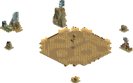
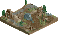
Survivors of the clashes that were Group K and Group L, respectively
MorganFan and Xtreme97, battle it out with bigshootergill (Group M), Camcorder22 (Group N) and Lurker (Group C),
who replaces Maverix.
You must view all parks in this match to vote. If you cannot view a park, for example if you don't
own LL, then please do NOT vote.
Once you have viewed all parks, select your favourite and second favourite in the above poll. The poll
will close after approximately 3 days and the results will be posted.
The winners will be determined by the formula set out in the Rules & Regulations topic. The creators of
the two highest scoring entries will proceed to the next round. The third highest scoring player will be
placed on the reserves list for the next round. The lowest scoring player will be eliminated.
Everyone may vote except for those participating in this matchup. If you are part of this matchup,
please null vote. Voting is public and monitored by admins, any cheating will be picked up on and dealt
with.
I think there's going to be a pretty clear top two here.
Qhyre Rock was my favorite, although it was really close. In the end I was just sucked into this really great setting and atmosphere. So calm, tranquil, just an idyllic setting. One of those things that looks effortless because of how well engineered it is, but it actually deceptively complex. Great work.
Climber's World Moab was my second place. Very close, and the fact that it had a great coaster and was so lively was almost enough to give it top spot. In the end I just vibed with the setting of the other park more, so went with that one. One tiny nitpick was that the coaster colors didn't totally work, for me. I felt there were other options while still paying homage to the natural rock shades.
Monkey Falls was probably third, for me. Massive and impressive looking, but almost felt one-dimensional compared to the top two. It felt like there was a layer of polish and personality that could have been applied on top to differentiate between the layers, maybe.
The old city fourth - nice concept and interesting to look at, but ultimately just not enough stuff going on to hold my attention longer than one coaster circuit.
Respite island fifth, felt nice and quaint but not conceptually up to the other parks.
1. qhyre rock---this is a stunning little piece (also, probs the best circle map i've seen in rct yet). beautiful and calm, and I spent a huge amount of time just scanning the architecture and dissecting it. its really masterfully crafted, in the way that is hard to realize until you try it yourself. particularly that building with the water coming off it, and the way it transitions to rock with the little window below on the backside. so hot right now.
2. aki---this is great, maybe some of the best sedimentary rock i've seen. really finishing what yous started in the h2h tarot park. love the climbing theme, the vibrancy of the coaster and overall just fun, great rct
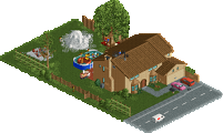
monkey falls---actually a great coaster, so fun to watch. those corkscrews through the rocks were the highlight imo. seems a little undercooked but just a classic micro composition here
respite island---this is understated but somehow packs a real punch. great atmosphere and sense of place, i just want to be there IRL. good shit
old city---seems like something was coming along here but it ended up unfinished, so hard to say. i'm not a huge fan of fully split-level micros but i am curious what the narrative was going to be here
Forgive my reviews if they come across as uninterested, QF5 is fucking with my brain and skill calibration
Old City - not bad, kinda simple. I'm not sure what the point of the upper layer is? Naming and story-telling would have helped a lot
Monkeyland - I like the macro, very cool structural design, I really like the weird bulging rock shapes you've created. I want more activity around the park, the animated monkeys are nice but I'm not getting a living space. lol @ the hidden path staircases, all the peeps gonna look like pothiccs if they make it
Qhyre - this feels very safe, obviously it's very good visually but there's no peeps, no rides, and comes across to me as somewhat generic. I do really love the map shape and colors, but I thought your first round entry was a lot more creative and ambitious
Climb - Pretty cool entry, I really like the functional climbs of varying difficulty. I could envision this being part of a larger indoor amusement park, very cool. One complaint: can we retire the rock layer aesthetic?
Respite - very nice for what it is, you've managed to make it busy, intricate, interesting, all in a highly compact space. Respect the commitment to LL, but for me it just can't compete in this format when compared to modern RCT2 capabilities
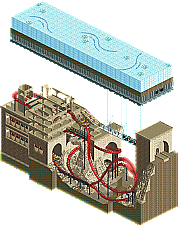
1. The Old City - Conceptually interesting. The layout is quite nice and the overall forms of the ruins are well done. The coaster has good interaction with the ruins and arches as well. However, there isn't enough connecting the two levels for me, and the ruins need a bit more detailing to not come across so blocky. Overall still a great submission that has a lot going for it.
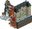
2. Qhyre Rock - Really beautiful. The architecture is stunning, with the right amount of detail to make it interesting but not crowded. Brave to go without a coaster but the end result here is really fantastic. It's difficult to come up with any critiques here but if I had to mention something, I would say that the boat may be going a bit fast. You also might consider adding an alternate rock color to break up the brown a bit. In any case, incredible job. This is the vacation photo everyone wishes they could've taken.
3. Monkey Falls - Really great stuff. The layout is impressive, especially in how it interacts with almost every part of the scene. The ruins themselves are also very well done, and the water features do a good job framing the structure. I would say this micro feels a bit stretched top to bottom. If you could remove some of the verticality without affecting the content too much then that would alleviate some of the emptiness at the bottom of the falls. Great work, I really enjoyed exploring all the different levels!
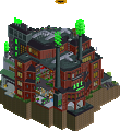
4. Climber's World - This park brought back a lot of fond memories from traveling around southern Utah. The rockwork feels very faithful to real life and the strata is a great detail. The coaster layout fits thematically with the hiking motif, and the delayed pretzel loop-looking element is a neat use of the new track pieces. If I had to offer a comment I would say that having both artificial rock walls doesn't seem completely necessary. I might remove the lower/smaller one and use the space to explore another facet of hiking or the unique geologies around that area. Ultimately a small comment though - great job creating such a bright, fun entry!
5. Respite Island - A nice, peaceful island that holds a deceptive amount of content. You've really used density to your advantage here and managed to pack a decently long ride into a small space without sacrificing much in the way of scenery interaction. This entry isn't conceptually as strong or bold as the others, but does it have to be? Sometimes an island is just an island, to be enjoyed for what it is. One comment is that this entry could've used one more pass at refinement - the default entrance, exit, and queue line stick out a bit to me. I never liked the large castle pieces much either but that's just personal preference. Really nice job!
-The Old City : There is something almost conceptual, I like the minimalism in this park reinforced by the use of a single colour which is a good idea. I think I would have even gone through with this idea by removing the ice surface! Anyway I think you took risks, congratulations!
-Qhyre : Very clean and well executed, the whole thing is super harmonious and quiet! I think it's a very good choice to not build a coaster, it makes the park light and soft. Overall this park is a good example of a structured and coherent park, not too much detail, just what is needed!
-60 seconds : The coaster is cool and the use of verticality is very goodn especially for the architecture, I like the choice of colours too but I find the whole thing a bit rough
-Climber : A lot of density on a small map, nice use of space which gives a great park! Like qhyre, I think this park is very fair in the use of details and coherence, there is no excess, everything is well thought!
-Respite Island : A small park full of charms, honestly I found it very relaxing and pleasant to look at!
The Old City - Simple but fun concept. Well executed and with a nice coaster. Somewhat lacking in detail, and I would have liked to see custom supports on the coaster.
Qhyre Rock - Very polished and filled with details. When I opened this one the second time it felt just as fresh and exciting as the first time, nice!
60 Seconds at Monkey Falls - Now this is a traditional micro. An absurdly tall coaster with a theme that's both straight-forward and slightly unclear at the same time. Also, obligatory ruins and underground section. Lovely!
Climber's World Moab - As a climbing enthusiast, nice! The pillars look somewhat rickety, I think I'd keep to the boulder area and admiring the coaster. Speaking of the coaster, I'm impressed how you've managed to fit such a big and realistic coaster in without compromising the surrounding area. Incredible. I also like the different layers of soil.
Respite Island - Pales somewhat in relation to the others but I like that you had the balls to submit something less overworked than an usual micro!
Xtreme97 - beautiful setting, expertly done. Some nice usage of new objects that I haven’t seen before, all very classy. Not as conceptually explorative but this goes to prove that good design sensibilities in composition, color, and aesthetics go a long way.
Camcorder22 - wow this was such fun! A nice surprise, particularly with the great layout that not only looks great but also has good flow and is relatively realistic in some ways. The rock walls and formations were executed really nicely, kudos on a great micro and my second pick here!
BSG - that coaster is wild fun, I love the idea of this car taking a chaotic circuitous route down a tower like this. The color scheme also did a lot for you to create a foreboding atmosphere in the jungle, if it were only for a little more finesse in the landscaping and architecture, this could have been a contender.
Lurker - calm, peaceful, quaint, all hallmarks of your style. Glad you submitted as replacement, but would have preferred something more in line with your R1 entry which was a great little idea packaged in a nice conceptual box.
MorganFan - The two layers add some interest here but I’m not sure I fully grasp the theme you were going for. Both the layout and architecture were a little square and barren, some finesse is needed to up the atmosphere. The top layer also felt dead, little details could bring some much needed vivacity and to keep our attentions longer.
MorganFan: I love this coaster! I'm a big fan of RCT dive coasters in general, especially ones that drop right out of the station, so this is really within my personal tastes. Your track layering for the new LIM track elements is really well done, too; it's pretty convincing in terms of blending with B&M track and really adds to the layout. I'm just a little surprised there's not more detail overall -- this feels less polished than your R1 entry. I don't think the top ice layer adds a ton to the piece, and the wall archy in particular feels lacking in detail, which is just a bit odd, since you had plenty of texture tricks in your Temple piece. Overall, though, a great layout, and its interaction with the environment is well done, especially the vertical loop.
Xtreme97: A really beautiful piece! What stands out to me the most, weirdly, is how round you got the shape of the scene to be. It looks very nice and really breaks the RCT grid. The archy itself is also top notch, as well as the metacomposition with the waterfall and building layouts. It does feel a bit lacking in energy without peeps and rides whizzing about, but it's fantastic from an architectural standpoint.
BSG: This is a really great concept! The "swinging" of the switchback sections of the coaster fit the "monkey" theme really well, and the layout as a whole is cool. Excellent verticality and really, really nice landscaping with the tower and the falls. I like the palette and color choices, too; the feel dark and saturated without getting lost. I wish I could make a cliff that looked even 10% as good as these! Overall, the coaster is great and well-integrated into the environment (and I like the eagles, too!).
Camcorder22: This is an astoundingly good micro, one of the best out there, I'd. I mean, just WOW. For starters, the coaster concept is very creative and absolutely wonderful, and the color choice for the track is just perfect. I love the vertical lift into the S&S-style first drop, and the rest of the layout is simply superb. It's also integrated really well into the landscape, such as the vertical loop, the inversion around the corner spire, and the way you did the lift supports on the rockwork. Which, speaking of, the rockword is so good! You used a really great collection of objects to form your landscaping; there's great texture and variety of shape. It also fits perfectly with the theme -- what a fun concept! The climbing walls themselves are really well done, including the multi-colored handholds; they really channel realism well, which adds a cool layer to the somewhat fantastical concept of an artificial climbing wall set in a real mountainous area. Overall, I love everything about this piece, and it was an easy number one pick for me! I see myself coming back to this for a long time.
Lurker: Super cozy vibes, just as you'd expect from a LL build. I really like your choice of side-friction coaster, as it fits the quaintness of the scene well, and I quite like how the layout wraps around the trees and buildings. Despite the limitations of LL, there are some nice details, such as using the monument pieces amongst the fence pieces to create more detailed borders. While not 'modern', this feels like pretty peak LL building capability. Solid work all around.
Qhyre Rock: This entry was really lovely. Just very well composed and everything just felt like it could be a real place. I do think this entry does only look really good from one angle though, the other angles are fine but that opening angle is definitely the clear stand-out to me.
Climber's world moab: Cool concept! Also liked the coaster layout. The rockwork was well done. Overall solid entry.
60 seconds at monkey falls: Cool entry as well. This just missed the mark for me because besides the coaster I felt like there wasn't really that much other content to hold the attention. I also felt like this entry was a reference to some movie/book and that I was a bit out of the loop. Still a solid entry though.
Respite Island: Charming entry. This has a nice clean and simple style which I like. I don't really have any criticism, this was pretty good for what it was, it was just a bit more lowkey than the other entries which is why it didn't win for me. Enjoyable to explore though.
The old city: Cool concept, I like the rockwork and the glas bridge was also well done. I just felt like this entry was a bit too bare, to the point where it almost felt unfinished (was it?). What is there is not bad but it just could a bit more detailling to really make it stand out.
Xtreme97: Now that's what I call Xtreme! The opening with the Quest Seeker along with the messages at the bottom immediately set the tone, almost like I'm watching a documentary. Landscaping and architecture are beautiful and really do feel like an island micronation. Love the use of the broken wall object to get the bare stone to peek through; super clever. The interior cutaways really hammer in the narrative, especially with the way you used ride track to display a name when hovered over. The Blue Pearl reference was funny too. Just a really beautiful gem of atmospheric worldbuilding and my favorite of the group.
Camcorder22: Hell of a layout and hell of a landscape! This reminds me a lot of what I wanted out of Home Away From Home about halfway through. Love all the peep scenes throughout; they really breathe life into what could have easily been a big red blob. Also new Fisch rocks make me big happy. Really could have used the different overhang pieces in HAFH instead of the castle blocks. Great little design; second favorite of the group.
BSG: God dude. This could've been so good had you had the time to get it finished. The scale is massive and you're rocking the Fisch as well as the rest of 'em. You're also thoroughly spoiling me with that new 4h Fisch rock block. The top to bottom progression of the coaster does a great job at slowly introducing each section without overwhelming you, although it does get hard to follow in some spots. I feel like the finished product may have come across as a bit dark or muddled, but for all I know you could easily prove me wrong. Love what you have but obviously I would've loved the finished result more.
Lurker: Wasn't sure who to expect when I caught wind of a LL micro in R2 but I should've known it would be you. Very pleasantly surprised to see you make it out of R1 as a replacement and give us some classic Lurker goodness. I like how you took advantage of the low tile limit and high stakes to really up your LL game. I'm noticing more and more hacks and frozen staff scenes in every one of your releases and taking advantage of those can really be what lets you hit that next level. Visually it is a little bit chaotic; I'm pretty sure you used almost every possible land face throughout! Somehow it works together as a whole, although a tad bit more consistency would be appreciated IMO. Ruins Run is a nice little layout with plenty of space for some cool interactions. Tough competition but I'm happy to see you make it into quarterfinals regardless.
MorganFan: AAAAAAAAAA this makes me so sad! Was so excited to see how'd you do after making that big upset in your R1. This has some great bones and I would've loved to see how this looked with an extra coat of polish. Love the coloration and new inversions in Ancients' Wrath. Glass bridge is cool in theory but I'm not understanding how it would work. Then again, I don't feel like I should be. Rockwork is awesome and it somehow works really well with that old metal wall. Just sad seeing this go unfinished; this could have been awesome with some extra time.
Couldn't vote in this as I don't have LL, but wanted to give some reviews:
MorganFan - Bummer to see this unfinished, as I think the bones are really solid and I can see the narrative you were heading toward. I liked this foundation and I thought the layout was nice, would love to see it completed.
Xtreme - Really loved this, the architecture and the execution were spot on as they always are from you, and it had plenty of little scenes to make it fun to explore. This may have made voting tricky in one of the other quarters, because I think the serenity and simplicity of concept combined with the incredibly high level of execution and detail are just lovely. Along with the shape of the map, this feels like a little trinket someone would have on their desk, a keepsake reminding them of a favorite vacation or something. I do see how compared with some of the bigger concepts in other matchups this might have felt lacking, but the beauty alone should not be ignored. A clear favorite for me.
BSG - I know you said you didn't get the time you wanted with this, which is a bummer. The sheer scale of the concept and the complexity of the coaster were a lot of fun. The places where things were starting to really come together I thought looked really cool and I can imagine that a more fully realized version would be epic.
Cam - Given that rock-focused micros with lots of little cutouts are almost a staple of MM at this point, this was a really refreshing take on that concept. The climbing walls of different difficulties were fun, I enjoyed the coaster, the rockwork was great and I think managed to hit a good balance between crunch and chaos. Knowing your MM history, I wouldn't have expected a micro like this from you but I'm pleasantly surprised. This shows a level of execution and finesse that has me thinking you could make a deep run in this contest, particularly if you can bring this quality with the bold concept of your first round park to a semi. Congrats on a great micro.
Lurker - No LL so I can't explore in game, but I enjoyed the charm of this and LL in MM is always a bold choice. I have to agree with others that LL is a hard sell in MM primarily because of the trend toward multi-layered and less grounded concepts that are just harder to accomplish. This felt really classic, but just missed on the wow factor that MM seems to require nowadays.
If voting, I would have gone Xtreme #1 and Cam #2, but congrats all around on a great quarter.
I've finally decided. I give first place to Qhyre Rock. It had a nice atmosphere and the music worked unusually well. Plus the rounded edges gave it a nice touch.
Second place I give to 60 Seconds at Monkey Falls. It has the best coaster of all the entries even if the surroundings are a little bare compared to some of the others.
Third I give to Climber's World Moab. Good coaster and good landscaping but compared to the coaster in 60 Seconds at Monkey Falls it isn't quite as interesting to me. The climbing walls are neat but there's nobody climbing them and nobody on top so they function for me, more as decoration.
The Old City. Cool ideas but it feels a little bare like you ran out of time and it didn't have the music to help sell it that you did last time.
Respite Island. I liked this but I have a bit of an issue with how the ride huts stick out. Otherwise, with the nice aesthetics I might have put this at third or fourth. Not that it matters for the actual voting.
Fuck, I reloaded the page by accident and lost the reviews I had written but not yet posted. Here goes again:
Xtreme - Amazing how you can keep churning out quaint masterpieces liket this one. Very well balanced in that it is really detailed, but not unnecessarily crammed with stuff just because. The absence of a main ride was the right move here, it would have distracted from the overall scene. Brilliant.
CamCorder - Love this theme, very dynamic and fun, and the execution is great. The coaster layout is killer, really nicely nestled into the map. We need more good and legit desert vibes like this, I'd like to try an Arizona theme sometime (though I know of course that Moab is in UT, not in AZ).
BSG - Very cool verticality, and great interaction between landscaping, architecture, and coaster. I wasn't the biggest fan of the palette, I guess it is supposed to be dusk or nighttime, but it looks too dark I think. Other than that, it is definitely a very good micro, but in the end, I rated Cam's higher because of the more innovative theme, and Xtreme's higher because of it being a bit more refined and captivating.
MorganFan - Very cool-looking map, even though I admit I don't exactly get the concept - is the glass bridge lowered from the surface above somehow? The layout is good, and the fisch rock/rubble formations look really good, but the bigger structures look a bit bland and the mix of brick and smooth stone textures look a little odd to me. Very nice, but not quite enough to garner a vote from me among this fierce competition.
Lurker - Very quaint, and very LL, but perhaps lacking that extra factor to make it a real contender among the more elaborate entries.
Such great vibes from Qhyre Rock. The recurring spiral theme, the buildings seemlessly flowing into the rockwork. I'd like to be here after a stressful day. Great piece of RCT you produced here Xtreme and easily my favourite of this group.
Looks like The Old City still misses something to really hit me. Perhaps it is due to time issues, but it's a bit hard to grasp how the two layers work together. The bottom of this micro is my favourite area, as it feels more complete than the rest. I wonder how it would have looked it you had more time. Digging the music.
Atmospheric LL build found in Respite Island. A coaster type I love and that we should be seeing more of. An eye-catcher or a bit more verticality in the middle of the plot would have maybe enhanced the overall aesthetic.
I really like 60 seconds at Monkey Falls. In particular the coaster. I especially love the all of the directional changes that it does. Also really like the temple sticking out of the rockwork in the upper half of the micro. Some of the vertical land edges could have been a bit more refined and some music would have been nice too.
Climber's World MOAB gets my vote for 2nd place. I thought it had the best coaster of this batch and the climbing walls are a fun concept adding to the overall setting of the map. Cool details all around and I especially loved the coaster interaction and the gradient on the outside rock walls.
Xtreme: serene vibes here. Seamless transitions from landscape to building. Almost dreamlike?
Respite Island: pretty neat. Ethan shared some screens is Discord that showed some of the grittiness in textures you had. I agree with Ulvenwood that more verticality and grandeur could've made this stand out more.
Monkey Falls: This was fun. Enjoyed watching the coaster traverse the map. Very moody and dark.
MorganFan: Shame this isn't full realized. Good bones. Nice layout.
MOAB: Easily one of the best things you've made in RCT.. love it. Great landscaping... layout is bonkers. Love the climbing theme as a whole. Just all around really great.
The Old CIty - Music is nice. Also, very understated park... normally I'd expect 'ancient underground ruins' to be swarming with detail and there's not a ton of color but ultimately it works. I wish it was more 'cave-like' though. Like, this is an ancient stone city that's backed up by modern truss supports and flat, symmetrical thick layer of ice... it probably could've done with some rock arches and stalactites instead.
Respite Island - The name really fits this... it's pretty basic stuff that looks like it could've been made more than two decades ago but hey, the classic LL style works and always looks good. It's almost an interesting clash with many of the other more modern entries. This isn't the most 'competitive' micro but it certainly is a pleasure to see. I can also appreciate how low to the ground the coaster is... makes it compact both vertically and horizontally.
60 Seconds at Monkey Falls - The coaster takes advantage of the verticality quite well... it truly is a lot of fun to watch whereas most tall micros tend to have things that happen at only one level. Also, the scenery selection and atmosphere are both very nice. With that said, the color scheme feels very gloomy and I'm not a fan of mixing rock objects with the in-game cliff faces, it's a little jarring on what is otherwise a high quality micro.
Climber's World Moab - I've always found those newer fisch rock objects cartoonish and really wish they weren't the meta. I also think this park is slightly messy and crowded... which is my kind of micro. And, because of that, this park gets my vote for second place. The coaster has some neat interactions and I think the landscaping is legitimately great. The rock climbing walls are also a plus.
Qhyre Rock - The breaking away from the grid, the small details, the beautiful composition, and the seamlessness of it all really makes this look more like an impressive piece of digital art than something made in a coaster game. I originally was tempted to vote Cam's park for first because it has more motion than this, but I felt it'd be criminal not to pick this one.
Great match guys... too bad Lurker and MorganFan didn't have more time for their maps, though it was cool to see a serene LL map from Lurker... and MF left the complete version of his map up to our imaginations.
Congrats to X and Cam for two wonderful micros. Wish I could have given you guys more of a competitive submission, but I didn't select a micro plan proportionate to the amount of time I had available to build, just slapped some finishing touches on it Sunday morning so it didn't look unfinished. Haha. If we had an option to use a 3 day extension I would have. Hope you guys slay it in Semi-Finals!
Overall; Love the rock work, reminds me of Villerouge sur Mer, especially the lower layers of different colours and textures. Also nicely flowing coaster, interacting greatly with the different rock formations and caves. The peeps climbing the rock formations is fitting very well into the overall concept and gives some nice little movements to the piece. The colour scheme is well chosen, and gives it this fresh overall look. Close call with Xtreme's entry, but more content with all the rides and overall time spend discovering all the little things you've put in the park, gives this the edge for me.
2) Qhyre Rock by Xtreme97
-Concept:+
-Content:+
-Quality:+++
Overall; Some amazing texture work here. Had to delete some scenery pieces to see how you did those 'broken' wall bits with the brick coming through. The little quest seeker boat gives it some much needed ride movement, and fits the calm atmosphere the piece has. Great colour scheme, foliage and rock work. The integration of the architecture into the rock work is seamless and gives it this almost picturesque feel. Could stare at this for hours..
3) 60 Seconds at Monkey Falls by bigshootergill
-Concept:++
-Content:++
-Quality:+
Overall; I feel the colour scheme was a bit too dark here. I think if you would've gone for a bit brighter/vibrant colour scheme, the adventurous theme would've translated better. It was fun following the coaster descending through various rock formations and caves. Very nice vertical construction. The little bits of architecture/temple gave some nice vantage points (for the monkeys ). Maybe could've used a bit more lush foliage as it felt a bit bare in spots. I know it's a rock, but for the overall aesthetic it would've worked out better I feel.
4) The Old City by MorganFan
-Concept:+/-
-Content:+/-
-Quality:-
Overall; Looks like you ran out of time unfortunately. Would've loved to see this fleshed out more, but the unfinished coaster station area, large bland walls, missing ride names and weird blue ice pack of land on top take it down too much for me. Nice coaster layout and Fisch rock work though.
5) Respite Island by Lurker
-Concept:-
-Content:-
-Quality:+/-
Overall; Didn't really do much for me unfortunately. Has a nice calm atmosphere though.
1.) xtreme97 - how do you do it every time? You're so good at the East Asian asethetic in MM, but this time it looks like you have some Polynesian influence as well. It's beautiful and peaceful, like a screensaver. There's no bad angle either. Not even a contest here, easily the best in the bunch. Can't wait to see more work by you in the next round!
2.) camcorder22 - I instantly fell in love with this. The rocks objects are the typical eye-jarring variety, but the coaster flows beautifully through them and it really captures that Arches or Zion NP look. Besides the coaster (the layout is one of the best in MM so far), I really like the little detail of layered rock at the park edges. Phenomenal job.
3.) bsg - Really cool coaster here. I'm not crazy about the darker colors here, especially with the whimsical name. I like the verticality a lot because each layer provides something unique and yet it is as a whole cohesive. My problem comes in with how bare some of it feels. Perhaps rushed?
4.) morganfan - ran out of time, I'm guessing? The concept is cool, but it obviously looks barren. It's a shame too, because that coaster layout is excellent. And I really like that glass bridge.
5.) lurker - pretty cute actually! I really like this style, but I just wish there was more content on the island, though. Quality-wise, it's better than last; content-wise, there's not enough there to merit any better.
25 Comments
Liampie Offline
Red Division
Yellow Division
Blue Division
R1
QF
SF
Survivors of the clashes that were Group K and Group L, respectively MorganFan and Xtreme97, battle it out with bigshootergill (Group M), Camcorder22 (Group N) and Lurker (Group C), who replaces Maverix.
The Old City
MorganFanQhyre Rock
Xtreme9760 Seconds at Monkey Falls
bigshootergillClimber's World Moab
Camcorder22Respite Island
LurkerVoting Rules
Turtle Offline
I think there's going to be a pretty clear top two here.
Qhyre Rock was my favorite, although it was really close. In the end I was just sucked into this really great setting and atmosphere. So calm, tranquil, just an idyllic setting. One of those things that looks effortless because of how well engineered it is, but it actually deceptively complex. Great work.
Climber's World Moab was my second place. Very close, and the fact that it had a great coaster and was so lively was almost enough to give it top spot. In the end I just vibed with the setting of the other park more, so went with that one. One tiny nitpick was that the coaster colors didn't totally work, for me. I felt there were other options while still paying homage to the natural rock shades.
Monkey Falls was probably third, for me. Massive and impressive looking, but almost felt one-dimensional compared to the top two. It felt like there was a layer of polish and personality that could have been applied on top to differentiate between the layers, maybe.
The old city fourth - nice concept and interesting to look at, but ultimately just not enough stuff going on to hold my attention longer than one coaster circuit.
Respite island fifth, felt nice and quaint but not conceptually up to the other parks.
Congrats guys, thanks so much for the parks!
Cocoa Offline
1. qhyre rock---this is a stunning little piece (also, probs the best circle map i've seen in rct yet). beautiful and calm, and I spent a huge amount of time just scanning the architecture and dissecting it. its really masterfully crafted, in the way that is hard to realize until you try it yourself. particularly that building with the water coming off it, and the way it transitions to rock with the little window below on the backside. so hot right now.
2. aki---this is great, maybe some of the best sedimentary rock i've seen. really finishing what yous started in the h2h tarot park. love the climbing theme, the vibrancy of the coaster and overall just fun, great rct
monkey falls---actually a great coaster, so fun to watch. those corkscrews through the rocks were the highlight imo. seems a little undercooked but just a classic micro composition here
respite island---this is understated but somehow packs a real punch. great atmosphere and sense of place, i just want to be there IRL. good shit
old city---seems like something was coming along here but it ended up unfinished, so hard to say. i'm not a huge fan of fully split-level micros but i am curious what the narrative was going to be here
wheres_walto Offline
Forgive my reviews if they come across as uninterested, QF5 is fucking with my brain and skill calibration
Old City - not bad, kinda simple. I'm not sure what the point of the upper layer is? Naming and story-telling would have helped a lot
Monkeyland - I like the macro, very cool structural design, I really like the weird bulging rock shapes you've created. I want more activity around the park, the animated monkeys are nice but I'm not getting a living space. lol @ the hidden path staircases, all the peeps gonna look like pothiccs if they make it
Qhyre - this feels very safe, obviously it's very good visually but there's no peeps, no rides, and comes across to me as somewhat generic. I do really love the map shape and colors, but I thought your first round entry was a lot more creative and ambitious
Climb - Pretty cool entry, I really like the functional climbs of varying difficulty. I could envision this being part of a larger indoor amusement park, very cool. One complaint: can we retire the rock layer aesthetic?
Respite - very nice for what it is, you've managed to make it busy, intricate, interesting, all in a highly compact space. Respect the commitment to LL, but for me it just can't compete in this format when compared to modern RCT2 capabilities
Sophocles Offline
Some comments in no particular order:
1. The Old City - Conceptually interesting. The layout is quite nice and the overall forms of the ruins are well done. The coaster has good interaction with the ruins and arches as well. However, there isn't enough connecting the two levels for me, and the ruins need a bit more detailing to not come across so blocky. Overall still a great submission that has a lot going for it.
2. Qhyre Rock - Really beautiful. The architecture is stunning, with the right amount of detail to make it interesting but not crowded. Brave to go without a coaster but the end result here is really fantastic. It's difficult to come up with any critiques here but if I had to mention something, I would say that the boat may be going a bit fast. You also might consider adding an alternate rock color to break up the brown a bit. In any case, incredible job. This is the vacation photo everyone wishes they could've taken.
3. Monkey Falls - Really great stuff. The layout is impressive, especially in how it interacts with almost every part of the scene. The ruins themselves are also very well done, and the water features do a good job framing the structure. I would say this micro feels a bit stretched top to bottom. If you could remove some of the verticality without affecting the content too much then that would alleviate some of the emptiness at the bottom of the falls. Great work, I really enjoyed exploring all the different levels!
4. Climber's World - This park brought back a lot of fond memories from traveling around southern Utah. The rockwork feels very faithful to real life and the strata is a great detail. The coaster layout fits thematically with the hiking motif, and the delayed pretzel loop-looking element is a neat use of the new track pieces. If I had to offer a comment I would say that having both artificial rock walls doesn't seem completely necessary. I might remove the lower/smaller one and use the space to explore another facet of hiking or the unique geologies around that area. Ultimately a small comment though - great job creating such a bright, fun entry!
5. Respite Island - A nice, peaceful island that holds a deceptive amount of content. You've really used density to your advantage here and managed to pack a decently long ride into a small space without sacrificing much in the way of scenery interaction. This entry isn't conceptually as strong or bold as the others, but does it have to be? Sometimes an island is just an island, to be enjoyed for what it is. One comment is that this entry could've used one more pass at refinement - the default entrance, exit, and queue line stick out a bit to me. I never liked the large castle pieces much either but that's just personal preference. Really nice job!
Babar Tapie Offline
-The Old City : There is something almost conceptual, I like the minimalism in this park reinforced by the use of a single colour which is a good idea. I think I would have even gone through with this idea by removing the ice surface! Anyway I think you took risks, congratulations!
-Qhyre : Very clean and well executed, the whole thing is super harmonious and quiet! I think it's a very good choice to not build a coaster, it makes the park light and soft. Overall this park is a good example of a structured and coherent park, not too much detail, just what is needed!
-60 seconds : The coaster is cool and the use of verticality is very goodn especially for the architecture, I like the choice of colours too but I find the whole thing a bit rough
-Climber : A lot of density on a small map, nice use of space which gives a great park! Like qhyre, I think this park is very fair in the use of details and coherence, there is no excess, everything is well thought!
-Respite Island : A small park full of charms, honestly I found it very relaxing and pleasant to look at!
Narc Offline
The Old City - Simple but fun concept. Well executed and with a nice coaster. Somewhat lacking in detail, and I would have liked to see custom supports on the coaster.
Qhyre Rock - Very polished and filled with details. When I opened this one the second time it felt just as fresh and exciting as the first time, nice!
60 Seconds at Monkey Falls - Now this is a traditional micro. An absurdly tall coaster with a theme that's both straight-forward and slightly unclear at the same time. Also, obligatory ruins and underground section. Lovely!
Climber's World Moab - As a climbing enthusiast, nice! The pillars look somewhat rickety, I think I'd keep to the boulder area and admiring the coaster. Speaking of the coaster, I'm impressed how you've managed to fit such a big and realistic coaster in without compromising the surrounding area. Incredible. I also like the different layers of soil.
Respite Island - Pales somewhat in relation to the others but I like that you had the balls to submit something less overworked than an usual micro!
AvanineCommuter Offline
Camcorder22 - wow this was such fun! A nice surprise, particularly with the great layout that not only looks great but also has good flow and is relatively realistic in some ways. The rock walls and formations were executed really nicely, kudos on a great micro and my second pick here!
BSG - that coaster is wild fun, I love the idea of this car taking a chaotic circuitous route down a tower like this. The color scheme also did a lot for you to create a foreboding atmosphere in the jungle, if it were only for a little more finesse in the landscaping and architecture, this could have been a contender.
Lurker - calm, peaceful, quaint, all hallmarks of your style. Glad you submitted as replacement, but would have preferred something more in line with your R1 entry which was a great little idea packaged in a nice conceptual box.
MorganFan - The two layers add some interest here but I’m not sure I fully grasp the theme you were going for. Both the layout and architecture were a little square and barren, some finesse is needed to up the atmosphere. The top layer also felt dead, little details could bring some much needed vivacity and to keep our attentions longer.
bmschulz Offline
Recurious Offline
Qhyre Rock: This entry was really lovely. Just very well composed and everything just felt like it could be a real place. I do think this entry does only look really good from one angle though, the other angles are fine but that opening angle is definitely the clear stand-out to me.
Climber's world moab: Cool concept! Also liked the coaster layout. The rockwork was well done. Overall solid entry.
60 seconds at monkey falls: Cool entry as well. This just missed the mark for me because besides the coaster I felt like there wasn't really that much other content to hold the attention. I also felt like this entry was a reference to some movie/book and that I was a bit out of the loop. Still a solid entry though.
Respite Island: Charming entry. This has a nice clean and simple style which I like. I don't really have any criticism, this was pretty good for what it was, it was just a bit more lowkey than the other entries which is why it didn't win for me. Enjoyable to explore though.
The old city: Cool concept, I like the rockwork and the glas bridge was also well done. I just felt like this entry was a bit too bare, to the point where it almost felt unfinished (was it?). What is there is not bad but it just could a bit more detailling to really make it stand out.
Gustav Goblin Online
Xtreme97: Now that's what I call Xtreme! The opening with the Quest Seeker along with the messages at the bottom immediately set the tone, almost like I'm watching a documentary. Landscaping and architecture are beautiful and really do feel like an island micronation. Love the use of the broken wall object to get the bare stone to peek through; super clever. The interior cutaways really hammer in the narrative, especially with the way you used ride track to display a name when hovered over. The Blue Pearl reference was funny too. Just a really beautiful gem of atmospheric worldbuilding and my favorite of the group.
Camcorder22: Hell of a layout and hell of a landscape! This reminds me a lot of what I wanted out of Home Away From Home about halfway through. Love all the peep scenes throughout; they really breathe life into what could have easily been a big red blob. Also new Fisch rocks make me big happy. Really could have used the different overhang pieces in HAFH instead of the castle blocks. Great little design; second favorite of the group.
BSG: God dude. This could've been so good had you had the time to get it finished. The scale is massive and you're rocking the Fisch as well as the rest of 'em. You're also thoroughly spoiling me with that new 4h Fisch rock block. The top to bottom progression of the coaster does a great job at slowly introducing each section without overwhelming you, although it does get hard to follow in some spots. I feel like the finished product may have come across as a bit dark or muddled, but for all I know you could easily prove me wrong. Love what you have but obviously I would've loved the finished result more.
Lurker: Wasn't sure who to expect when I caught wind of a LL micro in R2 but I should've known it would be you. Very pleasantly surprised to see you make it out of R1 as a replacement and give us some classic Lurker goodness. I like how you took advantage of the low tile limit and high stakes to really up your LL game. I'm noticing more and more hacks and frozen staff scenes in every one of your releases and taking advantage of those can really be what lets you hit that next level. Visually it is a little bit chaotic; I'm pretty sure you used almost every possible land face throughout! Somehow it works together as a whole, although a tad bit more consistency would be appreciated IMO. Ruins Run is a nice little layout with plenty of space for some cool interactions. Tough competition but I'm happy to see you make it into quarterfinals regardless.
MorganFan: AAAAAAAAAA this makes me so sad! Was so excited to see how'd you do after making that big upset in your R1. This has some great bones and I would've loved to see how this looked with an extra coat of polish. Love the coloration and new inversions in Ancients' Wrath. Glass bridge is cool in theory but I'm not understanding how it would work. Then again, I don't feel like I should be. Rockwork is awesome and it somehow works really well with that old metal wall. Just sad seeing this go unfinished; this could have been awesome with some extra time.
FK+Coastermind Offline
Couldn't vote in this as I don't have LL, but wanted to give some reviews:
MorganFan - Bummer to see this unfinished, as I think the bones are really solid and I can see the narrative you were heading toward. I liked this foundation and I thought the layout was nice, would love to see it completed.
Xtreme - Really loved this, the architecture and the execution were spot on as they always are from you, and it had plenty of little scenes to make it fun to explore. This may have made voting tricky in one of the other quarters, because I think the serenity and simplicity of concept combined with the incredibly high level of execution and detail are just lovely. Along with the shape of the map, this feels like a little trinket someone would have on their desk, a keepsake reminding them of a favorite vacation or something. I do see how compared with some of the bigger concepts in other matchups this might have felt lacking, but the beauty alone should not be ignored. A clear favorite for me.
BSG - I know you said you didn't get the time you wanted with this, which is a bummer. The sheer scale of the concept and the complexity of the coaster were a lot of fun. The places where things were starting to really come together I thought looked really cool and I can imagine that a more fully realized version would be epic.
Cam - Given that rock-focused micros with lots of little cutouts are almost a staple of MM at this point, this was a really refreshing take on that concept. The climbing walls of different difficulties were fun, I enjoyed the coaster, the rockwork was great and I think managed to hit a good balance between crunch and chaos. Knowing your MM history, I wouldn't have expected a micro like this from you but I'm pleasantly surprised. This shows a level of execution and finesse that has me thinking you could make a deep run in this contest, particularly if you can bring this quality with the bold concept of your first round park to a semi. Congrats on a great micro.
Lurker - No LL so I can't explore in game, but I enjoyed the charm of this and LL in MM is always a bold choice. I have to agree with others that LL is a hard sell in MM primarily because of the trend toward multi-layered and less grounded concepts that are just harder to accomplish. This felt really classic, but just missed on the wow factor that MM seems to require nowadays.
If voting, I would have gone Xtreme #1 and Cam #2, but congrats all around on a great quarter.
Ge-Ride Offline
I've finally decided. I give first place to Qhyre Rock. It had a nice atmosphere and the music worked unusually well. Plus the rounded edges gave it a nice touch.
Second place I give to 60 Seconds at Monkey Falls. It has the best coaster of all the entries even if the surroundings are a little bare compared to some of the others.
Third I give to Climber's World Moab. Good coaster and good landscaping but compared to the coaster in 60 Seconds at Monkey Falls it isn't quite as interesting to me. The climbing walls are neat but there's nobody climbing them and nobody on top so they function for me, more as decoration.
The Old City. Cool ideas but it feels a little bare like you ran out of time and it didn't have the music to help sell it that you did last time.
Respite Island. I liked this but I have a bit of an issue with how the ride huts stick out. Otherwise, with the nice aesthetics I might have put this at third or fourth. Not that it matters for the actual voting.
Splitvision Offline
Fuck, I reloaded the page by accident and lost the reviews I had written but not yet posted. Here goes again:
Xtreme - Amazing how you can keep churning out quaint masterpieces liket this one. Very well balanced in that it is really detailed, but not unnecessarily crammed with stuff just because. The absence of a main ride was the right move here, it would have distracted from the overall scene. Brilliant.
CamCorder - Love this theme, very dynamic and fun, and the execution is great. The coaster layout is killer, really nicely nestled into the map. We need more good and legit desert vibes like this, I'd like to try an Arizona theme sometime (though I know of course that Moab is in UT, not in AZ).
BSG - Very cool verticality, and great interaction between landscaping, architecture, and coaster. I wasn't the biggest fan of the palette, I guess it is supposed to be dusk or nighttime, but it looks too dark I think. Other than that, it is definitely a very good micro, but in the end, I rated Cam's higher because of the more innovative theme, and Xtreme's higher because of it being a bit more refined and captivating.
MorganFan - Very cool-looking map, even though I admit I don't exactly get the concept - is the glass bridge lowered from the surface above somehow? The layout is good, and the fisch rock/rubble formations look really good, but the bigger structures look a bit bland and the mix of brick and smooth stone textures look a little odd to me. Very nice, but not quite enough to garner a vote from me among this fierce competition.
Lurker - Very quaint, and very LL, but perhaps lacking that extra factor to make it a real contender among the more elaborate entries.
Ulvenwood Offline
Such great vibes from Qhyre Rock. The recurring spiral theme, the buildings seemlessly flowing into the rockwork. I'd like to be here after a stressful day. Great piece of RCT you produced here Xtreme and easily my favourite of this group.
Looks like The Old City still misses something to really hit me. Perhaps it is due to time issues, but it's a bit hard to grasp how the two layers work together. The bottom of this micro is my favourite area, as it feels more complete than the rest. I wonder how it would have looked it you had more time. Digging the music.
Atmospheric LL build found in Respite Island. A coaster type I love and that we should be seeing more of. An eye-catcher or a bit more verticality in the middle of the plot would have maybe enhanced the overall aesthetic.
I really like 60 seconds at Monkey Falls. In particular the coaster. I especially love the all of the directional changes that it does. Also really like the temple sticking out of the rockwork in the upper half of the micro. Some of the vertical land edges could have been a bit more refined and some music would have been nice too.
Climber's World MOAB gets my vote for 2nd place. I thought it had the best coaster of this batch and the climbing walls are a fun concept adding to the overall setting of the map. Cool details all around and I especially loved the coaster interaction and the gradient on the outside rock walls.
ottersalad Offline
Xtreme: serene vibes here. Seamless transitions from landscape to building. Almost dreamlike?
Respite Island: pretty neat. Ethan shared some screens is Discord that showed some of the grittiness in textures you had. I agree with Ulvenwood that more verticality and grandeur could've made this stand out more.
Monkey Falls: This was fun. Enjoyed watching the coaster traverse the map. Very moody and dark.
MorganFan: Shame this isn't full realized. Good bones. Nice layout.
MOAB: Easily one of the best things you've made in RCT.. love it. Great landscaping... layout is bonkers. Love the climbing theme as a whole. Just all around really great.
Jaguar Offline
The Old CIty - Music is nice. Also, very understated park... normally I'd expect 'ancient underground ruins' to be swarming with detail and there's not a ton of color but ultimately it works. I wish it was more 'cave-like' though. Like, this is an ancient stone city that's backed up by modern truss supports and flat, symmetrical thick layer of ice... it probably could've done with some rock arches and stalactites instead.
Respite Island - The name really fits this... it's pretty basic stuff that looks like it could've been made more than two decades ago but hey, the classic LL style works and always looks good. It's almost an interesting clash with many of the other more modern entries. This isn't the most 'competitive' micro but it certainly is a pleasure to see. I can also appreciate how low to the ground the coaster is... makes it compact both vertically and horizontally.
60 Seconds at Monkey Falls - The coaster takes advantage of the verticality quite well... it truly is a lot of fun to watch whereas most tall micros tend to have things that happen at only one level. Also, the scenery selection and atmosphere are both very nice. With that said, the color scheme feels very gloomy and I'm not a fan of mixing rock objects with the in-game cliff faces, it's a little jarring on what is otherwise a high quality micro.
Climber's World Moab - I've always found those newer fisch rock objects cartoonish and really wish they weren't the meta. I also think this park is slightly messy and crowded... which is my kind of micro. And, because of that, this park gets my vote for second place. The coaster has some neat interactions and I think the landscaping is legitimately great. The rock climbing walls are also a plus.
Qhyre Rock - The breaking away from the grid, the small details, the beautiful composition, and the seamlessness of it all really makes this look more like an impressive piece of digital art than something made in a coaster game. I originally was tempted to vote Cam's park for first because it has more motion than this, but I felt it'd be criminal not to pick this one.
bigshootergill Offline
Great match guys... too bad Lurker and MorganFan didn't have more time for their maps, though it was cool to see a serene LL map from Lurker... and MF left the complete version of his map up to our imaginations.
Congrats to X and Cam for two wonderful micros. Wish I could have given you guys more of a competitive submission, but I didn't select a micro plan proportionate to the amount of time I had available to build, just slapped some finishing touches on it Sunday morning so it didn't look unfinished. Haha. If we had an option to use a 3 day extension I would have. Hope you guys slay it in Semi-Finals!
Six Frags Offline
1) Climber's World Moab by Camcorder22
-Concept:++
-Content:++
-Quality:++
Overall; Love the rock work, reminds me of Villerouge sur Mer, especially the lower layers of different colours and textures. Also nicely flowing coaster, interacting greatly with the different rock formations and caves. The peeps climbing the rock formations is fitting very well into the overall concept and gives some nice little movements to the piece. The colour scheme is well chosen, and gives it this fresh overall look. Close call with Xtreme's entry, but more content with all the rides and overall time spend discovering all the little things you've put in the park, gives this the edge for me.
2) Qhyre Rock by Xtreme97
-Concept:+
-Content:+
-Quality:+++
Overall; Some amazing texture work here. Had to delete some scenery pieces to see how you did those 'broken' wall bits with the brick coming through. The little quest seeker boat gives it some much needed ride movement, and fits the calm atmosphere the piece has. Great colour scheme, foliage and rock work. The integration of the architecture into the rock work is seamless and gives it this almost picturesque feel. Could stare at this for hours..
3) 60 Seconds at Monkey Falls by bigshootergill
-Concept:++
-Content:++
-Quality:+
Overall; I feel the colour scheme was a bit too dark here. I think if you would've gone for a bit brighter/vibrant colour scheme, the adventurous theme would've translated better. It was fun following the coaster descending through various rock formations and caves. Very nice vertical construction. The little bits of architecture/temple gave some nice vantage points (for the monkeys ). Maybe could've used a bit more lush foliage as it felt a bit bare in spots. I know it's a rock, but for the overall aesthetic it would've worked out better I feel.
4) The Old City by MorganFan
-Concept:+/-
-Content:+/-
-Quality:-
Overall; Looks like you ran out of time unfortunately. Would've loved to see this fleshed out more, but the unfinished coaster station area, large bland walls, missing ride names and weird blue ice pack of land on top take it down too much for me. Nice coaster layout and Fisch rock work though.
5) Respite Island by Lurker
-Concept:-
-Content:-
-Quality:+/-
Overall; Didn't really do much for me unfortunately. Has a nice calm atmosphere though.
RCT2day Offline
1.) xtreme97 - how do you do it every time? You're so good at the East Asian asethetic in MM, but this time it looks like you have some Polynesian influence as well. It's beautiful and peaceful, like a screensaver. There's no bad angle either. Not even a contest here, easily the best in the bunch. Can't wait to see more work by you in the next round!
2.) camcorder22 - I instantly fell in love with this. The rocks objects are the typical eye-jarring variety, but the coaster flows beautifully through them and it really captures that Arches or Zion NP look. Besides the coaster (the layout is one of the best in MM so far), I really like the little detail of layered rock at the park edges. Phenomenal job.
3.) bsg - Really cool coaster here. I'm not crazy about the darker colors here, especially with the whimsical name. I like the verticality a lot because each layer provides something unique and yet it is as a whole cohesive. My problem comes in with how bare some of it feels. Perhaps rushed?
4.) morganfan - ran out of time, I'm guessing? The concept is cool, but it obviously looks barren. It's a shame too, because that coaster layout is excellent. And I really like that glass bridge.
5.) lurker - pretty cute actually! I really like this style, but I just wish there was more content on the island, though. Quality-wise, it's better than last; content-wise, there's not enough there to merit any better.