You must view all parks in this match to vote. If you cannot view a park, for example if you
don't own LL, then please do NOT vote.
Once you have viewed all parks, select your favourite and second favourite in the above poll. The poll
will close after approximately 3 days and the results will be posted.
The winners will be determined by the formula set out in the Rules & Regulations topic. The creators of
the two highest scoring entries will proceed to the next round. The third highest scoring player will be
placed on the reserves list for the next round. The lowest scoring player will be eliminated.
Everyone may vote except for those participating in this matchup. If you are part of this matchup,
please null vote. Voting is public and monitored by admins, any cheating will be picked up on and dealt
with.
mama - this rules, I was literally re-watching Neon Genesis Evangelion this week, great timing. Love that you lean into your strengths, this is perhaps your cleanest large-scale creation yet
Mulpje - love this! Your natural inclination for verticality is a great fit for this contest, I can't think of anyone better right now at constructing epic fantasy scenes
AVC - absolutely gorgeous. I remember you talking about this concept during H2H9, so glad to see it come to life here. I think the micro format is the perfect size. Just incredible work all the time
I've decided on my one and two. I give the win to Mech Hangar two for all the cool details. Even though I'm not exactly an NGE fan. The second place was a bit tougher for me to decide. Both are worthy of a second round but I personally prefer China Blue because it was portrayed as a sort of decoration which makes it more fun in the back of your mind while you're watching it. And I like the coaster style slightly more but only by a little. And I'm likely to catch fire for saying this out loud, but that sort of muted color palette used in Fort Voxus just doesn't suit my tastes the way it's used here.
AVC – Stunning stunning entry. Just beautiful really, pretty much a work of art using RCT as the canvas. My first pick.
Mech Hangar 2 – Yep that rocked, all the small details and the custom rides really added this great scene. The Mech itself reminded me of a modern day Anubis, loved that the arm was just being attached and the splashes used as sparks flying was really cool. My second vote, keep doing what you're doing this MM because you already have that epic scale. I'm excited to see what you do next.
---
Mulpje – I'm a huge lover of your work, and this is no exception, in my eyes you just came up against two beasts. Beautiful architecture throughout and joint best coaster with AVC. If this is what you have in store for us with your work this year, I'm a very happy boy. Great entry!
This was one of the hardest match-ups to vote for, but here we go:
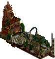
1.) Mech Hangar 2 (mamarillas) - Astounding. I love the arm hanging at the lower level, ready to be put into place where the workers are welding or something in preparation. There's so much creativity in how pieces are used to tell the story here. Just phenomenal. I was skeptical of the coaster at first when I saw the overview, but I think it pulls things together really nicely. Fantastic work.
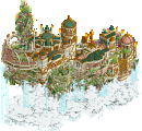
2.) China Blue (AvanineCommuter) - Love it. This is basically art with coasters. From the ornate pedestal to the coaster layout, it's all just so classy and cool. I don't fully understand the water at the bottom, but whatever. Besides the water, the colors and textures really feel like a ceramic pot. Well done. This could be first here, but I think it's just a matter of content in the one above that places it second for me.
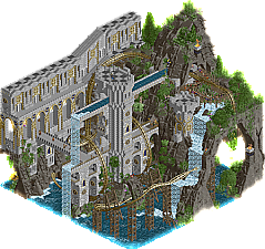
3.) Fort Voxus (Mulpje) - I was really close to putting this second (and I mean really close). Everything is done so well here. The muted colors, the coaster layout, the rockwork and foliage, supports and castle structure, just everything. I really want you to move onto R2, because this is just fantastic. Superb entry, I'd say my favorite 3rd place vote by far. Sorry that you matched up against 2 of the best.
1) AVC - Absolutely stellar work! The visuals grab and hold your attention without becoming overbearing. Macro and archy is amazing as well.
2) mamarillas - Super unique idea and a strong execution of it! The verticality and scale are on point, making the whole thing feel way bigger and more badass.
3) Mulpje - This feels massive and the landscaping and rockwork are done so well. I wish you had done more with the castle but what is already there is lovely.
AVC - She's the number 1 seed for a reason! This was stellar, so glad you revisited this concept and in a format that was great. The juxtaposition of the white and blue with the dark brown is so visually pleasing and it has all the details and composition that I'd expect from an AVC creation. I will say, comparing this to the original concept I remember you showing awhile back, I think some of the finer detail is lost. I think it might have elevated this further if you had a special palette that gave a more full range of whites and blues to play with, rather than just having two colors to do the entire thing in. As a result, there are a few places that I think your crunch-elements struggle because that element of texture and blend is so stark. But all in all, another beautiful AVC micro creation.
Mulpje - Firstly, you've definitely started to carve out a style and vibe that is all your own. This definitely felt like your style of park. I love the drama and the creativity of the world building, from the height to the fantastical forms and unique coaster layout. While I love the styling of the archy, it did feel blocky in places, but the landscaping was top notch, particularly loved how you integrated the torches into the rockwalls.
Mama - Considering that we've seen mech-micros before, man did this slap in a whole new way. The size is immense, and gave you so much room to add in tons of other details. I love the choice to leave the back open and give yourself 360 degrees of visibility, really shows your faith in your ability to sculpt something amazing. Beyond that, you've managed to meld your skill for huge sculptures with finer NE-centric details. Honestly, my favorite thing is the top-most crane arm above the head, that thing looks so cool. The coaster was a nice touch that I feel like some will claim was unnecessary and others will say was essential. I could go either way, but didn't feel like it detracted from this in any way. Really impressive start to MM.
I'm gonna shock myself here and give Mama my #1 vote. I just felt like this was near flawless and the execution so clean. AVC gets my #2, purely based on the feeling that this could have been a bit cleaner, but the concept is so AVC and so beautiful to behold. Congrats to all on a great round, no let downs here.
1. AVC: Nice job upstaging me on the Asian theme. Still my GOAT though. This is such a cool and artsy concept for a micro and it just looks so damn cool and pretty with its limited color palette. A third accent color for the top half would have ruined it. Hell, I almost wish you made the water blue instead of aqua. Chinoiserie is a really fun layout with or without scenery, and the way it ties into the theme reminds me of the pottery-themed Virginia Reel from Leon's H2HC park. For how much everything blends together, the archi and landscaping are also super detailed and crunchy. The bottom half with the lacquerware is just as cleanly executed as the top and gets its point across crystal clear. Also Porcelain Throne is a funny name. I love everything you do and this is no exception. Stoked to see your run through the rest of the tournament.
2. mamarillas: Get in the robot, mama! Wasn't expecting the sequel to drop but watching you go full Evangelion on it is insane and your execution is fantastic as always. Leave it to Turd Ferguson to rock the sculpture game like almost no other. Just as impressive as the macro is the micro. The astronaut entertainers and water effects resembling welders is super impressive, as is the trainitecture on the crane near the top. One weirdly specific thing I'm particularly enthralled by is the stuff on the bottom. Seeing mechanics and forklifts dwarfed by the EVA-01's feet gives you a great idea of how titanic the thing is. Coaster was cool but this micro is just as good without it. Really impressive work though, super excited to see what you do next.
3. Mulpje: I hate having to put you last after seeding you to beat AVC in my bracket predictions. It definitely looks like a very Mulpje micro. Landscaping with the Fisch rocks is awesome; it's been cool seeing everyone and their mother break them out this contest. Also digging the castle archi, especially how it pokes through the back. Layout does its job with the scenery on, but hide it and it's definitely a little awkward in spots. Nice stuff but just unfortunately not enough to compete. So many good parkmakers are getting knocked out early and it makes me big sad.
@AVC, I voted for this, but I really wish it had just a dash of some vibrant contrast: some gold kintsugi or a gold rim on a plate or two, or a striking red element to frame or highlight something special. I feel like that little extra flair would have made this really unforgettable.
@Mulpje: love the world building and it's a beautiful scene.
@mama: the mech didn't do it for me. It felt too rounded and smooth, not greebly and angular and metallic like I'd expect. The rest of the map was interesting and had a lot of cool highlights
Avanine Commuter - Looks like it could be in a snow globe. The white blue and brown reminds me of Royal Milk Tea which is unrelated. I like the way the blues all feel specifically painted on instead of a blue object. Like your crunch and lines in the path. Really fits the theme well. I dig the restricted color palette and heavy detail approach. The architectural forms and the way you set up the motifs is unique and elegant as ever. The curvy paths against angular architecture and the style of fences use that kind of echoes the bobsled motifs. Very clever and well put together compositionally. Fantastic!
Mamarillas - I love this mech, so much ingenuity. The more I look at it the more intricate and rediculous these gargantuin infrastructure aspects are. It's overwelming which is fantastic. There is an abundance of qualtiy with this extreme verticality you have achieved. The map has a very clear and defined shape but there feels like sucha s trong level of grid breaking and forms despite of this.
Mulpje - I like the way this map was framed, really sets the stage for the world it's set in hinting at an extension of the land formations and the castle on each side. The scale is fantastic and your colors/style continues to be so atmospheric and iconic to you. I dig the wood supports on steel track kind of like an RMC but it feels like a different kind of Hybrid coaster. The wall motifs on the castle are really nicely done, execution across the map is great.
Overall; Wow, amazing build. Love the quality of your sculpturing. Only minor gripe I had is that the arm that fell off is kinda entangled in the Mech Pilot Testing coaster rails, not very realistic (joking off course ). Also love all the tiny stories, custom vehicles and props you created, all with very high detail and adding to the whole. I didn't mind the coaster going through it all, as it added some much needed movement and aliveness to the micro.
2) China Blue by AvanineCommuter
-Concept:+++
-Content:++
-Quality:+++
Overall; Cool concept, love how you took a gimmick and put it on an whole other level. The Delfts Blauw (as we call it over here in the Netherlands ) really works well imo, although at first I thought it was dangerous going for a 2 colour colour-scheme. Lovely ride interaction with the architecture, and the crunch on everything is what gives the whole that polished feel it needed. Great job!
3) Fort Voxus by Mulpje
-Concept:+
-Content:++
-Quality:+
Overall; Love the landscaping and how the nicely flowing coaster interacts with it. Bit inconsistent on the supporting of the coaster though. My main concern with this was how bland and drab it all felt. Maybe it has to do with the palette or the monotonous colours used, but some more vibrant colours would've done this micro wonders I feel. (or some music)
#1 - Mamarillas - It was a close call between this and AVC's entry, but in the end, the pure fun-factor of this won out. It's not only fun though - I think you've taken your detailing to the next level, so that while this might have cartoony influences at heart, most of it felt very convincing. That robotic arm on the top level made by trains... hnng. Looks so great. Also, of course, the statue is very impressive. And you didn't waste the opportunity to integrate a really fun coaster into the scene. Great stuff!
#2 - AVC - Very cool concept, and daring to keep it to just two colors, but you pull it off. The intricate structures and the interaction with the coaster are really compelling. And the circular map shape adds another level of technical impressiveness to it. Very cool, and as said, I was for a long time not sure whether to give yours or Mama's entry the first vote, but I am happy that both can go through, since they are both amazing entries.
Mulpje - Cool idea to have a fort built around an airy, cavernous cliff structure like this, and the execution is impressive. It also allows for a coaster that is very integrated into the scene, and that is exactly what you have. I think I'd have liked to see a slightly more organic fort structure - The tall, straight sections become a bit too repetitive and dominant in this scene - and I also think the coaster could have benefitted from another, more bold color choice. Great stuff!
Mamarillas - you really played to your strengths and in stunning fashion. So much creativity and detail in here, and the entire micro is perfectly composed. Stellar.
Muljpe - Atmospheric, beautiful, and stately. All very indicative of your work. Definitely agreed on a color change for the coaster, and it could definitely have used some music and shapes to break the grid, but still a great entry nonetheless.
1. AVC : It's clever, it's beautiful, the choice of colours is a masterpiece
2. Mamarillas : Super fun, I'm jealous of the idea ! I really hesitated with AVC for the first place, but it's a real coup de coeur thanks to you for this park
3. Mulpje : It's a very good park, a little bit massive but the realization is rellay solid! I put it in 3rd the competition was too strong with mama and AVC
1 AVC: Wowow! Love it, classic AVC aesthetic fantasy. Glad to see a resurrection of this idea after you posted a snippet of something like this from post-H2H, and perfectly suited to Micro Madness! The amount of clarity and detail you've achieved despite the very limited colour palette is superb as well, definitely an expert sense of composition.
2 mamarillas: I'm in love <3 Have always wondered how one could approach making an EVA in RCT2, so of course the king of sculptures pull it off! Instantly recognisable, and to top it off the map feels alive with little bits of activity, ensuring it isn't stale. Also love the use of trains for one of the mechanical arms, simple but great.
3 Mulpje: Another tight group, was really struggling to choose. I do hope we get to see another micro or two from you in the contest! This one was really nice, I can see how it's inspired by those little voxel art scenes but at the same time is very uniquely you. Great landscaping, especially in the back with the caves!
AvanineCommuter: Really, stunningly beautiful. The china tableware theme, the archy, the layout, the supports, the simple yet effective color contrasts -- this is genuinely beautiful. The amount of ideas you've packed in here is amazing, and, despite the incredibly density of detail, it doesn't feel cluttered or overdone. Just wow. One of the best micros made to date, I reckon.
Mulpje: A banger of a coaster. I love the layout with the vertical drop out of the station, and the way it weaves through the caves waterways works together very well. Both the landscaping and archy look fantastic and detailed, and I also love the little touches such as the treasure chest and gold pile. There's a lot of atmosphere to the scene in addition to the all-around excellent execution of everything. I love fantasy, so this setting appeals to me particularly well.
Mamarillas: Definitely a step up from Mech Hangar 1 -- wow! First off, this is some of the best verticality of the contest, I think. The mech theme makes it non-arbitrary, and the details (such as the amazing crane) and animated scenery add a ton of life. Using an RMC Raptor as the coaster to represent wiring is GENIUS; what a creative idea! The layout is genuinely awesome, and it helps guide your eye through the piece as it gracefully runs through the scene. Your use of flats is great and very thematically appropriate as well.
This was genuinely such a hard round. All three of you did a fantastic job, all in completely different ways.
1. AVC---stunning work again and classic avc stuff. I love the round forms and the porcelain aesthetic is super creative and new. just the right mixture of diorama and movement for me
2. mam---I really love that you chose to revisit this and try again. I also love evangelion and you did a great job, especially with that single rail coaster. I would have liked to see a bit more movement and storytelling maybe...perhaps an angel in the lab? the mech itself is pretty good, although the upper torso proportions dont feel quite right to me
mulpje---nice little castle and I love the way it all interacts with the terrain (as much as I hate those rock objects...) i dont love that green colour you use for the coaster and detailing. you're not colorblind, are you? I only ask because I've seen before that specific color used weirdly by colorblind folks
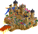
Is Fort Voxus based on an animated voxel/sprite kinda image? I SWEAR I've seen this landscape before, I've wanted to make a micro out of it forever. Absolutely adore this. Love the drab colors and the built half/natural half. My one complaint is the coaster is a little awkward. Starts SUPER strong but everything after the dive in to the waterfall is kinda awkward.
China - wow. So few colors, but it's just gorgeous. The leaf designs emblazoned on the path. Just, wow.
Mech Hangar 2 is a 0/10 because no "IDIOT SHINJI" memes. This is very ambitious, and in particular I love the crane and design of the mech. If I had to have a complaint, I guess it would be that it's so limited in scope just to having the mech, rather than broader references to the rest of the world (beyond just the quotes, which aren't super specific, just like the ride names). But really that's a small complaint. Lovely micro, and perfect idea for the contest.
You are completly right on the Voxel image here it is if you want to check it out. When i saw that image it really wanted to recreate it. I also agree on the 2nd coasterr part, i really had no idea what to do with it after the waterfall to the point I almost just deleted it. Looking back at it it may have been the smarter thing to do.
27 Comments
Xtreme97 Offline
Red Division
Yellow Division
Blue Division
R1
QF
SF
Our only match of 3, but nonetheless a very tough group with all players bringing their trademarks to the table.
China Blue
AvanineCommuterFort Voxus
MulpjeMech Hangar 2
mamarillasVoting Rules
wheres_walto Offline
mama - this rules, I was literally re-watching Neon Genesis Evangelion this week, great timing. Love that you lean into your strengths, this is perhaps your cleanest large-scale creation yet
Mulpje - love this! Your natural inclination for verticality is a great fit for this contest, I can't think of anyone better right now at constructing epic fantasy scenes
AVC - absolutely gorgeous. I remember you talking about this concept during H2H9, so glad to see it come to life here. I think the micro format is the perfect size. Just incredible work all the time
Thethrillman Offline
Get in the robot shinji, good work all this is really tough
Ge-Ride Offline
I've decided on my one and two. I give the win to Mech Hangar two for all the cool details. Even though I'm not exactly an NGE fan. The second place was a bit tougher for me to decide. Both are worthy of a second round but I personally prefer China Blue because it was portrayed as a sort of decoration which makes it more fun in the back of your mind while you're watching it. And I like the coaster style slightly more but only by a little. And I'm likely to catch fire for saying this out loud, but that sort of muted color palette used in Fort Voxus just doesn't suit my tastes the way it's used here.
J K Online
AVC – Stunning stunning entry. Just beautiful really, pretty much a work of art using RCT as the canvas. My first pick.
Mech Hangar 2 – Yep that rocked, all the small details and the custom rides really added this great scene. The Mech itself reminded me of a modern day Anubis, loved that the arm was just being attached and the splashes used as sparks flying was really cool. My second vote, keep doing what you're doing this MM because you already have that epic scale. I'm excited to see what you do next.
---
Mulpje – I'm a huge lover of your work, and this is no exception, in my eyes you just came up against two beasts. Beautiful architecture throughout and joint best coaster with AVC. If this is what you have in store for us with your work this year, I'm a very happy boy. Great entry!
RCT2day Offline
This was one of the hardest match-ups to vote for, but here we go:
1.) Mech Hangar 2 (mamarillas) - Astounding. I love the arm hanging at the lower level, ready to be put into place where the workers are welding or something in preparation. There's so much creativity in how pieces are used to tell the story here. Just phenomenal. I was skeptical of the coaster at first when I saw the overview, but I think it pulls things together really nicely. Fantastic work.
2.) China Blue (AvanineCommuter) - Love it. This is basically art with coasters. From the ornate pedestal to the coaster layout, it's all just so classy and cool. I don't fully understand the water at the bottom, but whatever. Besides the water, the colors and textures really feel like a ceramic pot. Well done. This could be first here, but I think it's just a matter of content in the one above that places it second for me.
3.) Fort Voxus (Mulpje) - I was really close to putting this second (and I mean really close). Everything is done so well here. The muted colors, the coaster layout, the rockwork and foliage, supports and castle structure, just everything. I really want you to move onto R2, because this is just fantastic. Superb entry, I'd say my favorite 3rd place vote by far. Sorry that you matched up against 2 of the best.
MorganFan Offline
1) AVC - Absolutely stellar work! The visuals grab and hold your attention without becoming overbearing. Macro and archy is amazing as well.
2) mamarillas - Super unique idea and a strong execution of it! The verticality and scale are on point, making the whole thing feel way bigger and more badass.
3) Mulpje - This feels massive and the landscaping and rockwork are done so well. I wish you had done more with the castle but what is already there is lovely.
FK+Coastermind Offline
AVC - She's the number 1 seed for a reason! This was stellar, so glad you revisited this concept and in a format that was great. The juxtaposition of the white and blue with the dark brown is so visually pleasing and it has all the details and composition that I'd expect from an AVC creation. I will say, comparing this to the original concept I remember you showing awhile back, I think some of the finer detail is lost. I think it might have elevated this further if you had a special palette that gave a more full range of whites and blues to play with, rather than just having two colors to do the entire thing in. As a result, there are a few places that I think your crunch-elements struggle because that element of texture and blend is so stark. But all in all, another beautiful AVC micro creation.
Mulpje - Firstly, you've definitely started to carve out a style and vibe that is all your own. This definitely felt like your style of park. I love the drama and the creativity of the world building, from the height to the fantastical forms and unique coaster layout. While I love the styling of the archy, it did feel blocky in places, but the landscaping was top notch, particularly loved how you integrated the torches into the rockwalls.
Mama - Considering that we've seen mech-micros before, man did this slap in a whole new way. The size is immense, and gave you so much room to add in tons of other details. I love the choice to leave the back open and give yourself 360 degrees of visibility, really shows your faith in your ability to sculpt something amazing. Beyond that, you've managed to meld your skill for huge sculptures with finer NE-centric details. Honestly, my favorite thing is the top-most crane arm above the head, that thing looks so cool. The coaster was a nice touch that I feel like some will claim was unnecessary and others will say was essential. I could go either way, but didn't feel like it detracted from this in any way. Really impressive start to MM.
I'm gonna shock myself here and give Mama my #1 vote. I just felt like this was near flawless and the execution so clean. AVC gets my #2, purely based on the feeling that this could have been a bit cleaner, but the concept is so AVC and so beautiful to behold. Congrats to all on a great round, no let downs here.
Gustav Goblin Offline
1. AVC: Nice job upstaging me on the Asian theme. Still my GOAT though. This is such a cool and artsy concept for a micro and it just looks so damn cool and pretty with its limited color palette. A third accent color for the top half would have ruined it. Hell, I almost wish you made the water blue instead of aqua. Chinoiserie is a really fun layout with or without scenery, and the way it ties into the theme reminds me of the pottery-themed Virginia Reel from Leon's H2HC park. For how much everything blends together, the archi and landscaping are also super detailed and crunchy. The bottom half with the lacquerware is just as cleanly executed as the top and gets its point across crystal clear. Also Porcelain Throne is a funny name. I love everything you do and this is no exception. Stoked to see your run through the rest of the tournament.
2. mamarillas: Get in the robot, mama! Wasn't expecting the sequel to drop but watching you go full Evangelion on it is insane and your execution is fantastic as always. Leave it to Turd Ferguson to rock the sculpture game like almost no other. Just as impressive as the macro is the micro. The astronaut entertainers and water effects resembling welders is super impressive, as is the trainitecture on the crane near the top. One weirdly specific thing I'm particularly enthralled by is the stuff on the bottom. Seeing mechanics and forklifts dwarfed by the EVA-01's feet gives you a great idea of how titanic the thing is. Coaster was cool but this micro is just as good without it. Really impressive work though, super excited to see what you do next.
3. Mulpje: I hate having to put you last after seeding you to beat AVC in my bracket predictions. It definitely looks like a very Mulpje micro. Landscaping with the Fisch rocks is awesome; it's been cool seeing everyone and their mother break them out this contest. Also digging the castle archi, especially how it pokes through the back. Layout does its job with the scenery on, but hide it and it's definitely a little awkward in spots. Nice stuff but just unfortunately not enough to compete. So many good parkmakers are getting knocked out early and it makes me big sad.
inthemanual Offline
@Mulpje: love the world building and it's a beautiful scene.
@mama: the mech didn't do it for me. It felt too rounded and smooth, not greebly and angular and metallic like I'd expect. The rest of the map was interesting and had a lot of cool highlights
Ethan Offline
Avanine Commuter - Looks like it could be in a snow globe. The white blue and brown reminds me of Royal Milk Tea which is unrelated. I like the way the blues all feel specifically painted on instead of a blue object. Like your crunch and lines in the path. Really fits the theme well. I dig the restricted color palette and heavy detail approach. The architectural forms and the way you set up the motifs is unique and elegant as ever. The curvy paths against angular architecture and the style of fences use that kind of echoes the bobsled motifs. Very clever and well put together compositionally. Fantastic!
Mamarillas - I love this mech, so much ingenuity. The more I look at it the more intricate and rediculous these gargantuin infrastructure aspects are. It's overwelming which is fantastic. There is an abundance of qualtiy with this extreme verticality you have achieved. The map has a very clear and defined shape but there feels like sucha s trong level of grid breaking and forms despite of this.
Mulpje - I like the way this map was framed, really sets the stage for the world it's set in hinting at an extension of the land formations and the castle on each side. The scale is fantastic and your colors/style continues to be so atmospheric and iconic to you. I dig the wood supports on steel track kind of like an RMC but it feels like a different kind of Hybrid coaster. The wall motifs on the castle are really nicely done, execution across the map is great.
Six Frags Offline
1) Mech Hangar 2 by mamarillas
-Concept:+++
-Content:++
-Quality:+++
Overall; Wow, amazing build. Love the quality of your sculpturing. Only minor gripe I had is that the arm that fell off is kinda entangled in the Mech Pilot Testing coaster rails, not very realistic (joking off course ). Also love all the tiny stories, custom vehicles and props you created, all with very high detail and adding to the whole. I didn't mind the coaster going through it all, as it added some much needed movement and aliveness to the micro.
2) China Blue by AvanineCommuter
-Concept:+++
-Content:++
-Quality:+++
Overall; Cool concept, love how you took a gimmick and put it on an whole other level. The Delfts Blauw (as we call it over here in the Netherlands ) really works well imo, although at first I thought it was dangerous going for a 2 colour colour-scheme. Lovely ride interaction with the architecture, and the crunch on everything is what gives the whole that polished feel it needed. Great job!
3) Fort Voxus by Mulpje
-Concept:+
-Content:++
-Quality:+
Overall; Love the landscaping and how the nicely flowing coaster interacts with it. Bit inconsistent on the supporting of the coaster though. My main concern with this was how bland and drab it all felt. Maybe it has to do with the palette or the monotonous colours used, but some more vibrant colours would've done this micro wonders I feel. (or some music)
Splitvision Offline
#1 - Mamarillas - It was a close call between this and AVC's entry, but in the end, the pure fun-factor of this won out. It's not only fun though - I think you've taken your detailing to the next level, so that while this might have cartoony influences at heart, most of it felt very convincing. That robotic arm on the top level made by trains... hnng. Looks so great. Also, of course, the statue is very impressive. And you didn't waste the opportunity to integrate a really fun coaster into the scene. Great stuff!
#2 - AVC - Very cool concept, and daring to keep it to just two colors, but you pull it off. The intricate structures and the interaction with the coaster are really compelling. And the circular map shape adds another level of technical impressiveness to it. Very cool, and as said, I was for a long time not sure whether to give yours or Mama's entry the first vote, but I am happy that both can go through, since they are both amazing entries.
Mulpje - Cool idea to have a fort built around an airy, cavernous cliff structure like this, and the execution is impressive. It also allows for a coaster that is very integrated into the scene, and that is exactly what you have. I think I'd have liked to see a slightly more organic fort structure - The tall, straight sections become a bit too repetitive and dominant in this scene - and I also think the coaster could have benefitted from another, more bold color choice. Great stuff!
AvanineCommuter Offline
Muljpe - Atmospheric, beautiful, and stately. All very indicative of your work. Definitely agreed on a color change for the coaster, and it could definitely have used some music and shapes to break the grid, but still a great entry nonetheless.
Babar Tapie Offline
1. AVC : It's clever, it's beautiful, the choice of colours is a masterpiece
2. Mamarillas : Super fun, I'm jealous of the idea ! I really hesitated with AVC for the first place, but it's a real coup de coeur thanks to you for this park
3. Mulpje : It's a very good park, a little bit massive but the realization is rellay solid! I put it in 3rd the competition was too strong with mama and AVC
Xtreme97 Offline
1 AVC: Wowow! Love it, classic AVC aesthetic fantasy. Glad to see a resurrection of this idea after you posted a snippet of something like this from post-H2H, and perfectly suited to Micro Madness! The amount of clarity and detail you've achieved despite the very limited colour palette is superb as well, definitely an expert sense of composition.
2 mamarillas: I'm in love <3 Have always wondered how one could approach making an EVA in RCT2, so of course the king of sculptures pull it off! Instantly recognisable, and to top it off the map feels alive with little bits of activity, ensuring it isn't stale. Also love the use of trains for one of the mechanical arms, simple but great.
3 Mulpje: Another tight group, was really struggling to choose. I do hope we get to see another micro or two from you in the contest! This one was really nice, I can see how it's inspired by those little voxel art scenes but at the same time is very uniquely you. Great landscaping, especially in the back with the caves!
bmschulz Offline
Cocoa Offline
1. AVC---stunning work again and classic avc stuff. I love the round forms and the porcelain aesthetic is super creative and new. just the right mixture of diorama and movement for me
2. mam---I really love that you chose to revisit this and try again. I also love evangelion and you did a great job, especially with that single rail coaster. I would have liked to see a bit more movement and storytelling maybe...perhaps an angel in the lab? the mech itself is pretty good, although the upper torso proportions dont feel quite right to me
mulpje---nice little castle and I love the way it all interacts with the terrain (as much as I hate those rock objects...) i dont love that green colour you use for the coaster and detailing. you're not colorblind, are you? I only ask because I've seen before that specific color used weirdly by colorblind folks
Ling Offline
Is Fort Voxus based on an animated voxel/sprite kinda image? I SWEAR I've seen this landscape before, I've wanted to make a micro out of it forever. Absolutely adore this. Love the drab colors and the built half/natural half. My one complaint is the coaster is a little awkward. Starts SUPER strong but everything after the dive in to the waterfall is kinda awkward.
China - wow. So few colors, but it's just gorgeous. The leaf designs emblazoned on the path. Just, wow.
Mech Hangar 2 is a 0/10 because no "IDIOT SHINJI" memes. This is very ambitious, and in particular I love the crane and design of the mech. If I had to have a complaint, I guess it would be that it's so limited in scope just to having the mech, rather than broader references to the rest of the world (beyond just the quotes, which aren't super specific, just like the ride names). But really that's a small complaint. Lovely micro, and perfect idea for the contest.
Mulpje Offline
https://www.behance....l-Art-Animation