Park / The Hunt
-
 17-January 23
- Views 6,164
- Downloads 224
- Fans 0
- Comments 28
-
 No fans of this park
-
 Full-Size Map
-
 Download Park
224
-
 Objects
1
-
 Tags
Tags


Red Division
Yellow Division
Blue Division
R1
QF
SF
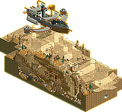
A classic layered-approach micro, a diorama of the desert, an ode to great music and a pleasant first-time submission. Who comes out on top?
Jet Propulsion Labs
In:CitiesThe Hunt
JappyRaining Men
MK98Unnamed Entry
SB1Voting Rules
MK98 - LMAO what a hilarious idea, I was cracking up laughing.. and the men just kept coming!
Jappy - EPIC! Great music choice, love the timed effects, love love love the raw meat CTR. Seeing a fucking raw steak emerge from the rocks as the music hit a crescendo was an incredible viewer experience
Jet Propulsion Labs is awesome too, Test Flight and its stats gave me another good laugh, those colors are chef's kiss
Nice to see something from SB1 as well, we're always lucky to have full matchups with new members
A bunch of really fun entries. Neat how Raining Men just keeps going on, most gimmicky parks tend to blow their load and then mellow down or stop completely. The exciting landscape, awesome music and nice, simple story telling in The Hunt gave it my top vote however.
It was a tough vote but I gave first two JPL for its detail and cool ideas. I gave second place to The Hunt. It didn't have as much of a conclusion as I would have liked but it was an entertaining theatrical sort of experience. Not sure how I'd rank the other two. Raining Men was funny but it wasn't as sophisticated in terms of the movement as the other two. SB1's Unnamed Entry was pretty fun but vanilla RCT2 without some sort of unusual theme or palette just isn't suited to micro size I guess.
Jappy – Tonnes of character, atmosphere and gimmicks. Great job, it was all quite stylised and then the meat came out and made me laugh. My top vote.
MK98 – Another really fun gimmick, moody AF but an absolute party. My second vote.
---
In:Cities – Everything I've come to expect from you, smooth architecture, innovative object usage and a creative concept underpinning the foundations you'd set. I'm just a bit of a whore for your stuff, and I wanted a little bit more from this entry in terms of the detailing and excitement attributes that you historically add to your releases. The others made me smile just a little bit more.
SB1 – I'll have an order of vanilla please. Looking forward to your next project mate, whether that is custom scenery or not.
1.) The Hunt (Jappy) - You had me at sandworm. Fantastic, whimsical story-telling like this will always go a long way for me. What's more, the airship and mountainside are beautiful. I really loved the music, too, that really escaled the scene. Excellent job, probably one of my favorite micros so far.
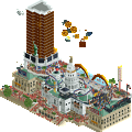
2.) Jet Propulsion Lab (In:Cities) - I love your style. As always, it's very clean and fun and creative. This is a textbook way to create a micro that lacks a big, central coaster, yet still has atmosphere. I love the launch tower coming out of the top of the main tower's widow's walk. It's right in your face, but I think the façade of the main building is an underrated part of this micro: it's gorgeous and has complexity to it. Well done. Take my vote, but you owe me a sub at Stasio's
This became a really, really tough vote.
3.) Raining Men (MK98) - wow, this was really really cool. Calling this a gimmick is unfair, because its really creative and combines seamlessly with the actual park. Speaking of, that MM logo is slick. I guess my only complaint is that even after staring at it for a while, I lose interest. I'm more interested in the technical side of how you set this up, but I think I need to vote by what's strictly in the park. Really tough call though.
4.) Unnamed Entry (SB1) - fun and classic! Good stuff, just some tough match-ups here. Keep learning and have some fun around here. Welcome to NE!
1) In:Cities - Love all the levels and the atmosphere here. There is a sense of whimsy that I also appreciate.
2) MK98 - The vibe here is great and the concept is hilarious! I love all the details and the dark comedy aspect.
3) Jappy - Everything here is wonderful, and it was very exciting to follow along. The atmosphere is great, and I love all the movement.
4) SB1 - Fun coaster, I like how the loops are timed together. I like the scale of the buildings here.
2. MK98 - what a gas! The gay in me had to pick this wacky concept. But beyond that, the amount of hacks it took to make this work is impressive in itself, and the effect was great. Really enjoyed this.
3. In:Cities - really nicely done with some great execution as expected. The jet propulsion ride is funny and overall it was well crafted. There was a disjointed feeling between the archy style and the concept for me though, and I wished the concept could have been taken further.
4. SB1 - the coaster is quite fun and the linked loops is a nice centerpiece. Looking forward to seeing you continue to make work and welcome to NE!
1. Jappy: Loved this to bits. Felt like I was watching a good movie or fighting a boss in a video game rather than looking at a RCT park, which goes to show how far we can take this 20 year-old theme park simulator as a medium. I can definitely tell Gangland inspired you. The narrative with the sand worm is a surprisingly effective foundation for a micro, and I love how you continue the narrative even though the sandworm itself makes multiple laps. As Walto mentioned, timing the steak catamaran with the music was just so perfect. The surroundings work really well with plenty of detail. While in VC with RobDedede, he mentioned how you made it work with so much negative space and I have to agree. The SS Dune Destroyer is also unbelievably sick and gets my seal of approval as a connoisseur of cool flying stuff. I really want to say I may have inspired you with those wings! I was not expecting something like this out of you but I am not mad about it in the slightest. You're a real artist, Jappy!
2. MK98: Genuinely one of my favorite concepts for a micro ever, and the way you executed it is staggering. 134 miniature railways? Just psycho stuff. The peeps all over the ground and the car accident were hilarious touches. I thought the archi was a little blah at first, but watching the music video shows you nailed the aesthetic. It also glitches like a mofo but who gives a rip, this just puts a big ol' grin on my face. My only flaw is putting the music as a link in a Word document is the lousiest way to attach custom music I've ever seen. Again, I don't care. Like Jappy, you've doubled down on an entertaining and wonderfully executed concept and made it work. Amazing stuff and obvious #2.
3. In:Cities: Hate to do this to you dude, you've got a really fun micro on your hands. The multi-layered approach is a classic micro move which you've made great use of. I also love how cutaway friendly it is, with both levels having great interior detail. The back side is a little underdetailed though; wish you had put some more fun touches back there outside of the big rocket. The ride ideas are really fun and tie into the theme really well. A great little micro, but I just liked Jappy and MK's more.
4. SB1: Always nice to see some new faces showing up for Micro Madness; many a star has been born through this contest. While I put you last, I still really enjoyed this. Cobra is a wonderful little layout which reminds me of the stuff I'd go goo-goo for in the multiplayer servers way back when. The synchronized interlocking loops made me smile, although they come at the cost of a lot of time spent in the block brakes. Supporting rides are nice too and make great use of the limited space you had. Unfortunately it just suffers from lack of detail, especially the Cobra station building. Even with NCSO you can get some unbelievably detailed parks; look at some of the recent DKMP releases or the classic NCSO parks by players like Shogo, RCT2day, or Terry Inferno. Best way to level up is to keep building, which I hope you do!
In:Cities - This micro was...confusing? The execution is top notch, there are plenty of ideas, and yet it feels a bit odd, like you didn't have a clear vision for it? Or, if you were aiming at something more artsy, this felt too grounded in reality to be so odd. The structures are great, the rockwork is great, the rides are fun and bring some action, but the overall of how everything comes together is just, odd. I can't help but feel like you didn't get the time you wanted to fine-tune this? Or it is aiming at an aesthetic that I'm not latching onto. There is so much that I like, but it doesn't come together the way your work normally does for me.
Jappy - Didn't you say you couldn't keep up with the modern meta? I call foul. This was great, crunchy and well executed, a great airship, and a fun little narrative with the ship bombing the dune-esque sandworm. I will say that I think the timing of the events felt a little off, as the worm exploded before I could even get a look at it and had to reopen paused. But otherwise, another great us of MM format to create something unique and engaging.
MK98 - This was just SUCH a vibe. I love the concept and all the work you put into making this happen. This is what MM is all about, weird and wacky creations. The aesthetic is really interesting, because you have these bold colored buildings, some really well done and others a little block (almost graphic) and then the heavy texture of the roads and bodies. I think maybe a more subtle shade of colors might have given you the opportunity to play more with the gore of what raining men would do to a city.
SB1 - The coasters were fun, I think you managed to get some great interaction for such a small space. Otherwise, this doesn't have the level of detail and composition that is NE's brand of rct, but as a new player and this as a first release, hopefully you'll stick around and hone your skills.
I'll be honest that Josh has made this a really hard vote for me. I think he has the best execution but the composition and how things came together had me complex. My #1 will go to Jappy for what I think is the most complete package. I'm torn between Josh and MK; both delivered something interesting but wacky. Where Josh's feels very unusual, MK had some blockier structures I think could have been refined. Ultimately, I think MK was more successful in capturing and conveying a clear idea to me, so MK98 gets my #2. Another interesting group.
1) The Hunt by Jappy
-Concept:+++
 And finally, the cave and airship gave it that edge it needed. Well done!
-Content:+
-Quality:++
Overall; Very cool movie-like micro. The custom music adds soooooo much to this, really dips you into this adventurous Indiana Jones/Mandalorean/Dune kinda atmosphere. The landscaping also is excellent, and it makes the absence of architecture (which I thought was dangerous going without in a micro) bearable. The Belgian jokes put a smile on my face, with the 'bait' for example
2) Raining Men by MK98
-Concept:++
 ) after you've seen the scene.
-Content:+
-Quality:++
Overall; Was kinda let down you didn't include the Raining Men song as .parkobj, especially because it's so easy to make with Gymnasiast's Object Editor Site. I know you included the youtube link, but I view the entries multiple times and not gonna open that link every viewing. Minor pet peeve though, as the concept and the execution are very nice. Well constructed urban setting with a nice colour palette and great lighting effects. Was missing some ride movement though, feels a bit dead (
3) Jet Propulsion Labs by In:Cities
-Concept:++
-Content:++
-Quality:+
Overall; I read on Discord you speed build this, and it kinda shows with unfinished/bland walls of the building and the big rocket. Un-Josh like almost. I love the underground part and quality of the (Fisch) rock work. I'm a bit on the fence on this one, as I kinda expected more from you, although what is there is still nice.
4) Unnamed Entry by SB1
-Concept:-
-Content:+
-Quality:-
Overall; The rides and their interactions are nice, but the bland buildings and unknown concept (other than a themepark setting I guess) kinda keep it down for me.
In:Cities - I always love the shit-posty concepts you do and execute them at the highest level. I like how sort of "low poly" that rocket ship is. Color selection is real nice with that roof and that path.,. I also dig the approach for landscaping. I feel like it ties in together with the gorgeous rocket piece where there aer these fairly manicured bursts of plants/rocks and some fairly clean flat faces in between. Just so oddly satisfying, real nice.
Jappy - Really well done world building, I really like the scale of things. Love the desert mines and the giant desert worm, reminds me so much of Terraria. The ship is so well executed with just the right amount of color. I also appreciate all the texturing/crunch you've done here feels very organic.
MK98 - Loved this one. It's so silly but it's so nice. I really dig the architecture, it has a nice unique style and shaping. There are a lot of nicely blended fine fetails all over the ground and rooves. It's cartoony but also morbid which is funny.
SB1 - This feels very true to form OG Rct. I do dig some of the structural choices you did here, the main building feels kinda abstract. The coasters are also quite nice, the double loop feels earned and the overall interaction with the landforms is nice. It is a bit vanilla but I think a minimalistic style can be developed from this.
Jappy: whoa wtf this is epic! The music really adds a lot. The explosions caught me off guard.. love it. Really creative.
Josh: goofy and funny. When I saw JPL was the park title, I thought something gritty and super serious. Boy was I wrong
MK98: Also goofy and creative. Makes for a tough vote. Kinda funny how all the peeps are mad. Was that intentional? You put a lot of work in to this and it shows.
SB1: Welcome! Rough around the edges so-to-speak. A bit underdetailed compared to the other entries. But interaction and the coaster layout are nice. Water those gardens!
#1 - Jappy - I believe this is the highest adrenaline I might have had ever viewing a RCT park! Really epic, and the fact that it goes on for some time just makes it better. The music adds a lot to the excitement as well. I do wonder if the map could maybe have used some more verticality, as the ship feels very close to the ground, but other than that, really a stellar entry, and I think you're approaching MM in a very good and captivating way here.
#2 - MK98 - Possibly the best utilization of the fact that all peeps look like men, ever. And raining they are, indeed. Endlessly. I appreciate that you made it an infinite loop actually, as that often requires another level of effort than simply having a sequence play out only once (in this instance, I guess you could have simply paused the game, deleted several "floors" of path filled with peeps, and let the peeps rain down that way). The city scene itself is also nice, even if it feels like some buildings got more love than others. The two corner buildings seen when rotating the view once are the best ones, I think, really classy. Fun entry!
Josh - How did you make your rocket not take off?... Joke aside, it was definitely not a lack of of some pretentious RCT trick that made me reserve my votes for other entries. This park is meant to be fun, not epic. And it is fun. And of course, both your macro and micro are great, very cleanly presented while also having a good level of intricacy and detail. But, it just feels a bit lackluster in terms of the overall idea. It's difficult to put my finger on it, but it felt like Jappy's and MK98's efforts were more focused, more pure. You're always so generous with your kind feedback that it is hard to say something negative about your work lol, but I think in the end, I know you can do something more special than this, and I want my vote to reflect that.
SB1 - While this was too generic and under-detailed for seriously contending for advancement, it is a nice, simple piece, and there are some cool indications that you have a good feeling for creating a nice macro, as the overall shapes and placement of the coaster comes together quite nicely.
1 Jappy: Excellent first micro, glad you took a risk with building a small story-based micro. The idea is really cool and executed well - feels like a scene from a great movie! Lots of details that stand out - the steak as bait is really fun, love the design of the ship. Great work!
2 MK98: Was guessing what this could be when I saw the file name, and it didn't disappoint lol. Also like how you set it up to keep going rather than just being a one shot thing. Nice style of architecture lining up with the design of the music video.
3 Josh: Has some hints of being a quick build but somehow you always manage to pull something super great out regardless of how much time you've got. Love the idea and some of the sillier things - the tnt, the haphazard explosives, lethal test flight ride. Strong aesthetic too even for how quickly made it appears.
4 SB1: Not a bad intro to the site, glad to see participation in any form. The little snippet of beach is nice.
1. MK 98 : I really like this architecture, it's simple but it works well, and the idea is so stupid that I put it in 1st position
2. Jappy : I have the impression that it is different from your usual constructions and I congratulate you, I found it very beautiful and very simple in a way (that's a compliment), I give you the second place
3. Josh : It's heartbreaking to put you in 3rd position, it's a very good park, it's fun and I laughed a lot
4. SB1 : A little too simple for me but there are good things, full of encouragement for the future!
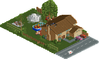
1. (closely) jet propulsion labs---I adore the house here and the vibe is just so on point. clean and wonderful. reminds me a lot of the game quantum conundrum!
2. (closely) jappy---this is awesome. I love the idea of mixing wild west steampunk with a sandworm quest. the boat with bait made me laugh and the flying ship is excellently detailed and constructed, easily the best 'flying boat' i've seen in a long time.
mk98---love this, and I love that you recreated the music video. Just hilarious and a great aesthetic too.
sb1---actually a really solid layout, i think the big station building hides a bit too much of it though
I really enjoyed The Hunt, even though it only "works" for the first 20~30 seconds or so. The ship is really neat, there's just enough going on to sell the concept, and I like a micro with a story. The steak on the cart is hilarious.
Raining Men is crazy glitchy for me, but the concept is nice and simple and architecture showcase micros like this can be risky. I appreciate that it just goes and goes, and you can watch the guest count plummet for minutes and the effect doesn't stop. The zombie peep objects give it a dark humorous twist that I appreciated.
JPL is a great concept but I think maybe the least well executed of the group. The central conceit of the mansion with a villain or mad scientist lair underneath is perfect, and the launch ride out the top of the tower with the fireworks is neat. The rocket test track sort of seems bolted on though, it probably would have worked way better in the underground section, and that would have let you put some kind of opening hatch hidden in the grounds above the big yellow rocket underground. Instead it is just stuck there since the entire house is on top of it. This one frustrated me a little, even though it's magnificent on a technical level.
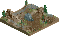
SB1 - solid little coaster layout for such a densely packed map. So much of your map goes to this brown structure, you needed more greenery and/or a bigger diversity of building sizes/shapes/textures here. Look for smaller touches too, like making sure your staff are actually cleaning vomit and litter off your paths, and your gardens are watered.
good, then it's coming across as intended lol
Appreciate you all showing love to the group F squad