Park / Southlake Street Fair
-
 17-January 23
- Views 7,565
- Downloads 284
- Fans 1
- Comments 34
-
-
 Description
Come celebrate 50 years of fun at the 2023 Southlake Street Fair!
-
1 fan
 Fans of this park
-
 Full-Size Map
-
 Download Park
284
-
 Objects
1
-
 Tags
Tags

![park_3324 [H2H7 R1] Circus Circus & Adventuredome Atlantic City](https://www.nedesigns.com/uploads/parks/3324/aerialt2970.png)
Red Division
Yellow Division
Blue Division
R1
QF
SF
With micros ranging from off the wall fantasy to gritty realism, this could be a lethal group.
The Stranger
hoobarooSagan 4 Launch from WSA Aristarchus Launch Complex
SplitvisionFiesta de los Muertos
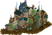
UlvenwoodSouthlake Street Fair
AmusementParkerVoting Rules
Ulvenwood - how fun is this? Coco is one of my favorite Pixar films, so I'm chuffed to see another rct interpretation. Lovely sculptures throughout but it does feel a bit.. Earth-bound in comparison to the film's set
Splitvision - I know what I'm about to witness and I don't think I'm prepared for it. I paused the game to start my comment.. diving back in now.. wow dude the launch alone would have been enough but to have the functioning countdown timer AND the separated landing? Come on man, leave some skill for the rest of us
hoobaroo - I saved this one for last and it didn't disappoint. Just unreal, friend. You're my favorite player of all time
Flipping eck... this is just another shit show of skill isn't it!
I'm not sure how I'm going to vote on this one. I literally loved them all.
Strong round guys.
This has been my favorite round so far. Such great quality from all 4 parks. I'd expect nothing less than a crazy use of the game from Splitvision. Ulvenwood's was super fun with a great choice of ride. AmusementParker came out of nowhere with one of the most pleasant parks of the tournament so far. Hard not to love it. And hoobaroo coming in with what feels like the sequel to the H2H project. Really beautiful. Great work to all-- hope to have a more in depth review soon.
1) Splitvision - Some of the most exciting rct I've seen in a while. The whole experience was so much fun!
2) Ulvenwood - Nailed the vibe on this one. The sculptures are fantastic and everything feels so lively.
3) Hoobaroo - I like the moody atmosphere to this. It feels very grand and majestic, but something is missing, like a punchline or a climax.
4) AmuesmentParker - Wow this is a super strong showing from someone new! Very pleasant take on a classic theme, and I like how cozy the main street feels.
Hoobaroo- i freaking love this style man, super inspiring and clean! I love the glasswork and the roof tripped me out for a bit. I like the rocket a ton. The train station is lovely and i love that motif in any rct!
Split- Holycow this is super impressive! This is always crazy and i dig it. I like the level of detail in the shoestring hacks and in the scenery for the launch tower!
Ulven- this is so fun and whimsical, i like the ride, it doesn't feel cramped and its well planned! The dragons looks so goood and the skeletons too, i love the hammock. I like all the named details too, and great use of music.!
AmusemntParker- This is so good and classic, its great NE realism and its done super cleanly and with a great sense of familiarity!
hoobaroo - This was kinda what I was expecting from you cause it's so unexpected. It feels like a continuation of the style you were playing with toward the end of H2H9, using rct as a way to create unique and beautiful visuals. I love the way you've darkened the outside of the building and then lit the inside with bright golds and yellows. There are so many fun, artsy touches that are very much my kind of thing, which made this as fun for me to explore as parks with dozens of frozen staff members. I do think that the neon-color tiles feel a bit out of place, and I think some slight hints at more of a narrative might have helped make this more accessible, but for me I'm sold on the artistic vision.
Splitvision - What we expected and what was delivered. This to me is the perfect kind of innovation that this contest allows; a unique idea that might fail in a larger format but succeeds wildly in MM. I love the launch and return, the countdown, the top notch ride hacks to take what are often static scenes and bring them to life. The details of the industrial/space vibe were great, probably the only thing I think might be missing was a bit more crunch on the surface level to add some depth, but otherwise this really delivered on everything I expected from you, so congrats.
Ulvenwood - My first impression compared to the other entries I've looked at in this division is the sense of fun and energy in this micro. For something that is so much brown, it has a lot of color. The music combined with all the skeletons playing instruments was a great idea and fun to explore. I do think the structure is a bit boxy and could have benefited from some more levels for peeps to access and/or colors to break up all the light brown.
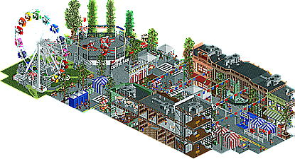
AmusementParker - For someone I don't know a lot about, this is an impressive park to open. Very detailed, lots of content and things to explore, and some great interiors. The execution is super clean, even down to the trim around the outside that gives this an almost play-set kind feel. The only drawback for me is that it doesn't have a big wow factor moment that I expect in the micro madness format. It is a great slice of realism, but against certain parks and builders this may struggle to compete with louder ideas. Congrats on a stellar first release though!
Taking into account the innovative styles and really utilizing the format of MM to the max, I voted Split #1 and Hoobaroo #2. Congrats on a great round though, loved all these entries.
Group D electric boogaloo.
1: Hoobaroo: Yeah uhhhhhh I love you. Don't know if I've made that obvious enough ever since you took MM3 by storm but you legitimately have one of my favorite styles of any builder on NE. On the topic of MM3, it's interesting seeing you go from a bottom-seed breakout star to a favorite to take it all and hungry for the title. Right off the bat, this feels uncannily similar to House By The Sea from H2H9. Not sure if The Stranger is a sequel with the boat going away from the house and toward the train station or if you just really wanted to see a finished House. (something something missing roof something or other) Either way I loved House to death so it's no surprise this strikes a chord with me too. The atmosphere is near unparalleled with the fades, lighting effects, ambient water, and the other particles and effects rising upward. I love the varying textures in the train station, and what interior views are modeled look gorgeous. Highkey one of the best interior designers in the game IMO. The little courtyard at the back is beautifully detailed; turn off the staff and peeps to really take it in. I'm noticing so many little details like the checkered pattern on the station floor continuing into the grass and just oh my god. What can I say except madly in love. Only thing I wasn't big on was the coaster. I don't think it really needed to be there and giving it a visible track shows it looks like kind of an afterthought. Still, obvious #1 for me.
2. Splitvision: My first thought when I saw your overview was "Huh, this looks underwhelming."
My second thought was "Oh god."
And yeah, you delivered. I wasn't expecting you to be able to pull off a hack of this caliber with the week you had, but I guess I totally slept on you. The countdown clock, the timed music, the sheer size of the CTR you managed to pull off, the way the lower half comes back down, the smoke; this is just FredD's from last year on turbo crack. So happy to see you keeping up the next-level hacks throughout this contest. You made this a really tough first pick. Please make it to finals and win this joint with a whole ass TI-83 that can play Doom.
3: Ulvenwood: Was expecting something beautiful from you and my god you delivered. The main facade is gorgeous, and the skeleton face in the center and the sculptures around are just so Ulvenwood. The musical skeletons, oh my god dude. Every angle there's something new and so so charming. Going with a ghost train was a genius choice to really tell a story with those interiors without dominating the landscape. Plus, you're just a natural with creating lovingly detailed dark ride scenes so this was right up your alley. Love how you reused the mirror effect from Lord Blackadder's entry in the DKMP ghost train contest but actually made it part of the ride rather than just an effect. The big thing that really hampers this for me is how uncannily similar it is to Mictlan from H2H8. Obviously both are Coco themed and I'd even argue yours is a lot more readable while still retaining that Coco charm. Unfortunately it just falters to a beautiful, original, and atmospheric concept and a total WTF moment. Don't be put off though, this micro is a treat and you wholeheartedly deserve to move on just as much as the top 2.
4: AmusementParker: God it makes me so sad to put you last. Your first few screens had huge potential, and you've let it explode in your first ever release. I'm looking at this and thinking it could be by a far more experienced parkmaker. Like the other entries this round, this just oozes with atmosphere. The merchant and game tents are executed super well and the flags above hammer in the street fair feeling. It's very easy to get lost in. While it is a little small scale and that green building is just a bit too green, your archi is already off to a brilliant start. Detailed interiors in your first ever release is one hell of a flex, and like the outsides of the buildings they are done unbelievably well. The guests in line at the porta potties got a good laugh out of me too. One of my favorite little touches is layering the Fisherman lights inside the Splitvision string lights to get them to blink. Little atmospheric touches like that are already separating you from the rest of the pack.
It is a little unfortunate to see you didn't make the rides peepable though. A little more experience with shoestringing and playing with entrance and exit locations and getting peeps on rides like this will be second nature. Also this release was begging for some wacky frozen staff scenes, which again can be made very easy with the Peep Editor plugin. Flaws aside though, this is seriously amazing and you're the revelation of this contest win or lose. Please keep building!
I'll have to think hard about this one. Maybe wait a day or two. I won't say which yet, but three of them appeal to me almost equally so I'm not sure which I'll vote for yet.
Hoobaroo - The beaux arts sort of style with the dreamy stuff is a great start. colors and moodiness are strong as ever. Dense, atmospheric, flashy, larger than life. Colors are really special here. The longer the look see more of the subtle splashes of reds and blues around the map... that path color is so luxurious. Also, lighting! so good.
Splitvision - You take the concept and you take it all the way to the top. Before opening knowing you I was like yea he is going to make that rocket move and he did and still shocked me. The build up with the count down, the audio and sounds. All the extra effects with the ctr. The way the crunch was done creating a shadow underneath the base... It just feels so monumental like I am seeing some kind of pixar short inspired by rct. Just so big, as always. One small step for man...
Ulvenwood - The sculptures are a highlight as always. Love all the referenes to the source material and the atmosphere building. Colors and vibe feel classy and very you. The dark ride interiors are always such a treat and the landscaping you did around the edge is really well executed. This feels like one of those cheap carnival dark ride facades with that layout taken to the highest level of atmosphere and themeing.
AmusementParker - That street architecture is so fresh, I like how you comitted to a sort of monotone vibe on much of the individual buildings. Feels retro. All the little micro festivities and interiors make this feel so dense and lively. I like how the interiors kind of tell a unique story or give a unique purpose to the buildings. Infrastructure and how you designed the rides together is also sharp Oh, and congrats on the first release! This is super high quality, I hope you stick around! Really great debut contest showing.
The Stranger is simply beautiful. At first viewing it reminded me a little of Time's Arrow in group D with the verticality and pleasant atmosphere but with much more activity. I love the art deco/gothic revival/whatever (I'm no architect) architecture and the colours. The subtle surrealist and/or sci-fi elements like the anachronism bring yet another dimension to the piece and speaking of those, I didn't even spot the titular stranger until I had explored the micro for several minutes.
^ I can see how you've taken to it after your entry. Agreed it's stunning.
1) The Stranger by hoobaroo
-Concept:+

-Content:++
-Quality:+++
Overall; The concept is a bit unclear to me, guess I'm the guy who has to have it spell out or something. If it's about the book/series 'The Stranger' I'm unfortunately unfamiliar with it, but guess it's about a stranger telling secrets to a guy and then his wife mysteriously disappears? Putting the concept aside, I see a beautifully constructed train station/crossing, in a dreamy Hoobaroorian atmosphere only you can construct. What a joy again to see this quality work from you, it puts a big smile on my face
2) Fiesta de los Muertos by Ulvenwood
-Concept:+
-Content:++
-Quality:++
Overall; Very vibrant and joyful atmosphere. Also very different compared to Mictlan in H2H8. Love the sculptures throughout the micro, the foliage and the little darkride going through the well constructed (although a bit monotonous) architecture. The joyous music tops it off!
3) Sagan 4 Launch from WSA Aristarchus Launch Complex by Splitvision
-Concept:++++
 I don't even know how you synced all this to be happening at the right time, but it sure was a blast (
  ) to watch it play out. After the initial viewing you've kinda seen it all though, but that's what a micro like this is about I guess.
-Content:+/-
-Quality:+
Overall; I thought when rating the micros to have 3 +'s as maximum for a category I chose as guidelines, but this concept is so out-of-this-world I had to give 4 and break my own rule
4) Southlake Street Fair by AmusementParker
-Concept:+

-Content:+
-Quality:++
Overall; This must be an alt-account from someone, can't believe you just come out of nowhere like this. Love the realistic fair vibe you created here, it all is so detailed. Especially love the interiors. Some music would add so much to this piece though, that's my only gripe. I would love to see more of your work, too bad you're in this group. I just hope you'll do a full themepark like this in the future and get Spotlight with it!
Ulvenwood - What a fun piece! I'd say this is the most fiesta vibe we've seen in RCT. The music plays a very big part, of course. The castle is really nicely done, and there are many well-crafted details around, like the skeletons playing instruments and the skull face on the wall of the castle. Really nice entry!
Hoobaroo - We've come to expect top-drawer sci-fi themes from you, and this is exactly what you deliver here. While I am not sure if this is based on some IP unfamiliar to me, I think I get the general gist of it. If nothing else, it looks amazing - it's like Studio Ghibli meets Christopher Nolan. Magical and loaded with high-level sci-fi vibes.
AmusementParker - Very quaint! I like the simplicity of depicting a section of a town with a cute small amusement park in it. What's there is really nicely done, and the cutaways add a layer of extra thought to this, but in the end, it might still lack that attention-grabbing factor to put it among contenders for advancement. A full scale-park in this vein would do really, really well on NE, though!
2. Hoobaroo - a continuation of House by the Sea? I’m here for it. Very much in your style of abstract, dreamlike surrealism with a penchant for large beaux arts structures. The attention to detail is wonderful and the whole thing oozes atmosphere. I still don’t get the narrative, but I don’t think that’s the point. Great stuff.
3. Fiesta de los Muertos - Another coco theme, and done so so well. The alebrijes and skeleton sculptures are so fun, and you really captured the vibe! Could’ve used your help two H2Hs ago… some of the architecture could be more refined here, but the little details really elevate the micro. Unfortunate you had to face two stellar entries.
4. Amusementparker - Not bad for Coupon’s shadow account. All jokes aside, this is a really really well crafted scene and hits the nail on the head for a mainstreet fair. Great work, this marks a very exciting beginning for you on NE!
Splitvision – I was dumbstruck at the sheer amount of innovation. This was my first vote for obvious reasons. I've watched it a couple of times, even though I know what happens, but I can't believe this is the same game I was playing ten years ago.
AmusementParker – My second vote for the sheer amount of crunch, micro moments and an impeccable atmosphere. Welcome to NE!
---
Hoobaroo – Beautiful skill and crunch shown throughout, the story was slightly lost on me so my vote went to AP as I felt the intent was clearer.
Ulvenwood – As a huge Coco fan I thought this was super fun, maybe a bit less polished for what I'd like but the colours of the peeps around the park was a nice touch. Whilst the skeleton statues across the park were expertly done, being out of scale with the peeps around the park (as everyone was skeletons essentially) bothered me a bit.
Yet again another ridiculously strong round.
1 - Splitvision : A brilliant idea, that's what I love about rct2, thanks for that
2 - Ulvenwood : The colour choice is good and the sculptures are great, I really like the overall look
3 - Hoobaroo : It's beautiful, but personally I find it a bit too obvious coming from you
4 - AmusementParker : The competition is tight in this group, it's a very nice scene well executed but a bit below the other 3 propositions
Splitvision: Amazing. What a way to show your dominance. Give me more.
Hoobaroo: Lovely atmospheric piece of fantastic RCT. Also give me more.
Amusementparker: This is great. Unlucky that you and I had to go up against these guys, but there is definitely a lot of potential in this slice of work.
Damn unlucky being in this group guys, any of these could have been top 2 in another group really.
The rocket was my favorite, don't even know how that happened. Amazing idea and incredible execution. and so CLEAN.
Second favorite was the dreamy stranger park, so much to see and tons of interesting stuff going on. Beautiful.
The Coco park could have topped another group, very unlucky.
1 Hoobaroo: Very exciting entry! Feels like a sequel of sorts to House by the Sea but still very much its own thing. You've really fleshed out this world so well, intricate details in every place that make it seem like you had a fully formed vision from the start.
2 Ulvenwood: Damn dude, you were squeezed into a really tough group. I enjoyed this a ton, so vibrant and with the cutest possible accompanying music! The little skeleton sculptures are incredible, and the added skull and musical note motifs are brilliant. I think the liveliness and ability to sit with the map without becoming bored is what snagged second place for me.
3 Splitvision: Definitely one of the most mind blowing effects so far in the contest. I was telling myself "no way" as the countdown continued and you delivered on the promise. So cool, and I like the added touch of it landing with just the booster. It may be a one-and-done effect but the impact is significant.
4 AmusementParker: Wow, what a suprise this is. It's a shame it may become buried in a strong matchup, and I think this would easily stand out in other groups. The architecture and realism details are superb, especially the interiors, and if this is a taste of what you can do then a full design or park would be excellent.