You must view all parks in this match to vote. If you cannot view a park, for example if you
don't own LL, then please do NOT vote.
Once you have viewed all parks, select your favourite and second favourite in the above poll. The poll
will close after approximately 3 days and the results will be posted.
The winners will be determined by the formula set out in the Rules & Regulations topic. The creators of
the two highest scoring entries will proceed to the next round. The third highest scoring player will be
placed on the reserves list for the next round. The lowest scoring player will be eliminated.
Everyone may vote except for those participating in this matchup. If you are part of this matchup,
please null vote. Voting is public and monitored by admins, any cheating will be picked up on and dealt
with.
TTM - Cute little entry, I do wish there was more to see inside the buildings considering how much space they occupy, and I wish the entry pathway were hidden
RCT2Day - I like this, I think your large trees are surprisingly effective considering what they're made out of, that's a clever use of the palm tree shape
Raunch - woah. This is absolutely gorgeous. Love the colors, love the textures, love the construction shapes, excellent work here
bsg - very cool, my cat's name is Hank and I showed him the park and he loved it so great job
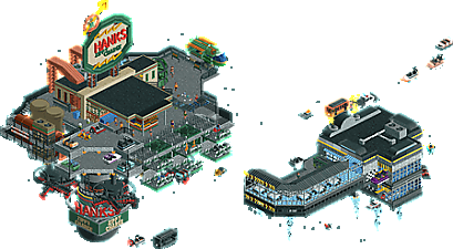
I voted Hank's Zippy Charge for first. It was an atmosphere based entry. I liked the enigmatic floating nature of it, it seemed to be a sort of space diner and electric equivalent of a gas station. I liked the cars zipping in and out.
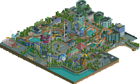
Botanical Tower is my second place vote. It feels like a turbocharged RCT2 version of Skygarden. Great peeps/ride interaction and gorgeous colors.
Third place I give to The Eight Expedition of Dr. Albert Falls. Good coaster, like the jump. The tree trackitecture is pretty cool. And I like the pun humor but it wasn't enough to compete with the absolute beasts of the first two.
TTM, Good aesthetics and I like the modernist style. The coaster was interesting and boring in different ways. It could have used a longer length, not a critique on the shuttle mode, but needed something more than the admittedly cool corkscrew out the edge of the building. I really like this entry, just not as much as the others sadly. Keep playing and you'll get better and come up with something more competitive in the future.
This is a very strong match, great entries from everyone!
1) RaunchyRussell - Beautiful structures and integration of the archy into the landscape and foliage, which were also well done. One of my favorite entries so far.
2) bigshootergill - Wow, this is such a great sci-fi piece! Interaction all over the place and a very lively scene.
3) RCT2Day - I'm so glad that MM4 was blessed with this wonderful NCSO. The scale here is great, and I love the trees.
4) TheThrillMan - This is very clean! Nice job on the shapes of the architecture, I just wish there were a few more pops of color.
1. bsg---love this. not the first time we've seen space cars but a very clean and fun version for sure. the giant sign is great and the spinning letters are so fun
2. raunchy---great, lush vibe. feels very optimistic and futuristic, and the honeybee ride is cute
rct2day---very close, hard to say no to a wooden mine cart. i am a sucker for jungle expedition vibes
thrillman---I like the curvy buildings and think you did a pretty good job selling the modern mall vibe. maybe a bit inconsistent with scale
bigshootergill: this is adorable! Such a mundane scene (flickering lights, dumpsters, police fining a driver), transposed into a strange environment. It’s not especially unique, but it’s unique enough. Reminds me of Levis’s RCTopia, as well as Astroid Fields. Can you imagine what AF could’ve been if you were this good back then, instead of just a promising newcomer? I love how clean and detailed this is. The rotating sign is also nice. I would’ve left the propellors out, they don’t really serve any purpose in space, except shred any cars that may go off course. On the other hand you haven’t specified that this is in space. Perhaps it’s still in the troposphere.
RaunchyRussell: Ha, this is what I want my park to look like. Loving the sea of flowers. Architecture is good too, with nice latticework and multi level paths and rides. The honeybee first drop is epic. Oh shit, the swinger itself is rotating! Great idea. Has anyone done that before? Lastly, nice bike ride. The circular plaza is a perfect space filler matching the shapes above. Just a shame the bikes disappear into the bushes. One of my favourite entries in this round.
RCT2Day: this map is just a vehicle for puns, huh? I enjoy it! Map is a bit underwhelming, I want to see the temple facade but there are two giant trees in the way. Speaking of, the trees look nice. Even the floating jungle trees with their uprooted trunks don’t look as weird as you’d expect. I can picture the roots being some kind of vine things hanging from the tree.
TheThrillMan: my first association with El Al is that time a plane crashed into an apartment building in Amsterdam in 1992, but based on the map name I believe this is just a hotel in Tel Aviv. I don’t think we’ve ever seen a realistic map set in Israel! Would’ve made for an interesting Grand Tour location, thinking of it. I like what you’ve done, except for the coaster. Ironically, some more movement is what would’ve helped this map.
1 RaunchyRussell: Damn, this is so cool. Wasn't expect this kind of direction for you but the naturalistic landscaping and foliage is superb. Great amount of things to spot from each angle without the map getting chaotic, and not a tile wasted. Awesome!
2 bigshootergill: Such a cool little scene. Feels like a perfect blend of "realism" with fantasy/sci-fi and the details level is so strong. The logo in particular shows you have a strong sense of design. A ton of fun little touches amongst all the activity, which itself feels really well balanced and not a chaotic thrum of noise. The speeding ticket, the space drivethru. Feels like a modernised outtake of Asteroid Fields.
3 RCT2Day: Really lovely micro, and effective use of objects too with the trees feeling like they have hanging vines (not totally convincing, mind you). Great atmosphere and sense of adventure, enjoyed seeing the coaster zipping about and doing the jump.
4 TheThrillman: This is rather charming. A little light on content with the buildings taking up so much room, but it feels like a fleshed out space which is great. Yoga guy with the speakers is a funny detail.
Overall; Great architectural structures combined with natural eye-candy. Love how the coaster is making its turns underneath the swinger and circus tent-dinner-sitting area. Bit thin on the stone poles on the lowest layer, where I was wondering if it could carry all that load. Anyway, top notch foliage and a great colour scheme throughout makes this a very memorable micro. Great job!
2) Hank's Zippy Charge by bigshootergill
-Concept:+
-Content:+
-Quality:++
Overall; Broken record here again, but custom music would've lifted this micro a few tiers. Apart from that, especially love the scrolling Hank letters around the zippy charge sign thingy. That's so clever. The kind of futuristic flying cars tank(/charge) station/dinner theme we've seen in Stardust Jubilee Casino in H2H9 already, but I still like the take you did on it. Some very nice detailed architecture, clever ideas throughout and a great colour scheme make this a solid entry from you bsg.
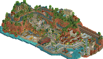
3) The Eighth Expedition of Dr. Albert Falls by RCT2Day
-Concept:+
-Content:+
-Quality:+/-
Overall; God, I'm getting PTSD from seeing those big trees In general they are just a bad idea, because they block so many views I know from experience.. Anyway, the micro is full of puns like for example vines/roots called "I'm rooting for these trees", and the canoe "We made it! Canoe believe it?".. It's well composed with the little waterside (with nicely constructed custom boat) transitioning to the beach and the temple complex in the background. Just a solid adventurous funny piece.
4) The White City by TheThrillMan
-Concept:-
-Content:+/-
-Quality:+/-
Overall; Feels too unpolished and rushed, with no inside interiors (which would add so much needed content to a small piece like a 15x15 micro), bland architecture (although I like the curves and the building on the right with the balconies) and unclear concept other than a wild guess it's in Israël seeing the "El-Al the experience " coaster. I like the pool and the ac-units/solar panels on top of the big building though.
RaunchyRussell - This is new-age serenity. The part of this micro I would like to highlight most is the shallow waterfall. Really well done. I think the use of circular structures throughout this micro also helped it stand out and give it its own unique aesthetic.
BSG - The definition of fun. This reminds me of the outskirts of Stardust Jubilee, in a good way, and I think this micro feels much more real (maybe because of the palette). This also reminds me of Futurama!
RCT2Day - Some very nice NCSO here. I think the way the canoes are placed along the beach along with the custom trees gives a nice natural shape that is tough to pull off in an micro, let alone an NCSO micro. I only wish the interior with the coaster was done with a little more detail!
TTM - An excellent entry for a beginner. I actually think the hotel was REALLY well done, but I think this map needs both more color and movement to gain more intrigue.
RaunchyRussel: Love this nature-themed micro, it's a great mix of having a lot of action while being very peaceful at the same time, with a great balance between the nature and the steel structures. And the actually foliage itself, great stuff, the flowers are amazing.
BSG: Great action here, the traffic is done so well (also, nice use of the base game ride vehicles for spaceships). Tons of fun small detail too, adding a lot to the lively atmosphere.
RCT2Day: Nice to see a NCSO-style micro. Trackitecture trees are hard to do and these look nice, and nice use of ride vehicles (I like those cycle birds).
TTM: Nicely done modern buildings, clean and solid with an interesting style. A good debut entry in a tough contest, showing a lot of potential for future builds.
1. RaunchyRussell: When Josh kept crowing about how you're secretly the best player in the game, he was definitely on to something. Immaculate vibes with just as impressive of an execution. Really reminds me of your work on the Adventurers Club finals park with the glass roofs and the swinger. May or may not have stolen your synchronized swinger/wooden coaster idea for the synchronized propeller on the swinger in my micro. Viewing the landscaping from bottom to top is showing so much that works super well; the subtle Fisch rocks, the buried trees, and the waterfall CTR lend to one of the best landscapes of the contest so far. It continues to shine inside the glass tower which is such a look! I know I've used the term vibey for like every single micro this contest but oh my god dude. That bar. The rides all feel like they have their place and the ambient biker is a really great way to liven up the bottom half. I usually turn off scenery to see the ride layouts but it's a little hard with all the trackitecture you've used. Not a bad thing! One of my favorite micros so far, and it's amazing to finally see solo work of this caliber out of you. You're gonna turn us all into Josh dude.
2. bigshootergill: This is a super fun concept which almost feels like a Stardust Jubilee outtake or a gritty Asteroid Fields reboot. The aesthetics are spot-on and almost remind me of Fallout. Love the rotating sign on the bottom; something the SpaceK letter vehicles are absolutely capable of but almost never utilized. The way ride vehicles slow down when bumping into each other was a great idea for the drive-thru as well. While it's nothing massive, this embodies the pure fun that you always seem to capture in your releases. Great stuff!
3. RCT2day: The puns. You're gonna kill me man! Really great NCSO though and just as cool of a backstory. The Kwango Kate looks amazing as does the rest of the riverbank. The black-trunked trees look a little odd as leaves for a bigger tree with a brown trunk though. Love the use of the monorail cycles as birds. Headhunter is a nice little layout although the interior cutaway is a little plain. Not a ton you can do with NCSO but something to break up all that brown would have been nice. Great entry though!
4. TheThrillMan: Nice to see more from you; this has a lot of potential. Love the shape and modern style of the hotel. Detail and interiors are sparse but get the job done. Not sure if El-Al The Experience needs to be there honestly. I understand you wanted to leave that open space, but the layout's kinda brief and mostly hidden. Nice job though!
The White City - definitely hide the entrance path on future micros. For how big of a focus the hotel was, it could have stood to be bigger for sure. I don't really buy that there's a full cinema in there, there's barely space for rooms with that coaster.
8th Expedition - Clever use of NCSO all around, and the layout was solid - decent mix of dark ride and roller coaster pacing. For how much the river side of the coaster layout is obscured, I thought the outside could have used one other big neat setpiece beside the jump over the goo and "room with tiger" (maybe if this was a room with cages and lots of things in it?). Good boat too. Unfortunately, I hate puns, so please leave immediately.
Botanical Tower - Love the lush forest floor foliage, full of all kinds of flowers. The cafe seating near the top of the main tower looks like it would just be so wonderful and cozy. My only real complaints are that Honeybee Dash doesn't really do much, though it is neat that it forms the outline of that one platform, but I was expecting that to follow through a little more, and the main tower looks kinda under-supported in a way that doesn't feel entirely intentional. I also respect the choice to cut the vertical space of the map edges too, it gives it a slightly more unique feel. Thank you for the slightly less obnoxious use of the waterfall CTR.
Hank's - Sweeps the group for me. Daring choice to have so much of your map really just ride cars over empty void, but there are so many details here it doesn't feel underutilized. The drive thru is hilarious. All the different space ships being different coaster cars is such a wonderful idea surely someone has used it in MM before, but I can't recall any off-hand. Only complaint is no Spaceballs Winnebago.
Raunchy Russel – My first place and definitely a park I'll be back to again and again to view. It reminded me of a conceptual version of the work that Liam's been doing on his solo, which definitely isn't a bad thing. I'd love to see you extend this concept to a larger area, as I couldn't get enough of it. Can't wait to see more of your stuff this MM.
BSG – Well that was pretty fun! Like Russel, I can't wait to see more of your concepts throughout this competition. I think what stopped me voting this first was the fact Russel did more, even though I loved everything you'd built. If you had a second story on top of the existing composition built in the same style, you'd have probably gotten first. Main critique is push the concept harder to secure the top spot.
---
RCT2Day – Great concept, your level of polish on the release was great to see and memorable. I wish there were more peeps and a couple more coasters on the track just to keep the movement going through the temple.
TheThrillman – My that coaster was at it's limit on that hanging inversion! Super extreme but great idea. The rest of the composition was really nice building. I wanted to see more innovation compared to the other entries, but this was a really nice introduction to your work. Looking forward to seeing more!
1. RR- Damn man this is so good. I love the atmosphere and the architecture is spot on. A really really cool vibe. The movement also adds so much to this entry. I feel like I need to see more of this style from you. Awesome work
2. BSG- This is so fun. I really love the concept and it is executed so well. I like your use of track pieces for the generator, the launch coaster supports in particular were clever. I now kind of want to see a full park (or city I guess) in this space-modern style. Very cool
RCT2Day- Great concept and really well executed NCSO. The architecture is very impressive although I do wish that there was more in the cutaway. The boat was awesome though and the jungle trees look very convincing. Good stuff
TheThrillMan- I really like the curviness of the architecture here although I feel like its missing a contrasting color. I also kind of wish we got a cutaway into the hotel so we could see more of the coaster. Either way I still enjoyed the entry.
1. Raunchy Russel : When I saw the miniature I was sceptical, then I opened the park and what an architectural work! It's lovely and very coherent, the curves are nice and this little river has a lot of charm. I really like this staircase too!
2. TheThrillMan : It's a very personal choice, I really like architectural experiments and I think it's very bold to make a building entirely white. It's simple but at the same time there's something interesting about it!
3. BSG : A very good park that would have deserved the first or second place, I really like the atmosphere of the park! I didn't look at the votes but I'm sure others would have put it as their first choice!
4. RCT2Day : A very good park here too, the group is really tough! A nice little narration and very nice trees, a little more detail maybe but the atmosphere and the theme are respected. A simple coaster but with a very good idea to enhance the ride!
BSG - Perhaps not a super original idea, but certainly executed very well and filled with lovely ideas. I really like the execution; clean and it felt a bit more edgy then I feel like we usually see from you, where your past work has tended a bit more cartoonish in nature (not a negative, just a difference in textural style). The hacking for all the rides is great, particularly how cars pull up to get gas and then zip off. I love the food truck, the police pulling a car over, and all the gritty techno wizardry of space-age style. I could see this being criticized as sparse but I think you've got plenty going on. My only criticism would be that you should have used a different color for the blacktiling. Right now, this feels like it's in outer-space and not just 'the sky' (which, based on construction, I assume this is like a flying cars concept?). If you had done a white or light blue, or even included a miniature of something at the bottom (maybe steal Babar's micro) then it would have been icing on the cake. But, other than that minor idea, really enjoyed this a lot.
Raunchy Russel - I think you managed to combine the verticality-benefits of old MM with a more modern aesthetic in a really great way. Fully curvilinear buildings like this can be tricky to pull off without sacrificing execution, and this really had a great level of polish. I liked all the rides and that it felt like this was a unique little architecture amusement inside a larger botanical garden or park. While this may not have wowed against some of the bigger concepts we've seen in round 1, I think its a great start and definitely shows the skills you bring to the table.
RCT2Day - As the NCSO pro that you are, it was impressive to see all the ways you utilized different objects to craft this micro. I love the boat and the overall narrative, and each setpiece is really well crafted on its own. The only thing that I think held this back was the composition. The trees loomed over everything such that it was hard to follow the ride. I almost wonder if squishing the map into more of a rectangle might have helped, so that you get the vibe of pushing thru the trees to find the temple.
TheThrillMan - This has the makings of a great micro. Tons of ideas, a good composition that gives us different angles with different looks, and a clear style. I really like the breakdancing peep, surprised we haven't seen that before (or maybe we have?) The main thing that holds this back for me is just execution. The coaster felt a bit odd, and the architecture was interesting but didn't have the finesse NE is used to. I think if you focused on that, and becoming more familiar with how to construct some of these ideas with more detail, that would help improve your game a lot.
I think BSG and Raunchy had the best combinations of execution and concept this match. Overall, I felt the execution was a bit sharper and more to see, so I gave BSG #1 and Raunchy #2. Congrats to all on a fun matchup!
BSG: I love the concept, seems like it would co-exist in the Stardust Jubilee universe! The hacked propellers, custom signage and spinning signs are wonderful, but my favorite part of this is that little food truck, so perfectly made, super creative. I want to see this expanded to a larger setting, fantastic work. You just edged out Raunchy for my vote. PS this need music...
Raunchy Russel: Very close to voting for this as #1. Loving the curvy shape of the tower and the movement throughout. Some intricate pathing and detailing to get all this to fit within the tower, so kudos on some great planning and detailing. The hacks and crunchiness adds so much to elevate this. The flowers I think could have been more full and curated a little more, but great work, wins my second vote by a hair.
RCT2Day: Very clever build in NCSO, those trees look so good with the trunks descending like that. The ride is nicely hidden and really did bring the concept forward, I think some more finesse is needed though to elevate it further.
The Thrillman: Nice little scene of a hotel, and a unique albeit odd spin on a coaster that I've not seen before. Though I think working with a more interesting concept would be helpful.
bigshootergill: This looks like something straight out of Futurama, and that's a HUGE plus in my book! We've seen a couple of these "futuristic floating setpiece" type of micros this round, but I think yours if my favorite. It's incredibly clean and polished from an archy/aesthetic point of view with just enough capitalistic grime to really sell the atmosphere. The pacing of the vehicles through the scene is stellar, and I love the moving details, like the rotating "Hank's" around the bottom. Fantastic all around!
RaunchyRussel: I've been loving this plant-based builds and this is no exception. The swinging coaster is a perfect ride choice for the setting, but I also like the freefall spire topper, and the shoestring wave swinger is also an absolute delight. This is detailed, almost to a fault -- it can be a bit glitchy and hard to read, and for every trackitecture element that worked (the diagonal bridge) there seemed to be something that didn't (the wooden coaster "staircase" up to the freefall). That's nitpicky though, as there's tons of energy to the scene and an absolute wealth of little sub-scenes to enjoy.
RCT2Day: I expected a little more narrative to this, but I did find the dying skipper to be humrous. The little wooden wild mouse is a cute and fitting concept, plus your boat is really great! I also liked the other files you included in the download -- it made up for some of the narrative that was lacking in the micro itself. I wish there were a bit more energy to the scene (no peeps makes it feel a bit lifeless), but there's nonetheless plenty to enjoy, and details like the tangled mess of trackitecture roots are nice to behold.
TheThrillMan: it was a bit of a sweaty palms moment watching the coaster stall in the half-corkscrew; I wasn't sure if it was going to crash off or not, haha. There's pieces here that I like, such as the great pool on the roof, but it's almost a shame you hid the coaster so much, as the smooth facades of the buildings aren't as interesting to look at as the coaster is. Still, there's a great sense of "breaking the grid" here due to all the smooth lines and curves, which adds a bit of realism.
26 Comments
Liampie Offline
Red Division
Yellow Division
Blue Division
R1
QF
SF
Ordinary scenes in space, and extraordinary scenes on Earth. Who will win this diverse match?
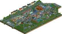
Hank's Zippy Charge
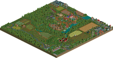
bigshootergillBotanical Tower
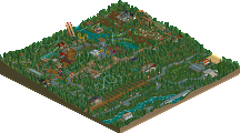
RaunchyRussellThe Eight Expedition of Dr. Albert Falls
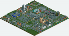
RCT2DayThe White City
TheThrillManVoting Rules
Thethrillman Offline
This is the first round guys take it easy! LOL
Definitely a learning experience here for me.
wheres_walto Offline
TTM - Cute little entry, I do wish there was more to see inside the buildings considering how much space they occupy, and I wish the entry pathway were hidden
RCT2Day - I like this, I think your large trees are surprisingly effective considering what they're made out of, that's a clever use of the palm tree shape
Raunch - woah. This is absolutely gorgeous. Love the colors, love the textures, love the construction shapes, excellent work here
bsg - very cool, my cat's name is Hank and I showed him the park and he loved it so great job
Ge-Ride Offline
All good works.
I voted Hank's Zippy Charge for first. It was an atmosphere based entry. I liked the enigmatic floating nature of it, it seemed to be a sort of space diner and electric equivalent of a gas station. I liked the cars zipping in and out.
Botanical Tower is my second place vote. It feels like a turbocharged RCT2 version of Skygarden. Great peeps/ride interaction and gorgeous colors.
Third place I give to The Eight Expedition of Dr. Albert Falls. Good coaster, like the jump. The tree trackitecture is pretty cool. And I like the pun humor but it wasn't enough to compete with the absolute beasts of the first two.
TTM, Good aesthetics and I like the modernist style. The coaster was interesting and boring in different ways. It could have used a longer length, not a critique on the shuttle mode, but needed something more than the admittedly cool corkscrew out the edge of the building. I really like this entry, just not as much as the others sadly. Keep playing and you'll get better and come up with something more competitive in the future.
MorganFan Offline
This is a very strong match, great entries from everyone!
1) RaunchyRussell - Beautiful structures and integration of the archy into the landscape and foliage, which were also well done. One of my favorite entries so far.
2) bigshootergill - Wow, this is such a great sci-fi piece! Interaction all over the place and a very lively scene.
3) RCT2Day - I'm so glad that MM4 was blessed with this wonderful NCSO. The scale here is great, and I love the trees.
4) TheThrillMan - This is very clean! Nice job on the shapes of the architecture, I just wish there were a few more pops of color.
Cocoa Offline
1. bsg---love this. not the first time we've seen space cars but a very clean and fun version for sure. the giant sign is great and the spinning letters are so fun
2. raunchy---great, lush vibe. feels very optimistic and futuristic, and the honeybee ride is cute
rct2day---very close, hard to say no to a wooden mine cart. i am a sucker for jungle expedition vibes
thrillman---I like the curvy buildings and think you did a pretty good job selling the modern mall vibe. maybe a bit inconsistent with scale
Liampie Offline
bigshootergill: this is adorable! Such a mundane scene (flickering lights, dumpsters, police fining a driver), transposed into a strange environment. It’s not especially unique, but it’s unique enough. Reminds me of Levis’s RCTopia, as well as Astroid Fields. Can you imagine what AF could’ve been if you were this good back then, instead of just a promising newcomer? I love how clean and detailed this is. The rotating sign is also nice. I would’ve left the propellors out, they don’t really serve any purpose in space, except shred any cars that may go off course. On the other hand you haven’t specified that this is in space. Perhaps it’s still in the troposphere.
RaunchyRussell: Ha, this is what I want my park to look like. Loving the sea of flowers. Architecture is good too, with nice latticework and multi level paths and rides. The honeybee first drop is epic. Oh shit, the swinger itself is rotating! Great idea. Has anyone done that before? Lastly, nice bike ride. The circular plaza is a perfect space filler matching the shapes above. Just a shame the bikes disappear into the bushes. One of my favourite entries in this round.
RCT2Day: this map is just a vehicle for puns, huh? I enjoy it! Map is a bit underwhelming, I want to see the temple facade but there are two giant trees in the way. Speaking of, the trees look nice. Even the floating jungle trees with their uprooted trunks don’t look as weird as you’d expect. I can picture the roots being some kind of vine things hanging from the tree.
TheThrillMan: my first association with El Al is that time a plane crashed into an apartment building in Amsterdam in 1992, but based on the map name I believe this is just a hotel in Tel Aviv. I don’t think we’ve ever seen a realistic map set in Israel! Would’ve made for an interesting Grand Tour location, thinking of it. I like what you’ve done, except for the coaster. Ironically, some more movement is what would’ve helped this map.
Xtreme97 Offline
1 RaunchyRussell: Damn, this is so cool. Wasn't expect this kind of direction for you but the naturalistic landscaping and foliage is superb. Great amount of things to spot from each angle without the map getting chaotic, and not a tile wasted. Awesome!
2 bigshootergill: Such a cool little scene. Feels like a perfect blend of "realism" with fantasy/sci-fi and the details level is so strong. The logo in particular shows you have a strong sense of design. A ton of fun little touches amongst all the activity, which itself feels really well balanced and not a chaotic thrum of noise. The speeding ticket, the space drivethru. Feels like a modernised outtake of Asteroid Fields.
3 RCT2Day: Really lovely micro, and effective use of objects too with the trees feeling like they have hanging vines (not totally convincing, mind you). Great atmosphere and sense of adventure, enjoyed seeing the coaster zipping about and doing the jump.
4 TheThrillman: This is rather charming. A little light on content with the buildings taking up so much room, but it feels like a fleshed out space which is great. Yoga guy with the speakers is a funny detail.
Six Frags Offline
1) Botanical Tower by RaunchyRussell
-Concept:++
-Content:++
-Quality:+++
Overall; Great architectural structures combined with natural eye-candy. Love how the coaster is making its turns underneath the swinger and circus tent-dinner-sitting area. Bit thin on the stone poles on the lowest layer, where I was wondering if it could carry all that load. Anyway, top notch foliage and a great colour scheme throughout makes this a very memorable micro. Great job!
2) Hank's Zippy Charge by bigshootergill
-Concept:+
-Content:+
-Quality:++
Overall; Broken record here again, but custom music would've lifted this micro a few tiers. Apart from that, especially love the scrolling Hank letters around the zippy charge sign thingy. That's so clever. The kind of futuristic flying cars tank(/charge) station/dinner theme we've seen in Stardust Jubilee Casino in H2H9 already, but I still like the take you did on it. Some very nice detailed architecture, clever ideas throughout and a great colour scheme make this a solid entry from you bsg.
3) The Eighth Expedition of Dr. Albert Falls by RCT2Day
-Concept:+
-Content:+
-Quality:+/-
Overall; God, I'm getting PTSD from seeing those big trees In general they are just a bad idea, because they block so many views I know from experience.. Anyway, the micro is full of puns like for example vines/roots called "I'm rooting for these trees", and the canoe "We made it! Canoe believe it?".. It's well composed with the little waterside (with nicely constructed custom boat) transitioning to the beach and the temple complex in the background. Just a solid adventurous funny piece.
4) The White City by TheThrillMan
-Concept:-
-Content:+/-
-Quality:+/-
Overall; Feels too unpolished and rushed, with no inside interiors (which would add so much needed content to a small piece like a 15x15 micro), bland architecture (although I like the curves and the building on the right with the balconies) and unclear concept other than a wild guess it's in Israël seeing the "El-Al the experience " coaster. I like the pool and the ac-units/solar panels on top of the big building though.
RobDedede Offline
RaunchyRussell - This is new-age serenity. The part of this micro I would like to highlight most is the shallow waterfall. Really well done. I think the use of circular structures throughout this micro also helped it stand out and give it its own unique aesthetic.
BSG - The definition of fun. This reminds me of the outskirts of Stardust Jubilee, in a good way, and I think this micro feels much more real (maybe because of the palette). This also reminds me of Futurama!
RCT2Day - Some very nice NCSO here. I think the way the canoes are placed along the beach along with the custom trees gives a nice natural shape that is tough to pull off in an micro, let alone an NCSO micro. I only wish the interior with the coaster was done with a little more detail!
TTM - An excellent entry for a beginner. I actually think the hotel was REALLY well done, but I think this map needs both more color and movement to gain more intrigue.
Lurker Offline
RaunchyRussel: Love this nature-themed micro, it's a great mix of having a lot of action while being very peaceful at the same time, with a great balance between the nature and the steel structures. And the actually foliage itself, great stuff, the flowers are amazing.
BSG: Great action here, the traffic is done so well (also, nice use of the base game ride vehicles for spaceships). Tons of fun small detail too, adding a lot to the lively atmosphere.
RCT2Day: Nice to see a NCSO-style micro. Trackitecture trees are hard to do and these look nice, and nice use of ride vehicles (I like those cycle birds).
TTM: Nicely done modern buildings, clean and solid with an interesting style. A good debut entry in a tough contest, showing a lot of potential for future builds.
Gustav Goblin Online
1. RaunchyRussell: When Josh kept crowing about how you're secretly the best player in the game, he was definitely on to something. Immaculate vibes with just as impressive of an execution. Really reminds me of your work on the Adventurers Club finals park with the glass roofs and the swinger. May or may not have stolen your synchronized swinger/wooden coaster idea for the synchronized propeller on the swinger in my micro. Viewing the landscaping from bottom to top is showing so much that works super well; the subtle Fisch rocks, the buried trees, and the waterfall CTR lend to one of the best landscapes of the contest so far. It continues to shine inside the glass tower which is such a look! I know I've used the term vibey for like every single micro this contest but oh my god dude. That bar. The rides all feel like they have their place and the ambient biker is a really great way to liven up the bottom half. I usually turn off scenery to see the ride layouts but it's a little hard with all the trackitecture you've used. Not a bad thing! One of my favorite micros so far, and it's amazing to finally see solo work of this caliber out of you. You're gonna turn us all into Josh dude.
2. bigshootergill: This is a super fun concept which almost feels like a Stardust Jubilee outtake or a gritty Asteroid Fields reboot. The aesthetics are spot-on and almost remind me of Fallout. Love the rotating sign on the bottom; something the SpaceK letter vehicles are absolutely capable of but almost never utilized. The way ride vehicles slow down when bumping into each other was a great idea for the drive-thru as well. While it's nothing massive, this embodies the pure fun that you always seem to capture in your releases. Great stuff!
3. RCT2day: The puns. You're gonna kill me man! Really great NCSO though and just as cool of a backstory. The Kwango Kate looks amazing as does the rest of the riverbank. The black-trunked trees look a little odd as leaves for a bigger tree with a brown trunk though. Love the use of the monorail cycles as birds. Headhunter is a nice little layout although the interior cutaway is a little plain. Not a ton you can do with NCSO but something to break up all that brown would have been nice. Great entry though!
4. TheThrillMan: Nice to see more from you; this has a lot of potential. Love the shape and modern style of the hotel. Detail and interiors are sparse but get the job done. Not sure if El-Al The Experience needs to be there honestly. I understand you wanted to leave that open space, but the layout's kinda brief and mostly hidden. Nice job though!
Ling Offline
The White City - definitely hide the entrance path on future micros. For how big of a focus the hotel was, it could have stood to be bigger for sure. I don't really buy that there's a full cinema in there, there's barely space for rooms with that coaster.
8th Expedition - Clever use of NCSO all around, and the layout was solid - decent mix of dark ride and roller coaster pacing. For how much the river side of the coaster layout is obscured, I thought the outside could have used one other big neat setpiece beside the jump over the goo and "room with tiger" (maybe if this was a room with cages and lots of things in it?). Good boat too. Unfortunately, I hate puns, so please leave immediately.
Botanical Tower - Love the lush forest floor foliage, full of all kinds of flowers. The cafe seating near the top of the main tower looks like it would just be so wonderful and cozy. My only real complaints are that Honeybee Dash doesn't really do much, though it is neat that it forms the outline of that one platform, but I was expecting that to follow through a little more, and the main tower looks kinda under-supported in a way that doesn't feel entirely intentional. I also respect the choice to cut the vertical space of the map edges too, it gives it a slightly more unique feel. Thank you for the slightly less obnoxious use of the waterfall CTR.
Hank's - Sweeps the group for me. Daring choice to have so much of your map really just ride cars over empty void, but there are so many details here it doesn't feel underutilized. The drive thru is hilarious. All the different space ships being different coaster cars is such a wonderful idea surely someone has used it in MM before, but I can't recall any off-hand. Only complaint is no Spaceballs Winnebago.
inthemanual Offline
Russel: this was my essentially initial vision for Petty Squabble before it devolved into the meta-mockery. Obviously I love it
BSG: a fun space scene, tons to see and full of life and worldbuilding
2Day: a clever scene and good use of objects
TTM: good architectural exploration and it felt real and lived-in, despite the lack of color.
J K Offline
Raunchy Russel – My first place and definitely a park I'll be back to again and again to view. It reminded me of a conceptual version of the work that Liam's been doing on his solo, which definitely isn't a bad thing. I'd love to see you extend this concept to a larger area, as I couldn't get enough of it. Can't wait to see more of your stuff this MM.
BSG – Well that was pretty fun! Like Russel, I can't wait to see more of your concepts throughout this competition. I think what stopped me voting this first was the fact Russel did more, even though I loved everything you'd built. If you had a second story on top of the existing composition built in the same style, you'd have probably gotten first. Main critique is push the concept harder to secure the top spot.
---
RCT2Day – Great concept, your level of polish on the release was great to see and memorable. I wish there were more peeps and a couple more coasters on the track just to keep the movement going through the temple.
TheThrillman – My that coaster was at it's limit on that hanging inversion! Super extreme but great idea. The rest of the composition was really nice building. I wanted to see more innovation compared to the other entries, but this was a really nice introduction to your work. Looking forward to seeing more!
barnNID Offline
1. RR- Damn man this is so good. I love the atmosphere and the architecture is spot on. A really really cool vibe. The movement also adds so much to this entry. I feel like I need to see more of this style from you. Awesome work
2. BSG- This is so fun. I really love the concept and it is executed so well. I like your use of track pieces for the generator, the launch coaster supports in particular were clever. I now kind of want to see a full park (or city I guess) in this space-modern style. Very cool
RCT2Day- Great concept and really well executed NCSO. The architecture is very impressive although I do wish that there was more in the cutaway. The boat was awesome though and the jungle trees look very convincing. Good stuff
TheThrillMan- I really like the curviness of the architecture here although I feel like its missing a contrasting color. I also kind of wish we got a cutaway into the hotel so we could see more of the coaster. Either way I still enjoyed the entry.
Babar Tapie Offline
1. Raunchy Russel : When I saw the miniature I was sceptical, then I opened the park and what an architectural work! It's lovely and very coherent, the curves are nice and this little river has a lot of charm. I really like this staircase too!
2. TheThrillMan : It's a very personal choice, I really like architectural experiments and I think it's very bold to make a building entirely white. It's simple but at the same time there's something interesting about it!
3. BSG : A very good park that would have deserved the first or second place, I really like the atmosphere of the park! I didn't look at the votes but I'm sure others would have put it as their first choice!
4. RCT2Day : A very good park here too, the group is really tough! A nice little narration and very nice trees, a little more detail maybe but the atmosphere and the theme are respected. A simple coaster but with a very good idea to enhance the ride!
FK+Coastermind Offline
BSG - Perhaps not a super original idea, but certainly executed very well and filled with lovely ideas. I really like the execution; clean and it felt a bit more edgy then I feel like we usually see from you, where your past work has tended a bit more cartoonish in nature (not a negative, just a difference in textural style). The hacking for all the rides is great, particularly how cars pull up to get gas and then zip off. I love the food truck, the police pulling a car over, and all the gritty techno wizardry of space-age style. I could see this being criticized as sparse but I think you've got plenty going on. My only criticism would be that you should have used a different color for the blacktiling. Right now, this feels like it's in outer-space and not just 'the sky' (which, based on construction, I assume this is like a flying cars concept?). If you had done a white or light blue, or even included a miniature of something at the bottom (maybe steal Babar's micro) then it would have been icing on the cake. But, other than that minor idea, really enjoyed this a lot.
Raunchy Russel - I think you managed to combine the verticality-benefits of old MM with a more modern aesthetic in a really great way. Fully curvilinear buildings like this can be tricky to pull off without sacrificing execution, and this really had a great level of polish. I liked all the rides and that it felt like this was a unique little architecture amusement inside a larger botanical garden or park. While this may not have wowed against some of the bigger concepts we've seen in round 1, I think its a great start and definitely shows the skills you bring to the table.
RCT2Day - As the NCSO pro that you are, it was impressive to see all the ways you utilized different objects to craft this micro. I love the boat and the overall narrative, and each setpiece is really well crafted on its own. The only thing that I think held this back was the composition. The trees loomed over everything such that it was hard to follow the ride. I almost wonder if squishing the map into more of a rectangle might have helped, so that you get the vibe of pushing thru the trees to find the temple.
TheThrillMan - This has the makings of a great micro. Tons of ideas, a good composition that gives us different angles with different looks, and a clear style. I really like the breakdancing peep, surprised we haven't seen that before (or maybe we have?) The main thing that holds this back for me is just execution. The coaster felt a bit odd, and the architecture was interesting but didn't have the finesse NE is used to. I think if you focused on that, and becoming more familiar with how to construct some of these ideas with more detail, that would help improve your game a lot.
I think BSG and Raunchy had the best combinations of execution and concept this match. Overall, I felt the execution was a bit sharper and more to see, so I gave BSG #1 and Raunchy #2. Congrats to all on a fun matchup!
AvanineCommuter Offline
BSG: I love the concept, seems like it would co-exist in the Stardust Jubilee universe! The hacked propellers, custom signage and spinning signs are wonderful, but my favorite part of this is that little food truck, so perfectly made, super creative. I want to see this expanded to a larger setting, fantastic work. You just edged out Raunchy for my vote. PS this need music...
Raunchy Russel: Very close to voting for this as #1. Loving the curvy shape of the tower and the movement throughout. Some intricate pathing and detailing to get all this to fit within the tower, so kudos on some great planning and detailing. The hacks and crunchiness adds so much to elevate this. The flowers I think could have been more full and curated a little more, but great work, wins my second vote by a hair.
RCT2Day: Very clever build in NCSO, those trees look so good with the trunks descending like that. The ride is nicely hidden and really did bring the concept forward, I think some more finesse is needed though to elevate it further.
The Thrillman: Nice little scene of a hotel, and a unique albeit odd spin on a coaster that I've not seen before. Though I think working with a more interesting concept would be helpful.
bmschulz Offline