Park / Salon Tichy
-
 18-January 23
- Views 9,684
- Downloads 476
- Fans 4
- Comments 29
-
4 fans
 Fans of this park
-
 Full-Size Map
-
 Download Park
476
-
 Objects
1
-
 Tags
Tags

Red Division
Yellow Division
Blue Division
R1
QF
SF
Purple is the recurring colour in this highly creative match, in which we see mice fighting planets.
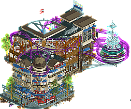
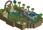
Salon Tichy
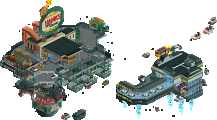
WhosLeonSignal Flow
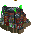
Camcorder22The Citadel
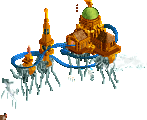
wheres_waltoF.R.O.M.
Ge-RideVoting Rules
yo leon chill its round 1
While I didn't vote for F.R.O.M (sorry) it really made me want to play Trackmania.
1) WhosLeon - Whaaat the heck man I love this! The cafe itself is awesome but there are so many layers to unpack! I love the coaster as well. The kitchens below were one of my favorite parts of this. I could gush about everything.
2) Aki - YES!!! I didn't realize how much I wanted an rct map dedicated to guitar pedals. The colors here are everything and the whole vibe comes together effortlessly.
3) wheres_walto - this is stunning, and I love how you reused the big stupid planet object and still somehow made it fresh. Colors and scene are perfect, wish it was more than one angle.
4) Ge-Ride - Wonderfully weird, and reminiscent of the Mouse Trap board game I had as a kid, this is such a refreshing entry. I love how you built the track for the coaster, and the colors were nice.
1. whosleon---as expected, an absolute banger from you, filled with atmosphere and life. such good european vibrancy here, with an excellent layout to boot. I love how this plays with the idea of being both something that is deconstructed for the viewer (and would, in its 'true' form, be a realistic closed building) and being something that is, in its final form, intentionally pulled apart. I'm not sure how to actually say what I am feeling in words, but it is certainly a kind of magical fantasy.
2. walto--- waffled between this and aki but man that bebop song hits hard. this is a lovely poem, that has more emotional weight than it has any right to from the rct alone. great work.
3. aki---like I said, by a hair. I love the idea of this, passing the signal between guitar pedals. such a clever little conceit for some fun parkmaking.
4. ge-ride---If I've learned anything doing creative things, is that if you lead in with 'i'm sorry in advance, this is not very good, yadayadayada...', then people will agree with you. Even if its true, just let it speak for itself! maybe people will like it anyway. no need for all the excuses. that said, its a cute little piece of geometry and colour. nice work.
1 Leon: Compact launched coaster? Urban european setting? It's a Leon micro alright. Love at first sight of course, so much packed in and lots to take in from each angle. The coaster is typically excellent, great self interactions and constant movement. Also loved the hanging ice cream balloon inside. The whole aesthetic of this one is fantastic top to bottom, one of my favourites from the whole round by far.
2 cam: This is so so good, really abundant with ideas and it's clear you were quite inspired with the level of detail put in. Ton of great inclusions and activity - the drum loop go karts, the super looper rides for the station, the text details. I also really enjoyed the lower level with peeps and the kind of underworld down there.
3 walto: Ha, leave it to you to find another great use for the stardust planet object. Really cool micro, fleshing out your fantasy style even further with more abstraction and a super strong choice of colours, matching up with the planet nicely. With the music it became rather calming too, though it's a shame it only really works from one angle.
4 Ge-Ride: Neat little entry! It's a bit of a shame that the ride wasn't open though, could have done with it and the music adding some life to the map. Perhaps that's a habit of older parkmaking? Other than that I found the map to be quite fun, if a little rusty. Glad to see more of your RCT though.
Leon - Wow. This spinning coaster may even top the one you did in Aqua Alta, which was impressive in its own right. The way you are able to effortlessly use space and scale to your advantage really makes this micro stand out. Everywhere there is something to see, and it feels a lot bigger than it truly is.
Walto - Nice to see the planet being used again. I am a sucker for dreamy, abstract landscapes and this hits the bar for me. I think the choice to go mostly monochrome was a bold one, but it worked out. I do think a little bit more of a narrative could have helped this one stick out more than it already does.
Camcorder22 - I am thankful some other people were able to point out to me this was themed to guitar pedals, as I am not an expert on those. This is another entry for me I wish I could give a vote. I simply think walto pulled off the purple/magenta, abstract aesthetic slightly more convincingly.
Ge-Ride - Remember to open your rides! I can tell this is something cool and creative, I just wish there was a little bit more information to help me learn what I am looking at!
Leon: Awesome interior detail with a great theme and atmosphere, and a excellent coaster that fits in and around amazingly well.
Camcorder22: A really fun and creative theme, love the color choices, a lot of actionm also a great use of the Rock Style 3 music.
Walto: Nice re-use of the Stardust planet object, and I like the otherworldy atmosphere this has.
Ge-Ride: I like all the colors and variety in the non-ride scenery track, reminds me of hotwheels track a bit. A fun and colorful micro.
1. Leon: Best micro of round 1. That is a high honor. The amount of content you packed into 225 (or less) tiles is genuinely unbelievable. There's as much to see in here as a full scale release. Conceptually, it almost feels like an elevated version of that cafe screen which I just love to bits. It's that same philosophy of an outside facade with an exposed interior, and oh my god this is an interior if I've ever seen one. Every single room from basement to coaster station is lavishly detailed and lively. The ice cream hot air balloon sculpture hanging from the ceiling; I genuinely have no words. It's the pure essence of the whimsy that absolutely radiates within this micro. Just as impressive are the less glamorous vignettes such as the subway, the pipes leaking piss and lean, and the dog eating ice cream from the trash cans; again, executed damn near flawlessly. Oida! is such a fun layout which really takes advantage of its surroundings. The curves around the fountain (again gorgeously executed, see a pattern here?) and the roof are inspiring. I leave on one question: this is your round 1?!
2. Camcorder22: Guitar pedals may be the coolest idea I've seen for a micro this whole round and the way you execute them is, well, electric. Stardust Jubilee palette putting in real work here. The pedals themselves are pretty much perfectly executed with some smart object usage resulting in a very clear perception of something never before seen in RCT to the extent of my knowledge. I also love how each pedal forms a different area; the Boost pedal forms the hub, the Loop pedal has all the cool Raptor track effects and a really neat flying saucer race, and reverb pedal has that super aesthetic water island. I really wish more were done with the reverb island, but maybe the empty space speaking on its own isn't a bad thing. The sales listing PDF is the perfect bit of context to back this beauty. MM1 finalist proving she's not a thing of the past; you love to see it.
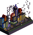
3. Walto: My king. You jumpscared the hell out of this group as a late signup with some beautiful art to show for it. The titular citadel is pretty funky with the mirrored halves with different palettes on each end and the elevators providing some connecting fiber. Love how your understanding of custom objects as mere shapes, forms, and textures rather than their intended purpose lend to the artistic value of this micro. Planet Stardust making its big return is cool to see. Not sure how much it's doing for the micro as a whole but I feel like it gives a little more depth to the top layer. Not exactly clear on what the narrative is, but I honestly feel like it may not supposed to be easily understandable which I can honestly get behind. Unfortunately it's a bonafide Julow moment and doesn't have as much to offer as Cam's, so I must bear the inconceivable pain of voting against my own H2HC captain. My sincerest apologies.
4. Ge-Ride: Hate seeing you end up in a group like this. This is a really funky little layout and very much in line with your eclectic style. Reminds me a lot of Mouse Trap. Honestly my favorite little touch might be the scared elephant entertainer. It was also a pleasant surprise seeing my name end up in the readme; glad I could help you overcome that potentially diastrous hurdle. I just wish you had remembered to open the ride before saving. Don't let a nightmare round like this prevent you from continuing to build.
Ok shit, you lads are ridiculous. Leon, best park so far, don't even know where to start. Feels bigger than a micro, works completely on it's own as a perfect little scene but would also fit into a larger park/setting easily. Just feels real and fantastic and believable all at the same time.
Walto got second for me, again it felt a lot larger than a micro. Beautiful colors.
Also loved the music launched park, super vibrant and fun to explore.
The wild mouse park felt a little lower quality-wise to me, tough to go up against the other three though. Interesting concept with scenery in place of track, one that i've seen but honestly has never been done very well to my knowledge. This felt a bit blocky overall.
Great great parks, god guys chill out.
Can't offer much on F.R.O.M. that hasn't already been said, it seems like you had a few different ideas but maybe they didn't fully develop in time to finish the entry.
MEGA La Reve Parapluie vibes from Salon Tichy. The exterior alone is SO intricate and SO detailed. Very dreamlike, and every little detail brings you back to the theme. The gigantic fountain is a weird choice but it's so well-executed and integrated so deeply in to the coaster layout that it just works. Really kinda speechless about this one, probably top 5 of round 1 if not higher.
The Citadel is weirdly... intense? My brain is struggling to parse it. Love the palette, but I think I just need something to latch on to here other than floating roofs, deco pieces, and some cool shapes and colors.
Love how active and visually loud Signal Flow is. This is another entry that maybe lacks some clarity, especially in that floating teal island that looks more rushed than the rest of it, but the text art and knobs were neat. Some punchy synthy music might have solid it a little more, too.
Uh. Could a set of 4 micros altogether get any more weird?
Leon: good composition and guidance to the viewer, despite the chaos and overwhlemingness of it
Aki: a bit too loud for my personal taste, but enjoyable and obviously quite inspired
Walto: I stared at this for too long
Ge-ride: despite the pessimism, this was a fun exploration of space. I'd have liked a few more moving parts to really tell a story with it.
1. WhosLeon : Full of charm and detail, I really liked this ice cream cone sculpture ahah, the whole thing is really nice and there is so much to look at!
2. Camcorder 22 : A very original theme I really like, it goes in all directions and the utilisation of space is so clever! I hesitated a lot with WhosLeon for the first place!
3. Walto : Very intriguing and mysterious, the set is very good, the colour work is excellent and works really well with the planet in the background
4. Ge-ride : It's cute as a kitten, it's lively and colourful, it's nice! Unfortunately you fell into a really strong group but congrats !
Camcorder: I dig this entry. It's quite similar to an idea I had which I won't reveal because I might still do it. The guitar pedals are so fucking cool (especially the jack inputs which simply look perfect) to see done in RCT as I have always had a slight obsession to them in real life. The whole concept is great and executed in a super cool way!
Walto: Beautiful, poetic, and leaves me guessing for meaning which I really like about this type of dreamy RCT. It would have been nice to maybe have a bit more structural girth to everything to make it a more 'explorable' environment, but as always with your work the aesthetics are cool as fuck and leaves me wanting more.
Ge-ride: I thought this was a great submission, as well. I think this is the first time i've seen a tracked ride made fully out of objects, and it results in a unique aesthetic, especially combined with the purple grid and grid-like blacktiling you have used. Great stuff.
1) Salon Tichy by WhosLeon

-Concept:+++
-Content:+++
-Quality:+++
Overall; Perfect! The first entry that gets maximum score on all categories that I use as guidelines. It's all exceptional here, from the concept of the extraordinary ice parlour, to the amazingly interacting spinning coaster, the custom music and architecture. Colour design and detailing are also immaculate. There's also so much content, such as all the little interior seating areas, the fountain, the little backside areas and even underground pipelines, that give it this polished look. Just wow man, can't wait to see what more you have in store for us, you've set the bar for yourself incredibly high already
2) Signal Flow by Camcorder22
 It's probably not what you intended but I just like to think it was
  Anyway, lovely colour scheme and great to see that big planet Tolsimir made for H2H9 being used again. Pity it's a 1 view micro, but that of course couldn't be avoided with the use of that big planet background. Also missing some custom music, which could've given this another dimension..
-Concept:+++
-Content:++
-Quality:++
Overall; Probably the most colourful micro I've seen so far this MM. Love it. Also great island bits with each his own unique look. The coaster flowing nicely between the islands and interacting with the architecture is just icing on the cake. The whole concept of the signal flow is well thought out and executed. Love the little drum loop go-karts going underneath the signal flow coaster, the signage throughout and the flickering lights behind the top hat tower. Music fits very well too.
3) The Citadel by wheres_walto
-Concept:+
-Content:+
-Quality:++
Overall; The good thing about art is you can make up your own story when it's not really clear what it's about or when it's not in-your-face clear. So when I saw the 'coasters' that float around being called 'him' and 'her' I made up this love story about a separation between the two citadels (the broken chains) and she kicking him out of the 'house' in front of the planet and throwing his stuff out (the broken windmill blade bits falling down and the crates going up and down)
4) F.R.O.M. by Ge-Ride
-Concept:-
-Content:+/-
-Quality:-
Overall; I like the custom rails you've created for the mouse track, but that's kinda it I'm afraid. The colours don't really jell, and not a fan of the purple grid-lines underneath it all.
1. Leon- Wow this is wild. Great layout, great architecture, great details, great centerpieces, great fountain, just great all around really. I don't really know what else to say about this one as it is just crazy. Great work
2. Camcorder22- This is a very interesting entry and a very good one as well. I like the unique palette and I really like the concept. Your use of the flat rides is also impressive in this entry. Overall, I really enjoyed
Walto- This is definitely an unique entry and I can appreciate that. I like the color palette and the strangeness of the entry. The movement is also very interesting and adds a lot to the entry. I probably would have voted for this is a different matchup.
Ge-Ride- This is a fun entry! I like the blockiness of it, I like the wild colors, I kinda wish the coaster was automatically on test mode as I didn't realize it actually ran through the track for a while. Overall enjoyable.
Congrats Leon and Cam, y'all crushed it. Fitting that I'd fall to you both on a park with rides named "him" and "her"
Leon - what else can be said? You're a monster, I knew I was in trouble when I landed in your group and you certainly delivered
Cam - awesome stuff, you prove once again that you thrive in the micro genre. You managed to fit an impressive amount of movement and hectic energy into such a small space
Ge-Ride - really cool shapes you've created, it reminds me instantly of a hot wheels track
Leon - This probably has me the most scared of any micro in the competition thus far, cause I believe we are destined for a clash in the QFs and my god. It has realism details with whimsical fantasy flourishes and a great coaster layout to boot. The execution and details are near impeccable, the amount of little scenes and smaller ideas take this over the top, when you didn't even need those to convince me. I'd be fascinated to see how you constructed this, as it feels like I'm missing a mathmatical formula for how to utilize a space in this way, all while creating these incredible sightlines and coaster interactions. You even have a fucking transfer track and a subway. When you started dabbling in this kind of parkmaking with the building challenges, I didn't think about how worried I should be for MM. Congrats, this is staggering and very likely my favorite micro of the first round.
Cam - Conceptually I love this. Hugely colorful, artsy, full of motion and light and tons of well used special effects. I will admit some of the references may have gone over my head, but regardless, I really enjoyed exploring this and all the life you put into it. I'm honestly surprised that you managed to fit this all in 225, it feels way bigger. I do think in a few places the execution feels a bit unpolished, and it suffers from having one great view but two ok views and a fourth from behind (phrasing) that really doesn't capture the magic of the front (more phrasing?).
Walto - From one view, I would call this a visual masterpiece. The colors, shapes, and effects you've used are gorgeous and create a style and aesthetic that, while clearly connected to other work you've done, is so unique. This almost has a similar feel to Babar's R1 entry, where it feels like we're looking at a micro of a massive space station rather than something at a more common scale. The only downside to this is it isn't half as magical from two angles, so I'm forced to wonder if I think this one angle is better than other micros in this match that have at least more to explore from the other angles. But man, I just can't get enough of this style from you.
Ge-Ride - This reminded me not just of your own past work, but also Ivo's in a way. It has a sort of post-modern vibe to it, where the shapes and colors feel like an attempt to challenge and even shirk modern conventions. I appreciate that you entered and while I agree this isn't at the level we often anticipate for MM, I did enjoy it as a very different and unique take to what we are so often seeing people build nowadays.
I slammed down my #1 vote for Leon, for what I think is probably my favorite micro thus far (but don't quote me on that, there were approximately 200 micros so I'm not sure). I really waffled on #2. I think both Cam and Walto put for incredible aesthetics and ideas, but both had the issue where not all of the four perspectives really offered the same power as the first. Ultimately, I'm just too obsessed with the aesthetic Walto created in that one shot that I gave it my #2 vote. I just sat watching it for awhile, and that doesn't happen for me often. I would like to request a framed print from the House of Walto. Congrats to all though, this was a really fun and unique group!
1.) Salon Tichy (WhosLeon) - How is even possible to fit so much good content onto 225 tiles? This is incredible, like Design-worthy on it's own, I'd say. The architecture is probably the best of any round, and you've successfully combined it with an exciting and interesting coaster. All very cool. I really like that winding staircase in the back with the umbrella (?) sculpture and flowers. Easy choice for top in this group.
2.) The Citadel (wheres_walto) - I love it. The colors are great, the architecture is exciting, and it's so dynamic and engaging. I could stare at this for a while. The movement and verticality of it all is flawlessly down. Big downside is that 2 of the other angles are pretty meh, but the main angle just looks so good that I had to give it to you.
3.) Signal Flow (Camcorder22) - This was difficult to put 3rd, because it is truly amazing! It's less cohesive then the others, which is a big deal for me personally. But it is equally interesting with every little detail and looks so cool. I love the station section especially.
4.) F.R.O.M. (Ge-Ride) - Pretty cool! Feels a bit like early Tron or like that early 90s blocky aesthetic. Besides the mouse ride, it lacks something with movement to really make it exciting. That said, I really liked the mouse ride! Really cool entry, but it had nothing on these masterpieces above.
WhosLeon: Probably my favorite micro from all of round 1, WOW. The layout is classic Leon: intricate, compact, with datflow, and all built into the confines of a beautifully executed ice cream parlor, details throughout both interiors and exteriors fully fleshed out, creative sculpturing and the ice cream centerpiece... truly next level. The music is the cherry on top, perfectly sets the tone and mood. Cannot wait to see your next entry!
Wheres Walto: LOVE this. You told a whole abstract narrative in such a beautiful way. There was so much movement to bring this alive even though it's only viewable from one view, and I adored the colors, the FK-esque sculpturing and composition, it's like a moving painting. Definitely could have used MUSIC to elevate it further.
Camcorder: You ALMOST got my vote, but fantastic fantastic stuff. Such interesting things to look at with creative moves and choices every which way you look. I can definitely tell you were inspired when you made this, I hope to see more of this kind of artistic flair in your future rounds!
Ge-Ride: Great colors, and some great geometry. Hoping to see more movement, but aesthetically this is very interesting.