Park / Lombardy Poplar Tree Nursery
-
 16-January 23
- Views 7,530
- Downloads 256
- Fans 2
- Comments 40
-
2 fans
 Fans of this park
-
 Full-Size Map
-
 Download Park
256
-
 Objects
1
-
 Tags
Tags
![park_4380 [MM3 R1] A Petty Squabble](https://www.nedesigns.com/uploads/parks/4380/aerialt4172.png)

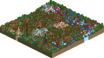
Red Division
Yellow Division
Blue Division
R1
QF
SF
Full circle meta round with a very uncertain outcome.
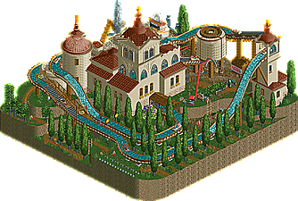
Lombardy Poplar Tree Nursery
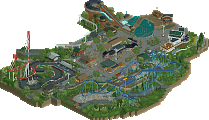
TolsimirPinewood Forest
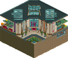
RecuriousAlmost Alone
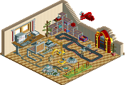
MiloTin Train
LurkerVoting Rules
Recurious got my vote, gorgeous little scene, I've been watching mrs walto play Red Dead Redemption so this hit the spot for me. Tolsimir was my runner-up, had me laughing a few times while still impressing with cleanliness and presentation. I like the diversity of this group a lot, Milo's minimalist scene was very effective and Lurker's idea was also very cute and clever (I love the train sculpture on the box!). Great work y'all
EDIT: it appears I've placed my votes in reverse order, hopefully this won't matter
Some great artistry and styles involved in these. The Tin Train idea is really fun. The others are also really vibey though. Milo with clever use of water, I love quaintness, and the architecture (with those new window objects) in Tolsimir's, and Pinewood Forest has a wonderful theme and great colors and macro.
Tin Train: fun, small, but well done.
Pinewood Forest: wow, loved it. Great drop over the water. Everything felt very cozy, and I love mine trains. Great waterfall as well. Kudos
Almost Alone: plain and simple. What are the odds that a shark would be near two drowning dudes? The ocean is too huge for such a coincidence.
Lombardy: Poor Steve lol. Neat little log flume with some easter eggs.
Recurious: wow, youre crazy dude. Really loving this. If you keep up this quality youll definitely be a big threat to the huge names.
Lurker: Very cute, i enjoyed it a lot. A bit basic, but nice idea and fun detailing.
Tolsimir: Loving all the jokes and that there are so much little things to exlplore in this. Definitely feels very Steve.
Milo: Liking to see an entry like this. I appreciate the minimalism and the scene you put together here.
1 Recurious: This a great, and not something I expected you to build! Awesome use of height and you squeezed in a great little layout. The foliage feels a little undercooked on the peninsula area, but thr scene down by the water is very sweet.
2 Tolsimir: Lmao, feels like a spiritual successor to 1K Museum. Lots of silly details abound and nice of Steve to lend his time planting all these trees for you. The rounded landscaping is so great as well.
3 Lurker: Love the idea, and it's executed very pleasantly. Feels exactly what the micro genre is designed for, little dioramas that feel like a park all in one.
4 Milo: Cool submission, a simple idea that feels time pressed but I'm glad you got something in instead of nothing. Good use of the water prompt from the rules too.
Lurker- Love this idea, its so you and its done so well. Theres a great amount of detail. I like the there is a lid! I like the little waterfall and river!
Tolsimir- its giving smooth. The steep log flume places are great! Glad to see them. I love the temple and the trees. All the details and peep names are great.
Recurious- this is done so well. It's so contemporary to the meta rn! I think its great and cozy.
Milo- this is so fantastic! Great story telling in such a small amont of space.
1. Recurious - Excellent entry, reminds me a lot of Leon's R1 last MM. Winning MM formula with a composition that makes it feel bigger than it is, good coaster layout, and lots of content without it feeling overly crowded.
2. Tolsimir - Pleasant, simple, meta, well played for an R1 entry. And of course new (?) Tolsimir land blocks dropped?? Bonus points for dunkin.
3. Lurker - Love this idea, and you did a really nice job making it feel like a miniature town with the small building scale.
4. Milo - missed the blacktile rule, good catch. Looks like you ran out of time but appreciate a nice morbid rct scene.
I'm going to have to think about this one before I vote. Talk about an apples and oranges round.
1. Recurious- I fucking love this type of rockwork and foliage. I really vibe with the atmosphere. I think it was a bold choice to go for the lighter beige for the rockwork and I think it paid off. If I could change something here I would probably add a diagonal building somewhere in there to offset all the on-grid builds.
2. Lurker- Damn this is a cool concept. I'm really vibing with the atmosphere although I think I would like to see more from the architecture. The rock work is pretty cool also, I like how it looks like gigantic cliffs on the scale of everything else. Very cool.
Tolsimir- Really cool entry. I like the minimal landscaping, I think it works really well here. I also like the archy here, the simplicity looks great. Loved it:)
Milo- I actually like the concept. clever making your micro benefit so much from the water background. I don't think there's enough here for me to give it a vote though.
Alright. First place to Tolsimir for a lovely atmosphere. I know I'm in the minority here.
Second place for Lurker for such a good concept.
Third place to Recurious for Pinewood Forest. It was very good aesthetically but it needed something a little more surprising. Close to second for me. Very good stuff though for third place.
Fourth place. Milo. This was a tough call because it was such a brilliant idea but it was very minimalistic and it sort of lacks an ending.
1. Recurious – A huge representation of how talented your RCT game is. This entry was a triple threat in landscaping, architecture and ride design. You've levelled up with this one buddy. First place for me.
2. Lurker – I hope we see more of these type of parks, it was a beautiful idea so expertly crafted. It looked like you had so much fun building this.
---
3. Tols – Few nice easter eggs here and there. I really appreciated the log flume and the cog as the reverser for the flume. Nice entry!
4. Milo – Simple yet effective. Probably the entry that gave me the biggest reaction to what was going on, mainly because you see this scene in the movies and this park instantly transported me to that. Love the subtle tracked rides for the floating barrels and the life raft. Even down to the bumpy section for the shark chomping, it was pretty gruesome actually, but expertly done in RCT.
I love this entry because it's so simple yet effective, but I do wish there was more so I could justify voting it in first or second place. I think Rec and Lurker just did more for me in that sense, but this has left a huge impression on me. Thank you.
An evenly matched bracket for sure. Impressive!
1.) Pinewood Forest (recurious) - this was the first park so far that took my breath away when I opened it. The scale is so interesting: everything looks so shrunk down, yet you pulled off a complete and full layout somehow! I love the turnaround to start the coaster, especially how its left on its own away from everything to really capture the viewer's attention. The waterfall running through the whole park adds such a great natural element, too. Everything is phenomenal, really well done. To me, it's clearly the best here.
2.) Lombardy Poplar Tree Nursery (Tolsimir) - gorgeous, peaceful, and plenty of jabs at Steve. I love the little details in the plaza area and the main building's architecture is beautiful. Solid overall.
3.) Tin Train (Lurker) - this one is interesting! I love the idea, definitely haven't seen this before! It's extremely cute and lively. It feels nostalgic, like something we all grew up with. The scale of everything is amazing. Its very creative, but I think it lacks a bit of the refinement as the two above it. But I like your style a lot! I'd love to see more from you.
4.) Almost Alone (Milo) - really cool idea, clever effects like the floating barrels.
#1 Recurious - A very, very pretty entry. Kind of how I would like to imagine Marmot Mountain could have looked, if we were building it for a H2H finals and tried really hard to pull off that mountainous frontier vibe. Archy is great with some stellar color choices, and the coaster is fun. The tiny waterfall is fantastic. The irregular map shape was a good way to spread it out and make it more interesting. Top drawer stuff!
#2 Tolsimir - Although the choice of theme perhaps felt a bit low-effort, it's nonetheless fun, and the buildings look beautiful. Very serene and enchanting scene. I wasn't a fan of some details around the buildings though as some of it looked a bit crowded or messy, though I guess the limited real estate is a factor there.
Lurker - I was very excited for this one from the overview. The park-in-a-box idea is really neat and you executed it well - but upon closer inspection, it just felt a tad undercooked. I would have loved to see some more intricate ride, landscape or architecture hidden under that lid. Still, what is there is very quaint and likeable.
Milo - This minimalist piece works really well for how scaled-back it is. Seeing nothing but all that water and the drama in the middle is quite effective as a set piece. Still, it felt a bit too bare to beat the more elaborate entries in this group.
1. Recurious - excellently crafted, reminds me of the baby of Leon's Derailed and Cocoa's Forest Frontiers. Another wonderfully executed layout with impeccable flow that dives in and out of the landscaping, looping over itself really nicely. The architecture was crisp and well done, overall just great atmosphere. Really nice.
2. Tolsimir - Very tongue and cheek entry, with some fun parts to see. I enjoyed the little jokes and all the little things with staffing, quite a few nice ideas in there mixed with a nice log flume. But you got lucky with this group ;D
3. Lurker - I was really impressed with the concept, it was really well executed as well. I think adding more little things to keep the viewer's attention would have taken this over Tolsimir for me, which would've been quite an upset!
4. Milo - I smiled when I opened this. I especially love the scenery tab being literally only a handful of objects, and yet you created a narrative with just a few simple ingredients. Definitely could've used more content to keep the viewer's attention, but I'm guessing that defeats the point of your entry.
1. recurious---a cute little train in pretty american scenery. can't go wrong by me
2. lurker---love the concept and a very cute execution. enough originality to get my second vote
tols---pretty and simple. a few lovely bits but maybe a bit too understated
milo---lol, you know i love a fun way to bend the micro rules. silly
1) Recurious - lovely. Great layout and execution of a classic mine train, always a winner
2) Lurker - you nailed this idea, I love it! Good sense of scale and plenty of things to keep you entertained.
3) Tolsimir - this is the funniest entry so far, and there's so many little things to look at. Super clean entry!
4) This is great, considering the minimalism! The way this entry actually made me feel something is commendable.
1. Lurker - I think your work is so charming and it's great to see you working with custom scenery. It isn't the most polished, but it seems so lovingly made that I couldn't resist putting it at #1.
2. Tolsimir - One of the most elegantly done joke concepts. It's cool to see you work on a more modest scale. The curved cliffs are really neat!
3. Recurious - It's a lovely entry. The way the waterfall flows through the scene is fantastic and adds a lot of energy. Like some others have said, it feels very reminiscent of past MM entries.
4. Milo - Haha rock on
1 - Tolsimir - This is hilarious and it makes me sad that I didn't make this. I appreciate the commitment to the joke (steve) and the map itself is simply elegant. The random Vans sign made me laugh.
2 - Recurious - Oh yeah this is the good stuff. The landscaping and foliage is excellent here - though I do wish you had some really tall trees in the mix. The interactions between the coaster and buildings and waterfall is done so expertly. The map itself is a bit rough around the edges, but it's not a dealbreaker. Makes me excited to see you attempt a large map of this style and quality.
3 - Lurker - This is a great idea! I do think it's a bit to conservative for MM in some ways, but quintessentially Lurker style. It's beautiful, it's clever, and it's executed so well. Great work on the train sculpture up top!
4 -Milo - thats what you get for beating me in h2h classic
Tolsimir - I think this is a really clever park; from afar it appears to be just a log flume (well executed, but not earth shattering), but then it is drenched in smart details and Steve-references that made it a lot of fun to explore. Combined with great macro and beautiful little scenes, this delivered in a larger way than I anticipated on first open.
Recurious - Not at all what I was expecting from you, but a lovely entry. As I said with nin's in group D, a great example of how to create a coaster-focused micro in a contest that doesn't often reward that. I do feel like this would struggle against some of the bigger concepts we are/will see in the contest, so adding another element or some greater sense of drama would have helped. But the level of execution and atmosphere is enough to convince me I want to see more.
Lurker - Conceptually, maybe my favorite of this bunch. The idea is great and MM is all about ideas. The execution is well done, though I think the box itself might have been possible to make a little cleaner. The buildings and tiny scale I think is both a hinderance and benefit. It makes sense in this concept, but it also makes the park feel small somehow (even with the huge top) in a contest where keeping my attention longer can mean a lot in getting the votes. Maybe finding a way to execute more within the box would have gotten that drama that MM really thrives off. But, as noted, I commend you for a bold and innovative creation.
Milo - At first I thought there might be more to this (like a hidden underwater ship or something) but alas. Honestly, I feel like this would have taken me longer than I'd have been willing to put in to it, but for what it's worth, I like the scene. I just wish it was part of something more.
I'm again torn on how to vote in this group. I think Lurker had the best concept, but Tolsimir and Recurious had better execution. Ultimately, I voted Tolsimir #1 for a well constructed park with some witty depth and Lurker #2 for a bold concept. While I think both Lurker and Recurious would deliver big in the next round, based on these entries I'm more interested to see what Lurker has to offer moving forward. But congrats to all on the group, another that forced me to think through my choices real hard.