Park / Cape Canaveral's Galaxy Tower
-
 15-January 23
- Views 7,145
- Downloads 267
- Fans 4
- Comments 39
-
4 fans
 Fans of this park
-
 Full-Size Map
-
 Download Park
267
-
 Objects
1
-
 Tags
Tags
Red Division
Yellow Division
Blue Division
R1
QF
SF
Realism, semi-realism, and two urban themes. Who will advance?
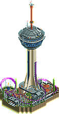
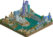
Cape Canaveral's Galaxy Tower
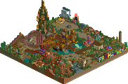
pantsTreasure Hunt
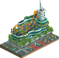
RWEBatman - The Killing Joke
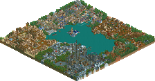
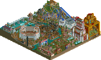
IretontOut of this World
RaymondLVoting Rules
Wow! Super impressed by Iretont, I thought he and pants put together better-realized visions so they got my votes. The other two felt simpler and more generic to me
Wow, that Batman entry is so cool, Iretont. Really enjoy the various floors and details you added.. well done.
Galaxy Tower is neat - very detailed and the coaster is pretty cool too.
Out of this World was a bit hard to read with the limited palette. Interest layout, and I enjoyed the use of rides/trackitecture.
Treasure Hunt was nice as well - fun little layout. Seems like this would be a good slice of a fuller park.
Voting for Galaxy Tower over Treasure Hunt because there's more architecture and verticality. Gave me more to look at and enjoy.
Pants went for height and the architecture is so clean and visually pleasing, while I love the aesthetics and the idea of Iretont's. RaymondL's color scheme is really out of the box which I appreciate and Treasure Hunt has a cool temple structure.
1 pants: MM14 is that way mate. Though this would easily annihilate those ones. Awesome work, nice integration of the coaster and just a lovely setting at the ground level. The tower is so cool, loved diving inside with cutaway view (and wasn't disappointed!). Excellent!
2 Iretont: This is very cool. Love the story taking place, accented by the music and peep scenes. Atmosphere is a win here too, lush use of the bright green pops of colour for the comic look.
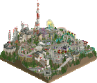
3 RWE: Super fun little entry. Can tell you had a good time letting loose making it. The drop over the pyramid alongside the water spouts and seating area is such a great moment of visual composition. Lots of solid peep and self-interaction too.
4 RaymondL: Certainly a surprise to me, great aesthetic with the neon blues and whites against the pitch black. The whole structure definitely has a big sci-fi Mortal Engines vibe.
Had a hard time deciding on this one. On one hand I'm a sucker for a good, realistic coaster layout and Apollo 18 (Cape Canaveral's Galaxy Tower) certainly is that but on the other hand I'm an old comic nerd and the execution and attention to details in Batman - The Killing Joke is incredible. In the end I had to pick the roller coaster however.
Pants- damn this is so freakin clean. The top of the tower is so great, i love all the details! Love how many peeps are up there! I’d love that drop tower. The layout is great at the bottom! That would be so freakin fun! Love the roofs
Iretont- ove the story telling! The music is so great. Its so layered and done well, super clean and exciting! The batmobile is done so well and the bat signal! Your use of objects is unmatched,
RWE- this is cute! The layout is kinda fast but its pretty smooth! I like the temple and how its worked into the rocks. The music is cool!
RaymondL- love to see some ncso stuff! This is super cool, love of cool uses of objects!
1. Iretont - Close one for first but I think this may have been the most impressive one of the bunch. Archy is really well done, the green goop color is a good accent without being too much. Feels really cinematic too, love how the soundtrack is synched with the drowning.
2. pants - We've seen a few Statosphere towers in this competition and I think this was the best take on it. Everything's very clean and coaster feels very believable for this type of park. Your style of realism is really instantly recognizable too in a good way.
3. RWE - not a theme we haven't seen before, but everything's done pretty well. nice layout and I like how the pyramid is buried into the mountain.
4. RaymondL - some nice NCSO fantasy stuff! Pallette gives it a distinctive look.
1. Iretont- This is awesome. This works so well all across the board. The colors are great, and there's so much movement. The atmosphere is perfect. Great stuff.
2. RWE- The landscaping is really cool from one angle but not quite as good from the back. I really like the palette you chose for this and the orange on the coaster looks so good over those browns. I really like how the temple is kind of embedded into the rockwork. Overall, very cool stuff.
Pants- Cool entry! I like the idea, and I really like how well utilized the tower is. The tower honestly looks kind of out of scale to me, I think it should probably be a bit taller. The foliage in this entry was also lacking a bit for me. Overall, very cool though. I enjoyed,
RaymondL- really cool stuff. I love the atmosphere and its pretty good NCSO. I wish you added a cutaway or something so we could see into the ship itself!
My first place is Iretont for the cool theme. My second is Pants for the good architecture, good rides, and good integration. I can't decide between three and four. Both very good micros, just not quite as good as the others. I'll have to ponder over it if there ends up being another poll to decide for the wild card spot.
I'm finding this round very hard to vote on. The quality in the parks are incredible, so I'm going to come back to it with fresh eyes.
1.) Batman - The Killing Joke (iretont) This is what I'm talking about! The atmosphere, the music, the little details, everything is done to perfection! I completely love this. Everything is instantaneously recognizable and clearly was made with a lot of love. The best part: it looks amazing from every angle. So good, the best micro yet.
2.) Cape Canaveral's Galaxy Tower (pants) - that's a fantastic layout that looks good from all angles. I love the coaster supports running up the tower, that's creative. Speaking of, the tower is gorgeous and clean and captures the vibe so well. I wish it was a bit taller to make it look in more proportion, but who cares. Colors are gorgeous, too. Best part was the little details at the top of the tower. All those supports, satellite dishes, antennas, etc. really brought this thing to life. You kill it with the space theming.
3.) Treasure Hunt (RWE) - Solid layout, especially the way it goes into the tunnel and disappears with the black wall object (I don't think I've seen that before). I'm not crazy about the rockwork, but I like the foliage a lot. I think it needed something else besides the coaster to keep my attention for longer. Overall very solid, I like it.
4.) Out of this World (Raymondl) - Tough choice putting this last, but the colors are a bit rough on the eyes. I love the creative idea and use objects/rides in interest ways. It just lacks cohesion compared to the others (which may be the point, but look to Cocoa's work for some good examples of beautiful chaos)
#1 - Iretont - Sequences/scenes depicteded in RCT are something I have dabbled a lot with, and I was immediately intrigued by this entry. The building looks great, the view on the backside is really well-developed, and bat signal is a cool touch. Obviously, the custom music also plays a big role here too. Very cool stuff, my only gripe is that the sequence wasn't longer or more developed - unless I missed something, nothing more happened after the batmobile pulled in.
#2 - RWE - A fairly simple entry with strong El Dorado influences, but it is executed well enough to clinch the second vote for me. The coaster is solid and I like the pitch-black tunnels. The custom music was also a nice addition instead of just going with any of the standard adventure-type tracks. Only thing I'd have changed is the plain land wall for the water, it looks a bit out of place when the rest of the map is lined by Fisch rocks.
pants - very nice use of verticality, and the tower is very well executed. However, while this was technically more advanced than RWE's entry, I just didn't find it compelling enough to give it one of my votes. It is a bit difficult to put my finger on it exactly, but I think I might agree with BarnID (the only one aside from myself who didn't put your entry as #1 or #2) that it feels a bit too much on such a small map.
RaymondL - A cool entry, however the stark black/icy blue color combo didn't quite do it for me, and I do think the structure could have used some CSO to break it up more, as it looked pretty repetitive in a few places.
This was a tough group.
1. Iretont - So much content, really well executed and atmospheric. This perfectly captures the theme and it was wonderfully fun to use cutaway to explore the park. The backside is chaotic and so much fun to see. Music really set the tone here as well.
2. pants - beautiful, clean execution of a very nice tower with quite a bit of content to see. Looking forward to you using your skills to bring forth more exciting concepts for future rounds.
3. RWE - this was a close third, the layout is wonderful and really impressive, especially with the use of large track pieces within such a small setting. The pyramid is also beautifully done, and I had a hard time deciding between you and pants.
4. RaymondL - cool colors but it was very blocky, and the coaster layout could use some more flow and aesthetic considerations for what parts are visible outside the building and what parts are hidden. I do like the interesting use of trackitecture here though.
1. pants---stunning tower and just so clean and fresh
2. iretont---really fun narrative and a really well-designed building with fun details
rwe---great layout but a bit muddy landscaping, needed a bit more oomph
raymondl---palette was a bit of an eye-destroyer but a fun piece of space fantasy. bit hard to follow the coaster
1) Iretont - fabulous take on this idea! Looking at all the details in this is a treat, and all of the moving parts add so much life.
2) pants - excellent verticality on display here, and the park section beneath the tower feels much larger than it actually is. The coaster is a fun take on that old stratosphere concept!
3) RWE - everything here is beautifully done, I wish I could have voted for it, but the size in comparison to other entries and the coaster held it back for me. S tier pathwork though.
4) raymondL - agreed, the palette was a bit harsh, but I love the enormity of this one. It was however a bit blocky, and I wish there was more movement.
1 - Iretont - Dude you've got to be kidding me. This is just so massive and packed with content. The story and narrative is on point - its the Killing Joke haha. Perfect. I'd expect nothing less from you when it comes to CTRs and synchronized rides. The audio added so much as well. The fact that you've put full interiors and included so many easter eggs is the icing on the cake. It's funny man, I was fully planning on building an Arkham Asylum map last MM if I would have made it to the finals. Similar kind of thing - would have told a story from the comics and would have had tons of villains and hidden things all over the map. You've done it way better than I could have done haha. I wish you would have hidden some Riddler question marks around the map - unless I haven't found them yet. I hope you have a few more of these in you!
2 - pants - Oh wtf dude this is too good. The architecture is so clean and well thought out. The dual elevators behind the glass is just perfect. Killing the retro epcot vibe still - it makes me sad that this isn't a real place because it's so believable. You've done such a great job at filling this map with interesting content, and it makes me excited for another full scale release from you.
3 - RWE - Man I love this! Gorgeous map, great colors, interesting coaster layout. I do think that the foliage falls a bit flat here. Some strategically placed taller trees and thicker patches of foliage would have done a lot of good. I get the sparse feel you were going for though. I really do think that the strongest thing of this map for me is the verticality. Despite not being a tall map, the way you've layered the track and paths is done so well. Particularly the elevated path overlooking the coaster drop/water. Great work man.
4 - Raymond - This is solid! Feels very nostalgic in the best way. I love the color choice, but I do feel that it could have been managed better. (No checkerboard roof/wall patterns, more vertical stripes, etc. Help guide the eye to key points and don't distract from it, etc) Thank you for the great submission!
Pants - Your execution continues to be so sharp. I love this concept and the sort of revitalization of that Stratosphere shuttle concept. Here it is done so believably well. It's stuff like this that really makes modern architecture grow more and more on me.
RWE - The composition here is so strong. The layout is so nice and the path has great flow. I like how you did the foliage and put some over the roof of the station. Guests don't see it but it looks nice as the viewer. I'm also kind of a sucker for tunnels like these. with coasters and paths.
Iretont - Amazing showing. I love all the storytelling details and the intricate infistructure you've done. All the colors are atmospheric and moody, everything feels very structurally supported and the movement keeps it all very alive and full of content. Even the little patches of landscaping feel special. It feels like you really made the most out of your 225 tiles, well done.
Raymound - I dig the commitment to trackitecture and WW/TT objects.Like Josh said this feels nostalgic, the big maximilist mechanical structure with large twister coaster. Just such a cool and special vibe.
pants - A micro after my own heart with this huge architectural focal point. Taking the tried and true MM format of 'big tower' but bringing it into a more modern, park aesthetic is really smart and the detailing and execution is stellar. I also love that you saved at the top (intentional or not) so that we had to pan down to see the full height of the building. Great dramatic way to introduce the viewer. I could see this struggling down the line if up against something that latches on to the more fantastical possibilities of micro madness, but we shall see.
RWE - A lovely concept, and as I've said in a few other groups, a great way to make a coaster-focused micro. The details, the archy, and the landscaping forms were all spot on and really give the impression that I'm seeing a small view of a larger park that I want to see. I did feel like the landscape coloring needed a bit more depth and variation in color, and as with all coaster/park focused micros, they have an uphill battle against some of the more fantastical and dramatic entries.
Iretont - This is what micro madness is all about. An incredible aesthetic, filled with content and tons to explore, creates a vibe that might feel overbearing on a larger scale but feels perfect for this size and format. i love the bold use of color, the industrial details, and interiors were next level. The bat mobile was also a great touch. All around exceeded my expectations in the best of ways.
Raymond - I didn't have any idea what to expect from you, and I agree with others that this isn't a bad entry by any means. The concept and color choice in particular are really bold in a great way. There is also a bit of an artistic was to how you brought things together that I enjoyed. That being said, the execution and overall styling were just lacking in some of the detail that we usually see in NE contests. I'd love to see you keep this aesthetic but refine it.
One of my favorite micros thus far, so #1 to Iretont and #2 to pants for a level of execution and crispness that I can't get enough of. RWE was a close second, love the coaster, but I just felt it lacked that extra dimension that MM really requires nowadays.
1. Iretont: Knew you had something stellar cooking in that head of yours when you inadvertently mentioned specially tailored CTRs. Just the Bat Signal CTR alone is the perfect detail, but the rest puts you up there with Kenos and Spacek as the premier CTR builder. There's so much motion and activity in this micro even without a headlining ride, which is a bold move. Turn on cutaway and the entire ACE factory has interiors which is pretty mind-blowing. And the Joker laugh timed with The Red Hood drowning in the acid? Chef's kiss. I think all this spectacle is glossing over the fact that this is your first solo CSO release. You've adapted to it super well considering you came from DKMP as a NCSO guy. On top of all that, I'll never not like a micro where I'm a named staff member. Awesome stuff dude, H05 sweep!
2. Pants: Big boy pants on. This is absolutely massive and a fantastic use of both the micro format and a visual style you can confidently pull off. Just as impressive as the tower's imposing structure is its interior; turn on cutaway and your detailing is impressive and authentic. You went just as ham on the top of StratosFear, which has to be an absolute hell of a ride to experience. Even if it feels like second banana to the tower, Apollo 18 is a nice little layout. Your layout skills from your unfinished park to now have improved dramatically and made you an absolute powerhouse builder. The frozen staff were funny too which is always a nice touch to any park. Very solid entry!
3. RWE: Very nice little design. The layout is great and I love how it interacts with the landscape (especially those pitch black tunnels), but I feel like you could have gotten away with a slower launch speed. The Fisch rock work is so nice here, and I'll admit I felt a little stupid seeing you hide foliage inside the rocks just by deleting them and plopping a big ol' bush inside. So much cleaner than zero clearancing. I love the temple centerpiece as well as the simplified color palette. That little vignette on the back with the single umbrella really tickles me too. Really hate to say this though, but content-wise it just doesn't really stack up to the top 2. Still a great micro though, good stuff!
4. RaymondL: It's a joy seeing you make the transition to NE to contribute a micro. I think the DKMP mini contests have prepared you well for this format. Between the slick modern architecture and the huge propeller on the bottom, this just screams cool. I will agree with Morgan though, it is a bit chunky and a lot of the movement and activity is hidden. Still, I appreciate seeing you contribute an entry!
Voted Iretont for the vine. Such a content-packed micro with an incredible amount of polish. H05 SWEEP