Park / Dungeons & Dragonfruit
-
 18-January 23
- Views 6,430
- Downloads 254
- Fans 0
- Comments 24
-
 Description
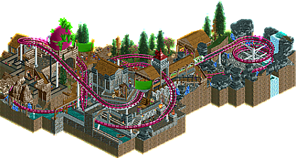
A gang of plucky adventurers seek to aid the small town of Fruta. Will our heroes become caught up in the Cult of the Dragonfruit's conspiracy, vanquish the fruit-smuggling Thieve's Guild in their sewer hideout, or find the hidden gems of Dragonstone caverns?
-
 No fans of this park
-
 Full-Size Map
-
 Download Park
254
-
 Objects
1
-
 Tags
Tags




Red Division
Yellow Division
Blue Division
R1
QF
SF
Can inthemanual take the first step towards a third micro madness final in a row, in this clash of high fantasy and highrises?
Dungeons & Dragonfruit
inthemanualThe Spire of Mars
ScoopCONCRETE JUNGLE
HexTemple of Tangled Tempests
MorganFanVoting Rules
Scoop - it's certainly pretty and clean, just wish there was more happening
Hex - it's certainly pretty and clean, just wish there was more happening (although it's more fitting in this setting). Gotta ask: how did you know Bubbsy was a fan of mechanical style?
MorganFan - At first glance I was surprised how much I enjoyed this. I really like the music, I like the vines, I like the birds, I like the narrative. Impressive scene
tim - this feels like a throwaway joke from a Rick and Morty episode. It's a nice little entry, but I don't have too much more to say about it. The dragonfruit is really well done
I love the mosh pit on this one
1) Temple of Tangled Tempests by MorganFan
-Concept:+++
-Content:++
-Quality:++
Overall; A very picturesque micro, with a lovely colour scheme and a nicely flowing coaster which has some great interactive moments with the architecture. Also love how you created the vines and the overall concept of nature taking over the wind tower and the little narrative you added when opening the park. Kudo's for the custom music as well, really adds to the experience!
2) CONCRETE JUNGLE by Hex
-Concept:++
 Maybe it's not what you were going for with this though, as I get 'Concrete Jungle' is a song by Bad Omens, and I guess you kinda used their music video for inspiration? Anyway, the big building is well constructed (especially love the deco pieces used) with a lovely colour scheme and nice overgrown features here and there. The concert/party on top of the building is just icing on the cake. Nice use of the jumping peeps and Roomie's dancing peeps, adds some much needed movement in the piece. Could've used the empty backside of the building for some more content though or little scenes. I second Walto btw: How did you know Bubbsy loves the Mechanical style and nin the Roman style? Did you guys send each other your entries? (thought that was a no-go in NE contests)
-Content:+
-Quality:+++
Overall; I'm a sucker for a zombie apocalypse atmosphere and if there was a party in the Walking Dead this would be it I reckon
3) Dungeons & Dragonfruit by inthemanual
-Concept:+
-Content:+
-Quality:+
Overall; I've never been a Dungeons and Dragons guy, so I can't really relate to any specific references you've put in, but overall I really like the medieval atmosphere you created. I may start to sound like a broken record, but custom music here would've elevated this so much, even the medieval standard tune would've done the trick. Does everyone play without sound when viewing parks or something? Not sure about the grey Kryptonian rocks though, stands out a bit too much I feel. Overall the combination of the colourful dragonfruit in combination with the grey-tones works well here and the coaster just adds some nice freshness to it all.
4) The Spire of Mars by Scoop
-Concept:+/-
-Content:-
-Quality:+
Overall; Never played Destiny 2, so I can't relate to the concept if that's what you were going for. The building has some quality to it though, but that's kinda it unfortunately. Also unsure about the landscaping (especially the colour scheme) that's surrounding it.
I'm gonna settle the score (ha, pun): Both bubbsy and nin frequented the RCT Club discord during the weeks of building. On one of the nights, we had a conversation stating our favorite in-game music. The obvious choice other than Roman Fanfare is Ragtime theme in my opinion. If you know anything about nin, he constantly cappella's the Roman Fanfare theme. I guess this brushed off on bubbsy, 'cause he started singing the Mechanical Style in the voice chat. This went on for at least the last 3 nights before the entries were due. Hope this clears the confusion up! Don't hang me.
I'm not sure if the music video for the song has a literal jungle in a city. I got obsessed with their album maybe a week prior to the MM announcement? And while it isn't my favorite song from the album, it's the easiest to take literally. I love concerts, I love mosh pits, so I thought it would be cool to have a concert of ghosts!
Well here we go! Lovely stuff everyone, we got a real strong round here.
Hex - Love the abandoned vibe of this! Foliage is very nice, and the idea of a concert on the roof of a rotting dystopian building is pretty original. Atmosphere is great.
Scoop - Massive scale, and the size and movement of electricity is badass. Building and general design is sleek, but I wish there was more going on.
inthemanual - Super cute theme and I love the idea! Castle archy is very nice, but seemed rushed, and I wish there was more.
1.) CONCRETE JUNGLE (Hex) - Wow, this was actually really impressive! I wasn't expecting much from the overview, but it has a great atmosphere. The roof is great, but I really love the street level. It's so detailed and tells a story with the placement of each car and the slow spread of nature. The inside of the building is kinda bland, but that's acceptable with everything else going on. Really impressive stuff!
2.) Temple of Tangled Tempests (MorganFan) - This is sweet! The vines and thorns are brilliantly done. Everyone should hide the track to also see what a cool building you created. The highlight for me is easily the bridge, which looks so ornate and beautiful fits in naturally with everything else. I also loved the story, which made me appreciate the coaster more (I initially wasn't crazy about it, but it's alright knowing the story). I do think some of the building becomes a bit too messy at the top and starts to lose its form, which is partly helped by the vines but not completely. Anyway, very well done!
3.) The Spire of Mars (Scoop) - The top looks great! I really like the muted colors interrupted by the yellows and blues of the coaster track and trains. I think I would've preferred a coaster going around this tower instead of a drop tower on the inside. But like ITM, I suspect time was an issue? The main building looks amazing on the lower level, but the surroundings are pretty bland. Still, pretty good, just not your usual amazing stuff.
4.) Dungeons & Dragonfruit (ITM) - Cute little layout and fun theme. Seems like you ran out of time, but no worries.
3.) CONCRETE JUNGLE (Hex) - Wow, this was actually really impressive! I wasn't expecting much from the overview, but it has a great atmosphere. The roof is great, but I really love the street level. It's so detailed and tells a story with the placement of each car and the slow spread of nature. The inside of the building is kinda bland, but that's acceptable with everything else going on. Really impressive stuff!
My first place goes to Temples and Tempests by MorganFan. Good visuals and good music. It was a bit minimalistic but it has a better coaster than my next best up so I'm giving it my first place vote.
My second place goes to Dungeons and Dragonfruit. Cutesy but fun. The coaster was alright but the theming of it was pretty good, like the Dragonfruit sculpture.
Third place I give to Concrete Jungle. Not bad, but I'm not exactly a metal fan and the music was a large part of the experience. Good architecture and interesting idea.
Last I give to The Spire of Mars. It was a cool building but like some others said, rather sparse and needed an extra ride or something to give it a little more interest. I can't fault you as a builder though, as I did the same thing in the first Micro Madness.
Well, I've given my votes.
Timmy - This felt very recognizably itm to me; a bit of whimsy, a great eye for color, and a great composition that really sets up fun interactions between the ride and the scenery. I love the dragonfruit sculpture and the inspiration for this. As a small piece of a larger fruity park this would slap, but I do feel like it is missing that extra dimension that MM demands nowadays (which you can thank yourself for in MM2). This is a great demonstration of your parkmaking skills, but I think it needed a little something more that you usually give in your micros.
Scoop - Love the destiny reference, big fan of destiny and that aesthetic (I did some pockets of destiny inspired testing for last H2H that never saw the light of day). The construction and details are really impressive, but it was just lacking a second dimension or element. It didn't help that none of the rides were named, which left fewer things to explore. In an ultra-competitive MM, this needed something extra to elevate it.
Hex - Conceptually, I can't help but love this. Hell, I've made entire parks dedicated to specific albums (though I don't dabble in the world of metal quiet so much). I love the vibe of taking a song and making a literal embodiment of it, like the crowd is being figuratively transported thru the music. The overall visuals are great and really bold, though I feel like the execution is in places a bit blocky, particularly for a structure that we were able to see inside. I also think there was a lot more room for additional content, even if it was just more texture and elements to sell the building in decay, or other nods to the world that was being created. So, conceptually I loved this, but I think execution could have really made this a slam dunk.
MorganFan - This entry feels SO fresh. Just like, an aesthetic and a vibe that feels so unique. There are a lot of familiar objects and textures here, but you've organized and used them in a way that doesn't feel like anything else. The coaster has great flow given it's packed into such a small space, and it was fun to watch it interact with all the vines and thorns and roses. In places this might be just a little too minimalistic for my taste, but otherwise this was unexpected in the best way, and I love the sort of mystic background, felt clever without feeling heavy handed.
This is a tricky group to vote on. Some of these are crafted well but I think miss on the extra sauce that MM requires nowadays, others have the sauce but are lacking a bit in execution. As with other groups, I feel like I have to go with the parks that best utilized the format of MM to elevate a concept, so I voted MorganFan #1 and Hex #2. Congrats to all on a competitive and very intriguing group!
1. morganfan---damn, outta nowhere! this is awesome. a really excellent, full-size layout, to start. with a lot of low and grace. and the surroundings are just so cool and mysterious, and again, excellent music choice. been a lot of that so far
2. hex---a close second for sure. love the decaying building, really excellently designed. the song is also really fun although you need to amplify the track in audacity or something beforehand to match with the default song volumes
itm---a cute little coaster with a nice narrative. I like the big dragonfruit and you know how i love puns
scoop---great tower and I love the swirling halo thingies. nothing to fault here but just missing a bit of life.
1 MorganFan: Awesome work, another lower seeded player surprising us with some strong quality. Loved this map, great theme with a well entrenched coaster and I think the backstory told with the messages is an awesome touch. The custom music sold the vibe very well too.
2 ITM: This is really sweet and the sort of fun blended concept that is suited to MM. Learning that it was inspired by your son is another cute motive. On the whole it feels a little unfinished, but what's complete is great work. The dragonfruit sculpture is cool and the pink/green pops really nicely.
3 Hex: Great map, feels like a cool concept with the ghostly peeps raving on top of a post-apocalyptic building and dotted elsewhere in the map. The mosh pit is a sick idea to use the dancing peep ride, and the execution is solid all round.
4 Scoop: Woah, impressive structure! Definitely feels quite adventurous though I wish there was more to the map, or a coaster of some sort to watch, a touch of music etc. The colour palette is used to great effect though and the architecture feels like a unique take.
MorganFan: Love the presentation and storytelling of this. Really well done architecture and foliage with a nice choice of colors as well, also a solid coaster layout. Everything is so clean and polished, it makes for a great smooth viewing experience.
Hex: Nice post-apocalyptic details, and a great way of incorporating the song into the micro
's theme. The circle pit was a nice touch too.
inthemanual: I really like this coaster layout, and the color works nicely I think. Also like the docks/canal on one side and forest/nature on the other.
Scoop: A cool structure, definitely a big and imposing centerpiece, also nice clean support work.
I was confused by the rushed/unfinished comments, but later realized some final touches were missing from the save that was submitted. A fix can be provided later, but otherwise this was the park I intended to make. I did take shortcuts and didn't always do the most detailed or technical approach, but I'm still happy with it and it turned out how I expected!
Hex: I'd vote this #1 of the group if I could. I think it's a great use of space and a great approach to architecture, while adding interest with the overgrowth and music.
Morganfan: I think this was a great idea with excellent macro composition, but I felt a little lacking in both the layout and the construction of the towers.
Scoop: It's a nice tower, with some nice extra layers to spice it up, but a tower alone isn't quite enough in a tough matchup.
I may sound like a broken record but it was another tough round for me to vote, I think all of them hit a certain level of RCT that was just really enjoyable.
Scoop – My number 1, I really liked this entry and it had all the right things for me. Great imposing architecture, nice amount of movement and a glimpse into the awes-inspiring solo you're creating. Great job here.
ITM – Killer dragonfruit! Not literally but I appreciate odd fruit being covered in RCT and this was one of the best we've seen. The concept was really funny as well, it's kinda like a big kids version of the caterpillar and giant apple ride at fun fairs! What I took away from this release the most was your attention to creating moments at all angles of your entry, things were unexpected and I watched the coaster layout a few times at different angles because you created this really great, aesthetically pleasing entry. This was my second choice for the above reasons, can't wait to see more from you.
---
Hex – Another great entry, huge amount of micro moments within the entry and expertly done. It really reminded me of The Last of Us. This would be an amazing H2H entry or maybe even a design, this theme is crying out to be expanded.
Morganfan – I think you've probably hit the award for best trackitecture through all the parks in R1, everything you crafted was thought-out and it's clear that you were in a flow with everything you created. Like some of the winning fantasy entries we've seen, I wanted some more direction to the world you'd so artfully created, a bit more storytelling for me personally, but I'm sorry I didn't throw a vote your way as you created a thoroughly enjoyable RCT experience. I completely get why you're in the lead and I think you'll do even bigger and even better in future rounds.
1. Morganfan- This is so cool. I really like the atmosphere that you created here. The pinks and greens work so well together and architecture it very fitting. I will say that I am not a huge fan of the blue coaster but that is kind of a nit pick. Really great stuff
2. Scoop- haha I love me a good tower of doom looking this. For real though the architecture here is really impressive and I like the concept. I feel like you could have done better on the ground foliage but the tower more than makes up for that. I really enjoyed this entry.
ITM- I like the concept. the effect you used for the dragonfruit seeds was also really clever. I like the foliage and architecture here but the landscaping is a little bit too hectic for me. I think I counted 4 or 5 different landscaping styles in here which makes everything feel a bit disconnected imo. Overall I still really enjoyed the park though.
Hex- Damn man that architecture it strong. I also think the concept you chose was really creative and I like the execution for the most part. I feel like you could have done more with the interior of the building. I also probably would have chosen a different floor material as everything kind of blends together as it is right now. Overall, I still really like this! great stuff
MorganFan: Love the idea here - the story messages really elevate this. Layout was nice as well. Colors/aesthetic was great as well. Great work on this. If I had one critique I would've made the tower a little taller?
ITM: Very pleasant to watch the coaster traverse the map. Cool concept. I think this is a bit simplistic at times in terms of your landscaping work, but overall I think this is well composed. More fruit parks please.
Hex: Really impressive building, damn. Love the subway/underground details the most though, enjoy seeing that when it's well executed.
Scoop: Love seeing Destiny 2 stuff in RCT - we need more of it. Would've loved to see some Hive stuff corrupting the tower or some tie-in to factions in the game. Otherwise, this is really cool!
Hex: This was super impressive, and had some funny moments there. Love that all the guests' thoughts are "I want to get out of Open Up This Pit!"
Architecture was perfectly executed, the vines are great, and the underground also was really well done.
ITM: Really lovely, this coaster layout is actually fantastic and I could see this being a smaller coaster within a bigger park. Loving the weaving in-and-out of itself and the station and other structures. Definitely a bit tame in terms of concept, but clever little wordplay and overall pretty refined work, gets my second spot.
MorganFan: Lovely idea and the coaster had some awesome moments / elements. Loving the overall aesthetic and the thorns, though it could have used a little more refinement in the composition to elevate it further.
Scoop: The tower is interesting although I don't know the source material, and particularly loving the colors scheme, but it definitely needed more content or story to complete the narrative and sell it.
1. Hex: NE needed more from you after H2H9; this is amazing! The massive building takes center stage; love how detailed and dilapidated it is inside and out. I'm also a big fan of the abandoned subway below. Of course the real meat and potatoes is the Bad Omens concert on top. Wasn't familiar with them before but you're slowly converting me to a metalcore stan and IDK how to feel. The dancing peeps ride for the circle pit was a brilliant choice; I just gotta be more responsible with where my burger goes next time. You're seriously slept on and I can't wait to see you keep building!
2. inthemanual: Adorable little entry with an even more adorable backstory. I love the narrative you've managed to weave around a theme as simple as dragonfruit. For a layout-forward micro, the layout itself is a great little family coaster with some nice flow. There are a few supports that didn't get hidden which is a shame. I like how the theming feels like a bunch of little dioramas that all form a pretty comprehensive world for a micro. Really love this!
3. MorganFan: The first impression you get of this micro can best be described as poetic. The messages really set the stage, as does the custom music with the wind and birds edited in. Shoutout to AJ. The amount of coaster you've packed into this micro is honestly pretty staggering; reminds me of how I used to handle 10x10 plots of land. I love the color palette and how the coaster contrasts with it. It fits the narrative that a coaster named Tempest wouldn't just naturally blend in. Smart move to use the single rail track for the thorns, and I love how you hid the roses inside. A bit less refined than the rest but still a really creative entry. Good stuff!
4. Scoop: This is just cool. Not super familiar with Destiny 2 but it matches the source material well enough. The tower is beautifully detailed and the electric blue ring effects around it remind me of the desert area in Planes of Advencia. Great landscaping too. My problem is this one doesn't really have as much going on as the others and lacks polish. Something like a coaster or an interactive element would have taken this one over the top for sure. Great stuff!
wow i really don't get the voting on this one. For me, the dragonfruit one was the clear winner, just a step up in quality from the others. I also really liked concrete jungle, and an argument for that to win is fine, imo. the other two were great but felt a little dead to me in comparison.