(Archive) Advertising District / Disneyland Greece
-
 02-September 04
-

Richie Offline
It just seems so, jumbled up. Yyou have rooves over rooves, random wall peices? The path is too small, in that pic you cant see the edge of the path. -

 Tech Artist
Offline
Well your 2 being Disney parks you can copy it piece for piece because it was done by Disney and you are doing a Disney park. With mine, I based it off the one at DL California but did have some originality in it.DF and I talk often on AIM. I know he wouldn't do anything like that. He is correct about us both being Disney rip-offs: I copied the Peter Pan facade piece by piece and he did the same. No harm done.
-
 Disney Freak
Offline
JAYJAY - Care to expand?Fantasyland facades:

Peter Pan queue area / facade:
RCT_Master - Look at the real screen. I copied piece by piece. Blame Disney.
TsUnamI - I'll see what can be done about Fisherman's objects. I'm glad you're enjoying the screens!
dragonfly - Sorry for the disappointment. Could you be more specific as to what you don't like?
Phantom Raider - Changed!
chapel -
Richie - What do you mean "you cant see the edge of the path."?
rctfan1556 - Good luck on your park! I'm going for the more realistic look thus, in the excisitng facades, not too much originality!
-

Richie Offline
I meant in the real photo you showed, you cant see the path to the left. In your screen, the path is far to small/thin. Its not something your going to be ably to change now without ruining the rest, unless theres nothing opposite the facade at the moment. -

 sacoasterfreak
Offline
It's looking good. I like the new screens. I like how you're using facade construction to represent a realistic theme park. The Peter Pan building looks excellent. I think that if you keep producing quality work like this you could have a chance at a parkmaker position, but it takes alot of time and effort.
It's easy to see the effort that has gone into this, and I can appreciate that.
I'm not too fond of Disney parks, but if you ever need some beta testers lemme know. -
 Disney Freak
Offline
I'm tired of presentations!
 I present to you the Sleeping Beauty facade (unfinished ofcourse). It will hold a "dark ride" type ride (the back space), a restaurant and a gift shop / confectionery (to the right of the screen). It's look is based on on the castle found at Disneyland California.

As you can see, I take constructive criticism seriously. I've increased the path sizes and the size of my facades... I've also used brighter colors to make it more cheerful! If you have anything to say, even about the smallest thing, feel free to comment!
-

Richie Offline
I dont like the use of the grey fishermans decorative fences. They dont stand out enough to be detail IMO, just looks like its rushed. The towers look quite poor to me IMO, whats the custom tower in the middle on the very left of the screen? Looks out of place.
I dont like the screen much at all really, i dont mean that harshly. Just that theres a lot of custom scenery in there that i dont like, for example the grey walls. I can suggest anything that you could use instead, i know it is the look you want, and its the best for that look.
I know you want some honest, so ive been honest here. I do like that you have increased the path sizes, it gives a more relaxed feel, and the facades wont feel so cramped together. -
 Disney Freak
Offline
sacoasterfreak - Thanks. I'm glad to hear you like it!
Richie - The middle tower indeed looks a bit out of place. That'll be removed. The grey fisherman fences are meant to be small details. I know it can hardly be seen but that is the point of small details.. They are there to be discovered. Believe me, this screen is far from being rushed. The moment I start doing so I stop playing. I appreciate the honest response, tho it seems to be only personal choices in scenery that bother you so I can't make much out of that. Thanks anyway. It's always nice to recieve feedback, good or bad!
-
 Highball
Offline
My only complaint is the size of the facade. Compared to the one's you've previously shown, it's too big. It will dwarf them. I think you should tinker with the corner tower (center one) because it is what makes the facade seem this way.
 -

 Scorchio
Offline
I personally HATE that hotel..... it's so ugly... the colors are so.... eww... I can't think of a name to describe it...
 -

 Highball
Offline
Dude, shut up. If you don't have any comments on how to improve the hotel, then don't bother posting.I personally HATE that hotel..... it's so ugly... the colors are so.... eww... I can't think of a name to describe it...
-

 Scorchio
Offline
I think the white and red is too "blinding", add some more black into it, and it would look cool.... and maybe some more greenery around it. If we're being realistic here, can you imagine if it was a sweltering hot day and you were sitting in one of those hotel rooms? Where's the shade?
 -

 JAYJAY
Offline
WOW, all this is is a cheap rip off of icemans park. And this does not have the disney feel, ur missing big time.
 -
 Disney Freak
Offline
Wow, you're a fucking idiot. You really should choose your answer. I can't rip off Iceman and NOT have a Disney feel. Stupid little you. Oh well....WOW, all this is is a cheap rip off of icemans park. And this does not have the disney feel, ur missing big time.

-

 Panoramical
Offline
tbh i dont really like all the colours mixed together. And the grey path inside the building also I don't like. But the architecture shows promise, and it does look like a Disney park.
 -
 Disney Freak
Offline
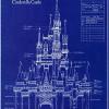
Hey Panoramical, first of all, thank you for commenting properly unlike some dumbasses here. Here's a picture of the colors I'm basing this on (imagine the blue darker, the color is faded here):
This is Sleeping Beauty's castle. As you can see, the color scheme is mostly grey/ blue/ pink. I'll see what I can do about the grey path. I can see your point here.
I'm glad you think this looks Disney which is my #1 target no matter how many others have achieved that look before.
-

 tyandor
Offline
I'm getting a bit tired off people saying this is a rip-off from Iceman's project. I've seen both projects side by side and they are very different excluding the Disney factor ofcourse
 -

 JKay
Offline
GayGay, why dont you spend a little less time discrediting other peoples work and a little more time working on your attitude? I highly doubt you could make any thing of this quality anyway, so don't say things that you can't backup. I personally feel this park does not resemble iceman's park in the slightest. Just keep doin' your thing DF...WOW, all this is is a cheap rip off of icemans park. And this does not have the disney feel, ur missing big time.

-

 Highball
Offline
Did you not read my earlier post? If I felt ANYONE was copying me, I would call them on it. But I don't feel that way, especially about this park. I think DF is doing an excellent job on this and I'm tired of people comparing his work to mine. He deserves better than that. So stop comparing us and just enjoy the damn park. Comment on HIS work, not mine.WOW, all this is is a cheap rip off of icemans park. And this does not have the disney feel, ur missing big time.
 Tags
Tags
- No Tags
