(Archive) Advertising District / Tranquil Bay
-
 31-July 04
-

 MightyMouse
Offline
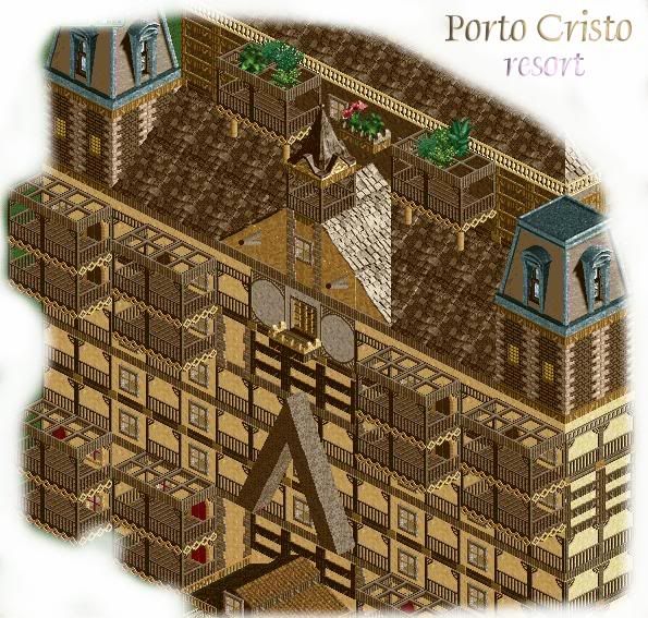
I like to see some potted flowers or benches(or just detail in general) on the balconys. Looks good, though.
 -

 JKay
Offline
Wow X!....this is amazing. I love the sheer fact that you even attempted to build such a large structure. Not an easy task, thats for sure. Architectually, this is very sound. You've actually done a great job reducing the flatness that can actually ruin the entire look of a hotel this large. The colors are a bit drab for my liking and it'd be nice to see some type of accent color there. I think the 1/4 tile shake roofs would suit better for the balconies as opposed the those wood supports and it'd also be nice to see those balcony floors supported a bit more; they look a little flimsy. But still, this is incredible, please keep it up!
 -

 tyandor
Offline
X250, on Sep 20 2004, 02:20 PM, said:
Moving it to a new pageI gotta get this thing organised more...
I have not shown screens of everything, trust me on that one...
Here is a HUGE update i suppose, the Porto Cristo Resort...
A huge 500 bedroom hotel, which i have nearly completed. Here you can see the front side of the hotel and the entrance. It is huge, nothing compared to a RCTNW or a rwadams hotel but it is pretty damn huge. The biggest structure i have ever made!
The hotel shape when finished is a 'C' shape with a swimming pool in the centre.
Feel free to comment or share your opinions on it as techincally it is my first hotel, and they do not seem to be my strong point as it took me about a week to get this one perfect!
Thanks.
-X-
This looks very good X. Maybe add some extra color, but that's really good! -

 Turtle
Offline
It's structurally very good, although i wish you'd have used more eye catching colours. It's very drab.
Well done on the building though... -

 X250
Offline
Thanks for all the comments, i am going to mix some dark red in there- not much but something to make it a bit more interesting. Glad you like my hotel!
-X-
 Tags
Tags
- No Tags


