(Archive) Advertising District / Tranquil Bay
-
 31-July 04
-

 Steve
Offline
You need to take a break on the advertising, man.
5 screens on a single page is a bit much.
Anyway, looks pretty cool. Like the atmosphere, here. -

 VC15SA
Offline
I really like it. The sewers was a great idea. The peach rooves look fine and I don't really see a color change necessary. Good job and keep it up!
 -

 X250
Offline
This is the last update on the park now. Three random screens from the park. I have nearly completed four areas. But for the time being i am just going to show you bits of Tudor Village and the Ancient area. I will show some screens in the future, but not very frequently. I might not even tell you when this thing is finished...
Anyway, i am off to Majorca now. So, hmm... Enjoy the screens while you can!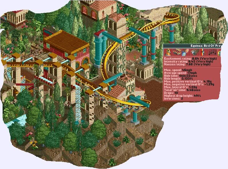
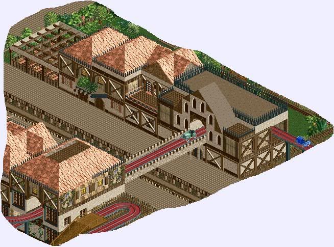
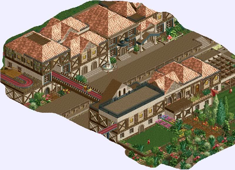
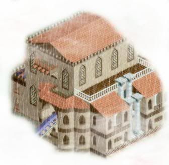
The last two are basically the same as the one i showed before except i have added a ride in there. In the Tudor Village i have also built a giant church-like building with a bell. Also i am not too sure of what to do the other side of the Tudor Village, i have shown you the 'wealthy' Tudor town in depth... Would you rather see a 'poor' side of town or a 'London Fire' theme with charred out buildings? I am 50/50 with that idea at the moment so if you have a suggestion please share it!
-X- -

 mantis
Offline
This is pretty uber, dude. I love the Tudor architecture - pretty spot on if you ask me. Also that other area looks very nice too, especially the little wooden poles sticking out of the buildings. Nice job.
 -
 Timothy Cross
Offline
Pretty nice! I like your architecture and atmosphere, not the easiest thing to pull off. Colors look decent too. I really have no complaints. good work.
 -

 X250
Offline
Only two comments...
Anyway an update on this park, i have demolished quite a bit of the Anicent Area as i thought it was a little too colourful, but most of the stuff is still there. I have started a technology area, and am progressing quite a lot on the Tudor area.
Here is a screen of a swan-boat ride entitled 'Anne Boleyn's Swans', i have also added a huge coaster in this section called 'Henry VIII' and another smaller coaster called 'Jack The Ripper'. Mostly, i have been refurbishing the areas as i was not happy with them. But i think they look a lot better now in my opinion. Anyway the swan-ride is hacked of course and takes a little voyage around an island where some of Henry VIII's wives were beheaded. Rumour says the island is haunted...
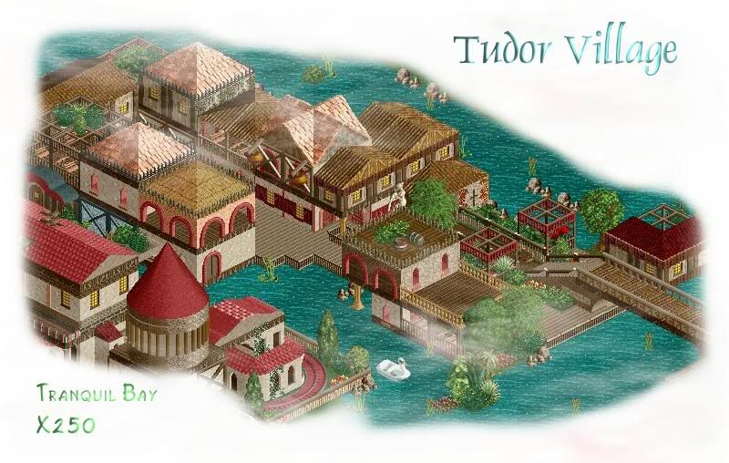
I will consider this as the first update on this park, the other screens were mainly tasters and quite a few of them do not exist anymore as i have revamped them. Comments about this screen are more than welcome!
-X- -

 tyandor
Offline
Wow, you're going forward with every minute
 The only thing I don't like is that cone roof. Maybe try to build a cone out of better objects?
btw, about the flying coaster: I think you should make the track completely gold. -

 Scarface
Offline
Tree selection is shocking
Rest looks very good
Try having some paths going into the shops aswell and it will make it look much better. -

 Panoramical
Offline
You are overadvertising this park. There wont be much point in releasing it if you carry on like this because people will already know the park well enough. Don't play for comments, play for fun. Anyway, the architecture is blocky, and the cycads don't fit, but otherwise it's good.
 -

 VC15SA
Offline
Not everyone is like you.Don't play for comments, play for fun.

Anyways, I love the screen. No suggestions. -
 OhioCoasteRFreaK36
Offline
That looks awesome man!
Is that effect suposed to be rain or a old picture look? If it is rain i like it! The building is a normal X250 building..The wow is there but i cant really tell.. -

 X250
Offline
'The Coal Mine' mini-mine coaster in the Tudor Village.
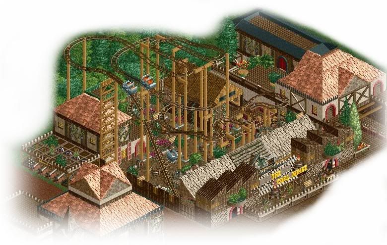
Suggestions and comments welcome!
-X- -

 coasterphil
Offline
That last screen is really nice. This park looks great, but I feel like I've seen the whole thing already.
 -

 X250
Offline
I gotta get this thing organised more...
I have not shown screens of everything, trust me on that one...
Here is a HUGE update i suppose, the Porto Cristo Resort...
A huge 500 bedroom hotel, which i have nearly completed. Here you can see the front side of the hotel and the entrance. It is huge, nothing compared to a RCTNW or a rwadams hotel but it is pretty damn huge. The biggest structure i have ever made!
The hotel shape when finished is a 'C' shape with a swimming pool in the centre.
Feel free to comment or share your opinions on it as techincally it is my first hotel, and they do not seem to be my strong point as it took me about a week to get this one perfect!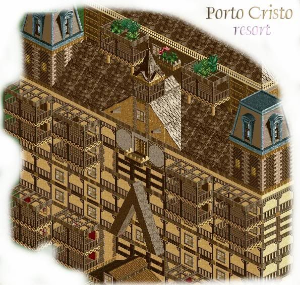
Thanks.
-X-
 Tags
Tags
- No Tags
