(Archive) Advertising District / Tranquil Bay
-
 31-July 04
-

 X250
Offline
TRANQUIL BAY
Tranquil Bay is a park set on the island 'Isla Dragonera' just off the coast of Majorca. The island has been used for many, many years as a nature reserve with hundreds of different species inhabiting the beautiful island. However, the island was thought to be not getting enough popularity among the tourists and Isla Dragonera nature reserve fell into serious debt.
The island authorities called for drastic action to take place and for a whole new image to the island. The animals who inhabit the island were shipped to another island just 12 miles away called Isla Conejera. News hit the island a theme park complete with docks and a mini-airport would be erected on the island...
Many locals and animal-rights members were strongly against this idea, and nearly banned the proposals of the theme park. But the authority went ahead with the plans and the theme park is now under away, being built as we speak... Tranquil Bay as it is known to be called, is supposed to have many themed areas including:
+ Ancient Village, an ancient area with arches, waterfalls and beautiful landscape
+ Colossus Ridge, a solid marble and stone area with some of the parks top rides.
+ Tudor Creek, shows life and architecture from the Tudor period.
+ Halloween Valley, the parks spooky area, dark and disturbing...
And most likely, a lot more...
Helicopters have managed to grab images from two areas- one of the Colossus Ridge, and the other of the Ancient Village...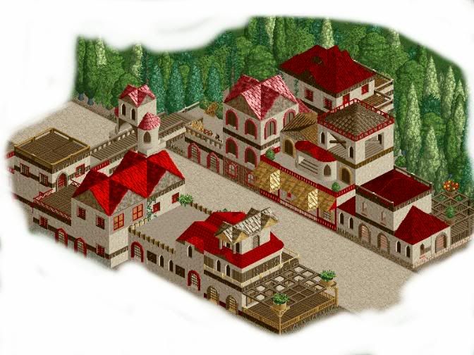
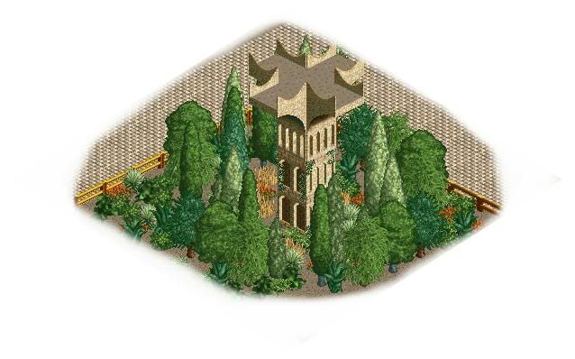
Next Update: Colossus Ridge.
Enjoy the screens, this park i am putting a lot of effort and detail into. So it will obviously take quite a while to build...
Comments greatly apprecited for what little i have shown and the concept behind the park... Thanks!
-X- -

 mantis
Offline
The first screen makes up for the second one
 Wonderful architecture, especially with little things like the wooden crossbeams and the vines. It mightn't hurt to have arches going into the buildings, but that might jsut be because i'm used to seeing them. Great job.
-

 Jacko Shanty
Offline
Looks great and all, but your main weakness is your landscaping/foliage. If you really want to strenghten your atmosphere, I would add some different colors of tarmac .. and add some more trees and bushes. There are quite a few bare spots in there. Maybe even add a few bare, jagged rocks. It shows promise though. Lots!
 -

 X250
Offline
Okay, so the second screen is wank...
To make it up to you, here is the re-furbished area complete this time! I think it is better than the boring tower thingy of the second screen i showed.^
Mantis, Jacko and Disney Freak, thank you for your comments and suggestions. I find them very useful. Jacko, i have tried to add that bit of landscaping you mentioned, i know it is definitly not my strongest point but i have tried hard to add some elevation to the park... I also think the foilage is better in this screen than the last one.
Thanks again and comments welcome: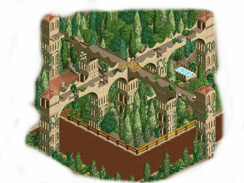
-X- -

 hobbes
Offline
Looks very good but is a bit overtreed in my opinion. Also, what is that yellow-ish stuff on the top of the central tower?
Anyway, I think it looks much better, but what exactly is it? Just a ring of towers? -

 CoasterForce
Offline
Certainly looks interesting, but I'd prefer more normal arches instead of the wavy style you've got going there. Either that or continue that wavy wall as it goes over the whole path.
Great job though. -

 mantis
Offline
Much more interesting
 I'm not sure about the faux-uniformity (if I can call it that) of the 1/4 tile trees, but apart from that it looks lovely!
-

 Jacko Shanty
Offline
Ya, that screen is pretty cool. I like how you made the crosswalk things over the path. It gives off a very overgrown look. And I don't think it's overtreed at all as hobbes said. I think it looks that way because you don't have a large variety of trees. Those tall skinny ones may be used a bit too much. This also might be why it looks bare in some spots.. when you have a lot of the tall skinny ones which take up one tile, it looks very bare. Try adding some more thick, fuller trees - like the weeping willow. And by the paths - instead of having tall trees by it - add bushes and flowers instead so it gives the path a more grown-in look.
One last thing, the ivy on the walls looks messy to me.. I think it's just my preference.. but I don't think the ivy look good any time in any park. Sorry if I was being a little critical in this post, I guess I just got carried away! -
 OhioCoasteRFreaK36
Offline
All your trees have the same coloring..this is what flowers are for
It is pretty cool, i also like the first thing but again the trees all look the same. -

 X250
Offline
Second Update
Yeh i know, another- i am just trying to get some decent screens in before i go on holiday...
This update is of a flying-coaster i have built in the park called 'EquinoX'. The screen also shows the 'aqua-zone cafe' as there is a nearby aqua zone where peeps can walk over whilst fountains drench them from head to toe! The aqua cafe sells seafood from all-over the world, including the famous sword fish for astoundingly high prices...
Also look out for the giant fishtank above the restaurant, that way you are guarenteed your fish is going to be fresh from the water!
As you can see i have tried to add some colour to the scene, and detail.. I have also reverted to my old way of adding foilage to create a denser atmosphere in there. I am not too sure about the supports i have used for Equinox, i have tried regular thick B&M supports but it looks far too plain- so i have added the castle-like arches and dressed them up a little... If you have any ideas about the supports please tell me them...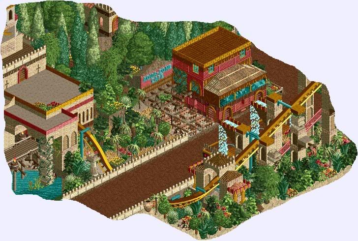
Hope you like this screen, it might be the last for a long time as like i stated before, i am off to Majorca for two weeks! I think thats just about it now...
well... enjoy!
-X- -

 CedarPoint6
Offline
Enjoy your vacation X. As for this, it's looks rather nice. I like the drop out of the station under the path and I especially like what you did with the supports. I think that you could probably do some work on the cafe, by first making it bigger and second having more of the castle style wals rather then that redish looking grating. That might make it look a little better.
 -

 the_legacy
Offline
looking real promising, all I can say is to keep it up!
I would add some colourful flowers in the first screens, to give it a little more of a theme park feel. -

 tijlovic
Offline
That 'ring of towers' is very impressive if you know what i mean. its huge, thats what makes it look good.
For the last screen: That balcony on the left is looking very empty imo, maybe put more stuff on it -

 X250
Offline
Construction on the park is moving so damn quick now i feel, about 10% complete in 3 days and its a 200x200 park! I love the holidays...
TUDOR VILLAGE
In the screen below you can see the Tudor Village main walkway, thanks to the wonderful invention of invisible paths- is peep functionable. The buildings are about as close to a Tudor building i could get with the bench i created, i could really have used some of Toon's roofs like the ones in his QFTB entry- they would have suited this perfect.
The Tudor Village is a mock-up of a real Tudor Village, with walk-through houses, gardens, fortune telling huts and most importantly... Open sewers in the middle of the pathway! (The bit down the centre with the green oozy water). Oh, and rides!
The first building you see as you walk in (on the left of the screen), is a mock-up of a olde English pub complete with a beer garden and fortune tellers tent in the garden. But for safety reasons the pub does not sell beer...
The other two buildings are the upper-class houses of the Tudor period, where wealthy people would have lived... The adjacent area (not pictured) shows a rotting stinky 'poor' side of the town.
Enjoy!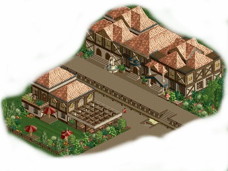
-X- -
 Ablaze
Offline
That is looking mighty fine I say, lol. Very very good atmosphere, you hit the spot there. Well done, keep this work up, very nice.
 -

 X250
Offline
Thanks Mort, i was a bit unsure with them peachy coloured roofs... I still do not know if they look okay now, i look at them and think that they do not look right somehow. Feedback appreciated!
(ps:- new avatar & sig---la fromage du artiste...)
-X- -

 CedarPoint6
Offline
A nice looking screen here. Great idea with the invisible paths, that really makes it look great. Very nice looking architecture- the peach roof looks fine as does the whole sewer thing- clever idea there. Can't wait to see some of the rides!
Nice cheese, btw. -

 yeshli2nuts
Offline
if you didnt say that that thing was an open sewer, i wouldnt have known what the heck it was. maybe try using the dinghy slide tube as a pipe comming out of a building pouring into the sewer to make it more obvious to the people that didnt read what you wrote.
i would also change the roof to the off red (the one that is directly next to the pink on the pallete (im so pathetic for knowing the color pallete by heart)).
other than those two things, the screen looks fantastic, i love it
 Tags
Tags
- No Tags