Park / The Three Villages

26 Comments

  • iris%s's Photo
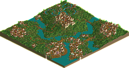
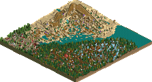
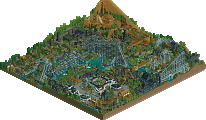
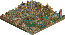
    Last year natelox entered the Hi-Rollers with a very unique entry, "Earth", a landscaping marvel with some beautiful, natural theming, without a doubt a one of a kind entry and one of my favorites in the whole contest. But...PyroPenguin didn't agree with that one, and so the term "Pyro'd" became famous, as natelox was drowned into barely making the top 10. So you would think that natelox would come a little more conventional right? Well, a loud resounding NO! would be sent right back at you. Once again proving that he is a master of the natural landscaping, nate recreated a beautiful countryside setting, where three villages inhabit, across the glen from each other. Each village is quaint, subtle, and just perfect, and each one is completely unique from the other. It truly takes skill to make the plain grass lands in RCT look so beautiful, but natelox really went way above and beyond anything like that. Seemingly taking inspiration from "Emerald Glen" out of Corkscrewed's Meadowbrooke Falls, he added more to it, enhanced the theme and really brought forth possibly his best RCT exhibit yet. And hey, even Pyro liked it!
  • cBass%s's Photo
    Incredible atmostphere, but I'm with Toon here. Where are the coasters? That's still the name of the game.

    Otherwise, I really like the go karts and the boats, and I'm really puzzled by the music.
  • Turtleman%s's Photo
    Honestly, I didn't like it. The architecture is so-so and the theming is good... But that's it. There's is nothing really special imo. I don't see how this placed so high.

    Sorry.

    Oh and why is it called Three Villages when there are 4?
  • rctfreak2000%s's Photo
    I thought it was beautiful. I think a rollercoaster would have completely ruined the atmosphere of it. It's absolute perfection. Natelox, you've become one of my favorite parkmakers thanks to this park.

    Great job.
  • Fenix%s's Photo
    I don't have my LL cd anymore so I can't see the park, but are those screens of different villages? If so I don't see how they're unique at all. They all see like the same architecture. I really dislike this park it just seems plain and borring. It also seems undeveloped. I really don't see how this got so high. Also what is the theme or ideas behind this park? It just seems like a quaint park and thats as far as the idea got. Anyways, as I said I don't have the cd so maybe I'm missing something.

    Edit: Oh and were are the rides this is still an amusement park right?
  • BigFoot%s's Photo
    The simplicity behind the park is mindblowing, really. Everything looks just how it should realistically. Nice job achieving really, a 'perfect' park, if simplicity was what you were trying to attain. If not, then oh well. ;)

    Not my favorite work of yours by far, but still fun to look at.
  • Ride6%s's Photo
    Honestly it's amazing how good it is with the simplisity. I certainly wouldn't place this in my top five but I do think it is at least top then worthy. The go karts go about their business without getting in the way and the similar complements should go out to the River Rapids and the Fishing Boats. All of the rides for that matter. I found one thing that really helps the atmosphere that you didn't do though, and that was to give each village it's own music. Always something quiet and calm, like summer style. It really boosts the atmosphere. Otherwise it feels just the way it should. I don't think it would've hurt much to put in a small terrain-hugging woodie, infact it would've seemed classy if you'd built it with the same quantness that everything else had.

    I love it in a way that doesn't make sense. If I look at this park on the surface (what it has) I think that I shouldn't like it but when I explore the park in detail I find myself loving all of it.

    I'm torn. There isn't alot to look at but everything that is there is completly lovable.

    ride6
  • guljam%s's Photo
    WOW! RCT! park!

    Better than.. better... :lol:
  • Valp%s's Photo
    I loved this park... the simplicity of it all is so nice...

    The river rapids was beautiful... just beautiful.

    Each village was so different, but so similar... I especially liked Ardmore. The only thing I didn't like was the techno music in the entrance and the colors of the scrambler...

    I think it would have been nice if you could have worked in an adventure ride somehow.

    This park was just dripping in atmosphere... but music might have helped some.

    Great job overall... this is probably the best I've seen so far.

    *

    Wait, I have to go against you in QFTBX. So it sucked. Terrible. Just give the game up now if you're smart and get a new hobby.
  • DragonInferno%s's Photo
    Well I'm only going by the screens, because XP has fucked up my LL, but I honestly don't like what I see. I've always been a huge fan of simplicity in art and that sort of stuff, but if its going to be simple it still needs some artistic value behind it. This dosen't really seem to. It just, from what I see, is the same building over and over again. That's not really simplistic, it's just "bleh". The lack of rides isn't what disinstrest me, it's just the lack of emotion and instrest that bothers me. Sorry, I really don't see how it got #4, but once again I'm just going by the screens.
  • Ride6%s's Photo

    The lack of rides isn't what disinstrest me, it's just the lack of emotion and instrest that bothers me. Sorry, I really don't see how it got 34,

    That's right it got 34th when there are only 23 entrys. :SA:

    And lack of emotion!? You obviusly haven't seen it in game. 8@

    ride6
  • gymkid dude%s's Photo
    not my cup of tea, but I respect the excellent amount of talent needed to make something so natural. I prefer butter's and phatage's, and hell, bokti's.
  • rctfreak2000%s's Photo

    That's right it got 34th when there are only 23 entrys. :SA:

    And lack of emotion!?  You obviusly haven't seen it in game.  8@

    ride6

    He meant 34 points.
  • Corkscrewed%s's Photo
    This is something I've wanted to try for a while but never really got the chance.

    Now Nate, I feel like I'm one of the few people who can really appreciate your work, so here goes...

    This is a pure exercise in landscape and space. It is, in my opinion, what Posix could have done, but failed in his PT entry. The vast majority of people build in RCT in the additive style. They view a park as a blank pallete to be given more and more stuff. Some go overboard, filling sections with so much information that the effects cancel each other out, and what originates as a myriad of detail fizzles into a chaotic bowl of RCT static.

    This is quite the opposite. Nate builds in the subtractive style. Rather than adding, he's taking away. He's sculpting space, creating ambience, and carving out areas. There's something expertly architectural about the way he goes about his work in this park, which is fitting, given Nate's love for architecture.

    Granted, a lot of people will not fully understand, enjoy, or appreciate this, which is the case in a lot of "great" architecture in real life. Most people will look at a building and think it looks nice, but only other architects will be able to critique its skill and manipulation of spaces. In this very same way, Nate has transcended the plane of building popular RCTecture (that's a new term I'm coming up with) to a whole new level of building, one that requires advanced and intellectual thought. Obviously, as we've seen already, some people will attest to the lack of traditional effects, like coasters, but there will be others who will apreciate the beauty of this art. Indeed, the map is a canvas, and Nate has swathed a stunning vision.

    To you, Natelox, I congratulate your vigor and your sticktoitness. Knowing that your work may not be kindly received yet continuing on with it takes a certain maturity that few people possess. Above all, you build for yourself, a trait I find extremely admirable.

    So well done! I completely agree with this top 5 finish, and I congratulate you on a job well done.
  • MightyMouse%s's Photo
    Just about everything single aspect of the park was executed with finess. The landscaping was some of the best I've seen, and the alteration of foliage was very cool. Also, the separate village idea was pretty cool. Good job Natelox. :)
  • Evil WME%s's Photo
    Cork.. sorry to have to say this, but that's just bullshit. You're not fooling me with those buildings, they still have no other thought to them then aestetics and possibly looks to form a certain sense of realism.. and they shouldn't have to much else, really. And the park not well received? it placed 4th in a mammoth contest.. Above a hell of a lot of people including yourself.

    To the park.. it's nice for what it is. But... I don't like what it is. It's nothing. It's a lot of grass to manipulate space or something.. but that just doesn't do it for me. It also look just like the Aegean. You're actually trying to make something that isn't exciting. Instead of taking the realism to the part where you recreate a city like area you take it to make a few boring villages. There is no color at all coz you want everything to smooth out. You mustn't forget when you do that you're actually trying to make something boring. I'd really wish you'd take on some serious colors again, and i don't think i'm the only one. Maybe finish one of those "unfinished" parks.

    If... WME would have judged

    1-3. ?
    4. Butter's Platypus Paradise- Butterfinger
    5. Universal's Cayman IOA- slob
    6. Darwood Grove- Kumba
    7. Gouvia Point- Voodoo
    8. WTF- Bokti
    9. Continent Traasok- Twisted
    10. Epica- Phatage
    11. Disney's MiniSeas- John
    12. The 10th Kingdom- Six Frags
    13. Elements- Gir
    14. Darkwood Amusements- Posix
    15. The Three Villages- Natelox
    16. Valkyr Sol- Corkscrewed
    17. Ancient Enchantments- Prince Ashitaka
    18. N.E.R.D.- Gymkid Dude
    19. Harmony Harbor- Micool
    20. Palm Springs Florida- NC
    21. Country Squire Amusement Park- rwadams
    22. Poplar Grove- Ride6
    23. Lesheban Wilderness- Evil WME
  • iris%s's Photo
    :lol: WME....you can't say that Corkscrewed's likes and opinions are bullshit. They are his. Nothing you can say will ever change that.
    Nate's park was absolutely incredible in my opinion. I don't think anyone else in this contest could create such a beautiful and natural atmosphere like nate did. Almost anyone else would ruin it by adding unnecessary pieces to the puzzle, like coasters, or anything else.
    Great job Natelox, I personally think I had you in 6th, but 4th is a great placement as well. And I find it ironic that one of the most unusual entries is one of the only ones to get very balanced scores from all judges.
  • DragonInferno%s's Photo

    That's right it got 34th when there are only 23 entrys. :SA:

    And lack of emotion!?  You obviusly haven't seen it in game.  8@

    ride6

    He meant 34 points.

    Actually I meant "#4" and I didn't ntoice I had put "34" when I went over my post, but yeah I'll go with that.
  • deanosrs%s's Photo
    Sorry nate... but it was just an emptier, smaller version of the aegean for me. Same hacks, same ideas, just spread over a much smaller canvas. I still like them, but originality was something this park seriously needed. It didn't do anything to try to win, perhaps that was the most dissapointing aspect of it for me.

    Still... of its kind enjoyable, congrats on the high placement.
  • natelox%s's Photo

    Why is it called Three Villages when there are 4?

    Well it was inspired by depression. Not to say I was depressed, but the thought of city folk complaining that they could never survive living in the country. Burtonport (the city with the docks) was ment to the downtown or the city of this imaginary land. And by calling it "The Three Villages", it's supposed to make you reconsider that even a tiny village is a home, just as a major city is. It's hard to describe.

    Thanks for all the comments, good and bad. I particuarlly enjoyed Corkscrewed's :) I found this park to be a great place to improve. I noticed my tree placement and selection and landscaping were far below were they could be, so I worked really hard at it for this park. I really like how it turned out and I now feel much more comfortable with those skills.

    Oh and finally, I don't know if I should in fact say thank you, but I will anyways to Pyro for seeing the park for what it was :) I guess you even'd yourself out on my scale.