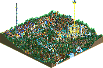
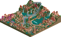
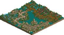
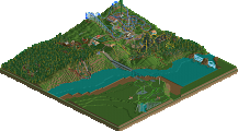
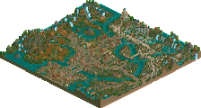
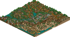
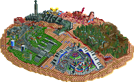
Well, only a few days ago Phatage was the newest Parkmaker on our staff, but with the addition of slob and John, he's already a veteran....ok, that may be pushing it. Still, it's amazing how far Phatage has come. After viewing the Pro Design he submitted for RCPro months back, I never could have expected what was to follow. Starting his NE legacy with his Pro Tour preliminary, "Unfriendly Invader" which completely blew me away, surprising the hell out of me. He then made his name even more known with his full park debut at New Element, "Six Flags Worlds of Excitement", a realistic park that brought the true magic of Six Flags straight into people's homes, fully equipped with special touches here and there and great attention to detail. He proved he could play LL as well with his release of "Fire Dragon", a wooden NE Design, before finally earning his Parkmaker Spot in the NE Awards. And to think, that was before people saw Epica! One of the most creative entries in the entire park, Epica is just truly amazing. While lot of the park is covered in trees, that is part of the theme. The rest of it is just pure brilliance in my opinion, proving that Phatage could quite possibly be one of the best three or four RCT2 parkmakers in the world. Absolutely amazing entry Phatage.....vague enough for ya?
i would complain about the sucky coaster layouts...but after SFWoE...we can see that phatage can design "normal" coasters, so the crazy adventury giga is a welcome addition to the park IMO.
That tower was great. The interlocked inline twists kick ass.
I have a readme to go along with this that I only finished a couple of days ago, problem is that its 5 megs. Can somebody host this for me? This isn't a futuristic city, and the readme will explain that.
I'm not sure what to think of the park... I know I like it, but I don't know why... there's lots of little errors here and there, mostly in the landscaping and architecture, which gives it a messy feel. Yet it still has class... I'm not being helpful here am I... anyway, it was a good park, the giga was hard to see in places but the jumps off the track near the end were very cool, and the transport in the park was also well executed.
The theme was an awesome idea, and the landscaping (well, at least the idea behind the landscaping) fits it perfectly. I just thought the themeing was perhaps a little too serene, I don't think you got enough hell stuff in there. It almost reminded me of Rivendell in places.
Awesome track work though, especially the entwined vertical twists, they were very well done. I agree, though, that the towers were a little excessive.
Still... I'll be taking a look at it again, your creativity never ceases to amaze. Well done on a top 10 finish.
Oh, and I can host that readme if you want. Send it to deanosrs@manutdfans.com and I'll upload it somewhere in the realms of my web space...
The park is very interesting to look at, there is a lot going on in there. The hacks in the coaster are awesome and must have took you ages to create, i like the tower and i have no idea how you built this park as it has so many caverns.
I bet this was a real devil to make, congrats on getting #8. As i reckon this is a deserved best entry so far, everytime i look at it i see something different which is what makes it such a good park.
Wow. I loved it. I particularly enjoyed how you started at the entrance with the eerie music building suspense and everything is hidden, then the actual park section of it is totally unveiled in it's glory and splendour. I realy enojoyed it. But yes, a Readme would be really helpful to try and work out what some of the things mean, and how you would define the theme. In a way, it is a heaven and hell park.......but in another way, it is totally original. I think the thing i enjoyed the most was that futuristic highway with the heartline twist floating car things. Another thing really liked was some of the colours in the architecture you used. Like that marble, blue and yellow building looked straight out of a futuristic city. And the blue and deep brown somehow worked wonders. I love it, but I really want to understand the actual concept of the park, so I look forward to having a look at the Readme
Man. no. I think someone's trying to be creative here.. Really, i think the creativity worked to some extent. The coaster going over the hill was lovely, possibly the loop too. But why the horrible ratings, you coulda made the first part slower or whatever. The the archy was satisfactory, and i somehow liked the technology bits for the tour. Really, the landscaping was absolutely terrible. There is no excuse for such terrible landscaping. The woodie's a bit like the hyper but worse. There's no real excuse for not making the ratings work. I liked some of this park.. some of it worked, but the majority didn't.
If... WME would have judged
1-7. ? 8. Universal's Cayman IOA- slob 9. Darwood Grove- Kumba 10. Gouvia Point- Voodoo 11. WTF- Bokti 12. Continent Traasok- Twisted 13. Epica- Phatage 14. Disney's MiniSeas- John 15. The 10th Kingdom- Six Frags 16. Elements- Gir 17. Darkwood Amusements- Posix 18. Ancient Enchantments- Prince Ashitaka 19. N.E.R.D.- Gymkid Dude 20. Harmony Harbor- Micool 21. Palm Springs Florida- NC 22. Country Squire Amusement Park- rwadams 23. Poplar Grove- Ride6
The architecture in this park is astounding. You're really pushing the boundaries here, Phatage. That building with the two troughs leading to the waterfalls over the woody track is exquisite. I think you could have used those same 1/4 tile waterfall pieces to break up your other waterfalls a little more. The falls in general are my favorite thing about the landscape, which doesn't seem to bother me as much as others. The map just seems a little off-balance, though. I'm not sure why.
I guess there's an unwritten rule about coaster stats or something, but I thought the rides made for some interesting atmostphere.
I thank you for noticing, I should have known that you'd one of the people who'd pick up things about this than most other people. The readme should explain everything, and it is much more informative if explored fully rather than just read.
I'll get to the read me when I get back from Drivers Ed, since I only have about 20 minutes now and with Dial-Up that probably isn't enough.
I'll say I didn't mind the landscaping, it could've flowed alittle better but I like the amount of land-height veriation. The archetecture was increadable through and through. The tower are excessive in their height though, they kinda brought the park down alittle for me. The coasters are what really kills this place. Both of them have good idea's done all wrong.
If it wasn't for the coasters I would almost think that Mala made it, and that's one of the highest complements that I can give. Work on the landscaping a little and the coasters too and you coud be on your way to being an RCT-fantacy god.
Really increadable park there. I think it desirves the top ten place it has, wow.
He can do coasters, so there must be some underlying reason for having them that way...
I figured out what the theme was after you saying that it wasn't futuristic, but that read-me just cleared a few things up for me...
I really liked the landscaping, I had no real complaints with it. The architecture is what stands by far, the rides were all cool and had interesting ideas, but it's a bit of a shame about the ratings.
I just have one question now... Is this a big metaphor, or is it just what it is?
30 Comments
iris Offline
Epica by Phatage
Well, only a few days ago Phatage was the newest Parkmaker on our staff, but with the addition of slob and John, he's already a veteran....ok, that may be pushing it. Still, it's amazing how far Phatage has come. After viewing the Pro Design he submitted for RCPro months back, I never could have expected what was to follow. Starting his NE legacy with his Pro Tour preliminary, "Unfriendly Invader" which completely blew me away, surprising the hell out of me. He then made his name even more known with his full park debut at New Element, "Six Flags Worlds of Excitement", a realistic park that brought the true magic of Six Flags straight into people's homes, fully equipped with special touches here and there and great attention to detail. He proved he could play LL as well with his release of "Fire Dragon", a wooden NE Design, before finally earning his Parkmaker Spot in the NE Awards. And to think, that was before people saw Epica! One of the most creative entries in the entire park, Epica is just truly amazing. While lot of the park is covered in trees, that is part of the theme. The rest of it is just pure brilliance in my opinion, proving that Phatage could quite possibly be one of the best three or four RCT2 parkmakers in the world. Absolutely amazing entry Phatage.....vague enough for ya?
gymkid dude Offline
That tower was great. The interlocked inline twists kick ass.
I guess hell is a popular theme?
Nice trackitecture. Great entry.
Phatage Offline
Scarface Offline
I will have another look tomorrow to try and let it grow on me
deanosrs Offline
I'm not sure what to think of the park... I know I like it, but I don't know why... there's lots of little errors here and there, mostly in the landscaping and architecture, which gives it a messy feel. Yet it still has class... I'm not being helpful here am I... anyway, it was a good park, the giga was hard to see in places but the jumps off the track near the end were very cool, and the transport in the park was also well executed.
The theme was an awesome idea, and the landscaping (well, at least the idea behind the landscaping) fits it perfectly. I just thought the themeing was perhaps a little too serene, I don't think you got enough hell stuff in there. It almost reminded me of Rivendell in places.
Awesome track work though, especially the entwined vertical twists, they were very well done. I agree, though, that the towers were a little excessive.
Still... I'll be taking a look at it again, your creativity never ceases to amaze. Well done on a top 10 finish.
Oh, and I can host that readme if you want. Send it to deanosrs@manutdfans.com and I'll upload it somewhere in the realms of my web space...
X250 Offline
I bet this was a real devil to make, congrats on getting #8. As i reckon this is a deserved best entry so far, everytime i look at it i see something different which is what makes it such a good park.
-X-
Metropole Offline
Great job
Metro
Turtleman Offline
Evil WME Offline
If... WME would have judged
1-7. ?
8. Universal's Cayman IOA- slob
9. Darwood Grove- Kumba
10. Gouvia Point- Voodoo
11. WTF- Bokti
12. Continent Traasok- Twisted
13. Epica- Phatage
14. Disney's MiniSeas- John
15. The 10th Kingdom- Six Frags
16. Elements- Gir
17. Darkwood Amusements- Posix
18. Ancient Enchantments- Prince Ashitaka
19. N.E.R.D.- Gymkid Dude
20. Harmony Harbor- Micool
21. Palm Springs Florida- NC
22. Country Squire Amusement Park- rwadams
23. Poplar Grove- Ride6
cBass Offline
I guess there's an unwritten rule about coaster stats or something, but I thought the rides made for some interesting atmostphere.
artist Offline
I have never been a fan of over the top fantasy parks, i mean yeah it's still good, i could never build anything like that.
Its just this style of building never really does anything for me.
Imo this should of came much lower.
Good job though.
Must of been tricky themeing them towers.
deanosrs Offline
Worth a read.
Janus Offline
deanosrs Offline
The other works now, it's just really slow. So use that ^ one.
Janus Offline
mantis Offline
Phatage Offline
Thanks Deano for the hosting.
Ride6 Offline
I'll say I didn't mind the landscaping, it could've flowed alittle better but I like the amount of land-height veriation. The archetecture was increadable through and through. The tower are excessive in their height though, they kinda brought the park down alittle for me. The coasters are what really kills this place. Both of them have good idea's done all wrong.
If it wasn't for the coasters I would almost think that Mala made it, and that's one of the highest complements that I can give. Work on the landscaping a little and the coasters too and you coud be on your way to being an RCT-fantacy god.
Really increadable park there. I think it desirves the top ten place it has, wow.
ride6
penguinBOB Offline
I figured out what the theme was after you saying that it wasn't futuristic, but that read-me just cleared a few things up for me...
I really liked the landscaping, I had no real complaints with it. The architecture is what stands by far, the rides were all cool and had interesting ideas, but it's a bit of a shame about the ratings.
I just have one question now... Is this a big metaphor, or is it just what it is?
Turtleman Offline