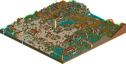
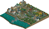
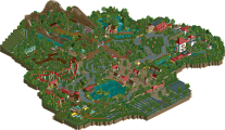
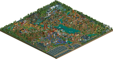
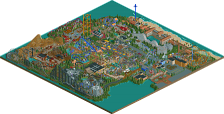
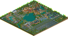
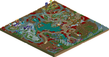
Up until voodoo lost his mind and threw the site's biggest temper tantrum of the past year, he was widely considered as possibly the best non-parkmaker at the site. He was at the top of all the lists, and he was constantly being compared to John, as the two would seemingly compete to race for a Parkmaker Spot. He had an amazing project lined up in Universal's Resort Europe, a multi-map masterpiece which had fans everywhere holding their breath. Then it happened, his arrogance spilled over and he attacked the board. Still, although his attitude has taken a sudden change for the worst (possibly due to the pressure put on to him becoming a parkmaker), his talent is not a question. He has all the tools needed to be a star here at the site, even though he claims to not visit anymore. He has solid coaster skills, great architectural skills, and his overall theming ability is basically unmatched by non-parkmakers. His screens used to dominate the Ad. District, and his preliminary rapids ride was one of the most beautiful water rides ever seen in RCT2. So, with all that leading up to his entry, what do we get? A very solid entry that isn't spectacular, but isn't disappointing either. It's exactly what one would picture from a voodoo park. The theming is good, great in places. The architecture is strong throughout. The coaster skills are there...but it's just missing that uniqueness to push it over the edge and into the top five. Whether or not voodoo is still building parks or visiting NE is unknown, but one thing I do know that with a start like this, voodoo could have had quite an impressive career here.
This was fantastic. Definately the best entry so far. The foliage was spot on, the landscaping is the best we have seen in the Pro Tour so far. The coasters were excellent (Especially loved the invert) The steel twist was a little slow in places, but the excellent theming made up for it . On the most part, the architecture was very good, but some pieces just seemed to be rectangles with bits of upward sloping track on them, which i didn't find so good considering there is so much rct2 scenery to choose from. The mine train was also fantastic, although it slightly lacked in the theming sector compared to the other 2 major coasters. The layout was excellent though, and i love the interaction with the rapids. The rapids were great too, but went underground a little too much which made it hard to follow.
At least I had fun building my park Kumba Nice park voodoo, almost looks SAC-ish... I loved the entrance area, and the 1/4 tile sculptures (that dragon head above Terra Khan was a nice touch)... But the rest of the park has some flaws here and there, and maybe you should've finetuned it a bit more... Nice entry overall...
Voodoo the park was great, the archy at the entrance was amazing, I was not to fond of the orange or the Path choice tho.. Both B&M's were soild, great layouts mainly on Nemesis Voodoo (nice to see that reasled in this btw) tho terra khan was kinda slow at times, still its always awsome to pull of 8 invert bemmers. the only thing i really disliked was the stage show "Shamans Curse", it sucked, you did not have room for it really. overall a very good entry.
and i liked that huge hidden sign, what ever did happen to URE?
I really enjoyed this one - especially the mine train and surroundings. The architecture was very pleasing, and I liked all the of the coasters (except for the terribly slow second inversion on the twister...although I guess the Dragon Khan references make up for it).
Hope you read this thread and stuff, cos it shows that people did appreciate what you made - it's a good park, and URE would have been a fine release if finished.
Now is the time I begin to wonder what it is my park has over these ones to make it place higher...it's only a matter of time.
(edit - Oh, and I must thank Voodoo for not using any of TAE's rides, because it keeps the filesize down. And good job on actually having 'Berserker' on berserk mode )
-The theming of the rides. -Those water falls were fucking awesome, for some reason. -Nemesis Voodoo. PERFECT layout. -The entrance area. Great atmosphere.
Steve Doesn't Like:
-The lame show in the back corner of the park. -The coaster colors (except NV's). -Some of the layouts had some slow bits. -Too many flowers!
Overall, I was really surprised by this. The entrance had to be one of the best in the contest so far. And you had boatloads of atmosphere. Great work voodoo. My favorite so far.
The architecture was flawless, and the landscaping just drew me in. Everything was just so beautiful!
Calamity's color was too vibrant for that type of ride. The layout was too broad and complex, that it took over that whole area, and didn't give a chance for the rapids to shine.
Wonderful, VD.... just wonderful. If I didn't know, I would think a parkmaker would have made it... the only downsides for me were the kiddie coaster and sometimes overbearing paths, but... I mean, the invert and multi-looper were excellent, and that mine train- wow, the double lift was great- one of the best I think we've seen in a while. The architecture could have been a tad more intricate/detailed, but it was great as it was. Overall, it's definitely the best so far.
Just think, people... there are fourteen- that's fourteen parks that placed above this one. I can't wait for the future results!
In your face Voodoo, Six Frags and ride6, aint second to any of you bastards now am I?
I took a gamble and lost on it, so shoot me. Additionally I started out with great intentions but got lazy as the park streched on.
On this, I love the enterence, it looks like something I would expect from an SA park. Very beautiful. The colors worked perfecly in that part too. Wow. Citrus Strip was the only area I didn't care for. It just looks like shit to have a coaster over path 90% of the time like that unless you build custom suppors and stuff to make it interesting but his didn't have that.
The Invert was excellent, great pacing, but the ratings were pretty bad. It could've lost a mph or two in a few spots to fix that... The twister was nice too and the dragon sculture at the enterence was wondeful. Shame that Voodoo left us without a history.
I really liked it but the overall effect was taken down becaus of several reasons:
The color schemes for the coasters. The trains on most of them were hideous and un-matching. Also, you used the blood red for the main color of 2 coasters right next to each other (I messed around for like 30 sec with the mine train to fix that)
The flowers. Although I liked how gymkid used flowers to his advantage in his entry, it didn't work here. Ok, I'll take that back, all you had to have done is not have used the gross bright green ones.
The naming of the rides. These were awful, Nemesis Voodoo? Come on, don't ever use your screen name for par of a ride, and besides, it doesn't even flow. Also, Citrus Twista? Pu-lease, at least be formal about it if you're doing formal themes. And adding to the point, you had about 3 or 4 things that were Citrus [random name here], how lame. Oh yeah, the slides names were lacking too.
And then, new element and rctu drowning, not cool, but it was rather funny.
But I did like all of the architecture, the themes, and the atmosphere of the park. The coasters were really good, but nothing spectacular. You could have done a lot more with that show, the only cool thing about it were that the seats weren't on both sides of the path. I can understand why calamaty cove was open, but you could have at least surrounded it by some buildings or something to make it a bit more appealing. Also, you should have had more entry/exit points for the cove itself, the kiddies would have to swim a long way to get to those steps...
Anyways, the problems really overshadow how good this really is for me. Perhaps it would have been taken care of if you had spent more time on it, instead of sending it in as quick as you did.
I loved that entrance, best in the PT so far. I loved everything else as well. My one and only complaint is that the 2nd area(the big brown one) could have had more buildings in it, it seemed to be just path, landscaping and rides. Nice Job Voodoo!
i only read the first 2 replies, so im sure its already been said but
entrance area = amazing
rollercoaster layouts = amazing
back of the park = couldve been better
i didnt really like the LL style that you mixed into it, but i really liked the monorail and "ne has drowned"
That's surprising, considering the show only consisted of a giant panda dancing.
Anyhow, I really liked the park too. The coasters seemed kind of messy in parts, like in gymkid's park.. but I liked your landscaping and all of your architecture. It was a very fun park to look through. I thought it was rushed some places though. Like you checkerboarded path in the Calamity area with dirt and rocky path in one area, but then forgot the rocky path in another area.
Overall, the best entry thus far I thought.. and it's a shame you're not still on my h2h team.
Well I'd like to appologise for that post, you know, I honestly dont know what I was thinking. Actually, I think I was drunk at the time, but im not usin that as my excuse. It was mainly a case of little things building up and then me just having to rant about something, life at the time was quite stressfull with the run up to exams and all. Oh well its said and done now, and im sorry.
Glad you all seem to like the park (so far ), from here on it only gets better really, we've still got 14 more entries! It placed high enough for me, if somebody offered me a 15 finish before the competition I would have took it. The entry was rushed, Il admit that, and If I would have took my time I would have polished up on the little 'bad' spots which are all over the show. In reality though I was glad to see the back of the project because I had a few Ideas bubling over for my latest park "Diego Point".
Iris: I still visit, only certain forums like PT or Ad district, and I tend to be a lurker thesedays, just to avoid being flamed mostly.
Kumba: "In your face Voodoo" - Yeah gotta give it to you man, I knew as soon as I saw your screen that you were going to finish higher than me. Congrats
Steve: "Too many flowers!" - Yeah thats a good point actuali, my next park has that problem sorted though..... I think.
pbob: "And then, new element and rctu drowning, not cool, but it was rather funny" - Thats quite ironic, wouldnt you say. Which is why I put it in. Sorry to AP about that little incident!
Anyways, after appologiseing to seemingly everyone, I think I could have (maybe should have) done better, if I had spent more time on it. Still, I hope you all enjoy it, and hopefully I'll get to release some other stuff at NE in the future.
i liked it. Some of it was really really good. The coasters were interesting, and some of the landscaping really worked. imo, this guy is still off to becoming a parkmaker, he just made it himself a hell a lot harder by making iris hate him haha. I think the attitude is terrible.. "all I care for is that my work is appreciated and liked," and maybe it reflects the park a little. Then again, i really like the wooden mine track at the entrance, and the entrance architecture. Around the invert and show the quality might have got lost a little, but overall a very very solid entry, and interesting too. I'm even a bit amazed by the fact there are still 14 parks that beat this one up, that should be nice =P. Oh, and at the above comment about the 'originality.' In my opinion (here it comes..) something like "citrus strip." takes possibly more originality than the whole of gymkids work. The Crocodile entrance like sculpture for Kahn was lovely, and the coaster designs weren't the same old same old. The station for the mine train, the supports for the beemer. Remember, just coz it all looks better than gymkids, doesn't mean it's less original. Here's the dosis of 'originality' that looks good. And in my opinion, that's the only originality that counts. Thus i don't like gymkid's entry much, nor micool's, no offence meant.
Yeh, I liked it. Although Nemesis Voodoo was the only good coaster for me, the first drop on the sitdown was pretty bad from 3 angles (although awesome from the other), and the coaster didn't seem to flow enough for a B&M. The entrance architecture was nice, as was the dragon at the sitdown's entrance, and because you developed these ideas and themes yourself, it may be overplayed but at least this is more genuine so I don't think that's a negative at all, and from your Diego Point plans it appears you're trying some different themes there anyway.
So.... easily the best park so far, but as Pyro (i think) said, it needed more architecture near the back of the park.
32 Comments
iris Offline
Gouvia Point by voodoo
Up until voodoo lost his mind and threw the site's biggest temper tantrum of the past year, he was widely considered as possibly the best non-parkmaker at the site. He was at the top of all the lists, and he was constantly being compared to John, as the two would seemingly compete to race for a Parkmaker Spot. He had an amazing project lined up in Universal's Resort Europe, a multi-map masterpiece which had fans everywhere holding their breath. Then it happened, his arrogance spilled over and he attacked the board. Still, although his attitude has taken a sudden change for the worst (possibly due to the pressure put on to him becoming a parkmaker), his talent is not a question. He has all the tools needed to be a star here at the site, even though he claims to not visit anymore. He has solid coaster skills, great architectural skills, and his overall theming ability is basically unmatched by non-parkmakers. His screens used to dominate the Ad. District, and his preliminary rapids ride was one of the most beautiful water rides ever seen in RCT2. So, with all that leading up to his entry, what do we get? A very solid entry that isn't spectacular, but isn't disappointing either. It's exactly what one would picture from a voodoo park. The theming is good, great in places. The architecture is strong throughout. The coaster skills are there...but it's just missing that uniqueness to push it over the edge and into the top five. Whether or not voodoo is still building parks or visiting NE is unknown, but one thing I do know that with a start like this, voodoo could have had quite an impressive career here.
Metropole Offline
Overall, an excellent entry VooDoo.
Metro
Kumba Offline
In your face Voodoo, Six Frags and ride6, aint second to any of you bastards now am I?
mantis Offline
Six Frags Offline
Nice park voodoo, almost looks SAC-ish...
I loved the entrance area, and the 1/4 tile sculptures (that dragon head above Terra Khan was a nice touch)...
But the rest of the park has some flaws here and there, and maybe you should've finetuned it a bit more... Nice entry overall...
SF
Kumba Offline
Voodoo the park was great, the archy at the entrance was amazing, I was not to fond of the orange or the Path choice tho.. Both B&M's were soild, great layouts mainly on Nemesis Voodoo (nice to see that reasled in this btw) tho terra khan was kinda slow at times, still its always awsome to pull of 8 invert bemmers. the only thing i really disliked was the stage show "Shamans Curse", it sucked, you did not have room for it really. overall a very good entry.
and i liked that huge hidden sign, what ever did happen to URE?
mantis Offline
Hope you read this thread and stuff, cos it shows that people did appreciate what you made - it's a good park, and URE would have been a fine release if finished.
Now is the time I begin to wonder what it is my park has over these ones to make it place higher...it's only a matter of time.
(edit - Oh, and I must thank Voodoo for not using any of TAE's rides, because it keeps the filesize down. And good job on actually having 'Berserker' on berserk mode )
Steve Offline
-The theming of the rides.
-Those water falls were fucking awesome, for some reason.
-Nemesis Voodoo. PERFECT layout.
-The entrance area. Great atmosphere.
Steve Doesn't Like:
-The lame show in the back corner of the park.
-The coaster colors (except NV's).
-Some of the layouts had some slow bits.
-Too many flowers!
Overall, I was really surprised by this. The entrance had to be one of the best in the contest so far. And you had boatloads of atmosphere. Great work voodoo. My favorite so far.
Geoff Offline
The architecture was flawless, and the landscaping just drew me in. Everything was just so beautiful!
Calamity's color was too vibrant for that type of ride. The layout was too broad and complex, that it took over that whole area, and didn't give a chance for the rapids to shine.
This was incredible, very nice.
Valp Offline
Just think, people... there are fourteen- that's fourteen parks that placed above this one. I can't wait for the future results!
Ride6 Offline
On this, I love the enterence, it looks like something I would expect from an SA park. Very beautiful. The colors worked perfecly in that part too. Wow. Citrus Strip was the only area I didn't care for. It just looks like shit to have a coaster over path 90% of the time like that unless you build custom suppors and stuff to make it interesting but his didn't have that.
The Invert was excellent, great pacing, but the ratings were pretty bad. It could've lost a mph or two in a few spots to fix that... The twister was nice too and the dragon sculture at the enterence was wondeful. Shame that Voodoo left us without a history.
Easily the best of the entries so far.
ride6
penguinBOB Offline
The color schemes for the coasters. The trains on most of them were hideous and un-matching. Also, you used the blood red for the main color of 2 coasters right next to each other (I messed around for like 30 sec with the mine train to fix that)
The flowers. Although I liked how gymkid used flowers to his advantage in his entry, it didn't work here. Ok, I'll take that back, all you had to have done is not have used the gross bright green ones.
The naming of the rides. These were awful, Nemesis Voodoo? Come on, don't ever use your screen name for par of a ride, and besides, it doesn't even flow. Also, Citrus Twista? Pu-lease, at least be formal about it if you're doing formal themes. And adding to the point, you had about 3 or 4 things that were Citrus [random name here], how lame. Oh yeah, the slides names were lacking too.
And then, new element and rctu drowning, not cool, but it was rather funny.
But I did like all of the architecture, the themes, and the atmosphere of the park. The coasters were really good, but nothing spectacular. You could have done a lot more with that show, the only cool thing about it were that the seats weren't on both sides of the path. I can understand why calamaty cove was open, but you could have at least surrounded it by some buildings or something to make it a bit more appealing. Also, you should have had more entry/exit points for the cove itself, the kiddies would have to swim a long way to get to those steps...
Anyways, the problems really overshadow how good this really is for me. Perhaps it would have been taken care of if you had spent more time on it, instead of sending it in as quick as you did.
Tech Artist Offline
shameless Offline
entrance area = amazing
rollercoaster layouts = amazing
back of the park = couldve been better
i didnt really like the LL style that you mixed into it, but i really liked the monorail and "ne has drowned"
Jacko Shanty Offline
Anyhow, I really liked the park too. The coasters seemed kind of messy in parts, like in gymkid's park.. but I liked your landscaping and all of your architecture. It was a very fun park to look through. I thought it was rushed some places though. Like you checkerboarded path in the Calamity area with dirt and rocky path in one area, but then forgot the rocky path in another area.
Overall, the best entry thus far I thought.. and it's a shame you're not still on my h2h team.
rctfreak2000 Offline
In terms of looks, this is very nice. I just wish you'd try something different than the generic RCT2 themes being made by most parkmakers.
Dixi Offline
Glad you all seem to like the park (so far ), from here on it only gets better really, we've still got 14 more entries! It placed high enough for me, if somebody offered me a 15 finish before the competition I would have took it. The entry was rushed, Il admit that, and If I would have took my time I would have polished up on the little 'bad' spots which are all over the show. In reality though I was glad to see the back of the project because I had a few Ideas bubling over for my latest park "Diego Point".
Iris: I still visit, only certain forums like PT or Ad district, and I tend to be a lurker thesedays, just to avoid being flamed mostly.
Kumba: "In your face Voodoo" - Yeah gotta give it to you man, I knew as soon as I saw your screen that you were going to finish higher than me. Congrats
Steve: "Too many flowers!" - Yeah thats a good point actuali, my next park has that problem sorted though..... I think.
pbob: "And then, new element and rctu drowning, not cool, but it was rather funny" - Thats quite ironic, wouldnt you say. Which is why I put it in. Sorry to AP about that little incident!
Anyways, after appologiseing to seemingly everyone, I think I could have (maybe should have) done better, if I had spent more time on it. Still, I hope you all enjoy it, and hopefully I'll get to release some other stuff at NE in the future.
Evil WME Offline
If... WME would have judged
1-14. ?
15. Gouvia Point- Voodoo
16. The 10th Kingdom- Six Frags
17. Elements- Gir
18. Darkwood Amusements- Posix
19. N.E.R.D.- Gymkid Dude
20. Harmony Harbor- Micool
21. Palm Springs Florida- NC
22. Country Squire Amusement Park- rwadams
23. Poplar Grove- Ride6
deanosrs Offline
So.... easily the best park so far, but as Pyro (i think) said, it needed more architecture near the back of the park.