Releases / Tussaud's Dallas Heights by Chapel_
-
 29-April 18
-

 Geoff
Offline
Tussauds Dallas Heights?
Aren't they a european company? Sorry if I'm wrong, don't thrash me. -

 chapelz
Offline
It's project ip I'm sorry I dont have any screens and I'm about to go to bed. And Tussauds is a world wide company.
 -

 super rich
Offline
Nice work chapel these are looking pretty nice here is what i think:
Bloodgulch looked nice i loved the building that when you open the park it starts at, nice layout of rapids.
Dallas heights: wooden warrior was good with nice ratings,but the trees next to the pathway looked a little too repetitive.
Anaconda looked nice but shame about the intensity rating i dont suppose it really matters.
Overall the rdes were layed out nicely, but some of the areas in the park seemed to look a little empty of scenery and theming. Any way well done i enjoyed looking at them. =) -

 iBrent
Offline
Both were very nice pieces of work, especially the rapids creation. Loved every square block of it. The onlt bad part was the download, 10+mb total for both, which became a rather boring wait, but a worthy one in the end.
Anything else you have working on currently? I'd love to work on a park with someone who possesses parkmaking skills such as your own. -

 Metropole
Offline
No, they are a european company. They have 3 parks in Britain, 1 in Germany and are affiliated with on in Spain. They also are affiliated with Warwick castle in England and of course, Madame Tussauds.And Tussauds is a world wide company.
I'm downloading them now, but I suggest you put a bit more effort into the release of your parks to encourage people to download them. Maybe give some information on the parks?
Metro
-

 Metropole
Offline
Hm. I wasn't too fond of them. The rapids had quite a nice layout, but the buildings were too big and roofy and kinda overwhelmed them.
As for the tussauds park. Why did you name it tussauds? It had no tussauds traits or rides. It seemed like you just named it tussauds as an afterthought. If you are going to base a park on a real life company, build to that company's style.
Anyway, the woodie was the best ride in the park. it had a nice layout with the exception of an extremely slow camelback near the end. The colours on it worked nicely too.
I was'nt fond of the invert. It was just unsmooth and un-b&m like.
Neither was I fond of the twister. 3 lift hills? Some extremely slow inversion and some way too fast inversions. And with 5 trains, it didn't get moving because they were blocking up the block brakes, so i had to take 2 out to actually watch them go round the circuit.
My main suggestion to you would be to make your architecture generally smaller. It will encourage you to use less large areas of rooving and add more details.
Metro
-

 chapelz
Offline
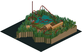
Thanks for the comments guys I guess I will give yall a pic of the hotel in my new project for yall.
BTW the dat is messed cause I recently got some new stuff I wanted to use in the park thanks Kumba.
DialUp Beware! -

 Evil WME
Offline
Looks nice.
but what kind of low quality image is that?
and.
why isn't it finished? -

OddmentsAlchemyLab Offline
Adding missing park files from my collection. 3 of 5
Confidence - fair. No screenshot to work with, but it has the look and feel of the times and seems consistent with competition benches being used with "Road Rally" tournaments.
 Blood Gulch.zip (134.08KB)
downloads: 333
 Tags
Tags
- No Tags


