(Archive) Advertising District / Disneyland Park
-
 02-May 04
-
 Highball
Offline
MASSIVE update. All the old screens have been taken down and replaced with the most up to date current ones. In all, I have posted about 25 new screens. This is because this park is WW and not everyone will be able to see it. Click on the pictures below to visit the appropriate album.
An overview screen and the Monorail and Ferry stations.
The newly expanded Disneyland Hotel.
Nothing you haven't seen before, but still fun to look at. The screens are new though so there may be some things you haven't seen before.

Three words: Sleeping Beauty Castle
That's it until I finish my QftBX entry. Later. -
 Disney Freak
Offline
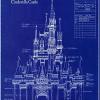
At first I looked at the castle like this:
 but now it's growing on me and I think it looks amazing! Your Fantasyland looks great such as everything else.
-

 RaoulXpres
Offline
Is it jsut me or are those ^^ two posters everywhere?
Anywho...
What I like is that it feels disney without being dirty or crowded.
I will have to find time to look at all the screen :-) -

 Steve
Offline
I am in love with the Daring Journey/Village Haus facades.
I'm still not feeling the foliage next to the castle, though. :\ -

 Meretrix
Offline
My only complaint is a matter of personal aethestics....I think that your tallest spire on the castle is too THICK...all real Disney Castles' tallest spires are VERY slim, or narrow, and yours seems a little too wide. But the castle still looks fab, as does everything else.
 -

 Fenix
Offline
I agree with Meretrix on the thick spire. I also think that the little one next to it doesn't look right. I'm talking about the little one with the big cone roof. It looks like a mushroom to me. The other thing I don't like is the landscaping around the castle. It looks whimsical enough to be there, but I think that Pine trees would make it look better, but hey it's your park do what you please. Great job you got incredible skill.
 -

 Highball
Offline
RCT2 sucks for castles. We all know that.My only complaint is a matter of personal aethestics....I think that your tallest spire on the castle is too THICK...all real Disney Castles' tallest spires are VERY slim, or narrow, and yours seems a little too wide. But the castle still looks fab, as does everything else.

I tried my damnest to ge the castle right, and I know it still looks a little funky, but I may work on it some more. Not for a while though.
No comments about the Monorail? I worked my ass off on that. Also, no one noticed the Space Mountain/Discoveryland sneak peek?
-

 Highball
Offline
Sorry to double post, but I TRIED fixing the Castle spires. The new screens should be up in a few. I also posted two more screens of Main Street, nothing new though.
 -

 rK_
Offline
still looking excellent, spires look decent and the area around dumbo is very nice, calm and scerene.
 -

 76 Trombones
Offline
I noticed the monorail, and I like the effort very much, but I (notice the I) perfer the real ride monorails. Just a personal taste issue.No comments about the Monorail? I worked my ass off on that. Also, no one noticed the Space Mountain/Discoveryland sneak peek?

As for the preview, I saw it. It looks very nice, except the rocks look very fake. Are you sure you couldn't just raise the land. By raising the land it looks a LOT more like the Disneyland Paris one, IMHO.
- 76
-

Richie Offline
WHERE WHERE WHERE I WANNA SEEAlso, no one noticed the Space Mountain/Discoveryland sneak peek?


-

 RaoulXpres
Offline
The Castle:
I think it looks good. Although, the more i look at it, the more I don't like the rooving (roofing?). It's too much like a house and not a castle. It works I guess but I think it could look a ton better. The big tower I'm fine with but it needs to be countered with some smaller spines around it.
Space Mountain:
Well it is a TINY glimpse but I'm really sick of the gold/teal space mountains. I may be wrong but out of the 3 that exist (WDW, DL, DLP) only one is that style. The other two are the beautiful pure white models. I prefer that.
Or maybe, call me crazy, but try somethign new. Don't do white, dont do teal/gold. EXPERIMENT. You have enough talent where you dont always have to follow the rules. -

 Highball
Offline
Well, I'm doing Discoveryland so it has to be Space Mountain: From the Earth to the Moon. Besides, I love the entire premise of Discoveryland. It's more exciting than Tomorrowland and has so many possibilities. This is what I want to do. I'm not following any "rules".The Castle:
I think it looks good. Although, the more i look at it, the more I don't like the rooving (roofing?). It's too much like a house and not a castle. It works I guess but I think it could look a ton better. The big tower I'm fine with but it needs to be countered with some smaller spines around it.
Space Mountain:
Well it is a TINY glimpse but I'm really sick of the gold/teal space mountains. I may be wrong but out of the 3 that exist (WDW, DL, DLP) only one is that style. The other two are the beautiful pure white models. I prefer that.
Or maybe, call me crazy, but try somethign new. Don't do white, dont do teal/gold. EXPERIMENT. You have enough talent where you dont always have to follow the rules.
BTW, there are four Space Mountains. One was an ugly brown but now it's white again. -

 Highball
Offline
Bah, I'm bored so here's a map of Fantasyland I did. It was originally in my TDLP (The Disneyland Project) notebook but I thought it would be cool to make it in paint. A couple of things before the screen:
1) I didn't outline all of the gardens, so there's no need to worry about that.
2) In the original screens I showed, the Peter Pan and Pinocchio rides were reversed from where you see them on the map.
3) It has been pointed out that I "misspelled" the word "Tales" in "The Adventurous Tails of Robin Hood." Actually, this was done on purpose because the ride is based on the Walt Disney animated classic "Robin Hood", in which the Robin Hood character was a fox. It's a pun/joke of sorts.
Oops. I almost forgot. The "1" next to the Mad Tea Party is the quick bite restaurant "The March Hare". -

 disneylandian192
Offline
i have been looking at your pics and i noticed that there is ALOT of scenery Just in Main St. Alone. How do you manage the scenery?( Having enough scenery to succesfully theme 6 lands.)
 -

 Highball
Offline
^ I donno. I just pick carefully. If I can make stuff on my own using existing scenery, then I do that to save room (One example is using Fisherman's curved awnings to create the umbrellas near Casey's Corner and the Village Haus rather than selecting a custom made umbrella).
Update on the park. I really didn't like how Fantasyland originally turned out. It was too cramped and things were just thrown in there. That was my own laziness. I have now given Fantasyland the time it deserves and done some major renovations. For starters, I flipped the positions the Pinocchio and Peter Pan rides and divided the two by a small stream coming from the Dumbo area. I also finished (finally) the Carousel covering. It's still not perfect so I may mess around with it again later. I'll post more screens once I finish up The Village Haus and The Cinderella Story.
Aurora's Enchanted Carousel. Located in the shadow of Sleeping Beauty Castle, Aurora's Enchanted Carousel features 33 intricately carved horses and seven original murals depicting the tale of Sleeping Beauty.
Pinocchio's Daring Journey. Wishes do come true! Follow Pinocchio on his quest to fufill his wish of becoming a real boy.
The area between Dumbo, the Flying Elephant and Peter Pan's Flight.
Sleeping Beauty Castle. The icon and centerpiece of Disneyland Park. -

 coasterphil
Offline
Those last screens look very nice, good work. I really like the simplicity in the carousel screen.
 Tags
Tags
- No Tags