(Archive) Advertising District / Disneyland Park
-
 02-May 04
-
 Highball
Offline
Captn Pineapple: I wouldn't say it's amazing, but thanks. Glad to see I am succeeding in the realism department.
Meretrix: Trust me, the rest of the lands are just as detailed as Main Street. Ya'll will find out soon.
Lucifer: All the walls are from RCT2 (except Toon's marble walls). And here's a suggestion for you: Take some prozac. I haven't read a positive comment from you all day.
Rctfan: See my comment to Meretrix. And on the "showing too much of Main Street" part, look who's talking. Ya'll have only seen about half of Main Street. -

 Highball
Offline
I know I said I wouldn't show it, but it just turned out way too good imo and I really wanted to share it.
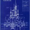
So, I now present a teaser screen of Sleeping Beauty Castle.
The castle is based off an early concept sketch for Disneyland Paris' Sleeping Beauty Castle by Herbert Ryman, one of the earliest Imagineers. But of course I threw in a couple of my own twists here and there to spice it up. Enjoy!
EDIT: I want to thank Steve for his building on Main Street and his gardening on the recent Disneyland Hotel expansion. You did great, man. -

 MightyMouse
Offline
Wow. I'm definitaly impressed. Honestly, that is what I would expect if I were to see a 'Sleeping Buety Castle.'
What's up with the yellow castle top though?(not complaining...not complaining) -

 Tech Artist
Offline
Wow, amazing! That reminds me so much of Disneyland's castle in Ainehime(sp?). Nice work MD.
The only thing I don't like is that bright yellow, it sticks out too much. -

 Geoff
Offline
To tell you the truth, the stone dome things that hold up those towers dosen't really look so good.
But then again, it's just a teaser. -

 rctfreak2000
Offline
All looks nice, but I think the foliage along the left side of the screen needs some work.
It just looks like spiratic shrub placement. I think if it was spiratic with other bushes too, it would be a lot better.
Good job on the castle though. -
 Disney Freak
Offline
Meretrix, on Jun 19 2004, 12:55 AM, said:
In earlier pictures there was a red brick wall from the European theme so I guess it's WW.Tis purty indeed...I forget...is this a WW park, or is it merely RCT2?
As for the screen:
Holy Shit!!! Straight out of a fairytale! Good work, Mad Dawg! I have to comment about the yellow tower. It just sticks out too much! Other than that, great job as always!
:scarface: -

 Highball
Offline
MightyMouse011, on Jun 18 2004, 11:43 PM, said:
The golden spire everyone is talking about was placed there specifically to break up the ocean of peach and royal blue. If the spire was royal blue, you probably wouldn't even know it was there.What's up with the yellow castle top though?(not complaining...not complaining)
Quote
The concept sketch I based the castle on was kind of an expanded version of Anaheim's castle. The sketch is a night shot, so the details are obscured. That is why I looked to Sleeping Beauty Castle for inspiration next.That reminds me so much of Disneyland's castle in Ainehime(sp?).
Quote
We all know landscaping is my weakest area, but I can tell you that farther down that hill is a larger variety of shrubs. I will put some of them on the hill to see how it looks.It just looks like spiratic shrub placement. I think if it was spiratic with other bushes too, it would be a lot better.
Quote
WW.Tis purty indeed...I forget...is this a WW park, or is it merely RCT2?
 In order to get this park just the way I want it, it had to be WW. If I could have avoided that, I would have.
Thanks for the comments everyone. I wasn't expecting such a positive response so it's good to know I'm not the only one satisfied with how the castle turned out. -

Richie Offline
Mad Dawg, on Jun 19 2004, 10:20 AM, said:
Its possible to convert them to regular RCT2, actually. You just need to load the file, and save it again under a different name. I will becoame a custom object.WW.
 In order to get this park just the way I want it, it had to be WW. If I could have avoided that, I would have.
-------------------------
I think the castle looks great, and the yellow looks fine imo, if they were blue there would be too much, but that small amount of yellow looks fine. Remember this is only a small part of the castle, imagine all that blue on the full size one
I seriously think you could be onto a spotlight, seeing that you enter it of course.
-
 Disney Freak
Offline
Richie, on Jun 19 2004, 04:28 AM, said:
Shhhhhh! Don't pressure him!I seriously think you could be onto a spotlight, seeing that you enter it of course.

spotlight, spotlight
-

 Tech Artist
Offline
Mad Dawg, on Jun 19 2004, 04:20 AM, said:
Ah so you like combined the 2 in a way but added your own twists? Still looks awsome and so far is a spotlight for sure even with WW.Quote
The concept sketch I based the castle on was kind of an expanded version of Anaheim's castle. The sketch is a night shot, so the details are obscured. That is why I looked to Sleeping Beauty Castle for inspiration next.Wow, amazing! That reminds me so much of Disneyland's castle in Ainehime(sp?). Nice work MD.
The only thing I don't like is that bright yellow, it sticks out too much. -

 Steve
Offline
Mad Dawg, on Jun 18 2004, 11:16 PM, said:
No problem, dude. I'm more than happy to help.EDIT: I want to thank Steve for his building on Main Street and his gardening on the recent Disneyland Hotel expansion. You did great, man.

As for the castle, it's looking damn sexy.
The pink and the blue looks great.
But as others have said, the trees aren't so hot.
Apart from that, awesome. Show my gardens!!1

-

 Highball
Offline
The trees were selected because they have that unique fantasy look to them. They may not look great from that angle, but from others they look fantastic.
As for my chance at spotlight: only if Hell froze over. Thanks for the vote of confidence though.
-
 Disney Freak
Offline
Mad Dawg, on Jun 19 2004, 12:41 PM, said:
Don't be modest!As for my chance at spotlight: only if Hell froze over

-

Richie Offline
Mad Dawg, on Jun 19 2004, 06:41 PM, said:
I cant freeze it, but i might be able to put the flames out with the garden hoseAs for my chance at spotlight: only if Hell froze over.

do you think we could get a look at those trees at another angle? Really, they should look good at all angles IMO, but since some in disney wouldnt be behind, maybe that adds to realism? -

Richie Offline
I wouldnt say it looks fantastic, but better than the last. In disney parks (paris anyway) they had flowers and stuff at the front, and as it worked back it got taller. Here, they just seem like they have been thrown here and there randomly. -

 Highball
Offline
Richie, on Jun 19 2004, 01:54 PM, said:
I know. I've reseached Disneyland Pairs to the core. I even bought this book, "Disneyland Paris: From Sketch to Reality" for $75. It was worth every penny.I wouldnt say it looks fantastic, but better than the last. In disney parks (paris anyway) they had flowers and stuff at the front, and as it worked back it got taller. Here, they just seem like they have been thrown here and there randomly.
 Tags
Tags
- No Tags


