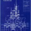
(Archive) Advertising District / Disneyland Park
-
 02-May 04
-
 Disney Freak
Offline
You probably HATE Disney because this looks like photos of Disney on display....I hate saying this and it's gotta be the first of a long while. I hate it. Sorry. The vegetation is not to my taste, and I find the architecture rather bland. I also don't like the paths you've chosen. They don't fit imo. Sorry bout that.

-
 vTd
Offline
As someone who knows Disney... let me give this park a big ole thumbs up... especially for your realistic use of facades.
A few minor suggestions on the new screens...
1) Not a fan of the waterfall next to the Wishing Well... Ugly. It would be better if you replaced it with something a little more tangible than the obviously paperthin "scenery water" you have.
2) Someone else mentioned it. "Haus" isn't Italian, it's German.
3) Make the ground underneath your gardens dirt-colored. -

 Highball
Offline
Damn. I go to work for a while and return to find ten replies.
Damn, you still haven't started on that yet? I'm not sure you will need much help. You seem to do pretty well on your own. I'll be there if you need any help anyways.Wow MD, I haven't checked out this thread in awhile, but I'm certainly not disappointed. The screens are beautiful and extremely precise when it comes to the Disney quality. I also like how you have everything so well planned out. You're definitely on your way to becoming the next Meretrix. You'll have to help me out when I start on the Main Street section in Walt*mart. My only gripe is about some of the scenery choices, mainly those ghastly spiral trees, but you make them fit somehow. Nice job!
Bah. Enough with the Haus thing. The restaurant is themed to Pinocchio (takes place in Italy), and I simply named it after the restaurants located in Tokyo, Orlando, and Anaheim.As someone who knows Disney... let me give this park a big ole thumbs up... especially for your realistic use of facades.
A few minor suggestions on the new screens...
1) Not a fan of the waterfall next to the Wishing Well... Ugly. It would be better if you replaced it with something a little more tangible than the obviously paperthin "scenery water" you have.
2) Someone else mentioned it. "Haus" isn't Italian, it's German.
3) Make the ground underneath your gardens dirt-colored. -
 vTd
Offline
Then forget the name thing... concentrate on my other two suggestions, specifically the waterfall.
 -

 Meretrix
Offline
'Tis lovely.
To whomever said he's on his way to being the next "me"....NEVER!!!
Just kidding....actually from your screens Scooter, you and I build completely differently. You are very methodical, and I...well I just throw shit together and hope it looks OK.
Anyway, the screens do look great.....they don't look at all like RCT....and I'm OK with that. I think that those who are "purists" are going to fight this tooth and nail.....to my mind, they are myopic in their creative pallettes.
Anyway, you're building this AWFULLY slowly....keep doing that, and this baby is sure to be unreal.
(Until Fisherman finishes his Disney resort....then you're hosed.) -

 Highball
Offline
Thank you for saying that. I'm pretty tired of being compared to you. (no offense).Just kidding....actually from your screens Scooter, you and I build completely differently. You are very methodical, and I...well I just throw shit together and hope it looks OK.

The reason I'm taking so long is because I am building this park for me. This is how I would want a Disneyland to look like. I also recreate many structures meticulously from pictures of the real parks, so that takes time as well. -

 Panoramical
Offline
I don't judge parks on whether they look like Disney or not. I judge them on whether I like them or not and what suits my taste. I really don't give a shit if it looks like Disney or Tussauds. I don't think a park's name should give it a different aspect from which i look at when rating.You probably HATE Disney because this looks like photos of Disney on display....

-
 Disney Freak
Offline
^ WTF? If you don't judge it for being Disney than how can you criticise a Disney park?
 I know the Disney style ain't for everyone but atleast be fair and comment on Dawg's target which is to make a Disney park..
Just my opinion... Lets just leave it at that... If you want a debate over it here's my aim:
DisneyFreak3103 -

 Panoramical
Offline
Right. But to show off a passing comment I'd like to say that you are correct in saying I don't judge it on how Disney it is. I judge it on how good it looks in RCT regardless of whether it is Disney or not.
 -

 Highball
Offline


Fort Comstock. The entrance to Frontierland from Main Street, U.S.A. Inside the fort is a glass blowing shop and several authentic artifacts from the Old West.
The Lucky Nugget Saloon. Owned and operated by Diamond Lil, the largest saloon in Thunder Mesa is home to the Rocky Mount Western Revue.
Tobias Norton & Sons Frontier Traders. Constructed next to Fort Comstock to profit from passing traders, Tobias Norton's shop sells a variety of wilderness items including survival gear and quality gold mining equipment. -

 Ride6
Offline
Hate the fort, love the other two. The fort is an example of bad custom sceanery used in quantity and its that exact kind of thing that makes me dislike the "disney" style (except when John and/or Cork do it since they know what good sceanery is).
The other two screens are beautiful, exactly how I would picture them.
To fix the first screen I suggest raising land and using the regular "brown wood texture" and use some of Toon's windows on it. If you don't have the windows just use some regular wood man cause that stuff looks downright shitty. Same goes for the cabin in the 3rd screen too.
ride6
ps- I love the tables in screen two.
-

 Geoff
Offline
The Luck Nugget is hoooottt stuff. I love it!
The fort first comes off as "blah," but you do grow into it as you keep looking at it. I just don't like the pagoda style roofs.
Just a suggestion: You should make the wood fences (jurassic style) on the top floor, differ in height so they don't look perfect... since it's an old fort.
The scale is just weird... I don't know if I'll ever get used to it.
Keep it up. -

 PymGuy
Offline
Looks great. Finally someone is pulling off Disney realisticly. (To me, Meretrix's parks were a more fantasy-style take on Disney.)
Keep it up. -

 RedBrain
Offline
¾Æ!! ³ª ÀÌ ¾¾¹ß°³»õ³¢°¡ é·ç ½È¾î!! ø³ª °³»õ³¢¾ß ¤»¤»¤» ±×¸¸Ã» ÀßÇØî¶ó °³»õ³¢¾ß
 -

 Highball
Offline
Exactly.¾Æ!! ³ª ÀÌ ¾¾¹ß°³»õ³¢°¡ é·ç ½È¾î!! ø³ª °³»õ³¢¾ß ¤»¤»¤» ±×¸¸Ã» ÀßÇØî¶ó °³»õ³¢¾ß
-

 Meretrix
Offline
Meretrix is dead!(To me, Meretrix's parks were a more fantasy-style take on Disney.)
Long live the new flesh. -

 guljam
Offline
I agree¾Æ!! ³ª ÀÌ ¾¾¹ß°³»õ³¢°¡ é·ç ½È¾î!! ø³ª °³»õ³¢¾ß ¤»¤»¤» ±×¸¸Ã» ÀßÇØî¶ó °³»õ³¢¾ß
"ÀÌ°Ç Ã¶¶Ç³ª°Ô ÀßÇÑ ½à °£³ªµéÀÇ ÀÛÇ° ¤Ã¤à ½Çæ°ø¿ø ÃøÂ¥ À߸¸µé¾ú´Ù."
 Tags
Tags
- No Tags