(Archive) Advertising District / Disneyland Park
-
 02-May 04
-

 Janus
Offline
No, I agree with you. It all looks very nice at first, but it looks like the scale is off on some things. Pretty confusing. It does look somewhat mediterranean though.My Splash Mountain is better.

Just kidding of course.
I'll comment on the Mediterranean screen... this is the first time I've really come to a problem with your oversized scaling. The building just looks so damn gargantuan, but some details, like windows and balconies, look puny juxtaposed by it. It just looks awkward to me, and as a result, I can't really assess the other qualities of the area. Part of it might be the roof overhangs. Anyway, I'm not sure what to really say, just that it looks odd to me.
I could be the only one tho. -

 JKay
Offline
Brought it to this page for ya.
Well, this screen certainly remains with the Disney feel you have going throughout the park, but I'm not feeling the Mediterranian aspect of it. As others said, I think its the trees / foliage, and I'm also not sure about the path. I would keep playing with this area, because it definitely has potential, but still needs work imo. -

 Geoff
Offline
^ I have to agree. Although, I think it's also the choice of windows.
You should have more open windows, and the texture of the walls should be the spanish mud walls. You should definitely use the windows for Toon's spanish pack. -
 Highball
Offline
Thanks for the helpful comments everyone. I'll toy around with it a bit more to see what I can get.
I know my scale is huge, but I love it. -

 Highball
Offline
Back to Fantasyland.
The Adventurous Tails of Robin Hood
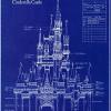
The facade is supposed to be the archery competition scene from the film. The circus tents are FastPass booths.
The Cinderella Story
Trees have since been added in the foreground (In front of 3FC).
The Old Mill Ferris Wheel & The Mad Tea Party
Ignore the top left corner. That leads to it's a small world on a separate map. -
 Disney Freak
Offline
Your Cinderella facade is beautiful. I still don't like the fastpass machines but everything else flows together amazingly! Good job!
 -

 Steve
Offline
Your Cinderella Story facade is amazingly classy. The blues and whites look great.
Cool fastpass booths. -

 Outlaw
Offline
Iceman, I love this whole park, and I'm going to suggest taking a look at these pics I've provided in order to make a point about your Splash Mountain, because its the only thing bringing this park down right now. So, please just hear me out with an open mind. And JAYJAY don't say a word, these are only suggestions, I got pissed off enough just reading your comments, don't make me have to respond to them.
http://lostworld.pai...h_mtn-jun98.jpg
In this pic, you can see that there really isn't much blockiness to the land at all. There is much, much more shubbery than you have, and more rock faces as well. Also, this doesn't have the briar patch at the bottom of the drop, but I know that's what the beanstalks are representing, and I think they stick out a little to much. My advice would be to lower them as Richie said, which you are probably already planning to do and seeing how that looks.
http://www.disneylan...s.com/bcsm2.jpg
This picture shows the briar patch better, and notice how it's not as overwhelming as it is in your screen. I think you should try some normal bushes, jungle type and normal type, and maybe ask around to see if someone could make you a new scenery piece to add in that isn't so overwhelming, because right now the main focus in your screen is the briar patch, when it should be the drop and mountain. This pic also shows the steps rather than the slope, which you were right about. But in the real Splash Mountain, the step ups are much more dramatic, like 15-20 feet each, while yours looks like a flight of steps that I could walk up with no problem, and it definitely above all else needs more shrubbery.
I don't see anything wrong with the custom tree, except for that it could be a lighter shade of gray with some darker shading in parts, but I don't see that as being a big deal.
Now, I know I don't have much pull in the Advertising District as I don't play much RCT, but I think that if you'll listen to at least a few of my suggestions and at least give them a try, you'll find that you can still make it look satisfying to yourself, and manage to please somebody other than JAYJAY the imagineer with this screen. It may be something that you don't want to do, but I'd rather take the time to get this looking good rather than let a main attraction be a lowpoint of such a beautiful park. -

 Highball
Offline
Outlaw, your opinion on Splash Mountain is very welcome and I thank you for the time put into your post. At this point, I am considering redoing Splash Mountain. Not because of the negative response, but because Frontierland is currently a designer nightmare.
If I continued building the way I am currently, both Splash Mountain and Big Thunder Mountain would have their stations right next to each other. Like WDW, this area would have gotten real crowded real fast. Also the Country Bear Jamboree and the Briar Patch area would be a dead end.
I'm going to rearrange Frontierland some to try to figure out a better way. So yeah, Splash is going to get a face-lift. Time to put another six hours into it. lol -

 Outlaw
Offline
It doesn't have to be 6 hours, man. Here's something I whipped up in about 30 minutes.
Your's would of course be on a larger scale, and you could put in your rocks and custom tree trunk which I didn't have in my scenery tabs. But I found that if you use the dead/haunted trees and hack in some bushes or shrubbery underneath that it would make the briar patch look much better and less overwhelming. I'd recommend making yours alot less cluttered looking though. -

 Outlaw
Offline
Haha, I doubt I could manage that. I got the ideas down, its the execution that kills me.
 -

 postit
Offline
The Cinderella ride facade is awesome and it falls in place beautifully. The fastpass things on Robin Hood are really awkward, though.
 -
 OhioCoasteRFreaK36
Offline
Looks great! I too don't like the fastpass for robin hood...i think there should only be one...
Lovin the cinderella stuff and the flags in the last screen are cool! -
 Disney Freak
Offline
I think Outlaw's post was quite helpful. Give his advice a try, maybe you'll produce something you like better than this one.
-

 guljam
Offline
Amazing work!
I like this screenshot!
kk
´Ã¹Ì¾¾¹ß ø³ª À߸¸µé¾úÀ¸¼À! -

 Highball
Offline
Those aren't flags. Those are gone now but they were supposed to be giant, or "Alice-sized" plants. I'll try to post a picture of the real thing later.the flags in the last screen are cool!
In reference to Splash Mountain: it's gone now. I'm trying to find a way to fit Big Thunder and Splash in the same area without breaking up the flow from Fantasyland to Frontierland to Adventureland. So don't worry about the old Splash.
I'm suprised no one has tried to correct my spelling in a ride title. lol... -

 NatMan001
Offline
Hey, the link isnt working anymore can you re-post it this looks like a sweet park!
 -

 Highball
Offline
What link?Hey, the link isnt working anymore can you re-post it this looks like a sweet park!

 Tags
Tags
- No Tags
