(Archive) Advertising District / Ports of Discovery
-
 16-April 04
-

 gymkid dude
Offline
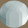
the tower looks like a condom on the whoa belly. A magnum. After it's been used.
 -

 Metropole
Offline
I like it a lot. A bit of explanation of what's going on in that first screen would be nice. Looking forward to this one.
 -

 CoasterForce
Offline
In screen one, the coaster turning over the path has no interactions or anything, so it just takes away a lot of the screen for me. I donno, just the placement of the coaster kinda ruins it for me.
While I would never call screen two "godly" it is good, but still, could use more detail, and a lot of it is just tall, plain walls. Try to spice that up more. -
 Timothy Cross
Offline
Both those screens look good, Kevin.
Screen 1: Really beautiful architecture with some great detail. I'm really looking foward to seeing this park in-game. It should be incredible. Also, others complain about that tower and the coaster which is near it. I agree with what those have said about the later, but honestly, I think the tower actually looks pretty cool.
Screen 2: Another beautiful work of art. I really dig the waterfalls as I'm always a sucker for those when they're executed well; and you've done that. Bravo. You've also done some great work with quarter tile objects. Overall, pure beauty.
So well done. This park looks to be super runner up quality, if not even spotlight quality. Can't wait to download it .
.
-

Richie Offline
screen 1 is truly beautiful, and i can see a lot of effort in it. However, you need to make the coaster fit. The area seems really planned, and then you just suddenly decided to add a coaster in there. Custom supports would work wonders, it would show that you have thought about it, at the moment i dont like the way its just hovering above paths. -

 X250
Offline
Nice to see my #1 'most awaited' park is progressing, i love the last screens. Especially the atlantis one, i have never seen the atlantis theme pulled off as well as this. The first screen is classical, i know it is unfinshed so i am not gonna comment on the blank tower-thingy. Just can't wait to see this park... I know you probably get this a lot...but.. what percentage would you say you are at now?
-X- -

 coasterfrk
Offline
My sentiments exactly. Your work is everything I wish my work was...unfortunately, I lose interest, inspiration, and available time long before I even get a small percentage of what you've accomplished. Excellent work.Mr. Prodigy is right!
I'm still in awe of this park's beauty. Corky hit the head on the nail about you creating atmosphere in places most people would not think of, or simply places you wouldnt think possible to create atmospheres in. Your quarter tile work is just incredible too. I must say that I would slap myself silly if this did not get Spotlight. Definitely a very inspiring park to me, even with un-finished screens. Please continue Kevin.

-

 Turtle
Offline
Screen 1 - I don't like the random brown arches. Also, I think the coaster would look better with less supports, maybe some custom ones. It's a beautiful blend of textures, but I feel that the dark purple jungle flower could go... Maybe replace that lone palm tree with a fuller one.
Screen 2 - I've never liked the smoothness of those blocks, but they do look quite good here. You need to put walls on the aqueduct in the very centre of the screen. Foliage is excellent, and I love the little eating area on the top of that building. The other aqueducts looks fantastic, I love the fences there.
How much is done? -

Kevin Offline
The tower in the first screen isn't quite done. But In game when you are able to see more of it's surroundings it looks better. As you can see it holds a Launched Freefall tower.
The park still needs a lot of work. But I don't think you guys will have to wait much longer. I have seriuosly been working on this park everyday. So it's progressing a lot faster than it was....ever, I guess.
But as I've told Iris and a few others... This park will be worth the wait, whether it gets spotlight or not.
I don't feel like replying to all of your guys comments and advice, but I will read through them and see what I can do. I do appreciate it though.
If you want any clues on the estimated release, just look somewhere in this thread. It'll tell you.

-

 Kumba
Offline
Wow was the hint hard to find
Screens look great, but the white steps in atlantis are ugly imo.. -

 muuuh
Offline
the first screen is very amazing. i love your style.
but the first screen is unfinnished. i hope you`ll build on it, because i like this rct2 park more, as the rct3 park.
the second screen is cool.
i dont know about the house with the white steps. its to confused for me . but i think its unfinnished.
Good luck!
muuuh -

 Evil WME
Offline
do you ever not search for lame hints?Wow was the hint hard to find

Screens look great, but the white steps in atlantis are ugly imo.. -

Kevin Offline
I really don't want to do this guys, but I'm afraid this park won't be getting done. Finishing it wouldn't be a problem, but my RCT2 disk is being a piece of shit. It got scratched too much and is unplayable. I don't know how, I do take good care of my CDs... anyways I'm not gonna go out and buy another disk.
So yeah, all of my saved work is pretty useless right now. I'll try and upload the lastest version and put it up for download.
Sorry. -

 Kumba
Offline
RCT2 is only like $8 to order online. I got Ed one after he lost his. Someone buy this man RCT2! (I mite, but id need to see the park first
 )
)
-
 Powersun
Offline
STOPPPPP!!!!
There's a No-CD Crack for RCT 2. You mustn't buy a new version
Why doesn't you use it`?!!!
Bye Powersun
 Tags
Tags
- No Tags

