(Archive) Advertising District / Universal's Hollywood Hills
-
 14-March 04
-

 Mike Robbins
Offline
hi mike,
i love the coaster track on top of the building, although it could have been executed better, it's something familiar, like i know i've seen something like it in real life. nice idea.
You're thinking of the Boardwalk Casino in Las Vegas. They tore it down a couple of years ago and they are currently building the massive Project City Center there. I did what I could in the space I had. It is right on the edge of the map.
And yes, there already is an Iron Man flying coaster in this section, thanks to Carl. And Wolverine is an invert. -

 Mike Robbins
Offline
The old Boardwalk Casino in Las Vegas. The coaster on top never operated. It was just decoration.
-

 TombraiderTy
Offline
And yes, there already is an Iron Man flying coaster in this section, thanks to Carl. And Wolverine is an invert.
Ah, my mistake. Looks great. -

 Mike Robbins
Offline
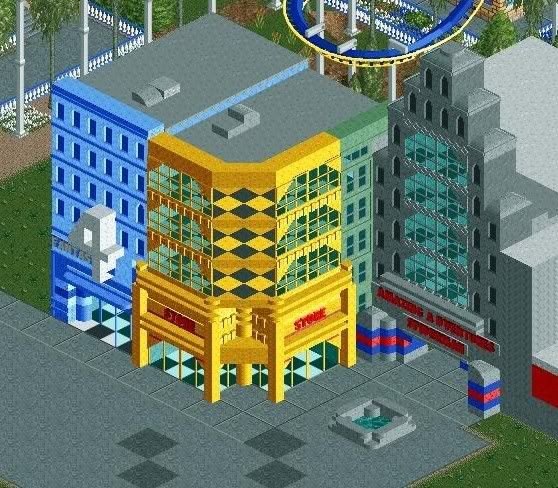
Small update..... Nin had the park for a couple of weeks. Due to school, he couldn't do too much but did contribute with these three buildings with the right building being the entrance to Spiderman.
-

 Video_Kid
Offline
I really like that. The only thing that bothers me is the scale of the building. I don't know, it could be just me. But to the guests, it might be rather big.
 -

 Louis!
Offline
^Yeh, i'd say the windows were a bit too far off the ground etc.
But what nin's done is supwerb. -

 Alpengeistfan1
Offline
The diner looks great, but that building in the middle of nin's buildings needs another color. It seems like there's a bit too much yellow.
 -

 Mike Robbins
Offline
I'm definitly going to drop the windows of the diner a little lower to the ground. I do see what you all mean.
And I'll add a bit of white to the yellow building to accent it.... probably some blue to the gray building too. -

 Comet
Offline
Nah I think nin's screens perfect, I wouldn't mess with it.
The diners good too just the scale is a little off. -

 Mike Robbins
Offline
On nin's work, I noticed the diagonol wall was missing (checkered floor coming through). For some reason I thought it was a cool effect he did but realized it was just missing wall. I added white diagonol wall there and made the ledge under the sign white. Just enough so it wasn't all yellow.
The diner was tweaked. I scalled the windows and lowered them. I also demolished two wall sections off the back to make the diner smaller and built another shop next to it: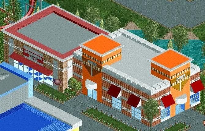
Edited by Mike Robbins, 07 March 2009 - 04:50 PM.
-

 nin
Offline
Oh, ha, I see the little 'effect' you were talking about, looks mosaic or something...
Glad you fixed it though..
-

 Mike Robbins
Offline
^ Yeah, it does look cool though. Maybe it should be left like that! lol... Either that or I'll change it from white to yellow to blend it in more.
 -

 Mike Robbins
Offline
I was going for a lofty type of diner. Kind of like those palces that have 20 foot ceilings. Anyway, this park is about 99% complete. All that is left is to theme the Iron Man coaster. I have no idea really how to theme this one. I sent Carl an email asking if he wants to finish this since he built the coaster. If not, then someone else is more than welcome to help out.
 -

 Alpengeistfan1
Offline
If you could show me a picture of it, then I could probably think of an idea, but I'm not the kind of person to build it.
 -

 Mike Robbins
Offline
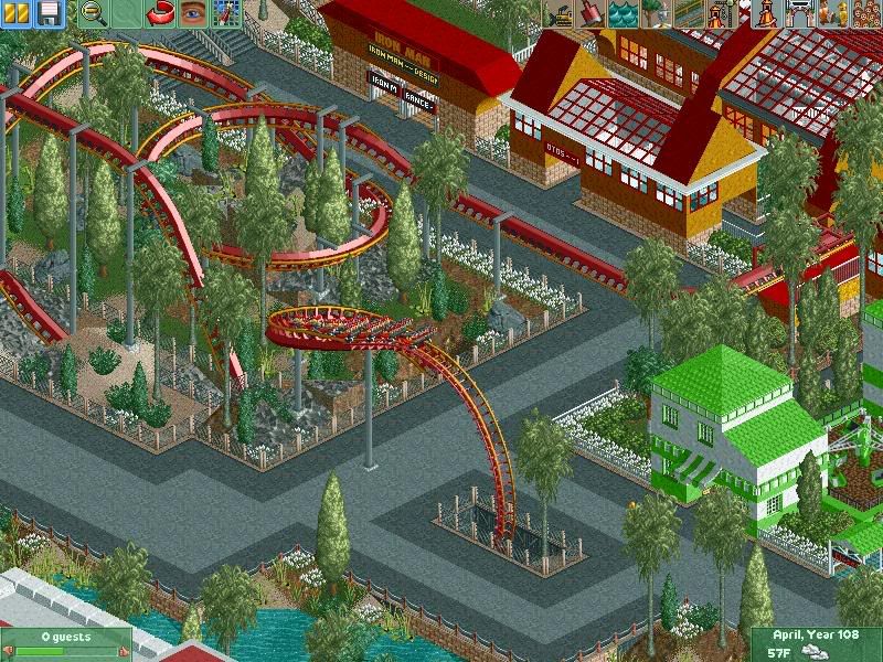
Here is the Iron Man coaster Carl did a long time ago, FINALLY getting some theming done around it:
-

 zodiac
Offline
the green building looks a little out of place, but the rest looks fantastic. the mood is perfect.
 Tags
Tags
- No Tags

