(Archive) Advertising District / Universal's Hollywood Hills
-
 14-March 04
-

 Mike Robbins
Offline
Thanks to Kumba for the awesome woodie which he built in 2 days!
As said above, the last major area to build upon and theme is in the Marvel section. I have a Wolverine B&M invert done, but needs some theming. There is also an Iron Man impulse that could use a cool station and theming too. I also need someone with a great idea for a Spider-Man ride (like in IoA) to build and theme.
I've been away from the game for so long so I don't know who is who anymore, so i'm looking for experienced builders. Let me know and send me some screenshots of your work.
mikedrobbins1476@yahoo.com
Yes this park is 4+ years old but it is near complete. A lot of the objects in the park is older, but still sufficient for making good theming. -

 Mike Robbins
Offline
Here's an update. Some new, some old screenshots:
Here is Kumba's coaster called Iguanadon.... same screenshot as above, except I added some foliage, a fast pass line to the left, a sign for the ride and a couple of buildings.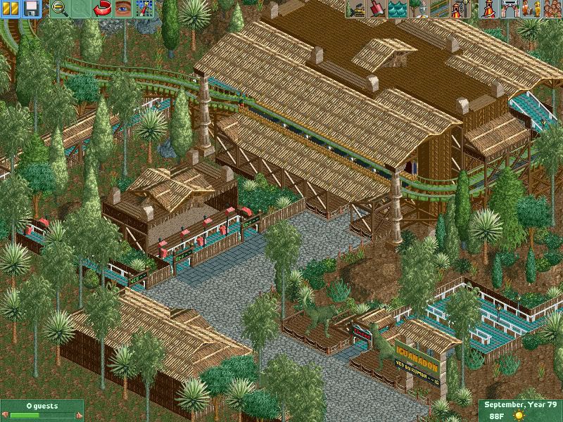
An older area of the park. This is the queue line for the Jurassic River Ride.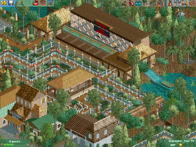
A newer section of the park. This is part of the station for Wolverine, a coaster in the Marvel section of the park. This is my first "new" work in a long time. I'm a bit rusty and would like some help in this area of the park.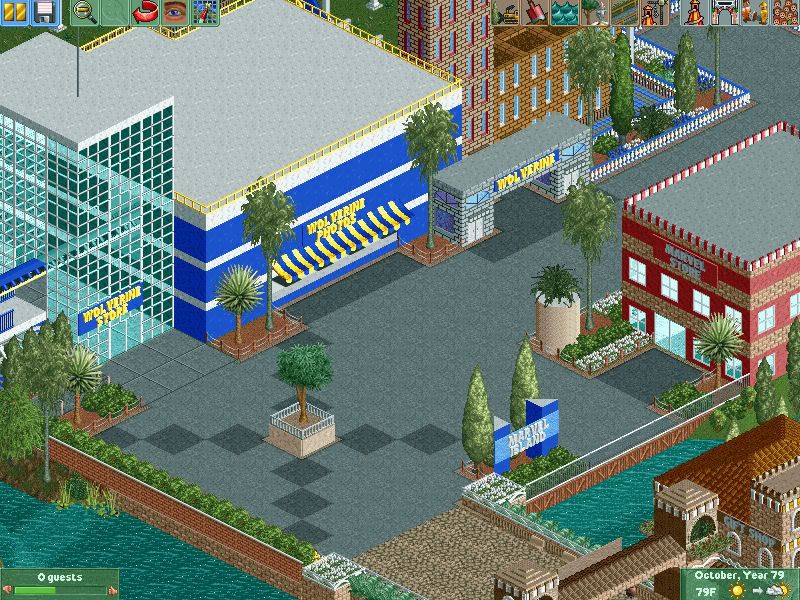
Another older section of the park. The Enchanted Oak Tavern.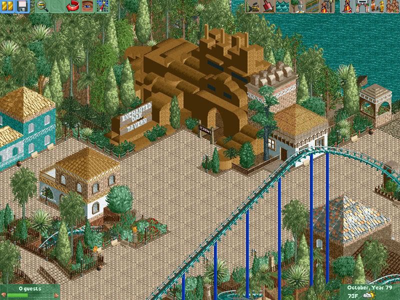
The Merlin coaster at the bottom of the screen with some of the areas around it.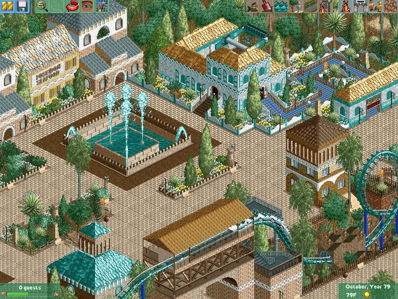
-

 Comet
Offline
It's really nice.
The top spin in the last screen should be viewable by peeps on the path though. -

 ACEfanatic02
Offline
Few things on the Marvel area:
- "Wolverine Photos" really, really needs something on the walls. Windows, a cornice, something. Right now it's an ugly blue cube.
- "Wolverine Store" -- what the hell is holding this up? Break up the windows with some walls or add some support. Not to mention that the building is completely empty.
Given the age of the park, I'm not entirely sure how much you can do, but it's not quite up to par as is.
-ACE -

 Mike Robbins
Offline
The Wolverine section will be fixed up for sure. Ge-Ride will get a chance sometime soon to help out. Right now I emailed the park to Carl who will do an Iron Man coaster.
 -

 posix
Offline
i'm sorry, but the foliage you added in the first screen is really awful. it doesn't work at all compared to what was there.
 -

 Mike Robbins
Offline
I'm limited on choices since this work bench is 5 years old. What would you suggest?
 -

 posix
Offline
something with care. it looks as though the foliage is all over the place in that first screen. it's just so random. doesn't look like you had an intention with it other than to fill the blank squares. maybe add some water and design shrubs around it or elaborate the path system to allow more "content" to fill with.
 -

 Mike Robbins
Offline
While map 2 is being worked on by someone else, I revisited map 1 and demolished a large blocky hotel and built something new.....
This is the Marriott Resort with the various colored buildings and multi-level pool: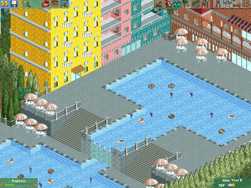
This is from a long time ago, but these are some shops on the bay: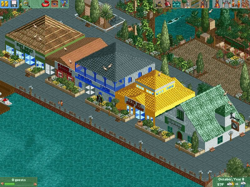
-

TwistedHelix Offline
The new hotel looks nice but I think you need something between the paths and the bottom of the buildings as it just seems to blend a bit too much at the moment. I love the seafood market but the rest of the buildings just seem a little odly shaped to be honest especially the yellow one but the surrounding are is really nice. -
 Dr_Dude
Offline
Crap, I had been thinking of that. Ah well, you beat meWolverine, a coaster in the Marvel section of the park.

-

 lucas92
Offline

You're using the walls wrong on your green roof building. It just seems glitchy right now... Fix that please!
Beside that, you've created an awesome atmosphere! -

 Mike Robbins
Offline
Those pirate roofs are like that. I don't have plain walls that will mix in so I had to use the roof inside out. Maybe I can put up some decorative crap to hide some of the glitchiness.
 -

 Mike Robbins
Offline
Two more screens. Thanks Carl for the cool coaster:
Iron Man, a launched flying B&M coaster: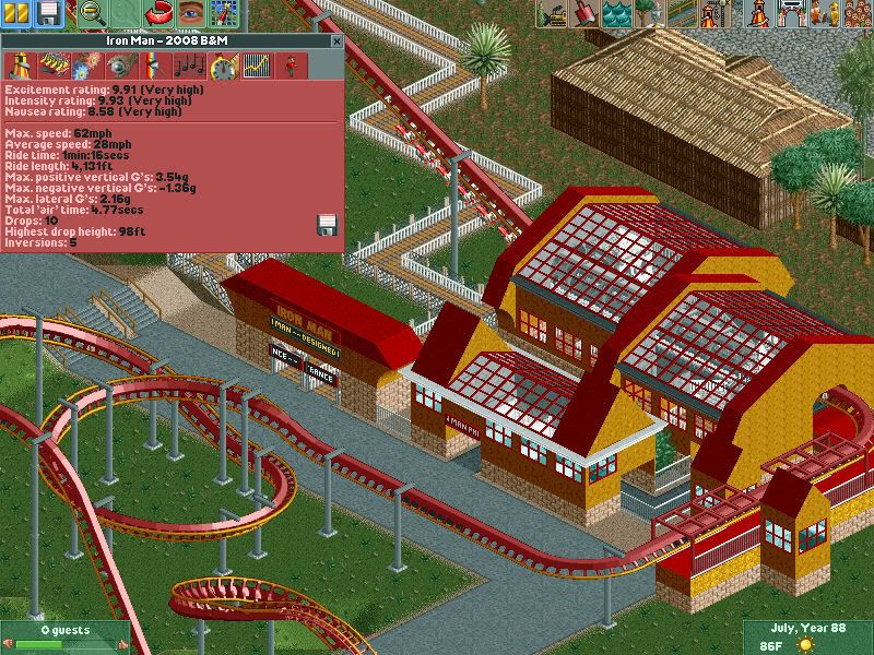
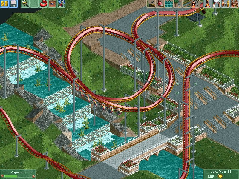
I do need some help theming and finishing this area. Any helpers? ??
??
-

disneylhand Offline
That coaster is unrealistic.
If that's what you're going for--I can't really tell.
-disneylhand -

 JDP
Offline
Yeah if you are shooting for realism, you failed miserably...
If not, then, well it looks decent. Different looking station but in a good way.
-JDP -

 Mike Robbins
Offline
Try to clarify as to the unrealistic coaster for the B&M flyer please. Like mentioned, the design is Carl's work so I won't remake any of it but I would like to hear how it could have looked different.
The initial station was also done by Carl. I made the building directly in front of it (for ride exit photos) and the entrance gate and brake station. I just patterned it after what carl did with the main station.
 Tags
Tags
- No Tags
