(Archive) Advertising District / Temptation resort [online]
-
 09-March 04
-

PBJ Offline
i agree with Jacko Shanty. make a helix around that littel rock that pop out of the water.
i think you have read the tips of me al ready on RCTHolland aboute the water above the entery of the coaster in the ground. -

 justdavy
Offline
And here are some new screen of the resort again
The white area's you see are still not ready to be shown
And I just painted it white ...im not ganna waste me time time...
but to keep things short here are the sreens and The tree's are going to be changed bud I had no time to do so....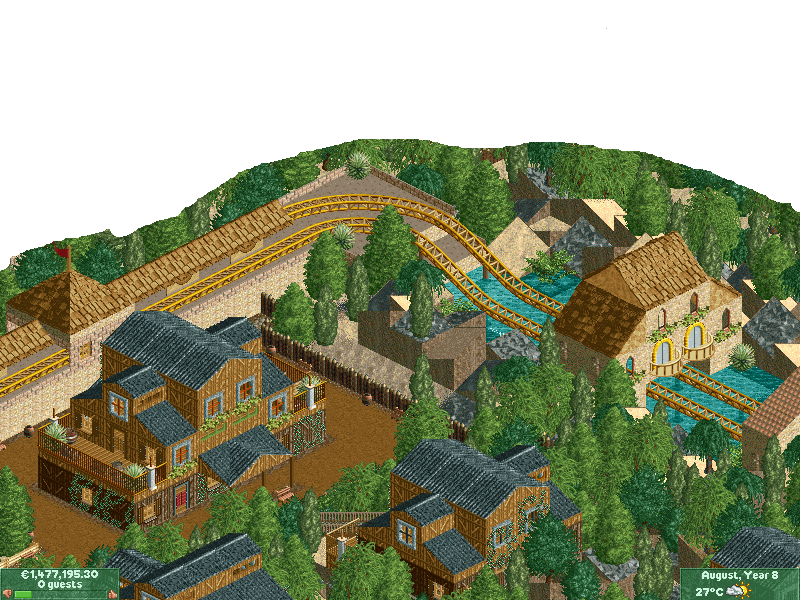
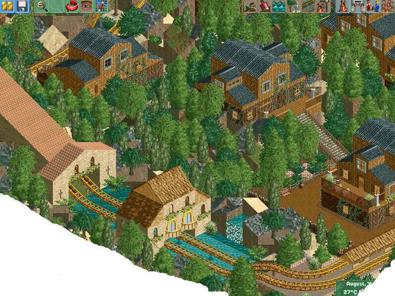
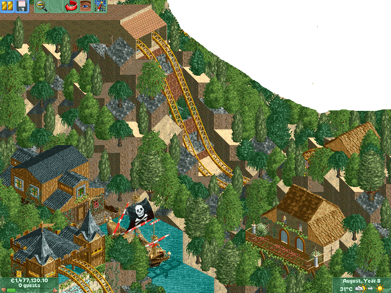
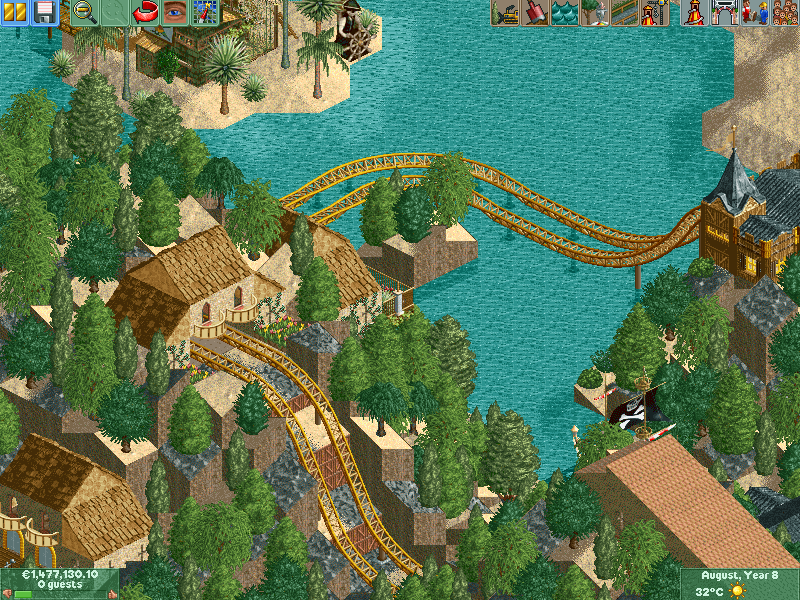
I hope you like it

-

 Panoramical
Offline
very good work, and i love your style of architecture. my only gripe with it is the vines coming off the buildings, they make it look "village", but the coaster looks good.
 -

 jon
Offline
For only your second park, its fantastic. The earlier screens you showed weren't the best but these screens are pretty good. The architecture and atmosphere are nice. Props to that. I like the vines but don't like your use of Toon's plants on those balconies. They don't seem to fit. Chnage that and you'll have one great park.
 -

 justdavy
Offline
First *** learn to read my post !do i have to keep saying this?
yes,it needs better landscaping
Do I have to keep on saying that the tree's are still UNDER CONSTRUCTION!
I don't like them either so stop bothering about the darn tree's
Just know that I did not had the time yet to change them!
And you're post is very useless some tips or better comment's would be better for starters!
But after seeying you're adittude I don't think I even want to recieve you're comments any more
Learn to read buddy.....learn to read
-

 justdavy
Offline
haha sorry my mistake
Guess now you can say to me learn to wright english buddy learn to wright english!
-

 justdavy
Offline
I've dropt down alot since my last update because I stopped building for a while.
To take a break and play more guitar and all those things
First I would like to say:
Any comments are welcome because It helps me alot in my learning progress!
But I will not change anything ...In stead of changing things I will use you're comments for the next time I will build another theme park
But enough explaining and talking !
Here are the screens
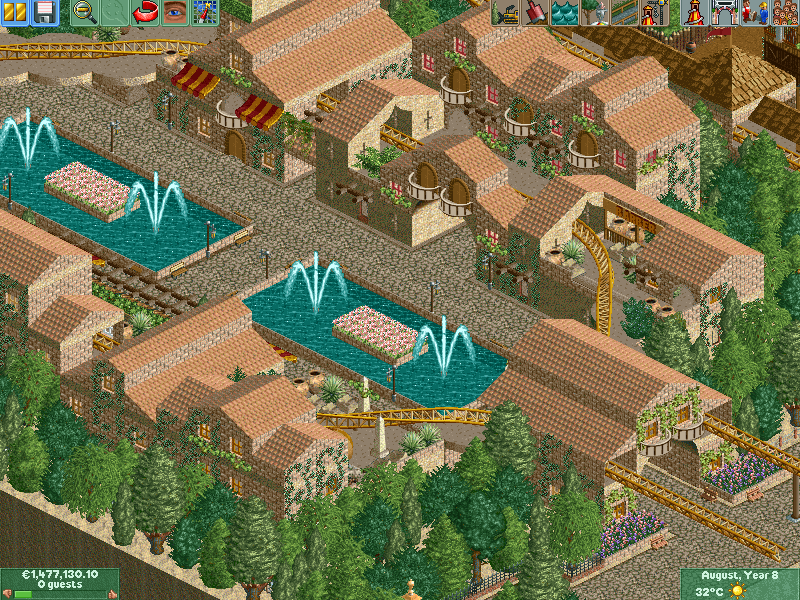
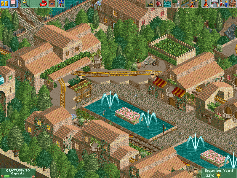
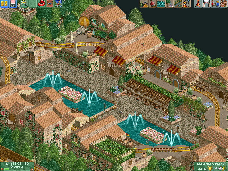
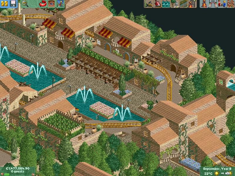
I really hope you like it because I know some of you are experts in comments (I really mean that) -

 Son Tested Shelter
Offline
Hmmmm....Well I'd like to see some more flowers, but thats my opinion...Also, don't uveruse trees or building types...I'm not gonna tell you what "overusing" is though...Also remember, don't make this for the folks who critique it, let it come from your own style. Don't be afraid to really think out of the box and do something different. I like what I see, it has atmosphere and is different from most other things I've seen lately...Also, what kind of guitar do you play? I have a Hamer electric and also a Taylor acoustic (plus some other cheap ones)...Peace-STS
 -

 justdavy
Offline
Thanks for you're comment
I know what you mean with overusing
And I'm always building in my style...lots of buildings but with the beauty of nature with it.
Nature is important in my eye's
I play a Yamaha paciffic It's an electric guitar which is bin costum made
Im not so very good...stil have to practise allot
But I loving it all the way!
#1 to play on the guitar is forever More then words from extreme
I love that song
-

 Son Tested Shelter
Offline
Cool man...yea I love putting nature, i.e. trees, flowers, hills, into my parks...I know everyone does, but I like making those elements be the real appeal. Its somewhat simplistic, but I still think its the most beautiful. Peace-STS
 -
 Disney Freak
Offline
Wow. I love your work! My only advice for is to make some more "interesting" shapes of buildings. Right now, most of your work is very symetrical! Keep up the good work!
 -

 justdavy
Offline
you're right I dident noticed that I was building some same style of roofs.
Tough I must say I use alot of different type's and ways in the roofs IMO
My idea was to build a coaster flying trough a main street and the mainstrait would be made of a mix of roman and egyptian theming. -
 Disney Freak
Offline
What I meant was, that buildings look alike at both sides. If you weren't responding to my comment just ignore me. I'm stupid!you're right I dident noticed that I was building some same style of roofs.
Tough I must say I use alot of different type's and ways in the roofs IMO
My idea was to build a coaster flying trough a main street and the mainstrait would be made of a mix of roman and egyptian theming. -

 rK_
Offline
your archy is excellent, your colors are a little dull and repetative. And for the plants on the buildings i would put in pots. The scenery interaction with your giga is amazing, it doesnt get hung up anywhere it just seems to flow without slowing down due to the scenery, very nice.
 -

 justdavy
Offline
I was responding to son...
What I meant was, that buildings look alike at both sides. If you weren't responding to my comment just ignore me. I'm stupid!you're right I dident noticed that I was building some same style of roofs.
Tough I must say I use alot of different type's and ways in the roofs IMOÂ
My idea was to build a coaster flying trough a main street and the mainstrait would be made of a mix of roman and egyptian theming.
But I forgot to say it so you're not stupid...I would have done the same thing as you did
But I also know what you ment I will try to look at it next time
 Tags
Tags
- No Tags

