(Archive) Advertising District / S.D.I. Presents: Ineuro
-
 25-January 04
-

 John
Offline
Well, obviously I'm not attempting at recreating Venice. Thanks for noticing.That looks nothing like the real venice.
Don't judge an entire area based on one piece of architecture.
You don't know what else I have planned to make it look more 'Venice-y'.
I'm glad people are liking Venice! Hopefully I will get to work on it again soon.
I guess not many people read entire posts anymore.
In the original post, we said that the other topic was disorganized.
So, we've opted for this more organized approach to advertising for club projects. -

 rctfreak2000
Offline
If it's called Venice, the architecture should at least fit. Otherwise, change the area's name...
 -

 jhoffa
Offline
first off, venice isn't a country.
and second. let me guess. in addition to spain and 'venice' here, you're having great britain, germany and france. -

 Jacko Shanty
Offline
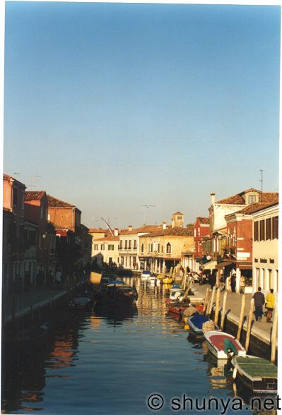
If you want to create more of a Venice atmosphere, then you need to delete all of the trees. Venice does not have one natural tree in the entire city. Although it does dwell on flowers, vines and potted plants.. here's a pic:
It looks really good though, regardless of whatever "theme" it's trying to be. Also, the Spain area looks splendid as well. -

 rctmanplaysrct
Offline
The one thing that picture doesn't have are the bridges that go across the moats every once in a while.
 -

 JBruckner
Offline
[font="Arial"]It's in the Italy area, smart one. I cannot disclose any information about the rest of the areas though.first off, venice isn't a country.
and second. let me guess. in addition to spain and 'venice' here, you're having great britain, germany and france. [/font]
-

 Raven-SDI
Offline
Hello.
Wow.
This project is turning out leaps and bounds better than I had ever imagined thus far.
As a rep, I would like to thank my fellow members and everybody who's commented on this amazing piece of art we are creating.
I also would like to that Glitch (or Aspirin) for getting back into the fold finally. It's good to have you back.
My section is going to be the hotness...
I will post a screen when I get the park.
I am plotting all of the layouts for arch and rides as I type this in my comp notebook.
PAoD
§Æ§ -

 JBruckner
Offline
[font="Arial"]You give it to ME then we post it, I run this shit, baby.Hello.
Wow.
This project is turning out leaps and bounds better than I had ever imagined thus far.
As a rep, I would like to thank my fellow members and everybody who's commented on this amazing piece of art we are creating.
I also would like to that Glitch (or Aspirin) for getting back into the fold finally. It's good to have you back.
My section is going to be the hotness...
I will post a screen when I get the park.
I am plotting all of the layouts for arch and rides as I type this in my comp notebook.
PAoD
§Æ§ [/font]
-

 AustinPowers
Offline
Looks to be a great park...
Logo: A bit too large....but nice, and easily resized I'm sure...
1st Screen: Looks great sloB! Your work just gets better and better...I love the colors, architecture, and coaster...be careful with that path though, it can get too repetitive looking...
2nd Screen: That woodie looks amazing...that arch completes the screen...
(Work on that Spain text...you can do better than that)
3rd Screen: I don't know if I like this that well...as said before, not like Venice....but if you plan on doing more that is like Venice then here's my suggestions (and thorpedo, I have been there ) Venice has no trees...at all...go with shrubbery and flowers....don't use many rocks or uneven land...keep going with those bridges from your screen, Venice has many....I also don't think that a rapid ride goes with the gondola idea....the canoe ride would fit better...
(the Venice text is perfect)
Can't wait to see more from you guys...
 Tags
Tags
- No Tags