(Archive) Advertising District / Phantasia Theme Park & Resort
-
 18-January 04
-
 Chesire
Offline
Yup, I like this park better than your other DL park. I just don't lik ehow the fountain on the cadtle is reallllly long. Maybe it can be shortened? If not, that is cool.
 -

 Six Frags
Offline
This defenitely makes me wanna go see any themepark!
I've always liked your realistic style, and the new screens look just awesome.
Only thing that bothers me are those curved glass things on the Discovery Bay entrance...
I've never liked them and never will, but that's just my opinion...
Anywayz, looking forward to more!
SF -

 tyandor
Offline
Something same with me: I don't like most custom-made flowers....This defenitely makes me wanna go see any themepark!
I've always liked your realistic style, and the new screens look just awesome.
Only thing that bothers me are those curved glass things on the Discovery Bay entrance...
I've never liked them and never will, but that's just my opinion...
Anywayz, looking forward to more!
SF -

Richie Offline
I cant wait until you show us a peek of your space mountain dome, asuming you are building a space mountain Your last one looked amazing!
-

 Toon
Offline
The screens are great! You truly are the Disney master. I haven't commented yet so going back through the screens, I particularly like the look of the overview and escpecially the mountain you built (it has a look unlike anyother I've seen in rct!) Everything here is looking great tho. There are always a few custom scenery choices in your work the I'm unsure about, but somehow the overall quality of you work hides the flaws in some of the scenery you use. I'm quite convinced you are the only one who could use a lot of this stuff and somehow make it look good.
 -

 tyandor
Offline
Maybe make a next-gen Space Mountain? (launched SLC maybeI cant wait until you show us a peek of your space mountain dome, asuming you are building a space mountain
 Your last one looked amazing!
 )
)
-

 Meretrix
Offline
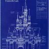
As I think I said earlier in this thread, there will be NONE of the traditional mountains in this park, rather three ENTIRELY NEW ones, based on Disney things that no one has thought to do yet (and because these are experiments, there may be a reason that no one has done them yet). Each of these new Mountains are based on Disney films, all of them classics, not all of them are animated films however. I will not release any pics of these attractions until the park is released. I will hopefully be posting one more shot in the archive tonight, as I am leaving tomorrow for NY. I'd like to get Phantom Manor (complete with the French soundtrack) into the Webshots album tonight. I just need to put the finishing touches on it.
 -
 Highball
Offline
I like everything but the roof. It doesn't look very Phantom Manor-ish. I guess b/c it is so small. Great work on the rest.
 -

 Tech Artist
Offline
Ya i'm going with Mad Dawg on this one and it being so small makes it look kinda bulky.
Also, at the top on the right side where you have all those small red castle windows, i think you should vary those up cause they look dull like that. Good work for a small manor but if possible make it bigger. -

 Meretrix
Offline
It is as large in terms of scale as the actual Phantom Manor at DLP. Trust me, I've been on that damn ride about 100 times. Oh well, can't please everyone. For now, adieu, I'm off to New York. See you in a few weeks.
 -

 Geoff
Offline
omg...
I see nothing wrong with phantom manor. IT KICKS ASS!
niiiiiiiiiiiiiiiiiiiiiiiiiiiiiiiiiiiiiiiiiiiiiiccccccccccccceeeee
-

 Jacko Shanty
Offline
The Phantom Manor is one of the most realistic pieces of architecture I've ever seen! You really make those vines fit, which can be hard. I agreee with the other two that the roof is kinda strange.. but It's better than just a typical pyramid shaped roof.. so overall it's looking VERY good.
-

 gymkid dude
Offline
im conflicted.
On one hand, I see a peice of architecture that a lot of time, effort, creativity, detail, and obviously skill were put into.
On the other hand, I just dont think that looks like RCT. -

 Meretrix
Offline
greetings from NY (it's F#ing COLD here!!!!)
Yes, Gym, it doesn't look like RCT. That's the POINT!!!! I am SOOOOOOOOOOO bored with the "RCT Style". Any chance I get to go against that, I'm there..... And it would be an insult to TT, Fisherman, Makonix, et. all, to NOT take their marvelous contributions and use them in new and different ways.
Not all will agree with me...that's OK. I no longer play this game for other people's reactions. I am just continuously amazed at what weird shit comes to me, and thanks to the above mentioned individuals, as well as others, I can finally "model" a theme park that I want to look at, and not have to "imagine" that those side friction coaster track pieces are actually awnings.
OK, let the flaming commence. -

 Meretrix
Offline
Probably MC. Probably. Anyway, I've got a game to sell. I can't concern myself with that now.
Cheers, and I'll talk to y'all ('specially if yer from tha South ) when I get back to SUNNY SAN FRANCISCO!!!! Yes,,,,,it was 65 and FLAWLESS when I left today!!!!!!!!!!!
 Tags
Tags
- No Tags
