(Archive) Advertising District / Phantasia Theme Park & Resort
-
 18-January 04
-

 Zephyr
Offline
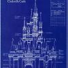
The castle is simply incredible...
The only suggestion I have is to experiment with the waterfall, maybe try moving it so it's in the middle of a wall. It looks a little awkward flowing down the corner of the castle. -

 Meretrix
Offline
Thanks for all the replies. For some reason yesterday I was unable to view NE. I thought that maybe the NE server was down...weird.
Anyway, as for the castle, it is not based on any other Disney castle. It is called Phantasia castle. The waterfall is the result of Mickey the sorcerer flooding that section of the castle. It's a concept that's still being played with. -
 Disney Freak
Offline
I must say you are very creative! Good luck! I hope the whole park turns out to be so amazing!Thanks for all the replies. For some reason yesterday I was unable to view NE. I thought that maybe the NE server was down...weird.
Anyway, as for the castle, it is not based on any other Disney castle. It is called Phantasia castle. The waterfall is the result of Mickey the sorcerer flooding that section of the castle. I't a concept that's still be played with. -

 Meretrix
Offline
In about 30 minutes, Webshots will have a tiny little update to Phantasia. Since I won't be here Sunday, I'll give you this week's update now. Three little shots of facades to some shops and attractions in Dark Majesty Kingdom (which is really Fantasyland , only darker and more menacing). Enjoy the shots, I know it's not a lot of info.....but.....as Hannibal Lecter would say.....
.....all good things to those who wait..... -

 Turtle
Offline
I think the only way to make that corner waterfall look better would be to delete that one square, and have the waterfalls running down the inside edges, if you understand what i mean. Might look a bit better.
Other than that, my hat goes off to you sir. Wonderful work. -

 mantis
Offline
Villains Gift Shop looks scary, which I guess is the idea. I really like the turquoise windows, and the ivy growing along the gables (if thats what they are).
I'm not sure about the grey brick wall you're using on the Snow White tower, but that's just a minor thing. The actual structure is great.
I'm not sure how 'breathtaking' that cat/mouse ride would be, but as far as buildings go that one's great. Those walls look a little better here, but there's something about them that just throw me off a bit...nice turrets, though! -

 Tech Artist
Offline
Wow the castle is incrediable and also very creative to have the castle be the one from Fanatasia. I like the waterfall because it adds to to the castle and it's story.
Villans Gift Shop: It lives up to it's name and looks wonderful.
Snow White: Hmmmm i like it but i think it should look more castly with a little bit of a cottage theme mixed in. Nice work though.
Lucifers Mouse Hunt: I like it! Nice idea and nice work.
I can't wait to download this.
Will you be sending it in for spotlight? cause i am sure it could win. -

 Steve
Offline
the buildings have are very nice and structured, and you have some great details as well. and i know the pirate rooves look scary, but do you always have to use them? just my 2 cents....
but hey, its till fantastic...
that has to be the most retarded question ive ever heard...Will you be sending it in for spotlight?

-

 Geoff
Offline
all your work is so amazing... This is probably my favorite update just because you've put a ton of personality into what's coming
Keep up the outstanding work. -

 Highball
Offline
Damnit, Meretrix. The Shadowlands in my park was supposed to be a dark version of Fantasyland, but now you've gone and done it, so I have to think of something else.
I really like the name "Dark Majesty Kingdom". It has a nice evil ring to it. The facades all look excellent, especially Lucifer's Mouse Hunt. Very nice and original idea. My only problem is the villain store. The structure is menacing, yes, but it needs to be more intimidating (in height, I mean).
Great work. (Like it would suck. )
)
-

 Meretrix
Offline
Again, the update comes early.....and this will be the last for three weeks as I will be in New York attending Toy Fair. Not much news to report, things are humming along nicely...Oh yes,.........
There are Screens in This Update
(allow 30 minutes for Webshots to update the archive)
Enjoy!!! -

 Jellybones
Offline
That entry archway into Discovery Bay is fantastic. Very nice way to set the theme.
 -

 Highball
Offline
Wow. Wow wow wow. That is pure perfection right there. The Adventure Isle entrance is great and so are the designs on Belles-Bistro. It makes me want to eat there. Lucifer's Mouse Hunt is an eye catcher too.
Discovery Bay is an area I want to see. Is the name referring to the old designs for Discovery Bay for Disneyland in CA? -

 Tech Artist
Offline
Wow again you wow me. Couple of things though,
On Belles-Bistro i think there is a little to many windows, and the ones above the 2 canvass i think should go. Nice work though.
The Discovery Bay entrance looks a tad bland but the small size of the screen could be throwing me off so i'll wait to see it in full to judge it.
Other than those 2 things this park is amazing.
This park i am very much looking forward to.
EDIT: Adventure Isle and Lucifer's Mouse Hunt is looking good. -

Corkscrewed Offline
Sonofa... Discovery Bay looks like it's going to be astounding.
Geez!
And you have the Dark Fantasyland thing down to a T. That'll come in handy. -

 gymkid dude
Offline
every once in a while i see a screen so good it makes me say "wow." or perhaps "yowza". That castle is one of them.
 -
 Disney Freak
Offline
WoW!!! You keep wowing me over and over!!! It's the same excelent work I expect from you!!! (and I have very high expectations!)
 -

 mantis
Offline
I've never liked the awnings you've used for Belle's Bistro - I just think they look like they don't belong in RCT. I think it's the angle.
Those spires on the Discovery Bay entrance are awesome, however. The colour scheme's been done before, but by you, so I guess that's ok
From what I can make out of the Adventure Island entrance, it looks mysterious (had to turn my monitor brightness up to see it all )
)
Great park, here.
 Tags
Tags
- No Tags
