(Archive) Advertising District / Disneyland Wisconsin
-
 07-November 03
-
 SkaterFreakboi
Offline
I guess I could always tone it down a shade...wont take THAT long
SkaterFreakboi
Offline
I guess I could always tone it down a shade...wont take THAT long
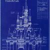
Yes its going to be taller and the arches will be added onto and wont stay like that... -
CoasterkidMWM
Offline
Basically what ^ said, and also, kill the WW fountains, they look like roadkill.
-
 Tech Artist
Offline
Roadkill fountains
Tech Artist
Offline
Roadkill fountains
I like it sept for that weird arched side. I'll wait till it is finished to comment more.
Direct all your comments on the Castle to SkaterFreakboi(Mike) seeing as it is his Castle.
Oh i am gonna start my Autopia in Tomarrowland soon, so look out for that to be coming. -
 John
Offline
That's your castle?
John
Offline
That's your castle?
There's nothing to it. At all. I don't mind the pink and blue, because that's as close as you can get to what a Sleeping Beauty castle would be like in real life, and when I made a version of my castle, I used those colors, with others added in of course. But, there's nothing to break it up. No accent colors. It's all pink, blue, and gray. It looks really bad because of the shapes, and how it doesn't culminate in one towering spire, like the others do. It's just pretty much a "blah" type of feeling I gather from it. -
 Highball
Offline
Oh, I'm sorry. I didn't know I wasn't allowed to correct someone's spelling of my own name.
Highball
Offline
Oh, I'm sorry. I didn't know I wasn't allowed to correct someone's spelling of my own name.
As for the castle, I agree 100% with John, especially about the single towering spire. I also think the castle is too narrow. I would raise the land where the water is (it's constricting the castle right now) and expand out there by widening the base both ways. This would allow you to have the castle slowly rise to the tower. You could then put the moat back.
Personally, I would have waited and showed a finished screen. -
 Meretrix
Offline
It's so funny that everyone seems to be responding negatively to the colors of the castle (well, at least one person did). They are exactly the same as the colors I used on the castle in DTA. Weird huh?
Meretrix
Offline
It's so funny that everyone seems to be responding negatively to the colors of the castle (well, at least one person did). They are exactly the same as the colors I used on the castle in DTA. Weird huh?
I don't like that castle at all. It's entirely too smooshed together. Loosen it up a bit. Make it more "flowing". Right now it looks constipated.
I do like the windows. Are they some new custom scenery that has hit the "scene"? I'm so out of it after only being gone for a week or two, it seems like both yours and Aero's parks are loaded with a bunch of custom stuff that I have never seen before. Anyway...
Fix your damn castle, and finish your damn park. That's all. -
 yyo
Offline
Shit, this topic is way longer than I thought it was, I was commenting something on the first page. Anyway, keep the fountains on the castle, they aren't great but it does look good with the colors. Not much i can comment on untill you post more screens
yyo
Offline
Shit, this topic is way longer than I thought it was, I was commenting something on the first page. Anyway, keep the fountains on the castle, they aren't great but it does look good with the colors. Not much i can comment on untill you post more screens
-
John
Offline
I just don't like the shape of it. It's lopsided. And like Meretrix said, it's constipated looking.
All the shit is coming out the left side of it... also, for the record, the other pink looked better.

-
SkaterFreakboi
Offline
^ Oh well...im not changing it again. Also note its closely based on the castle at Disneyland which is also very small, close togeather and constipated looking.
-
Outlaw
Offline
With an attitude like that you'll end up with a shitty looking castle.^ Oh well...im not changing it again. Also note its closely based on the castle at Disneyland which is also very small, close togeather and constipated looking.
-
SkaterFreakboi
Offline
No attitude at all. I just dont feel like changeing it again.With an attitude like that you'll end up with a shitty looking castle.
-
Meretrix
Offline
The second castle with the first castle color scheme should suffice just fine. I see more of the Disneyland Castle evidenced in the second pic. Ultimately, as long as you're happy with it, that's all that matters. The center castle is always tough, no matter which castle you use as inspiration, or how many times you re-do it. Just crank it out and move on. You can always tweak it later.
-
 Jellybones
Offline
Jellybones
Offline
Then it's never going to get better.No attitude at all. I just dont feel like changeing it again.
-
California Coasters
Offline
First of all Mike has joined... huzzah, let's celebrate... Hehehe... heh........... heh. Okay...
I like the color of the castle, keep it. Nothing much to say because the screen is so incomplete, looks good, or if you want tme to speak ACN, "OMG beSt Thing EvAaaArR!1111!!!!!"
Chris you probably understand...
-
 mantis
Offline
mantis
Offline
lmao that's hilarious.^ Oh well...im not changing it again. Also note its closely based on the castle at Disneyland which is also very small, close togeather and constipated looking.
I think it looks fine, to be honest. I don't buy this whole realism lark though.


Tags
- No Tags