(Archive) Advertising District / Walt Disney's Disneyland Utopia
-
 27-October 03
-

 Tech Artist
Offline
No, only funny stuff.
DO you laugh at EVERYTHING???The skull head to? Huh i thought they were WW objects.
Anyways... Nice parks so far. Looks Aero and Disney all the way.
No suggustions at the moment.::sucks teeth::
Maaaan.. sheeeeit!


 LMAO!
LMAO! -

 California Coasters
Offline
OmG RoTfLmAo!!!!!111!!!!11


This has been a stupid rctfan ripoff, hope you enjoyed it.... (NO offense to anyone, lol) -

 aero21
Offline
Well, another update is here (which I debated doing), but i have some new stuff to show. The park has been succesfully moved from the scenario editor to my saved game folder and ride pieces are beginning to show up here and there. The park is still about 20 percent completed, but i am still hopefull for a February release. Adventureland is still the area recieveing the most attention at the moment, with Fantasyland getting little bits here and there. I hope to start construction on Tommorland soon, but i have to finalize a few design parts first. Expect Star Tours to make a big statement as I feel it is underapreciated at the real Disney parks. Anyways on with the pics, I have three for you:
Here is a picture of the steam boat in frontierland, you will notice the paddle wheel has been attached:
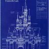
Here is a picture of the castle still under construction:
and finally, here is a shot of the double carousel in the agrabbaugh part of Adventureland:
ENJOY! -

 Meretrix
Offline
Groovy update.
Screen 1: LOVE the boat!!!! and the bridge to the right of the boat. Not sure about the white and lt. brown balcony piece on the bldg. in front of the boat.
Screen 2: 2 words; CASTLE TALLER!!!!!!!!!
Screen 3: PHANTASTIC!!!!!!! -

 Highball
Offline
I agree with Meretrix. I like how you pulled off the Double Carousel in an enclosed building. Was it inspired by the Carousel Caravan in the Arabian Coast at Tokyo DisneySea?
Scott -

 guljam
Offline
This park Better than'LEGO' Blacks...
RCT2 game is realistic better than lego
Surprise park.. -

 mantis
Offline
I saw the first two screens and thought 'hey that boat's cool...not so sure about the castle', and then I saw the last one and thought 'damn, if the whole park's like that then wow!'
Great work! -

 Janus
Offline
Wow. Very very detailed (beware of the sprite limit...), I love all the different path types, like that drawbridge in the 2nd screen. The 3d screen is close to Disney perfection in my eyes. The boat looks great and so does the castle, that could be a bit taller though.
 -

 \/\/33/\/\an
Offline
Lol!Very very detailed (beware of the sprite limit...)

I wouldnt say detailed, but fuckin awesome! The arabian structure and the 1st screen with its boat are both amazing. Castle would be nice without the ugly gray roofing. Try a different roof type? -

 Janus
Offline
What I meant with detail is not only the amount of scenery pieces used, but the attention to detail. Like that drawbridge, or the brilliant use of Fisherman's victorian arches...
 -

 Tech Artist
Offline
Screen 1: AWSOME.
Screen 2: It's good but make the castle taller and put a tad bit more work into it. Good castle though.
Screen 3: I wub that building and it's double carousel. Perfecto.
-

 aero21
Offline
Castle would be nice without the ugly gray roofing. Try a different roof type?
I have been looking into that. As far as the height of the castle, I am useing the Disneyland template. It's meant to look tall from main street but not be over intrusive to the rest of the park. I suspect many of you asking that it be taller are more familiar with the WDW version or even the Paris one. If you ever get a chance to stand right next to the Disneyland one, you will be very surprised at how short it is.
The double carousel is inspired by the one at DisneySEa, i just love the atmosphere of that area so i just had to put a version in my park. Most of the attractions have that kind of detail in them, earlier in the update i posted a picture of the Haunted Mansion where you can see more of the small details that are makeing thier way into this park. -

 John
Offline
Indeed. It leaves the impression like "that's it".If you ever get a chance to stand right next to the Disneyland one, you will be very surprised at how short it is.

This park is shaping up very nicely. I love the boat, it is so, "cute" looking, just what you'd expect from Disney. I'm not sure of the castle, but I've always been a fan of the Sleeping Beauty ones myself, so that isn't your fault. The Adventureland picture looks fantastic. Perhaps some more windows and archs to pull it all together?
-

 Jacko Shanty
Offline
I like your castle the best. It's very original... and realistic. Though maybe TOO medieval and not big enough. I know castles are supposed to be medieval, but the look is a bit depressing.. and Disney takes away that effect. So I dunno.. try to make it look medieval.. but more magical and less scary/depressing. I REALLY like the detail though.
Other screens are perfect.. so I'm not going to comment on them.
-

 gymkid dude
Offline
I absolutely love that steamboat. Amazing.
The castle looks sloppy, disjointed, and messy. I honestly don't like it. You've mucked it up with unRCTish custom scenery like that one marbly pyramid steeple blue thing, and it just mnakes it look n00bery.
The 3rd screen is back to your amazing leetness. -

 gir
Offline
The double carousel is simply amazing! It doesn't get much better than that.The double carousel is inspired by the one at DisneySEa, i just love the atmosphere of that area so i just had to put a version in my park.
 Tags
Tags
- No Tags
