Head-2-Head-X / H2HX: Playoffs - 3rd Place - Dambusters vs Lonely Hearts Club
-
 18-August 24
-

 Xtreme97
Offline
Who will make it to the podium? The penultimate match of the contest makes both teams climb mountains despite the late stage of the event.

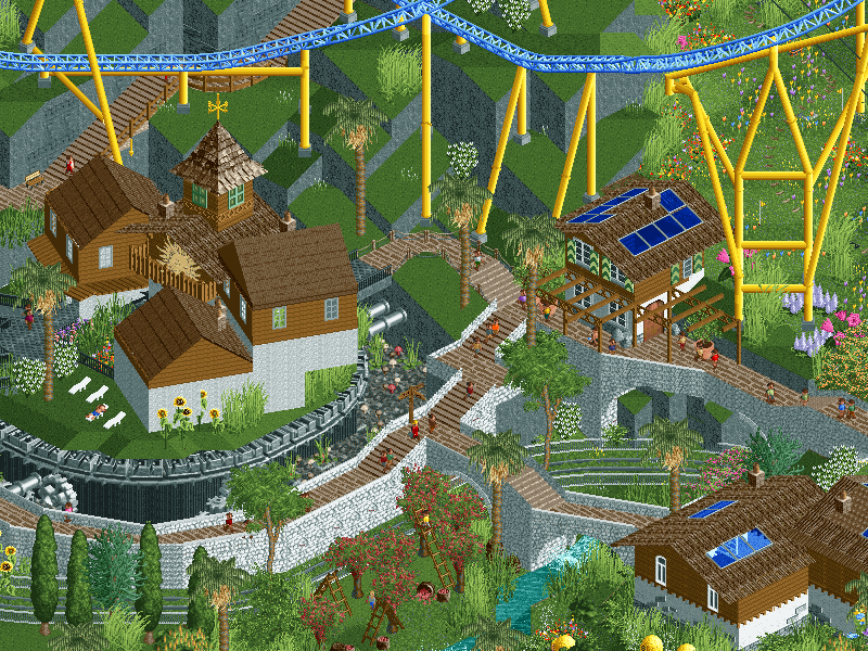 Sonnental
The future is bright.
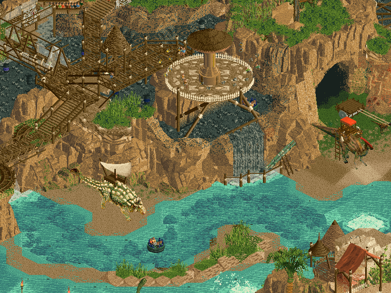 The Land Before The Land Before Time
Once upon a time there was a land before time. This... is the land before that one.
-
Voting rules
- The poll will stay open for ~72hrs.
- Do not vote unless you have viewed both parks in-game.
- Everyone may vote except members of either team. Any illegitimate votes will be ignored or removed.
- Anyone with an account that predates the start of H2HX, or who has been drafted onto a team, may vote in this match. Anyone with a newer account must pass the admins' account integrity checks.
- Voting is monitored by the admins to improve fairness.
-

 CoasterCreator9
Offline
Two really nice parks for very different reasons. I love the Dambuster park on a personal level, but the LHC park is undeniably impressive and very skilled.
-

 Lurker
Offline
Sonnental:
I really like the aesthetic of this, the blend of natural and modern materials. The main town especially, great interaction moments too with the coaster and the colors on the station are great. Love the foliage in the valleys, vibrant flowers and some nice use of the swaying foliage objects. Also some nice clean supports for the coaster.
The Land Before The Land Before Time:
I like the theme, and the landscaping is excellent. Lively, colorful, great height changes, really impressive stuff. And the ride design is great, Expedition Extinction's impressive layout, Switch-O-Saurus's creative support work and the way Apex weaves around the falls, all so good. Also, the sound design, nice touches that make the park even more lively along with everything above. -

 Liampie
Offline
A quick reaction to LHC: beautiful map, beautiful colours. I love the painted rocks, such a clever and original way to insert colour into this. Cool map shape (I like the caves too). Cool coaster(s). Some anachronisms I thought were out of place, such as the classical petra-esque facade, and the cart with wheels being pulled by a dinosaur. Ironic because coasters have wheels, but still. I also wish you didn't use scenery manager to create the waterfalls and such, because in my version of open animated objects tend to break when copy+pasting them. I can shoot holes in this for unpolished bits or glitches, but I think we can agree that most teams are running fumes and there has been speed buildings involved on all teams, including yours. In the light of this, it's not worth mentioning. Good job LHC.
-

 alex
Offline
Great work LHC, I like that you went with a classic RCT theme but made it feel fresh with a modern execution. Both the coasters are up there with the best we've seen in the contest imo - I really like the parallel drops and stacked turnarounds on the woodie, and the diver is short and simple but super flowy. If you guys were on a time crunch you wouldn't know it, especially with how elaborate and well crafted the landscaping is.
-

 Hex
Offline
Great work to the Dambusters for, probably one of my top layouts of the contest? Between this layout and the invert in Buxom, you guys built some of the best coasters this season.
The Solar panel on the coaster caught me off guard; I actually giggled when I first saw it like, "WHAT?!" But it really fits the theme. Like I said, this layout is SUPER excellent. So many twists, turns, and crossovers without feeling repetitive; it utilizes so much of the space in the map like a design should. Additionally, the pacing is chef's kiss. That thang hauls the whole way through!
Great colors too - this map has such a clean, atmospheric presence that we haven't seen too much of this contest (other than Bene?). I also dig the "alpine-meets-new-age-solar" aesthetic.
My only (slight) gripe of the map is the execution of the landscaping. Don't get me wrong, I love the smoothness it possesses, as well as the overall height. I just wish there was a bit more detail and some change in shapes in some bits, but I can look past it for both the way the rest of your map utilizes the height differences, and the possibility of time constraints.
TL/DR; Great coaster, unique, clean theme, love the height changes.
Great work again, Dambusters!
-

 wheres_walto
Offline
Sonnental -
I really liked this. I'm struggling to remember the name but it reminds me of fantasy concept art I've seen (windpunk maybe?) The windmills and swaying foliage, plus solar panels, livestock, and fruit trees give off the "sustainable" vibe I think you're going for. It's really nice and the concept comes through. The landscaping is refreshing, blocky but satisfying. I like the architecture, it's reminiscent to me of a Swiss mountain village and the blue glass reinforces the solar panel motif. All in all, a very nice digestible submission that should easily win design if it wants to
Land Before Time -
This too I thought was great. Right away the bubbling tar pits stand out, love the geysers shooting (I've never thought to do that). Lovely rockwork, the caves throughout are great even if there isn't much to explore inside them. Love love love the wood and rope material use, you've captured that look perfectly with varied object usage. I have every intention of borrowing that style for future work. Cave drawings and general style are very cool and fresh throughout. The more I look, the more impressed I am with the overall construction, the vibe, the landscaping, and the life that this holds with the working dino scenes. Great job y'all, this is a well-earned capstone for your season
-

 SSSammy
Offline
sonnental - I absolutely love this map. Such a stylistic and distinct way to end a season of stylistic and distinct parks. the vibes are powerful and i am enamoured
-

 GammaZero
Offline
Episode 3(rd place): gamma just chills and looks at parks
The final stage of the contest is well and truly underway. Exciting times! And I'm really glad to see that, even in the third place decider match, H2HX is still as competitive as ever, with two great parks for us to enjoy. Let's get to reviewing them:
Sonnental
First off, I need to mention that I'm not super familiar with the classic RCT style this park was inspired by, but I can definitely feel how refreshing and unique it is, while still maintaining a clearly high level of parkmaking skill.
The concept is very strong, and brought together well via all the small but clever details (the solar-powered coaster train is genius), as well as the obvious setpieces. The landscaping, arguably being the central feature of the map, feels like the definitive edition of the "jagged slopes" style of the LL and Vanilla days. It's perfectly complemented by the coaster, which is one of the best to use the large corner pieces that I can remember in recent times.
Next up, the foliage and architecture. For both, the mix of old-school style and modern object palette (and sensibilities) leads to truly beautiful scenes. Certainly one of the most distinctly aesthetically pleasing themes I've seen in this contest, and one I'll likely remember (and be inspired by) in the years to come.
Overall, such a nice way to cap out the Dambusters' season. Amazing work!
TL;DR: striking, aesthetic, inspired.
The Land Before The Land Before Time
And now, for something completely different. This is a park that has to be praised on its pure technical execution, along with an incredibly strong theme.
Let's get something out of the way first: best landscaping of the contest, hands down. This is just insane. And, for a park whose main feature is the landscape, very warranted too. In comparison, the foliage is relatively simple, but appropriate, so no complaints from me there.
The other highlight of this park is the strength of the rides. All three coasters (and the river rapids) have amazing layouts, but the true boss here has to be Expedition Extinction. Such a clean layout and footprint, and that triple splashdown is just badass. Best wooden coaster of the contest?
Finally, I want to talk about the theme. Jurassic/Prehistoric is usually not one of my favorites, but it's just so well executed here that I can't help but love it. Although static, the dinosaur objects fit here like a glove, and really bring that final wow factor that this map needed. Also, the map shape itself is a really nice touch.
Outstanding job, Hearts! Had your season gone slightly differently, I'd be scared out of my mind going up against a park like this in the Grand Final. Excellent park, and excellent season overall.
TL;DR: landscaping, rides, holy shit.
And, with this, I only have one more review to go before it's all over. Crazy, huh? This has been an awesome season of H2H so far.
-

 Jene
Offline
Sonnentall
Fun idea to make a solar-powered coaster and a great layout. I love the big swooping dramatic elements. A lot of beautiful colourful foliage. The rockwork isn’t doing it for me though. The archy reminds me a lot of Riverlands season 9 hotel. I’m always happy to be reminded of Fisch’s masterwork, but it does feel a little old-skool for a H2HX park.
Land b4 time
Another fun park. Packed with coasters and attractions. Expedition Extinction, Apex and Switch-a-saurus have great layouts. I like the wooden supports tied together with rope. Also a really fun moment when the rapid gets shot up by the geyser. I really like the way the sides of the park are done. Rockwork is very tasteful, but it does contrast with some of the area’s on the map that look a little crude or rushed. Big fan of the use of the ice-track curves!
Conclusion:
I liked both parks equally in design, one park just had a lot more content in terms of attractions, so I went with the Lonely Hearts Club
-

 chorkiel
Offline
Obviously both parks are really good. Sonnentall is a great vibe and a nice concept which I would love to see more of. LB4T was a great classic H2H park filled with fun rides and other details.
So difficult vote. Most RCT is a form of escapism to me. It's one of the reasons why I like it. This pretty much made me choose between escaping to different times. Either to a serene and calming future with no worries - and a roller coaster. Or a past with dinosaurs and roller coasters. Hopefully we'll experience the future created in Sonnentall instead of falling back to LB4T. Then LB4T will still be escapism.
-

 Turtle
Offline
it's no easy feat to keep going after elimination from a contest, and this should be praised all day long. two more awesome parks for us to experience, thanks to all involved.
Sonnentall
this theme feels new and classic all at the same time. lovely vibe, with some really classy restraint shown throughout. reminds me of slob in the best way, along with the coaster colors.
while we're there, goddamn. what a coaster! the layout is long, flowing, imposing, and interesting, and the speed throughout is magnificent. the landscape really supports the layout by making it feel overall like it's all at the same height, but the landscape height change masks how much higher the first half is than the second. result being, incredible pace. and the solar panel at the back is so clever. and looks great. i love it.
there's a really interesting foliage mix throughout the park too. it feels like a theming exercise honestly. like, can we make these unorthodox objects and colors look good together. and yes, you can. this is the work of a proper designer. just goes to show really, and the end result feels fresh. a great job also with landscaping - comes off as feeling intentionally blocky and turns a potential negative into a positive.
there are tons of other things dotted around the map to develop the theme - the windmills, the kites, the foliage swaying in the wind, solar panels... they all come together to create a lovely atmosphere. lovely swiss style architecture, and overall vibes. if "understated classiness" was a park.
Land Before the Land Before Time
upon first glance, i had both of these parks at a roughly similar level. and i do still really like sonnentall. but the more time i spent in this park, the more i found myself wanting to really dig deeper. and everything i found, i loved. there is a deceptively large amount of really great stuff - it's incorporated in such a clever way into the map that it isn't immediately apparent.
i really don't know where to start, there is so much that i just loved. the dino theme is one that we haven't really seen done well, at least not for a while. this is definitely a new approach that i haven't seen before. GREAT landscaping. the gradient from rock to grass is masterful. it looks so natural that you don't notice the objects involved, which is the mark of truly great landscaping/foliage.
the ropes on the wooden beams is something that i'm amazed hasn't been done before. it's going to be copied a TON. the mine train supports for the woodie, amazing. in fact, let's chat about this woodie for a second. it's pretty much definitely my favorite coaster of the whole contest. it's so unapologetically ridiculous. quad water drop is just silly. love it. the vert looks simple but i couldn't stop looking at it. the supports, the rope lift, the layout is so flowy... damn.
the rapids, again simple upon first glance, but then you get into it... the dark underwater tracks are a GREAT idea that works perfectly. the geyser is brilliant. the geyser lift, even more brilliant. the tar pits section, great idea. this brings me onto another really understated but brilliant part - the switch-o-saurus. i watched this for ages. just feels like such a fun ride, and the colors are just great. high quality stuff all over.
my takeaway from this park was that it would probably have given any park a run for its money in a final. there are so many fun ideas and they're all integrated so well into the overall theme. oh, and the map is a giant dinosaur footprint. no notes.
-

 Ge-Ride
Offline
Sonnental is a fun, relaxing park to explore. The coaster is nice and well supported. Some of the best supports I've seen since G Force's Loop and Corkscrew coaster in Southwinds. The kites are nice to look at, as is the tower. The architecture isn't phenomenal but it's very pleasant nonetheless. There's some well incorporated diagonal structures though the park itself isn't heavy on them.
TLBTLBT is really fun. I'm going to say something that will put me in the minority. Switch-O-Saurus was my favorite of the coasters. Expedition Extinction was nice but this was pretty clever in combing turnarounds with multiple trains without them colliding. EE I admit would be more fun to ride in real life though. And the landscaping is a well combined use of different blocks and the blurring on the edges of the map. And there's lots of little rides and details from the Brontosaurus Bumpers and Discovery of Fire to the fighting dinosaurs. I like this park a lot even after more than one view.
So, both good works but I prefer TLBTLBT overall because it has more content and a well executed, somewhat out of the ordinary take on a prehistoric theme.
-

 Gustav Goblin
Offline
Sonnental:
+ This is a harder vote for me than it seems to be for many others. This in my mind is an absolutely quintessential textbook design that elevates classic principles to a modern level. Simple yet effective theme that gets iterated and explored all around the map, forming a world around an incredible coaster. I'll elaborate more soon, but this is just so smart. This is the kind of design I want to make.
+ Absolutely love the core idea of clean energy and how many different ways it appears around the map. The solar panels, windmills, and kites all give the map a great identity, and they even carry into the architecture, landscaping, and ride design. Simply brilliant. I love this so much.
+ Hell of a hyper! The lack of a chain lift and the solar panel on the back implying the train is solar powered is such a fun idea and really pushes the concept farther. It's a solar coaster! The interactions with the town are just mint too.
+ Love the architecture motifs. Traditional brown and white Swiss houses felt a little odd in such a summery setting, but they quickly grew on me. Love the blue glass/solar panels mixed in, especially the red to yellow gradient on the glass frames on Solaris's station. The domed building and the row with the windmills and blue glass awnings are highlights to me. I could imagine myself under any of these trellises.
+ Great landscaping all around! The classic landscaping with the black edges works surprisingly well, and I imagine it's a refreshing break from getting isometrized by Fisch rocks. The solar panels give it some much-needed curviness. CHE's swaying foliage works so well in this map too, and I'm equally impressed by how effective the untouched grass is. This really reminds me of places I've been myself, albeit I have never left the United States.
+ This gives Patagon a run for best bike path in RCT. The almost entirely vanilla landscaping using the unused wildflowers texture works perfectly. You don't need much more than that! The swaying grass with yellow tips is a perfect compliment to the multicolored flowers. Using half-invisible wild mouse track for bike treads is also a really smart idea. All framed beautifully by Solaris's first turnaround.
+ The spinning house on the giant cogwheel is such a cool yet impractical idea. You can even make the cogwheel spin, although it crashes right after.
- Music! I'm missing it! Considering the classic vibe of this map, you could have even thrown on Summer style and called it a day. I turned it on and it instantly turned the sunny, optimistic vibes up to 11. I know custom music is the vibe nowadays, but Allister Brimble's iconic tunes still have merit 25 years later!
= Let's address the elephant in the room. Blue and yellow giga named Solaris surrounded by mostly brown architecture? Is this a sloB reference?
The Land Before The Land Before Time:
+ Striking first impression with the dinosaur foot-shaped map. Such an iconic macro overview and gives some great opportunities for some cool coaster shapes and a big main section in the middle.
+ Obvious plus here is the landscaping. So dramatic with the gradient rockwork, towering monoliths, and the impressive caves in the map edge. The cave art does so much to add some vibrant pops of color and break up the huge swaths of beige.
+ Sonnental had one amazing layout. This park has three. Expedition Extinction is my personal favorite and one of my top layouts from this whole contest. So layered! Apex, while IMO the least good of the three, has an incredible lift mechanism. Love the selection of shoestrung flat rides to round it out. Cretaceous Cascade is also a great supporting ride; I just wish the geyser lift had been synced. Everyone brings up plugins for this purpose, but I'm pretty sure it can also be done by hacking a second station onto the rapids and synchronizing them.
+ The architecture is simple yet very effective. Love the round pueblo-style buildings and the temple structures with the Fisch columns. Fisch blocks putting in work in this park big-time.
= The dinosaur objects are pretty crusty, but I also feel like they may have been the inspiration behind these park. I can imagine someone on LHC finding them and immediately getting the idea.
= What's up with Switch-o-Saurus's music? We go from dinosaur roars and Hit Rock With Other Rock While Yell to Sammy ripping a 7/8 time guitar solo?! I can't list this as a negative since it goes pretty hard, but it does break the immersion a tad.
- With so much rockwork, the map can get a bit brown and blobby especially near the edges. There are also some rough spots and signs of rushedness to get something out, which I can understand but is ultimately still a negative.
- Not a huge negative and probably a result of time, but frozen staff could have gone miles in this park.
-

 Babar Tapie
Offline
2 superb runs, with memorable parks for each of the 2 teams !
Sonnental : Quite minimalist, but in a good way. It's quite zen and relaxing, especially after a H2H with dense, packed parks. The flying deer and wind turbines are cool, and I also really like the flowers on the mountain, which are very poetic and catch the eye. The mountain itself is interesting but lacks a bit of visual variation. A good point for the beehives (I love this kind of micro detail, we also proposed our own model of beehive but yours are very nice ahah). The top of the tower is really cool, but the structure is a bit bland in comparison. The little Tramway is also very interesting! A cool little park, super chill, to be enjoyed in its natural state.
LB4 Time : What a great conclusion to the contest, the landscapes here are absolutely stunning. The work on the cliffs is just wow: the shapes, the colour gradation, it's splendid! I loved the little touches of paint and the drawings on the rocks. Talking of landscapes, the water work is just as clean as the cliffs, so it all adds up to something extremely coherent. The attractions are cool, the wooden architecture like the bridge and the supports are great, the chain system for Apex is brilliant, it's what we were looking for Troubadours and Baladins. A very, very good park to conclude this contest, for a team that I don't think missed a single one of these parks on this H2H, absolutely all your parks were a joy to discover, thanks to you!
-

 Xtreme97
Offline
The poll is now closed. The final voting score was:
45 > 6The first podium placement is decided! The Lonely Hearts Club have bounced back from a brutal Semi-Final defeat to secure a third place victory over The Dambusters, with a late burst of energy to craft a wonderfully imagined pre-historic map boasting some gorgeous landscaping and superb ride design. Early on in the contest it was clear that you would combine raw RCT skill with technical innovation, and it wasn't for nothing that you were at the top of the standings after R3 of RR.
Creators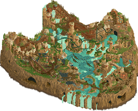
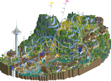 The Land Before The Land Before TimeSonnental4 J K 30 % 3 mamarillas 26 % 4 Jens J. 15 % 2 RobDedede 10 % 1 Hex 10 % 2 SSSammy 2 % 2 deanosrs 2 % 1 AmusementParker 2 % 5 FK+Coastermind 1 % 1 Camcorder22 1 % 1 CHE 1 %26 total3.05 weighted8 total2.6 weighted
 SSSammy
Offline
Gustav - the music is on the swinger ride, and if you close and reopen it, it will be the vibe the park was supposed to open with. It just didn’t get reset because deadline comes at you fast
 Liampie
Offline
I will make several longer posts (Sonnental making of, perhaps a longer TLBTLBT review, and a Dambusters eulogy/end of season thing in a seperate topic), but for now I'd like to sincerely congratulate J K and the Lonely Hearts Club with their podium finish.
I was in touch with J K several times over the past two weeks, to see if this 3rd place match was happening. 'Very likely not' was his typical answer, though on deadline day he told me they managed to get their act together and were submitting. I thought we were cruising for an easy 3rd place, or an even match with two casual speed builds. I think J K has been a bit too modest about this park, it's totally H2HX worthy!
 Not to say that he lied, I know that they simply pulled off a miracle (as did we, but that's for another post).
Though it would've been nice to win, obviously, I'm happy that we got an actual match and that we got a park as good as this. I can't say I disagree with the outcome of the match, nor with the Lonely Hearts Club getting third place instead of us. Fantastic ending to a fantastic season, 100% deserved!
Was this the best 3rd place match in H2H history?

 RobDedede
Offline
I really enjoyed Sonnental. Of course, the coaster kicks ass, and it's so awesome how it barely loses any speed throughout its massive, sprawling layout. I figured it may have been a Morgan coaster, and I am glad I was correct in that assumption. I have wanted to do a Switzerland theme for a bit now, or maybe just the Alps in general, and I'm glad you all executed it quite splendidly here. The theme is hopeful, realistic(?), and somber all at once. I want to know what kind of world this park lives in. Is most of the world in climate chaos while this mountain village survives in splendid isolation? Is the bunker in the side of the mountain a signal to a society that has given up on the outside world, yet continues to thrive on its own? In any case, it's very compelling and was cool to see. A highlight for me was the melted glacier landscape with the palm trees and flowers, as well as the rotating village cogwheel area. Swell park, Dambusters, and a great season by you all.

 Cocoa
Offline
dinoworld: I really like this park, and I would love to see it with a few more weeks of work as originally intended. Its kind of like the dinosaur park we've always dreamed of. to start with, the woodie with the water splashes is genius, feels like the perfect realization of the stupidest rct special element. i love the flinstones fantasy archy, the shading and textures, the toothy caves, cave paintings, wooden timber structures with clear rope ties (what a use of the suspension bridge objects!), the big dinos in the water, the bridges with foliage hanging below, the tar pits. its all over a little bit hard to read coz it gets a bit mushy in places, but I feel like that could be solved with a bit more tlc. I like that the park is obviously goofy and campy but also kind of treats the theme with love, you can really feel the atmosphere coming through beneath it. congrats on a successful season for your whole team---I think you have done something pretty interesting where it really felt like each of your parks was better than the last, like you were collectively working towards a style and an aesthetic that you got better and better at.
sonnental: i've said it enough but jeez what a layout i mean man have you seen that massive turnaround over the central mountain. channels and improves upon the old 2004 rct2 gigas wonderfully
 Tags
Tags
- No Tags