Head-2-Head-X / H2HX: Round Robin - R5M3 - Lonely Hearts Club vs Jazzcats
-
 18-July 24
-

 Xtreme97
Offline
In the last matchup of Round Robin, the Lonely Hearts Club and Jazzcats face off with two parks both set in North America, and deliver some H2H-atypical down to earth realism.
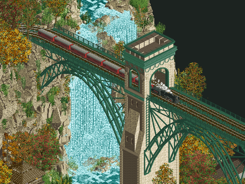 Chateau Frontenac
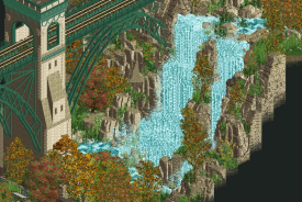
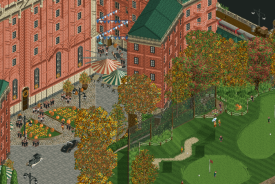
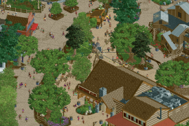
Built in 1893, Québec's Chateau Frontenac is among the finest of Canada's Grand Railway Hotels.
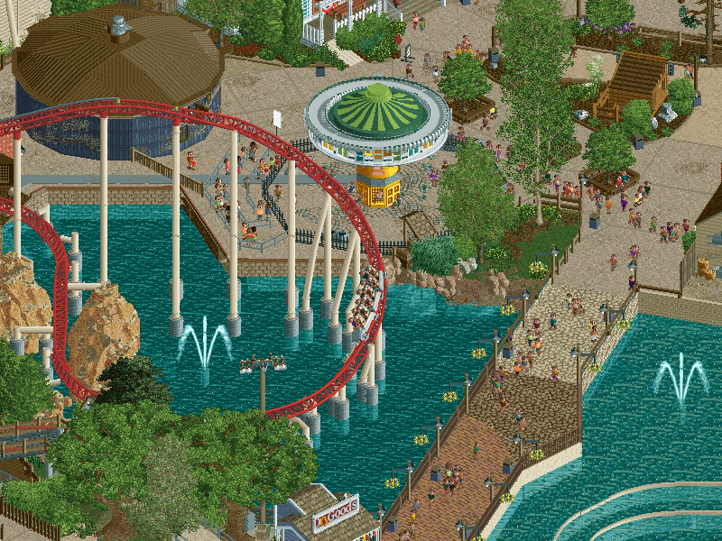 Cedar Point's Maverick
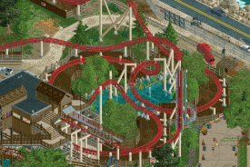
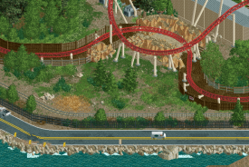
The Old West was never this wild!
-
Voting rules
- The poll will stay open for ~72hrs.
- Do not vote unless you have viewed both parks in-game.
- Everyone may vote except members of either team. Any illegitimate votes will be ignored or removed.
- Anyone with an account that predates the start of H2HX, or who has been drafted onto a team, may vote in this match. Anyone with a newer account must pass the admins' account integrity checks.
- Voting is monitored by the admins to improve fairness.
-

 Ling
Offline
What a finale on that woodie. Absolutely love unconventional layouts like that. Chateau is gorgeous but I wish the "village" was around it instead of across the valley. Waterfall and landscaping are gorgeous but the verticality gets kind of lost with just how noisy the objects used now are. The bridge supports do a good job of demonstrating the elevation change though.
Has Maverick ever actually been seen running all six trains?
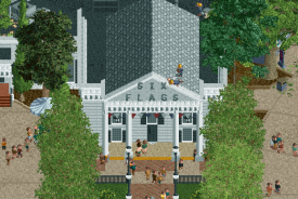
 Mechanics adding the Six Flags branding is cute. So much crunch. Maybe too much. I love the atmosphere and vibe of the seating areas with all the lights strung between the trees.
 -

 ottersalad
Offline
Interesting matchup. The Chateau is very picturesque. The park itself is quaint, simple, but really well done. It makes me want more. Also quite a different sort of park than anything you've guys made. It's more grounded and digestible which is refreshing. The wooden coaster is pretty neat in how it's seemingly a family ride then at the very end it has a daring drop.
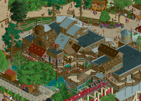
Maverick is pretty neat. Perhaps I'm more critical because I've ridden this dozens of times and know it all too well. Maybe it's just my memory/nostalgia goggles but this all feels a bit undersized compared to the real deal.. almost as if this is like, 85% scaling? But that's probably due to the limitations of the game more than anything. But overall this really does a good job at recreating Maverick and that back part of Cedar Point. Sky Hawk is really well detailed. The station for Maverick is superb considering how many weird aspects to that building there is! What a weird shape.
Kudos to both teams on capping a great Round Robin. These are both great entries.
-

 BelgianGuy
Offline
while i liked both, maverick was realism heaven... crunchy, accurate, lively while staying gritty and the forms and alignments where superb and captured me more than chateau
Chateau is amazing don't get me wrong, there's a few little things that bothered me. while the overall map is super super impressive stuff like the track of the train that goes over the woodie having no support while you made this incredible bridge seems kinda weird to me, also with the sizes of the centerpieces like the castle and the bridge being that good and that big, the "town" side of the map felt out of scale comparatively. it's like 2 different maps meshed together and i came off as inconsistent. those little downsides aside this map is gorgeous, the rockwork, the structures, the signage and the mansion are simply sublime, the woode coaster is also a beauty. definetly a very strong matchup and i think this'll be more towards what people prefer stylistically over wich is "better" as both are of such a high level
-

 hoobaroo
Offline
Chateau Frontenac
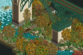
Not only is this my favorite yet from you guys, it's also probably one of my favorites of the contest. This park is pure atmosphere. There are so many small and subtle touches that go a long way in making this park just feel good to have open. The swaying bushes and falling leaves of the autumn foliage, the sound design... A bit of a tangent here but the sound design is gorgeous. Seriously. The separate sound of falling water by the waterfall, the chirping and cawing birds. The individual church music next to the sound of the guitar music in the town. The effort put into this pays off big time and shows real love and attention from the builders, and made me want to linger just a bit longer in every area, as I could imagine being there. Architecturally, I think the buildings by the river in the town and the bridge are big highlights. But the strongest part of the park might be the landscaping. Those dense clumps of autumn foliage are just gorgeous, along with the rockwork around the waterfall. That middle area under the bridge between the two parts of the park might be my favorite part of the park. I could live there. I also like how there are 9 different pumpkin objects. Never enough. By the hotel, I thought it was well done, if a bit blocky. Some pop and depth could've taken it from good to great, I think. The fact that the interiors were done was a nice touch (really clever piano), but maybe some peep scenes and movement could've really brought it to life. The scenes outside were great however, with the valet service pulling up, and the golf course with the putting peeps. The coaster was well done too, compact and with fun moments. Also, we haven't seen a map shape this long so far I think, and I appreciate the risk. Unorthodox map shapes can be hit or miss, but it worked well here to create three separate, distinct areas. All in all, a favorite of mine so far, I wanna live here

Delicious
This whole area is painting-esque, just beautiful colorwork.
The whole lobby/golf area in the front of the hotel was very well done. I think leaning into it even more, maybe making it more festive or gatsby-esque could've been nice to make it more atmospherically pronounced and distinct from the town. Lights? Party-goers? Still done well in any case
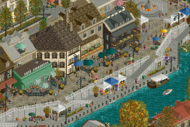
Loved all the details and architectural shapes going on here by the river, one of the best areas in the park I think.
Cedar Point's Maverick
I'm not typically the biggest fan of recreation or realism building, but as I've improved at the game, so has my ability to appreciate the craftsmanship and creativity that goes into works like this. First off, loved the music, loved the banjo cover(?) of The Chain, and all of the subsequent tracks that follow. I don't know how faithful the layout is in recreation terms personally, but it was still very well done. The way this park breaks the grid through all of the varying angles of trims and paths was so seamless that you don't even really think about it unless you're paying attention to it, which is a sign of great execution. The landscaping and mixing of textures outside of the park is so well done too, feels so real. I think what really elevated this park for me though was the attention to detail in tiny peep scenes that give the park life. The floating drone that links to actual ride footage, the peep on the outskirts recording for views, all of the little peep scenes with dialogue... that one mechanic hammering the sign onto the roof was so cool. These details breathe life into the park and make it easy to immerse myself into it. Not all of the cutaways were done, but I see that more of as a bonus, and the ones that were done were very well done. I also now have banjo The Chain stuck in my head.
Amazing pathwork here, so dynamic
Love this moment here with the curved fences and pond detailing.
The landscaping here for an entirely negative space is so good. It shows how consistent the quality is throughout the whole park.
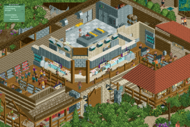
Lovely cutaways.
The peep scenes scattered throughout were a lot of fun, with this one being one of my favorites.
I'm leaning towards LHC now for the the quality of atmosphere, but the craftsmanship and execution of Jazzcats is so strong, so I'll have to think about it. Great job to both teams for two beautiful parks.
-

 CoasterCreator9
Offline
Amazing job from both teams, you guys really came out swinging.
Frontenac - Lots of great atmosphere, some fantastic landscaping. The architecture is really impressive; recognizable but not quite a 1:1 recreation - I kinda appreciate that route with this structure. I love the village and the lively feel of it all (plus that's one of the better custom carousels I've seen made). Glad you guys included detail beneath the bridge, it makes that part of the map a little more interesting; but I don't think the narrow shape of the map is doing you any favors - which is a bit unfortunate. This would have really benefitted from just a bit more width, but what's been done with the limitations is truly very impressive. The coaster is unique and pretty fun, but it feels like it was tacked on to satisfy the "has a roller coaster" box that a lot of H2H parks try a little to hard to tick. It always weirds me out a little bit when the effort is made to include some cutaway detail, but then leave it out from other areas. I made that mistake with Port Disney, and I think this park fell into the same pitfall. Maybe some of my favorite fall foliage as well here! Great job to all involved.
Maverick - Holy shit. Someone extremely passionate about Cedar Point had a heavy hand in this. I could go on about the little details here - but the key point is that some of these details are such clever inclusions that it blew my mind. I found myself thinking "I wonder if they included the little bit of the old flume that Maverick's queue is in the old stati- oh, yep - there it is." Farmhouse Kitchen & Grill's interiors? Identical. I could find the very table I sat at eating there. This might be one of the best purely recreational pieces of RCT that we've yet seen. I was just there last month and I felt brought straight back. I think this level of dedication might be lost on some who have not been to the park or are unfamiliar with it, but it is most certainly not lost on me. My only gripe is that Cedar Creek Mine Ride never has a queue that long, and I think there was a missed opportunity in not including the Halloween Haunt décor that they leave up all year in Maverick's infield these days. All in all, I am truly astonished by the amount of care and attention to detail (Seriously, even the crossing signs before the launch?!) that's at play here. Superb work.
-

 Tolsimir
Offline
It may be that you have bugged landtextures installed on your PC. In order to avoid glitching, please download these and update them by putting them into your object folder:
https://www.nedesigns.com/topic/38234/tolsimirs-custom-scenery/?p=789634
-

 Faas
Offline
Chateau
Very similar setup to Castello Altovento with a town on one side and a big landmark building on the other with a coaster, with a bridge connecting the two. It worked there, and it worked her. Lovely setting and very good landscaping as well.
I liked the coaster but I think it would have looked better as an actual wooden rollercoaster, especially considering the trains and the noise it makes. I think it would have been worth sacrificing some of the track pieces for. Also in the bridge and the hotel the copy-paste work with TI seemed a bit too obvious. Maybe you could have spent some more time giving each section of building a bit more character. Great park nonetheless!Maverick
With recreations like this it is always a risk that it will cater mostly to the people that have been there in real life. But this is executed well enough that that doesn't matter at all.
Great recreation, I like the consistency in the quality and scale of everything, and how clean it all looked.
And very clever easter egg to familiarise others with the coaster and its environment.
I don't have any complaints I think. Maybe the beiges blending in with each other too much in some parts.
Well done to both parks!
-

 Babar Tapie
Offline
Chateau Frontenac: Another great achievement by LHC. I really like the way the park is divided into 3 parts: town - bridge transition - castle. This long shape works really well and makes the whole thing look perfect. My favourite part is ... the bridge. The work on the cliffs and the landscape in this part is quite simply gorgeous, everything is harmonious and coherent, and I also really liked the charming maple syrup merchant/manufacturer. The town section is also very cool, though perhaps a little rigid in its straight composition, however I really liked the buildings along the river. The castle is cool too, maybe a bit massive but it's still a castle. It's great that you've designed the inside, it's a real bonus here. Last but not least, the golf course is absolutely brilliant. To sum up: the park is super immersive, this little tourist tour works really well, and the chill music is also very well chosen. A very contemplative park, personally that's what I like!
Cedar Point's Maverick: A theme that speaks a little less to me, it's very bold for an H2H and I think this park will easily find its audience!!!! So I took a look at what the original looked like and your recreation is fucking incredible here. The crunch is top notch, it's also super fluid and organic. Stupid thing but I really liked the Cedar Creek Mine Ride supports, Maverick station is amazing too. Lots of cool details to look at (for example, I really like looking at the signs in a park, and here they're really cool), ah and also the path design is great. My only negative point here would be this diagonal road along the sea, it might have been technically difficult to do but I would have liked to see something half-diagonal for a smooth transition.
My vote goes to LHC, 2 great quality parks, but I prefer the Chateau Frontenac theme.
-

 posix
Offline
Couldn't bring myself to vote for either park, sorry. Both have clear merit, one sometimes more over the other in different areas, but overall they were both totally enjoyable and made me happy to explore.
JC
I do appreciate a good clean unfrilly down to earth realism park at this point. I've never been to the park, but immersion was still super easy. All ride design seemed to be done with loving attention to detail, which managed to set itself apart from wanting to be correct (which it also automatically achieved however from what I know). My favourite bit may have been the greenery around Maverick. The little shrubs here made for a foliage crunch that I found exquisitely tasteful and just really great to see. I was also impressed by how much dedication you applied to make the park seem like a real cut-out from its full self. Even the rides that typically are "outside props" had peeps in them, and felt pretty serious despite being hidden due to the tile limit. Again though, I saw this as proof of love for the source material, and it was lovely.LHC
Some incredible vistas here and just such a beautiful waterfall. A tranquil and unimposingly pretty bridge, connecting the two parts of the map. And then a hole big coaster playing with the cliff? Some of this macro was mad. At times perhaps a bit too mad. The "upper" parts of the coaster felt a little cramped, but it also didn't matter because of course you would gaze at the majestic building here. Although we've seen a lot this contest, this scale is still impressive. Reminded me of a different kind of RCTNW in a way. The town on the other side was lively and successfully rendered its retro objective. I was impressed by the palette nuances in beige and grey tones you were able to incorporate here. I didn't find it bland, instead it was rather interesting to see, and gave this an artistic edge over the competitor map.
Well done to both teams.
-

 In:Cities
Offline
Huge fan of both of these maps. Both feel nostalgic, warm, and extraordinarily atmospheric.
Chateau feels like a place I've been before, and yet it's a place I want to visit again. It's beautiful, it's comforting, and it feels like home. Clearly a lot of love and passion went into this map, and it truly shows. It feels like a love letter to this part of the world. You guys should be so proud of this. The music is gorgeous and so fitting. The autumn foliage is on point. I will say the map shape isn't my favorite - i'm admittedly not a fan of the long horizontal maps. But obviously I understand the restrictions for H2H map sizes. The coaster is a little weird to me too. Thats just a personal preference though. If it were up to me, the map doesn't need it. I'd have liked to see some manicured gardens or tennis courts or something in that station area. But that really doesn't affect this park negatively for me at all haha. It's a great layout and hugs the terrain so nicely. Custom supports are so excellent as well. Overall a gorgeous little map that I'll be sure to revisit simply for the vibes. Great work!
Maverix is such a breath of fresh air this H2H. I think it succeeds perfectly in what it sets out to do, and I applaud the builders for executing a recreation to this high of a level. Upon opening both of these maps, I thought without a doubt my vote would go to the LHC for creating such a beautiful, warm, inviting map. But the more time I spent looking around Maverick, the more I was swayed. I think the real thing that locked in my decision on this was when I pulled up google earth as a reference on my other monitor and looked at it in comparison with your map. Truly an incredible job on recreating this area in such fine detail! There's so many little brilliant details to find. And like the builders of Chateau, it's very obvious to me that a lot of heart and soul went into this one. It's clear that the builders are not only familiar with Cedar Point, but that it carries a special place in their hearts to have built this map to the level of thought and care that it ended up as. The pathing is thoughtful and organic. The scale and architecture is spot on and feels appropriate. The music is fun and brings a lot to the overall atmosphere. This map is just so lively and full of energy; much like a day at the real park. And of course I love the taco bell. Honestly, this map just makes me want to see a full recreation of Cedar Point to this level haha. Amazing work guys - this is a special one.
Josh -

 Turtle
Offline
gotta echo Posix here, i am really loving both parks for different reasons. haven't voted yet and not sure which way i'll end up going.
Maverick
i haven't been to cedar point, so i'm not at all familiar with the source material. but who cares when the park is so well constructed. again echoing posix, the love for the place really shines through. the cutoff rides being fully functional, peepable, etc. the little scenes that feel so real, the rocking chairs on the bank of the water.
it shouldn't go unnoticed that a lot of this park is diagonal/half diagonal, which makes the whole thing feel pretty organic in a way that a lot of recreations of real parks haven't managed in the past. high skill level stuff. the music is also fantastic, one of my fave songs.
the centerpiece coaster feels really nicely done, again it's not something i'm personally that familiar with but there are plenty of realistic touches that really sell it. and again like posix said, there also seems to be little areas which probably aren't exactly realistic, but just make it look better in RCT also. i appreciate the flexibility, you've landed in a place which feels real without being sterile. the park as a whole feels bright, lively, inviting, and atmospheric. love it.
Chateau Frontenac
obviously setting-wise, this one is right up my alley. big ambitious landscape, beautiful foliage, a big ass waterfall... you're speaking my language. the valley section is definitely my favorite bit, the bridge is a very impressive structure, and the valley itself is so picturesque it just makes for a really nice setting. with a thin map like this you risk breaking the immersion, but i found that actually it just kinda nicely funneled me to either side of the map.
the castle end is great. a big repetitive structure can sometimes feel out of place on a natural map like this, but it's appropriately detailed and a nice style difference from some other castles we've seen. the front with the putting greens, cars arriving, and the bonus interior i liked a lot. i initially thought the woodie would kinda blend in a little much with the colors vs. the backdrop, but i found myself following it and really liking the layout. especially that last drop, damn that would be so fun.
the town area is great also, some lovely little scenes again, and the waterfront is very charming. lots going on, very believable and atmospheric. overall a cool unorthodox map, with great vibes throughout. shoutout to those swaying bushes, i'd imagine they'll be in most parks going forwards.
-

 GammaZero
Offline
Episode 5, Part 3: gamma runs out of title ideas
Wow, I can't believe we're already at the end of Round Robin. We've seen so many amazing parks, and this round is no different. Both teams brought their A game, and I'm excited to get into these reviews!
Chateau Frontenac
Okay, this is really classy. It strikes me as the sort of map where one (or more) of the builders was extremely confident in bringing the setting to RCT - nothing feels like a compromise or out of place.
Of course, the three big strengths displayed here are the architecture, the foliage and the landscaping. The castle is impressive and has just the right level of detail (and interiors!), the town on the opposite side feels lively and authentic, and the fall scene with the river is just gorgeous.
I do wanna bring special attention to the support work in the map, both for the coaster and the rail bridge. The level of intricacy is sublime, and the use of the watchtower object is very clever.
I'd be remiss not to mention the map shape and composition - although it's personally not to my liking, I do have to applaud how well it frames its main features. Again, more than anything, I'd say this build exudes confidence. Amazing job!
TL;DR: tasteful, intricate, gorgeous.
Cedar Point's Maverick
I gotta preface this by saying that I've never been to Cedar Point, so I'm not exactly 100% familiar with the source material. But, honestly, I don't think that matters that much - you'll see what I mean.
Although the implied centerpiece of this map is obviously meant to be Maverick, I actually think its true strength lies in the portrayal of the entire area around it. Don't get me wrong, the coaster is fantastic - probably the best rendition of Maverick we'll ever get - but I find myself so immersed in this map, and that immersion definitely comes from the (painstaking) accuracy to which all its features are constructed.
Let me go back to the point I made in the first paragraph. Yes, I'm speaking from the perspective of someone who's never been to the actual park, but I can't help but feel like this RCT rendition actually takes me there. Again, the whole area contributes to that feeling, even the partially cut off rides. So, I'm not gonna praise all the specific details present in the park - other, more capable people have already done that better than I could've. Instead, I want to praise how all those details create that unmistakable "day at the park" atmosphere. Once again, amazing job.
TL;DR: realistic, immersive, crunchy.
I'm truly glad we get to finish this stage of the contest with two fantastic parks. As Round Robin draws to a close, I'd like to express my commiserations for the teams who end up not making the cut - it sucks to see two teams go out in such a high-level competition - and congratulate the three other teams who will join us in the Play-offs. See everyone in the Semi-finals!
-

 FredD
Offline
Chateau Frontenac
I like how the shape of the map leads toward the castle, as a grand finale. The castle is definitely a great piece of rct, great archy here. The modernized classic wooden coaster fits in so well here. Really like its layout, very flowy and good pacing. Really love that last big drop into the cliffs, what a way to end that coaster ride!
The bridge ofc is also spectacular. But the landscaping around and beneath is as spectacular, those waterfalls are wonderfull. I also like the autumn colors of the trees and foliage. The village itself is also quite neat, with the terraces at the waterfront as my fav part of this area.
Really lovely park and really the type of park I love to see.
Cedar Point's Maverick
As a CP fanboy I can only adore and love this! Wow! I've visited the park twice, not really enough to see how accurate this recreation is but it feels so right. It definitely feels like the real CP, and it makes want to go back so hard...
You guys did a great job on recreating the layout of Maverick. Recreating real life coasters is hard, it's a battle between accurateness and flow but it doesn't seem there was really a compromise here. Looks flowy and recognizable as the real one. Though I think this one is styled better than the real one haha.
But then the paths and its environment are also... real. Great curves and pathing details. All the foliage in between works so well. Also the detailing is amazing, the missing heart roll has been mentioned on discord is there and a funny wink to Mavericks history... but all the rides on the edge are also properly functioning. Like even that simple pre-lift turn of SteVe has a train with peeps running on it.
Yeah... can't do anything else than vote on this. And pray that the builders of this map will continue building the rest of the Point after H2H

-

 Bluetiful_Monday
Offline
I think this match is going to come down to what people prefer. On one hand, we have a nearly perfect recreation of one of Intamin’s greatest coasters in perhaps the most well-renowned amusement park of all time. On the other is a park focused on dynamic landscaping and pristine architecture. For the Jazzcats, it’s incredibly accurate to the source material. Come to think of it, there really isn’t anything to criticize. Maverick is spot-on. The care and consideration for the surroundings adds a level of character without taking the focus away from the coaster. Strictly speaking as a design, it’s fantastic.
For the Lonely Hearts Club, what a gorgeous park. The absolute embodiment of beautiful. The screenshot your team chose for this matchup might be my favorite thing on NE. As you could guess, I am huge into landscaping focused parks. This reminds me so much of Blue Hen Falls and Cuyahoga National Park. Just really ticks the itch I have for exploring that type of atmosphere. There’s quite a bit of content to uncover with the town, the coaster with that epic final plunge, and the hotel on the opposite side. Consider me a fan.
-

 Lurker
Offline
Chateau Frontenac:
Love the fall atmosphere in this, amazing foliage, great landscaping and a fantastic railroad bridge for a dramatic centerpiece. The town is beautiful and peaceful, the hotel is impressive (And has interiors, love that touch) and overall the map really captures the things that make that area such a popular tourist destination. The coaster has a cool dramatic moment with that drop into the valley, some nice support work too.
Maverick:
Never been to the park, but this seems spot on from the POVs and drone footage I've seen. So many amazing little details, it's clear the builders of this knew a lot about the park, especially with stuff like the death roll in the weeds. Lots of nice staff scenes, and the whole drone footage scene with the link was a cool touch. Some great grid-breaking paths, and the foliage, especially the grass is excellent. -

 Liampie
Offline
Chateau
I’m excited that the Grand Tour is happening again, and your interpretation of the Canada prompt is very good! Wait, no, this is H2HX still. But it feels like a GT park and that’s always a good thing in my mind. The extras that come with the download help to set the scene and the park delivers without going overboard on anything. Every park trying to be the best most bending thing in the world is tiring and I like that this park is just trying to be the best version of itself. The village is a nice area to start out in. Archy is well done, again not overdone, and feels Quebecian. Quebecesque. The music is pleasant and the reverb makes it sound diegetic. Would be nice if I could trace down the musicians or speakers the music is coming from. There are musicians on the far end of town but it’s quiet there. Not so diegetic after all. 60% no. Anyway, lots of nice little details. I like all the market stalls, the raking peeps, the fleur de lis mural, the big banner, and the completely stagnant village tractor ride. A few things confuse me. When is this park set? At first it seemed like you were going all in with a 40s (approximately) setting, but then there’s a starbucks too - which ironically bothers me more than the RMC that I’ll discuss later. Rides are always the exception though. I’m also confused the village doesn’t have a train station. 60% no. Anyway. nice little fair. The Belvedere nicely leads the map into the next area: the valley.
First of all, I think this is my favourite bridge this H2H, sorry Jazzcats. The autumn foliage shines here, was about time someone did it. Swaying grass and ambient sounds: this park really excels at being subtly excellent. The camp is really nice, and I like the way you did the toilet. The valley also has the worst thing on the map: the mama’s maple syrup object.
Now we get to the other side of the map: the chateau. It’s surprising we’ve never seen a take on the chateauesque style in RCT before. The building is well done, but I guess it also demonstrates why it’s not all that appealing to build in RCT: it’s repetitive and not super interesting to look at. The scale is just ridiculous, which is not inaccurate but still a tad unattractive. I much prefer the village. The facade on the railway station side feels more human and it totally works there. I also appreciate the interiors. You spent a lot of time on arranging bed sheets in different ways . The map is missing some life here. The golf course is borderline dead, and the paths lack peeps. Sometimes some peeps exit the coaster, immediately to be hit by the valet service. I suppose you would’ve tackled this if you had a few more hours before the deadline - no hard feelings here. Alright, it’s coaster time. I think Circulaire is absolutely fantastic. It looks good, flows well, has originality, but it’s not unbelievable as an RMC in my opinion. Custom supports are fantastic, and for technical details they do a good job of enhancing my viewing experience, which I can’t say for every custom support - often it’s just there to make it look real. Here it looks cool. It’s only the side friction awning that I think looks shit.
I don’t want to end my review with the word ‘shit’ which generally doesn’t apply to the park, so I’ll end with a summary: I love the park, it delivers on all fronts without frying my brain (or my laptop - rare). It’s very comfortable and it gets my vote over the Jazzcats.
Maverick
Another normal park that I can view with a normal framerate, hurray. Pretty bold move to go with a recreation without your name being geewhzz. I must say that it’s a bit of a miss for me. A lot of the map is well done, but I don’t find it to be very good looking, and it starts with the coaster. Looks quite faithful as far as I’m familiar, but I find the surroundings to be quite ugly, some of the attempts at crunchy landscaping are rather crude. All the attention to detail with interiors and supports cannot change my mind, though again its all well done. The station area was again not very good looking, it’s a bit hard to read:There’s also some nice stuff here like the Wawel-esque (sorry lol) large customized trees. I think alex already pointed out the big restaurant in the middle, that’s good and easy on the eyes. Why is there a building called Six Flags? Is that also a thing in the real Cedar Point? Funnily enough one of my favourite choices in this park is the greenish water for the rapids ride. I don’t recall seeing that before but I’m sure we’ll see it again a lot in the future, it’s a good observation that often the water for water rides should have this disgusting chemical colour. I can smell the chlorine.
All in all I can appreciate the effort that went into this and I think it’s successful in most areas. Other areas I’ve nitpicked, it does not get bad anywhere on the map. When it is unattractive, I doubt the choice to adapt this in H2HX more than I doubt your execution. Well done, but it’s not for me unfortunately.
 Tags
Tags
- No Tags


