Head-2-Head-X / H2HX: Round Robin - R4M2 - Dambusters vs Lonely Hearts Club
-
 02-July 24
-
 Xtreme97
Offline
Xtreme97
Offline

The second match of Round 4 is here, with a nostalgic VHS-fuelled adventure facing up against an engrossing Scottish murder mystery.

 Dambuster Home Video Presents: Buxom the Sunset Sorceress, and the Purple Haze at Castle Death
Buxom3_full_1080p_VHSrip.mpeg

 Murder in McAllan
A misty dawn breaks over sleepy McAllan, but the seaside town is soon to wake to the sound of screams…
-
Voting rules
- The poll will stay open for ~72hrs.
- Do not vote unless you have viewed both parks in-game.
- Everyone may vote except members of either team. Any illegitimate votes will be ignored or removed.
- Anyone with an account that predates the start of H2HX, or who has been drafted onto a team, may vote in this match. Anyone with a newer account must pass the admins' account integrity checks.
- Voting is monitored by the admins to improve fairness.
-
 Ulvenwood
Offline
I really liked the semi- seductive look on your face.The overall appearance is very masculin. Is it me or do your swords look bigger than last time I touched them. Anyway, derailing here. Lighting could have been better but a solid 8.5
Ulvenwood
Offline
I really liked the semi- seductive look on your face.The overall appearance is very masculin. Is it me or do your swords look bigger than last time I touched them. Anyway, derailing here. Lighting could have been better but a solid 8.5 -
 Goliath123
Offline
Goliath123
Offline
With my partner from Scotland it was hard not to vote for McAllan but will say its nice to see a large scale coaster (Dambusters Invert) that isn't an RMC these days. The invert alone nearly swayed my vote but man the Scottish village charm was captured perfectly and takes me back to the days of living in Scotland
-
 Six Frags
Offline
Six Frags
Offline
Murder in McAllan by the Lonely Hearts Club
-Concept: **
The concept reminded me a lot of Valley of the Kings, with the scavenger hunt, and Gangland with the solving of the mystery. You still managed to give an unique touch, with the little inside jokes, and everything that adds to that murder mystery atmosphere, with the color scheme, object choices, sound design and general aesthetic of the piece.
-Content: ***
Going through all the audio clues alone was a lot of content in itself, and all the inside views of the buildings and cellars really make you spend tons of time exploring all the content.
-Quality: **
High quality overall, just some spots were a bit lesser quality, for example the area around "The Angel's Share", stood out a bit too much with those dark and somewhat chaotic/cluttered supports.
Overall;
Very cool atmosphere. I'm a sucker for this kinda horror/crime vibe the park has, and every aspect adds to it, from the architecture, to all the posters/clues around the map and all the dark humor to the color scheme.
The coasters were a nice addition as well, Fish Hook was kinda simple, yet brilliantly thought out going through all the buildings and the shape being that of a hook (kinda ). Also love that it ends on near the waterfront and the Helm swinger interacting with it in that turnaround.
The Angel's Share had nice pacing and a good layout, especially when you turn views so you see the diagonal track pieces this becomes apparent. I didn't really like the supporting job on it though; was a bit too chaotic and cluttered, and it didn't do the aesthetic any good imo. The Mc Allen distillery building was of lesser quality than the other architecture on the map I felt, so a bit of an imbalance there. I think the somewhat plain roofing job is what takes it down a notch for me.
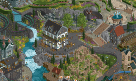
Going to opposite side, I really loved the big manor. Definitely the highlight of the map for me, and everything, from the geometry to the polishing, works great. Exploring its inside also was a real treat, great attention to detail, and lovely little scenes in there. I also loved the interiors of the distillery and cellars, and loved how it was integrated into the map edge with all the pipes and curved brick walls.
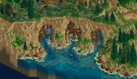
The town area itself was nice, I especially loved the little subtle height variations and the bit with the rope fences. The dock had nice detailing and structures like the boats, and the seagull audio gave it a great vibe.
====================
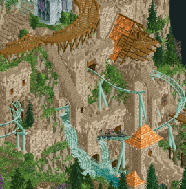
Dambuster Home Video Presents: Buxom the Sunset Sorceress, and the Purple Haze at Castle Death
-Concept: *
I felt the execution of the concept was lacking. I get you wanted to recreate that VHS movie atmosphere from the attached video link, but I felt the concept was lacking in bringing it across for me, or taking full advantage of the premise.
-Content: **
There's a lot of really nice facades, but I felt it was missing some 'meat' behind it. Maybe some inside cutaway scenes in the big castle would've done the job.
-Quality: ***
The quality of the architecture and landscaping was very high, but I felt the palette was hurting the overall aesthetic too much. In fact changing the palette to English 2 made it much more enjoyable for me.
Overall;I like being bold and taking risks with such a daring palette. In this case it didn't work out for me and in fact took the park down a notch. I get you wanted to create this kinda 80s VHS color scheme and atmosphere, but it hurt the overall aesthetic of the park for me. When I changed to English 2 I had a much better time appreciating all the awesome architecture and landscaping, without getting a headache. Having to do this is a negative for me though.
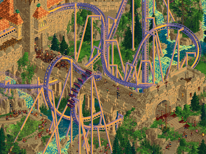
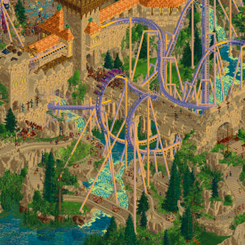
Purple Haze was very lengthy, but had a nice flow and interactions with the architecture and landscaping. I especially liked its station building.
Grimblo's Oozing Goo Coaster was a fun little supporting coaster and had awesome interactions with the mountain. Loved how it dipped in and out, and that little bit with the waterfall was probably my favorite bit of the map!
The Mystery of the Open Graves was a refreshing take on a darkride. Pretty clever having it out on the open like this, although some more impacting set scenes would've been nice. I loved how it travels back over the bridge to the station building though, nice planning.
The Lantern Smuggling Dinghies were a very fun ride to follow along, going through the caves and seeing all the extraordinary scenes. Some nice blood dripping action and floating peeps going on there

Also loved the little see-through on Dungeon Dropper into the tower, when you turns views.
The terraforming and Fisch rock work was the highlight of the park for me though. Loved all the caves and see-through scenes, and how it was so well integrated into the map edge with those Ethan Fisch Rock Boulder walls, the Tolsimir Land Detail walls and the Xtreme Transparent Fade walls.
The big castle had very nice geometry, deco and polish to it. The color scheme was kinda monotonous though, but there was enough variation in textures to make up for that. I also loved how it was sitting there centrally on top of the mountain face, and how everything was folded around it.
====================
Very close matchup, but in the end I went which for me had the better atmosphere. If Buxom had the English 2 palette from the start I would maybe went the other way though, but I have to take the initial aesthetic into account. Great job tho guys!
-
 WhosLeon
Offline
WhosLeon
Offline
no one ever asks how is leon.....
two parks that are unique and special in their own way... this one's gonna take a while to decide. upon opening last night my first impression was leaning busters heavily. just a super cool in-your-face aesthetic that brings something we haven't seen before to the table. while the filter might mask some of it a little (or perhaps a little too much at times), there's brilliant fundamentals underneath; a killer layout and some of the best rockwork in recent memory. LHC's park seemed aesthetically a little bit less refined and "perfected" so to say, but makes up for it in it's storytelling. i'm not done with follow the whole narrative yet but i've already laughed out loud multiple times. great work from both teams -
 FredD
Offline
FredD
Offline
Buxom the Sunset Sorceress
Fun opening with that VHS stuff.
Love to see another medieval park. The village is great, very atmospheric. Great use of textures and lots of details around.Also fan of the elevated castle with the meandering paths up there, going through great landscaping. The invert is great, really love how big it is and how it brings movement to almost every part of the map. Very flowing as well with some great placed interaction elements.
Also a fan of the Xperience Movers, great to see that CTR in game and it will come in handy for future darkrides. Also fun station it got. Also fun cut outs at the park edges, though I do think the boats are going a bit too fast. Grimblo's was also a fun coaster with especially a very nice and original lift scene!
Overall very cool and enjoyable park. Music wasn't my cup of tea, think a classic medieval song would go better. I wasn't also much a fan of the palette, I don't think the park really needed that palette effect and it's still great with a more natural palette.
For me, one of the better Dambuster parks so far.
Murder in McAllan
Rides/park in a real life/realistic setting... could've been a Dambusters park
 Nailed the Scottish vibe here, the architecture is great and very enhancing the atmosphere. The port is done really well, love the shaping and shading of the docks here. Great crunch game.
The distillery and Manor are also very great, with superb interiors as well. The rides here were cool too. Love the boomerang, fitted in very well. The woodie was fun too. The best "ride" was the log thrower though! Great detail.
Have to admit that I skimmed over the story at first. And this park still holds up without it, but once Hex pointed out to me how it really works I was hooked. Such a clever way to tell a story! Wish it was kinda explained better for the dumbasses like me
The story kept me hooked and searching for the next clue. The Kumba one was hilarious. I'm glad they found the killer in the end, the end scene was also done really well and clever. Loved it!
-
 wheres_walto
Offline
wheres_walto
Offline
Big Titty Goth Mommy Park
+ lovely palette, this is a nice alternative to the madinat sunset palette with softer contrasts. I like it quite a bit
+ very cool ritual scene, it's detailed while remaining clear and is an excellent visual throwback to 80s movie posters. I'm not super well-versed in that genre, but the Heavy Metal South Park episode is an all-timer so this is selling for me
+ this is a rare instance where the palette actually hides how complex the construction and object use is. The main structure is texturally interesting, the combination of Kong stone blocks, decorative stone, and minecraft paths is fresh and sells the use of larger bricks
+ big dominant coaster. I don't really care about layouts but it's nice for the macro and the color contrast with orange rooves works quite well
+ the more I look, the more I acknowledge that there are no clear weak spots: the architecture is very good and shows impressive style variety, the landscaping is very good and also shows variety, the cutaway scenes are detailed and fun to discover
Murder on the Gustav
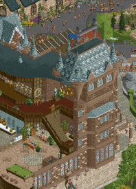
+ the castle is perhaps the best single building of the season, exterior is lovely but the interiors absolutely blew me away. I'm impressed how you've managed to fit so much detail into an enclosed space while also having it feel open and easy to breathe. This is special
+/- the newspaper clippings are fun and convey clearly, though I wish they weren't messy from other angles. It would perhaps have been more elegant as single angle custom objects (a la Leon/Xtreme Belgium park) but I respect the commitment to using existing tools
+ my grandma dragged my brothers and I every summer to the Scottish games and would make us set up a tent all day. I have many memories of those events (and childhood photos of me in kilts). Seeing caber toss and tug of war in rct is not something I expected, but it's a very cool slice of something relatable to my life
+ it's funny that the soda jerks were caught brewing illegal soda, if only you knew how much we've been cheating behind closed doors
+ murder mystery is a fun engaging quest, I liked finding audio logs and poking around for potential clues
I haven't decided yet. My preference has slightly shifted upon second viewing, but it's still too close to call. These are both character-heavy parks with fun concepts in classic H2H style. It's a shame that one will lose because both are deserving of a win
-
 Sulakke
Offline
Sulakke
Offline
Murder in McAllan
+ These are the best and most detailed interiors I've ever seen. Love all these new object you've created for this. These will be very valuable for the rest of the community.
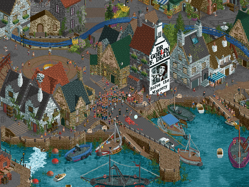
+ Love the harbor. I especially like the irregularities in the rockwork docks. The fishing ships are great too (the cranes and lobster cage!).
+ The houses in the village have a lot of charm. I especially like Wee Chippy and the row of houses starting from Evergreen Flowers to Trout Bevs a lot.
+ I want to give a shout-out to the tavern. A really pretty building.
+ Love the diagonal ship hanging in the ropes.
+ The story line is executed flawlessly and was a lot of fun to follow.
- While the corner of the distillery is crafted well and Angel's Share being a cool coaster (love the stag front car), I dislike the color scheme you chose for this area and the pallete in general. The grey color of this pallet works alright in small quantities in the village for example, but I don't like it in bigger quantities and I'm not a fan of the grey, green, gold and purple scheme. The gray makes the rockwork also look unnatural to me. And I've got the same issue with the brown that was used for the mansion.
- I agree with Walto about the detective board. It's a great idea and looks cool from one angle, but not from the other angles. Also, the peeps walking in front of the newspaper clippings didn't help it either. The clippings found in the park self were a nice addition though.
- The red moon and clouds didn't add anything in my opinion.
Dambusters Park
+ The opening with the VHS noise is cool. I also like the overall nostalgic atmosphere created with the palette and the music.
+ The main castle is an imposing structure and it looks great.
+ Although there were some cliche elements like the cobra roll under the bridge, I really enjoyed the layout of Purple Haze. Good support work too.
+ I really love the stone and wooden walkways that are embedded in the landscape around the castle. The spiralling stair objects look great here.
+ The landscaping is great. The elevation is pretty sick on this map and I really like how you combined the colored Tolsimir rocks with the Fisch rocks. The foliage is good too.
- My main complaint for this park is the castle and rocks being the same color, which made the park very beige and in a lot places it was hard to tell the difference between the castle and the rocks.
- It's not a big deal, but the sounds of the notifications of new rides hurt the atmosphere in the beginning. I'm sure you didn't want to have it like this either.
Two great parks that I both really enjoyed. Thank you for that! In the end, I didn't have a clear favorite and couldn't decide which park I liked better, so I nulled.
-
 Turtle
Offline
Turtle
Offline
this feels like a close matchup, both very good parks with a decent amount of content and strong vibes.
VHS Castle
the first thing that hits is the palette, along with the aggressive VHS effect. i'll be honest, neither of these things hit home with me. i think this is one of those parks that i'm just not going to "get" as much as other people, unfortunately. within the first couple of minutes i found myself wishing for a palette that made it easier to see what's going on. with so much of the rides and scenery in that same strong color, everything kinda blends. and i kept thinking "if only there was more contrast because i'm pretty sure i'm looking at some really cool stuff". i also didn't "get" the connection between the VHS retro style, and the map itself, which seems to be a medieval castle/village with haunted undertones. a strong idea like this is always going to be slightly hit and miss i guess, for me it missed.
once i get past how i feel about that in general, the map itself is a super stylish, consistent and skillful piece of work. it feels pretty well polished, especially the castle itself which is huge without feeling too repetitive. the coaster is fun to follow, the landscape is daring and pretty well pulled off, and there are enough supporting rides and scenes to find that the map feels full and lively. definitely a map to be proud of... interested to hear if it was made with this palette active as i can't imagine the eye strain ha!
Murder in Scotland
at first glance, this map feels slightly less ambitious scale-wise than the other one. but the more time i spent in it the more i found, and it kept me looking for more. murder mystery is a really cool idea, and i like the way you've done it. it's one of those h2h gimmicks that adds a layer on top of a cool map, and this one landed for me. i like the aesthetic of the newspaper / red string etc., and the music also adds a really nice mystery vibe. scotland isn't a theme that has been done a ton, and i like this rendition.
the murder mystery itself was cool and fun to follow, especially the last step - nice use of RCT for the reveal. but i also just found myself finding cool areas of the map that i liked. the docks are my favorite area i think - tons of texture, really sweet small houses with stepped rooves, feels very authentic scottish fishing village. boats are great too, especially the diagonal green fishing one.
the other 2 areas that i'd like to highlight are the manor house/castle, which is excellent, with all the interiors really fleshing out a cool but large building. and the distillery, which didn't land as well for me. the archy is great, along with the map edge cutaways, cool stuff. the woody supports just make that part of the map feel so heavy and oppressive, being dark and substantial. i'm generally never someone who wishes for less rollercoasters, but in this case i feel like a different choice would have worked better, and allowed the cool scenery to breathe a bit more.
anyway 2 good parks that I enjoyed, one of which kept me exploring more and one that just made it kinda hard to do that.
-
 AvanineCommuter
Offline
Longer review coming, but both parks offered a lot to love.
AvanineCommuter
Offline
Longer review coming, but both parks offered a lot to love.
Dambusters won my vote in the end as I was more drawn to the fundamental parkmaking choices - landscaping was top notch, color palette was bold and interesting, atmosphere and architecture were on point, and the coaster was one my favorites so far in the competition.
LHC had a great fun factor to the park with the narrative, but I preferred the aesthetic stylings of the Dambusters park. -
 ottersalad
Offline
ottersalad
Offline
Went with Dambusters. I think AVC is right here - Dambusters Home Video really delivers on amazing fundamentals. Hands down some of the best rockwork/landscaping/terraforming we've seen. On top of that, the castle is amazing. Easily outclasses Troubadour and Castello Altovento in that regard. And on top of that on top of that, the coaster layout is quite fun and has great moments of interaction. Also love the lantern boat ride - silly, but just adds more to see and explore.
The palette/aesthetic to me is pretty cool. It's bold and risky and I think the effort pays off. The skill here is high and I think it's something many builders will revisit again and again for inspiration.
Meanwhile, this cave is really neat and crafted so well:
Also, this coaster track color slaps. Loved it in Billy Wonka, love it here.
DKS 2: Scotland Boogaloo
Overall, I am a fan of this. Just tough when you have to vote one over the other. The setting is cool, the interiors are wonderful. The music and the audio files to help with the story of the map are great additions. I think it's kinda funny, whether intentional or not, to build a park against Liampie that feels like a successor to DKS.
When comparing the two parks, where this loses out is a couple of things.. namely architecture and ride design. A bit too much 2x2ism going on and samey-ness with the seaside village. I think Leon said it best, that this felt a little less refined. One area that could highlight this well was the area around Brodie's.. there's 4-5 different path types.
In terms of ride design, Angel's Share and Fish Hook aren't at the same level as The Purple Haze. I think the wooden coaster supports were a bit of a miss as well. Felt like an NCSO style layout plopped on top of a CSO park.
Again, this is a great park. Just sharing the few things that led me to vote for the Buxom Sorceress on VHS Cassette Tape.
-
 Gustav Goblin
Offline
Gustav Goblin
Offline
Very hard vote so lemme think critically and dig deep while I mull it over.
Dambuster Home Video Presents: Buxom the Sunset Sorceress, and the Purple Haze at Castle Death:
+ This is up there for most unique vibe of the contest. I think the part that gets me is if you swap the palette to English II and throw in the Troubadors music, it becomes a nice medieval park with a great coaster in the middle. Throw the trippy stuff back on and it hits. This is Adult Swim-core. This is a High on Fire music video. It's giving The Sword. This nails the cursed '80s Conan the Barbarian VHS ripoff feel and I love it. The VHS CTR effects at the beginning obviously sell it, but man this aesthetic kicks ass. One of those themes you just don't expect anyone to go for. It could've been so safe, but considering the remaining builders safe is not the word of the day here.
+ Sorry boomers, I don't hate the palette. It sets out what it's meant to capture, a sunset captured through a degrading casette tape. It's not 4K HDTV up in here. Even if it's not the most traditionally appealing, you have to respect the artistic vision here.
+ The interiors are fantastic. The Buxom scene is a whole moment in its own right with all the crazy effects. And maybe the floating crystals too. Also love the huge spiral lift through the library.
+ The Purple Haze at Castle Death is a DYNAMITE layout. The interactions are consistently incredible throughout.
+ Wonderful collection of very detailed medieval architecture.
+ Please let me find the person who chose the soundtrack and kiss them right on the lips. So much good-ass psychedelic doomy stoner Sabbath worship. I'm a Castle Rat fan now. Gizz works so well here too.
+ There's a dude named Grimblo. A whole-ass dude named Grimblo in a H2H park. I love Grimblo.
+ I'm very confused but thoroughly entertained by the whole-ass YouTube video you attached to this park. I can't find anything about this film online so I'm convinced it's completely original. With that in mind, who produced the video? How'd they nail the cheesy VHS feel? Hell, what's up with this channel being made in 2008? Was this a 16-year psyop? Is it a builder's old channel they just never used? How did it get here? Questions aside, this is a fantastic way to sell the concept. I also appreciate that I'm not the only player in this contest to sound like they got struck by lightning at an inconvenient time.
- It honestly gets a little beige. There's a ton of granular detail in the castle and the landscaping, so it's a shame to see it start to blend together. Zoom out and you can't exactly tell the castle from the cliffs either. Both a macro and a micro issue unfortunately that could have been circumvented with some slightly different color choices.
- I'm honestly missing more of a narrative! Considering this is supposed to be a shoddy VHS movie, I feel like at its core it's not crazy ambitious with the concept outside of pure aesthetics. Would have loved to see something even as simple as frozen staff scenes that form a consistent narrative. I noticed some custom named rides near some important figures, but I wanna see them do something! Get some cheesy acting in there or something, hell yeah! Opening LHC's first spoiled me I guess.
Murder at McAllan:
+ A murder mystery was in my list of H2H ideas, so it's cool seeing it actually realized ingame. It works really well to not only add a cool layer to a unique park but help you explore it in more depth. This was my logic for the audio logs in Valley of the Kings, so now it feels like y'all killed me and robbed my grave. Considering this, I still really enjoyed it! The writing was done really well and I'd love to know who was behind the script once the builders are out.
+ While I didn't notice this on first glance, I love how the buildings near each clue have a news headline printed on them. Not just a bold artistic choice in an otherwise realistic park but a great way to help the player know where to go. Y'all definitely thought like game designers here. Took me until the second go-around to notice the red letters as well.
+ What a map edge! Such a cool effect with the clue board and the newspaper clippings, especially the way they lead up to the ship's anchor.
+ AMAZING interiors. I barely even questioned them and just kinda acknowledged them as they were because they felt so natural.
+ Great archi, especially the manor, the tavern, and the ruined church.
+ Appreciate the custom music! I can tell Sammy's been hard at work on the tunes again.
+ Saving the sappy part for last. Considering my role in this park, this feels like a complete and utter roast but with so much love behind it. I really don't consider myself a remotely important figure in NE outside of yapping like a maniac and being completely braindead, but it's funny that my lore gets to be immortalized in H2H through this park. The Indian buffet jokes, the audio crapping out in my phone call like the talkback, and the shower draft gag among others honestly made me feel a little warm and fuzzy behind the "oh come on now" gut reaction. Like damn, I'm here. Obviously the other meta gags were really funny too, but the highlight was definitely "They always ask WhosLeon. They never ask HowsLeon."
= Is the blood moon at the top a Yatagarasu shoutout? That's really neat if so, but it doesn't really match the atmosphere of the park.
= Some bits are a tad bit hit or miss like the woodie near the brewery. It's a great layout, but the default supports read a bit chunky and obtrusive. Even if you all didn't want to take the effort or didn't have the time to do custom supports, a mine train underneath with invisible track would be a little more elegant and open up more space.
= This is not a negative because this can be attributed to my crippling stupidity, but I didn't immediately catch note of where each clue was. I saw the ride names, followed one of their instructions, and got the ending spoiled on clue 5! This sucks because it would have blown my ass to find out you discover the killer through another Valley of the Kings trick (albeit not mine).
----------- Unfortunately I am not only dead but somehow in an incestuous relationship with my dad. Thank you LHC, very cool!
Gonna be a tough vote between fun and exploration or unique aesthetics done really well. Both teams should be proud regardless.
-
 G Force
Offline
Always hard for me to vote against a H2H park with a great inverted coaster. This was a close one but I think the vibe of Castle Death just wins our over the intrigue of McAllan. Both parks I think will be respected more as time goes on, great stuff!
G Force
Offline
Always hard for me to vote against a H2H park with a great inverted coaster. This was a close one but I think the vibe of Castle Death just wins our over the intrigue of McAllan. Both parks I think will be respected more as time goes on, great stuff! -
 In:Cities
Offline
In:Cities
Offline
Time to pop out a quick review, as both of these parks really deserve the time spent exploring them!
Scotland vs Gustav
This is a weird one for me, because despite helping push a very similar interactive element for the Valley of the Kings audio logs, the clickable Clues were something I wholly overlooked when I viewed this map the first couple times. I was like wtf why can't I solve this mystery. Ended up doing cutaway and thought oh, this is underwhelming. And then I realized i'm an idiot and did it the correct way lol. Nice work guys - this is super well done and very effective. Leon's voice is so sultry hahah - absolutely cracked me up when I heard it for the first time. Excellent execution!
The map theme overall is super unique. I can't recall seeing a Scottish theme done before in RCT - especially not to this level of execution. Absolutely nails the seaside vibe. On it's own, the map is super strong even without the mystery element. So many great details to discover! I'll drop some screenshots in the discord.
Overall, this map grew on me (as most H2H maps tend to do after repeat viewings). Highlights include the mansion (the stag motif, interiors of course, overall crunch and details), the highlands dancers (amazing object mamarillas haha), the ruins in the middle of the town, the irregular shape of the shoreline and docks, the little dip of the coaster into the dock area, the highland games in general, kilt stand, the Cake stand (should have had pothiccs selling some), Tug of war, and of course all of the amazing objects that AmusementParker created! So insanely impressive. It's very obvious that the builders and the LHC team as a whole really had a blast putting this park together!
Fantastic work team. This would have gotten my vote against most maps.But I ended up being swayed in the end to vote for the LSD fueled trip that Liam and the busters took us all on.
Big boobed goth girl rides into the sunset and plays with magic crystals
Okay wtf guys. What an entrance. I must admit, I enjoyed the grainy VHS static upon opening, but didn't put any further thought behind how it was actually done until I viewed in game again. I'd love a deep dive on this, because I still don't know how it was executed. Using ride vehicles for the effect is absolutely brilliant.
The palette seems to be a big point of contention for some. I get it, sure. There's no point in trying to fault others for disliking it and wanting to change it - we've gone through this countless times. But we've also seen much more egregious examples of palette usage in H2H than this, thats for certain (being guilty of some palette anarchy myself). To me, this palette works beautifully to convey a gorgeous sunset vibe. It feels like the sun is casing beautiful reflections all over the place and highlighting the details of the map just as it would in a real golden hour. This adds to the overall vibe in such a great way. It feels nostalgic, and helps transport the viewer to this place in imagined time. Remaining on this subject - the reflections throughout the map are incredible. While a subtle detail that I admittedly passed over on my first viewing, they really help to contribute to the big picture overall, and I'm grateful for the effort put in to include them!
Thematically, this feels straight out of a movie that I'd have picked up from the local Blockbuster (or Movie Gallery in the small town I grew up in) and I love you guys for it. It immediately feels familiar and novel at the same time. It feels like I've been here before - whether in dreams or film. Hard to put into words, but you guys have nailed it.
My absolute favorite scene is the underground scene with the floating crystals. Thats a straight up album cover haha. The colors here are so bold and absolutely spot on. Actually looking at this section as a whole - the colors overall are just so excellent. The tan rocks, the psychadelic purples, reds, pinks with the neon yellow/green is just so effective. Especially paired with the dark cool tones of deep green and blue for the foliage and water. Masterfully done. The ONLY suggestion I would have have would have been to make the main castle the same colors as Grimblo's castle. The grey with the sunkissed highlights is so beautifully rendered, it looks like one of those classic PC game loading screens. Heroes of Might and Magic vibes. Ride wise, the oozing goo coaster is such an absolute blast. The spiral lift is excellent. And the goo oozing into the ground below is such a nice little detail. A true mnonkey exhibit. I also appreciate the LSD and DMT boat rides lol. Flaming (smoking?) windmill is a great nod to Frankenstein.Narrative wise I think it could have been a little easier for viewers to follow the three swords story. But thats not a big issue to me personally. Big highlights of this map for me are the multi layers of curvy path everywhere (flawless), sunken ship on an interesting angle, peep heads on pikes, the entire floating crystal scene with Buxom the sorceress held captive by drug mnonkey, the single angle reflections everywhere (so well executed), all of the interior scenes, the bits of the castle rooves missing shingles and showing the framing, the texture on the castle in general (so detailed), all of the open graves/caskets and with the presumable bodies being used in the ritual below (I think?), the soundtrack, I could go on and on.
Incredible work guys, this map will stick with me for quite a long time.
Its tough voting against either team. Both parks are peak H2H rct and i'm here for it. Thank you guys for a great match!
Josh -
Gustav Goblin
Offline
My absolute favorite scene is the underground scene with the floating crystals. Thats a straight up album cover haha.
I feel like I'd just randomly find this randomly promoted by YouTube and it would be the most lifechanging album I've ever heard
-
 Babar Tapie
Offline
Babar Tapie
Offline
Ok, for the second time I cast a null vote, I know it's not the best choice for a contest but it was really heartbreaking to choose for one or the other here. My null vote is a way to say « guys, you've both made great parks, and for me it's not possible to say that one team did a better job than the other ».
Buxom the Sunset (…) : This castle is incredible, without doubt the best I've seen on NE, the mix of textures gives it a unique look. Theme is bold and clever, and the atmosphere is amazing and really immersive : palette, music (perfect choice) and plugin have a lot to do in this. Btw It reminds me a film I saw recently : Riddle of Fire
Murder in McAllan : Great concept, happy to see a park without plugins but which succeeds in delivering an immersive and intriguing park. The survey (investigation?) concept is not new, but works very well here. The architecture is less impressive than the Dambusters park, but it's got that little something that's super cool to look (I can't explain it properly sorry).
I'm sorry to not write a longer review for these two parks, they are just both awesome. I think the imperfections become secondary in this kind of park, because we feel such a dedication to your concepts that you succeed in drawing us into your worlds, congrats to both team !
-
 Hobeon
Offline
Hobeon
Offline
Dambuster Home Video Presents: Buxom the Sunset Sorceress, and the Purple Haze at Castle Death
Sick vibe. Awesome big ass invert coaster. Absolutely love the music, somehow very fitting. Gladly left it running in the background for a while.
Whole bunch of things I really like in this park. Grimblo's oozing goo coaster! What a fun layout. Those monkeys monkeying around on the supports might be a safety violation. The big caves with the underground docks look so cool!
Also love the boats with the little lanterns on them!
And then there's crucified peeps, heads on stakes, magic all over the place, like hell yeah I'd visit, maybe even smoke a little, maybe ride some rides, you know that's what they're for but I would also like to come back with body mostly intact. Super cool stuff though. Really liking this park. Floating crystals!
Murder in McAllan by the Lonely Hearts Club
Despite the dark theme, this is a lovely looking park. Too bad about Gustav, I'll miss his yapping.
This is one of the best wooden coasters I've seen so far. Very readable, easy to follow around, one sick element after the other, tons of cool interactions and stellar supports. Love it! The small family boomerang coaster looks awesome too, I love how naturally it fits in the environment. Glad you didn't go overboard with rides in a setting like this.
Even though it's usually not the most important thing to me, I can appreciate how much effort you put in the setting and backstory of this park. Love the newspaper blurbs along the edge of the map, the castle ruins, and the tramline. Also love how clearly the interiors of the big buildings are visible without having to use cutaway view. The handymen working an illegal underground farm, lol
Cliche af to say but god this is a difficult choice. I love both of these parks a ton (don't be fooled by my short reviews, I've spend well over an hour digging though each of these parks)
-
 chorkiel
Offline
I'd probably rate these parks similar. They're both great and mainly differ in concept so tough vote.The weird video concept and esthetic was very funny. The whodunnit was pretty clever but I expected it to be more interactive - like gangland. This isn't a gripe, because it's insane to expect parks to be like gangland. But I did feel like the newspaper cutouts and the blood moon took away from the park while the gimmick didn't add as much as hoped. The setting worked extremely well for the concept though. But in the end the dambusters had a profound weirdness which I appreciate.
chorkiel
Offline
I'd probably rate these parks similar. They're both great and mainly differ in concept so tough vote.The weird video concept and esthetic was very funny. The whodunnit was pretty clever but I expected it to be more interactive - like gangland. This isn't a gripe, because it's insane to expect parks to be like gangland. But I did feel like the newspaper cutouts and the blood moon took away from the park while the gimmick didn't add as much as hoped. The setting worked extremely well for the concept though. But in the end the dambusters had a profound weirdness which I appreciate. -
 GammaZero
Offline
GammaZero
Offline
Episode 4, Part 2: gamma keeps it short, again
I've been a bit busier than usual (and also pooped from looking at The Screameasy too hard), so yeah, time for short reviews again. I'm sorry! It's not like these parks are any less deserving of my usual spiel, and it especially feels bad to give this treatment to such a close matchup (IMO), but you gotta do what you gotta do.
What The Fuck Is A VHS Tape
I'll just come out and say it: the aesthetic is sick, but the special effects (plus the supplementary video) don't do that much for me. That's not to say that they shouldn't be there though - I just personally think they're neutral aspects.
Almost everything else is a positive for me though. The invert is unique, has a cool, imposing layout and the colors pop really nicely. The medieval architecture is really well done and juxtaposes really well with the zany palette and psychedelic atmosphere. The landscaping is breathtaking. The narrative elements are really cool to follow, while not being overly intrusive. The music slaps. Hell yeah.
The only real nitpick I have is that, due to the map's elevation and density of content, I do think some of the sightlines end up feeling a bit mangled. From one of the angles, for instance, the castle towers completely blocks the invert's coolest parts from our view, which is a bit of a shame. But that's about it. Really cool park.
TL;DR: trippy, impressive, great music.
Murder in McAllan
Look, I get that you're a bit shook about how the rest of playoffs is gonna go, but it's kinda fucked up to kill a team member just for that.
Jokes aside, I think this is one of the most elegant ways I've seen someone do interactive experiences in RCT. Unfortunately, I did feel like it was a bit hard to follow (or to start!) at first, but that's probably because I was too tired to look at the ride list on my first view
The murder mystery plot is quite fun, and I especially like how you did the final scene. I do personally feel like the concept would've been cooler with a fully original cast instead of the community references, but that's obviously completely subjective, and the staff names did get a laugh out of me. Anyway, you guys nailed the Scottish harbor vibe (I think), and I do appreciate how there's just the right amount of density in this park - gives things room to breathe, and makes me appreciate each building and scene even more.
Once again, I have a tiny nitpick: for such a large centerpiece, I do think the woodie's layout feels a bit clunky. It looks as if it's just trying to avoid its surroundings rather than having its own footprint. But it's still a pretty nice ride. And, overall, this is a really cool park.
TL;DR: interactive, quaint, gory.
Well would you look at that, these didn't even end up that short. And, yeah, this is a really tough matchup (even though I've already made my decision). May the best park win this one!
-
 Lurker
Offline
Lurker
Offline
Sunset Sorceress:
This does a great job pulling of the VHS aesthetic, and I like the sunset tones to everything. The inverted coaster is impressive and the supporting one is nice if a bit difficult to see at times, and I really like how both are incorporated into the theme. The landscaping, foliage, architecture and scenes all really make this a lively park.
Murder in McAllan:
Architecture is really impressive, I especially like the ruins in the middle of the map. Also some well-placed cut-outs with some impressive interiors, and a lot of great setpieces adding to the harbor feel. Also impressed with the coaster layouts, and the interaction of the family boomerang with the town. Murder mystery game is a nice touch, and a cool way to make sure viewers see everything in the park.
Tags
- No Tags