Head-2-Head-X / H2HX: Round Robin - R4M1 - Hurricanes vs Jazzcats
-
 30-June 24
-

 Lurker
Offline
Base X:
I like the setting, and the landscaping is nice and dramtic with the height, with some nice ice effects. Wing coaster is a great choice for the theme and the layout has some nice interaction and the new vehicles are great.
There are rough edges though, the intro sequence was hard to follow with the tons of windows popping up, and I couldn't really tell what all the plugin was doing, other than making my game drop frames.
The Screameasy:
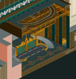
Absolutely stunning. The theme and concept is already fun and cool, and the execution is amazing. Architecture with top tier fine trim work, an incredible density of content with scenes and murals everywhere you look that really bring this to life.
Some of the cut-outs were a bit hard for me to read (A problem I have with a lot of those in any park), other than that I have nothing to complain about. But that cut-out revealinng the wooden coaster and the multi-layer indoor park is so good, it feels like something out of a dream. -

 FredD
Offline
Base X
The idea behind this park is pretty cool. A figher jet fight was a cool way to open this map but since it kinda moved over the whole map instead of just one area, it was kinda hard to follow. The landscaping is for me the best part of this map. Not only is it refreshing to see landscaping built up by something else than Fish Rocks (sorry Fish!), I also do think those Tolsimir land rocks work really well with the ice and snow.
The big land arch is also great, though kinda a missed opportunity to have not more interaction with it. The choice for a wing coaster is a fitting one, but not really a fan of the lay-out which is a bit too spreaded out and after the last zero-g it kinda meanders back to its end I feel. Music was a great addition here.
The base itself is done pretty nice. Overall I do feel this park misses something. I think with more time there could be done more to make this map a bit more interesting. Nonetheless a good park but a bit shortcoming for H2HX I believe.
Screameasy Park
Fuck it guys... I'll have to retire now...
Absolutely stunning park. It for sure can be named one of the best H2H parks ever made. The story behind is so cool and pretty clever. I really have no idea where to start naming stuff I like because there is so much there!
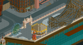
The closed down Riverland with the protesting peeps, all the signs, the posters, the custom peeps scenes, the music and sounds,... Architecture is phenomenal! Like those boat docks are incredible, just as all the building facades. So detailed and so clean still. The included rides are also topnotch, with an incredible wave swinger cover, very cool wipper snapper and old woodie. That whole part of Midtown Express is easily my favorite part of this park.
The amount of details in this park is staggering, you can open this park multiple times and still discover new stuff. Yeah, can't give anything else other than pure praise for this park. It comes so close to perfection. I feel bad for the Canes, but this park would've swept any park in this contest. It raises the bar up quite some notches.
I'm not so pro-accolades for H2H parks but if any H2H park comes close to deserving a spoltight win... it's this one.
-

 deanosrs
Offline
Base X
Does this park contain the best set of new CTRs ever? The stealth wing coaster will definitely be re-used in parks going forward and the snow vehicles and fighter jets are so cool. Being limited to 1 tile does hurt the jets a little, but the runway scene is epic, love it.
I wasn't a fan of the intro sequence. It feels like the park is very demanding of the viewer's attention with the crash alerts popping up, but I wasn't totally sure what I was looking at throughout.
The plugin caused significant slowdown for me, and on my own, I couldn't easily spot the effects. Personally, I preferred viewing the park without which is what I did. (Specifically I created a post-crash save and deleted the plugin, so both things that only affected my first view of the park)
The landscaping was a mixed bag. I really don't like those rocks if I'm honest, although I do like how the snow sits on them and I love the floating ice CTR. That's really cool.
The splashes of navy/teal in the architecture I really liked. I think here the park just needed more time. The building at the back is really nice, good detailed structure but inside the glass it having zero inside it just broke the atmosphere for me, totally. I'm sure you guys ran out of time, but having Elon in there doing stupid experiments like fitting pilots with brain chips would have been really cool.
I really liked the coaster layout. Good pacing, landscaping interaction, just a lot of fun to imagine riding it.
Overall, for me, the park had some great moments, and is one of the best ideas I've seen this h2h. I just think you guys needed more time to test it, and get some more content/polish on the map.
Screameasy
When I see everyone fawning over a map, my instinct is to try my level best not to jump on the bandwagon. I just really struggle not to here though. The audio is lovely. Sets the scene and story for the park perfectly, and then goes into music which perfectly sets the atmosphere.
The architecture to me is the same level or a tiny little notch below Wrigley Field. That is to say, it's damn near perfect. Some lovely half diagonal buildings which look put together as though the challenges of building at this angle just don't exist for these Jazzcats.
The highlight of the map for me is the signs. Getting those letter CTRs on half diagonals looks so great. The bitmap images of the dude and the peanut are just absolutely priceless. The map oozes atmosphere, the subway station and drains below the ground are both real NYC "moments" for me.
The hidden parks for me are really good, but not quite up to the quality of the city, if I'm picking nits. I'd imagine that parks that were trying to hide from authorities would be a bit more grimey than this, a bit more dangerous (since no regulations to follow) and just a bit less polished. I guess I'm trying to say they're too good? And that being the only real criticism I can find kinda sums up how I feel about this.
It's the best park of h2hx so far. I don't think many people will have it below #1 in the contest so far. Every other park has some pretty unavoidable draw back to point to, some compromise it made. This one is such high quality and with only the tiniest little niggedly flaws, if any.
-
 G Force
Offline
Incredible work Jazzcats, this is the park I dreamed of being able to view when I saw your roster. Truly incredible. Right up there with the best H2H parks of all times, Lenox, DAW, Siege, Stardust, Le Reve. And it stacks up really well with those too. Just love the concept, so simple yet so clever and prefect in execution. I don't really have much to say in terms of a conventional review, whenever we get a park of this quality and there isn't anything to criticize I find it hard not to get selfish wishing for things to be slightly different. Maybe some more conventional coasters, or something like that, but yeah, not really the point of the park anyway. Just man, that opening scene on "times square" is simply incredible, haven't felt that way about an RCT park in a long time. Fantastic work guys.
Hurricanes... well clearly this wasn't your best effort, I do like the concept for what is there, just very undercooked. Hopefully at some point in the future we can see a more fleshed out version of this. I guess it's good you didn't put out your best against the Jazzcats here as I don't know if it would be beatable in any matchup.
-

 alex
Offline
Base X:
I like the stylised look of this: the ‘flat’ snow colour against the harsh rock is really interesting and I applaud the boldness. It did mean however, that where there were undercooked spots they stood out quite a bit - for instance where the bright snow met the very dark water you could have done with some softer transitions. The concept doesn’t particularly resonate with me for some reason and I assume that there’s some kind of mini game component that I’m missing out on. It’s possible that I’m too lazy as a park viewer but it’s equally possible that the park asks too much and is a bit of a laborious experience. Either way, it didn’t stop me appreciating what was there at face value. Really tough luck on the matchup here.
The Screameasy:
There isn’t much to add to what’s already been said - it's truly a landmark release. The concept is crystal clear, is beautifully executed, packed with fun details and feels quintessentially H2H in the best possible way. Fantastic work Jazzcats. -

 Turtle
Offline
Glad to see this get a great score, as you can tell from the review and also my vote, it's up there with anything i've ever seen in RCT. perhaps opens up a discussion on what a spotlight should be, as i'm sure everyone has different opinions. for me, i don't think there should necessarily be a minimum tile-limit for spotlights... i was just thinking, if someone asked me to show them the best ever RCT, what would i show them. this is right at the top of the list for me.
-

 posix
Offline
Match conclusion
posix
Offline
Match conclusionWinner
The poll is now closed. The final voting score was:
1 < 52One of the most brutally one sided matches concludes at the hand of what would become the highest rated H2H park to date. Jazzcats, there aren't many hearts left your park could win.
Creators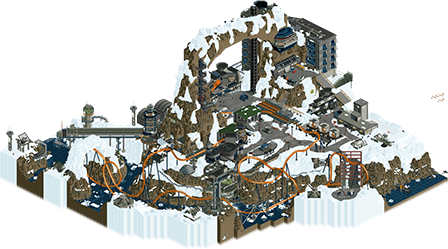
 Base XThe Screameasy8 total1.55 weighted10 total2.91 weighted
 J K
Offline
Congrats guys, can't wait to tune in to Sammy's playback and hear how this park came to be.

 Gustav Goblin
Offline
Props to Saxman and Bubbsy and Brightside and Spacek, all of them are incredible builders that all played their part in an amazing vision. With that said, between this and Micro Madness I think we can safely call Leon the best player in the world. Almost no one comes this close to such a perfect balance of superhuman detail, perfect composition, wonderfully swoopy and flowy layouts, clever and addictive concepts that get taken a mile, and those little supporting details that just wrap it up perfectly. I can maybe think of enough players on one hand tops. Apologies to AVC but I definitely have a new RCT hero alongside you now.

 saxman1089
Offline
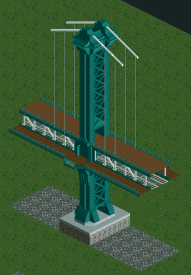
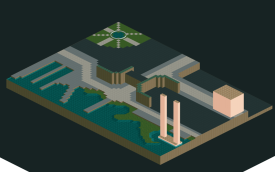
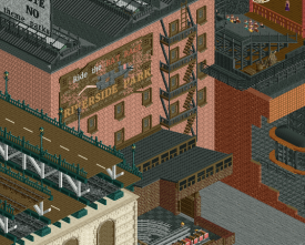
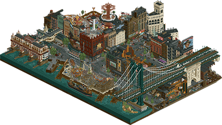
Where do I begin? I have been absolutely floored by the response our park has gotten. Over the past few years since H2H9, I honestly didn’t think I’d ever come back to this game. Things were moving quickly in life, and I found my extra time going into other things. Fast forward to H2HX signups, and I tell myself, fuck it. I’ll sign up, hopefully get drafted even though I’d been inactive, and maybe build 10% on some park if I can manage it.Leon totally took a chance on me, and we as a team all start kicking around ideas. Leon presents the Screameasy idea, and I’m immediately hooked. It’s one of those ideas that you know is a good H2H idea that can get you halfway to a win, and now just requires execution. Leon and I agreed that a big NYC bridge would really place the park in the time period and provide a great set piece for the match. Being a literal bridge engineer in my day job, I couldn't help but jump right on this. I considered the Queensboro, Brooklyn, and Manhattan Bridges as possible inspiration. We ultimately decided on Manhattan Bridge as the main inspiration mainly for its looks and how we thought it would work in the context. My first test is shown below; things stayed pretty much the same throughout the building process just adding some more detail each time I worked on it. As was reading up on the structure, I found that the owners of the real bridge actually asked my engineering firm's founder to perform an independent check of the design as the foundations were under construction. The next day, I was able to find an authentic copy of the actual 1909 findings in the library of my office. While I didn't end up using the report for anything specific in the park, it was a great source of inspiration. I'm not comfortable sharing it in a public forum, but I'd be happy to share privately if you're interested.One thing that become apparent was that we didn’t have enough angles of trim to make the main cables have the proper shape. We had placeholders in the file for a while, until Spacek made a beautiful set of bridge cable objects that I imagine will have further use in many RCT infrastructure projects in the future. There’s a whole set of cables without the bands that hold the vertical suspenders as well, but only some of them made it into the park in the end. I'm sure we'll get them released soon. I know some people have said they wish the bridge didn't block an entire angle, but we set things up around it so not too much gets blocked. It actually helped us hone in on the most important cutaways and viewpoints, almost a kind of "Julow" approach.After the bridge, I assisted Leon on the gold “Art Deco” Hall. Leon had come up with the main motif and color scheme, and I ran with fleshing it out a bit more. He really did most of the detailing including most of the designs on the walls, although I did the one art deco mural under the first drop of the coaster in that hall. This really was the start of the main collaborative effort that we kept building off of each other’s work. The area around Whipper Snapper was maybe the best example of this. I started the area, laid out the ride and the stairs descending around it, and did the background mural. After this we struggled to support the coaster above it for a while, but eventually landed on what’s there currently with the decorated beams. Leon came in and added a lot more art deco motif, including the balloons and some of the other trims. It really brought the area to life. My first WIP attempt at the area is shown below.The Riverside Park came to be after we decided it would be neat to show a shuttered park, with rides and other stuff reused elsewhere in the secret parks. I planned out the macro of it, did the mouse layout, station building, carousel, slide with missing top, and then Leon came in and grunged the hell out of it. The protest was always an idea we had, but we really added it in over the last two weeks or so. I also did the ship with some additional detail from Leon. It was originally supposed to be stealing ride parts, but we changed it to be a government ship confiscating things, thus the reason for the protest and fire. One of the docks has a green light, which is a nod to F. Scott Fitzgerald’s The Great Gatsby. Again, the first shot at the abandoned park is shown below, which morphed into what's in the final park over many building sessions.Some of the other things I built were the freak show, the jazz club, the casino, the stolen track warehouse, the cane’s place apartment building, and a bunch of the billboards (Edison Electric, Dr. Eckleberg which is another Gatsby reference, Nathan’s hotdog, the Arrow Collars which was a copy of a real billboard, Omega watch, Dodge Brothers, Coca Cola, Mr. Peanut, Thoosie Rolls, the Sign Available, Uneeda Biscuit, Stetson Hats, and the Rat Race ad which Leon helped with). I ended up getting the whole map peeped up, did the moving traffic, fixed some peep jams, did the shoestrings except for Blind Tiger and the Parachute ride which we had 94 do for us, and did other smaller stuff all over the map. First shot at the back of building mural is shown below, which was done pre-pixel art. I went back a few days before the deadline and updated it to match the other pixel art. As I said on Discord, Leon literally placed each pixel object for the smoking dude manually. I started that way with the cat, and it ended up looking not as good due to the image itself. I found out I could paint each square individually, and then manually repainted the cat to where it ended up. Mr. Peanut was then made with a wall of grey colored glass squares that I then painted as needed.We knew that we wanted to have 1920s music to set the scene, and also that radio was big during the time period. To tie these together, we thought it would be neat to work the premise of the park into an opening radio message. I wrote a script, had AI do a little 1920s polish, and then I offered to try to brush up on my Transatlantic accent and record it. Monsterbux expressed interest in helping, so we traded off little bits of radio between the songs to really draw people in to the time period. Most of the music came out of this playlist (https://youtu.be/dTz...iPA86o3bo-8ZiAL) although I added "Let's Misbehave" myself.As far as build timeline goes, we started on this thing back in early April, and have just been trucking ever since. If we needed to, we probably could’ve finished the map for Round 3, although it wouldn’t have been nearly as polished or refined. We absolutely would've had the park done for the original Round 4 deadline without any trouble. We spent the extra week just polishing and adding content, and having so much fun doing it. Deadline day wasn’t stressful at all.Building with the whole crew on this map was amazing. I was able to get almost instant feedback from fellow builders and the team, which pushed me to build better and harder. It was great waking up to tags from Leon saying "this shit is fire" and stuff like that. Speaking of, I personally believe that Leon is the top RCT player in this community right now. He's got a great eye for detail and object use, and combined with his amazingly fast and deliberate building, it's just an absolutely devastating combination. He was also more than willing to help me out in getting my stuff up to snuff or offering criticism on how to improve things. I'm so happy to be on his team and not opposing him, that's for sure.I don’t think we’ll do a dot map for this one because a lot of it was collaborative and we’d need like four different dot maps to cover everything, but if you want to know who made something specific, please let me know. Maybe Leon will feel differently about a dot map, idk.I don’t think we really understood how liked the map was until the votes started coming in. I had honestly seen the park so much at that point, that it seemed like a normal H2H park to me. I’m so grateful that the community has enjoyed the map as much as we enjoyed making it!
 Jappy
Offline
If I got a nickel for every time in H2H I built on an icy, rocky map with industrial feel and deep ravines that lost in a land slide I'd have 2 nickels which isn't a lot but it is strange it happened twice.But hey, if we had to lose, at least it is against the best H2H park ever made. I had a BLAST looking at this! All the little scenes, the archy, the general idea... No wonder this dethroned DAW as the best H2H map ever. Well deserved the win!
 wheres_walto
Offline
Great write-up saxman, it's really great to see you come back to the game like this. You've still got it

 SSSammy
Offline
great work everyone. it truly sucks to go up against the park of the contest. the worst part about this contest is that things that people have grafted hard completing have to lose and that can feel like wasted time. you have a lot to be proud of hurricanes, don't let comparison rob you of that.

 chorkiel
Offline
The ScremeasyDon't have much to add to what's been said already. When I first opened discord and saw people gushing I knew this was going to be a Leon park. When I first opened the park it was obvious. I'm pleasantly surprised by how much Sax (and to a lesser extent Bubbsy) contributed. Shows that not only is Leon able to build great stuff but also elevate the people he works with. Great thing to see in H2H. Reading how much fun people had working on it makes it even better. Congrats on this achievement! I outright loved it.Base XUnfortunately one of the weaker parks of the contest. Fortunately it went up against the screameasy. I think even if this was finished to its full potential it wouldn't have won. The idea is dope! Liked the buildings as well! The thing that I outright disliked was how the rides crashed kept stopping the music. I would've preferred this without the plane scene in the beginning over this version to be honest. I hope to see more from these builders because I know they can do better

 bigshootergill
Offline
Killer park Jazzcats... probably wise we didn't build anything very good, would have got crushed either way.

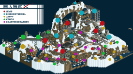
Here is a quick dot map of what everyone did. I think the idea was actually pretty decent, just the time crunch and a late start to the park didn't allow us to realize it's full potential. Either way, we had fun building it and edged out a Design accolade.

Probably one of the best things from this map was the CTRs the Kenos has provided the community for future use: Snow transporter, snowcat, snowmobiles, missiles etc.
One little note about the intent of the park... we were nervous that the community wouldn't appreciate a map about a military base, that it might be glorifying war. We wanted to steer clear of that idea at all costs, so we went with the "Elon Musk Military Tourism" angle.As for the opening scene, our apologies if you didn't like all the explosions haha, we looked into having a plugin block those pop up boxes but Levis couldn't figure it out. Maybe there is a way, I have no clue about that stuff. In the end we still went with the scene so it would showcase the cool new CTRs, and create the atmosphere of what this tourist location could provide for it's customers. If there weren't any explosions the opening scene would have been kinda meaningless. We expected some would figure out to hold "backspace" and others would complain... and voila, that's exactly what happened.


 roygbiv
Offline
In hindsight this is so obviously saxman there's a big bridge executed very well. Really impressed by the infrastructure on the cutaway columns.
The interiors almost felt like dreamscapes placed into the buildings which was very cool.
Base X : highway to the danger zone

 AvanineCommuter
Offline
Base X: There were some really fun moments here in this park. I personally didn't mind all the explosions, it brought me back to Battlefield days of RCT and was a nice hit of nostalgia! I do wish that the choreography of the planes were a little easier to follow though. In terms of the park itself, some really cool details with all the icy pathing and vehicles, and some nice scenes scattered throughout the park did keep me exploring a little bit. I think the coaster was OK - but could have used more shape instead of sprawling out so wide across the map. I did enjoy the wingcoaster head chopper cutout, which was a nice centerpiece moment. The large land bridge was a good idea but a little clunkily executed, which I think goes for most of the architecture in the park - the idea is there, but they were both a little underdetailed and a little too massive in some instances. I think the nice texturing of the snow and paths clashed with how clean the buildings were. Still, there were nice areas like the diagonal runway and some of the smaller round base buildings which looked very on theme. The biggest standout for me was the ice floes and how they bobbed / moved, a nice touch that really sold the concept and setting well.

 CedarPoint6
Offline
What more is there to say on Screameasy?? An easy spotlight in my eyes and the best park of the contest. Huge congratulations.
Reviews for both:
BaseX:
Screameasy:

 Ethan
Offline
Screameasy: The Whimsical Wonderland

This park is raw penetration of imagination!
 Drats! I hate Leon and his goons
  , but I can't help loving the clever concept of Screameasy. Indoor rides as whimsical expansions of classic riverside park vibes
  . The idea of an "inside" park, with an exterior that feels recreational but hides a coaster and elaborate interior resembling an ice cream utopia is mind-blowing!
  The storytelling is phenomenal
  —a true sign of the times with cigarette ads shoved in your face, but heaven forbid you just want to take a spin on the Big Dipper.
  Secret entrances, mouse cars for custom flats, Gatsby-style bridges, and signage points that deserve a standing ovation
  ! The fonts steal the show! Watching Blind Tiger knit all the rides together scratches so many itches
  . Meow Wolf-style underground tunnels are an absolute dream!
Base X: Mechanical Mayhem


it:
Base X is a winter wonderland of destruction and mayhem!

 Giant turrets, moving pistons, and artillery
  turn this park into a mechanical marvel.
The custom wing rider slicing through the keyhole is the epitome of slick , and the giant rock arches bring beast mode to a whole new level. The bold choice of white snow flooding everywhere is like a big milk jug explosion.
 Moving targets with ships gunning them down add a layer of interactive chaos.
it: Ice tracks, floating ice, and mechanical door movements create a kinetic landscape of fun! :
 The destruction aspect—so good!

 Tags
Tags
- No Tags
