Head-2-Head-X / H2HX: Round Robin - R3M2 - Jazzcats vs Evergreen Gardeners
-
 11-June 24
-
 posix
Offline
Match conclusion
posix
Offline
Match conclusion Winner
The poll is now closed. The final voting score was:
38 > 18Congratulations Jazzcats on your first (!) and much deserved win of the season. Let the mighty comeback begin.
Creators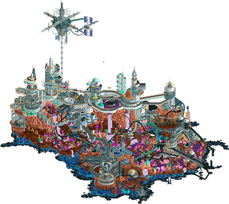
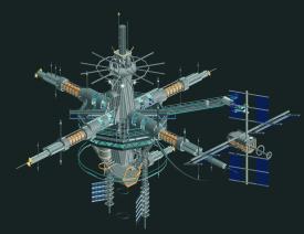
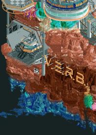
 Void Extraction Research BaseThe Yards10 total4.45 weighted10 total3.95 weighted
 Bluetiful_Monday
Offline
Bluetiful_Monday
Offline
Void Extraction Research Base: The theme is unconventional, and I like it. The colors are whimsical, but work wonders when tapered based on your topography, and texture choices with objects. Easily the best coaster of the match, and I don’t think that’s even up for debate. Layouts like this are what I live for. This comment goes for just about any map from H2H, but it’s especially noteworthy here: the closer you look, the more you discover. I found myself in particular gravitated towards the river system. Another unconventional aspect of this map, especially considering the theme, but it’s this kind of imagination that helps push the fantasy envelope. My biggest criticism is how tricky parts of the map are to read with all of these elevation changes packed so tightly together. Overall, this park was a joy to see.
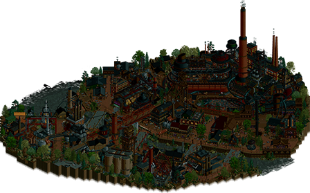
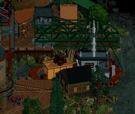
The Yards: Architecture is extraordinary. I’m not sure if there’s any contesting that claim, but I was thoroughly impressed with the level of detail in every single building. Throw in the fact the map isn’t even on the grid. Despite some criticisms from others about the darkness of the palette, I don’t happen to have any quarrels with it. I find it atmospheric, and quite helpful to highlighting all of the important pops of light. Almost at home, with all the bar scenes and exposed brick meeting modern industry. My main criticism is with the coasters - they’re out of sight. The main highlights are at least present, and while the underground construction gives an F.L.Y. feeling, I wish the bulk of the layouts were at least somewhat visible to the viewer. As a result, it feels crammed (it’s off in the corner as is). I gotta agree with Posix, I’m not a fan of the music choice. But all criticisms aside, I think The Yards easily falls into the classification of elite park making material.
Final Verdict: My vote went to The Jazzcats for their whimsical vision, gorgeous colors, and expertly done coaster. Wonderful work to both teams.
 Jens J.
Offline
Jens J.
Offline
Void Extraction Research Base
Holy hell. This park is bonkers. Took me a minute to realize what exactly the plugin did besides the sounds but man that void sprayer is sick! The car colors randomly changing throughout the coaster layout is a neat touch too. If I had to summarize this park in one word, I would totally say "elevation". Everywhere you look, the screen is filled with content from lovely and bizarre looking landscape at the bottom to the nicely shaped buildings up top (and capped off by the awesome looking space stations high up).
There's so many details I love about this park so I'll just name a few:
- The void stamper if that's what you would call it haha.- The test subjects scene
- The sucking up of "void"
- PIPES! You're a legend Spacek
Besides that, I also really liked the landscaping! The effort put into blending the various rock layers with such diverse colors into each other so well has to be applauded. Bravo Jazzcats!
The Yards
Holy hell x2. Music is bangingggggg. The rest has to be lying to themselves, this track really adds to the vibes of this park. I could totally see myself having a blast on that party boat. Just as the Jazzcats' park, The Yards also has tons of elevation. What I was more impressed by though is the perfect implementation of half diagonals into the park. The half diagonal "Castaway" sign and the boat go hard and all off it fucked with my brain so hard that I still have trouble convincing myself that the train bridge is not half diagonal haha. Crazy stuff.
Just as V.E.R.B., this park also deserves a list of details I loved (as there were plenty):
- Timing the conveyor track with all the buckets to the windmill objects is a lovely touch.- Amazing interaction moments between the coasters
- The silo and utility truck scene
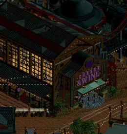
- The Cheese and Wine building entrance, phenomenal execution here
This was the hardest match yet for me as this is currently my top 2 for H2HX. Great work from both teams!
 deanosrs
Offline
deanosrs
Offline
I was unable to vote on this matchup as I was away last week, so adding brief writeups now.
VERB by the Jazzcats
This is not a theme that I typically go for. I was just never into space stuff as a kid so I miss on many of the references for these kinds of builds. The foliage to me just looks like a colourful ugly mess. Maybe that's part of the theme?
I guess I'm just not super quick, a lot of this park goes over my head. Void Experimentation Test - the opening of this ride is absolutely fantastic. I love the way the train is parked and then gets painted void and shot out the blast doors. A top 5 H2HX moment so far for me I'm sure. But, I don't understand the repainting of the trains throughout the rest of the ride. I'm just unsure of how the environment is repainting them or why.
The vehicles are cool. I especially like the one tucked away next to the VERB sign in Hangar 2.
This isn't a park thing, it's a me thing. I just struggled to find the narratives of the park or really jibe with it. I can appreciate the skill behind it for sure and totally get that some parks just aren't for some people!
The Yards
Before I viewed the park, I thought there was something of an excess fuss being made about a peep jam, but after viewing the park, I think I get it. The park is so good and so wonderfully composed that it is frustrating for something like that to be a blemish on the park! But that happens in H2H with deadlines.
I get the darkness critique too, it is a little much. I turned up the brightness on my monitor and it became more tolerable.
With all that out the way. I can start listing what I love about this park which is a lot! First and foremost - the angles of the composition. I don't mind having a theme that's a little tired in RCT when the entire composition of the map is so novel. So many areas, like the tower at the entrance of the old cow, or the pathing on the smaller half of the map around the factory: I glance once and think, that's neat RCT. Then I look again, amazed that most of it is half diagonals, then spend a good 10 mins with the scenery picker figuring out how the hell you guys did that. I bet half your time was spent re-ordering stuff in the tile inspector! Crazy.
There's a fully half diagonal boat, with a concert on it! Ridiculous! There's a train parked on half diagonal rail tracks!
The station/factory area for Machinus Volta is the visual crescendo of the map. So much movement going on aside from the rides. The huge textured tower reaching up into the sky. It's all so beautiful yet ugly. Perfect for the theme. The coaster to me is paced a little slow in places.
The lights throughout (new flickering versions spotted!) are great, and such a good way of marking out the macro of the map, guiding eyes around the park.
I think this one is probably going to settle in as my new #1 of the contest so far. I really wish the peep jam wasn't there, but I can live with it if it means the queues for the cheese and wine shop are lower.
Solid theme, A+ macro and a healthy dose of "I could never do that". Love the park. For the Yards to only get 32% seems crazy to me.
 Jappy
Offline
Jappy
Offline
BIRB. I mean VERB
ITS GETTING AGITATED. Okay, before I start with the praise, gotta say this soundbyte was so short that I was getting pretty tired of this soon, and the sound was turned off fast. That out of the way, I took some time to see what the theme was but I did find it very creative when I discovered it. The mining of void is a really cool concept. The futuristic archy is a great contrast to the more colourful and wacky alien surroundings. I have to say that I did not notice the coaster at first, and only found out about it in the comments here. Seeing how this is done by plugin, I found it to be a pretty unncessary gimmick tbh, the park is good enough without it.
The Yards
A park almost fully built on the half diagonal huh? And in the dark? I'm getting a sense of deja vu. No prices for guessing who made this. I'm not 100% what this is, but it looks like a gentrified industrial area turned into a party district? Cool idea for an RCT park, that's for sure! Music def adds to this vibe, I can see myself enjoying this IRL! Archy is amazing,, and love the different rail lines going through everything. While I am still not a fan of half diagonals, they work brilliantly here. That party boat is very well done. Sorry to say that the peep jam does bother me a bit. Part of constest parks is not only that they look good, but also funtion, and that hurts the park a little. Not enough to sink it though, this is still brilliant!
 AvanineCommuter
Offline
What a nerve wracking matchup this one was… We were very scared for this matchup but I’m breathing a sigh of relief that we were able to compete here. Thanks to all the words of appreciation for VERB from the community, I’ll be posting a BTS post in due time with some background on this build.
AvanineCommuter
Offline
What a nerve wracking matchup this one was… We were very scared for this matchup but I’m breathing a sigh of relief that we were able to compete here. Thanks to all the words of appreciation for VERB from the community, I’ll be posting a BTS post in due time with some background on this build.
When opening the Yards, our team collectively had a big “gulp” moment seeing how amazing this park is. Moody, atmospheric, fully off grid while maintaining clear legibility, dense macro with some really cool interaction and stacking of elements. What an incredible piece of RCT!
I loved the idea of an Urbex park in an abandoned factory setting, and throughout the entire park you see such clever and intricate weaving of ideas and architecture in beautiful ways. The fully diagonal boat and dock area was so clean, the giant car carousel looks almost taken out of a high punk fantasy setting, and the coasters themselves were so well integrated (maybe a little too well integrated that it became hard to watch…!) into it’s surroundings. A few standout bits: the gravitron ride and the dance club within the adjacent black train car - what a killer idea so perfectly rendered in game, the half diagonal corner with the overhead train tracks, the lift hill of the euro fighter on the X-brace structure, and the diagonal car carousel structure overlooking the park.
While I echo others’ concern that the palette is way too dark that it started to hide details and did a disservice to the park, it did set the right mood and ambiance you were going for. What would have helped is an integration of lighting design and color theory: with such a deep night palette, you cannot solely rely on pops of string lights as the only source of lighting. Like we saw in Bellum, adding gradient wall washers to illuminate the buildings surfaces would have elevated this park to another level by bringing increased legibility to sell the incredible work that’s already on the map. Incorporating lights pouring out of the illuminated interiors of some building entrances also would have spotlighted them and provided more contrast against a sea of darkness.
That being said, this park surely will go down as one of the best in H2HX, and is in my top 3 parks of the season so far! MorganFan
Offline
MorganFan
Offline
The Yards
While my first impression was that it was too dark, I had an amazing time with this park once I got used to the palette. I wish there could have been more pops of light though. Regardless, this is wonderfully vibrant, and I had no problem with readability. The macro is laid out satisfyingly and I could see this place being real. The large yet understated coasters worked to the park's benefit to show off the super clean architecture. At any rate, the park feels balanced and expansive, with how both the extreme and chill areas are given enough space to breathe.
Void Extraction Research BaseThis is the kind of fresh idea that one can come to expect from both AVC and H2H. Visually stunning, delivers on color throughout, with a great coaster and theme concept. I love the buildings and highly greebled vibe of the architecture in general. The more natural areas add a pleasant amount of space away from the cluster of giant space buildings that completely overtake the map (in a good way) when you rotate it 180 degrees. Void and black usage is perfect in contrast to the brightness of everything else, and it feels like the edges of the game are creeping in. Well done, and congrats AVC!
 Cocoa
Offline
Cocoa
Offline
aight back home, time for reviews
verb-honestly the best thing here is the color choices and art design. I love the pastel scifi, its so relaxing and well-appreciated compared to the usual gluttony of h2h parks. the buildings are all stunning (if a little empty) and there are some architectural forms in here I couldn't have dreamt up. the only thing i kinda hate is that grey/black 'mesh' path texture, i sort of wish you went with anything else there instead. i love that we have one feature ride which is immensely follow-able, and kitted out with a great narrative. to me that feels quintessentially h2h. you said that the void idea came late in the process---its almost impossible to believe, since it feels so key to what i love about the park. taking something in the game and exploring it from a new conceptual angle, building it explicitly into the form of the park is so much of what i love. kudos on a well deserved win, finally
the yards-so much to love here, i really did have to think on it. i love the waterfront, the party atmosphere, the dense mysterious foliage and the industrial architecture. all extremely high quality, and oozing with fun. I wish it was real. the park is more readable in game than in screens, so i don't have any issues there. but i did struggle to figure out what was going on in the back half of the park, behind all the genuinely stunning buildings. I spent really multiple minutes trying to find the flyer station and i'm still not entirely sure i figured it out. the ride interaction is great but I couldn't find the queues, stations, or any relevant infrastructure to ground me as i was trying to watch them all go. in a game of inches, that was really what sealed it for me. but it really did come close-i love the half diagonal boats, diagonal boats, trains, bridges, little restaurants and clubs, etc. i think this park is likely to grow on me in a way not every h2h park does
 Ethan
Offline
Ethan
Offline
Void Extraction Research BaseVery great and excellent thematic conceptI am obsessed with the pipes. I love the launch track voice audio concept and clever plugin usage. The color coordination of this entire map is to die for. The architectural shapes are absolutely stupendous. The purple river rapid and water stuff is a great choice. The map edge is excellent. The giant crane digger and other automotive craft are genius. The new objects are amazing. Pops of color in the glass ornaments against dark materials are impressive. The flat ride with the orbit thing is a nice touch. The monorail and single rail rides throughout the park are gorgeous and perfect supporting rides.The YardsI love the opening area where the people are sneaking into the parkThe skate park is subtle but nice. The behemoth steam boat structure draws the main focus perfectly. I love the layers upon layers design style of the coasters. The build-up to the industrial fortress has the perfect midway with clubs, creating a lively experience. The depth of seeing down into everything with peep objects is fantastic. The smoke stacks are amazing. The gravity wall and bridges are crisply executed. The park avoids feeling samey despite a homogeneous color vibe. The shipyard with the boat is another amazing detail. CedarPoint6
Offline
CedarPoint6
Offline
Reviews!
VERB:
The Yards:
This was a harder choice for me despite having one that's more 'realistic'... I actually really liked VERB a lot. The colors really jumped out at me, especially the rockwork transitions from the blue to the red. Ultimately I did lean towards The Yards, but this was one where it feels bad to have to pick one because they're both super high quality.
Tags
- No Tags
Members Reading
- Copyright © 2002-2025 New Element Designs
-
Community Forum Software by IP.Board