Head-2-Head-X / H2HX: Round Robin - R3M2 - Jazzcats vs Evergreen Gardeners
-
 11-June 24
-
 posix
Offline
posix
Offline

The RR half-time match is an epic between two heavyweight parks, a very welcome sight after our brief but most unwanted technical interruption.

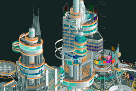
 Void Extraction Research Base
$ describe "Void" > Density 0.8 g/cm³. Reflectivity 0.0%. Half-life 1.79E+308 s. Conductivity min 0.0 S/m max 0.0 S/m. Notes: "Void exhibits perfect absorption of electromagnetic and ionizing radiation. It is found exclusively on and extracted from planet B01-C-25"
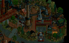
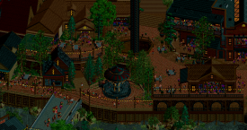
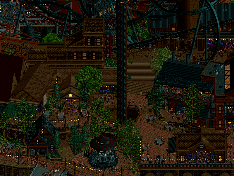 The Yards
Discover the extraordinary at The Yards, a unique theme park crafted by urban explorers who transformed an abandoned factory into a thrilling adventure paradise.
-
Voting rules
- The poll will stay open for ~72hrs.
- Do not vote unless you have viewed both parks in-game.
- Everyone may vote except members of either team. Any illegitimate votes will be ignored or removed.
- Anyone with an account that predates the start of H2HX, or who has been drafted onto a team, may vote in this match. Anyone with a newer account must pass the admins' account integrity checks.
- Voting is monitored by the admins to improve fairness.
-
 J K
Offline
J K
Offline
Both parks are insane, so much love and attention in both with tonnes of innovation. Larger writeup soon.
-
 wheres_walto
Offline
wheres_walto
Offline
What a fascinating matchup this is. I think both parks can be described as highly ambitious, stunningly constructed, completely modern, with both also suffering moments of minor frustration for me as a viewer.
Verb -
Cool concept, what is void? I'm sure there were other inspirations, my first thought are the research facilities in Portal 2 studying different kinds of goop. The pipes solidify that image for me. The structures here are massive, complex, incredible. I see very little copy-pasting, which is unreal for something imagined at this scale. I can obviously see how Valley of Kings may have stolen some thunder. The rockwork is excellent, the color transitions are smooth and satisfying. Big flowy coasters. The only plugin effect I noticed was the stamp. Very cool! I'm sure there is more happening but I'm tired and can't be bothered to search for it right now. I didn't notice anything to do with audio... maybe I'm dumb. It's so interesting that the music is subdued while the park is so visually loud and overpowering. Great job capturing a unique alien feel. It's subtly hostile, I don't think I enjoy being here. I can't hold that unsettling feeling against you because it was so clearly the intention
Yards -
Another fun concept, very clearly one that means something to the builders. The factory construction is stunning, with new objects and shapes that I've never imagined. I don't love the darkness of the palette, but it helps the lights pop and the immersion is stronger at night with the type of park this would be in reality. The half diagonals are unmatched: the fluent use of CTRs on a half diagonal grid is just wow. I love the different clubs overflowing with peeps, each with distinct facades. The ride interactions are much stronger in this park, but the peep management is distractingly poor. I'm an old school player so seeing peep jams in one area while two other foot bridges stand basically empty is annoying.
I haven't voted yet. This is very clearly a matchup of top tier players flexing their muscles and showing off their individual styles. The biggest strengths are largely shared between the two, while the weaknesses are more distinct. Great job guys, I'll be taking bribes for my vote
-
 ottersalad
Offline
ottersalad
Offline
Really impressive work on both parks!
VERB
Really fun, bright, creative aesthetic that I am drawn to immediately. I mentioned in Discord that it feels like Starfield, but I can definitely see the No Man's Sky inspiration here as well. Really fun to see an alien world in RCT. More of that please! Architecture was really cool as well. Some creative shapes, a very large and grand scale. The textures/objects used were a bit on the flat and plain side for the buildings, but not everything needs to be mega crunchy. The main coaster was really neat - loved the coaster getting painted(?) in void coloring and then launching thru the doorway was a great set piece. Layout was superb too. The landscape gradient was stellar, probably my favorite part of the map overall - the usage of colors.
Yards
I have to say it, this was a dark map. Some details were a bit lost because of how dark everything was for me. But, looking past that, there is no doubt that this is an incredible work of RCT. The effortless use of half diagonals alone is impressive. The park feels lively and busy, lot of movement, great ride interactions. I agree with Walto that the peeps are a huge distraction. I thought the EDM music went along with the giant crowd of peeps walking in circles when I opened the park.. but nope, that was just a massive crowd of peeps stuck walking in a circle. It made for everywhere else on the map feeling dead and empty. The static crowds of peep objects didn't really help in that regard - imo they are supplemental to actual peeps traversing the map. I sincerely hope I don't sound harsh/critical... especially considering I can't make a park this good. This park will be a great example to look back on when it comes to composition and building structures that have layer and nuance.
edit: So 2 days later.. I went with VERB. I really enjoyed The Yards - really grew on me. The music really sets a vibe and a tone while viewing the park. Below is a picture of I really enjoyed about The Yards. The infrastucture, layering, density, cleanliness, fully readable. So good. What won it for VERB in terms of my vote was the creativity and overall great layout of the main coaster. The unique world/setting too was refreshing and the landscaping is top notch.
Edited by ottersalad, 13 June 2024 - 07:16 PM.
-
 Turtle
Offline
Turtle
Offline
two really clever parks, both with themes that honestly i'm usually not a fan of, generally. space stuff tends to feel too sterile for me, and factory themes tend to feel too dirty and don't actually look good. happy to say both of these prove me wrong.
VERB
right off the bat the color scheme is absolutely amazing. almost dr suess-like, without feeling cartoony at all. the landscaping is up there with anything i've seen, and again the colors are so good. the orange/yellow trims on the architecture feel perfect.
obviously a really impressive map overall at first glance, lots of height variation and a completely alien feel. similar to Valley of the Kings it feels like a fully fleshed out theme - alien but pretty evident what's going on, easy to understand. the coaster is immediately the star - it really made me want to follow it and see what's going on. great ride. took me a couple of tries to work out what was going on with the launch, but damn the recoloring is so clever. and then the colors change through the layout. feels like one of those great ideas that you somehow worked out how to do. major props.
the waterfalls and landscaping may get overlooked as it's so wacky looking, but it's high quality stuff. skillful to be able to blend so many colors in landscape and foliage without it looking shit.
lots of other stuff going on too - the elevator pounding the void clumps flat is brilliant. the pipes everywhere look so flawless that's it's easy to overlook also - that's a theme with the whole map really. kinda effortless. very hard to get that feeling with something completely new and conceptual. great work.
honestly as i viewed this park first, my thoughts were "this park is obviously going to win, no matter what the next park is like. it's so good."
The Yards
well bloody hell, here we go. first thoughts - dark. it's very dark here. also the music is very strange compared to the opening scene. let's look around. oh hang on, i think i know what's going on. once i got more into the map and over to the other side of the river, this thing really clicked into place for me. the lights everywhere are EXCELLENT. best nighttime theme i've seen, definitely. the atmosphere of this place is incredible. the music is PERFECT for the setting. it really reminds me of the canal area in central Birmingham in the UK when they gentrified it - lots of dark brick etc. and really trendy bars and restaurants.
you've done really well to get so many rides into this area. it feels lively and organic. all the coasters were interesting and cool to watch. personal fave was the Pipeline one with the half loop coming out of the smokestack.
it's worth mentioning the technical skill that's gone into so much diagonal and half diagonal architecture. probably the majority of the map has this going on, and it's tough to get it to look fitting alongside "normal" grid stuff. but you've done it perfectly. this might be the best example of it ever. major props.
the biggest compliment i can give this map is that it feels like one person built it, with a LOT of love for the subject matter and a really clear image of what they were going for. it's quite a specific setting but it's immediately apparent to me, and it's just a really nice place to be. the longer i spend in the park, the more i feel at home. vibes.
incredibly tough to vote here and neither park deserves a loss.
-
 Camcorder22
Offline
Camcorder22
Offline
Ive always been self conscious about my ability to write good rct reviews but that ends now!! These amazing parks deserve some more reviews!! obligatory “shame one park needs to lose”, it really seems like both teams brought their all and this might be the strongest match so far, with 2 parks that will be talked about long after the contest ends.
VERB
First of all, absolutely in love with the concept, maybe one of my favorite RCT concepts of all time. It allows exploration of a new open feature, and also kind of breaks the 4th wall about an aspect of RCT maps that we usually just try to ignore, and makes it part of the map itself.
It seems like high concept space fantasy parks are having their time to shine, at least in the contest/small park format, and you’d expect a lot of parks start to look kind of the same. This park treads the line perfectly of looking like the builders doing what they do best, while still introducing a completely fresh aesthetic. The color scheme is VERY bold, and easily could’ve looked like a bunch of chewed up skittles if it was done wrong, but it appears the builders were very mindful of this, and this is where the composition of the park comes into play. The rock layers help create some separation between the intense colors while also setting themselves apart from the typical Fisch layer rock meta. The foliage/water, the most vibrant part, has enough separation from the more dense parts of the map such as the archy-heavy areas that it prevents intense clashing, while the architecture sticks to a still bold, but smaller selection of colors that is less present in the foliage. And the result is a map that, despite everything that’s going on, looks like SOMETHING when its zoomed out, which is honestly, a feat. Another bit I like is the “void” gaps built into the middle of the map, for things like the coaster loop, etc. fits the theme, looks cool. Checks all the boxes of a great h2h map and then some, don’t think I have much negative to say about it at all.
The Yard
Ive always been a dark palette truther so this doesnt bother me. It does feel quite dark, especially after looking at VERB ironically, but my eyes adjust pretty quickly and nothing is lost. Yalls monitors just aren’t bright enough! Another fairly novel concept with an old industrial area turned into an nightlife entertainment area/amusement park. I like the way that unlike many other urban parks, the amusement park/urban aspects are fused together instead of having an amusement park + outskirts. On a purely technical level, this park might be even more impressive than VERB, and maybe any other park this contest. The archy is flawless, the half diagonal use makes everything look dense and off the grid without being like “this is a half diagonal”. The interaction is top notch. Looking at the side of the map with the two coasters weaving in and out of each other, through the industrial buildings, and above layered paths and bridges… i don’t know how yall did that and made it look good. The whole section with the boat and the double decker car carousels is so cool too.
Since I have to split hairs in order to vote on this match… I’d say the aesthetic of The Yard feels less novel. The concept is fairly unique, but the overall dark industrial vibe and palette inevitably brings to mind parks like Le Coeur. If anything, changing up the color scheme a bit to focus less heavily on the burnt red could’ve prevented this. The park does set itself apart as unique with more viewing, but that was my initial reaction.
Vote ended up going to Jazzcats. Two expertly crafted parks, one which felt a little more unique with a concept I loved a little more. Matches like this are both the tragedy and fun of H2H!
-
posix
Offline
The YardsWhat a crazy park. First thing I did was to turn off ride music in the game menu, because gosh it was atrocious. Then the palette hurts this park for me further and I swapped it to English Desert. With the park unpained, wow it's amazing. the construction of the industrial theme in such a complex composition and density is really astonishing. There's just a lot to explore and love, and the half diagonals actually looked like half diagonals because you blended them in so well, especially through the restaurant seating areas. The ride design in the upper parts of the map looked like three Leon micros combined into one, and it's really coming together nicely. I found this really impressive.VerbJust massive. It doens't happen often that such a fantastical setting full of micro reaches such levels of immersion. It was like a dream that sucks you in. I loved it. I didn't want to understand the park or analyse individual things, I just wanted to swim in its vibe and trip a little. It was lovely. The audio here was intentional and successful, and the aesthetic aspect of the game was given strong importance, which is what's most important to me about RCT. I have no idea what the plugin did, but I'm not sure it wsa all too necessary to understand. I thought this was one of the more successful H2H space themes in a while. Well done.
-
 Gustav Goblin
Offline
This match is so hot you can fry an egg on it. Either of these parks having to lose should be illegal.VERB:+ INSANE aesthetics across the board. So many bold, striking color choices which I am so here for.+ Took me a bit to get the theme, but it's a great example of a meta theme that is executed well enough and integrated into the world of this park enough to not feel like it's trying way too hard to be funny. It clicked when I noticed the void being sucked into the pipes.+ The architecture feels like everything I was trying to do on Valley of the Kings and failing because I am not superhuman unlike these amazing builders. Clean forms, compound shapes, greebling to break the monotony; just done so damn well.+ The plugin is subtle enough to not mar the viewing experience with or without it but adds a surprising amount to the narrative. The gantry painting the train void color only for it to come off in real time, the synced audio, and the void stomper turned out amazing.+ I have to bring up the synced audio again. Next goddamn level. The gantry going silent when it stops moving, the timed LSM launch sound which I think will probably get used in a realism masterpiece in the far-off future, and the narration throughout build a soundscape unlike anything we've heard in this game before. It's a functioning preshow scene. What the actual hell man.+ FANTASTIC landscaping. The gradient on the rocks really helps differentiate each level and prevents it from becoming a red rocky blob. Lean water, the wacky alien foliage, and the crunchy blue bottom layer that wisps away at the edges make this park feel so alien.+ Void Experimentation Test is a hell of a layout. That first inversion with the void dripping off the supports in front of the colorful landscaping is a landmark moment. Love the supporting cast of rides too.+ Love the activity in the busier backstage sections. Glad to see VERB imported some Contraptions from Gamma Station!- I'll admit at times the spacey archi feels a tad bit underbaked. There are pretty sizeable sections where it's just very basic shapes and forms with not a lot to break them up or add interest. Clean aesthetics can be tough in the modern crunchy meta, but even a bit more greebling or frozen peeps here and there would have perfected it.The Yards:+ UNREAL level of detail on every front. Just ridiculous freak brain stuff.+ Concept is super fun and I can tell the builders had a lot of fun with it. The rides lean into the theme super well.+ This might be the best use of half diags in the game. It feels like it was built on the half diagonal, almost like Riverview was last season. The half-diagonal CASTAWAY sign caught me off guard.+ Static peep scenes all throughout the park turn up the atmosphere to 11. The music, the movement, the lighting, everything. Very very immersive.+ Trains, static and moving. The off-grid placement for the static trains looks seamless and I love Jeff and Larry. Half-diagonal railroad track objects really round it out.+ I have no idea what that gigantic round building the CAR-ousel is supposed to be on but it's so chaotic and I love it.= Amazing coaster layouts, although I feel like they drag at times.= Didn't hate the music honestly. Works with all the clubs built inside the factory.- I've always been a big palette proponent, but unfortunately I think the nighttime setting does a disservice to the level of detail in this map. It's very hard to make out on a smartphone screen, which was how I had to gauge my first impression of this park before seeing it ingame. It's obviously better on a proper screen, but there's still some difficulty reading things especially with how homogenous the architecture is.- It is CRUSHING seeing a park of this caliber with such obvious peep/pathing issues. I've tried to see past this but it's hard not to notice empty bridges and street scenes juxtaposed with turbo superspreader circle pit peep jams from hell right nearby. The aforementioned peep scenes help with this but unfortunately not enough.- The Belt's conveyor belt sometimes zips right off its rails at mach speed and completes a circuit before coming back! I'm guessing this was a late addition with little time to proofcheck.Super hard vote. I have a rough idea of which park I like more but need to sit on this one a little more. Best match of the contest, best parks of the contest, certified banger no matter who wins.
Gustav Goblin
Offline
This match is so hot you can fry an egg on it. Either of these parks having to lose should be illegal.VERB:+ INSANE aesthetics across the board. So many bold, striking color choices which I am so here for.+ Took me a bit to get the theme, but it's a great example of a meta theme that is executed well enough and integrated into the world of this park enough to not feel like it's trying way too hard to be funny. It clicked when I noticed the void being sucked into the pipes.+ The architecture feels like everything I was trying to do on Valley of the Kings and failing because I am not superhuman unlike these amazing builders. Clean forms, compound shapes, greebling to break the monotony; just done so damn well.+ The plugin is subtle enough to not mar the viewing experience with or without it but adds a surprising amount to the narrative. The gantry painting the train void color only for it to come off in real time, the synced audio, and the void stomper turned out amazing.+ I have to bring up the synced audio again. Next goddamn level. The gantry going silent when it stops moving, the timed LSM launch sound which I think will probably get used in a realism masterpiece in the far-off future, and the narration throughout build a soundscape unlike anything we've heard in this game before. It's a functioning preshow scene. What the actual hell man.+ FANTASTIC landscaping. The gradient on the rocks really helps differentiate each level and prevents it from becoming a red rocky blob. Lean water, the wacky alien foliage, and the crunchy blue bottom layer that wisps away at the edges make this park feel so alien.+ Void Experimentation Test is a hell of a layout. That first inversion with the void dripping off the supports in front of the colorful landscaping is a landmark moment. Love the supporting cast of rides too.+ Love the activity in the busier backstage sections. Glad to see VERB imported some Contraptions from Gamma Station!- I'll admit at times the spacey archi feels a tad bit underbaked. There are pretty sizeable sections where it's just very basic shapes and forms with not a lot to break them up or add interest. Clean aesthetics can be tough in the modern crunchy meta, but even a bit more greebling or frozen peeps here and there would have perfected it.The Yards:+ UNREAL level of detail on every front. Just ridiculous freak brain stuff.+ Concept is super fun and I can tell the builders had a lot of fun with it. The rides lean into the theme super well.+ This might be the best use of half diags in the game. It feels like it was built on the half diagonal, almost like Riverview was last season. The half-diagonal CASTAWAY sign caught me off guard.+ Static peep scenes all throughout the park turn up the atmosphere to 11. The music, the movement, the lighting, everything. Very very immersive.+ Trains, static and moving. The off-grid placement for the static trains looks seamless and I love Jeff and Larry. Half-diagonal railroad track objects really round it out.+ I have no idea what that gigantic round building the CAR-ousel is supposed to be on but it's so chaotic and I love it.= Amazing coaster layouts, although I feel like they drag at times.= Didn't hate the music honestly. Works with all the clubs built inside the factory.- I've always been a big palette proponent, but unfortunately I think the nighttime setting does a disservice to the level of detail in this map. It's very hard to make out on a smartphone screen, which was how I had to gauge my first impression of this park before seeing it ingame. It's obviously better on a proper screen, but there's still some difficulty reading things especially with how homogenous the architecture is.- It is CRUSHING seeing a park of this caliber with such obvious peep/pathing issues. I've tried to see past this but it's hard not to notice empty bridges and street scenes juxtaposed with turbo superspreader circle pit peep jams from hell right nearby. The aforementioned peep scenes help with this but unfortunately not enough.- The Belt's conveyor belt sometimes zips right off its rails at mach speed and completes a circuit before coming back! I'm guessing this was a late addition with little time to proofcheck.Super hard vote. I have a rough idea of which park I like more but need to sit on this one a little more. Best match of the contest, best parks of the contest, certified banger no matter who wins. -
 Congoy
Offline
V.E.R.B."It's getting agitated!" - My first viewing was without the plugin and I had questions about why the coaster track was only dripping void in some sections and why the soundscape felt a little too empty, even for a void map. My second viewing was with the plugin and it resolved everything, the effect and sounds are fantastic! It really pushes the narrative to the next level. The void factory tile smasher is another great effect here, the timing is perfect. New sign font is really nice. The landscaping is very colorful and a good compliment to the void color. Architecture is on point as well, love the pipes extending into the void which look like they're absorbing the surroundings and dumping the impure void. Fantastic map, excellent work all around!The YardsI want to visit this place, it feels real. The music tracks are fire. The grid breaking is very impressive, so much so that the pieces that are on the grid look like the grid breakers, wow. Architecture is absolutely stunning. The vertical lift for the Eurofighter coaster is great. The canal and the boats are awesome. The placement of the roto drop is really nice. Actually, the overall macro is really nice. It can be difficult to get buildings so close to each other and not ruin the sightlines, good work there. The nightlife vibe was captured extremely well, and the vision came across clearly, great job!
Congoy
Offline
V.E.R.B."It's getting agitated!" - My first viewing was without the plugin and I had questions about why the coaster track was only dripping void in some sections and why the soundscape felt a little too empty, even for a void map. My second viewing was with the plugin and it resolved everything, the effect and sounds are fantastic! It really pushes the narrative to the next level. The void factory tile smasher is another great effect here, the timing is perfect. New sign font is really nice. The landscaping is very colorful and a good compliment to the void color. Architecture is on point as well, love the pipes extending into the void which look like they're absorbing the surroundings and dumping the impure void. Fantastic map, excellent work all around!The YardsI want to visit this place, it feels real. The music tracks are fire. The grid breaking is very impressive, so much so that the pieces that are on the grid look like the grid breakers, wow. Architecture is absolutely stunning. The vertical lift for the Eurofighter coaster is great. The canal and the boats are awesome. The placement of the roto drop is really nice. Actually, the overall macro is really nice. It can be difficult to get buildings so close to each other and not ruin the sightlines, good work there. The nightlife vibe was captured extremely well, and the vision came across clearly, great job! -
 roygbiv
Offline
roygbiv
Offline
Really hard to pick here still not too sure which one I like better
YARD : The execution on this map is insane. Very hard to read at first glance but fun to dissect. This park really excelled at the building aspects and made some crazy bold choices elsewhere. Very dark scheme and very annoying song choice. Overall this park had stuff I liked a lot but didn't come together for me.
VERB: This park is cool too. Reminiscent of Liam's metropolis. Vertically was cool and this park felt very big. Did feel similar to last weeks valley of the kings park in concept but more in space. Was there an audio puzzle or something it just kinda loops. I really liked the dripping off the coaster track big fan of that. Overall this park was a bit more fulfilling but not necessarily a concept I liked.
-
 RobDedede
Offline
RobDedede
Offline
I went back and forth on my vote three times.
The Yards:
I ended up voting for this park. Let's get into why. I love the theme of an abandoned factory. That's right up my alley. This park reminds me of my old Andy Warhol design, x10,000. I don't mind the dark palette. The peep jam thing wasn't a huge issue for me, either. Really cool, fun ride design. I loved the conveyor belt log flume and suspended coaster, in particular. The music is an absolute bop, really sells the atmosphere. I can imagine this being a gentrified factory in Chicago that all the millennials hang out at. Perhaps my favorite detail is how you made the factory machinery still functional (somewhat) in that large, oval loop. As nin pointed out in the discord, this map also excels in going off-grid while still looking quite clean. Great work, Gardeners. Ultimately, I voted for you because I enjoyed both maps very close to equally, but upon subsequent viewings, I found this park's execution, especially on the micro level, more advanced and impressive.
VERB:Initially, the vibes of this map won my over more than Yards. In fact, I might still slightly prefer the theme and atmosphere of this map to the Yards, but it's very close. For me, on this map my eye kept going back to particular places, like the coaster, the pipes, parts of the alien landscape below, and the swooping tower. The Yards, by contrast, led my eye to explore every corner of the map. The conclusion I drew from this is that the Yards had slightly more content to explore that was executed at a very high level. Not sure if that makes sense. Anyway, this map was superb, regardless. I loved the space architecture and the giant satellite above the map. The plugin effect was cool and quite subtle. If I had to criticize one thing, it would be that some areas of the base, especially on the lower levels, feel a little bare and perhaps finished quite last-minute. Hopefully your readings aren't elevated nor are getting agitated after my vote/review!
-
 FredD
Offline
FredD
Offline
The Yards
Ok let me with saying I like this map and what's there looks incredibly good. All the buildings are done so well and everything is interweaved greatly with eachother. I like the choice for Vertigo, such a weird ride type that fits really well in this setting. The CARoussel is also pretty neat, and that whole oval setting it is in catches my eye everytime it crosses my view.
Music is personally meh for me, but I have to admit it fits the setting very well, much club vibes and this kind of place would be insanely popular irl. I do have to say you didn't make it really easy to view the park imo. Readabilty is really a mess and I can't really stroll through the park effortless. Pipeline and especially Machinus Volta are quite hidden away inside the building. The launch MV should've been a weenie for peeps and us, rct visitors. Personally also not a fan of the palette, I get why you went with it but it makes stuff so hard to see as a rct viewer.
VERB
I like the idea of mining void at some wacky place somewhere in space a lot, very original. A good opportunity to have some cool space/futuristic theming and infrastructure plus some wacky foliage. Love all the crazy colors for the bushes and plants. Also liked the rockwork a lot, overall I loved all the colors in here.
The coaster was pretty neat, very swooshy and loved how it keeps raging untill the end while being so long. A lot of cool details in this map too like the trains of the coaster getting painted with void before the launch, the trains getting their colors back during the ride, the dripping void of the track, the tile smasher, space station hanging above,... Very much enjoyed this map!
-
 chorkiel
Offline
chorkiel
Offline
The Yards
I unironically love gentrified places like this. Spent all day in one today for a convention and have spent plenty of weekends at parties at them. This place was no exception. It's fantastic! From now on I'll always wonder which rides would fit best when I'm visiting one. Not a huge fan of the palette but I'll admit it was done extremely well. Much like in real life I'd much prefer the night version after spending the daytime (drinking) there first. With a quick palette swap I was able to see more and afterwards enjoyed the original more already.
VERB
The idea was pretty cool and extremely well executed. You created a cool esthetic for the planet. The plugin didn't add much for me. Didn't even notice it at first tbh. The dripping track was dope tho! Honestly don't have much to add to the reviews above. Enjoyed it loads but I preferred The Yards.
-
 FK+Coastermind
Offline
FK+Coastermind
Offline
Mid-move so quick thoughts; this is probably matchup of the contest thus far for me. Both stellar, both well executed, both provided a unique and refreshing aesthetic. It pains me not to vote for The Yards, the obliteration of the grid here is worth studying. But, I can't fault Verb in that regard either and it had an aesthetic that felt that much more distinct by the smallest of margins. All involved should be proud.
-
 GammaZero
Offline
GammaZero
Offline
Episode 3, Part 2: gamma goes to space (and gets drunk)
After a long wait (at least it felt that way to me), we're back with more H2H! And boy, was the wait worth it. Round 3 is when I expected every team to go all out again, and we're definitely seeing that in this matchup. On with the reviews:
Void Extraction Research Base
Okay, what the hell. No, really, where do I even begin?
This has got to be one of the freshest park concepts I've seen in a long time. May be a hot take, but I feel like most concepts - even H2H ones - are inherently derivative of other RCT in one way or another. But this concept (and its execution) feels completely new to me. Crazy, right? This is the third space-themed sci-fi entry in the contest, yet I'm calling it fresher than anything else. But I'm being genuine here, I look at this park and it feels like I'm looking at NE-quality RCT for the first time, without anything else to base my opinions on.
Of course, a lot of things contribute to this. The alien color palette, the sleek white architecture, the literal space station up there, and all the crazy shit the plugin is doing. All these things elevate what is already an insanely executed map. I could point out all the amazing individual things, or all the small details that bring life to this map, but not only do I feel like most of it just speaks for itself (or has already been mentioned by other reviewers), I'm also actually writing this review after the second one, so please give me a break

However, as to not cheapen the value of this review, let me at least mention two things. Firstly, the coaster flows so well, it hurts. Might genuinely be one of my favorite layouts in H2HX so far, maybe even my favorite. Secondly, the plugin effects to elevate the coaster's theme are just awesome. Really serves to create an immersive theme, as opposed to just an excuse to plop down rides onto a random environment.
Here's where I'd put in any negative feedback for this park, but... I got nothing. I'm not kidding. If it were up to me, this park would go down in NE history as one of the H2H (and overall) greats. And I sure hope it does.
TL;DR: fresh, fascinating, ingenious.
The Yards
You know, even though I agree with the "no public builder speculation" rule, sometimes it leaves me at a loss. This is one of those times. Because this park is so very clearly a specific builder's way of saying "yeah, I'm in this contest, and this is what I do. Did you forget?" It feels so familiar to this builder's style and inspirations, yet so fresh in its concept and execution. And, if the builders are revealed and it turns out that I was wrong, well, I have to give whoever actually built it props for fooling us like this
Alright, let's talk about what's on the map. Honestly, this is insane. Near-perfect execution meets unbeatable atmosphere. Having been to the place I assume this was inspired by (at least partially), it's remarkable how much the park gives me those specific vibes while still retaining its dreamlike construction and features. The texture use is really cool, the composition breaks the grid in the most natural way possible, and the industrial theme lends itself well to the impressively tall structures without breaking immersion. On that note, goddamn Six Frags, these pipe objects are awesome!
I really like the ride selection, they all fit really well with the theme. Vertigo and The Belt are probably my favorites of the bunch (surprisingly), but they all feel very flowy - I just wish the other layouts were a bit more visible in parts, but that's an understandable tradeoff. What I absolutely can't fault, though, is how well all of them are integrated within the theme - Pipeline's lift hill tower being the obvious example.
Honestly, there's not much I can think of as far as real negatives go. If anything, my #1 nitpick is that the park might suffer a bit from the contest's size restriction. Intentional or not, it does feel like everything is a bit too smushed together, making the viewing experience a little rough. But honestly, that's about it. I know the peep jam exists, but I'm not gonna dock points for unintended game behavior. The palette is also fine in my eyes, it achieves its purpose really well. And, finally, I love the music! I mean, what did you guys expect would be playing in a place like this? Overall, brilliant park - one of the best we've seen so far, IMO.
TL;DR: atmospheric, grungy, grid-breaking.
Okay. Deep breaths. That was... a lot. Way more than I intended to write originally. But who can blame me? This matchup is ridiculously high-level. And it really sucks that, even though I wholeheartedly believe that these are two brilliant parks that could win any matchup they ended up in, I still have a clear favorite (you can probably tell which one by the way I reviewed them). So, I don't know, whatever you make of this long wall of text, at least come out of it knowing that didn't vote against a park for any negative factors. Alright, this comment needs to end at some point, so I'm calling it. Congratulations. And thank you for not springing this shit on us.
-
 alex
Offline
alex
Offline
This was the first genuinely tough call for me, two amazing parks in different ways. On the visual level, I loved that both parks had a striking aesthetic and clear identity. I thought The Yards had the edge in terms of technical execution and level of detail, but I found the broader strokes of VERB to be more interesting and readable. In terms of ride design I also found VERB a bit more focused compositionally whereas the coasters in the Yards felt a bit too hidden in their surroundings. In the end it was the novel concept of VERB that won me over - it's really clever how you created a narrative and some mystery around the void background that our parks exist within.
Great job guys, I think both these parks are in my top-5 so far
-
 Hobeon
Offline
Hobeon
Offline
VERB:
Man I love this park, this kind of fantasy space theme is right up my alley. Great architecture and landscaping, love the walkways between the buildings. Tons of stuff stacked on top of each other without hurting readability, top notch stuff. The grape juice waterfalls look delicious but it's probably not safe to drink. The bright colours for the foilage is a bold choice but it fits the theme well.
This might just be the main base the explorers from Valley of the Kings came from haha
The Yards:
Sick. Love the architecture, the look of the old factory buildings with the grimy grey river running straight through it. The big factory is a bit hard to read, but that may be a me issue. Despite that there is a ton of cool details that caught my eye, like the tall brick pipes, the round storage tanks, the old steam train turned into a dance club. This is a place I'd love to visit IRL. Not a fan of the music though, I enjoyed viewing the park more with the sound turned off. Still enjoyed viewing the park a lot! The peep jam didn't bother me, rct peeps are dumb as a bag of rocks.
Oh and I loved the railway bridges!Fantastic job to both teams!
-
 mamarillas
Offline
mamarillas
Offline
Amazing round, very tough choice. Yards is so impressively built, hardly a whisper of the grid remains. It's the kind of RCT that I could never manage myself: architectural, lively, dense, urban. But VERB just brings me more joy as a big scifi fan, packs in lots of fun new details with plugin, and uses the vibrant color scheme to highlight the void theme. Great work to all builders!
-
 Liampie
Offline
Liampie
Offline
The Yards
I can imagine you guys submitted this thinking you had a sure winner on your hands. I would too, because the park is brilliant. The diagonals and half diagonals are some of the best we've ever seen. The atmosphere is also very good, with effective use of peep objects and using multiple levels to achieve pleasant and interesting path spaces and seating areas. The diagonal waterfront area is therefore my favourite part of the map. There is technically great stuff everywhere I look, it's tough to point out specific parts that stood out. I must also point out the interactions between rides and environment here, the pretzel is hard to wrap my head around, pun intended. On a more critical note, the park is so dense my computer can barely run it and it's rather painful to follow the rides around, but that is also because the rides are embedded so well they are actually rather hidden. Another critical note is that the dark palette did not do this park any favours. I understand you want to make the string lights stand out, but I think I would have made a different decision based on the palette's pros and cons. In any case, brilliant park, but a little difficult to look at.
Void Extraction Research Base
This is a really good comeback by you guys - against The Yards it's not an obvious winner right away. It's not as insanely technically perfect as The Yards, but instead it offers a more out of the box aesthetic and concept that I simply find more interesting. I don't think an alien landscape instantly gets my approval as being more creative, but in this case I find the execution to justify that description. The blue base rock layer makes it, the contrast it adds is much needed. I also like the look of the veiny rocks here, and of course the look of the void coloured trees to change the map edge contours. The waterfalls are spectacular, the coaster is clever and easy to follow, the architecture rushed in places but effective in others... I like how easy to read this park is. It's a great canvas for interesting details to stand out and be discovered. The tile smasher is an obvious standout. I must be somewhat critical of the plugin use. I like the subtle effect you guys used it for with the coaster changing colours, but on the other hand, was it necessary, and how does it affect my admiration for you guys as RCT players? What impresses me is doing surprising and original stuff within the existing game mechanics. Plugins are a new tool at your disposal, opening some doors. What you did here with the trains could've been achieved without a plugin, comparable to the hack Coasterbill did on the dive coaster in Uncanny Valley. I think the use for plugins is more excusable if you use it for stuff that could not be done otherwise. If you're using it to make the game easier... Are you a good RCT player or are you a good programmer? I want to judge you on your RCT skills and taking shortcuts does not contribute to that. I suppose it's the same as making new objects for things you could've made using existing objects as well. I find a building put together using dozens of trims and blocks more interesting than the same thing but designed as a 3D render. It's new technology with ongoing debate which is why I'm elaborating on it, but these are all the thoughts I have right now. Back to the park; summarised: very creative, very cool to look at. You're getting my vote, though I wish I could give something to The Yards as well. It's a cruel game.
Tags
- No Tags