Head-2-Head-X / H2HX: Round Robin - R3M1 - The Dambusters vs Soda Jerks
-
 02-June 24
-
 deanosrs
Offline
deanosrs
Offline
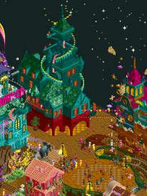
The Sailor - Dambusters
This park is a real mixed bag to me, it's full of hits and misses.
Glitchy stuff bothers me I think way more than most, and there's a lot of it on the map.
In contrast, the boats are some of the cleanest RCT I've ever seen. It feels like they belong on a different map. Not quality wise at all, but more just in terms of style. Glancing from the Sundowner building to the boats and back is probably the most extreme version of this.
Another contrast that just seems off to me is the scale of the lighthouse versus the uber detailed buildings below it on the edge of the map.
My guess is this park will grow on me the more I view it, and when I understand more of the story from the builders talkback, just like Wawel did - but I can't avoid that I have to vote inside 3 days so first impressions count for a lot.
I think probably the builders and team will read this review of the park and be really frustrated that I didn't get it. Here's the thing though: for h2h you have to put up ideas that are easily understandable. That's part of the context. This park ultimately made me work too hard to figure out what was going on and what might otherwise be deliberate contrasts to create an effect came over to me as stylistic discord that I couldn't reconcile.
With all that said, let me finish on stuff I loved here. The Nightcap Inn, despite having an awkward window overlay issue, looks exactly like the house I grew up in, and gave me such a fuzzy feeling to see it on the map. I love the piss waterfalls, I don't think you could ever have too many of those. The hangover station is a building that really nails it. I love the effect on the roof and the boat emerging from the side of the church, complex details executed really cleanly.
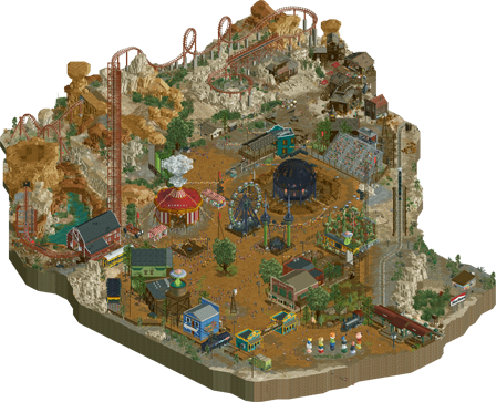
Yucca Desert/Action Park - Soda Jerks
I'm going to comment on the plugin, but park first! Oozes atmosphere and is very visually clear. The globe of death is wonderful, not a huge fan of the coaster - seems like a super early brake run to me - but I'm not an expert there. The music is wonderful but needed extending to the edge of the map - there's a band near the BBQ area and the game is silent if I put them in the center. That's a very picky issue for sure!
There's a really nice balance of half diagonals, and I especially like the teal building there. I think the whole park just nails the vibe, is really fun, enjoyable and clear to look at, and ticks all the boxes you want from a h2h park. I would like to have seen maybe 20% more content. The paths do take up a lot of space. But again, it's much better not to over stretch and nail what you put on the map, as was done here.
Ok, so onto the plugin, doing this in the order that is respectful to the builders! It's great, I love it. Great use of the site messages. The effects are wonderful, use a good broad amount of the API (although there's still plenty to dig into that none of us did yet) and really clean - they don't dominate the map but elevate it, which is exactly how I think these things should be used.
At times, I could have used a little more guidance as to where to look, or on what timescales to expect the effects to take place. This is again, very picky.
The plugin isn't reusable for other parks, as we were heavily criticized for over the first two rounds (even though it was largely addressed in round 2). But guess what, that doesn't matter at all! There's no rule that says everything we do needs to be reusable for other parks, nor should that detract from the huge amount of time that went into a very long plugin file. I think, frankly, this got a little silly especially considering the maturity of plugin use and the tight deadlines of the contest. I look forward to seeing more plugins from other teams over the rest of the contest.
-
 In:Cities
Offline
In:Cities
Offline
Time to sneak in a review while I can.
Dambusters park is breathtakingly beautiful, ambitious, exciting, and a real blast to explore. The more time I spent looking around, the more I grew to appreciate the efforts that went into it. While I did find the macro a little odd, the micro really made up for it. There are so many tiny vignettes of peep scenes that really make you pause and try to interpret their meaning. Whether you're right or wrong as a viewer feels irrelevant - it still causes you to stop and feel something. And thats something I really appreciate. The music really sets the tone here - perfectly suited to set the atmosphere. The use of color here is fantastic. Is the map cluttered? Sure. But the color choices really do a great job in making things feel readable and intentional. You can see this in the section with the tan pathways and curvy stairs in particular.The coaster itself is a lot of fun to watch. In a park like this, I could care less about realism. Does it look cool? Yes. Does it have interesting interactions? Absolutely. Especially the bit that wraps around the Delirium swings. One of my favorite details are the "Chug chug chug" buildings. Brilliant idea. Barbie vs oppenheimer looking houses near the beach are also a highlight for me.
I really like and appreciate the differing styles shown here - I think the combination of the two is a risky move, yet successful. I find that no matter where I rotate or pan around the map, there's a beautiful scene to take in. Everything was shown consideration and attention to detail, and I really love that.
Regardless of match outcome, I think this park will hold up as a beautiful work of art that only gets more appreciated over time. Great work to the builders and all involved.
But the aliens though
-
 spacek531
Offline
spacek531
Offline
The Sailor felt like a combination of Disney's Fantasia and Disney's Peter Pan. Is this what neverland would look like to a reluctant sailor? The gravestones around the map were powerful. I didn't really understand the music choice. The modern segments of the music took me out of the experience. Very evocative park, even if I didn't like some parts.
Yucca felt like a mix between the midway layout of Cirque Macabre with the nature aspect of Biota. Very beautiful desert rocks. Crunch not overdone, and some nice but very few buildings. Clever vehicle use for various effects. Plugin was flashy and added to the experience of the park. Beautiful park, even if it felt it didn't have that much content.
My vote goes to Dambusters. -
 AvanineCommuter
Offline
AvanineCommuter
Offline
Some really amazing work this round. What a great match!
The Sailor was beautiful with some really standout moments - the atmosphere and the whimsy of the park are what I've come to expect, and it's really sold well here. Some of my favorite scenes were the festive port with the sailors, the diagonal brick sloped road climbing up the cliffside, the rainbow gradient curved path surrounded by organically placed village buildings, the drunken brawl, and my favorite, the scattering of pastel lily pads springing forth from the river. Some visionary parkmaking here, creating these beautiful scenes and bringing them alive. Architecturally there were some gorgeous buildings, including my favorite, the tower with the ship coming out of it. However, there were others that felt less considered, or at the very least a bit rushed. I do agree with others that the park works wonderfully in one angle but less so in the others, and I wish the overall macro composition allowed for something be to seen and presented in all angles to feel more fully encompassing. The coaster itself was not a bad layout by any means, but it was also a little too nestled into the surroundings that it became difficult to see, especially beyond the one angled view. I also wished there were more narrative scenes; with so many peep objects and animation throughout, there were surprisingly little in terms of peep scenes to bring some clarity to the narrative. With such a dreamy surreal concept, this would have been very helpful to elevate the mood and story further.
Yucca Desert Park wowed me beyond the incredible plugin effects (shockingly effective and really really fun to watch it unfold!)... I personally think this park has the best landscaping of the contest so far; the unique shapes of the rock towers, the carved cliffs using different types of rock colors in organic swoopy shapes, the crunchy gradient of the ground work and the muddy piles around the motorbike ball... perfection! I'll be taking lessons. Beyond the landscaping, the park's rather simple overview belies the very technical building in both the architecture and the supporting elements. Half diagonal buildings are perfectly rendered, shanty shacks are crunchily textured and feel organic, graffiti looked real and gritty, the trains, busses and cars look almost like they were large scenery objects that came pre-made outside the game. Digging into the details really exposed some brilliant design choices and object uses that feel effortless. The coaster was a great Arrow looper with some really nice integration with the landscape. On top of that, what a killer killer music track that really sold the hokey Western atmosphere. This park won my vote and shot up to my top 3 parks so far. Congratulations SJ, can't wait to see what you guys have in store for us next!
-
 Liampie
Offline
Liampie
Offline
Due to the site's brief downtime the polls will remain open for a bit longer.
Added about six more hours to account for the recent downtimes. We're closing at 11 PM CEST tonight.
-
Liampie
Offline
Match conclusion
 Winner
The poll is now closed. The final voting score was:
18 < 40The Soda Jerks add a second win to their resume, being in a good position after a rocky start. The Dambusters: busted.
Creators Turtle
Offline
Turtle
Offline
congrats to the soda jerks, a really great park. walto you can tell you live here in vegas, some really great local details.
i personally went the other way and i was a little shocked to see the scores so far apart when i voted. i guess that's the hard part of making a binary choice, when maybe your decision might be weighted 60/40 one way or the other. i loved the Sailor, it's something that i'll definitely come back to. so cinematic and strange, just a really lovely place to be.
 wheres_walto
Offline
wheres_walto
Offline
The Sailor -
I really enjoyed this, as I love pretty much everything hoobaroo builds. What stood out to me was the storytelling aspect. A romantic intro, the sailor and his partner in a grassy field, I imagined this as the start of their love story. Younger, more innocent days. The Swan Lake music choice was beautiful while foreshadowing a double-sided character. As we descend the map, we enter the sailor's vices. In this case, alcohol and general debauchery. I quite liked the contrast between grounded pub-like buildings at high elevation and colorful dreamlike buildings with hazy features further down. Some buildings are hard to read, but it's easy to see them acting as a drunken recollection: they're unclear and difficult to recall with precision. The music transition to Since I Left You was a surprising change of pace, but one that both kicked up a more free-spirited mood while lyrically spelling out the lovers' separation and exploration of a new life. The scene on the dock was simple yet powerful, the characters felt much older and scarred by that time. Nobody captures liminal spaces in rct quite like you can. I hope this isn't the last we see of you in this contest
 Wanted
Offline
40 - 18 is harsh. hoob & team, this is some excellent work you should be proud of.
Wanted
Offline
40 - 18 is harsh. hoob & team, this is some excellent work you should be proud of.
2 great parks. The bar is just so damn high these days Gustav Goblin
Offline
Gustav Goblin
Offline
The Sailor: I literally guessed the lead builder just by refreshing the parks page and seeing the name of the park. I don't know if anyone has done this any faster.
+ No one captures a VIBE like Hoob. This is Hoob's stage. This is where he serves. Atmosphere is through the roof in almost every tile of the map, even the more reserved and not Hoob bits at the bottom.
+ I think my favorite thing about this map is the progression from top to bottom. It's such an effective way of telling a story. Walto captured it beautifully, going from introducing the titular Sailor at the church to the bars he visits which become more and more abstract the drunker he gets and ending with the dock scene where he leaves for war. I love how it ends with the Sailor staring off the dock and at the butterfly in the distance. Again, no one catches a vibe like Hoob.
+ Hangover's station is incredible and my favorite building on this very building-heavy map. The lighting effects, the boat coming out the side, and the mast on the roof really tie in the nautical vibe in a surreal way. Huge fan.
+ Get that OpenGL ready and zoom all the way in. The little street scenes isolated and viewed up close are unbelievably immersive. Mentally I'm there.
+ The reflections near the Deep Dive. Gotta keep that streak going after Stardust Circuit and House by the Sea.
+ Hangover is a dynamite layout, especially the first two drops that wrap around the village and the last hill that goes around Delirium. Would love to know who did this layout seeing how many builders are on this map.
+ The mansions that slowly shrink and turn into sandcastles. Hell yes. Love how it sacrifices realism in favor of surrealism to artistically bridge that gap.
+ The clock tower with the huge pendulum in the middle.
+ The beer-soaked street with the "CHUG" buildings. Such a smart use of those water objects.
+ Good-ass boats Roy.
= The Sundowner is a crazy setpiece if not a little chaotic.
- And unfortunately speaking of chaotic, I have to bring up this map's big crux. Zoomed all the way in it's beautiful and zoomed all the way out the river at least breaks up each section. At normal zoom, however, it's hard to really make much out with all the visual noise and variation between buildings. My first thought looking at this map was "This is Jaguar-level chaotic." My eye just keeps jumping around between buildings and it just does not come together on a macro level for me. Something with this level of conceptualism and micro detailing with a classier macro foundation underneath would be some of the best fantasy RCT has seen.
- Unfortunately kind of a two-angle wonder. The map feels a little small and underbaked when the compass faces east and south. I feel like time may have gotten you all there which sucks.
- Dumb nitpick but IDK why you didn't use a swinging ship CTR for Vertigo. It also clips through its base and the nearby buildings and the last two cars are squished together.
- Some of the buildings near the port feel a little undercooked compared to the detailed archi up top.
Yucca Desert Park: Guys I think Walto is an alien.
Liampie
Offline
I'll let the actual explanation and write-up to hoob. I only stepped in during the last week, mostly building in the last 2-3 days. I intended to fill a lot of gaps and to polish the map in general but I found it hard to adapt to hoob's anarchistic style which is quite different from my own style that I like to think of as quite rational. Instead I focused on the docks area, which needed a lot of development (there was virtually nothing) and it would be much more grounded and sober than the rest of the map - a much better fit for me.
I did pretty much all the architecture in the docks area other than the tram stop and the stuff around the swinging ship (though I did slap some windows and barrels on in the last few minutes before submitting), up tot the tan pendulum tower with the clocks. The pathing, general layout and the cranes are also mine. Some of this was built more deliberately (the cranes), some of them were built very quickly or integrated in a very quick way (pendulum tower and nearby staircases).
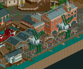
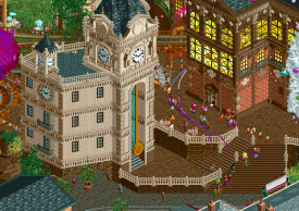
In the drunk area, I did contribute this wine themed tower next to the Sundowner.
I wish I had more time to develop this building a bit more, but I don't think it stands out too badly. I like the trick with the animated walls to make it look like the building is filled with red liquid. I can also take credit for the idea of the chug chug chug buildings, got the idea when I saw a bottle shaped building while in Augsburg a few weeks back. Hoob executed it beautifully. I also contributed the brawl in the plaza in front.
Gustav Goblin
Offline
Was always interested in seeing how you'd work with and temper Hoob and I love what you contributed here. Was a big fan of the clock tower building and the idea of using the cursed moving wall to represent a building filled with wine is absolutely genius. Love seeing your more whimsical and idea-driven side come out, there's a subtle beauty to it.
 nin
Offline
nin
Offline
I lost my motivation to do full reviews like I did earlier...
A bit bummed to hear this, I've enjoyed the format since MM!
I'm hoping to leave more thorough reviews as the season progresses and I find more time, but Yucca park was such a nin concept and so well executed that I couldn't resist voting for it. I've wanted to do the southwestern/alien theme for a long time and it's almost maddening how well you all achieved it here. A great piece of work.
In:Cities
Offline
Collectively as a team, we've decided to build every park with "the nin vote" in mind.
nin
Offline
If we still had signatures this would be mine forever.
Collectively as a team, we've decided to build every park with "the nin vote" in mind.
 GammaZero
Offline
GammaZero
Offline
Episode 3, Part 1: gamma is late
Usually, I make it a point to always do these reviews before the match is closed, for a variety of reasons. Unfortunately, since the site hasn't been in the best shape lately, I'm only getting to review this one now (and I'm still praying that my window doesn't close as I'm about to post this). In any case, especially since this is an opposing park, I'm gonna review it as if I didn't know who built on it, and completely disregarding the match result. Does that achieve anything worthwhile? I don't know, I'm just writing words and pretending I know what I'm talking about.
The Sailor
First off, this park's narrative is really cool, and not hard to piece together at all. I say this because that tends to be a personal issue I have with more high-concept parks, where the builder clearly knows what's going on but the viewer is left confused. Not the case here!
At a macro level, this map is sublime. Opening on the church ruins and letting the viewer descend the winding steps towards the docks (and accompanying surrealism) is just genius. Unfortunately, this does mean that the park is best viewed from the one angle, but I wouldn't call that a deal breaker by any measure. At a micro level, it's also great! In general, I'd say the architecture ranges from effective to stunning (aside from a couple areas which I'll get to later), and, of course, I have to mention the imposing elevation on display. I especially love how the pub crawl element is sold, by, well, having pubs all along the intended route. The peep-level life and details are super cool as well, probably one of this map's strongest points.
Now, let's talk big stuff. My favorite things here are definitely the coaster (and its station), and the ship (along with her little sisters). In fact, due to their close proximity, that whole area demarcated by them is definitely my favorite in the park. Really, I just wish the woodie were more visible in general - especially from other angles - a layout this nice shouldn't be hidden away like this, IMO. Also, I wish there were a more elegant way to do those sloped turn transitions on the traditional wooden coaster, but I'm obviously not gonna dock points for that.
Well, I guess it's time to talk about the parts I've been avoiding so far. The park is obviously flanked by two impressive surrealistic setpieces. I... am not the biggest fan of either. I'm fully aware that this is just personal preference, and their existence makes total sense in the context of the narrative, but unfortunately, this clash of styles just isn't my cup of tea. I can at least appreciate the intriguing beauty of the Sundowner area and the story purpose it serves, but the teal stuff on the east just feels unnecessary to me, and even messes with part of the coaster. You'll have to forgive me if that area also serves a narrative purpose that I just didn't catch, but, honestly, even if it did, I don't think it'd change my view on it

Despite the above rant, I still think this is an extremely strong entry, and definitely one with significant staying power in H2H and NE history. I know it's a bit of a dick move to say this when I'm part of the team that just beat it, but I really think you guys should be proud of what you've created in such a short timeframe. GGs.
TL;DR: beautiful, thought-provoking, damn look at that boat.
Can't wait to see what the rest of this round has to offer! Well, I say that, but I guess I can wait, we've been waiting longer than we'd want to already
Get well soon NE! chorkiel
Offline
chorkiel
Offline
This was an easy vote for me. That's not a smack on Yucca, but an applaud on The Sailor.
The Sailor had some immersive storytelling. I'm so glad to finally see a full park led by Hoobaroo finished. It's such an artistic park that it's almost easy to look past the great building. Most of the architecture would have been quite nice by itself, but the extra layers of confetti and booze really brought them to life. Also impressive how you were able to fit so much content on a park and it still remained so legible.
Yucca was pretty cool. I mostly liked the landscaping. Another great soundtrack from the Soda Jerks! The alien invasion was very clever and particularly the roof lifting up was cool. My main quip was that I didn't like the design of the UFO's and honestly found the park without it to be a bit boring. The rides by itself were all great but didn't really come together as an exciting park to me.

Tags
- No Tags
Members Reading
- Copyright © 2002-2025 New Element Designs
-
Community Forum Software by IP.Board