Head-2-Head-X / H2HX: Round Robin - R2M3 - Dambusters vs Hurricanes
-
 18-May 24
-

 Xtreme97
Offline
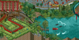
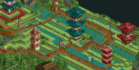
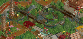
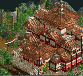
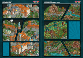
The final match of Round 2 sees the Dambusters take on the Hurricanes with a pair of lively cultural maps, from which at least one team will grab their second victory.

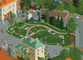
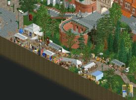
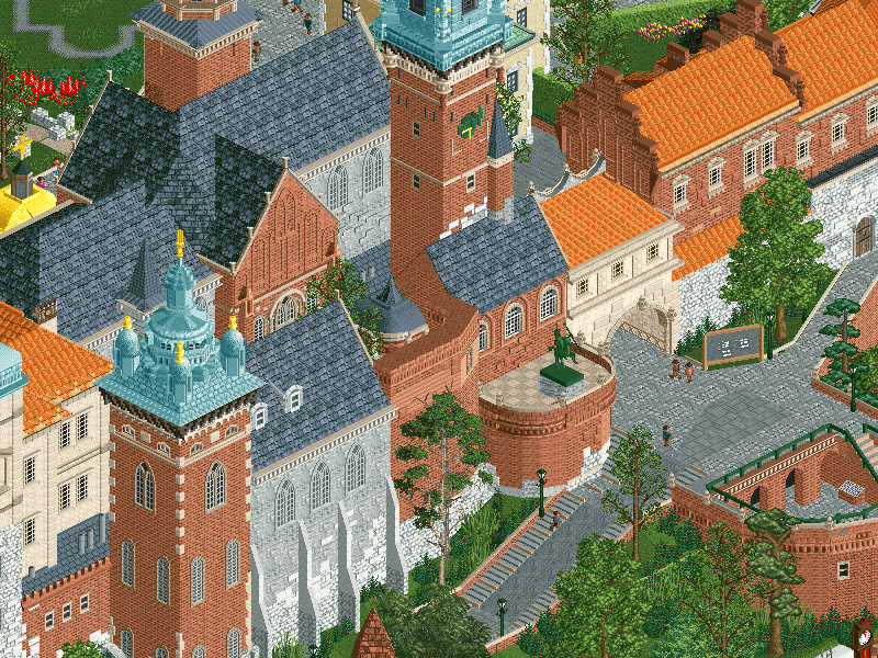 Wawel Castle
Once the seat of the Polish kings, Wawel Castle is now one of the most popular sights in the city of Krakow, attracting tourists and investors alike.

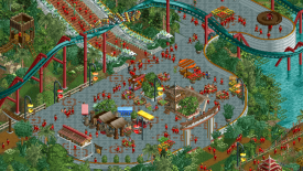
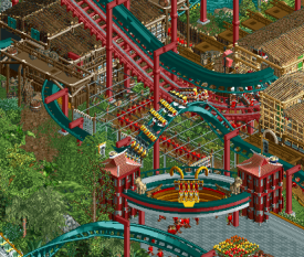
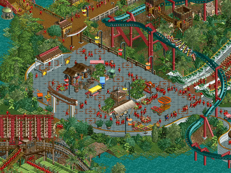 Naam Chalong Suu Oom
Life shrinks or expands in proportion to one's courage.
-
Voting rules
- The poll will stay open for ~72hrs.
- Do not vote unless you have viewed both parks in-game.
- Everyone may vote except members of either team. Any illegitimate votes will be ignored or removed.
- Anyone with an account that predates the start of H2HX, or who has been drafted onto a team, may vote in this match. Anyone with a newer account must pass the admins' account integrity checks.
- Voting is monitored by the admins to improve fairness.
-

 wheres_walto
Offline
Wow another great matchup.
Wawel Castle -
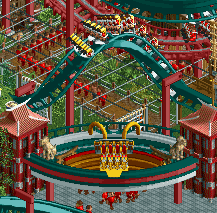
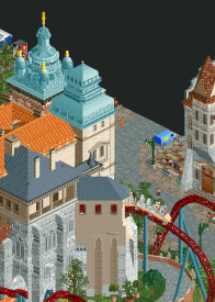
The scale of the architecture jumps out immediately, it's genuinely impressive how you've managed to create something that is essentially a castle and courtyard to be so massive yet so interesting. The foundation shapes are lovely, very striking angles and a fortress-like vibe. The main structure itself is lovely: masterfully textured, highly varied in shape and color. This is something I'd never be able to build so I admire the hell out of it. The music choice make me think also of Mont Saint Michel, which I think is fitting given that the structure is reminiscent of that map.
It does feel very GT to me: this is a setting park, but for me it's missing something to take it to the next level and hold my interest. There's a lot going on: hot air balloon (awesome), street market (awesome), the peeps look like they're enjoying a leisurely afternoon (fun), there's bikes, public transport, walking tours. Everyone is having a nice relaxing day, and maybe that's the point. The underground museum was a nice discovery. For me, it's an encapsulation of my feelings about the entire park: it's realistic and immersive, I can picture myself there, but I want more to be happening. I think my feelings here say more about me than the park. You've managed to capture a very specific leisurely European vibe, you're never trying to do too much, just what is necessary. From that perspective, this is a complete success.
Naam Chalong -
Okay wow, no wonder the file size is so small. I've long had a soft spot for modern NCSO style and this is a lovely showcase. The rides used throughout are awesome: custom 4-way splash on the diagonal boat? Peeps under the train to produce a dragon celebration? Using steam from train engines? Skilift chairs as lamps? Even the path patterns show resourcefulness. These things are so novel and fresh to me, I loved finding new details and was rewarded everywhere I looked.
Two really good parks, each successful in executing two very different intentions
-

 In:Cities
Offline
Time to knock out (an early) review while I have time. Going to do some quick highlights of things I really like about each park so as not to influence voting in a negative way. Tons to discover in each map - taking time to explore is well worth it!
Liam visits Poland and builds a Poland park with his buddies
- FIrst impression is great, the organ music is very fitting here.- Big red Mike Wazowski coaster is excellent. Nice flowing layout with solid interactions with the building. I really like how it wraps around the building. (small nitpick, but I think it would have greatly benefitted from a visible station area)
- BBL Drizzy (tbh, map was even more fun when listening to this song while viewing)
- Krakow Balloon is great! Can see lots of uses for it.
- From what I can tell, seems to be an accurate rec of the real place - well done!
- Digging the roman/gothic architecture vibe
- The start fort sections are so well done on the back side of the map. Super believable
- Old building foundations in the center are a great touch.
- Brick building covered in vines is a vibe.
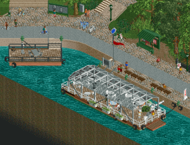
- Floating seating/restaurant area is so nice - feels real.
- Love the scenes of the musicians performing in the park, and the people feeding geese
- Underground museum is so tight. I love the T-rex haha
- Ukraine flags everywhere is a great detail
- Underground pool seems very European - guarantee they're all wearing small bathing suits.
Kumba drafts DKMP players and gets pressured into letting them build an NCSO park
- Peeps holding the dragon float is genius - so cool.- Boom coaster is such a great choice here. I've been wanting to build one of these in game for quite some time now, and this one is so incredibly well done. Test of Faith is a very apt name. Nice one
- The custom riverboats are so excellent! The pontoon boat is particularly well done.
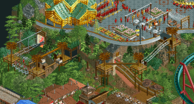
- Test of Courage ropes course and firewalking is awesome haha. Great effect here with the smoke.
- Pagodas in the rice fields are well crafted. Such a strong aesthetic here.
- Plaza pathing is a neat trick. Love it.
- Panda buddha
- Test of Fear water splash is so sick! Always amazing to see something synced up so perfectly like this in game. Queue through the rice paddy is great!
- Invert coaster layout is excellent. Great flowy design and beautiful colors.
- Test of Patience water market is so well done. Perfect amount of clutter and readability.
Two beautiful maps worth exploring!
-

 Six Frags
Offline
Naam Chalong Suu Oom by the Hurricanes
-Concept: *
The Asian (Thailand in this case) concepts have been done a lot on NE, and I didn't experience something completely new or fresh to justify going for another one.
-Content: **
Quite some content in there, I like all the rides and how you've used rides to create more content with.
-Quality: *
I wasn't really a fan of the 2x2 or other basic shape buildings on the map, as well as some of the rough path edges and lack of detail on some parts of the map.
Overall;
I'm not sure it's the NCSO that's holding this back for me, as I've seen some incredible NCSO parks in the past. I think it's more the fact that some stuff is so basic and unpolished that it didn't do anything for me unfortunately. In the end I'm just more of an aesthetics guy I think, and the basic shapes in architecture, rough path system and weird map shape didn't really help in that department.
I do appreciate some inventive stuff you guys pulled off though, like the broken rails on 'Test of Faith', the custom (bigger) boats and those peeps carrying the dragon. On Test of Faith I found the entrance to be weirdly positioned though, as I was expecting the temple on top of that mountain to be it, but was surprised that temple didn't have any function and the entrance of Test of Faith was somewhere on the side. Missed opportunity I think. The panda worship see-through scene on take-off was cool though.
The bone temple was the highlight of the park for me I think (pity it had no inside though, some more story there would've been awesome to discover). Those flying bikes around it (
 ) were a nice visual touch.
Test of the Naga had a nice layout and I liked how it went through the tunnel. Would've been cool if it went through a giant dragon mouth or something for some more visual excitement, instead of a tiny dragon sign at the corkscrew. Cool stairs tho, with those dragons as handrails.
One of the other cool things I found was the splash on 'Test of Fear', very well timed/hacked.
The custom buildings you did were ok, nothing really 'wow', but I was a bit disappointed with the inclusion of those base game Asian tower scenery pieces. Bit of a cheap way out in a contest like H2H, and would've been cooler if those were custom made in an inventive way. (I'm sure there will be die-hard LL/NCSO guys that don't mind all these basic ways of building though).
The port/waterway was well done, again nothing really wow, but solid.
All in all, this felt like a nice throwback park, and I'm sure you'll get a lot of votes for going ballsy and completely ignore today's meta. People will find this park to be a refreshing way of building, and I'm 100% sure I'm in the minority here, but it just wasn't for me unfortunately. Still, well done all!
====================
Wawel Castle by the Dambusters
-Concept: *
A castle in Krakow with coaster. That's as far as I got.
-Content: *
Not really a lot going on, other than the architecture and the coaster.
-Quality: ***
Here's where the park came to life for me. Awesome architecture, and the coaster was well paced and nicely integrated into the landscape and scenery.
Overall;
Uhm, don't know what to say about this one guys. The architecture on the castle and surrounding courtyard was immaculate, and in the end what won you my vote in the slightest of margins, but other than that and the coaster, there wasn't really anything going on in this map. Did you guys ran short on time or anything? That must've been it, and it's such a shame as it will probably lose you this match as a result, but man, that castle and courtyard are just phenomenal. Super high polish, great color scheme and palette, and nice geometry.
Smok Wawelski was great to follow along, love how it comes out of that tower after the lifthill, how it integrates with the landscape and how well paced it is. Nice touch on the 'cut-away-one-more...' underneath and that underground section was a great little addition.
The surrounding city buildings were a bit bunched into each other and monotonous, kind of paled in comparison to the castle+courtyard, but still a nice visual in the bigger picture. It was unfinished in spots though, with windows missing on the backside of buildings.
====================
So this match-up was a weird one, I'll probably be in the minority, but in the end the architecture in Wawel Castle made me vote for the Dambusters. The overall content and stuff to experience is way higher in Naam Chalong though. I went for quality over quantity this time unfortunately for the Hurricanes. Well done all!
-

 Jens J.
Offline
Naam Chalong Suu Oom
C'mon NCSO! When doing NCSO in H2H (speaking from experience haha), you obviously gotta bring some tricks with you to convince the viewers and you guys sure did that. First of all, the usage of vehicles (or as I say more often: car-itecture) is insane. Log flume boats for the pagoda roofs? Crazy shit and god bless the poor soul that had to (I assume) manually move them all into the right place with the Ride Vehicle Editor.
Other than that, you also have the hacked splashes for Test of Fear, the custom stairs made out of ride track and all the custom boats made out of a combination of ride vehicles, coaster track and scenery pieces. I would say my favorite bit of trackitecture was the rope course, so many cool section in there like the pole jumping and avoiding the swinging logs!
Cool stuff in here Hurricanes, lovely to see a team take the risk this early on and actually produce an NCSO park!
Wawel Castle
Lovely architecture in this map! Upon doing some research, seems like y'all did a great job at matching the existing buildings. Really appreciate the serene vibes in this park, especially in the middle of the park with that nice garden section!
By never having heard of this castle before, I was pleasantly suprised to discover an underground dino museum haha. Loved the footsteps in the pathing there. In general there were some really nice details throughout the park, especially a lot in the "garage sale" section of the map!
Solid work in this park Dambusters!
-

 Lurker
Offline
Wawel Castle:
Architecture is impressive, scaled well, really clean and overall map composition is really good. Main coaster is sort of random but does interact nicely with the surroundings and has some nice pacing. I also like all the scenes near the map edge, like the market and barge. I do think the center of the map could've used some more stuff like that, maybe an extra couple of things to add to what's there.
Naam Chalong Suu Oom:
Love seeing NCSOpen in H2HX, some really nice clever object and especially ride vehicle use. I especially like the tower base paths and the market stalls, also the dragon celebration and golden dragon boat. The ride design is also pretty good (I liked the inclusion of that concept mine ride), with the architecture I found the buildings with trackitcure roofing a little bit hard to read with the object choices there, the ones with stalls as roofs I liked that best. Also think this map feels the most lively of the two in this match. -

 Gustav Goblin
Offline
I'll be real, being an active participant this H2H has made me really understand meta fatigue. It's refreshing seeing a match like this with two more restrained parks.
Castle Wawel:
+ Very chill recreation, almost like a Grand Tour park. Took a look at the castle in Street View and it's a pretty accurate recreation.
+ Archi is the star of the show. Quality and finish vary throughout, but there are some very nice buildings here which I've been picking apart and studying.
+ The bits of open space feel nice and serene rather than unfinished. On the contrary, I love the chaos of the garage sale scene.
+ Big fan of the Krakow Balloon CTR. I can see myself using that quite a bit in the near future.
+ Underground museum was a cool touch and I liked how the coaster weaves alongside it.
+ Love the barge.
= BBL Drizzy. A zoomer had to have worked on this.
= Am I glad he's frozen in there and we're out here and he's the sheriff
- Some bits look a tad unfinished or rushed.
- Not gonna lie, feels a little safe for a H2H park. It's nice but nothing about it really wows me.
Naam Chalong Suu Oom:
+ Was not expecting a NCSO park this early in the contest and this is a truly remarkable one. I like the choice to go with vanilla NCSO plus the official open pieces, even with the DKMP influence present throughout this park.
+ Love the overarching narrative with the frozen staff names and the rides representing different tests.
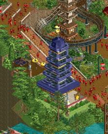
+ Custom pagodas with the medieval houses are really clever and the Indigo Pagoda is just insane. Hit or miss for me in terms of viewing, but it goes to show how much work the vehicle editor is putting in this H2H. Always warms my heart seeing the invisible castle wall dot trick, which I believe I was the first to notice and point out.
+ Test of Fear's splash hack is so cool.
+ Can't believe y'all pulled off Test of Faith so well in NCSO. Really unique ride with a great temple nearby.
+ Love me a good Nemesis clone.
+ Great boats, especially the golden dragon boat. Again, vehicle editor is redefining NCSO for those with the balls and time to really abuse it.
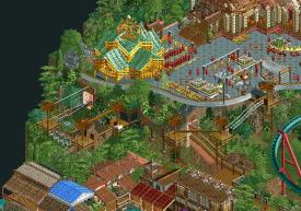
+ Huge fan of the pathwork in the plaza and the guests carrying the dragon floats. The Sanctuary of Truth is ridiculous too.
+ Great cutaways with the DKMP tunnel trick.
+ Love the obstacle course.
= I feel like Asian themes have been done a lot with NCSO, albeit not to this standard.
- NCSO unfortunately means some awkwardness like the shrine roof near Test of the Naga's lift. That trick has never come across as a spire to me.
-

 Mr.Brightside711
Offline
NCSO: This park is pretty fun, though at time the amount of object spam can be a bit overwhelming, there are enough details and scenes that made up for it. Also some great ride design and tons of movement makes this park feel so alive. Here are my favorite parts:
This plaza, especially the floor.
Naga's entrance.
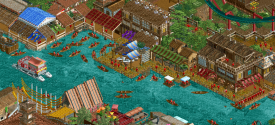
The boat hack is awesome.
These fields.
Test of Faith was the star of this round IMO. So fun seeing this coaster realized in game and it pretty good too! I just wish the cars traveled through even more often!
This palace also adds so much to this side of the river
The river and all the buildings along it.
The ropes course is really really clever and well done.
These details earned my vote. Good job canes.
-

 Mr.Brightside711
Offline
Uwu Castle: This park is clearly a victim of the deadline. Most of the problems I have with it are the lack of movement and just life going on, which is especially noticable in a touristy city center. A few more days would have done this park wonders, because arcy-wise it is really strong, it just isn't very fun. I'm sorry for being so negative, but here are the things I loved:
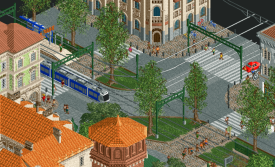
The trams and station were really nice!
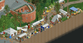
This scene, but especially the dining barge.
The flea market.
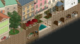
These basement scenes! I wish there was more stuff like this up top!
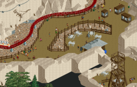
I liked this cutaway scene alot! The coaster going through this area is fun.
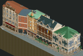
This row of buildings are my favorite on the map. Love the flags that hang off the balconies. But its clear here, not a single moving thing on this side of the street.
My favorite thing on the map is this tower <3
I am interested to hear more about the park's construction and builders. The park is really good and I think it will probably score well. I'd rate the quality higher than NCSO. I just didn't have that much fun with it.
-

 Sulakke
Offline
Wawel Castle
+ Obviously, the architecture is fantastic. Some of the pieces I love most are the tops of the towers with yellow ornaments (especially the lower one is amazing), the tan building in the corner with the orange roof and the restaurant building with the Ukranian flag. Actually, I could point out every building on the map, because they are so good.
+ I love the way you did the trams.
+ The fort walls and especially the half round open circle.
+ The custom trees and the new Ash tree object.
+ The market.
+ The ruins.
- I think you could have done without the coaster. It felt forced in and wasn't really interesting. I would have preferred a realistic recreation without any rides at all or a map with more rides integrated than just one coaster.
- Some of the coloring could be better. The bright red letter signs and flowers in the middle were a little bit out of balance with the rest. I think a different color of blue/green for the top of the towers would have been better too.
Naam Chalong Suu Oom
+ There are so many great ideas to discover on the map. I'm not the biggest NCSO expert so I don't know if any of these ideas are done before or are completely new, but I want to point out two of them I love most: the splash effect and the dragon celebration.
+ Love the dragon steps and the barrel roll flying over them.
+ I like how you did the patterned paths. They go well with the theme.
+ The indigo pagado is really nice.
- I'm not a fan of the bone sanctuary. It looks messy to me and also a bit too big compared to the other buildings on the map.
- I didn't get the frozen canoe ride. It's got something to do with patience, but it looks weird like this.
- I think you could have done more with the landscaping to push this park to a next level by adding some dramatic cliffs for example.
-

 Babar Tapie
Offline
Wawel Castle
Memories of my trip to Krakow via Katowice by bus.
I don't remember the castle very well, so I can't say how similar this one is, but it's a very good castle we've got here. The part of the castle around the coaster is quite impressive, these gray inserts with this beige color work wonderfully. This church is also very nice ! I loved the flea market, I might have brought some color changes to the tents but that's really secondary. I liked this hot-air balloon too, it's simple but very effective. The second part of the castle lacks a bit of detail, once again I don't have the castle in mind, however I like these late medieval diagonal walls, finally it's something quite new in castle design on NE. On the negative side, I find that the forms outside the castle tend to look very square, same goes for the water which looks very straight. Some areas seem less polished than others too. It's a good park, but there's a little bit of madness or story missing here.
Naam Chalong
Hard for me to review an NCSO park, it's really not a style I'm familiar with.
However, I think there are some very good ideas here. I loved the idea of flying dragons, as well as that staircase ramp, the simplest ideas are always the brightest. Test of Fear is great, that diagonal building is really cool and the effect of the dive in the water is awesome, the whole area is one of my favorite parts of the park. The sanctuary is also visually impressive, maybe just those carts that look a bit strange but that's a detail here. In fact, I'm just realizing that the more I explore the map the more I discover really cool things: this dragon boat, the dragon sign, Test of Faith station.
I've enjoyed exploring your park, I think there are some great ideas here. I came with some reservations and in the end you surprised me !
Hard for me to choose, I'll be tempted to be a coward and cast a null vote. I think I'll take some time before deciding.
-

 deanosrs
Offline
Wawel Castle - Dambusters
This is a very digestable map. I love the little market area with the tents and grandfather clock. Those markets are a key part of european cities and although a small little area, it casts a great vibe next to the castle.
The castle itself, I feel like a lot more roofs are orange than are done that way in RCT. Almost like there's an unwritten rule that people don't like orange. I'm glad you guys pressed ahead with it here. It contrasts really well with the other colours and adds a lot of character.
The tramline is another feature that adds a lot of the right feels to the map for its setting. All these details really help zero in the map on Poland, not just "eastern europe".
I think the two drawbacks here are firstly, it feels like you guys mainly wanted to do exactly that: recreate part of Krakow, rather than build a theme park - and then the coaster feels like it's there almost to justify it as an H2H entry. I'd have liked to have seen a carnival taking over the castle, or the nearby town, at least some more rides - not just for the RCT of it, but to bring the map to life a little more. The hot air balloon is a nice touch, and the bicycles riding along the riverfront get us a little bit more there.
The second drawback is the age-old H2H challenge of time. It feels like with an extra week, a couple of architectural touch ups could have helped a lot, and maybe also time for some more details around the map, maybe use the map edge to extend the dinosaur exhibits.
I really enjoyed looking at the map, it was immediately clear what you were trying to do and it was done well. I enjoyed my visit to Krakow!
As you can see, the MDs were quite taken by the dinosaur museum.
Minideano 1: It's funny how they put a dinosaur museum underground
Minideano 2: I like the roller coaster ride going through the dinosaur museum
Naam Chalong Suu Oom - Hurricanes
I'll start by acknowledging I'm one of the dissenting Wawel voters, and contextualize that with my review, because there's an awful lot I liked. Some I was downright envious of in terms of RCT skill.
Test of Fear has such a cool splash down effect. It's the kind of hack that works best in NCSO where the viewer is already conditioned to elaborate a little on the pixels to take something extra from them. So I don't see boat seats creating the splash, I just see splash. Really cool idea done perfectly.
Test of the Naga was the map highlight for me. A really well built coaster, the layout giving me Nemesis vibes (my #1 coaster!) just built into the landscape really well, with a lovely moment of guest interaction before the final corkscrew.
The Dragon Celebration was a really nice touch. I knew immediately exactly what you were going for here, and it adds to much atmosphere to the scene.
Everyone in their little red shirts is a nice touch too!
Other times, the caritecture fell a touch short for me. The log flume pagoda for example, although I imagine that was painstaking to put together - it looked like a pile of log flume boats more than a pagoda.
Overall, I'd say that the park impressed me a ton, perhaps as much as any park this contest so far. But, I just found it a little abrasive to look at. I think the temple around Sanctuary of Truth speaks to this the most. I'll admit straight up I could never build that. It would take far too much skill and patience for me. So while I'm in awe of it, it's not something I think looks as pretty as other parks. I think this is just a nuance in how different people vote. Some may go for who they think deserves the vote, I try to vote for what I enjoy the most. And I did enjoy this a lot! This was a really close vote for me and I just enjoyed the castle a little more. Plus, when you have two kiddos in total awe of a dinosaur skeleton in rock next to you, it's tough to not have that sway you!
Minideano 1: Those cars with people hanging down with them are really good
Minideano 2: I don't know what the big house at the back is made of
-

 GammaZero
Offline
Episode 2, Part 3: gamma's heel turn
So, the folks in both teams who were no doubt refreshing the feed constantly might have noticed that I'm reviewing these after voting, which isn't something I was doing before (as far as I remember at least). With that in mind, my typical review style will change slightly for this one, just so I'm being totally transparent and not blowing smoke up anyone's proverbial behind. After all, I do believe that the team I didn't vote for wouldn't appreciate a seemingly fake review where I don't go over what made me not vote for them. Anyway, here we go.
Wawel Castle
First off, I have to say. You guys have either made the Guess the Builder for this one extremely easy (for the main builder, at least) or an elaborate scheme to prank everyone who will guess the obvious choice. Although, I guess nothing can beat your R1 park in terms of clear builder identity. In any case, let's talk about the park itself.
Just looking at the architecture on display here, I don't think I even need to look at reference material to be able to confidently say that it's very accurate to the source. And of course, damn is this city scene beautiful. The shapes are striking, the textures are yummy and there is just enough micro-level detailing to make the buildings feel real and aesthetically pleasing without bordering on object spam.
The balance between city and nature is also super refreshing, and makes the map feel truly varied, despite its size and shape (although I guess I should be praising Krakow for this, not you guys). Additionally, I love the details and dynamic elements of the map: the hot air balloon, the trams, the flea market, and the underground scenes (thank you Jens for pointing out the cave on the Discord, I almost missed it!).
As for the elephant(s?) in the room, though: yes, the signs are there that time wasn't exactly on you guys' side for that final cleanup pass, and yes, the map does feel a bit too peaceful for H2H standards (similarly to Biota in Round 1). Regarding the second point, I don't think it's a detractor per se, it's just a bit of an objective risk considering the expectations many (if not most) people have for H2H parks - nevertheless, it might have been possible to add more rides and/or tourism elements to make the map feel more alive. Also, I will go ahead and disagree with what seems to be a prevalent opinion that the coaster feels shoehorned, or like an afterthought. As someone who has suffered with very similar criticisms in the past, I still don't think a coaster needs to feel like the main feature of the map, or interact with everything constantly, if it makes sense in-universe for it not to do those things; therefore, Smok Wawelski is fine in my books (and I love the layout!).
Okay, I think you guys get the picture, I have to cut this one short

TL;DR: authentic, balanced, slow burner.
No Custom Scenery Objects
You guys ain't slick, haha. What is slick, though, is the sheer amount of NCSO expertise and wizardry that you've managed to stuff in a H2H-sized map. I was the only one to boldly declare that we wouldn't see any NCSO parks at all in this contest, so for such a park to have more value than a simple middle finger to little ol' gamma, you have to use every trick in the book to give the map significant substance and plenty of wow factors. And you did, so I have to commend the bravery and confidence on display.
I could spend hours going over every single trick and technique in this park that I appreciated, but just know that, as a former NCSO tryhard (who, admittedly, didn't achieve much), I see them and I love them, and they all help to build the desired theme immensely. I will, however, bring attention to the main rides - they're all brilliant. Test of the Naga is an awesome take on the classic Nemesis-style invert, Test of Faith is a really well-executed rendition of that type of ride (is it the first?), and Test of Fear is just genius, with its water splash trick.
Overall, I do appreciate how you guys pulled every stop to make an NCSO park competitive in the meta-breaking H2HX. Unfortunately, I do have to talk about where it falls short for me. To be completely frank, most of the architecture and landscaping, while technically impressive, just didn't do it for me. Trust me, I really tried to love it, but when you ask me to judge an NCSO park next to a fully-fledged CSO park equally, I just can't, in good faith, deem pagodas made of stacked cars, tracks, and other random stuff as more aesthetically pleasing than what can be achieved with the "unfair" level of micro that modern CSO provides. There are definitely highlights, like the invert station and the smaller temple over the DK coaster, but I couldn't really vibe with the rest. The landscaping is a similar story: I fully understand why the jagged rock look was chosen, but I can't help but put it a cut below what can be achieved with perfectly manicured, purpose-built objects. It really sucks, because I still think this is a great park, but it's the nature of the contest, you know?
I hate to end a review on a negative note like this (especially one as lengthy as the above paragraph), but you guys should definitely focus on the positives, because not a lot of my criticism applies to the park in a vacuum. Also, it doesn't look like you're gonna have to worry about this, right?

TL;DR: lively, technical, risky.
Right. I know. I've been on the receiving end of the type of bullshit I just concocted above, so I know how potentially demoralizing it could be. And if it really was, I'm sorry. But, again, I feel like transparency is more valuable in this case. Also, sorry for the extremely long rants, lol. I tried to keep them short, if you can believe me. Let me just end this by saying that I still think both parks are of insane quality, it's just the H2H way to go over everything with a fine-tooth comb and act like the critic from Ratatouille whose name I forgot. So please, no matter what the result is or how my unhinged reviews make you feel, be proud of your work first and foremost. And please use some custom music next time. It's almost always better.
Well, that last take is gonna rub some people the wrong way. Hopefully it makes everyone forget about the rest of the spice. See you in Round 3!
-

 Turtle
Offline
two very interesting parks here, very different also. i'd imagine voting for this being quite polarizing. kinda comes down to execution vs. fun factor, almost.
Wawel Castle
you've done very well here to have an entire map basically be one thing, but not have it feel samey samey. it's a bit of a risk, as well as having a map that's light on rides/movement. the balloon is a really nice touch though.
the orange rooves are likely true to the real life version (i'm assuming this is a real castle in krakow) but they are garish from this airborne perspective. however they do vibe VERY nicely with the eggshell blue towers. beautiful.
that's a good adjective for this park, actually. beautiful. it feels very polished (if you'll excuse the pun, get fucked Steve now you can't use that one in your review). everything fits nicely, but the whole map does leave me sliiiiightly wanting a little more fun.
Naam Chalong Suu Oom
obviously copied and pasted that, gonna be tough to remember. luckily we can all just abbreviate it to NCSO, you clever bastards. conversely this map is full of life and fun. many good ideas around, and i'm a sucker for existing scenery pieces used in new and novel ways.
this is one of those things kinda like the LL/RCT2 debate back in the day - if you judge this park alone, it's great and impressive and pushes the boundaries etc. but unfortunately we have to judge it against a vastly different park with different toolsets used to build. and for me, i just enjoyed being in the other park slightly more. it feels more complete, more realistic, more intricate, all things i enjoy. i very much liked the NCSO park, but alex has set that bar pretty high in terms of atmosphere/theming etc.
still i'm very happy to see a NCSO park in the contest - obviously this was a strategy of Kumba's when drafting, and i'm glad to see it played out. nice work to all involved.
-

 FK+Coastermind
Offline
As others have noted, a very different matchup in terms of what seems to have worked and/or not. While I feel like Hurricanes put out a great park and a great argument for NCSO in H2H, I also feel like this might have been a bit time and place for the park, as I'm unsure how it'd fair against other parks we've seen thus far this season. Regardless, I thought the activity and excitement incorporated throughout the Hurricanes' park was pretty infectious. It had a great sense of fun and played well with the depth NCSO can bring thru unique tricks and hacks. Some areas were a bit hard to read and I think were begging for some additional texture to give more depth. Still, a fun park that engages well with the source material of rct.
On paper, Wawel seems right up my alley; urban, architecture-focused, with tons of opportunity for texture and detail. What I struggled with was an almost eerie sense that the park was missing something, like there was more intended that I can feel isn't there. Wawel comes across to me as a speed build, with a ton of focus on the macro positioning of buildings but the details that differentiate those structures and give depth are not always there. The affect is almost like seeing out of focus, where one building has so much depth and the next feels a bit flat or undercooked. It's definitely weird though, because the park has lots of great details and things to explore. This isn't an issue of 'lacking content' for me, I think both parks offer plenty to explore. It just didn't feel like Wawel was consistent throughout and that made certain areas feel more 'empty' even when they weren't. Guess that's a drawback of aiming for a more 'lived in' style of realism. That's why I think NCSO might have been perfectly suited as an opponent to offer what Wawel didn't, even if it lacks for some of the wow factor for me.
Congrats to both teams on the parks and a matchup that just feels really different than others, heh.
-

 RobDedede
Offline
Wawel Castle:
I really like this map a lot! I like how understated it is. Furthermore, I like how accurate of a recreation it is to Kraków, and I don't happen to mind that it's a “GT” map or whatever. All of those things can be true, and at the same time, I do have to acknowledge that this map is VERY safe. It's a recreation of a European landmark with a coaster in the middle of it. There is nothing wrong with that, but for me that doesn't win a H2H match. You see what I mean? There is NOTHING wrong with this map, it just doesn't work super well in a H2H context, if that makes sense? I think there are things that could have been added, as a layer of sorts, to make the map more successful. I don't know necessarily what those would have been; I don't feel comfortable suggesting to the builders what that should've been, but I think you understand what I mean. Some moments I liked were the trams, the architecture with the Ukrainian flags, and the little market with the grandfather clock.
Naam Chalong Suu Oom:
Clever acronym here. I think the reason this park is so ahead in the polls is because, in contrast to Wawel, it is bold. It goes for straight NCSO, with lots of cool hacks. Is the execution everywhere perfect? No. Nevertheless, at least for me, the decision to go full NCSO is really cool and paid off here. To be clear, I would not be saying this if the park had suffered greatly in its execution. It did not. It is still a great park with cool coaster, especially the one that jumps the track. The level of NCSO wizardry here is genuinely impressive. I think the most impressive aspect for me is the giant Sanctuary of Truth. It truly is a really cool setpiece, and I don't want to imagine how long it took to put together. Great work, Hurricanes. I am really curious to see who built on this map, and how the shares looked. I have a sneaking suspicion Kumba's weighted builder shares are going to be crazy low.
-

 FredD
Offline
Wawel Castle
I don't really know what to think of this park... Don't get me wrong, what is there is great. It's just that kinda feels small and empty for being a H2H park?! Maybe we are just too spoiled lately.
Archy is great, love the castle. Coaster is cool but I think a bigger castle that used more of the map would've helped the map better. Also think that the castle garden could've fit some small rides in for some more life.
Overall a lovely map, if I didn't know I'd say it's an ideal Grand Tour map.
Naam Chalong Suu Oom
It remains a bold choice to for NCSO in H2H despite it's revival. Nonetheless, a bold choice that can pay off. No lack of atmosphere or details here. I like the composition with the Sanctuary on top, as big weenie overlooking the whole map.
So much clever use of objects and rides here: dragon celebration, rice fields, pontoon boat, the flume boats as pagoda... The river/water market was so charming, easily my favorite part of the map. The invert was cool but I also liked the diagonal nautic jet a lot! I'm a sucker for these rides haha.
Much to see and discover in this map. Great entry.
-

 Hobeon
Offline
Wawel Castle:
Lovely scenic park. I really like the architecture of the castle, especially the front part of it overlooking the city. The coaster sits nicely in between the castle and the city with a few lovely interaction points.
I do with there was something like that on the back half of the map. As others had already mentioned, there's a bit of a lack of movement there. Maybe it was intentional, maybe you just ran out of time.
What is there however does look great. Love the star shaped castle walls, the diner boat, the peeps biking around, the trams, some peeps just sunbathing, there really isn't a shortage of content.
Naam Chalong Suu Oom:
Oh man I'm glad to see an NCSO map in this contest! (clever name, too haha)
And what a contrast with the Dambuster's park this round - A clean, quiet architecture focused map vs a busy ncso map full of hacks and tricks. One map is just nice to look at, but this one is so fun to explore. I've spend more time trying to figure out how you did all the tricks than just looking at the map.
Love the Test of Fear ride, the pagodas with the mine track, the mine track used for stairs. The test of faith and the naga are great too, there's so much creativity in all these rides
 Tags
Tags
- No Tags
